main: July 2010 Archives
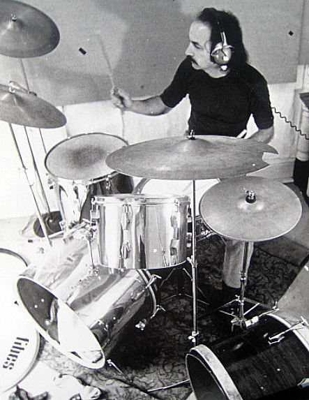
Rafael Ferrer playing drums, Philadelphia, 1967
A Life Divided?
The work of Rafael Ferrer is characterized by a caesura, or so it might appear. Provocative classics of the late '60s and through most of the '70s -- installations with a definite guerrilla flavor, using dead leaves, ice, grease, cloth, galvanized steel, and so forth -- are perceived as distinct from the tropical paintings that followed. It would seem that the former celebrates the cerebral and the ad hoc, whereas the latter are densely representational paintings that play more directly with heritages and languages. Or are the paintings Neo-Expressionism-cum-Hairy Who? Later we find out that the suave representations of Alex Katz, limning the quotidian and the New York School of poets and painters, have played their part, too.
Trying to account for Ferrer's sculptures makes classification even more difficult. The hanging "kayaks" introduce anti-tropical fantasies and reversals of European Romanticism. What is the mirror to the Euro-American escapism, which, from Melville to Gauguin, involved the tropics? Why do I, who have been to Tahiti, still think of South Pacific humidity as preferable to the identical climate we now suffer through on the streets of Mannahatta or in the former potato fields of Long Island now encumbered by empty mansions? If you yourself are tropical -- let's say of Caribbean origin or, nowadays, a New Yorker in July -- might not the arctic be your paradise? Might not kayaks be exotic? And, come to think of it, wouldn't great blocks of melting ice be nice?
In a period characterized by a reevaluation of the performative art of the '60s and '70s, the danger now is that all subsequent paintings, not just Ferrer's, will be seen as retardaire. In fact, compared to his earlier installations, Ferrer's works on canvas are not in the least bit sexy. A reconceptualization is required. Although it focuses on the paintings, "Retro/Active: The Work of Rafael Ferrer" at El Museo del Barrio (to Aug. 22) is a long-delayed and long-required toast to one of our most talented mavericks.
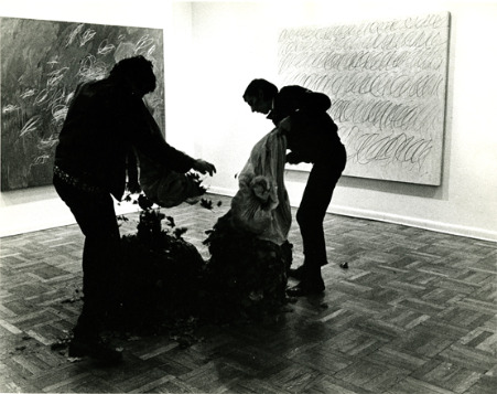
Ferrer, Three Leaf Pieces, 1968 (Castelli Gallery)
Or A Double Life?
In 1968, Ferrer, uninvited, dumped piles of dead leaves into the elevators of the then important Dwan and Fischbach Galleries, in the front room of Castelli further uptown and at the Castelli Warehouse, where Robert Morris had installed his anti-form show.
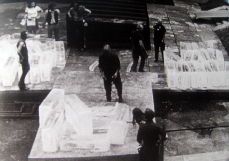
The following year, when Ferrer was invited by Whitney curators Marcia Tucker and James Monte to participate in "Anti-Illusion: Procedures/Materials," he deposited leaves and blocks of ice on the entrance ramp of the museum. Inside, he created a wall/floor piece involving grease and hay. Some of the flung hay clung to the greased-up wall.
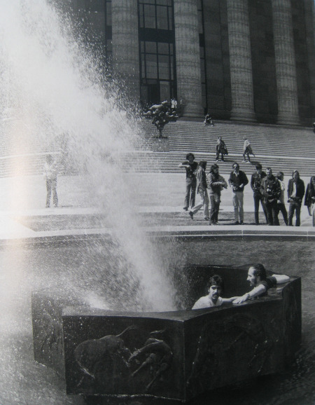
In 1970, sitting in a fountain in front of the Philadelphia Museum of Art, Ferrer performed Deflected fountain, for Marcel Duchamp.
The same year, for the exhibition "Information," he displayed 50 blocks of ice in MoMA's garden.
 * * *
* * *
Nevertheless, by 1980, Ferrer was making paintings of Caribbean shacks, outdoor cookery, cockfights, hallucinatory deep-noon shadows. These are featured in the current exhibition at El Museo del Barrio, the performative works reduced to a room of ephemera.

Ferrer, El Sol Asombra (The Sun in Shadow/The Sun Astounded), 1989.
Born in Puerto Rico, bilingual and bicultural, Ferrer as a young man worked as an Afro-Cuban drummer in New York. Because his beloved stepbrother was the actor José Ferrer, he also met various Hollywood types. He definitely did not "come from the slums of Puerto Rico," as one reviewer put it in1971. This error is cited and corrected in exhibition curator Deborah Cullen's catalog essay "Poetry on the Margins." In Vincent's Katz catalog interview the artist himself says he drew up in {miramar, a well-to-do neighborhood of San Juan."
Why would someone make that kind of mistake in an otherwise fine exercise in appreciation? It is more romantic, I suppose, to come from the slums than from more aflluent climes. Well, just ask anyone who has crawled his way out of the slums how romantic that is. The awful prejudice here is the notion that all Puerto Ricans come from the slums. Or all Cubans. Or all Mexicans.
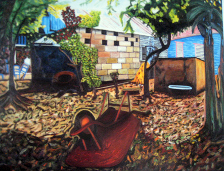
Ferrer: Paraiso (La Barbacoa), 1994
Another Day, Another Caesura
Herewith, I can further develop my theme of Second Acts in art. Constant readers will recognize that my braided view of art is slowly but surely being expressed by Artopia itself. Cross-referencing among the posts is only the most obvious form of braiding. Thematic strands are coming to the fore.
The surprise of my recent weigh-in on late Warhol was that the Pop Pope indeed did have a Second Act. His First Act ended with the assassination attempt. His Second, following the caesura of the dreadful commissioned portraits, consisted of picking up where he had left off. Under cover of his media bliss, he plugged new images into his working procedure, his style. Some worked: the Rorschachs and the Last Suppers, in particular. Ferrer's Second Act, as described above, was a little different, as was his caesura.
My idea is that Ferrer is having a Third Act. Here, my model is the foolproof template of a traditional play. First Act: characters and basic situation introduced; End of Second Act, characters are up a tree; Third Act, characters get down from tree -- problem solved.
The Ferrer Third Act is the notion that there is in fact no division between Ferrer's anti-form works and the paintings that followed. The current exhibition, if it were not so soft in this regard, could have proved this.
Carter Ratcliff's smart and well-written catalog essay is a reprint of his 1983 Cincinnati Contemporary Art Center piece, "Rafael Ferrer in the Tropical Sublime," composed closer to the break-off point. He hints at an unacknowledged continuity, but backs off. Leaves are romantic. Yes and no.
I am not convinced that the performative works were in themselves a criticism of post-Minimal anti-form. But Ratcliff is right about the ice and the kayaks having a different meaning for someone born in the Caribbean than for someone born up north.
In the catalog, Edward Sullivan dutifully delineates the Caribbean and Euro-Caribbean antecedents of Ferrer's early work and his post-1980 turn. That Ferrer once met Wifredo Lam is probably important, but is it more important than that his sister-in-law was Rosemary Clooney? We have Show Biz connections confirmed in a long e-mail interview conducted by Vincent Katz, son of Ferrer's friend Alex, wherein Ferrer also gives a lot of credit to the emotional support of his brotherJosé.
Oddly, critic/poet Ratcliff wonders why Philip Leider (editor of Artforum, 1962-71), when reviewing the Castelli anti-form show for the New York Times in 1968, was blind to Ferrer's leaf pieces. He had to step over them to see the exhibition, but he did not mention them. It were as if they were invisible, and Ratcliff suggests that this was because Ferrer was challenging the anti-romanticism of Minimalism, a dictum subscribed to by Leider. But something far worse was involved.
Even mentioning Ferrer's leaves would sanction similar actions in the future, thus threatening curatorial and art-dealer power. Control over who gets shown is essential. You can't just have someone walking off the street and dumping bushels of leaves on the floor, can you?
Currently, this may be why Thierry Geoffroy, the creator of Critical Runs, Emergency Rooms, and Penetrations, is not yet well-known. Artists running through the streets and artist complaining-rooms may be strange, but inserting unsolicited artworks in actual exhibitions (i.e., Penetrations) is truly destabilizing.
More productive is Ratcliff's valorizing of Ferrer's surprising but possibly ironic fondness for conquistador Hernán Cortés, who, when he wanted his men to march to the interior of Mexico to challenge Montezuma, sank all boats so they couldn't turn around and go back to Cuba. When asked what he would do next, Cortez reportedly answered: "Something will turn up." The implication is that Ferrer, when he turned his back on anti-form, had burned all boats. However....
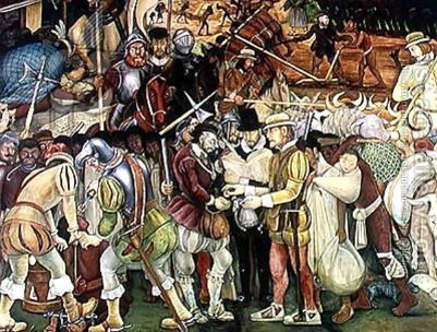
Diego Rivera, The Conquest and Arrival of Cortés..
Rafael Ferrer, The Third
A number of image juxtapositions throughout the El Museo del Barrio catalog make a case for previously unnoted continuities: A 1969 installation (Niche) is paired with The Barbecue of 1991-92. The galvanized steel and the tarp in the installation seem to rhyme with the materials depicted in the painting, as does the sense of enclosure and of light. Disorder has no border.
Hanging elements in For Reba Stewart, 1971 (Philadelphia ICA) rhyme with the hanging carcass in the 1987 painting Innocence. A pile of leaves from Three Leaf Pieces (1968) rhymes with the leaves in Paradise/Barbecue (1994). The rectangular opening in the tent in Tent, Tree, Bucket, Light (1970) rhymes with the window seen through the door of The Open Door (1987). The whirlwind of hay in Hay, Grease, Steel (1968) rhymes with the hubbub of black shadows in The Sun in Shadow/The Sun Astounds (1989).
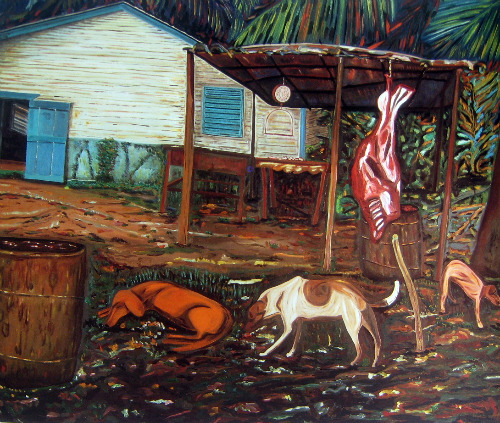
Ferrer, Inocancia/Innocence, 1987
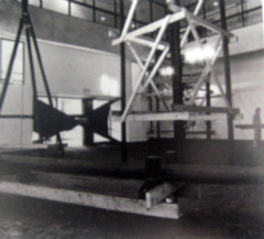
Ferrer: For Reba Steward, 1971
These "rhymes" expose the previously unnoted inspiration for Ferrer's anti-form installations. Both the installations and the paintings spring from a common ground, a common landscape. If the photos of the anti-form pieces were similarly juxtaposed with the paintings in the installation itself, a good case for continuity might be made. Shouldn't curator Cullen have at least re-presented a leaf piece? Or stuck some ice blocks at the entrance to the museum?
Here instead, the message reads that the errant son of Puerto Rico turned his back on Yankee art and returned to his Caribbean roots. The rich and lush is to be privileged over the cold and rational, never mind that on both sides of the Ferrer caesura we are always facing chaos.
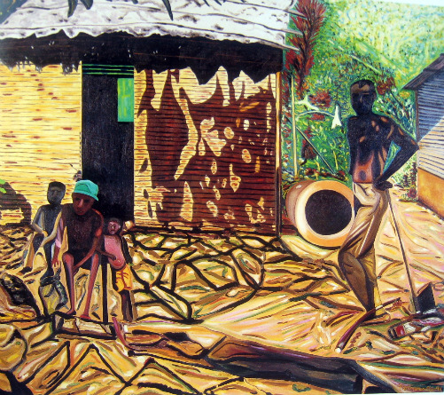
Ferrer: Conquista de la Solidad/ Conquering Solitude, 1990-91
Themes To Die From
The work in the exhibition is not displayed chronologically. Instead there are clusters under confusing double-headed titles: "Darkness/Menace," "Art/Memory," "Series/Language," "Music/Rhythm," "Light/Movement." Almost anything could fit anywhere. There are large paintings and less consequential "faces." We are treated to some complicated hanging "kayaks" but are also force-fed some pre-Conceptual welded things that could have easily been omitted.I found, by the way, that I particularly liked the larger paintings. There is no doubt that The Barbeque, Innocence, Paradise, In the Mountains..., and Conquering Solitude are strange and wonderful. And then there's the collection of paper-bag self-portraits and the poetic, painted blackboards. I was drawn to both, perhaps because they are slightly mad accumulations, but also because they embody a fountain of creativity, improvisation, inspiration continually renewed.
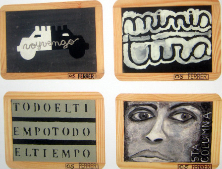
I suppose the "themes" are an attempt to make sense of Ferrer's tendency to jump back and forth and all over the place. I would rather have had the rhythm or the polyrhythm or the braid of his oeuvre as it developed. The themes stand in the way. If you are trying to get the cat back into the bag to rescue it from the oncoming flood, the easiest way may be to kill it first, but that is of no use to the cat.
Another theme, although it is not posted as such on the walls, is cultural identity. In her catalog essay, Cullen mentions that the ultra-decorative, more-is-more artist Lucas Samaras once told Ferrer to put "more Puerto Rico into it"; whereas Minimalist Morris insisted, "I don't want to see you concerned with being a Puerto Rican." Unfortunately, neither artist was right. I like it best when Ferrer's imagination takes command.
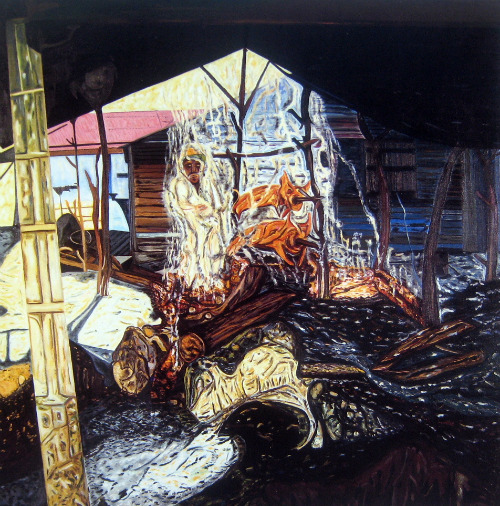
Ferrer: La Barbacoa (The Barbeque), 1991-92
Pull Out the Rug!
By 1980, there was indeed a sense that Conceptual art, Minimalism and the various post-Minimalisms had gone as far as possible. A nostalgia for expression and emotion raged. Even the flamboyant was fresh. I thought Patterning and Decoration would be the answer. It was gridded, so it could claim a distinguished history. It was global, cross-class, and cross-cultural. But Neo-Expressionism won, also beating down what we now are forced to call the Pictures Generation. Yet only temporarily.
I am not sure even now that Ferrer is an expressionist. But who is? You can't step into the same paint twice. You can't be sincere while looking in a rearview mirror. Wasn't Neo-Expressionism really a kind of Conceptual Expressionism? Don't look behind, abandon all ships; something will turn up.
FOR AN AUTOMATIC ARTOPIA ALERT WHEN A NEW ESSAY IS POSTED, PLEASE CONTACT: perreault@aol.com
John Perreault is on Facebook. You can also now follow JohnPerreault on Twitter
From the Artopia Discussion Group: "Will the internet destroy art?" is now archived and available on The Artopian.
.
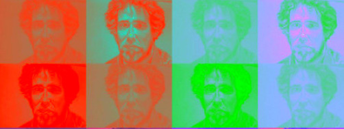
John Perreault by John Perreault, 2010, dimensions variable. (Image of Portrait of John Perreault by Philip Pealstein,1973, multiplied and altered with Pop Art app and Picnik).
"There are no second acts in American lives."
-- F. Scott Fitzgerald.
Drella by Starlight
"Andy Warhol: The Last Decade," at the Brooklyn Museum through Sept. 12, is essential but problematic. Originating at the Milwaukee Museum of Art, it is a thin survey of the Pop Pope's second act. The art world has already seen these images before, here and there, and repackaged at various Gagosian galleries. Not entirely pleased by the selection, I scrambled through my Andrew Warhola library to locate entire series not included -- some justifiably so, some mysteriously omitted.
Death is not the ultimate curator; it merely sets the stage. But it does offer some career advantages. No further false starts, missteps and, after a point, no undiscovered work. The sorting can begin in earnest. Death imparts a certain stability.
The thesis is that Warhol (1928-1987), through a new interest in abstraction, judicious recapitulation, collaboration with younger artists and a return to hand-painting, achieved new glory from 1977 to his death in 1987. Well, yes and no.
The 1979 Whitney exhibition "Andy Warhol: Portraits of the 70s" was loathed, even by yours truly. Celebrities were interchangeable. Anyone able to cough up the bucks could be as famous as Marilyn or Liz, as if a mediocre silkscreen painting could really confer fame. Andy had not been inspired. Even portraits of people he apparently knew and liked, such as Metropolitan Museum curator Henry Geldzahler (who gave him the idea for the winning Disaster Series) or charming superstars like Liza Minnelli, turned out vapid, almost as if he had intended it. Only Andy's grand and perverse paintings of Chairman Mao were deservedly well-received.
Two years after Andy's death, the 1989 MoMA ritual retrospective put the nail in Drella's coffin. Drella? His Factory nickname tellingly combined Cinderella and Dracula. The Valerie Solanas assassination attempt was the great divide. Even those who originally hated the soup cans and Marilyns suddenly discovered how truly great Warhol had been before those nearly fatal shots to the chest in 1968. Nevertheless, Robert Hughes in Time magazine reported how distraught the operatives of the Warhol estate were that so few of the 273 works at MoMA were post-assassination. But hadn't Andy already given up painting with his Castelli show of cow wallpaper and silver pillows? We now know that along with founding Interview "fanzine" (with poet Gerard Malanga), forays into cable TV, producing Paul Morrissey's films, night-clubbing, sucking up to celebrities and debutants, public appearances and product endorsements, Andy soon came up to speed after the shooting and was no slouch when it came to the main game -- paintings. Luckily for fans, he left behind a mountain of investment opportunities.
At first his methods did not change. He fished for painting ideas or continued to accept commissions, selected and cropped the images, then supervised the silk-screening. The most important moment was signing the results. The flaw was that after collaborating with the likes of new art-star Jean-Michel Basquiat, he decided to go back to "hand-painting," appending a surprising callowness to his Retrospectives series by trying to duplicate the spirit behind his first -- and hand-painted -- efforts at Pop.
Warhol never had a hand worth thinking about, and his art can in part be explained by his efforts to work around that fact. In his illustrations, he sometimes used his mother's hand and/or a blotted line. Not everyone can be de Kooning or, in a more studied manner, Jasper Johns; or in an unstudied one, Robert Rauschenberg. These examples notwithstanding, a good hand does not automatically mean great art. That would be too simple. Many an artist with a great hand has produced trivial art. It is, however, something you cannot fake.
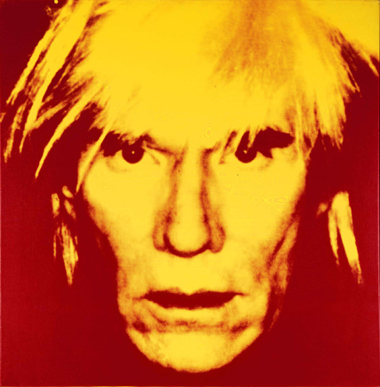
Andy Warhol, Self-Portrait, 1986. Acrylic and silkscreen ink on linen, 40 x 40 in. (101.6 x 101.6 cm). Mugrabi Collection. © 2010 The Andy Warhol Foundation for the Visual Arts, Inc./Artists Rights Society
Fame Queens I Have Known
An archaic term, dating from the '50s or earlier, Fame Queen (linguistically related to other specialty categories like Leather Queen, Dish Queen, Size Queen) was used in gay patois to describe someone inordinately fond of famous people -- who seeks them out and in some sense collects them. Usually, but not always, "a friend of Judy" (i.e., gay), the Fame Queen worshipped at the altar of Garbo, Garland, Liz, and Liza. There were subcategories too, Opera Queens being the most notorious and most annoying, dating back to at least the 18th century.
Compared to Fame Queens, sports fans are wimps. Fame Queens pushed the envelope of irrational adulation. Autographs and "sightings" were only the beginning. The latter sometimes developed into stalking. In the higher echelons, Fame Queens populated their dinner parties and sprinkled their cocktail events with the famous and the infamous: actors, models, politicians, designers, mass murderers and even artists. The auras rubbed off on the host. You could become famous for knowing the famous. All you had to do was get your picture on Page Six a sufficient number of times.
As a Fame Queen himself, Andy knew that everyone wanted to be famous. Fame makes you sexually attractive. So he conferred his legendary 15 minutes of fame upon almost anyone who would apply. Fame rubbed off on you. You could catch it like a tropical disease. Or aura.
Even if you were beautiful -- which Warhol was not -- you had to have a hairdo or a look; you had to make yourself photogenic and instantly recognizable; you had to know how to make an entrance; you had to know how to deliver quotable lines that could turn into headlines. Andy also knew, alas, that fame had no morals. In the Warholian universe, tyrants and creeps were equal to the most liberal of movie stars. He was wrong about most debutants, about all art collectors. He was wrong about industrialists. He was wrong about the Shah of Iran and the Shah's wife.
By studying art fame, Andy learned the ropes. When he wasn't at his table with his protective entourage of Factory Superstars in the backroom of Max's Kansas City or at an opening or at a party, he was on the phone pumping art critics: David Bourdon, Gregory Battcock, even myself, recording every word, wanting to know what everyone was doing and who was where. Gossip was his drug of choice.
The art books began to appear. The museum exhibitions proliferated. And so did all the product lines: prints, then posters, placemats, shopping bags, and souvenirs. By putting the shopping cart before the horse, his premature release of art peripherals made him look like a master before the fact.
Or was he being ironic?
Irony allows you to have everything both ways. You can become famous by making fun of fame. You can laugh all the way to the bank by making fun of art-as-business. Parody can pay.
The horrible joke is that by revealing the business side of art, developed in the U.S. in stealth during the pre-Pop art period, Andy - smart but fey Andy -- made business the norm, thus inspiring some very talented successors, specifically Jeff Koons and Damien Hirst who seem to glory in the tongue-in-cheek transparency of art-as-business. Parody risks becoming paradigm. And art-as-publicity? Salvador Dalí was first. Or perhaps Tristan Tzara.
Andy elected to fess up, to let the cat out of the shopping bag. Fame, even in the art world, could be faked. That was why certain powerful critics hated his guts. And some well-established artists, too. But by admitting the tricks of the trade, he transcended the dark side of art. Worse yet, he blew up the Romantic ideal. The artist is not autonomous. Ideas? Many were suggested, some were selected.
Andy knew all about Dada. His first New York roommate was his Carnegie Tech classmate Philip Pearlstein, who did an early, painterly painting of Superman, later became a respected realist painter of nudes, and who wrote his MFA thesis on Francis Picabia. Andy also knew all about survival.
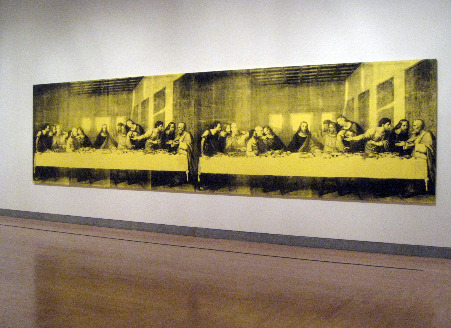
Warhol, Last Supper © 2010 The Andy Warhol Foundation for the Visual Arts, Inc./Artists Rights Society
What Price Fame?
Coming from commercial art -- where he was already an established illustrator -- Andy had no heroics. His playful illustrations bought him his townhouse. He financed the early years of his Pop art career by continuing his commercial art ventures. One form of commercial art supported another kind of commercial art.
In commercial art proper, everyone had a voice in how a layout was finalized, an image locked down, a sales-point sealed. Signatures had no authorial weight. As a fine artist, Warhol became the art director of his very own brand.
Which works are best? The artist is the last to decide. Critical reception? Well, not even that, since the market selects most favorites, by default. And that is not entirely a bad thing: some artist don't have a clue. They are not necessarily the best critics of their own work; distance is not possible. Critics are myopic; so let's leave the final cut to the market.
But when was the last time you read someone attack a ridiculous auction price or a collector's purchase? Private collections, no matter how quixotic, gross or conformist, are always beyond criticism. Collectors buying and selling like blue-chip art dealers, stacking the cards, and inflating prices for gain are left to play their games. No one wants to look a gift horse in the mouth.
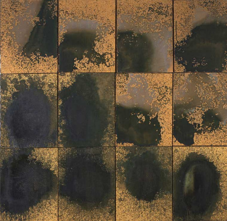
Warhol, Oxidation Painting. . © 2010 The Andy Warhol Foundation for the Visual Arts, Inc./Artists Rights Society
Warhol Tip Sheet
And here at last is what you have been waiting for:
Kinds of paintings represented in the current exhibition, but should have been omitted:
1. Apparently first conceived as Easter presents, the "Egg Paintings" are banal in an uninteresting way. The banal, paradoxically, can be "interesting." A popsicle stick, a tongue from a sneaker, a thermometer in a birdcage, if looked at in the right way, can be metaphysical. But not flat, solid-color egg shapes in random display. They do not even work as decoration.
2. The yarn paintings were commissioned by Filpucci, an Italian yarn company, and it shows. The visual reference to Pollock's drip paintings is not all that clever, is it? And take that away and you have a big yawn -- a yarn yawn -- or possibly a good pattern for wrapping paper. Well, why not? Warhol did produce cow wallpaper. I think there is a marketing potential here. Yarn-painting fabrics would work, too. I'd like a cowboy shirt made of that.
3. The collaborations with Jean-Michel Basquiat are neither Basquiat enough nor Warhol enough to matter. I may be in the minority, but Basquiat's charms (aside from his good looks) have always escaped me. His work may be graffiti-based, but it is also a secondhand look at cubism and Stuart Davis, a look we don't necessarily require.
But here is something to ponder: It is very interesting indeed that Warhol embarked on some collaborations with Basquiat and a few other fashionable artists younger than himself. No doubt this escapade and his desperate need to keep up with shifts in art-world taste influenced him. How do you represent this in an exhibition without also signaling approval? If you label the work as lacking, the loan will most likely be withdrawn or at the very least the source will forever be closed to you. Solution? Picture (if possible) or at least mention the work in the catalog -- where such things really count -- but keep it off the walls.
4. I know the prestigious Dia Art Foundation once offered up an entire show of the Shadow Paintings. One of its biggest mistakes. What is this image a shadow of? Because you cannot tell, the series is just a suite of boring variations, some sprinkled with diamond dust. Yes, I hasten to add, boredom like banality can be very, very interesting. But, alas, not in this case.
5. I am not sure I can be objective about the Camouflage Series, because I myself produced some paintings of camouflage and studied it for awhile, way before Warhol. Archille Arshile Gorky painted real camouflage during World War II, and the name of my first book of poems is -- guess what? -- Camouflage (1965). Even when Warhol applies camouflage to his fright-wig self-portrait, it seems routine.
6. Missing in action, but not at all missed, are the skulls, the crosses, and the hammer-and-sickle paintings. And the portraits of famous Jews (I am not kidding) are nowhere to be seen. Add the de Chiricos, funny now only if you know that Warhol chose images of the late paintings that Giorgio de Chirico himself copied from his now classic "metaphysical" period. No one wanted his pseudo-Renoirs.
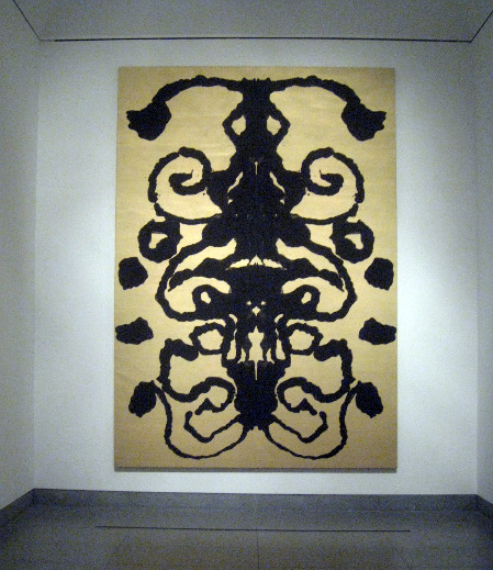
Warhol: Rorschack Painting. © 2010 Andy Warhol Foundation for the Visual Arts, Inc./Artists Rights Society
And the winners are:
1. The Oxidation Paintings are sometimes called (maybe too accurately) the "Piss Paintings." Male and female volunteers urinated on surfaces of copper paint causing landscapes and cloudscapes of oxidation. Shower queens will rejoice and others will be simultaneously attracted and repulsed. What could be better? These are far better as parodies of and statements about Abstract Expressionism than are the dismal Yarn Paintings.
2. The Rorschach Paintings. To make one, pour and fold. Anyone can do it. Sort of. The two Rorschach works here, like the Yarn and Oxidation paintings, refer to AE. These Rorschach splots, inspired by the well-known psychological test, are more gateways to the conceptual than to the subconscious. Perfect gifts for super-wealthy shrinks with big, big lobbies. Or Bellevue Hospital?
3, The Retrospectives. Negative versions of the Warhol classics, only bigger and clearly destined for museums that can handle the scale... and the mournful tonalities. I was surprised. Copies of pictures of copies. Like the fake de Chiricos by de Chirico.
4. The Last Supper Series was commissioned by a commercial art gallery across the street from the site of the actual Leonardo Last Supper. Here too, the biggest are the best. All of them are jokes about art-about-art and art as religion, rather than -- as sentimentalists like to think - indications of Warhol's personal religious convictions. Here, I don't think the commercial commission ruined the results.
Silence Is Golden
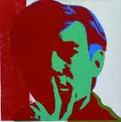
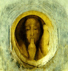
At parties, imitating the master, the Factory entourage mostly sat on the sidelines in silence; thereby, no mistakes could be made. Silence -- whether assumed by Garbo, Susan Sontag or Andy -- always appears sagacious. The things you don't say have more power than what you might blurt out. My favorite Warhol self-portrait image is not the fright-wig silliness, but the finger-to-the-lips image from the '60s, connected in my mind to Redon's Silence.
Well, Andy has now been silenced for years. Silenced for good. But can we see the art divorced from the hijinks, the put-ons, the camp? Better yet, should we? Now the camera can pull back for a greater view than the closeups could ever create, no matter how skillfully edited in a rags-to-riches montage -- ending up in ... Catholicism!
What is the Warhol legacy? Artistic talent can be executive as well as lone-wolf. The artist as CEO of his own atelier is more traditional than the lone-wolf valorized by Romanticism and perpetuated by Modernism. Unless an artist is born rich or marries rich, artists have to be just as practical as everybody else. Starving is not fun. But if the whole enterprise is only about making money, than the purpose of art is defeated. Parody becomes paradigm.
Never Too Late
Monet got better and better. Late Matisse is better than early Matisse. Late de Kooning is great. I find the "clamdiggers" and even his subsequent works, his hand freed up by aging, just fine. Duchamp's "unfinished," posthumous Étant donné is, in its own way, as mysterious as The Bride Stripped Bare by Bachelors, Even.
What can you do when you have achieved something rich and strange? Should you just keep doing the same thing over and over again?
If you are Duchamp you can pretend you have given up art.
If you are as visually loquacious as Picasso, you can (1.) play out all the variations of the discoveries you made as a youngster and/or (2.) climb on every bandwagon and trust that your own personality will prevail.
If you are Salvador Dalí, you can issue watered-down versions of your First Act success.
If you are Jackson Pollock, you can get drunk and drive to your doom.
If you are Andy Warhol, you can die and........be born again.
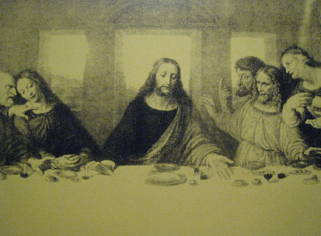
Warhol: Last Supper (detail).
FOR AN AUTOMATIC ARTOPIA ALERT CONTACT: perreault@aol.com
John Perreault is on Facebook.
You can also follow JohnPerreault on Twitter.
