main: November 2008 Archives
YOU'RE CLOSER THAN YOU KNOW.
DO SOMETHING.
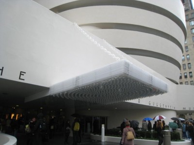
Waiting in Line
Rarely does a museum visitor have to stand in line for longer than it will take to see the exhibition inside. Timed tickets -- as for MoMA's current van Gogh crowd-pleaser -- are a godsend. Plus, speaking for the bottom line, crowds can kill time by dumping money in any convenient gift shop.
In truth, one can breeze right through the Guggenheim's "theanyspacewhatever" show (to Jan. 7). With few exceptions, pauses for thought will not interrupt your descent down the ramps. So it should take a very short line to match actual viewing time. But no such luck.
Certainly I can cut ahead of a line with my press pass, but I think every art critic should experience what it is like these days for a layperson to go to an art museum, when tickets are $18 at the Guggenheim and $20 at MoMA. Nevertheless, museuming is cheaper than going out to a movie, costed out per hour -- if you hang around looking at art for more than three hours. And who can't do that? At the Guggenheim you can watch Fritz Lang's Scarlet Street
or some other once-censored film, and Rirkrit Tiravanija's endless artist interviews. If you want to see the one-hour-and-45-minute Quantum of Solace (the new James Bond movie with the world's worst title) it will cost you $12 bucks to get into the multiplex.
One Tuesday afternoon, I waited in line outside the Guggenheim in the rain, which, on the positive side, gave me a longer, better view of Philippe Parreno's Marquee. I read somewhere that the bank of light bulbs is supposed to blink, but maybe that's only at night or maybe it doesn't work in the rain or maybe there was a short circuit. In any case, it is the essence of marquee: no words, just pure advertisement. It is, however, a kind of false advertising. Although there is at least one Hollywood film always being shown inside -- selected by Douglas Gordon -- "theanyspacewhatever" show is only minimally entertaining. But that's probably true of Quantum of Solace too.
Once inside, I found myself pressed between a soggy German couple ahead of me and a damp Brazilian mother and son behind me. I was the John Perreault filling in a sort of John Perreault sandwich. The snaking line filled the whole ground floor and many people were chatting on their cell-phones: Hey, Mom, I'm inside the Guggenheim and I can't even see the admissions desk.
Why was "theanyspacewhatever" show so popular? I had been looking forward to seeing Gordon's words on the floor: "We are evil." No, we are not evil. We are wet. And I never did get to see them, even from above.
I KNOW THE PLACE FOR YOU.
Too many people! But why? This is the show that everyone loves to hate; every season has one. Its critical reception is worse than the now valorized "Information" show at MoMA in 1970.
Are these crowds here to see Catherine Opie's photographs, which are also on view, but off to the side? Doubt it.
While waiting on line, I photographed Angela Bulloch's rotunda piece called Firmamental Night Sky that masks the skylight with twinkling stars.
And then, over the heads of the waiting customers, I photographed the words and sentences on the walls here and there, contributed by both Douglas Gordon and Liam Gillick. Gordon's are plain. Some samples quoted in all capital letters are interspersed with this essay.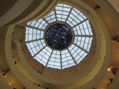
Gillick's words are fancy and, when they are not one-line poems, seem to mean to be confused with practical signs. Some do both. His cut-out, black-aluminum sign over the Members Desk reads: "a piano and black snow."
I still haven't decided if these neo-wordworks are supposed to be satires or appropriations of Jenny Holzer's projected words on display every Friday evening on the Guggenheim façade (to Dec. 31), which is not part of "theanyspacewhatever." Or a goof on her entire project? Gordon's phrases -- under the title Pretty much every word written, spoken, heard, overheard from 1989... are more poetic than Holzer's "truisms" and more original,
IT'S BETTER NOT TO KNOW.
but therefore paradoxically less original as art, although I like them anyway.
But while waiting in line reading any words you can, you may wonder if Holzer has proprietary rights to words as art or if she has inadvertently created a genre, free for the pickings.
I remembered that as part of Prospect I in New Orleans, Berlin artist Monica Bonvicini contributed the word DESIRE in big, cut-out letters resting on the roof of the New Orleans Museum of Art. Get it? Streetcar Named DESIRE; art is a form of DESIRE; the museum is showing "Objects of Desire," a show of Faberge jewelry; every artist has one DESIRE: to get into an art museum, etc.
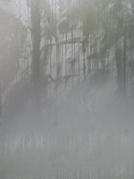
While waiting, I also photographed the condensation on one of the Guggenheim ground-floor windows. Why is there moisture on a museum window? Although it creates a misty Abstract Expressionist "painting" combining Edwin Dickenson and Franz Kline, it doesn't bode well for climate control, does it?
A half hour later, when I finally made it to the admissions counter, I asked the pleasant youngster in attendance if the museum was always this crowded.
"Is it because MoMA is closed on Tuedays?"
"Well, yes, I suppose so," she offered, "but particularly when it's raining."
When I worked at the American Craft Museum, in its condo across from MoMA, Tuedays were always our biggest gate, which is why I think the move to Columbus Circle is a mistake; almost as big a mistake as the name change to the Museum of the Arts and Design, whatever that is supposed to mean.
I Am a Camera
Finally on my way to the elevator -- yes, I always start at the top and work my way down, even for shows that are chronologically arranged from the bottom up, which "theanyspace" is not.
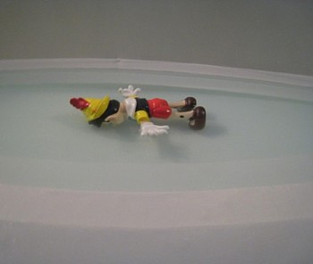 I managed to snap a picture of Maurizio Cattelan's hilarious Daddy Daddy, which is Disney's Pinocchio floating face down in Frank Lloyd Wright's little decorative pool. I was afraid I was going to be arrested, but the guard did not blink an eye. Later, when I attempted to photograph Carsten Holler's Revolving Hotel Room on the top ramp, I was definitely stopped in my tracks. Apparently you are allowed to take pictures on the ground floor but nowhere else, as if anyone would make money off of photographs of mostly empty bays, or a projection of a Fritz Lang movie (Gordon), or the free coffee bar next bay over (Tiravanija).
FROM THE MOMENT YOU READ THIS, UNTIL YOU MEET
SOMEONE WITH BLUE EYES.
Or, on next ramp down, Jorge Pardo's snaking system of pierced cardboard partitions that is so irritating you want to sneak right under them to cut short your ordeal. I love the '50s as a design period, but I have no liking for '50s redux. Of course, showing "design" as art (which is what Pardo has been doing for quite a while now, rather mysteriously) is what makes it seem like it's interesting, until you think about it the next day. I suppose he is really doing a latter-day P & D (Patterning and Decoration) turn and nothing more conceptual than that, which means nothing really conceptual at all.

Baywatch
I counted seven empty bays on the spiral, unless you want to add the empty bays in Dominique Gonzalez-Foerster's Promenade, a sound piece of a rainstorm sealed off visually from the Guggenheim's plunge by a scrim. If you count these, then there are a total of 15. I assume this is to further reveal the curved walls of Mr. Wright's monument, now restored.
Or is this an homage to Yves Klein -- patron saint of Artopia -- who once exhibited an empty art gallery? Or perhaps it is meant as a backhanded compliment to Artopia, which in a previous incarnation 10 years ago proposed the Museum of Itself (M.O.l.) -- a museum that would exhibit and preserve only documents related to itself: internal memos, mail, board minutes, signage, cancelled admission tickets, utility bills. How's that for institutional critique? Artopia is always a decade ahead of the curve.
I NEVER KNEW.
The title of the Guggenheim show apparently comes from Gilles Deleuze and is significant only because it is appropriated from this most highly regarded and impenetrable of French theoreticians. It refers to the meaningless footage sometimes inserted between sequences in a movie, thus apparently referring to spaces overlooked in ordinary life. Or does it inadvertently spill the beans? Any space whatever! In other words, all of these works could be launched anywhere and are not really site-specific.
Not quite true.
The Pinocchio doll might work face down in one of the pools at Rockefeller Center, but it wouldn't work in the swimming pool of a YMCA. There needs to be a height above to create the illusion of a great fall or jump.
The Parreno Marquee would not work as well in front of the New York Public Library; it needs placement on a museum in order to crackle with the entertainment value that it's calling attention to: the entertainment value of art, whether negative or positive. Holler's hotel room would work in any art space, although the rotation aspect seems to suit the shape of this particular museum. Would it work in a church or a bank?
IT DOESN'T MATTER
WHO I AM. I WANT TO TALK WITH YOU.
Yes, but it would be a slightly different artwork, wouldn't it? For a fee of $259 to $799 you can sleep in Holler's art, but it was booked up by the time I heard about it. Would art critic Jerry Saltz still want to sleep with his art critic wife Roberta Smith in the Holler construction if it were placed in the Museum of Natural History, which for quite awhile has hosted sleep-ins for kiddies @$129 per kid? Or in the Wall Street Stock Exchange? As it turns out, Saltz fell asleep in the Guggenheim alone. He slept in the Holler, but still gave the show a nasty review.
The other problem with the show is that we are led to believe that the artists were handed the curatorial reigns and somehow were to work collaboratively. Even Spector, the curator of record whose idea this was, now admits it was a group that was not really a group. And evidence of collaboration is slim indeed. The artists are not even united by a neo-conceptual turn to audience/artist interaction. "Relational Aesthetics" is hardly an art movement and certainly not a style. And the much repeated "institutional critique"? Give me a break. Would a real critique be so mild-mannered and polite?
Some of the artists have worked with others, some not. A with B, B with C but not with G. What we need is not an explanatory text, but a sociogram.
I lost interest in Holler's revolving bedroom -- which is, after all, kind of Oldenburgian -- when I found out later that the idea of letting people sleep in it overnight was Spector's, not the artist's.
Note: I am corrected by Lauren Van Natten, Senior Publicist of the Guggenheim: "It was not upon Nancy Spector's insistence that the Museum offered for guests to stay in the hotel room, rather, it is part of the artwork as per the artist's intention. When the piece was exhibited previously at Kunshalle Bregenz during Holler's solo exhibition there, the hotel room was also booked for guests."
Cattelan, Gordon, and Tiravanija are outstanding artists. Wouldn't it have been a better idea to mount solo exhibitions of each rather than the hodgepodge now offered? Or would that have been too decisive, too controversial?
Spector says the artists in her show acted as collaborators, an advisory board, and as co-curators over the course of four years. Four years! I am all for letting the lunatics run the asylum, but perhaps Spector needed a faster, brighter, higher class of lunatics.
Keeping in Touch
What image sticks in my mind? I have already mentioned that the Passage ramp is sealed off by a scrim. When you look across the Guggenheim vortex, all you see at first is the white cloth, but then you see fingers and hands running along, pushing out the cloth from the inside, like the fingers and hands of ghosts in a budget horror-flick. It is impossible for people to keep themselves from running their fingers and hands along the cloth barrier. Why is this? Is it because there is not much to see, and therefore the sense of touch must be expressed?
Note: Gordon's 24 Hour Psycho Back and Forth, a double projection of Hitchcock's Psycho -- one screen playing the movie forward, the other screen backward -- will be shown again on Jan. 6, beginning at 10 a.m. and continuing, of course, through Jan. 7, 10 a.m. This is a variation of his signature 24 Hour Psycho.
I BELIEVE IN MIRACLES.
Also: I did not see Pierre Huyghe's lights-out museum event, in which visitors wearing miner's caps toured "theanyspacewhatever." You can see glimpses of it throughout the "overview" video on the Guggenheim's website.
NEW! ARTOPIA VIDEOS! TALKING, CRAWLING, WALKING!
Three Artopian documents are now available for viewing on The Laboratory of Art and Ideas website:
*John Perreault gives a gallery talk on "In Plain Sight: Streetworks and Performances 1968-1971", an exhibition curated by John Perreault and Judy Collischan, at The Lab, featuring works by Vito Acconci, Scott Burton, Eduardo Costa, Bernadette Mayer, Marjorie Strider, Hannah Weiner and John Perreault, a cadre of activist who were contesting object art.
*Perreault's re-creation of his 1971 Whitney Museum performance called Critical Mass in which he ties himself to 26 objects -- one for each letter of the alphabet -- and crawls off the performance site, dragging them behind.
*At the opening night of "In Plain Sight" Perreault also performed a circumambulation around a black marble sphere positioned in the middle of a plaza in the Belmar, Colorado, shopping center.
The Black Sphere Circumambulation was the third in his ongoing series of circumambulations. The first was the P.S.1 Circumambulation in March of 2008, followed by the Dead Maple Circumambulation on Long Island, and the M.A.D. (Museum of Arts and Design) Circumambulation at Columbus Circle, N.Y.C. The Black Sphere Circumambulation was been followed by The K.K. Projects Block- Long Dinner Party Circumambulation (New Orleans) and The Eastern State Penitentiary Circumambulation (Philadelphia).
f
AJ Ads
AJ Blogs
AJBlogCentral | rssculture
Terry Teachout on the arts in New York City
Andrew Taylor on the business of arts & culture
rock culture approximately
Laura Collins-Hughes on arts, culture and coverage
Richard Kessler on arts education
Douglas McLennan's blog
Dalouge Smith advocates for the Arts
Art from the American Outback
For immediate release: the arts are marketable
No genre is the new genre
David Jays on theatre and dance
Paul Levy measures the Angles
Judith H. Dobrzynski on Culture
John Rockwell on the arts
Jan Herman - arts, media & culture with 'tude
dance
Apollinaire Scherr talks about dance
Tobi Tobias on dance et al...
jazz
Howard Mandel's freelance Urban Improvisation
Focus on New Orleans. Jazz and Other Sounds
Doug Ramsey on Jazz and other matters...
media
Jeff Weinstein's Cultural Mixology
Martha Bayles on Film...
classical music
Fresh ideas on building arts communities
Greg Sandow performs a book-in-progress
Exploring Orchestras w/ Henry Fogel
Harvey Sachs on music, and various digressions
Bruce Brubaker on all things Piano
Kyle Gann on music after the fact
Greg Sandow on the future of Classical Music
Norman Lebrecht on Shifting Sound Worlds
publishing
Jerome Weeks on Books
Scott McLemee on books, ideas & trash-culture ephemera
theatre
Wendy Rosenfield: covering drama, onstage and off
Chloe Veltman on how culture will save the world
visual
Public Art, Public Space
Regina Hackett takes her Art To Go
John Perreault's art diary
Lee Rosenbaum's Cultural Commentary
Tyler Green's modern & contemporary art blog
