main: October 2008 Archives
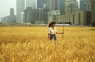
Agnes Denes: Photograph of Wheatfield -- A Confrontation
What Do Women Want?
In Artopia, art is gender-neutral. This does not mean we deny that women, for one reason or another, cannot offer art that deals with what are sometimes called "women's issues." And men can deal with "women's issues" too, or for that matter, topics deemed male or manly by our weird little culture: sports, war, guns and cars (as if women were immune to these). Nor do we need to ban particularly womanly subjects such as birth or menopause. In fact, participant perspectives are always worth having, as I think Judy Chicago proved ages ago, with both her Dinner Party and The Birth Project.
The point is that unless you are ridiculous enough to hold to the old-fashioned notion that art itself is gender-specific (i.e., specific to males), it behooves us to look at the art itself. Some men have mothers, wives, daughters and want to know what goes on inside of their heads. If we need art at all -- and we do, now more than ever -- we cannot afford to avoid more than half of the art produced, simply because men have not produced it.
Statistically, more male than female artists are famous, but this is merely documentation of oppression, or at best the sociological facts. In our culture, little girls are expected to be "artistic." In spite of this, some of them go on to art school and actually develop the notion they can be full-fledged culturistadors, on a par with Michelangelo and van Gogh.
So the short answer to my question is that women artists want to be treated fairly as artists. Women want success.
Let us leave aside for the moment the definition of success that equates it with commerce. Even what we might call spiritual success in art is dependent upon support systems and supportive persons, but at this late date, when feminism is thought to have won out, there are few fully developed support systems and support persons for women artists, even among women. Show me the art dealer who represents more than one or two women artists; show me the art critic, male or female, who writes about more than one or two female art stars; show me the collector who puts her money where her gender is.
So...
This fall I have been reluctant to venture into Chelsea, which seems more and more the art world's red-light district. Is it because I am afraid I will be knocked down by bodies falling out of penthouses? Oh, I'm sorry that was last week, when the stock market was still bottoming out and real estate and art sales were being left in the lurch. The reason I have been avoiding Chelsea is certainly not because I think auction houses are more important -- which is the insouciant thing to say. Nor is it because I spend all my time hanging out in museums, which as everyone knows, here and abroad are the handmaidens of the blue-chip galleries. This is not new; it is simply more transparent.
Instead, I am drawn to the unexpected.
Women in the Driver's Seat
For instance, who would have thought - way back when - that an all-woman co-op gallery would outlast most commercial gallery startups. A.I.R. is celebrating its 36th year, with the three-part "A.I.R. Gallery: The History Show." A.I.R. documents, now in the NYU library archive (70 Washington Square South, through December 12) are neatly on display on the third floor of Philip Johnson's oppressive Bobst Library through December 12.
Be forewarned, you must request a temporary pass, but that's easy enough. On your way to Special Collections, the exhibition starts as a long hallway, but, fear not, a turn at the end opens up into a real room with cases of A.I.R. documents. Every announcement ever mailed. Photos, programs.
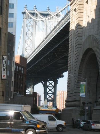
A two-part exhibition of actual artworks is also on view in DUMBO, where A.I.R. is now ensconced (111 Front Street, Brooklyn; Part One to November 1, Part Two Nov. 6-29). It is in one of those big old warehouse buildings, the third floor of which is dedicated to modest but chic gallery spaces. The galleries are there to provide high-end real estate identity and customers for the double-latte outlets on the strip below. No, I'm only joking. Chelsea is too expensive. And you don't even have to say DUMBO is Brooklyn. You know you are in Brooklyn because you can glimpse Manhattan, if you peer down one of the narrow streets. It is not that far away. Up and down the street I see nannies pushing expensive baby carriages. When I look up, I see penthouses. And I suppose even here the bodies will be falling to the pavement unless we stop all of these automatic stock transactions, little-boy panics and out-of-control deals that even the dealers don't quite understand. What exactly are "credit default swaps" and "collateralized high-rated or BBB tranches"? And you used to think Dada was hard to define.
Just in case you wanted to know, DUMBO was not named after the Disney elephant.
Does anyone remember that SoHo means "south of Houston" or that TriBeCa means "triangle below Canal"? It used to be that if you could coin an acronym for any old neighbor and move the real estate.
To invent a new parlor game, DUMBO does not mean:
DANGEROUS U-TURNS MAKE BROOKLYN ODD,
DEAD UNCLES MEET BROKEN OPALS,
or DUST UPON MY BEAUTIFUL OPPORTUNITIES.
Anymore than TriBeCa means TRIUMPHANT BECKONING OF CARAVANS.
Because of the Manhattan Bridge Overpass and the Manhattan Bridge itself --glimpsed between film noir buildings on film noir streets -- DUMBO (Down Under Manhattan Bridge Overpass) looks like a movie set, even on a sweaty October afternoon. The wheels-on-metal traffic overhead adds punch to the Manhattan Bridge harp.
Here's some history: The A.I.R. all-woman gallery was founded by Barbara Zucker and Susan Williams, later joined by a host of others, and opened its doors in what was once called the Cast Iron District in 1972, before SoHo became the going term. "A.I.R." stands for the A.I.R. (Artist in Residence) sign that used to warn firefighters that artists were encamped in an otherwise industrial building -- and/or was meant to honor Jane Eyre. The all-woman co-op SoHo-20, it should be noted, was founded the following year, which leads me to suspect that by 1973 SoHo as a term had caught on.
Ghosts of the legendary East 10th Street co-ops, such as the Area, Brata, Camino, Hansa, James, March, Phoenix, and Tanager galleries, were still about. These artist-run venues had seeded the Abstract Expressionist aftermath and, it could be argued, the art world as we know it. Here are some artists that were co-op members or invited guests, many showing for the first time:
Brata Gallery (1957 - mid-'60s): Ronald Bladen, Al Held, Nicholas Krushenick, Kusama, George Sugarman.
Camino Gallery (1956 - 1963): Elaine de Kooning, Alice Neel.
Hansa Gallery (1952 -1959): Allan Kaprow, George Segal, Robert Whitman.
Tanager Gallery (1952 - 1962): Alex Katz, Alfred Jensen, Philip Pearlstein, Myron Stout, Tom Wesselmann.
[Source: "Tenth Street Days; The Co-ops of the '50s," 1977, curated by Dore Ashton and Joellen Bard. Catalog essays by Ashton and Lawrence Alloway.]
In the '50s, the East Village was just the Lower East Side, which included everything east of Broadway. That was before some bright person in a real estate office coined the new name to make some really tawdry brick apartment buildings on Second Avenue sound classy. It was hoped the area would be perceived as just the Eastern sector of The Village, famous far and wide as the capital of Bohemia, at least in the Big Apple, a.k.a. New York City or New Amsterdam.
Nevertheless, by 1972 co-op galleries, sometimes confused with vanity galleries, had a bad name -- as if artists-run art stores could be any worse than strictly commercial venues. In vanity galleries, you pays your money and you gets your show, no sweeping the floor required. If the truth be known, many less-than-blue-chip galleries expect artists to pay for announcements, receptions, framing shipping and various other extras.
Vis a vis, co-ops where artists call all the shots, some artists actually have better taste than art dealers. However, unless sufficiently motivated by poverty, anger, some ideal or pet peeve, artists find gallery-sitting, collector-courting and critic-chasing boring. They would rather be home painting, or whatever. Chefs do not make good waiters.
A.I.R. had a mission: to expose women artists, whom everyone knew even then are not well-represented by commercial venues. This was true in 1972 and, although things have improved a smidgeon, it is pretty much the case today.
If you go, do not expect a Chelsea megaspace. That this anniversary sampling has to take place in two parts should give you a clue that you are stepping into the past. Or stepping into the future? This may be the size of galleries to come.
And as disillusionment with the commercial art world spreads, as profits sink and inflated reputations tank, artists - male and female -- will once again create their own opportunities.
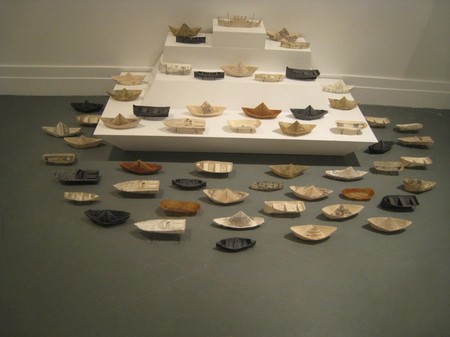
For me there is a certain déjà vu. I wrote about many of these artists years ago. So last week I revisited a larger-than-life hairy youth painted by Sylvia Sleigh (Annunciation, 1975); Patsy Norvell's Glass Garden (1979-1980), a tool shed-size greenhouse with engraved glass panes; Judith Bernstein's drawing of a gigantic screw (Bill Copley's Bedroom, 1977) which looks like a giant penis; a decorated "cake" by Pat Lasch; and, of course, Agnes Denes' classic Wheatfield, A Confrontation (1982), represented by a photo of the two-acre wheat field she planted in the landfill near the World Trade Center. But there are many artworks I haven't seen before. New to me, for instance, was Barbara Siegel's Sea Queen (2003), a beguiling and oddly moving fleet of paper boats. Still to come: Ana Mendieta and many others.
Barbara Siegel, Sea Queen, 2003
* * *
It's Only Words
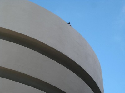
John Perreault, Worker Putting Finishing Touches on Guggenheim Facade, 2008
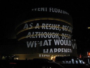
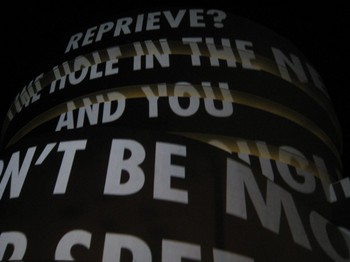
Jenny Holzer is at it again. To celebrate the restoration of the Guggenheim façade, she is projecting gigantic rolling texts on that very surface every Friday evening through Dec. 31. That curvaceous monument still evokes some pre-World War II fairground or a sound-stage building in Things to Come -- so futuristic it is charming.
Holzer's dusk-to-11 p.m. projections are futuristic too as they scroll, in all caps, up the pregnant belly of Wright's masterpiece. They never come to rest and, depending where you stand, are distorted and sometimes partially concealed by the building-bulge. This adds a perhaps unintended mystery to the meaning of the texts, necessarily unattributed given the on-street, after-dark circumstances. One of my snapshots captures this meaningless string of words:
WITHIN AN INCH, A HAIRSBREATH FROM AN UNFORTNATE COINCIDENCE
Or how about this text:
I have a new insight into Holzer's logomania. Slogans, aphorisms and other texts are not so much about whatever meanings one can derive, but about the act of selection and the acts of presentation. Do not confuse her "signs" with concrete poetry, or with the words and word fragments in Cubist paintings or those of Stuart Davis or even Robert Indiana.
More ambiguous, although completely legible on the Guggenheim website, is:
MORE PEOPLE AND NEW OFFENSES HAVE SPRUNG UP BESIDE THE OLD ONES - REAL, MAKE-BELIEVE, SHORT-LIVED...
Here's the credits:
For the Guggenheim, 2008. Light projection. Guggenheim Museum, New York. Text (pictured): "Tortures," from View with a Grain of Sand by Wisława Szymborska, translated by Stanisław Barańczak and Clare Cavanagh. © 1993 by Wisława Szymborska. English translation copyright © 1995 by Harcourt, Inc. Used/reprinted with permission of the author. © 2008 Jenny Holzer, member Artists Rights Society (ARS), NY. Photo: Kristopher McKay
I guess somebody doesn't want to be sued.
Although she has appropriated more words than any other conceptualist, Holzer is an abstractionist. The texts are often obtuse (or painfully banal). Someday I may get around to comparing her use of language to Lawrence Weiner's or, further back, to the single-word poems of the young Aram Saroyan. You can see one of Holzer's most effective "Truism" pieces, styled for the internet, here.
* * *
Hoofs Prints in the Dust
Can an artist be too original, too ambitious? Gillian Jagger, in my book, is truly an original, one of the most original artists I have ever come across. Her work is bigger than life in its homage to both beasts and geology, and her use of space. The problem is that she is difficult to classify: critics, curators and collectors want examples of categories, not precedent-breaking, back-breaking, space-claiming, raw sculptures.
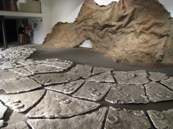
Jagger makes casts of what appear to be heavily trafficked pastures, the mud around wilderness watering holes and the unsung trails of migrating herds. And these great chunks of plaster and latex are deployed within specific exhibition sites to exploit the drama and the grandeur of her themes.
You think at first you are looking at the crackled bed of a dried up lake or a marble quarry gone berserk, but then you see the hoof prints, at least in the present work, now at the Violet Ray Gallery, 727 Washington St. (at Bank) in Greenwich Village, to October 30. Many years ago, when visiting Africa, Jagger witnessed thundering herds in the wild. The image and the awe stuck with her, finally finding expression in these new works, under the title "In Between."
When Jagger uses plaster, you don't think of George Segal, you think of Nature. When she installs her gigantic flat (!) sculptures - whether as floor pieces, wall pieces, or something in between - she takes your breath away. Now, retired from teaching, she glories in her maturity. She is neither a Minimalist, anti-form artist, or Earth Artist. She is sui generis.
FOR AN AUTOMATIC ARTOPIA ALERT WHEN EACH NEW ESSAY IS POSTED SEND YOUR E-MAIL ADDRESS TO : perreault@aol.com
PAST POSTINGS CAN BE READ BY CLICKING ON "ARCHIVE."
THEN CLICK ON DATE OR SCROLL DOWN FOR
HEADLINES AND SUBJECTS.
John Perreault: Critical Mass Redux (1971-2008)
How History Is Rewritten
Yours truly has finally managed to get a few things off his chest. Or, more correctly, off his back. As keeper of the Street Works and Performance flame, I have carted around a burden these many years since the late '60s, waiting for someone, anyone, to delve into these phenomena.
Belmar? Lakewood? These names are not strange to me: I spent an important part of my childhood in the New Jersey seaside resort town of Belmar. Inland, the mostly Jewish resort of Lakewood was a car ride away, where in all seasons one could see wizened old women with and without their mates, sunning and airing themselves on porches in the pine-scented air.
This Belmar and this Lakewood are very different. At an altitude of 5,000 feet, there is not a beach or a pine tree in sight. Where am I? Somewhere flat. Flying into Denver is like preparing to land on a big quilt. The squares are fields, some swiped with enormous circles created by the wands of irrigation's one-armed clocks; here and there, tractor-generated pillars of dust move slowly, slowly. And then you see the startling, stark-white "tents" of Curt Fentress' 1995 Denver International Airport, meant to rhyme with the distant Rockies, but imparting the odd feeling that you are about to touch down somewhere in the Arabian peninsula. Perhaps Dubai?
Curt Fentress: Denver Airport Terminal, 1995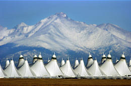
Later, Belmar itself turns out to be a nascent but flattened La Jolla, minus the beach. Or is everything around us one big beach?
Just as imagined, my 242 photocopies are stapled to the pristine walls of the Lab as part of an exhibition called "In Plain Sight: Street Works and Performances 1968-1971." They document now-ancient yet still relevant artworks initiated by an exceedingly and self-consciously avant-garde cadre consisting of Vito Acconci, Scott Burton (1939-1989), Eduardo Costa, Bernadette Mayer, Marjorie Strider, Hannah Weiner (1928-1997) and yours truly.
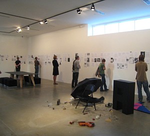
In Plain Sight (installation view)
We, the instigators/producers of Street Works and early Performances, were writers of one sort or another who suddenly proclaimed ourselves artists through our daring deeds, propaganda, and organizational skills. (The exception was Strider, who had already been inducted as an artist into the annals of Pop.)
Acconci, Mayer, Weiner, and I were already published poets. Acconci and Mayer edited the mimeographed magazine 0-9, now a treasury of poetry's next step after the New York School. The New York School of poetry (John Ashbery, Kenneth Koch, Frank O'Hara) were named after the New York School of art (Pollock, de Kooning) because of social, professional, and aesthetic correspondences.
Burton was a would-be playwright. Costa had studied with fabulist Jorge Luis Borges and was one of the authors of the Happening That Never Happened hoaxwork (in Buenos Aires). One of Costa's "Fashion Fictions" had even made the cover of Italian Vogue. Acconci, Burton, and I were also art critics.
"In Plain Sight" is in plain sight until Jan. 4, 2009. Art historian Judy Collischan and I are the curators.
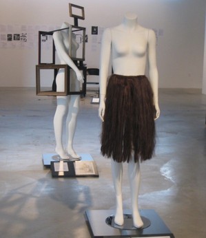
Along with the photocopies of leaflets, flyers, press releases and press coverage (a small part provided by myself in the Village Voice, where I was the art critic at the time and such tactics were not forbidden) there are a number of choice souvenirs. Viewers are exposed to Strider's Frame Dress from the Fashion Show Poetry Event of 1968 held at the Center for Inter-American Relations in N.Y.C.; it was modeled by the naked dancer/choreographer Deborah Hay. Also on view is one unit of my Hair Piece, here displayed as a kind of apron to shield the privates of a female dummy, whereas in real life (i.e., the Fashion Show), the two-unit sculpture was a veil, skirt, arm- and leg-cuffs modeled by poet Anne Waldman.
And then there's Costa's gold ear-piece shown in a glamour photo by Richard Avedon and, from Street Works IV (sponsored by the Architectural League of New York in 1969), a "replica" of Weiner's Weiner's Wieners, which was a rented hot-dog stand that offered free hot dogs at the curb in front of the League's headquarters. At the Lab, the stand-in for the original stand is displayed inside the second-floor gallery space and, at the opening, offered free dogs too.
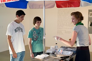
Hannah Weiner: Weiner's Wieners
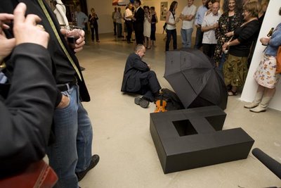
Pictures of Acconci biting himself are up on the wall. And among the other mementos of our vital art movement, there's a large black letter A and 25 other objects, one for each of the remaining letters of the alphabet, all tied to a folding chair by black twine. This represents a performance I did at the Whitney Museum in 1971 called Critical Mass.
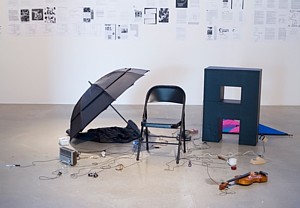
John Perreault: Critical Mass (props)
For the opening of "In Plain Sight," I once again tied the 26 things to myself and crawled out of the gallery space, but this time my hair was short and I wore a Brooks Brothers suit and a tie. Also, to celebrate the opening reception, I circumambulated a 10-ton, black-marble sphere imported from Russia that was sited behind the Lab in a little plaza, thus balancing the old with the new. Although the symbolism escapes me, when it is covered with and floating on a thin skin of flowing water, the sphere can be rotated with the touch of one finger.
John Perreault: Black Sphere Circumambulation, 2008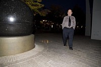
Back inside, through examining the ephemera displayed, the patient viewer will discern that there were over 200 hundred artists, poets and critics involved in the various Street Works. Now being celebrated at long last, the seven-person cadre itself also produced and starred in over 20 performance evenings within a short period, in venues as various as the Wadsworth Atheneum in Hartford, Conn. (the debut site of Virgil Thompson's Four Saints in Three Acts), Hunter College, the Whitney and the 14th Street YMHA.
Marjorie Strider: Frame Dress; Perreault: Hair Apron, Fashion Show Poetry Event, 1968.
The first Street Work was initiated by Hannah Weiner in 1968; at that time she was a successful designer of women's underwear. The event occurred outside her loft on West 26th Street. She hired two off-duty but fully uniformed Coast Guards to signal each other from one end of the block to the other, using regulation flags and flag codes. Wearing a gas mask, this writer wheeled his bicycle slowly down the street.
Above the clean-cut Coast Guard guys madly waving -- and above an assembly of 50 or so invitees -- poet and Paris Review editor Michael Benedikt projected a pornographic movie onto Weiner's loft window.
This led to bigger Street Work jamborees, as mysterious as they were ephemeral, but aimed more at the general public than an exclusively art-world audience. The first of these was on the Ides of March, 1968. At a time before cell phones, I made calls from one phone booth to another in a proscribed midtown area, hanging up before anyone could answer. Acconci walked back and forth in front of St. Patrick's Cathedral. During another Street Works installment, Burton cruised the street in full drag and was not recognized by any of us. Costa claimed to have replaced missing street signs. Strider placed picture frames here and there. Critic Lucy Lippard drew chalk circles around each poet she came across. Avant-garde critic, artist and elder Lil Picard (who, like dance critic Edwin Denby, had survived the Weimar Republic) handed out art-world junk mail she had received the week before.
I have dedicated my "In Plain Sight" catalog essay to Picard and Denby. The catalog, in the spirit of Street Works, is a three-ring binder containing photocopies of all the photocopies stapled to the walls and slated for disposal.
I should note that Street Works were originally a response in part to Earth Works, which some of us considered elitist. It would take and still does take a considerable amount of cash to visit Robert Smithson's Spiral Jetty. Smithson was a friend and verbal sparring partner, so I couldn't help answering his own sarcasm with some of my own. I certainly didn't have the money to visit Utah.
It was also a time of social upheaval. The Vietnam war was not exactly popular. Assassinations seemed to be the order of the day: JFK in '63, Robert Kennedy and Martin Luther King, Jr., in '68. In 1969, the Stonewall riots upset quite a few people, and in 1970 the Kent State massacre earned big headlines. Civil-rights sit-downs and peace marches proliferated.
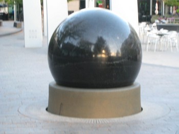 Black marble sphere, Belmar, Colorado
Inequality, visible as always, now seemed intolerable. Artists too protested against perceived ill-treatment at MoMA during the notorious Machine Art show. There was an art moratorium. Even art critics were in revolt, and I found myself elected president of the American Section of the International Association of Art Critics, a group that had become moribund under critic Rosalind Krauss.
The Absurdity of It All
Street Works attempted to make the cityscape visible again, with the added virtue of shaking up rigid career hierarchies and in so doing challenging institutional passivity and conservatism. Moving indoors, Performances were neo-Happenings constructed on a more conceptual basis. Both Street Works and Performances were firmly grounded in Futurism, Dada, Happenings and Fluxus -- with a dose of Situationism for good measure. Poets were, of course, well-read. And we knew about art.
As a viewer of as well as participant in Street Works, I can testify that once one was keyed up to search for artworks within a certain number of city blocks within a certain time, everything was vivified; everything was sculpture. Is the mother holding the hand of her child a dancer dancing? Are the scraps of paper in the gutter Schwitters-like collage? Is that billboard real or only an artwork? Is the panhandler who approaches you an artist? Are the products in the shop window sculptures-for-a-day? Why is that telephone in the booth ringing and ringing?
But other lessons can be learned.
At a time when commerce rules the arts, we need to be reminded that one can make art without a MFA and with little or no cash-outlay -- hors de commerce, as it were. One creates one's own venue; the arts do not have to be controlled by money interests. In Artopia, the definition of an artist is not an art-school graduate who makes his (yes, still usually his) living by selling art products. An artist is someone who makes us see.
Visual artists should look at poets. Was William Carlos Williams (Robert Smithson's baby doctor!) any less of a poet because he made his living by practicing medicine? Or T. S. Eliot less a poet because he was a banker? Was Hart Crane less a poet because he once worked in a bookstore? Am I any less an artist because I am a poet who has made his living as an art critic? Are there not clerical and factory-worker artists? Was Marcel Duchamp less an artist because he was in some ways Brancusi's New York art dealer?
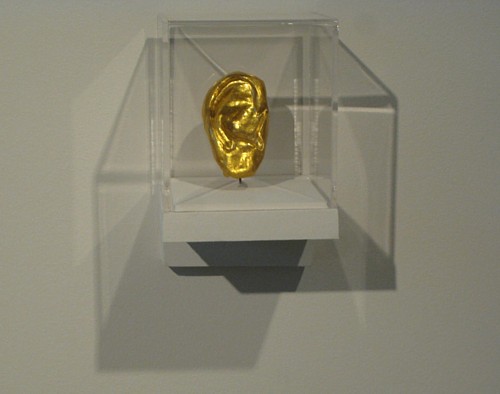
Eduardo Costa: Ear (Fashion Fiction), 1968
The Crawl
Vito Acconci became the leading proponent of Body Art and now focuses on architectural projects. Bernadette Mayer became the director of the St. Mark's Poetry Project, Eduardo Costa eventually made sculptures out of solid paint. The late Hannah Weiner began to see words on people's foreheads and became a highly regarded avant-garde poet. The late Scott Burton evolved into an artist of note, specializing in furniture as sculpture. Along with writing poetry and fiction (Hotel Death, 1998), making toothpaste paintings, mending stones and working as an critic, curator and arts administrator, John Perreault just kept on being John Perreault. He kept on traveling.
Artopia on the Road
Daniel Libeskind: Denver Art Museum, 2006 Travel is a great way to unravel. 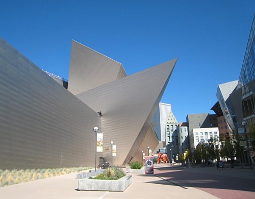
When in Denver, you can't miss Daniel Libeskind's Denver Art Museum (2006). It nearly blots out the once controversial museum building next door by Gio Ponti (1971) and, fortunately, the Michael Graves library. Libeskind's escapade is like his Jewish Museum in Berlin: all acute angles and lethal-looking triangles. I like the DAM -- at least the outside, because it screams "this is the place!" It doesn't look like a Greek temple or a bank or a fort (which Ponti's building does). If it is not a Greek temple or bank or fort, it must be ... an art museum.
The problem with the DAM is inside. How do you show paintings on walls that tilt? You have to build false walls and add all sorts of props and shims. My idea for an exhibition is to show a year's worth of shims in situ without the art they held up. Or better yet, mount the shims on normal walls and then affix blank canvases to reveal the angles and tilts they would have had to battle. Note too that whereas the angles and cul de sacs (symbolic!) inside of the Berlin museum are photogenic, it is the outside of the DAM that most pleases the camera.
Like his Jewish Museum, Libeskind's DAM building would be a great work of architecture if empty. Or could it be that we just have to get used to it? I remember the scandal of Frank Lloyd Wright's Guggenheim, now finally restored to its pale-beige glory. At first many opined that it looked like a gigantic washing machine, and even I thought that having to stick paintings onto dowels to compensate for the curved walls in each bay was a bit much.
How swiftly we have rewritten architecture. Michael Graves rapidly replaced Robert Venturi, and now neither seems to have much influence. Buildings as icons are the rage. All that matters is how they look. They can be impractical and loony, but as long as they are photogenic they will carry the day. At least for a while.
Hanging From the Cosmic Ceiling
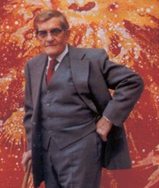
Vance Kirkland: Explosions on a Sun 70 Billion Light Years from Earth, 1979 So Adam Lerner, the energetic director of the Lab -- the DAM was in some way the Lab's launching pad -- said there's one more place I have to see: the Kirkland Museum of Fine and Decorative Arts, named after painter and educator Vance Kirkland (1904-81), whose studio it had been. 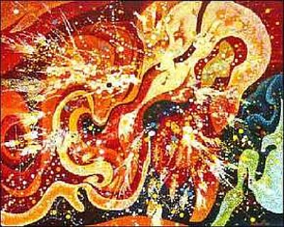
This charming museum is dedicated to its former owner's paintings. But that's not all. Seeded by Kirkland's collecting mania, the cottage-like museum also houses a huge collection of American "decorative art" (here meaning design objects), most of it from the '50s: by Russel Wright, Eva Zeisel, the Eameses. Everything is crammed together. Looked like home to me, but I zoomed in on the paintings.
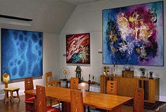
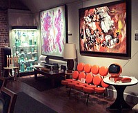
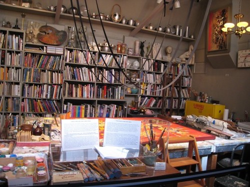
In one of the rooms we see Kirkland's painting apparatus: leather straps hanging from the ceiling in great, drooping arcs over a broad worktable displaying an unfinished painting. He was a small man (5'1") and increasingly frail as he aged, so in the last and most glorious period of his art, he placed his canvases horizontally and suspended himself over them via these straps. Hovering arm's length over his surfaces, using dowels, he laboriously applied the final dabs/dots of paint on top of his oil and water grounds. Yes, oil and water.
Kirkland was a successful watercolorist in the '30s and showed at Knoedler in New York. After the Surrealism that followed his American Scene phase, he began to use oil paint as a resist for water-soluble colors. Then, in about 1951, living, working and teaching in Denver, he became an Abstract Expressionist without portfolio, painting the cosmos as it might be seen by someone with supra-spectrum vision or synesthesia. He did, in fact, see sounds as colors and vice versa. His great swirls of color, eventually dappled with brilliant dots, don't have preferred tops or bottoms, and quirky Kirkland resisted signing his abstractions because he didn't want them limited to a single orientation (sometimes, though, he signed them on opposing edges). I thought of the cosmos, but also of those big rectangular fields you see from the air when you fly into Denver; neither has a top or bottom.

Kirkland,The Energy of Explosions 24 Billion Years BC, 1978 (partial view)
One cannot exactly call Kirkland an Outsider Artist, for he was obviously in touch with all the major trends in the art world; he was on the board of the Denver Art Museum and founded his own art school. As he matured, he spent more and more hours painting, often more than 12 hours a day every day for weeks on end, floating over his horizontal canvases, but selling less and less.
Kirkland was obviously talented, obviously charismatic, obviously capable of creating some astounding abstract paintings, obviously driven. But where shall we place him? In some cases, his dotting technique resulted in Op Art results, but he is primarily an Action Painting isolate, marching to his own drummer. A visionary of sorts, he synthesized opposites: oil and water, Op Art and AE.
Because Kirkland's paintings are displayed where he made them, sandwiched among piles and arrays of dishes, pots and furniture, visitors can enjoy them without the white-wall bracketing of most museums and galleries, and they sing. May they always be seen this way, and not removed to the slow death of standard display.
When art history is again rewritten, as it must be, there will be a special niche for Kirkland. But that art history will have to be of a new form created by those who can think outside the standard headings that slide lectures demand. How can we change the patterning of art history, the rote route, so it can allow the truth of an unofficial Abstract Expressionist making some of his best paintings -- and some of the best paintings of late-AE -- as late as 1980, in of all places Denver, Colorado, in a cottage, crammed with tchotchkas?
FOR AN AUTOMATIC ARTOPIA ALERT WHEN NEW ENTRIES ARE POSTED E-MAIL: perreault@aol.com
AJ Ads
AJ Blogs
AJBlogCentral | rssculture
Terry Teachout on the arts in New York City
Andrew Taylor on the business of arts & culture
rock culture approximately
Laura Collins-Hughes on arts, culture and coverage
Richard Kessler on arts education
Douglas McLennan's blog
Dalouge Smith advocates for the Arts
Art from the American Outback
For immediate release: the arts are marketable
No genre is the new genre
David Jays on theatre and dance
Paul Levy measures the Angles
Judith H. Dobrzynski on Culture
John Rockwell on the arts
Jan Herman - arts, media & culture with 'tude
dance
Apollinaire Scherr talks about dance
Tobi Tobias on dance et al...
jazz
Howard Mandel's freelance Urban Improvisation
Focus on New Orleans. Jazz and Other Sounds
Doug Ramsey on Jazz and other matters...
media
Jeff Weinstein's Cultural Mixology
Martha Bayles on Film...
classical music
Fresh ideas on building arts communities
Greg Sandow performs a book-in-progress
Exploring Orchestras w/ Henry Fogel
Harvey Sachs on music, and various digressions
Bruce Brubaker on all things Piano
Kyle Gann on music after the fact
Greg Sandow on the future of Classical Music
Norman Lebrecht on Shifting Sound Worlds
publishing
Jerome Weeks on Books
Scott McLemee on books, ideas & trash-culture ephemera
theatre
Wendy Rosenfield: covering drama, onstage and off
Chloe Veltman on how culture will save the world
visual
Public Art, Public Space
Regina Hackett takes her Art To Go
John Perreault's art diary
Lee Rosenbaum's Cultural Commentary
Tyler Green's modern & contemporary art blog

