main: November 2004 Archives
Six Ways of Looking at the New MoMA
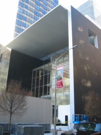
MoMA from 54th Street
1. Cash-Flow
A former director of a nonprofit art institution might look at the newly expanded MoMA -- Super-MoMA, MoMA IV, and MoMA Redux -- in a particular way. He or she would see income-generating party spaces. Earned income equals cash-flow solutions.
(How the Museum of Modern Art became The Modern and then MoMA is another story. Branding is all. For a more friendly tag, I suggest the name be reduced to Museum of Modernism, i.e. MOM, the Museum That Loves You Back. (Sorry, Philadelphia, we are going to appropriate your weird substitution for the apparently sexist City of Brotherly Love.)
In the meantime, MoMA's brand new pass-through lobby, joining 53rd and 54th midblock, is great for cocktail receptions. The slightly expanded garden is perfect for really upscale weddings.
But the second-floor atrium space, with Barnett Newman's Broken Obelisk looking bigger and grander indoors than it did outdoors, is for the totally serious occasion. Does it really matter that Monet's Water Lilies seem to have shrunk to postage-stamp size in a niche just off of the atrium's four stories of air? Given the right camera angle, the panorama still makes a great backdrop.
Nevertheless, the primo space is the sixth floor. Keep Jim Rosenquist's F-111 on permanent display. Keep Ellsworth Kelly's Sculpture for a Large Wall ! I know the sixth floor is supposed to be for changing exhibitions. But I'd otherwise keep it bare. Think how many tables the Kelly room alone would hold for sit-down dinners. Think of the high-cost product debuts you could host, or even the small exposition or two. Is this where we are going to put the Elizabeth Murray painting show in fall of 2006? Will her oddly popular paintings hold the space? At least MoMA is featuring a woman artist for a change. But since it doesn't look like we can substitute the worthy Pat Steir, better to leave up the Rosenquist and Kelly.
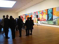
James Rosenquist: F-III (during a press conference)
2. Back Stage
A former museum curator might look at Super-MoMA in terms of curatorial logistics. How are we going to get the damned artworks in and out? I remember when I worked across 53rd Street at the American Craft Museum, struggling with the registrar to get artworks into that highly honored piece of architectural garbage. Anything that could not be carried in a suitcase had to be jimmied in along a torturous underground passageway that led from the CBS loading dock down the block or, if too big for that route, unpacked on the sidewalk and carried through the space allotted for the removable revolving door. At pre-Neo-MoMA one day I saw their crew gingerly pop out one of the big plate-glass windows on 53rd Street to get a very large crate inside. Now they seem to have a real loading dock and certainly some way to get the Broken Obelisk inside and up to the second floor. The rest I will believe only when I see some monumental Richard Serras on the sixth floor.
Otherwise, the walls look good. I love the slight, illusionistic float; instead of baseboards, there's a narrow recess. The lighting works, although as usual I prefer at least 15 percent more light. Can't the light-bulb people come up with brighter lights that will not damage paint on canvas, works on paper, fabric? Galleries and slide projections or, nowadays, PowerPoint or just our computer screens have accustomed us to many more lumens poking right at us, into us. And -- a real miracle -- there seems to be a certain amount of built-in flexibility in terms of gallery spaces. You don't want to have to show a Joseph Cornell in a four-story atrium, or a Monet. (Oops, sorry, I forgot.)
Above all, there are walls. Too many new museums have too much glass. Here architect Yoshio Taniguchi has made just enough openings to let you glimpse the city outside or, more often than not, the other wings of MoMA (for we are talking about an artful cluster, not a singular, stand-alone building) or the garden below to overcome the claustrophobia that would result from the generally curatorially preferred no-window art chamber. Taniguchi did not make what I call the Getty Mistake: blinding natural light that has to be constantly scrimmed. Of course, we are in New York and most light is already scrimmed. (Dare I mention how a Rothko in another museum a train ride from New York is ruined by a window directly above it? The daylight, even in winter, makes your pupils shrink.)
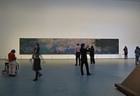
Claude Monet: Water Lilies
3. Where Is the Building?
As a reluctant architecture critic, I find most buildings disastrous. Like everyone else, I like Gehry, in principle; and, unlike many, I also like his opposite Peter Eisenmann, whose signature building at the Waxner Art Center at Ohio University in Columbus is better in actual experience than it reads. You can perceive the two contradictory found-grid systems that underlie the structuring. Everything felt as if it made sense, even the "historical" split tower. Would I want to hang art there? Listen, if I could hang art in I. M. Pei's leaky atrium, I can hang art anywhere and make it look good.
I had the privilege of working in Pei's first museum; the Everson Museum of Art in Syracuse, N.Y. It is also one of the first designer-museums. Built in a downtown oxymoronically devastated by urban renewal, someone seemed to have thought that a fortress was necessary; to this day you can't find your way in without a guidebook. Surprise: in a high-snow zone, the flat roof was prone to leaks.
No one will have a difficult time finding the Ultra-MoMA entrances. And I doubt the roof will leak, although the mega-minimal façade on 54th Street may not be entirely immune to pigeon droppings. I just hope that, unlike at the Everson, there are enough electrical outlets in the offices.
There are, certainly, many more serious things to say. I was surprised that the complex is as successful as it is. It's all a 3-D grid, fittingly so, given the midtown street grid. If the truth be known, neither façade is much to look at. But once inside, except for the atrium, the building disappears. This is an artist's and an art-lovers dream.
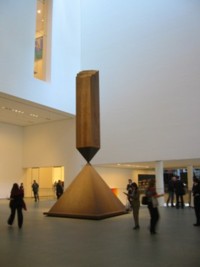
Barnett Newman: Broken Obelisk
4. Post-PoMo MoMA
An art critic might look at the art but also what may or may not be going on under the choices. The second-floor contemporary galleries are sumptuous, underlining Ultra-MoMA's renewed commitment to the new. This is a particular kind of new, an Artforum, old-news new, cover-story new, a blue-chip gallery new, an informed but unadventurous consensus new -- but, compared to the dark ages of William Rubin when Dada was a dirty word, it's new all right.
Well, sort of seminew but not quite old-hat new. For instance, the first room features a big, free-standing wall piece by Gordon Matta-Clark (sections cut from a real house), and we even have a special area for projected art, not a particularly thrilling selection, but at least it's there. And then there's even glass, not only a glass work by Kiki Smith but also one by Josiah McIlheney. And ceramics: a case of tiny vessels by Charles LeDray. Of course, in this context none of these pieces is really glass or clay. They are not craft-art, they are sculpture-art.
The other plus is that the newish work is not divided up into modern and postmodern as it is at SF MoMA, which I visited this fall. Because SF MoMA has so many fine Robert Rauschenbergs, he is the dividing line, landing squarely on the PoMo side. Ultra-MoMA in N.Y. will have none of that silly PoMo stuff, since we all agree that PoMo was simply the latest version of Modern once Modern was purged of Greenbergiana.
The installation is sort of chronological, like the history floors above, but even more "by eye," with some slight bowing here and there to formal juxtapositions. As upstairs, the juxtapositions never go quite far enough. Shouldn't the Matta-Clark have been in the same room with the Whiteread cast room? Good taste rules. This looks good next to this. The selection will change annually, so we wait with bated breath for further revelations, puzzles.
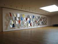
Ellsworth Kelly: Sculpture for a Large Wall
5. It All Begins With Paul Signac?
Art historians, theoreticians, and educators might look at how MoMA's historic collection is presented. For as MoMA goes, so goes the world. I am not at all upset that, as we were warned by an article in the New York Times Magazine, we begin our journey through modernism with Paul Signac's Opus 217: Against the Enamel of a Background Rhythmic With Beats and Angels, Tones and Colors, Portrait of M. Félix Fénéon in 1890. This is a fractional gift from Mr. and Mrs. David Rockefeller. I am not sure how big "fractional" is, but surely they could have afforded the whole thing. Otherwise, my motto is that beggars should be choosers.
We do not begin with Cézanne's The Bather or Picasso's Les Demoiselles d'Avignon. We begin with Signac! As usual MoMA, for better or worse, creates the official history of modernism; as the best museum of modern art in the world, it cannot do otherwise. Everything it does is exemplary. Beginnings determine everything, so one would assume that the Cézanne or the Picasso (since MoMA owns no major Manet that I know of) would be a logical, albeit overly didactic, start. No, we need a little surprise, a little wit.
And, after all, why not honor the Rockefellers right at the start and get it over with. It was once their family museum, and one assumes the donations have never stopped. In terms of Signac, is MoMA at long last honoring followers as well as leaders, workers-in-the-trenches, as it were, as well as the four-star generals of art?
Yes, Signac's subject Félix Fénéon was an art dealer. Are we also honoring the evil demons of art commerce? Or since Fénéon was also an art critic, are we, perish the thought, honoring goads and flunkies?
Always trying to put a good face on things, I will assume that the gentlemen in question, like myself, was an excellent and virtuous critic, and at long last MoMA is honoring this strange and unfairly denigrated profession so important to art and culture. And even sometimes important to literature, poetry and philosophy.
And after the entrance? The masterpieces we love shine. As for the much-publicized freedom to take various pathways, it hardly seems much freedom at all. Objects have to be arranged somehow, and no matter how you arrange them, since pathways are always linear, dialogue among them is never really going to work. Unless, of course, you wrench them out of time and context. This is called formalism. What we need is some better way to show a dialectic between, let us say, the form-driven and the content-driven. Or art and life. Or images and words. Or the personal and the spiritual. Or even money and art.
MoMA Gets Ready: Down to the Wire
6. The Twenty-Dollar Question
As an ordinary museum-goer might look at Mega-MoMA a bit suspiciously. The $20 fee is scary. Director Glenn Lowry is quoted as saying MoMA receives no government money. Excuse me, I think a press release in my packet clearly states that MoMA recently got $65 million from New York City and $10 million from New York State. Perhaps Lowry means not regular, line-item money, as the Metropolitan or the Queens Museum receive.
Andbecause MoMA is a nonprofit educational institution, it pays no income or property taxes. Taxes not paid end up being made up by taxes you pay. Someone has to pay for the police force, the fire department, and the army and navy. MoMA does collect sales tax in its various gift shops. I suppose you could argue that Our Holy Mother of Art is a tourist lure and tourist eat in restaurants, stay in hotels, and shop in department stores, all of which pay taxes.
But, speaking as a former administrator, admission is cash. Unlike promised gifts, cash is there every day at the end of the day. So...I'm sorry to say, knowing how invaluable a resource MoMA is....
...if I did not have press credentials and American Association of Museum membership, I'd go for becoming a MoMA member, like the rich. It's cheaper by far than paying single admissions. Paradoxically, if you can afford membership and go more than four times, you get in for less than the ordinary Joe or Joan. Most movies are $10, an average of $5 an hour. Will you spend four hours at MoMA? MoMA is a better entertainment deal than most movies and, besides, at MoMA you can be seen, unlike in a dark movie theater. You can pose against various panoramas or modernist icons. You can be the star of your own movies. Even in terms of what it costs to go to church, this is a bargain; at least you don't have to give up your sexuality or your soul.
Seriously, when asked if there should be an admission to The Museum of Modern Art, John D. Rockefeller supposedly said there had to be, or no one would value the art. It is odd that once the Metropolitan and the Whitney started charging admission, their attendance shot up.
And the poor? The students? The retired? I hope more and more corporations will, like Target, subsidize free hours or, better yet, memberships for all of us. Your membership card would have the name of your sponsor on it: K-Mart, Dog-Chow, McDonald's, Oxford-MedCo-AOL-Time-Warner.
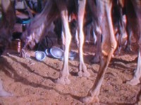
Daniel Rothbart, Meditation/Mediation (Camels, Wadi Shlomo, Israel)
Camels Munching and the Mississippi Passing By
In a Roman backyard near a big tree, a man singing softly to himself walks around a circle of twelve cast-aluminum bowls of various sizes; he stops, kneels down and sings into the largest bowl; then he gets up and taps it with an aluminum gong-striker that looks like a giant sex-toy. The man is the artist Lucio Pozzi.
An anonymous "Algerian Entertainer" in an Israeli hotel is seen teaching dance movements to a group of ladies; the twelve bowls are on a table in the foreground.
Camels, munching on straw, poke at the bowls, sounding them.
Michael Kennedy, an Elvis imitator, does his turn in a Las Vegas parking lot, then, using the sex-toy, strikes the aluminum bowl at his feet.
Beni Corri, an Israeli performance artist, empties his pockets and, naming each item, places it on the floor in front of him: "My telephone [a cell-phone], my keys." Then, removing each from his wallet: "My notes, my credit card, my visit cards, my wife [a photo], my son [a photo], my daughter [a photo], my prayer, my driver's license, my i.d., my money, and [finally] my wallet."
The aluminum bowls have been there all along; he uses one as a kind of bongo drum, beating a fast rhythm in front of a boom-box tape-recorder; plays back the tape and, lifting his shirt and jacketup under his armpits to expose his torso, does a cheerful dance around the room
He then begins to reassemble the things from his wallet, this time using an ambiguous "our." Is he referring to himself in the plural? It can't be the "our" of coupledom, because not only does he say "our son" he says "our wife." And once he has put "our notes" into "our wallet" he bows with a solemn "Thank you very much."
Artist Giordano Pozzi, son of Lucio, in the Roman backyard at the Fondazione Baruchello, places three paper sculptures into three of the aluminum bowls, sets fire to them, tends the fires, then scoops up the smoldering ashes with his bare hands and places them in a smaller bowl.
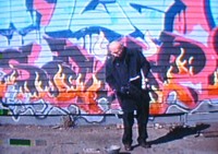
Critic Enrico Pedrini, outdoors against a graffiti mural, announces "Meditation on dissipation" and then throws his books to the ground near the bowls, where the wind turns their pages.
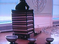
Critic and curator Achille Bonito Oliva, sitting before one of the metal bowls in his study, proclaims: "The critic vomits words of analysis into the synthetic form of the vessel..."
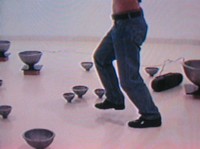
Rothbart, Meditation/Meidation (Beni Corri, Performance Artist)
We see these events in the form of a projection piece called Meditation/Mediation, part of Daniel Rothbart's solo exhibition at the Andrea Meislin Gallery (526 W. 26th St., to Nov. 27). Are the recorded events Street Works, Performances, Found Art, Dada Events? Some could be seen as Street Works, some as Performances, some as rituals. Making a video, in some cases, facilitated other artists' artworks (Bernardo Scolnik's nude, new age celebration; Wayne Bartlett's accordion, pop-up suitcase enclosure emitting altered bowl-sounds); inspired rituals such as Francine Hunter McGivern bowing, using a bowl as a hat; or the simply documented bowls in front of a street musician in Israel and a silvered mime in New Orleans.
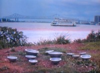
And I mustn't forget the bowls on a Mississippi embankment: silent, as a ferry slides by with the sound of its very own clangs.
Rothbart, Medtation/Mediation (Mississippi River)
I Like It, But What Is It?
Street Works are ephemeral artworks or actions placed in or taking place in the streetscape, usually referencing and inspired by that particular social and physical environment, not necessarily for an informed audience.
Performances are nonmatrixed artists' theater -- more structured than most Happenings and more complicated than Fluxus Events -- presented in theaters, auditoriums, gymnasiums or other nonpublic sites always for an informed audience.
As part of what I now like to call the New York Street Works and Performance Group (Vito Acconci, Scott Burton, Eduardo Costa, Bernadette Mayer, Marjorie Strider, Hannah Weiner and myself), I coined the term Street Works in 1969, playing off of the then burgeoning Earthworks. In terms of indoor presentations, Burton preferred Theater Works, but Strider coined the term Performances, which seemed to stick -- later, but to all the wrong kinds of artist presentations. Performance Art in the '70s became more like stand-up comedy monologues than sculpture or dance. Analysis gave way to entertainment, usually not very good entertainment at that.
Where have Street Works and Performances been the last 30 years? Could it be they were forced underground by commercialism? Or that they no longer provided an inside track to an art, movie, or pop-music career? The history was buried under the rush to comodification and show-business cash.
Yet the idea of artist-initiated, non-object art forms and formats lives on and will blossom unexpectedly now and again. Everyone thought that Futurist and Dada theater was locked into art history, but then Happenings came along in the '50s in the U.S., and Fluxus world-wide.
In a sense, Street Works and Performances have become just one of many genres available to the contemporary artist as he or she becomes the fashionable author of the ubiquitous one-person group-show. So unless there's some retention of the spirit of opposition or some new territory at stake, performance-based, non-object art forms are just there as loss leaders. They usually can't be sold, but they give the related objects the aura of the avant-garde.
Rothbart: Meditation/Medation (Enrico Pedrini Throwing His BooksDown)
Streets, Dens and Yards
This is not the case with the art in Rothbart's exhibition. The branchlike, cast-aluminum sculptures refer to the tree image central to the Kabbalah. They thus provide a grounding for his12 bowls -- also of cast aluminum -- that are the focus of his Street Works, Events, and Performances. Rothbart's Semiotic Street Situations are documented by handsome color photographs. The more recently initiated Meditation/Mediation is performance-oriented.
There's more to the Kabbalah than Madonna. But here I can no more than outline the link between the Kabbalah and Rothbart's very Japanese-looking bowls, perhaps indicating a tentative match or mash between Jewish mysticism and Buddhism. The bowls are shaped like the most widely known tea-bowl form: a demisphere poised on and uplifted by a much narrower stem or foot. A lotus, in effect. Since the artist places these in various street situations and then photographs them, at least one part of their meaning is that of Buddhist monk begging-bowls. In conversation, the artist sometimes even refers to them as begging-bowls.
The bowls, however, are also the vessels in Luriac (and thence Hasidic) Kabbalah. The energy or the light or the meaning poured from the Unknowable-Unnameable-Unlimitable down, down the Kabbalah tree, from vessel to vessel. like champagne poured on the top of one of those wedding-glass pyramids. At this wedding, however, the vessels at the bottom are not strong enough, so they burst, leaving shards containing sparks of the Light. These somehow must be liberated and returned.
This was the innovation of Isaac Luria, The Lion of Safed (1534-1572) who was only at that mystical city for two years, taught endlessly, wrote a few prayers and then expired from the plague, having been what certain Sufis might have called The Pillar of his age. To see his grave click here.
Luria's taught that the vessels must be repaired, the sparks returned, and then the Messiah will come -- or at least there will be Redemption. To risk another symbol, that's it in a nutshell. The world is but husks.
Lightweight enough to be carried in a big canvas sack, Rothbart's bowls have been placed by the artist on the banks of the Seine, in front of a traveling circus in Italy, in Israel.
The Performances came next. The closest we can get to them is the Meditation/Mediation, which we will therefore take as a work in itself. It documents and provides the reason for more than two dozen actions (to use another term) or interventions (favored by Rothbart): in the backyard of the Foundazione Baruchello in Rome, in Israel (in Eilat and Herzliyat), in Nice, in New Orleans and Las Vegas.
Meditation/Mediation is refreshingly unslick. In those segments, shot at the Foundazione Baruchello with a very homey audience of friends and acquaintances sitting about on the lawn, we even see the artist once, standing dreamily by his camera, caught off-handedly by the Foundation videographer.
Aren't we a little tired of those clear, cold, projected digital images we see everywhere now in galleries? What do they show? What are they other than advertisements for themselves?
Meditation/Mediation is over an hour, so most gallery-goers will not have the patience to view the whole thing. I think it should be shown in a movie theater, but I did my best. And then I looked at Rothbart's DVD on my own monitor at home, where the images and sounds are clearer and oddly enough afford a distance from the thought that Rothbart might be nothing more than a facilitator. As if that were not enough. I concluded that his use of other artists (and critics) is Warholian, and as with Warhol, the results are all his.
Rothbart: Meditation/Mediation (Wayne Bartlett)
Imagine Peace
The segments, in no matter what order you look at them, add up to something very complicated. The Yoko Ono spirit is present throughout and not just because her motto Imagine Peace, per her instructions, was placed on the backyard tree in Rome. The separately filmed events end up as a braid of genres, and the bowls take on an eerie presence. Surely time, place, and friendships are equally themes. Rothbart's blend of amateur shindigs, street performers, artists shticks and even landscapes (and camels) is charming and elevating. I suspect a few fallen sparks were set free. Symbols are not just a convenient way of expressing the normally inexpressible. After all, the bowls do not allow just anything to happen; symbols, correctly understood, also create realities.
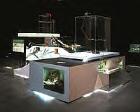
David Altmejd, The University 2
A Werewolf in Brooklyn
I first saw David Altmejd's work in the last Whitney Biennial. In my Artopia essay I gave his Delicate Men in Positions of Power a prize for The Most Strangely Creepy and Oddly Moving Installation. The prize could have been for the best werewolf art, the best art about werewolves. Now at the Andrea Rosen Gallery in Chelsea (525 W. 24th St., to Nov. 27) we can get another look at what this artist is up to.
I think it best to concentrate on the big sculpture called The University 2. The much smaller University 1 is made of mirrored glass, wood, something called mirror mastic, and staples. I like the staples. It is a glamorous piece, but abstract -- sort of like those mirrored boxes once produced by Kusama (see below) and Lucas Samaras, only turned inside out -- and looking like, if the truth be told, a mirrorized model for a certain Canadian World's Fair apartment house of the future. But just because he is originally from Montreal doesn't mean that this Brooklyn artist had Habitat on his mind, does it?
Another piece, in which, according to the handout/press release, "A monster forces a bony finger into the behind of a werewolf," is also dwarfed by University 2. It uses the same tricks -- mirrors, glass and plexi, fake hair, dubious jewels, and death -- but takes up far less mental space.
In University 2, one still thinks of Paul Thek (who made a reputation with a full-size self-portrait called The Death of a Hippie and endless vitrines of artificial meat) and Thomas Lanigan-Schmidt, who made glitter into a word of praise. But Lanigan-Schmidt's dead rats from his early "poverty period" have now been reborn as stuffed birds. Altmejd too has quite an imagination, but it strains toward and then, with considerable cunning, slightly backs away from narrative.
Truly, Altmedj's work is about transformation. Isn't that why we fear the werewolf? People changing into wolves is almost as scary as an old friend turning into a Republican or evangelical "Christian." Or looking into the mirror and seeing yourself suddenly becoming quite like some evil, older relative with bags under your eyes and hairs growing out of ears, nostrils, and even (as happened to a friend) right on the tip of your nose.
Or is the werewolf here not about falling back into some animal state of anger or lust, but about an animal straining to be human?
In any case, the werewolf or werewolves are dead. And, at least in Altmejd's visionary tableaux, they have started sprouting crystals. If we fear relapsing into animalhood, do werewolves fear relapsing into mineral? Since the werewolves --or, more correctly, werewolf parts -- look like road kills of fierce beasts wearing acrylic wigs, we are sucked into some pretty strange territory.
Is there a dead werewolf at the heart of every university? Some of my academic friends would vote for a live werewolf, dead center. If all the mirrored platforms and passageways depicted are only a model, rather like a bizarre jewelry display (if Tiffany went wild), then the werewolf debris represents a huge beast indeed. Flowers make it a memorial. Stuffed birds bring it all back down to playtime. And then -- did I tell you this? - there is something enervating and nerve-tingling about the tentativeness of it all. You can see the seams. In one place you can even look inside and see the carpentry.
Kusama's Circles and Spheres
Yayoi Kusama is at Robert Miller (524 W. 26th St., to Nov. 13) with a variety of old works and one spectacular new one called Narcissus Garden. The latter is made up of hundreds of large, identical, shiny stainless-steel balls. There's that mirror theme again. And a mirrored peek-box centers a smaller room. Plus, up-front in the gallery, stuffed "lobster-claws" forced into cylindrical containers harken back to the Oldenburgian organic.
Also on display are classic Kusama circle-motif paintings, which on any given day can give Agnes Martin -- a far too dignified artist indeed -- a run for her money. Kusama is not only a proto-Minimalist, painter she is (or was) also a naked-Happenings, polka-dot artist. One of her events was a male-to-male marriage at Judson Church, c. 1968 or earlier.
Putting the paintings in the same rooms as the installations may or may not be a mistake; sharing the gallery with the ever-boring and virtually talentless Victor Vasarely (Mr. Op Art) definitely is an error, if not an out-and-out insult. Templates for possible black-and-white wrapping paper didn't look serious during the hey-day of Op -- two months in 1960 -- and certainly don't look serious now. Or even amusing.
Kosuth Is Back!
As far away as you can get from Altmejd and Kusama -- well, maybe not Kusama -- is the new exhibition of works by Joseph Kosuth at Sean Kelly (528 W. 29th St., to Dec. 4). You should also note that the Chelsea Art District has now crept as far north as 29th Street, still a hot-bed of taxi companies and taxi service establishments. But, mark my word, not for long.
The Sean Kelly is as chic as any other prime Chelsea gallery, and there's yet another block before the elevated High Line railroad track ends (or begins) in a sudden curve. Will the proposed elevated park finally contain the art industry?
Turning the High Line into a linear park is a great idea (one of the few of late),although I think we can do without the overly fussy winning design.
Kosuth, a founder of Conceptual Art and certainly one of its most austere practitioners, is back with a vengeance, an elegant vengeance but a vengeance nonetheless. The brick wall above the Kelly gallery entrance is strewn with words in ivory neon: History, Place, Parts, Whole, Context, Meaning.
There. Now you've read the show. Well, not really.
You still have to read a long 1988 quote from French philosopher Gilles Deleuze inside on the gallery wall inside and/or on the announcement. It begins: "I think there's an image of thought that changed a lot through history. By the image of thought I don't mean its method but something deeper that's always taken for granted, a system of coordinates, dynamics, orientations: what it means to think, and to 'orient oneself in thought.' "
As usual, it is actually difficult to decide if Kosuth really understands what he is quoting, any more than it once was difficult to decide if Bernard Venet (before he became the sculptor of arcs) understood the mathematics he patiently copied. Venet once told me that he didn't.
For those who may need to catch up with Kosuth's past, conveniently there are three dictionary definitions from 1965, all defining the meaning of meaning in German, possibly Russian and certainly Hawaiian. Furthermore, blue neon in the director's office spells out "Subject/Subjective."
There. Now you've read the show. No, not really.
After a hallway (with a "key" to what lies a head), one comes upon, rather is assaulted by, a room full of words placed over fluorescent lights: philosophical quotes, of course, from everyone from Derrida to Voltaire.
Language is the subject; philosophy is the subject. But what is the objective? Art, after all, is not philosophy. But neither is language.
Sealing Your Mind
More directly political, so perhaps not as provocative, is Cildo Meireles' installation at Galerie Lelong (528 W. 26th St, to Dec. 4). Called Strictu, it consists of a table, two chairs, steel poles, handcuffs and a quote from a Ku Klux Klan leader: "We want to steal their time. We want to steal their space. We want to steal their mind." One of the best of the avant-garde Brazilians, Meireles is also showing his cool Descalas, "ladders" flat against the walls that make up variations on a theme -- or on a metaphor. Is it because of the proximity of the interrogation piece called Strictu that the ladders seem so effective? Repression and evil are simple; it is liberation that is complex.
In Another Part of the City
I also highly recommend Barbara Kruger's current show at Mary Boone uptown (753 Fifth Ave., to Dec. 2004). Called "Back to the Future," all works, in one way or another, use her white lettering on red or black, highly graphic, signature-style. In one case -- the knockout piece from 1995 -- countless guys in white bathing caps swim in a sea of phrases all beginning with "busy." Busy with dying, Busy with strategizing. Busy with boasting, Busy with killing. Are they really all men? Don't women die, strategize, boast, kill? But I won't quibble; it's a powerful piece.
The show is a mixture of old and new pieces, making the point, I am afraid, that the more things change the more they stay the same -- in politics and in the human predicament.
An image of President George W. Bush with the words "falling upwards" is bound to be a crowd pleaser, at least on both coasts. Another favorite of mine, since the presentation of the text as white letters on a bright red ground in an art gallery is ambiguous and therefore thought-provoking is Untitled (Pledge) from 1988. Simply and bluntly, it's the Pledge of Allegiance, which in case you've forgotten, reads like this: I pledge allegiance to the flag of the United States of America and to the Republic for which it stands, one nation under God, indivisible, with liberty and justice for all.
The "under God" was added by Eisenhower as a Cold War ploy. Does Kruger know this?
AJ Ads
AJ Blogs
AJBlogCentral | rssculture
Terry Teachout on the arts in New York City
Andrew Taylor on the business of arts & culture
rock culture approximately
Laura Collins-Hughes on arts, culture and coverage
Richard Kessler on arts education
Douglas McLennan's blog
Dalouge Smith advocates for the Arts
Art from the American Outback
For immediate release: the arts are marketable
No genre is the new genre
David Jays on theatre and dance
Paul Levy measures the Angles
Judith H. Dobrzynski on Culture
John Rockwell on the arts
Jan Herman - arts, media & culture with 'tude
dance
Apollinaire Scherr talks about dance
Tobi Tobias on dance et al...
jazz
Howard Mandel's freelance Urban Improvisation
Focus on New Orleans. Jazz and Other Sounds
Doug Ramsey on Jazz and other matters...
media
Jeff Weinstein's Cultural Mixology
Martha Bayles on Film...
classical music
Fresh ideas on building arts communities
Greg Sandow performs a book-in-progress
Exploring Orchestras w/ Henry Fogel
Harvey Sachs on music, and various digressions
Bruce Brubaker on all things Piano
Kyle Gann on music after the fact
Greg Sandow on the future of Classical Music
Norman Lebrecht on Shifting Sound Worlds
publishing
Jerome Weeks on Books
Scott McLemee on books, ideas & trash-culture ephemera
theatre
Wendy Rosenfield: covering drama, onstage and off
Chloe Veltman on how culture will save the world
visual
Public Art, Public Space
Regina Hackett takes her Art To Go
John Perreault's art diary
Lee Rosenbaum's Cultural Commentary
Tyler Green's modern & contemporary art blog
