main: September 2004 Archives
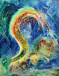
Eugene Von Bruenchenhein, Untitled
The Art District That Ate Manhattan
Checking out the Chelsea Art Guide (a freebie at most galleries), I see that 220 galleries are now listed and black-dotted on the map that tracks them from 12th Avenue to 7th Avenue and from 29th St. to 13th. The densest cluster of numbered dots, however, is still from 26th Street to 20th between 11th and 10th Avenues. Where will it all end? Chelsea: the art district that ate the West Side, that devoured Manhattan?
Lack of decent public transportation was not a hindrance; cabs will go anywhere. And so will art dealers. But it is not just the initial savings on rent or that spaces were not too long ago cheap enough to buy. It is what, for want of another term, might be called the Asian Market Principle.
In the outskirts of New Delhi, all used-tire dealers cluster together; in another area all sari venders. In Tokyo, all the electronic shops are in one neighborhood. In the past, this made no sense to Western sociologists. It seemed exotic and counterintuitive. Wouldn't it be better to be the only used-tire dealer on your block? But New Yorkers have not forgotten the old Diamond District on 47th Street, the Flower District on 28th St, and the Button District farther north. Similars attract.
Is it that competitors like to keep tabs on each other? Or the altruistic wish to make comparison shopping easier for the consumer? I say it has to do with attracting consumers in search of one particular thing. Even if there happens to be one vendor with better goods or cheaper prices, that's a plus, because of spillover.
This fall there are more galleries than ever. I count at least 28 additions. Now there's in-fill, with ground-floor spaces that attempt to look like the garage-conversions pioneered by Barbara Gladstone and a few others.
And the art. We know where it comes from: bad art schools. But where does it go? Storage, I assume. No one ever talks about how much storage and trucking income adds to the economy. Unless art dealers are insane (a few are), some of the art must sell. Although historically art investments do not do as well as the stock market, post-bubble they look like they might.
Chelsea Strategies
Art students usually go to Chelsea on assignment; some of their traditional, stay-at-home suburban moms are now on guided tours; but art-world regulars develop rigid short-lists: Paula Cooper, Gagosian, Barbara Gladstone, Matthew Marks. I myself sift through press releases and announcements to develop my midweek list, more like a battle plan or a Grand Tour itinerary than a to-do list. I write down all the shows I want to see; then rearrange them by block and sometimes by building. If it's noon, this must be 23rd St. There are some old warehouses that have dozens of galleries: for example, 508-526 W. 26th, 511 West 25, and, with the largest but slowest of elevators of all, 529 W. 20th. The virtues of these three is that they have available WCs on each floor.
Some galleries, based on past experience, are best avoided. Some are iffy or spotty, but can be surprising. And then, as the day wears on, it's triage, triage.
Here are some recent results...
* * *
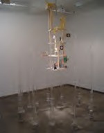
Untime Structure, 2004
Julianne Swartz, whose stairwell installation of sound and light-transmitting tubes you may remember from the last Whitney Biennial, debuts with "Speculative Mechanics * persistent optimism" at Josee Bienvenu (529 W. 20th St.. to October 23). This is not really her first solo exhibition, as proclaimed by the press release; a few years back she had an exhibition of shadow pieces at UrbanGlass in Brooklyn. Maybe the press release should have said "her first solo exhibition in Manhattan in a commercial gallery." But let's not quibble. There's press release truth and then there's truth.
Fresh on the heels of her widely publicized Can You Hear Me? for the New Museum, it's a splendid show. Can You Hear Me? allowed passersby to communicate to upstairs occupants of a Bowery flophouse through a bright-yellow plastic tube. The new work also uses large plastic tubes, with the exception of a brilliant suspension-by-magnet piece. Otherwise you can look into spiffy white tubes and see yourself or someone else or the room. The newest sculpture, Un-Time Structure, is not as slick, so at first it's off-putting, but then when you circle it, the twittering sound-producing things in the center begin to make sense: your eyes are a clock. I also liked a small, almost invisible projection that allows you to see the storage room of the gallery, in miniature.
* * *
The New Museum, awaiting its snazzy new downtown building on the Bowery, is temporarily on the ground floor of the Chelsea Museum (556 W. 22nd St). "Adaptive Behavior" is a group show (through Nov. 13) that is supposed to have something to do with this transition. Alas, it reminds me of the notorious, but perhaps more ambitious, New Museum theme shows of the past: dubious topics, dubiously illustrated, pumped up with muddy rhetoric.
Here, 11 artists from five continents are described in the handout as (in the context of the growth of technological networks) "paying close attention to the specific qualities of place and individual behaviors as they are inscribed within this global experience." But it continues, "And while these artists make use of such networks, their overriding concern is to restore the intimate power of imagery, and of human exchange, even as this is threatened by the ubiquity of those very networks." Is this a case of "Having your cake and eating it"? Or, although there is yet no catchy term for it, "Any statement can be applied to any artwork"?
I did like, however, in this mélange, Tonico Lemos Auad's Untitled (Carpet Antelope), a wall-to-wall carpet with a few figure artfully made of carpet fluff, visibly scratched from the self-same peach (?) colored carpet. Otherwise, the installation favors unfashionable media cacophony.
* * *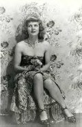
Untitled, n.d.
For fans of Outsider Art, a survey of the strange art of Eugene Von Bruenchenheim at Feigen Contemporary (535 W. 20th St., to Oct. 23) is essential. Von Bruenchenheim worked at a Milwaukee bakery during the day and on his art at night. When he died in 1983 at 73, a stash of his extraterrestrial "finger-paintings," sculptures made of chicken bones, and "cutie-girl" photographs of his muse Eveline "Marie" Kalke came to light. Some parts of his feathery paintings were manipulated with brushes made from Marie's hair. Actually, even for those not acquainted with the art genre of the untrained and the visionary, there is enough unconscious surrealism -- now that's a fine phrase -- to please or provoke.
* * *
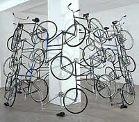
"Forever" Bicycles, n.d.
Ai Weiwei is by all accounts a mover and shaker in new Chinese art. He was part of the Stars Group that rejected Chinese propaganda art in 1973. After that he attended art schools in New York, living in the East Village for 12 years. Armed with Duchampian and Warholian strategies, he went back to Beijing in 1993.
Chelsea is full of surprises. It's the Robert Miller Gallery (524 W. 26th St., to Oct. 9), not known for the avant-garde, and not Gagosian or Cooper that's presenting an inspired survey of Weiwei's work. A gigantic chandelier nearly fills one of the small front rooms from ceiling to floor, emitting heat and seemingly sucking the air out of the room. The centerpiece is "Forever" Bicycles, a large cylinder of 42 conjoined Forever brand Chinese bicycles. A while back, I thought I might have an opportunity to go to Beijing, so I rented every contemporary Chinese movie set in Beijing I could find. Bicycles, bicycles. Even special traffic lights just for bicycles. What we don't know if bicycles symbolize ecology or a new definition of poverty, the latter I suppose.
I also particularly liked Weiwei's iron and wood Bench Map of China. Only when you look at the sides do you realize that the cross-section ends of the rippled mass reveal the map of China. Other pieces, such as documentation of dropping a Han Dynasty urn and photos of giving the finger to various tourist sites seem merely naughty.
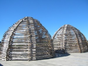
Andy Goldsworthy: Stone Houses, 2004
What Was Earth Art?
At times Earth Art was dirt or stones dumped in a gallery, but mostly we visualize artworks made outside the gallery, outside cities, on and of the land or the earth. Key works, such as Robert Smithson's Spiral Jetty (1970), were created in the wilderness. Richard Long took walks in Great Britain. His first walk in 1967 was described as "a straight line in a grass field, which was also my own path, going 'nowhere.' " He also aligned stones or arranged them into circles in barren landscapes.
But after awhile, sculpture parks, college campuses, and even mining sites became fair game. One work that comes to mind is Dennis Oppenheim's breathtaking blow-up of his own thumb print superimposed on the earth skin of Art Park outside of Buffalo, New York -- a barely disguised former toxic waste dump. Much Earth Art was ephemeral or almost inaccessible, so photography reared as its vehicle of communication or, in fact, became the art: set-up photography in which the setup was made with bulldozers.
Most of all, Earth Art contested the idea that art had to be shown in galleries or museums in order to be art; that it had to made of traditional art materials; and, although some Earth Art sculptures were funded by gallery owners (Virginia Dwan) or by entities such as the Dia Foundation, most were unsaleable, uncollectible, and theoretically exempt from commodification. Although Earth Art kingpin Smithson would have fumed at any pro-ecology content, whether intentional or not Earth Art implied a concern for the environment that was much ahead of its time, if only by calling attention to the landscape as a canvas or a surface to be carved into, rearranged, or variously inscribed.
A case can be made that Earth Art is not unrelated to our very own 19th centuryHudson River School. Recently on a writing assignment upstate, I visited Olana, landscape painter Frederic Church's "Persian" retreat, now fortunately a state-run museum (apparently in a perpetual state of restoration). The house itself is not to my taste, but I was impressed by the siting and the site, the latter landscaped by the artist himself. From the house you have a sweeping view of the Hudson below and of the lake Church constructed to mirror the bend in the river. Though Smithson seemed to prefer more rugged landscapes -- akin to the blasted 'scapes of Caspar David Friedrich (1774-1840) -- he, like Church and his mentor Thomas Cole,was in his own way chasing the sublime and its terrifying beauty: doing in sculpture what Barnett Newman claimed for abstract painting.
There's a Smithson retrospective now at the Museum of Contemporary Art in Los Angeles, to Dec. 12, traveling to the Whitney next summer. And you can see Richard Long's new indoor work atSperone Westwater(415 W.13th St., to Oct. 23).
In the incredibly beautiful Long show, a three-part plywood floor piecerecalls his famous lines and walks, and a fine slate sculpture is in one of the farthest rooms. But the best works are hispaintings, made from Cornish chinaclay and river Avon mud, executed on plywood. As someone who has himself "painted" on plywood, I warmed to them immediately. Painterly but nonexpressionist clay strokes are taped off into rectangles, circles and a few other minimalist forms, in juxtaposition to the waterlike grain of the raw plywood. They were all done in the gallery over the Labor Day weekend!
When Smithson died in a plane crash in 1973, it seemed that Earth Art had stopped. So fast was the art market churning, one fashionable art style after another, that Earth Art seemed like just another blip on the Artforum screen.
Nevertheless, James Turrell kept working on his volcano site; Ana Mendieta was adding the body to Earth Art; and then Agnes Denes -- now with a retrospective at the Chelsea Art Museum (556 W. 22nd St.,through Nov. 6)-- harvested her Wheatfield planted on the landfill created by the excavations for the World Trade Center in 1982. Conceived in 1982, but not finished until 1996, her Tree Mountain in Finland,consisting of 11,000 trees planted on a huge cone of soil, also deserves to be placed in the Earth Art canon.
The way art moves and changes is a lot more complicated than we are led to believe. It is not a river, or a steady march from amoeba to Einstein. Against the single-line evolutionary model, I am now fond of visualizing art history (and a lot of other things, including my own life as a poet, critic, artist) as a braided spiral, as indicated last week.
Pluralism in art was originally pushed aside for commercial reasons, for surely it is easier to sell something if it can be presented as the inevitable end-point to a single evolutionary line: e.g., Matisse to Pollock to Olitski. The single line is also derived from simple-minded interpretations of Hegel and then Marx; Manifest Destiny in U.S. history; and the evil idea of the one and only, one true religion.
But because no model is as easy to visualize as the single line, antipluralism is also a failure of the imagination. In contrast, try the braid; you'll like it. It is a little harder to visualize, but the effort is worth it. It might bring you closer to the truth. Pluralism, the present condition of art, is a knot; according to knot theory (an odd byway of mathematics) all knots can be unraveled into continuous braids. Once you can visualize the braid as a model, then turn it into a spiral.
My braided spiral, in which landscape is one strand, suggest that not only does Earth Art persist -- passing behind and interacting with one style-strand or another -- it will return, transformed. We are waiting.
* * *
I am sorry to say, we have not been waiting for Andy Goldsworthy, who has been inexplicably honored by the Metropolitan Museum of Art with a rooftop display of his new Stone Houses ( 1000 Fifth Avenue at 82nd St, through Oct. 31). Alas, not all spirals spiral up. There is such a thing as a slippery slope. Was he chosen because he seems to be popular or, given the Metropolitan's U.K. (but middlebrow) bias, because he is British?
The Metropolitan rooftop-sculpture venue is in itself quite wonderful, but now that the notion of works made specifically for the site has been passed by whatever committees are in force, we must expect artists better than someone who is the Andrew Wyeth of Earth Art.
Here, Goldsworthy's stacked stones from Scotland are surrounded by a kind of beehive made of split rails from New England. What this has to do with the Met roof or the spectacular Central Park below escapes me. The pair of sculpturesis inert.
In any case, to verify my suspicions, I also looked at Goldsworthy's picture book, called Time (Abrams, 2000). His Street Work rain shadows might have once been promising. He lies on the ground or on a sidewalk; it rains, he gets up leaving a dry silhouette. However, in the context of the Earth Art pioneers, they too pale. Some may find his photographs of ephemeral squiggles, fences and piles curiously poetic. (I do not.) The photographs are attractive in a calendar-art sort of way, but there is no ambiguity, no depth, no darkness, no complexity. Concepts and forms are weak. But I also have to add that there is really no charm, either.
I also watched Thomas Riedesheimer's popular documentary called Rivers and Tides, 2001, now on DVD available from docudrama.com. The film is efficiently photographed, nicely edited, and the music by Fred Frith suits the vaguely New Age relationship the artist subject has to nature. There are no cyclones, earthquakes, plagues, tidal waves or hurricanes in Goldsworthy's nature. The most drama we get is a tide in Nova Scotia gently dispersing his laboriously constructed pile of driftwood.
But, oh, I almost forgot. There is, near the end of the film, what appears to be a waterfall of blood, but it turns out to be only pulverized ironstone, dropped into the water upstream -- because, you see, Goldsworthy is attracted to the color red and the ironstones because, as in our blood, the red is caused by iron.
Fluffy bits of wool-gatherings, arranged along the top of a stone wall near his Scotland home? Let's not dwell on them. Nor on an Alpine cow rubbing its side on one of Goldsworthy's Teletubby-shaped, pine-cone "guardians."
Not every artist working outdoors has to attempt the sublime. We sometimes like the casual, although we are appalled by the twee. Although Goldsworthy endeavors to philosophize about how he needs his art-making to know himself, there's a lack of self-consciousness and sophistication in his work.
He goes on and on about rivers and how they are not about water but about flow. Flow, flow, flow. Everything is flow. Well, Mr. Goldsworthy, the stone fence you had wallers make for you at Art Park, those lines of dandelion heads through a field of blue flowers, the image that "bleeds" through your clay-covered wall in the south of France, the string of pegged-together leaves that goes floating down a brook -- these may look like "rivers" to you, but they look like snakes to me, snakes removed from the power of myth.
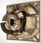
Bontecou, Untitled, 1962
The Lee Bontecou Problematic
Every time we go to the New York City Opera we look forward to seeing Lee Bontecou's fine wall piece. There's no mistaking it: dingy canvas stitched to metal "ribs," a gaping hole. The center juts from the wall as if (excuse me, Herr Freud) it might eat you. Or is it the fuselage from hell? The artist herself apparently associates her imagery with the Second World War.
Titled "Untitled," as was and is always her wont, I can't say this particular work beats the primo Jasper Johns also on display, but it holds its own and far surpasses all the odd, puzzling, or simply unspeakable artworks placed here and there on various levels. Should I say it?The Johns and the Bontecou also surpass any art in the two other Lincoln Center halls.
I include an inexplicably immense Chagall at the Metropolitan Opera building and strangely invisible Richard Lippold suspended piece in the lobby of Avery-Fisher Hall. Chagall -- never one of my favorites -- is best with intimacy, and Lippold, now nearly forgotten, couldn't counterbalance the sheer ugliness of the cheesy surroundings and the invisible upper-reaches of the lobby.
It is quite amazing actually that the New York State Theater, rising up on the shoulders of the notion of a people's opera and Balanchine's New York City Ballet, and designed by the elitist Philip Johnson should end up looking the best and having the best art of all the Lincoln Center buildings. We won't even mention the notorious acoustical dead spot on the stage (a stage that, after all, was designed primarily for ballet, not opera) except to note that directors seem to be drawn to it like the abyss and habitually place divas there to sing -- rather, mime -- their most important arias.
But Bontecou cheek-by-jowl, or cheek-by-jewel, to Johns? I remember when Bontecou also showed with Leo Castelli -- even Don Judd, wearing his critic hat, liked her work -- and then she disappeared. Was it really because everyone hated those dreadful vacuum-molded, hanging plastic fish?
Yes. She took offense at the bad reviews. Divas do not tolerate criticism.
As luck would have it, her disappearance was in the long run fortunate. Discouraged, she apparently stopped making those fish. She began a teaching stint at Brooklyn College, so far away; and hid out in a studio in Pennsylvania, apparently also off the map. And now at the age of 73, she's back. She's this year's comeback queen. Every art career needs a touch of myth. Running off to Tahiti or cutting off your ear or dying in a drunken car crash won't work anymore. But we all love the comeback story, particularly when it includes "gone but still here."
I say that her disappearance was fortunate for, as the current retrospective (and last exhibition at the temporary MoMA QNS, closing Sept. 27) proves, those fish were bad, the artist's pro-ecology sentiments notwithstanding. The smaller, free-standing oceanesque creatures and, of course, the drawings of this period are fine. But those fish! They should be lamps. Without them, however, there could be no mobiles to follow.
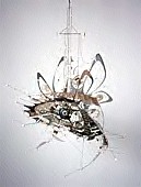
Untitled (Hanging Sculpture), 1991
The mobiles - aquatic, but also celestial - are ecstatic. Sometimes an artist has to fail in order ultimately to succeed. We could not have known at the time that the plastic fish would later be seen as steps not as ends. If the plastic fish had been warmly received, if Bontecou had stayed around (in the swim, as it were), if somehow she could have acknowledged the vaginal imagery of her signature works (thus binding herself to feminism of a certain sort), would she, could she have come up with the mobiles?.
Would Agnes Martin be the icon she is if she had stayed in Manhattan? Or Georgia O'Keeffe? Moving to Connecticut didn't help Richard Pousette-Dart. Perhaps he should have moved to the Southwest. The new rule seems to be: women, run away; men, stay.
Since all of this might sound flippant, I should say I was deeply moved by the stitched-to-metal canvas works and the recent mobiles. The best of the wall- sculptures, which also can be seen as relief-paintings, aggressively balance illusion with materiality, a materiality predicated on the use of (to quote more than one label) "welded steel, canvas, velveteen, saw blades, rope, pipe fittings, soot, spools, washers, grommets and wire."
One of the reasons the two billowy, mostly fiberglass pieces don't really work is that the materials have no history in themselves. "Untitled" of 1966 even has lights inside of it. Bontecou's Schwitterness is replaced by what used to be called Pace Gallery slickness: plastic, plastic, plastic.
Pace, presently PaceWildenstein, is now so blue chip that art history forgets that at its birth, Pace taste preferred plastic to passion. The vitrine became the sculpture. I am thinking of the otherwise admirable Paul Tek, whose creepy meat sculptures were so distanced by their manner of display, they could pass for a weird kind of minimalism.
One reason Bontecou's mobiles -- by the way, the only worthwhile addition to the genre since its inception by Alexander Calder -- fascinate, elevate, agitate, radiate is that they have hearts of porcelain. The porcelain chunks are the equivalent of the wall-sculpture holes, for it is a material, clay, that the art world has been trained not to see.
Could we not be any more forewarned than by the judicious placement of Bontecou's 1957 terra-cotta sculpture right at the entrance to the stingy MoMA QNS galleries devoted to her life's work?
But all is not smooth sailing. The real question is not whether or not the artist should have been arrested for lifting those U.S. Mail canvas bags she found beneath Avenue B letter boxes. The real question is: Are the prime works (the stitched canvas wall-pieces and the new mobiles) Cubist? This is Issue #3.
In case you haven't noticed, all my essays address issues. This is why, I suppose, some use ARTOPIA as a reading assignment for their art students. Yet I am not writing a textbook: I am just trying to see below the surface of things. I do not believe, as one once famous artist once said, that in terms of art what you see is what you get. A fan once accused me of solving problems he didn't know he had. At least I think he was a fan. Philosophers, when there were philosophers, were often accused of that very same thing.
Issue No. 1: How does timing and myth apply to an art career? Are there gender differences?
Issue No. 2: Is it a good idea to name all artworks you make "Untitled?" How on earth can you easily refer to specific pieces by Bontecou, since she made more than one "Untitled" in each year, without giving dimensions or citing what institution now owns the piece? Even so, the Chicago Museum of Contemporary Art owns at least two. We are art critics, not registrars. Titles (other than "Untitled") allow easy retrieval and identification. On the other hand, if you don't want to skew the viewer's interpretation, anything other than "Untitled" or a simple number can be a problem. Even a nonsensical title can yield strange and possibly irrelevant viewpoints. But, the evil questioner asks, are there any irrelevant viewpoints?
Issue No. 3. Is Bontecou a Cubist?
Bontecou's best canvas wallpieces and her recent mobiles are not as Cubist as the fiberglass pieces. For all their piecework, they have strong centers; Cubism does not. Most classical Cubist paintings, by Braque or Picasso, have weak centers if the motif is a personage and none at all if a still-life is getting the Cubist multiple-viewpoint treatment. Yet, it cannot be denied that there is a Cubist aroma to all of her works. Also, if there's a classical Cubist color, it's tan, and that's Bontecou's color. Is this horrible?
I remember when a certain self-proclaimed intellectual, now a film historian, returned from Paris (where she had written impenetrable art reviews for an
English-language newspaper), pinned me down at a party and asked me two things: "Well, Monsieur PEAR-oh, how does it feel to be the most-read critic in New York?"
I hate people perversely Frenchifying my name. I was writing for the Village Voice, but never thought myself worthy of being accused of being too popular, which was really what she was doing. And then she asked: "And what does everyone think of de Kooning now?" Too Cubist, I blurted out. And said "intellectual" made her bed with the Minimalists from that point on. Could I have been wrong?
No. I was just wrong in going along with the consensus suggesting there was something sinful about being a Cubist. Too fussy, too compositional, too French.
One of my fantasy exhibitions is a Cubist update; that would be a real shocker, for everyone assumes that Jackson Pollock, Field Painting, Color Field, Post-Painterly Abstraction, and Minimalism wiped out Cubism. I have thought this and taught this myself.
I now subscribe to the theory (my own) that art history is best seen as a braided spiral: many strands going on at once, many things skipping back and forth through time, coming back, disappearing. By the way, the braid that turns back into itself as in a Arabic or Celtic knot is my image for the spiritual in art -- the timeless.
So what would this new view of Cubism look like? We'd start with the classical Analytical Cubism of Picasso and Braque and not branch into Futurism (and thus Dada, etc.) but skip to de Kooning, then Robert Rauschenberg and Jim Rosenquist and Lee Bontecou. And then, whether I like the work or not (I don't) I'd have to include post-target/post-number Johns and post-protractor Stella. Surfaces and images are fractured, as is space and time. Note that I have chosen Classical Cubism, i.e. Analytical Cubism not Synthetic Cubism, which I find only pleasing.
But Neo-Cubism is probably not worth a dime, since the Greenbergers (although Clem himself once thought Pollock was extending Cubism) made the sales point that Pollock, Noland, early Stella and the rest were all anti-Cubist, anti-composition, as if it were really true that there is no intra-textual, relational, going back and forth among forms and/or colors. Cubism was un-American and, besides, one had to take the next step. Art is always involved with taking the next step.
Future issue: Is there always a next step?
AJ Ads
AJ Blogs
AJBlogCentral | rssculture
Terry Teachout on the arts in New York City
Andrew Taylor on the business of arts & culture
rock culture approximately
Laura Collins-Hughes on arts, culture and coverage
Richard Kessler on arts education
Douglas McLennan's blog
Dalouge Smith advocates for the Arts
Art from the American Outback
For immediate release: the arts are marketable
No genre is the new genre
David Jays on theatre and dance
Paul Levy measures the Angles
Judith H. Dobrzynski on Culture
John Rockwell on the arts
Jan Herman - arts, media & culture with 'tude
dance
Apollinaire Scherr talks about dance
Tobi Tobias on dance et al...
jazz
Howard Mandel's freelance Urban Improvisation
Focus on New Orleans. Jazz and Other Sounds
Doug Ramsey on Jazz and other matters...
media
Jeff Weinstein's Cultural Mixology
Martha Bayles on Film...
classical music
Fresh ideas on building arts communities
Greg Sandow performs a book-in-progress
Exploring Orchestras w/ Henry Fogel
Harvey Sachs on music, and various digressions
Bruce Brubaker on all things Piano
Kyle Gann on music after the fact
Greg Sandow on the future of Classical Music
Norman Lebrecht on Shifting Sound Worlds
publishing
Jerome Weeks on Books
Scott McLemee on books, ideas & trash-culture ephemera
theatre
Wendy Rosenfield: covering drama, onstage and off
Chloe Veltman on how culture will save the world
visual
Public Art, Public Space
Regina Hackett takes her Art To Go
John Perreault's art diary
Lee Rosenbaum's Cultural Commentary
Tyler Green's modern & contemporary art blog
