Artopia: November 2010 Archives
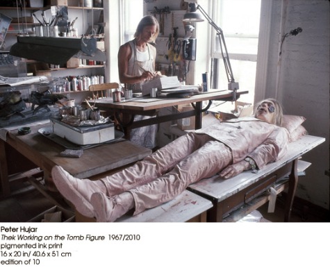
Theknologies
During this Great Recession, which comes with an art slump as well as an economic one, it is clear that during the last decade, not only did so-called theory not pay off, but that art sank, as did aesthetics. What I now call the tragic academic --- fourth generation neo-CONceptualism, neo-Pop, and re-inSTALLation art --- is a bore. Painting is still in hiding. Sculpture, dead. Bloggers lament that there are no more art movements. Theorists cheer, not realizing that now they have nothing to deconstruct.
There have indeed been other periods in history that produced little great art and perhaps no great art at all. We comb the Middle Ages and find --- literature! And perhaps a tapestry that might have survived. An altar
here and there. Architecture. Wish we could have similar results now, but look, dear friend, at The New York Review of Books. It will really make you weep. Look at the art in Chelsea galleries, and, alas, most museum shows of living artists.
But the good news is that this very same slump allows a long-required revision of the cannon, of those rankings created by commerce rather than aesthetics, of art history determined by (yes) commerce. So depleted has art become in this past decade that just to keep the wheels rolling and the machinery oiled, revisionism has become the one and only trend. The vacuum must be filled. Not all such efforts will succeed, but much-needed revisionism in art (perhaps the arts, plural) is coming out of The Big Slump. What have we unfairly cast aside? What have we scorned, misinterpreted? What have we avoided.
Until "Paul Thek, Diver" opened this fall at the Whitney (to Jan. 9, 2011), only in outdated textbooks would you know of Thek. And then for his meat boxes and The Tomb. Most of his European sojourn was off the map and the works after his return to New York have been, with some justification, dismissed as fey.
The missing years of Paul Thek --- Middle Thek, I suppose --- were the golden years. This is now clear, thanks to the current retrospective. Thek's reputation is best served by the installations he made in Europe after his fake-meat "Technological Reliquaries" had come to a dead end in the U.S. and before his ill-starred 1976 return to New York.
The brave Whitney catalog shows him with his flaws exposed. How then do we deal with a self-destructive, impulsive, erratic artist? His brush with fame? His fall from grace? We cannot separate the art from the man or from the art world of the time. We cannot separate the art from its reception. And then there is the perennial problem of ephemeralization. How can we grasp what was behind the remaining photos and fragments? These are only some of the critical challenges worth tackling, because the art is sometimes brilliant and always emotional.
Birth of a Star
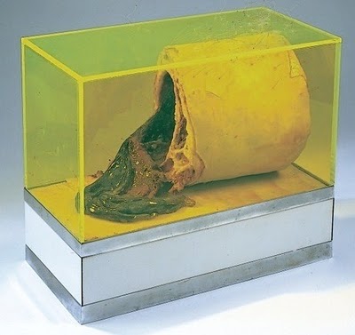
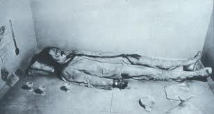
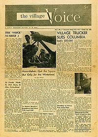
Thek's meat-box cul-de-sac was sealed by The Tomb (1967), a faux-minimalist geometric enclosure containing a latex cast of the artist's body altered to look truly ghastly. It was referred to in the press as The Death of a Hippie or simply The Hippie. It was even on the cover of the Village Voice, thanks to photographer Fred McDarrah.
In 1981, Thek wrote in a letter to a friend, in regard to his Hippie: "I really don't want to have to do that piece AGAIN! Oh God no! Imagine having to bury yourself over and over." After it was exhibited that year in Cologne, Thek refused to accept his dead puppet, his life-size Ken doll, his dozing zombie, from the shippers.
Thek turned his back at last on his pseudo-doppelganger, his latex alter-ego, his frozen golem. His notorious horror-movie Hippie, wearing pink clothes, with chopped-off fingers, bloated lips, and stringy, shoulder-length hair, languished in some warehouse of undeliverables, rejected shipments, nixed crates, orphaned boxes, still wearing the necklace partially fashioned out of Thek's own locks.
Seems like Thek had a bad temper and often acted impulsively. Not a good sign.
Gone. Only photos left now. The dead hippie died, but became yet another art-world legend. Nothing becomes a legend most than a lost or destroyed artwork, particularly if it has been well-documented.
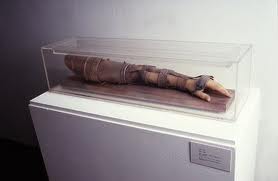
In a whirlwind of good taste, The Tomb is not recreated at the Whitney, but --- as befitting an icon --- is represented by photos and ephemera. This is a disappointment, until you think about it. In Thek's meat period, death is the theme, mixed with fallen warriors: Warrior's Arm (1966) and Warrior's Leg (1966-67). Dismemberment. Ancient Rome. Vietnam. Remember Vietnam? We hardly remember the invasion of Iraq.
The Exile's Inexplicable Return: Look Homeward, Angel
When our exile returned in 1976, the art world had still not recovered from the stock-market crash two years before. In what might have been a game-changer, Thek's 1977 show at the ICA Philadelphia, commandeered by Suzanne Delehanty, went ignored. You know the joke: I went to Philadelphia but it was closed. Yet Delehanty's saintly survey was ignored not because it was where it was, but because the work was too strange, off-the-map, and possibly too Catholic. It now looks like Delehanty was the saint, not Thek. He himself complained that Delehanty in the catalog emphasized his German-American Catholic roots and Catholic symbolism too much. Complain, complain.
Some who knew him have reported that he later tried to deny his homosexuality too.
Of course, things back then were not as free as now, when we can be more open, I hope --- unless you happen to be a United States Marine.
He kept on making art, continued to draw and write in his notebooks, and even showed some paintings on newspaper pages and, ripped from context, Pied Piper bronzes he had made in Europe. He hung his paintings low on the wall, fronting them with child's chairs. Very sweet. Reformed Thek? But none of this made a dent.
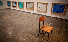 Why this lapse into obscurity? Why, in the first place, had he returned? Not a clue is offered in the otherwise exemplary catalog.
After his Euro-sojourn, he was plagued by rage. There weren't meds then for rage. Some have suggested that his rage was caused by undiagnosed and/or unacknowledged HIV/AIDS, which at that time presented little hope of survival. HIV sometimes directly attacks the brain cells, resulting in psychosis. But apparently he did not know he was HIV positive until a year before his death in 1988.
If that was the case, we cannot blame him for his behavior nor romanticize it.
He surely felt he had been abandoned by celebrated friends such as the writer Susan Sontag, who years before had dedicated her popular collection of essays, Against Interpretation, to him -- of all people. Their odd relationship was always a deep mystery to me. Miss Ice Queen photographed well and we all know that those who are photogenic have a better chance at fame. She stood firmly in the closet. In her writings she was often wrong, simplistic, and entirely too self-confident. Nevertheless, I suppose I have to say she is sorely missed, as perhaps the last popularizing proponent of the intellectual life.
And photographer and ex-lover Peter Hujar turned his back on Thek as well. It was on a 1963 trip to Italy with Hujar that Thek was turned on by the exposed corpses in the Capuchin catacombs of Polermo. This gruesome vision of mortality led to Thek's wax meat.
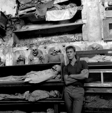
Peter Hujar, Paul Thek at Palermo Catacombs, 1963
Thanks to the catalog, I learned that in 1991, Times reviewer Holland Cotter had written in Art in America that by the time of his death in 1988, "Thek had alienated those closest to him, sabotaged practically every professional relationship and been for nearly a decade all but invisible in the New York art world."
I have another theory. Our exile's virtually invisible return merely illustrates the art-world adage: once you leave New York, you can't come back. (Which is just a variant of "out of sight, out of mind.") Even more recently, many an artist has lost his or her leg-up by taking a teaching job in Des Moines, or any other "Des Moines" of the collective mind.
Thek Trek: Europe Endless
Life is timeless
Europe endless
Parks, hotels and palaces
Europe endless
Promenades and avenues
Europe endless
Real life and postcard views
Europe endless
Elegance and decadence
Europe endless.
Europe was endless in 1977, and it kept right on being endless until just last week. Art is now global. But that's another problem. It's only global if you live in New York, London, or Berlin. And once the economy goes, so goes art.
* * *
After The Tomb, Thek died and went to Europe. We didn't see much of Thek's art in the Big Apple save his Fishman (another latex casting, but his replicated body this time clad in latex fish), which hung in a tree in the back courtyard of the Stable Gallery in 1969. Removed from the more complicated things he was doing in Europe, the piece made little impact and seemed gratuitous and shorn of the Christian symbolism it now bears. In short, his resurrection fell flat. A rotting corpse? Fine. A rebirth of the flesh? Too weird.
Could it be he was already no longer part of the Sontag circle? That his looks had faded?
Thek was brought up as a Catholic and it seemed to have stayed with him. During his Euro-nomad period he was fond of dipping in and out of monasteries, between gay escapades. Later, near death, he was rejected as a novice by a Carthusians in Vermont, most likely because they simply did not have the wherewithal to take care of someone so ill. Three months later he died.
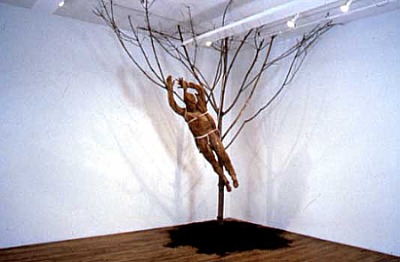
Thek: Fishman. 1970-71?
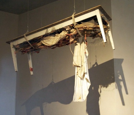
Thek: Fishman in Excelsis Table, 1971.
High Thek
In revolt against the commercialization of art in New York, of which he was part and by which he profited, Thek had has bigger fish to fry and better opportunities in Europe outside the reach of the Pace Gallery, once his dead hippie had made its nefarious mark.
Pace in New York in its infancy had represented him at his meat peak. That now venerable venue was known back then for showing plastic, and plastic within plastic. Pace was known for slick, not for turning over blue-chip art products, as the recent multi-location, 50th-anniversary celebration of itself would like us to believe.
Even Louise Nevelson seems to have been convinced to make Cubist "cities" of the stuff --- plastic. Chryssa, of the abstracted neon signs, was increasingly encased. She, by the way, triumphs in the oddly selected "Women Pop Artists" show imported from Philadelphia by the Brooklyn Museum. (An Eva Hesse joke? Martha Rosler's grad-school photomontages? An atypical Marta Minujin?)
We all remember this exchange in Mike Nichol's The Graduate (1967) :
Mr. McGuire: I just want to say one word to you - just one word.
Ben (played by Dustin Hoffmann): Yes sir.
Mr. McGuire: Are you listening?
Ben: Yes I am.
Mr. McGuire: 'Plastics.'
Ben: Exactly how do you mean?
Mr. McGuire: There's a great future in plastics. Think about it. Will you think about it?
Ben: Yes I will.
Mr. McGuire: Shh! Enough said. That's a deal.
And then Lucas Samaras was Paced and erased or plasticized, and a few others who have mercifully slipped my mind. Marjorie Strider at Pace briefly offered "cuties" with pop-out boobs, like the man-bait triptych now at The Brooklyn Museum, that didn't need to be encased.
Thek claimed that his Technological Reliquaries were a critique of Minimalism and to some extent of Pop. If that were his intention, it was not clear at the time. To claim that the "meat" had something to do with the then overpraised Norman O. Brown's reconciliation of body and mind was stretching it. If anything, the reliquaries were received as examples of latter-day Surrealism. The very bright critic Gene Swensen put forth this point of view.
I don't think the Reliquaries are surrealist at all. They are too good to be surrealist and go deeper than everyday dreams of the Freudian sort. The chunk of "meat" inside of the over-turned Warhol Brillo box is now an art-about-art classic. And the "rotting" gladiator arm shows how close Thek was to the underbelly of Catholicism.
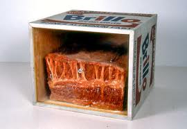
And then Thek really, really gets into trouble.
Thek's Euro-Works, even before the 1977 Philadelphia survey, were dismissed, misinterpreted or, more correctly misdiagnosed, even by such smart critics as Lawrence Alloway.
Postminimalism of the Robert Pincus-Witten stamp (his term having won out over Lucy Lippard's earlier, less toney "Eccentric Abstraction") was all the fashion, and although formwise Thek could have been fitted into, squeezed into, plopped into, dropped into the Postminimalism sub-category going by the name of Anti-Form (Morris felt pieces, Keith Sonnier's neon-and-cloth pieces, Thek's friend Eva Hesse's droopy latex, etc.), he was given the cold shoulder. Why? Anti-Form and Postminimalism, it was then agreed, like Pop and Minimalism before it, had to be devoid of self-expression and of up-front content. Both styles were seen as the antidotes to AbEx bombast and spirituality. Anti-form was not anti-formalism; it was formalism in a different form.
Ad Reinhardt's Zen Buddhism was tolerated because Buddhism has no godhead per se, but his interest in Christian mysticism, Rothko's in Judaism, Barnett Newman's Kabbalah references, Richard Pousette-Dart's high mysticism (or Pollock's Theosophical leanings) were systematically repressed. This has always been a puzzle to me. Well, perhaps not a puzzle. We do not want to offend the collectors, historians, curators, and critics, who apparently only subscribe to the Church of Capitalism.
Thek's references to penitence, reliquaries, erotic bondage, and his use of lawn dwarfs, lingering bits of fake flesh, and his innovative procession-format --- plus more Christian symbolism then the likes of Pincus-Witten, Lippard, and Alloway were likely to be able to handle or wanted to handle --- meant he was dead in the water. Holy water does not hold water. As you can see in the Whitney incarnation of Thek's work, High Thek is replete with head boxes and thrones with leather straps. Isn't this just a little too S & M? Was it, thanks to the Sontag curse, camp?
Plus, in some ways, like Andy Warhol (another secret Christian), he was just too gay. And didn't Thek use LSD like all the other hippies? Obviously a Jesus-Freak drug-addled elf. Also, what the hell was he doing in Europe? Reports surfaced that he had been seen cycling around Amsterdam with one ear painted red. Going from one orgy to another, no doubt.
I am not saying Middle-Thek is problem free. He borrowed voraciously from Beuys (whom he never met). An artist is sometimes at least partially defined by whom he or she steals from. Later back in N.Y.C. he seems to have been a bit too influenced by, his old friend Neil Jenny. And admitted it. Is that the real problem with the later work?
Why Middle Thek is High Thek
A lot of Middle Thek, was done collectively or semi-collectively. There was even a group called Artist Co-op which included Ann Wilson and photographer Edwin Klein. Above is Ann Wilson's recent Procession in Honor of Paul Thek, (2008), actualized at the SKM Karlsruha in Cologne upon the occasion of a Thek survey. It starts slowly with a little talk by her, but once the procession starts it is quite moving. The procession is also a tour of the survey that will give you an idea of Thek's European installations.
The idea of an installation as an artwork continually being made is far different from a pre-made, static installation or environment that the viewer experiences outside of time, like sculpture.
Precedents for the Thek-type of installation might be Claes Oldenburg's The Store (1961) and Robert Morris' Continuous Project Altered Daily (1969). You see the process in increments every day you return to the site. Each day is a different slice of that process, that slice of time. You don't see the final results of process --- except for perhaps the last day of the exhibition or in photos much later.
Thek's work along these lines came about because sculptures he himself had packed badly arrived broken at the Galerie M. E. Thelen in Essen (Germany) a few days before his exhibition was to open. The exhibition became A Procession in Honor of Aesthetic Progress: Objects to Theoretically Wear, Carry or Pull. (1969).
To Summarize Why Middle Thek is best:
1. Ephemeral post-studio process work shown in stages as it was made, sometimes collectively, at each site.
2. Innovative uses of materials and procedures, including the recycling of what might have been stand-alone pieces like Fishman to arrive intuitively at deep cultural and personal symbolism scorned by anti-form minimalists in U. S.
3. Subject is not just death (as with meat works, and The Tomb) but death and resurrection.
4. No longer as in his earlier work an attack on Pop and Minimalism, but possibly showing the way to another path out of Beuys other then Anti-form and "cool" Performance Art --- moving from the latter's social sculptures to socio-sexual rituals and processions as static formats.
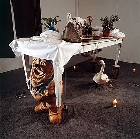
Thek: Dwarf Parade Table, 1969.
We must somehow jettison the notion that everything an artist does - even a great artist - is equally valuable. Well, yes, we fetishize every Duchamp scrap (which he probably intended, allegorist that he was), but also put too much value on some of Picasso's dreadful mistakes - whole decades of mistakes. Maybe everything Vermeer did was great. But he left so little.
When it comes to artists such as Thek who have great moments but not great careers, we have to be brave and chart the ups and downs and distinguish the strong work from the not-so-strong, the floundering about from the focused moments of genuine daring. The list of now-famous and highly marketable artists in this category is long indeed.
It is more important to make great art than to have a great career.
Paul Thek's art, however, now has a back story. It is perhaps not as deep and disturbing as Beuys' back story, but it is a back story nonetheless and should not be avoided.
Artopia version:
Charmed and handsome artist hits it big; turns his back on America, to wander from one big European show after another of ephemeral, improvised installations; exile returns and is scorned; sometimes works bagging groceries and as a hospital janitor. Diagnosed with HIV. Dies one year later of AIDS. His art is "rediscovered" two decades after his death, giving primacy to his prescient European installations known only through photographs, fragmental remains, and partial reconstructions.
We should judge artists by the peaks and not the furrows or flatlands stretching in all directions. Inspiration is wonderful and to be cherished no matter how briefly it lasts. But the artists themselves and their dealers, their curators and historians (both types beholden to access and largesse), and --- it goes with out saying - the artist's heirs or beneficiaries, all see every blessed artwork as equally successful and equally valuable.
Or, on the dark side, when a series of works no longer seems interesting, saleable, and/or relevant, the baby is likely to be thrown out with the bath. This is what almost happened to Thek.
Well, not on my watch.
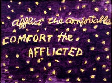
Thek: Afflict the Comfortable COMFORT THE AFFLICTED, 1985.
FOR AN AUTOMATIC ARTOPIA ALERT E-MAIL perreault@aol.com
NEVER MISS AN ARTOPIA ESSAY AGAIN!
John Perreault is on Facebook.
You can also follow John Perreault on Twitter: johnperreault
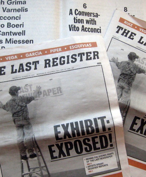
The Rules of the Game
Brought in by my poetry elder John Ashbery in 1961, I was interviewed and then hired by the editor of Art News, Thomas B. Hess, a famous critic of that time. The avuncular Mr. Hess offered two rules:
1. Never write a review of artworks you have not actually seen.
Reviews were supposed to be published when the exhibitions were still up o readers could cross-check your descriptions. (Only newspapers manage that now.) This meant the Art News reviewer had to make studio visits. Or, if the art were by a dead artist or someone abroad, you had the dealer pull the canvases out of some rack in the back. In both cases there could be a switcheroo, but you were mostly covered.
I now think that some reviewers must have been caught not seeing the art, relying on photographs supplied by the gallery, if anything at all. Studio visits and/or dealing with art dealers was a lot to ask for $4 a review.
Reproductions were not appended to each entry, by the way. It was all definitely on the cheap. And there lingered over everything Harold Rosenberg's hatred of color reproductions as misrepresentations of artworks. Better to have nothing at all. Did he foresee the MoMA Syndrome?
In his diatribes, Rosenberg did not compensate for a lack of imagery by peppering his words with vivid descriptions. He did not even cite titles of particular paintings. Despite his passion, and insights that were closer to the art and the artists than Clement Greenberg's formalist frames, one had the feeling you were thinking about art in some dark room -- a very large dark room, but a dark room nonetheless. Is a dark room better than a brightly lit Greenbergian morgue?
If reading this, you feel you have slipped into a time warp, don't worry. You actually have. Back in 1961, critics at Art News, which was pretty much the only game in town, were chosen from the latest crop of poets, not from graduate programs in art history or art "theory," as became the pattern at places like Artforum, with dire consequences.
Poets Ashbery and Frank O'Hara had worked out, so why not try the next generation of poets, such as Carter Ratcliff, Peter Schjeldahl, David Shapiro and even long-haired John Perreault? And if Perreault, why not Vito Acconci?
#2. Never write about your friends
Hess' reason for urging his army of poets not to write about their friends -- notice the assumption that poets would have artists as friends, which was likely then, but certainly not now -- was that no matter how much you praise your friends, it will never be praise enough. Oh, that Tom Hess, he certainly knew artists.
The point is not that one should or should not write about friends. My point is this: Hadn't Hess himself written about his buddies Willem de Kooning, Larry Rivers, Barnett Newman, and Fairfield Porter?
So in the spirit of Hess's "good for the goose but not for the gander" advice, I offer some new rules for art critics, poets or not.
And of course, in the sprit of Thomas Hess, I will break my own rules.
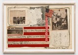
Judith Bernstein: Are You Running With Me Jesus? (1967)
I Wrote the Rules Today
#1. Never judge an exhibition by the title.
"The Last Newspaper" (New Museum to Jan. 9, 2011) is billed as "A major exhibition inspired by the ways artists approach the news and respond to the stories and images that command the headlines." If it is an exhibition about how artists have used newspapers in their art, it cannot in any way be about what the title says it is.
* * *
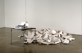
Hans Haacke: News (1969)
2. Never judge an exhibition by the press release.
Contrary to the intention of the curators and perhaps even to the intention of the artists, the mostly familiar artworks in the exhibition -- such as Hans Haacke's 1969 chestnut News, a wire-service news feed -- are really about newspapers becoming content over and above the news they supposedly convey.
But even this information does not make the play-it-by-the-numbers, grad-school assignment at work here any less dull.
The 27 artists in the exhibition purportedly "all disassemble and re-contextualize elements of the newspaper in an effort to take charge of, and remake, the transmission of information that defines our daily lives. Using methods of collage, mimicry, and repurposing, these works deconstruct the newspaper and address the ambiguity about what is 'news.' "
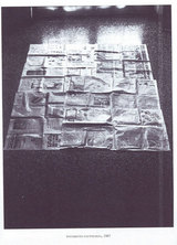
Luciano Fabro's 1967 Pavimento is a grid of newspaper pages mimicking the Italian custom of covering newly washed floors with same. How does this reflect "the mechanics of dispersal"? How does it "address the ambiguity about what is "news"?
Do Thomas Hirschhorn's newsprint dresses "deconstruct the newspaper"?
In order to see the vase, you may have to take out the flowers.
* * *
3. Never judge an exhibition by the art (or the art left out).
The examples included in the exhibition (some fine artworks in and of themselves) show news (Haacke) and/or newspapers (Robert Gober) as art material and/or subject.
Nevertheless, works from the late '60s also express the first wave of newspaper shrinkage that resulted from television subsuming news. Although most of the "classics" of what might be called News Art are on the 4th floor (and in the case of Hirschhorn's dresses, the 5th) and the new efforts on the 3rd, the exhibition is curiously ahistorical.
Where are copies of Andy Warhol's Interview?
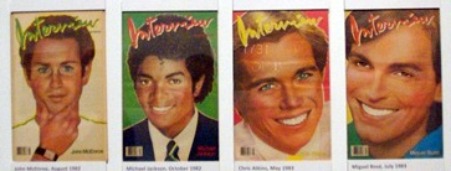
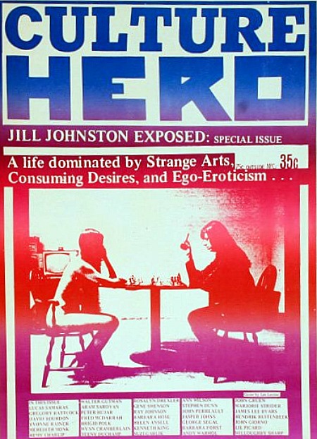
Les Levine's Culture Hero?
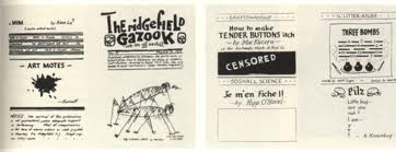
But why not go back even further? Picasso and Braque referenced newspapers in their Cubist smash-ups. Then I would have included Man Ray's four-fold broadside Ridgefield Gazook of 1915, featuring a drawing of grasshoppers mating.
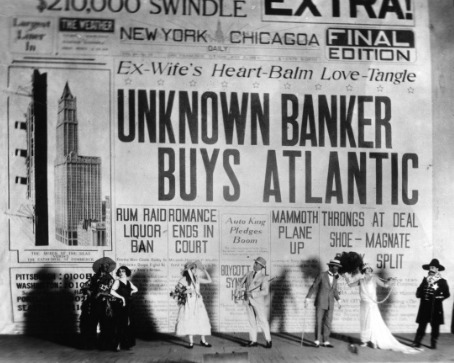
I would have reproduced Gerald Murphy's 1923 backdrop for Cole Porter's Parisian curtain-raiser Within the Quota.
#4. Never judge an exhibition by comparing it to the one you would have done.
In my exhibition -- which, of course, would have to have a different title and appear in a different, more educationally oriented and critically focused museum -- I would find a place in the exhibition itself for:
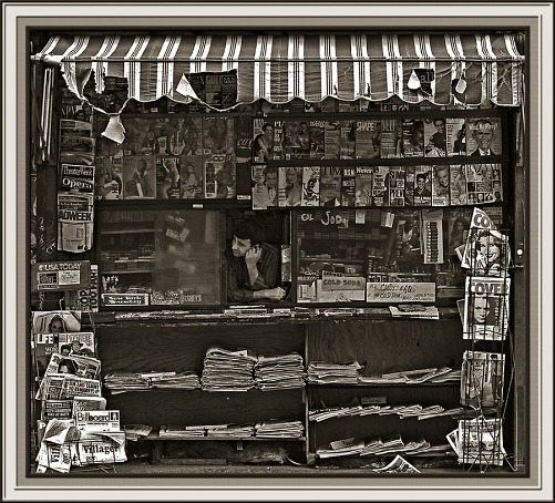
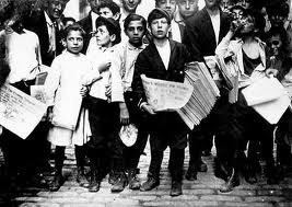
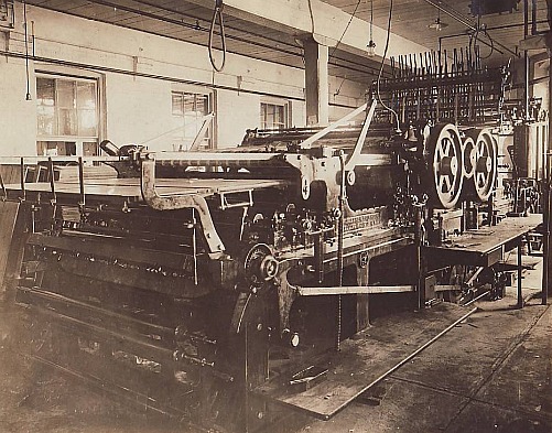
---Historic photos of newsstands, newsboys, and at least one printing press, to provide a context.
--Screenings of Citizen Kane and His Girl Friday.
---I would have shown newspapers once available in a particular year or within a selected decade. For instance, when my very own father, who read every newspaper in sight, for a short time had a newspaper delivery service at the Jersey Shore, here are the newspapers (c.1950) he handled:
Of local origin: Asbury Park Press and Trenton Times
Philadelphia: Philadelphia Inquirer, Bulletin, Philadelphia Daily News
North Jersey: Newark Star-Ledger, Newark Evening News, Jersey City Journal
New York City: New York Times, Herald Tribune, Journal American, Daily Mirror, Daily News, World-Telegram & Sun, Wall Street Journal, N.Y. Post, Jewish Daily Forward
Much to my father's annoyance and embarrassment, someone even demanded the Daily Worker.
---And I would have shown the tabloid-format papers that proliferated in New York City in the '60s and '70s.
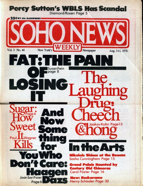
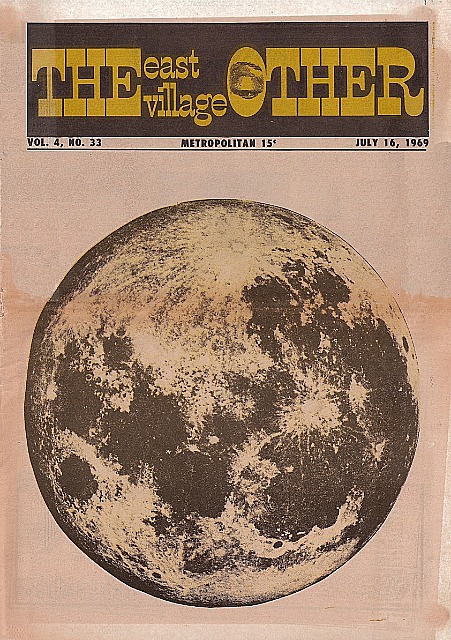
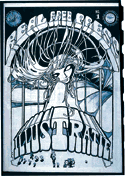
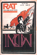
When I as art critic shifted from the Village Voice to the fledgling Soho Weekly News, there were many other tabloid-format weeklies, bimonthlies, monthlies. The East Village Other, Avatar, Rat, New York Free Press, Screw, New York Review of Sex, and that old stand-by the Villager come to mind. And there were others in cities across America.
![]()
In New York, the East Village Other and New York Review of Sex both offered art coverage. Lil Picard wrote for EVO, and Gregory Battcock, who had already debuted his series of art anthologies for Dutton (The New Art, etc....) wrote for the NYRS.
Read this LINK for the inside dope from a designer who once worked the underground newspaper field.
* * *
5. Never judge an exhibition by the catalog.
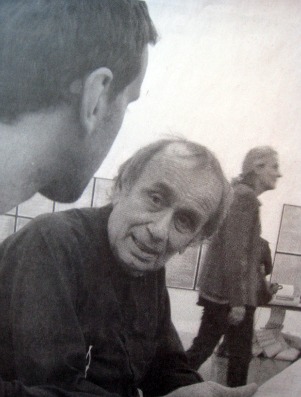
Viewing the production of a newspaper called The New City Reader tells you why the internet now rules. Newsprint is too labor-intensive. Or is it? Here I only saw two or three young men sitting in a kind of stupor. Perhaps they were thinking up headlines or ledes or kickers? Seeing the newspaper process implanted in the New Museum is a bit like watching paint dry, but at least in the issue I acquired there's an interview with artist/architect Vito Acconci. And we like the large format, intended to allow paste-ups on public walls.
Also offered is The Last Register, a free weekly that at the end of the whole shebang will serve as the catalog for the exhibition. True, in the issue I took home there's an article about artist Francesc Ruiz, who creates newsstands as sculptures, of which there are photos. None is in the exhibition; instead he creates cartoons for the back page of each Last Register issue. The paper is not badly done, but it is no substitute for a real catalog that one might want to consult when the exhibition is still available to be seen.
* * *
6. Never judge an exhibition, negatively or positively, by the curator's track record.
"The Last Newspaper" was organized by Richard Flood, chief curator of the New Museum, and Benjamin Godsill, curatorial associate.
Richard Flood is Chief Curator of the New Museum. Prior to his 2005 appointment at the New Museum, Flood was Chief Curator of the Walker Art Center, Minneapolis, where he organized a wide range of exhibitions, including "Brilliant!: New Art from London"; "Zero to Infinity: Arte Povera 1962-1972"; and solo exhibitions on the work of Robert Gober, Sigmar Polke, and Matthew Barney. Flood was previously curator of P.S.1, director of the Barbara Gladstone Gallery, and managing editor of Artforum magazine.
I Read the News Today
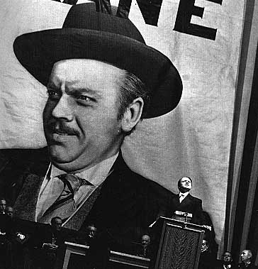
Newsprint rubs off on your fingers, leaving smudges on your nose. Oily, smelly. Extra, extra. Stop the presses. Men in rolled-up shirt sleeves pounding gigantic Remington mechanical typewriters. Stop the presses. Sheets of paper ripped from Remington rollers, crushed into balls and thrown on the floor. Spencer Tracy, Rosalind Russell. And, yes, director Sam Fuller, who once worked in a newsroom. Headlines, deadlines, breadlines, and blind items. Gossip columnists and racing sheets. Murderous art critics, as in Laura. The funnies and the daily dose of buxom cuties, baseball stars, movie stars, and machine-gunned corpses. Newsboys, newsstands, the special fold that turned a daily into a square flying saucer that could be skimmed to a porch. And where else would we get the phrase "phoning it in," i.e. by rote, composition by cliché.
And of course the ever-present fate of yesterday's black-and-white-and re(a)d- all-over: birdcage liners, fish wrapping, sponges for puppy pee and kitty poo. Or, in the hinterlands, sheets of outhouse toilet paper.
Newspapers are unclean.
Citizen Kane is a pain.
Should we pull the plug on print?
Don't have to. It's a done deal.
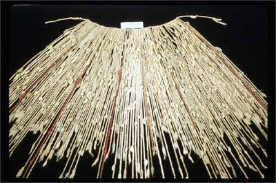
Inca Khipu -- knot language.
Books and libraries are next and probably art museums, which leads one to fantasize that there once was a totally digital world-wide civilization and then a passing comet demagnetized the files, unknotted the strings, caused a wave of amnesia that resulted in everyone forgetting how to open the files or what the knots meant. There is now, of course, not much physical evidence that such a civilization, along with its great art and magnificent literature and sprung-rhythm accounting system, ever existed.
FOR AN AUTOMATIC ARTOPIA ALERT E-MAIL perreault@aol.com
NEVER MISS AN ARTOPIA ESSAY AGAIN!
John Perreault is on Facebook.
You can also follow John Perreault on Twitter: johnperreault
