Artopia: May 2010 Archives
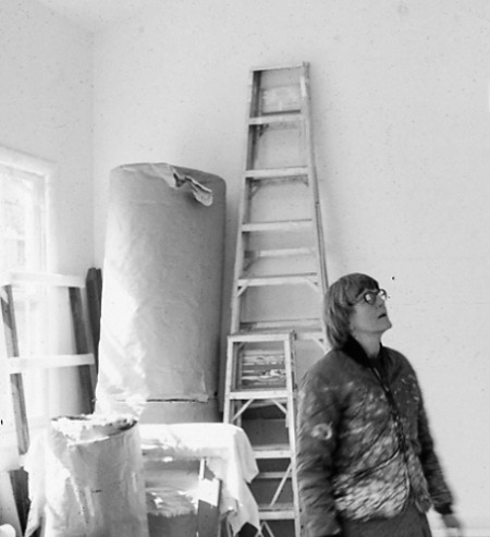
Had they been monochrome, the "objects" in Truitt's 1963 show would have qualified as first examples of orthodox Minimal Art and with the help of monochrome the artist would have been able to dissemble her feminine sensibility behind a more aggressively far-out non-art look, as so many masculine Minimalists have their rather feminine sensibilities.
--Clement Greenberg, "Truitt: Changer," Vogue Magazine,1968. Reprinted: The Collected Essays and Criticism: Modernism with a Vengeance 1957-1969.
Problems in Art Criticism: A Cautionary Tale?
From James Meyer's finely wrought interview in Artforum (May 2002) we learn of Anne Truitt's double-life: "I worked in between carpools and buying food and cooking and whatever else I had to do. I lived an outside life, but really I was living an inside life."
Divorced at last, she also was lucky enough to have a Guggenheim grant that allowed her to build a separate studio in her backyard.
This separation shows in her art. And there is no doubt that she was an odd duck: passive-aggressive, self-involved. She came from a "good" family, as did her husband. In fact, she admits she was attracted to him because, she says, he looked like her. Later, in and around the D.C. area, they were not exactly an invisible couple. They were associated with that moment's Camelot. Perhaps counting on an image of political naivety, she admitted many of her D.C. friends were in the C.I.A . Her husband James Truitt was personal assistant to the publisher of the powerful Washington Post and was even at one point publisher of ArtNews.
Thus ensued her curious life, moving here and there wherever hubby was employed, because she was the good and obedient wife and mother -- on the surface. Of course she never admits that some of the marital problems she encountered may not have been entirely her husband's fault.
She seems quite indifferent. They divorced; he remarried and moved to Mexico and later committed suicide. Figuratively speaking, she doesn't bat an eyelash. She is also icy about the mysterious love-diary written by a close friend who was one of JFK's secret flings, or why it was sought by the CIA, or what Truitt or her husband had to do with the scandal. Perhaps that is a mercy.
* * *
Another Truitt text has been released on online by the Archives of American Art of the Smithsonian Institutions. It is the entire transcript of a long and boring oral-history interview. Read it and weep. There is hardly anything about Truitt's art, and alas, the details of her domesticity are tedious. A life unedited is a life unseen. Even when she starts to make art, we don't care a fig. And neither does she, or so it seems. I thought I would find more details about her dealings with critic Greenberg or even juicy tidbits about JFK. No such luck. There is, however, one surprise.
When Truitt moved with her husband to Japan for a year or so, one of her few friends was the Artopia-approved James Lee Byars, who at one point gave her an artwork that required she destroy it:
I have not destroyed it. Imagine destroying it. I wasn't going to do that. But that was the whole essence of what his work was about, coming into being and going out of being, and about the passage of time. But we mustn't go off on him, because I could talk about him for hours. A very interesting man and a real friend, and the only person in all of Japan that I found with whom I could really talk. We used to converse back and forth. Compatible. He was compatible. Mad. Quite mad, but compatible.
Finally, he ran out of money, but that was usual; he never had any money. But he ran out of his visa, and that was a serious matter. Then they were going to deport him, so I called Maurice Tuchman at the Los Angeles County Museum. And greatly to his credit and forever to his credit, he met him at the airport. I put him on the plane in Japan and Maurice Tuchman met him in L.A. and took him under his wing and launched him into America.

And then there are her books of writings. Here's a sample quote from a sheet produced by the gallery that now handles her work:
Having taken off from the houses, trees, fences, and fields of my childhood...I very soon found that I was leaving the literal object behind...I discovered form and color, and ultimately to the work I am doing now, at once more austere in structure and more expressive in color....May 3,1975, Daybook
And similar clichés.
They have the considered pomposity of a nun or a schoolmarm and are in the tiresome Willa Cather declarative mode. Truitt, alas, seems also to aspire to that pinnacle of pomposity reached by Georgia O'Keeffe.
Problem: Must a critic consult an artist's life, statements, interviews?
Answer: It may be risky.
Articulation is not the product of intelligence; it is intelligence. Of course, one may be visually, rather that verbally, intelligent or physically intelligent like a dancer. We cannot expect all artists to be verbally intelligent, can we?
The MoMA Syndrome Strikes Again!
I have never really dealt with Truitt (1921-2004) in any serious way, but, if the truth be known, she has over and over induced in me what everyone now calls The MoMA Syndrome. As I explained in the last Artopia, we know what The Stendahl Syndrome is: Venice finally seen is simply too much. Newer and less known is The Paris Syndrome: tourists every year faint from disappointment when they finally see The City of Light. In a natural progression, I have identified The MoMA Syndrome as that feeling of disappointment when you finally see real art you have previously known only from reproductions. MoMA itself is not to blame; I merely use it as a symbol because it is lucky to have so many iconic artworks. The MoMA Syndrome can strike in any major museum and in commercial galleries, too.
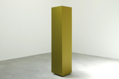
The MoMA Syndrome is not without problems. At the risk of trafficking in paradoxes, there is the unavoidable deception that occurs when using superior imagery to illustrate art you find wanting. You undercut your text. It only sets up false expectations. Should illustrations be eschewed? I was going to do that here, but thought better of it. The olive green/khaki monochrome, I reproduce is the best in the exhibition and shown all alone in a small room off the main exhibition space.
Also, there is the scary hypothesis that when the reproduction is more attractive than what is being pictured, it might be the image that is really the art. Purification is objectification. The virtual could become the fact.
I look at slide projections and color reproductions in books, magazines and now on the internet and always think that I love Truitt's work -- until I actually see it. In reality, the corners of the four-square columns are not crisp enough. The colors are lame and often pasty. Those "crowns" and dropped-panty "baseboards" are arbitrary. Oh, how I would like to love her work. Other than Helen Frankenthaler, she was really the only woman in Greenberg's pantheon. And a Minimalist! Well, almost a Minimalist, as we shall see. Perhaps a Minimalist by default.
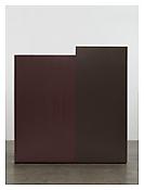 And Then There Were Three
Kenneth Noland told David Smith about her, and Smith told critic Greenberg: "And now there will be three," Truitt remembered Greenberg saying. He meant Noland, Morris Louis, and herself. Mind you, I say, not feisty Gene Davis with his vertical stripes. Not Sam Gilliam with his paint-soaked, unstretched, draped canvase. Not any other D.C. artist of the period.
I should like Truitt because I do have a taste for reduced forms and for color, and, I confess, always seek the mystic. I should like her because she seems finally (she later claimed) not to have followed Greenberg's orders; she thought he wanted her to be less Minimal. I think she should have been more Minimal, but simply did not have the talent or the nerve.
I should like Truitt because she is a woman and there were very few female artists who made it through the hoop during the period of the William Rubin/Clem Greenberg autocracy. (I almost said "anti-left" autocracy.) Although we know Uncle Clem moved from the left to the right, probably after the Hitler-Stalin Pact, I have no idea what Rubin's politics were. Of course, many in the '30s just gave up on Soviet Marxism, either transferring to Trotsky's Permanent Revolution or willfully sinking into denial about the Stalin-Hitler deal, like my old friend Alice Neel.
Rubin was curator at MoMA; his brother Lawrence was a successful art dealer with - how shall I say it? --- overlapping art tastes. He showed Frank Stella; MoMA showed Stella.
Uncle Clem
In regard to Uncle Clem, what we have against him now is that after championing Jackson Pollock and David Smith, he was wrong forever after. Jules Olitski was not a great painter; sugary is not augury. He may have been right about Kenneth Noland (1924-2010), but the jury is still out. The Guggenheim, which hosted a Noland retrospective in 1977, has dredged up a four-painting memorial show in its Monitor Gallery, just off the fourth-floor ramp. And Half, 1959, a "target", is quintessential. So too The Time (1967) in terms of the "horizontals" --- horizontal stripes, always wider than tall that seem vast and preternaturally flat at the same time. Trans Shift, 1964, is a failure, like most of the dynamic "chevrons." Strand, 1981, is an irregular, 8-sided shaped canvas that, in my view, is a disaster.
While promoting some very minor talents indeed -- I am not here referring to Noland --- Clem was unremitting in his hatred of Pop and Minimalism. Wrong, wrong. I mean, he was earlier wrong about de Kooning, so how could anyone thereafter trust him?
Here is a video that shows Uncle Clem at his most rhetorically deceptive, for who among us would want easy art and who would not want personal taste challenged, along with popular taste? Come on, be a man.
;
Minimalism in many ways developed out of Greenbergian formalism. Without Greenberg, there would not have been a Stella. Why didn't he see that Stella's black pinstripes and even his protractor paintings are beautifully inert and self-referring? He could not have known in the '60s that Stella would tank -- aesthetically speaking. And after two MoMA exhibitions. Nor does it make sense that Greenberg was not really sold on Barnett Newman and certainly not Ad Reinhardt.
Perhaps because Reinhardt stayed with his pre-War social commitments? Was Newman too much of an anarchist for Clem's Cold War politics? But, oh, not only are we not to mix art and life, we are not to mix art and politics, unless it is right-wing politics.
In real life -- I only met him once - Uncle Clem seemed benign and avuncular, and he certainly was not stupid. I had always admired his tough writing style. Here's a key paragraph that everyone knows by heart. It's wrong, but convincing because it sounds so good:
The essence of Modernism lies, as I see it, in the use of characteristic methods of discipline to criticize the discipline itself, not in order to subvert it but in order to entrench it more firmly in its area of competence.
We were the battling jurors of the Syracuse Scholar/Everson Museum of Art Drawing National in 1985. I was the curator of the Everson Museum upstate. I.M. Pei's photogenic building was already leaking and sinking. Syracuse University, on the hill, was Uncle Clem's alma mater and he still had some roots in that God-forsaken brown-soil town, once a canal hub, once an industrial center.
What I remember most vividly is that he voted for any female nude, no matter how ineptly drawn. The old satyr.
Interestingly enough, as I settled in as resident curator, local painters of a certain sort invited me to make studio visits. Artists are everywhere. I was shocked that they expected me, like Uncle Clem, to tell them what to do. There was even a Greenberg exercise they called "Around the Clock." A painting would be rotated until Uncle Clem decided which end was up.
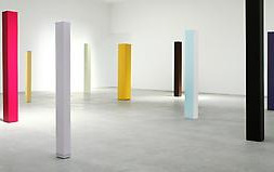
Is She or Isn't She?
I should like Truitt's work. But then I see the work in the flesh, as it were. There happens to be a goodly sampling now at Matthew Marks (522 W. 22nd St., to June 26), and I found myself looking forward to it, but it turns out that I had to circle and circle to find the good pieces, separating out far too many failures.
Since Truitt's work is at least quasi-sculptural, the installation video on the gallery website is better than most stills. Sculpture needs to be circled, and you need zooms and multiple points of view. But the camera eye always slicks up all surfaces and textural discontinuities. Since we are all photographers, we can translate what we are looking at into the cyclopean view, which is rectangular, flat and divorced from larger relationships. The cyclopean fixed image, however, is difficult to reverse. It sticks in the mind --- a memorial to the death of nuance, the destruction of time.
Uh-oh. MoMA Syndrome at work? Or are these pillars really dull?
Do I like that most of these cubic columns float an inch or so on hidden, recessed risers? It makes them less like Minimalist sculptures, that's for sure. But does it make them more like paintings? Yes and no. And I do like the vacillations between painting and sculpture. Artopia will always be in favor of the interstitial.
How Greenberg liked Truitt's work is still a mystery. It really cannot fit into his evolutionary art-determinism -- Picasso leading to David Smith in the same way that fish lead to amphibians and amphibians to dinosaurs. Or the way feudalism, leads to capitalism, which in turn must lead to communism.
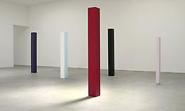
The Photogenic Jinx
To cut to the quick, Truitt's color/sculpture/things, like Pop Art, are photogenic. In real life, however, they disappoint. The works do not look good in groupings either. She herself never conceived of them that way. In fact, in the Myer interview she remembers her surprise at the installation of her first New York show at the André Emmerich Gallery in New York:
Let me go back to February 1963, with these three men--Bill Rubin, Clem, and Ken [Noland]--arranging the stuff in André's gallery. I was completely floored. I had never thought of the works together. I had simply thought of them as individual sculptures. I was astonished to see how they considered them in relation to one another. And they put two of them in the back room because they didn't "fit."
Greenberg lectured all and sundry that each medium should remain true to itself. Painting should be flat and have no illusions -- no tin cans or beer cans stuck on. And certainly not be produced by switching a stuffed goat for stretched canvas. He was a ruthless scold. Now, of course, it is easy to see that at the root of this was something deeply sexual: his fear of the interstitial. Not all Pop artists were gay. Greenberg's accusation against the Minimalists and what he calls "their femininity" (see quote at the top) is totally loony, unless in some backhanded way he wanted to indicate that everyone is both masculine and feminine.
Certainly Truitt's signature artworks are formally interstitial -- neither painting nor sculpture, but something in between. But why was she the exception to Greenberg's dictum? If her interviews are accurate, she had the charm of a wet mink coat.
Was it David Smith or Greenberg who was impressed by Truitt's social credentials? Is it permissible for a woman to be interstitial, but not a man?
This time -- and I think my last time -- I determined that Truitt's least fussy pieces are the most successful. Yet I would have liked her to have taken another step. The contrasting horizontal bands at the crown and/or base of the already too figurative pillars are not integral or really very interesting. They are like accents, and whatever oppositions or dialogues they set up with the main color could well be eliminated. She couldn't take what can only be called the John McCracken leap into totally acompositional color. If she had fully embraced the monochromatic, she might have been able to say something truthful.
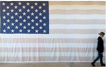
Faded Flag
Two works by two contemporary women artists also bring up some critical problems, none of which have to do with feminist content per se. That content is now a given; we applaud such content.
Mary Carlson's Flag, a gigantic, handmade, artificially faded Old Glory now hanging in the strange glassed-in space at Long Island University in Brooklyn (Humanities Gallery, 1 University Place, to June 11), is a knockout. Inspired by faded 9/11 flags she had seen, it is not, however, her first handmade flag. She made all-white "ghost" American flags in the early '90s, and again in '07. It was the January 2010 Campaign Financing Supreme Court ruling, allowing unlimited corporate political contributions, that caused her to take up needle and thread and sewing machine again, outdoing herself. The new "old" flag is perfect in scale and placement.
I perused the images on her website: yes, there are other flags.
The flags are by far her strongest work. And if I were to "Clem" her, I'd tell her to stick to flags; she needs a little bit of branding. Besides, a giant handmade flag -- thank you Betsey Ross -- is far different from an encaustic one concocted by Jasper Johns, but continues the argument with great force.
Should I, a critic, be telling artists what to do? Well, somebody has to keep them in line.
Walking Monument
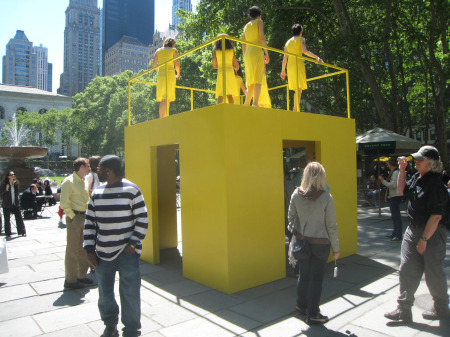
Kate Gilmore's snazzy Walk the Walk, sponsored by the Public Art Fund, was on display in Bryant Park behind the main branch of the New York Public Library, May 10-14. We have already mentioned Gilmore's excellent video/performance in the Whitney Biennial.
Trapped inside a double-walled, almost ceiling-high column of her own making, Gilmore, in a polka-dot dress, is seen from above kicking at the internal walls with her high heels trying to get to the top of the column, revealing glimpses of yellow. Will she make it to the top to escape, or at least to turn off the video camera?
We looked forward to seeing what Gilmore could do using seven women performers atop a yellow cube in the open air.
Unlike Roberta Smith in the New York Times, we were not at all disappointed. In fact, camera in hand, yours truly thought it was so good he considered doing his first circumambulation appropriation, snapshoting as he slowly circled the canary-yellow cube.
All in yellow skirts and white pumps, the women on top of the open cube walked aimlessly, randomly, but without being either sullen or sunny -- a neat trick. The yellow rhymed with passing taxicabs. The sound of heels could have been clog-dancing done by distracted deer. The spectacle made one think. A septet of secretaries? A paean to the unsung gofers in nearby offices? A sarcastic comment on voyeurism?
Here too it helps to know that a woman was responsible for the artwork. Produced by a man, the meaning would be different.
We too will congratulate Gilmore on her expansion; but Walk The Walk clearly is up to her usual level, if not beyond. She is kicking down another wall. Public art is seen by more non-art audiences than video, which (with the exception of YouTube incarnations) is indeed like "preaching to the converted."
* johnperreault is on Facebook.
* follow johnperreault on Twitter.
FOR AN AUTOMATIC ARTOPIA ALERT, PLEASE E-MAIL: perreault@aol.com
Sleepers Awake
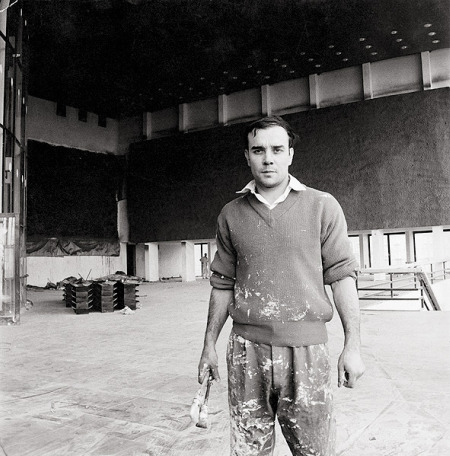
Not all museums are asleep. Some are trying to rope in customers by stealth or educational and internet outreach. Certainly the most innovative ploy is the Hirshhorn Museum's new effort, led by a Facebook experiment. A daily Facebook entry offers Yves Klein information-nuggets, up to the opening day of "Yves Klein: With the Void, Full Powers" (Washington, D.C., May 20 to Sept. 12).
Not a member of Facebook? Reading this entry after May 20? Never fear. You can access the installments on the Hirshhorn website by going to the Yves Klein Material Archive. So far, as of this writing, both the English translation of a 1957 radio interview and the one minute of Klein's own Judo film are essential.
What I call Twitter-koans can also be accessed through the Archive -- and, of course, on twitter.com itself. Although Klein was not a Zen adept, his mastery of Judo brings him "almost close," and thus his pithy conundrums are entirely appropriate for Twitter
Examples:
"Judo has helped me to understand that pictorial space is above all the product of spiritual exercises."
"Each defeat must be seen as an important step towards the final victory."
"Through color I feel the sentiment of complete identification with space; I am truly liberated."
