Artopia: March 2009 Archives
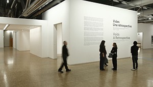
Being and Nothingness
What is the void? It is not a vacuum, nor is it emptiness. Whatever it is, it is decidedly not plural ....
Voids: A Retrospective is an exhibition that just closed at the Centre Pompidou in Paris, but it will make one more appearance -- at the site of the co-producer, the Kunstalle Bern in Switzerland. In its own way it is as important in our century as were certain exhibitions in the second half of the last: When Attitudes Become Form at the Kunsthalle, Bern, and Earth Art at Cornell University, both in '69.
This daring exhibition consists of nine empty rooms. Arranged chronologically by the date of their initial incarnations of the void, the artists are: Yves Klein (1958); Art & Language [Michael Baldwin, David Bainbridge Terry Atkinson and Harold Hurrell] (1966-67); Robert Barry (1979); Robert Irwin (1970); Laurie Parsons (1990); Bethan Huws (1993); Maria Eichhorn (2001); and Roman Ondák (2004).
Never mind that the use of the word retrospective is suspect. The term in English usually means an examination of the career of a single artist, not a survey or group show. I attribute this -- along with many other interesting anomalies in art and life -- to shaky translation. Not all words in different languages have exact equivalents. Or is this bending of a term meant to alert us to the unusual nature of the exhibition, the poetry of the concept?
The curators, who should receive full credit for their authorship, were John Armleder (an artist himself), Mathieu Copeland, Larent Le Bon, Gustav Metzger (artist pioneer of auto-destructive art), Mai-Thu Perret (artist) and Clive Phillpot (esteemed former librarian of New York's MoMA).
Making something out of nothing is hard work.
Before I go on to summarize each room -- you can find more information plus excerpts from the catalogue on the Pompidou website -- I must opine, as no doubt many have, upon the cleverness of reexamining well-regarded but perhaps misremembered exhibitions. Would we still be impressed by a recreation of MoMA's 1970 Information? Or further back, the historic Armory show of 1913?
I don't think we should let sleeping dogs lie. You can read and read and pore over press reports, contemporary art criticism, and scholarly footnotes, but actually seeing the selfsame artworks now would be ... well, a trip. To expand Heraclitus's aphorism that you cannot step into the same stream twice, if you have changed, then the art will have changed too. How could it be otherwise? I am thinking specifically of Klein's empty gallery.
The eight other rooms represent something else. They are exhibitions that have drifted from view, as it were, but nevertheless clearly are descendents of Klein's breakthrough. Some are daring, some are academic riffs, but all are worth looking at. Oops. I mean not looking at. I mean thinking about. We cannot let mere perception stand in the way of ideas.
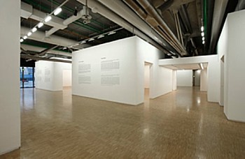
Empty Rooms -- Empty Mind
In terms of the void, only Yves Klein, who studied Judo and Zen, got it right. If he had been an Islamic mystic he would have been associated with the Path of Blame. His void was a scandal. Subsequent voids -- all empty galleries -- are merely about art, in one way or another. Just as Klein's faked photo of jumping out of a window was the essence of the void, so too was his empty gallery over 50 years ago. It was the first of its kind and, I think, remains the only one that is truly a void. It destroys his own oeuvre. It is a hole in the fabric of art. It is at the center of art. It has replaced the readymade. It is pure thought and pure emotion.
The Specialization of Sensibility in the Raw Material State Into Stabilized Pictorial Sensibility opened April 28, 1958 -- well, sort of opened, since the Iris Clert Gallery, freshly painted white, was illuminated but locked. No one was allowed inside. But Klein was not as forensic as his apologists would like him to be.
There was at least one more Klein "void." According to a Pompidou text: "A few months before his death on June 6, 1962, he produced his last 'void,' taking down paintings hung in one of the rooms of the musee d'Arte Moderne de Paris for the Salon Comparaisons."
Of course, in English there is a pun: To "void" is to shit. Had Klein been digesting Manzoni? Did he know enough English to perceive the pun?
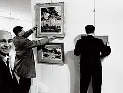
Yves Klein's last void.
Other Voices, Other Rooms
The trick to creating a new artwork that is an empty gallery -- so late in art, so after the fact -- is to force upon it a unique context or meaning. Labels and titles are the frames of these three-dimensional frames, these so-called voids. We bring to them all we know rather than confront what we do not and cannot know. We sense that under certain circumstances the void is palpable, but ultimately we are confronted by lessons in context.
Art and Language's Air Conditioning Show was meant "to question deeply rooted convictions about the nature of art and its relationship to its discursive and institutional context."
Robert Barry's Some places to which we can come, and for awhile "be free to think about what we are going to do." [Marcus], "invites the visitor to consider the exhibition space nor for what it is or what it has to show, but as a place to meet and reflect."
Robert Irwin's Experimental Situation posits that "a gallery is never truly empty, as every space has specific qualities that we can perceive."
Laurie Parsons' untitled exhibition, apparently her last, was her consideration of "the gallery itself, rather than continue to unquestioningly use it as a context." Parsons removed the exhibition from her resume, so "to respect Laurie Parsons' original gesture, there is not label bearing her name in the exhibition room." *
Bethan Huws's Haus Esters Piece (Museum Haus Esters, Krefeld) is a kind of readymade: "... struck by the beauty of the Mies van der Rohe building ... [she] decided to leave it empty, with a text available for visitors."*
Maria Eichhorn's Money (originally at the Kunsthalle Bern) is an empty room that resulted from her research into funding of the exhibition and her decision to devote the budget for her show to the renovation of the building.*
Roman Ondák's More Silent than Ever is "supposed to be equipped with a hidden listening device.*
Note: All rooms with an asterisk represent work by artists new to Artopia and who are now Artopia-approved.
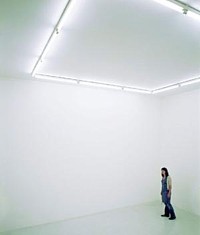
Roman Ondak, More Silent Than Ever, 2006
Null and Void
The emptiness frames itself, having been relieved of all other duties. An art space devoid of objects is much more effective as art than an empty frame hung on a wall, probably because it is not an object functioning as a sign, but a space serving as such.
The only thing that comes close to the empty-gallery feat are Robert Rauschenberg's all-white canvases of 1951. Or, yes, John Cage's 1952 silent composition 4'33". Is there an equivalent in literature? I know that somewhere someone has produced a novel that is all blank pages. If not, I will do so immediately. Aram Saroyan, when he was writing one-word poems, "published" a ream of blank typewriter paper.
Is there a dance equivalent to the empty room? I presented such an anti-dance, anti-artifact called SOLO (A Dance) in 1969 in a small Manhattan theater on West 3rd Street on a program with Vito Acconci and Bernar Venet. To the music of Swan Lake and then to a tape of jackhammers, I moved to specified positions on the stage between the lowering and raising of the stage lights. I moved in the dark, so no one in the audience of six -- count them, six -- actually saw me move. Scott Burton, who later created "living sculptures" theater pieces, worked the lights.
Vacancies
Concerning the show at the Pompidou, I have these nagging doubts. Were the rooms really empty? Was one room more empty than another? Were the rooms of different sizes? Did Klein get a bigger empty room than Art and Language? Did one room have more aura or more mana than another?
Did the preparators repaint all the rooms to obliterate the fingerprints and dirt- shadows of previous exhibitions?
I love the memory of a painting left on a wall when the painting is removed. I love the way a pedestal marks the floor.
This, of course, is related to the sadness of empty, recently vacated and not yet renovated rooms that I can view to my heart's content by searching Craigslist. I know this is a really depressing hobby of mine, but I can't stop looking. Someday I will make small paintings of them.
Not All Empty Rooms Are Alike
As already mentioned, Voids is traveling to Bern -- which probably means the labels and the catalogs are merely sent -- but it should have had a wider itinerary. Why did other institutions refuse to take the exhibition? Not enough space? You'd think that during a time of empty budgets a show of empty rooms would be perfect. No crating! No shipping! MoMA's cramped sixth floor would be perfect for showing nine empty rooms. For other large-scale works, MoMA our Mama, taking advantage of the real-estate downturn, should acquire the public library branch now up for sale across the street and the forever-empty former site of the American Craft Museum next door.
... And then I had the idea that I should pick up where Klein left off. As an artist I should just do empty rooms, but absolutely nothing else. And no trimmings or labels would explain the joke.
Taking a page from Ad Reinhardt-influenced Severe Minimalism, there would be no progress, no development. In some sense, once you had seen one you had seen them all. But in another sense, even rooms of the exact same dimensions would be quite different, because of differences in date, in geographical and institutional location, and because I would be a different age and of a slightly different disposition at the manifestation of each void. The rooms would be numbered, I guess, and include the name of the location: Empty Room #22, Philadelphia Museum of Art; Empty room #32, Gagosian Gallery, London; Empty Room #335, SFMOMA; Empty Room # 388, LACMA. Empty Room #498, the Rose Art Museum at Brandeis.
And then best of all, outdoing Severe Minimalism, my Empty Rooms would finally and totally obliterate originality.
Careerwise, my voids would easily be accepted into permanent collections, because no storage or climate control would be required. No security. No insurance. They could not be damaged by flood or fire. They could not end up at fire sales or in dumpsters. Of course, forgeries would be numerous, but loans to other institutions would be a snap, leaving aside whether or not you could charge for such a loan. I think you could, and in fact should, to guarantee the proper respect.
Furthermore, I now also claim authorship or hereby "sign" all empty galleries in art museums during the downtime between exhibitions when they are unavailable to the public.
And sales? I see no reason why collectors who in their daily lives deal in credit-default swaps and other derivatives would have any problem with owning an empty room, an empty gallery, an empty museum, or emptiness itself. Think of the investment potential. Think of how easily my voids could be smuggled from country to country.
But when I awakened from my dream I felt strangely empty. Would I have the discipline to continue creating one empty room after another? Would I be able to resist making things? If I were only concocting voids, what would fill the void in my life? Would I have to face The Void?
FOR AN AUTOMATIC ARTOPIA ALERT WITH EACH NEW ESSAY PLEASE CONTACT: perreault@aol.com
What The Art World Was
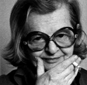
This is an odd, but fascinating book. Look Up: The Life and Art of Sacha Kolin by Lisa Thaler (Midmarch Arts Press, 2008) is the tale of an artist written not by an art historian, but by a genealogist and/or, as the author seems to prefer, a "family historian" using her professional tools ... and then some. In an afterword, Thaler discloses she was drawn to Kolin's story for three reasons:
I was curious about the children of the so-called illustrious immigrants. Little has been written about this younger generation of refugees. I was surprised that a prolific, exhibiting artist could have so quickly fallen into obscurity. And I was challenged by the research constraints and saw potential for innovations in my field. Could I read a painting the way I read a birth certificate?
This is the story of an "almost," an also-ran, a could-have-been -- yes, a failure -- who, according to many who knew her, was energetic and charming. For an art historian, art critic, or curator there would be no cash value or prestige in writing about a failed artist. We are, therefore, often denied the nitty-gritty taste of the real lives of artists -- most of whom are not superstars. Here we get the taste -- the bad taste.
If Look Up were to be made into a movie, it would show Kolin's art in 1981 being tossed into a dumpster outside an expensive Soho loft, then cut to author Thaler discovering a painting by Kolin in an art auction, falling in love with it, and finding out that she and a collector cousin now had Kolin in common.
Books about artists are either promotional tomes, often with serious and brilliant essays by noted art critics and art historians, or at the not-so-distant other end of the commercial spectrum, pop entertainments of the Lust for Life variety.
Concerning the latter, who now wants to read about the lives of artists when most are businessmen or -women? It's not entertaining to read about a visual arts CEO and his (mostly his) struggle with auction houses, dealers, and tax accountants.
But can you imagine -- even if you like his art, which I do -- a novelized life of Damien Hirst? Art has, alas, been thoroughly demythologized.
Look Up is a window into an art world that no longer exists. I don't think I ever met Sacha Kolin, and I am glad of that. But I could have met her. It's a Facebook (or as I call it, Facebutt) Effect: we had a few "friends" in common, and many more friends of friends. Far too many friends of friends. The author and I also overlap. Although she lives in Chicago, she studied contemporary art at Hunter College with Mary Miss, a sculptor I know.
Sacha Kolin, Departure, 1954 
Sacha Zelig
I think of Look Up as a kind of "found" novel. I would have loved to have invented both the subject (Kolin, pronounced ko-LEEN) and the author of record. Because the writing style is lean, the text could pass for latter-day modernism. It is just awkward enough in places to make the whole enterprise ring true. Everything is presented; very little is interpreted. What lesson are we being taught, if any? Is this a cautionary tale? Whatever happened to Truman Capote's Non-Fiction Novel genre?
The "author" -- far too obsessed with Kolin's Jewish roots -- is, while certainly not the main character, at least the dispassionate voiceover. Yes, Kolin, born in Paris of Ukrainian Jewish parents, was raised in Austria, where the family had to escape from the Nazis back to Paris, from where they had to escape again, not to Argentina with other relatives but to New York. New York of the Great Depression.
But the Kolins, Thaler admits -- undercutting her personal theme -- were assimilated and seemed not to have retained even cultural markers. Daddy Kolin was an inventor of some success, and with wife and unmarried 25-year-old daughter Sacha -- our heroine -- in tow, was able to afford various palatial Upper West Side apartments, at least up to a point. These digs no doubt had doormen and views of the Hudson.
In Austria, Daddy Kolin had developed "the first contra-rotating propellers in 1911, the first sonic tip speed propellers ... and the first airplane capable of vertical take off" and then in the '20s developed sorely needed, and very profitable, "grain sorting, cleaning and crushing machines." In the U.S. after the war he designed "turbo-pumps and inducers for rocket engines."
Because she had studied at the Weiner Kustgewerbeschule and the Vienna Academy of Fine Arts, Kolin claimed membership in the Vienna Secession. In Paris, she studied with Rodin's stone-carver.
And fresh to New York in 1936, brash Kolin joined every artist association it was possible to join. And pushed, pushed, pushed. She gave dinner parties and bought her clothes from a high-end clothing shop on Madison Avenue.
There was no stopping her. After World War II, she plied her ambition in Provincetown, Massachusetts, then a thriving summer art colony. The names ring a bell: she was a member of the Gallery 256 co-op along with Will Barnet and Louise Nevelson. Thaler found Franz Kline listed in Kolin's P-town address book.
Shape-shifting with every art-world tide, she showed at Guild Hall in East Hampton and then in Hampton Bays at David Burliuk's short-lived art gallery. Burliuk was the illustrious Ukrainian father of Japanese Futurism.
Although Kolin never embraced Abstract Expressionism or Pop, she had an Op Art moment. And then, at the height of her "career" -- when she had transformed herself into a Park Place/Primary Structures minimalist -- she showed at the Max Hutchinson Gallery in 1978. I knew some of that gang. And then too she bothered Andy Warhol and seems to have been actually friends with the notorious Ray Johnson of Mail Art infamy, who sometimes bothered me.
Kolin, Night and Day, 1956 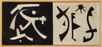
The Dark Side of the Heroic
Kolin was short and flamboyant, entertaining. She never lost her Middle European accent. Fearing dentists, later in life she was toothless but could still eat corn on the cob. Strong gums, indeed. And she was a chain-smoker, as were so many in the deep, dark past.
She stuck with Daddy and, after the early '60s, with her signature dogs, which were salukis - a kind of ancient Arabic greyhound. Her dogs were with her until the end. Although she had often espoused help for the homeless, she and Daddy and the dogs at one point were homeless and lived on the proverbial park bench and then -- to add a note of classy originality -- in a rented car, parked on a side street.
But this was not the end of her ups and downs. Daddy, who just went on and on and always wore a suit and tie, although increasingly rumpled, finally got stored away in a nursing home, where he delivered memoranda on how to improve efficiency.
As to Sacha herself, she kept plugging away, building up enormous bills at Dean & Deluca, the ritzy Soho food emporium. No matter how poor she was on any particular day -- waiting, waiting, telephoning over and over again, waiting for some art deal to come through, or some dinner party -- she never took the subway, but required cabs.
How did she survive? She was relentless, some say ruthless. She had confidence, as did the riverboat con men in Herman Melville's great 19th-century "postmodern" novel, The Confidence-Man, written about the time the term was first used.
She never held down a job. She never taught at some god-forsaken art school in Podunk. Her art was her only work. She traded art -- which she promoted as being far more valuable than it actually was -- for her rent, her clothes, her food, her medical attention. She was the queen of networking and the museum-donation triad: A donor in hand, she would persuade a museum director (often installed in a university museum) to agree to acquire one of her works -- a drawing, a painting, and eventually big-time Primary Structures for outside. She would have already "sold" the work to the collector at a bargain price, and then the "collector" would donate the work and be able to deduct the so-called market value of the piece from his taxes. Then, as now, artists were not allowed to deduct more than the cost of materials -- which, by the way, really needs to be changed.
This triad scam came into effect in the late '60s. And it did result in museums acquiring a lot of work they normally would not have been able to afford. So perhaps it was an indirect subsidy to museums (and in some way to galleries and artists, too). Direct subsidy, as through the newly founded National Endowment for the Arts, was soon quite iffy, given the rednecks in Congress and the generally anti-art, anti-artist prejudice of the unconverted. The latter probably realized unconsciously that art was a religion, and we have always been for the separation of church and state, right?
But the museums were happy. Although they may have been misguided by how well Kolin looked on paper, as it were, they expanded their "permanent" collections or acquired a big-time public marker for their lawns. The artist was happy. She made the sale and she was in yet another museum collection. When I briefly became the curator of the Everson Museum in Syracuse, New York, there was indeed a big Kolin in front of I. M. Pei's leaky cubic building. Flat roofs in snow country? Well, they looked good. And Kolin's sculpture seemed perfect, too.
Kolin (and unidentified man) in front of Sky #1, 1973, in front of the Everson Museum of Art, Syracuse.
Lost Horizons?
Oh, lost world! Kolin's world was not the semicorporate art world we now know. Go to art school; get a degree; show at Gagosian. Or die.
In contrast, her world still reeked of the Cedar Bar -- which everyone knew was not on Cedar Street but on University Place, walking distance from all the galleries on East 10th Street. It was not a place for women. Kolin herself complained about how women artists were treated and how they were often dismissed by male critics, male curators, male museum directors. She herself, however, had no women friends.
Art had not yet been demythologized. Art was still a belief system.
But why was she a failure? Her paintings were not all that original. She was always one step behind. And cheerful whimsy doesn't really have much staying power. Her sculptures done later on in life were much better.
Never had a retrospective in a New York museum. Never had an Abrams tome about her work. Although she had reviews in Art News and other magazines, she was never championed by a high-profile critic.
Look Up (titled after one of her paintings) is the life-of-an-artist as nightmare. And if you are foolish enough to identify with her, you will be sorry. Although she thought of herself merely as an exile, behind her awfully cheerful Miro-esque paintings, behind her leisurely suppers and elegant dogs, was the soul of a con artist.
After her beloved Daddy -- let's not go there! -- lost his earning power, which was years after he had been investigated by the F.B.I. for espionage, they lived by her wits and by barter. The check is in the mail, the rubber check. But in the meantime, Dear Landlord, why not take something much more valuable in lieu of stupid money: Here is a painting or a sculpture worth thousands.
Kolin with unidentified sculpture, c. 1973?
Multiple Endings
So you think having your art in the permanent collection of an art museum will guarantee immorality? Think again. The author reveals that "Nine out of 20 of the museums cited in her 1973 Everson exhibition catalogue have deaccessed all their Kolin holdings."
And then there is the image of the curb-side Soho dumpster piled with her stuff at life's end: paintings, drawings, cardboard maquettes for sculptures.
If this book were to be made into a movie, we would have to have a better ending. Mine would be that New York's Ukrainian Museum would give her a retrospective. After all, both her mother and father came from the Ukraine. Or are Jews from the Ukraine somehow not Ukrainian? Failing that, although she was totally assimilated, there's always the Jewish Museum. And someone in the New York Times would proclaim her a great rediscovery.
But as Graham Greene wrote in his now all too appropriate story "Across the Bridge" (about a con-man tycoon on the lam whose only friend is a stray dog), "Death doesn't change comedy into tragedy."
So, how is this for an ending? According to an informant, after refusing treatment for ovarian cancer, on her death bed she had the final word.
"What can I do for you?" The friend asked. "Out of the corner of her mouth, she said, 'Lobster.' So I bought a whole lobster just down the street. Sacha devoured it."
ALTHOUGH PAST ESSAYS CAN BE ACCESSED BY CLICKING ON "ARCHIVE" TO THE RIGHT (SCROLLING DOWN REVEALS SUBJECTS), NEVER MISS AN ARTOPIA ESSAY AGAIN!
FOR AN AUTOMATIC ARTOPIA ALERT CONTACT: perreault@aol.com
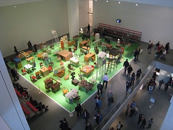
Martin Kippenberger: The Happy End of Franz Kafka's "Amerika," 1994.
How German Is It?
I have a problem with Martin Kippenberger. Not personally; after all, I never met him, but I have a problem with his work. It is not anything fancy as might be suggested by the awkward subtitle of the current festival at MoMA: "Martin Kippenberger: The Problem Perspective" (to May 11). If an art history graduate student were to use this phrase and I were the professor (which I have been), I would make the criminal leave the class, the university, the universe.
So, where to begin?
The best thing and simultaneously the worst thing one can say about the huge amount of "art" Kippenberger (1953-1997) left behind is that it is all so '80s. In order to really "get it," you had to be there, which does not bode well for immortality, does it? We like art that is anchored to its time and its culture, but if that is all it is, then we do not really cherish it. It has no -- perish the unfashionable thought --transcendence. In Artopia, the transcendent and the quotidian are not in opposition. In fact, they can be exactly the same.
Furthermore, to get it off my chest right at the beginning, this once again fashionable artist left no oeuvre. He left jigsaw-puzzle pieces that, even when you put them together, won't add up to a pretty picture, an ugly picture, or any picture at all.

But I have to confess that the '80s was not a period I liked. The new art was all supposed to be post-Postminimalism or postmodern, and most of it was pretty dumb. The market reigned, most critics cow-towed, capitulated; went to dinner, dining on the fatted calf.
Kippenberger, Disco Bomb, 1989
Surely, art about art was nothing new. I had been teaching that
aspect of art since the '60s. What was different about the "bad painting" and most of the lightweight lifting of the period was that art about art was all most of the art was about. To me it looked academic. It was quotation art, It was footnote art. And that still holds true for many Big Names from the '80s.
There was no peeling away of the given. There was no attack on the bourgeois. The art world had become the bourgeoisie. Artists had lost their calling. Art was product. The practical aspects of the art enterprise became the center and not just the unavoidable support structure. The clever or their clever apologists claimed that the various product lines were critical of the very thing that made them marketable. But never before had such tepid irony been put to such tepid use.
At least Kippenberger was rambunctious, was vulgar. At least Kippenberger was sometimes abject, forlorn, ridiculous. As a failed, fancied or would-be actor, he was so bad at acting that his attempt at filling the role of artist was transparently a kind of silly -- sometimes petulant, sometimes hilarious -- form of acting-out. The products he produced in his art "factory" are not art; they are props. He invented Prop Art
 .
.
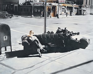
No one wanted so much to be bad as poor Kippenberger, hence Martin, Into the Corner, You Should Be Ashamed of Yourself (1989), a 3-D "self-portrait" of the bad boy forced to stand in a corner, oh, just hoping to be spanked. As an example of failure -- which, oddly, is its strength -- it is not much different from the painted-to-order 1981 photorealist piece of junk showing Kippenberger posing and looking much like his idol, screen-star Helmet Berger, on an abandoned sofa in a New York street from the series called "Dear Painter, Paint for Me."
Being an artist is a way of composing yourself. Or inventing yourself. Uncle Andy knew that, and much earlier. In Artopia we see Warhol's silkscreen paintings of Marilyn, Elvis, Troy, Liza, Jackie not as evidence of a poor boy from Pittsburgh trying to shine up to the stars, but as delicious, malicious deviousness. He was creating a context, a platform, for the introduction of Andy Superstar, Andy Warhola's greatest creation. With his index finger held up to his lip - like Redon's Silence? - Andy is the triumph of ambition over false modesty. What was the secret he eternally asks us not to share?
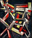
Kippenberger: With the Best Will in the World I Can't See a Swastika, 1984
The Secret of Success
To his credit, Kippenberger apparently was also out to get at or to Oedipize some of the most pompous artists who have ever stalked the earth. Here we have to time-trip to the '80s, in Germany. Yes, Germany. For Kippenberger was about as German -- at least as post-Checkpoint Charlie German -- as one can get. I doubt that he had much love for the great Joseph Beuys, now safely enshrined in Artopia Valhalla. Kippenberger's satires of the role of the artist in Western society -- substituting the actor and the buffoon for the martyr and the saint -- are aimed at The Master Himself. Beuys's multivalent performances -- such as the remarkable How to Explain Art to a Dead Hare -- are transformed into Kippenberger babbling to himself: "If everything is good, then nothing is good anymore."
So what.
Don't be such a baby.
Kippenberger is the anti-Beuys. His Germany is not the Germany of Siegfried but the Germany of beer and bratwurst. And yet .... What are we to make of Kippenberger's backhanded loyalty to the cult of the artist? Misplaced Romanticism? Deutsche Punk?
No. In the hands of Kippenberger (or those of his many studio assistants), the lesser fish are much more efficiently speared. I mean, horror of horrors, the unholy three: Sigmar Polke, Gerhard Richter, and Anselm Kiefer. This loathsome trinity performed the same function that David Salle and his like performed in the U.S. They returned art to painting -- safe, dreary, saleable "painting." They delivered the goods. But with just the right edge. Naughty, but supremely digestible.
What is the connection between pastry and pastiche?
Goodbye to performance art, non-object conceptualism and even to Earth Art. Collectors must have normal art for their investment portfolios.
How do you stick it to Gerhard Richter? Well, first you hire someone to make a photorealist painting of two tipsy lads walking down a busy street in broad daylight. But if that is not good enough or obvious enough, you buy one of Richter's small, very boring abstractions -- just as boring as his photorealist paintings -- put legs on it to turn it into a coffee table, and then sell this assisted readymade for less than you paid for the Richter itself.
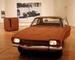
How do you answer the pompous straw paintings of Anselm Kiefer? You cover a much admired, American-made Ford Capri with brown paint and oat flakes, hence Capri by Night, 1982.
How do you take a poke at Sigmar Polke? You make your own paintings of overlapping banal imagery.
Is Kippenberger any better then Polke/Richter/Kiefer? Only a smidgeon. What saved him was his lack of talent.
My Kippenberger problem is one of gilt by opposition. What does it mean when pretty much all you can say about an artist is that at least he is not like X, Y, or Z? Which would be like saying that Jasper Johns is great because at least he is not Robert Motherwell or Helen Frankenthaler or Jules Olitski.
Kippenberger was severely limited. He does not appear to have been particularly smart or good at making things.
Because of this, he was both a literal and a psychological Bricoleur - pace Claude Levis-Strauss -- rather than an Engineer. That I have to use the terms of that recherché dualist is telling.
Kippy took things from here and there: ideas, old pieces of furniture, personae. And because of his lack of talent he was able to allow emotions normally forbidden to the art of the period: sadness, childishness, and, yes, despair. Because he had no talent, he had to steal from everyone, parody everyone, and use gross humor to make his way.
On top of this, it now looks like he was also out to get Warhol, Sol LeWitt, and, best of all, Pablo Picasso.
With his endless production of posters, books, and "artworks" of all kinds, our Bad Puppy (unlike his Bad Yuppie American counterparts) aimed to out-produce dear old Andy. With his scary and ultimately very moving Kafka piece -- The Happy End of Franz Kafka's "Amerika" (1994) -- he was out to skewer the theme-and-variation investigations of Sol LeWitt. See here LeWitt's Three-Part Variations on Three Different Kinds of Cubes (1967-71), truly an Artopia favorite. Instead of cubes, we get Kippenberger's variations of the interview table with two opposing chairs -- thus revealing the Kafka underpinnings of some of the most beautiful work produced in the generation that came before.
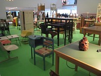
The scene constructed by Kippy Inc. is a forlorn employment office for immigrants, furnished from some Salvation Army outlet in hell. Nowadays, the downsized (i.e. the suddenly fired) can apply for unemployment insurance online -- using public-access computers in libraries or their Blackberries, but they are not spared cabin fever.
Celestial justice has deemed that now every American must feel like an immigrant again, as homeless stockbrokers and bankers wander with their ever-younger replacement wives and their mall-rat broods from one broken-open, abandoned McMansion to the next, dining out on rusty lettuce left outside in garbage cans behind fast-food joints, charging up their cellphones and portable computers (if they still have them) in the few unprotected electric sockets in public places. They go to Long Island railroad stations in their suits not to commute, but to recharge their batteries. Greed was their creed. And now they wait to be interviewed in the soccer field of Kippenberger's The Happy End of Franz Kafka's "Amerika."
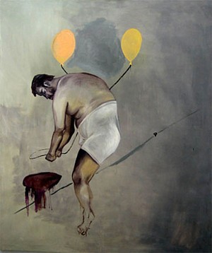
And the late Kippenberger self-portraits? Mr. Gross shows himself not as the movie-star wannabe of his youth, but as a bloated Picasso. And only in his 40s. Those diaper-like underpants, once worn by Picasso and appropriated by Crazy Uncle Kip, will never go away, which is a lesson for us all. What was Pablo thinking when he allowed himself to be photographed wearing these abominations? And what was Kippenberger thinking? There is both fear and glory. We now like our artists trim and well-disciplined. Kippenberger was neither. Duchamp would never allowed himself to be photographed in droopy drawers.
We also like our artists sober. I wish I could say that Kippenberger aptly illustrated the Blake adage -- and official Artopia motto ---that the road of excess leads to the palace of wisdom. No such luck. Known for singing boisterously and dropping his pants at the drop of a hat, Kippenberger, who died at 44, was not about self-possession or wisdom. He could hardly stand up.
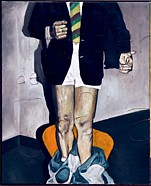
Kippenberger: (detail) Down with Inflation, 1984
NEVER MISS AN ENTRY AGAIN! FOR AN AUTOMATIC ARTOPIA ALERT, NOTIFY perreault@aol.com
|
The Turn of the Screwed
Judith Bernstein's outrageously penile screw drawings continue to be anti-war, anti-sexist statements that rise above simplistic agitprop. Her show last year at the Mitchell Algus Gallery in Chelsea garnered considerable attention.
The first art critic to review her work (in the Village Voice in 1973), I have been a long-time champion. Recently, I introduced her talk at the Drawing Center in SoHo and, through the miracle of my new Flip digital recorder and YouTube, I can share a 10-minute clip right here:
Many thanks to Judith Bernstein, to the Drawing Center and its executive director Brett Littman.
AJ Ads
AJ Blogs
AJBlogCentral | rssculture
Terry Teachout on the arts in New York City
Andrew Taylor on the business of arts & culture
rock culture approximately
Laura Collins-Hughes on arts, culture and coverage
Richard Kessler on arts education
Douglas McLennan's blog
Dalouge Smith advocates for the Arts
Art from the American Outback
For immediate release: the arts are marketable
No genre is the new genre
David Jays on theatre and dance
Paul Levy measures the Angles
Judith H. Dobrzynski on Culture
John Rockwell on the arts
Jan Herman - arts, media & culture with 'tude
dance
Apollinaire Scherr talks about dance
Tobi Tobias on dance et al...
jazz
Howard Mandel's freelance Urban Improvisation
Focus on New Orleans. Jazz and Other Sounds
Doug Ramsey on Jazz and other matters...
media
Jeff Weinstein's Cultural Mixology
Martha Bayles on Film...
classical music
Fresh ideas on building arts communities
Greg Sandow performs a book-in-progress
Exploring Orchestras w/ Henry Fogel
Harvey Sachs on music, and various digressions
Bruce Brubaker on all things Piano
Kyle Gann on music after the fact
Greg Sandow on the future of Classical Music
Norman Lebrecht on Shifting Sound Worlds
publishing
Jerome Weeks on Books
Scott McLemee on books, ideas & trash-culture ephemera
theatre
Wendy Rosenfield: covering drama, onstage and off
Chloe Veltman on how culture will save the world
visual
Public Art, Public Space
Regina Hackett takes her Art To Go
John Perreault's art diary
Lee Rosenbaum's Cultural Commentary
Tyler Green's modern & contemporary art blog
