Artopia: April 2008 Archives
New Orleans has been turned upside down. New art, new food, new people. Disasters are opportunities, if you live to tell the tale. Homeowners become homeless; art critics become ace reporters; neighborhoods disappear and new ones are invented. Real estate opportunities abound.
New Orleans post-Katrina, at least on the high ground in the well-worn tourist parts, is like a dreamscape you have visited many times but never in real life. Everything seems familiar. I recognize the city. The city recognizes me.
I have a dream city I sometimes enter. I look around and immediately think: I am here again. Objectively, each time it may be a different place or a composite of places I have been. It is familiarity and recognition that is repeated, not any particular city.
But is the meaning the same?
For me, New Orleans is closest to that familiar place, the place of recognitions.
* * *
The Big Easy is warm compared to the Big Apple. Ferns and flowers proliferate beneath a chilly, slightly menacing slate-gray sky. The iron balconies in the Vieux Carré are still strewn with plastic Fat Tuesday throws. And so are some of the trees. Mardi Gras never stops.
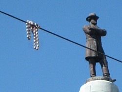
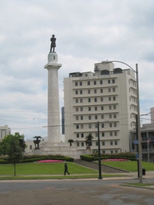
Through my boutique hotel window on Lee Circle - a no man's land where the Central Business District (the CBD), the Warehouse Art Gallery District, and the Garden District converge -- a plastic necklace suspended on an electric wire floats in front of General Lee. The statue of Lee looks away from the Anglophonic Garden District behind it and avoids the Ogden Museum of Southern Art and the Civil War Museum to the right and gazes down Charles Street towards the French Quarter, while the Charles Street trolley half-circles Lee Circle, once in each direction. I pretend I can see the streetcar named Desire, which I know exists. In the past, I rode it once. In the cultural capital of the South, Desire is a real street.
 I recognize it all, but the atmosphere is weird -- rather like a de Chirico painting with Spanish moss; rather like a sigh.
At first I couldn't put my finger on it, aside from the suspicion that there were fewer tourists, which is good for lone visitors, such as myself, but bad for tourism, the major industry of NOLA -- New Orleans, Louisiana, to spell it out. NOLA is also called the Queen City of the South, Crescent City, Saint City, City of Mystery, Chef City, City of Vampires, The City That Care Forgot, the Paris of the South, the City of Nicknames. Although The Big Easy is the official pet-name, the moniker of record, we could also call it Pork City or Art City, as you will soon find out. Or City of Shame, Capital of Global Warming, and the Museum of Faulty Engineering.
What was missing?
Well, for starters, one quarter of the population, mostly black. I didn't see any of the 140,000 deadly, formaldehyde-infused, Federal Emergency Management Agency trailers used to house homeless flood victims, but I did glimpse an enclave of igloo tents under a freeway ramp. I also heard Spanish where Spanish has not recently been spoken.
Food Is Art
Hotels are bargains, and the high-art restaurants, supported by one of the world's greatest indigenous eating cultures, are up to speed, including a few I hadn't been to before. And since everyone who is interested in art is interested in food, I'll recommend Cochon and Herbsaint.
Both shrines to pork are near the warehouse art district and purvey the culinary creations of prizewinning chef Donald Link. Link has a James Beard Prize to his credit. At both nouveau-Cajun outposts, you might make a meal of several small- plate "appetizers" in order to sample some of the tasty things that can be done with all the parts of the pig that can be eaten -- which, to recycle a cliché, is everything but the oink. And upriver in Cajun country -- the inspiration for Cochon and Herbsaint -- they're working on the oink.
I finally had head cheese the way it is supposed to be made, unlike my father's French Canadian failures. At Cochon it was a thin slab served with little pieces of toast and seeded mustard, presented, I swear, as delicately as if it were caviar. Head cheese is not as rubbery as everyone expects; certainly not at Cochon. And it is so salty and savory that your mind simply does not focus on the little bits of things suspended in the pig's-head aspic. After ingesting it, would I think the thoughts the pig had thought?
And how could I resist deep-fried slivers of pig's ears, which are even closer to my personal yuk level? Would I hear what last the pig had heard?
 Signature plates: The "dressed" oyster-and-bacon sandwich entrée, really a Gulf Coast BLT, at Cochon was like biting into a deep-fried cloud. At Herbsaint, the mysterious breaded and deep-fried soft-boiled egg burst under my fork, spilling egg yolk on a small nest of spaghetti coated with super-rich pancetta-studded cream.
Who says there's nothing left to be done with textures and flavors in food? Who says the unctuous is outré? Not me; not anymore.
And for a change of pace, the Tuesday lunch "express" at Lüke (which features German and French food) was Cochon de lait: a cube of roasted pork topped with a crispy square of skin as a kind of icing on the porcine cake. The honored and honorable cube was smothered with a luscious brown gravy, no doubt made with a lard roux and pork drippings, all balanced by a perfect potato purée off to the side ...
Periodically, I would phone My Editor, food critic emeritus Dr. Jeff, to issue a Pork Report. He, the Baudelaire of food, was audibly envious and immediately began looking for cheap airfares. To read Jeff's recent potato piece click here.
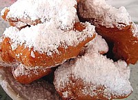 And by the way, the beignets at the Café Du Monde in the Quarter are even better than I remembered. Fortunately, I also had a vivid recollection of powdered sugar from these heavenly deep-fried blobs dusting and temporarily ruining too many items of dark clothing in the past. Knowing where I was going for breakfast, I dressed pale and white, even though it was not yet the day after Memorial Day.
In Cemetery City, gentlemen may wear white throughout the year.
It must be those little sips of absinthe (detoxified but legalized at last) that keep our elders impervious to both summer vapors and winter chill, as was once the case with many maiden aunts who took their essence of wormwood in dainty teacups.
But now, I am told, in public at least you have to do the sugar and spoon and flask of water thing, hoping that no one will think you are about to shoot up.
Notice how swiftly the New Orleans of the Imagination takes over every tale; how cunningly literature invades every trope! I hate Tennessee Williams. But slipping into the swamps of literature and/or Hollywood is all part of the NOLA-Roller Braid, the Time Travel Tongue-in-Cheek Fugue.
Art Is Food
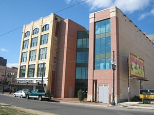
I was in New Orleans to speak on the subject of contemporary craft, a topic that always inspires me to an Artopian turn: "Hand Made: The Blur Between Contemporary Art and Contemporary Craft." The well-attended gathering was at Louisiana Artworks, a spectacular new craft center opening in calibrated stages near Lee Circle. Artworks has claimed an old furniture department store and then some. Soon visitors will be able to view glassblowing, pottery, and metalwork from a series of spectacular Piranesian ramps and walkways. I was on an initial advisory panel years ago, and now, to paraphrase Artworks director Joy Glidden (once director of the DUMBO Art Center in Brooklyn), it's bigger than the Whitney. That would be 93,000 square feet. There will also be 19 artist studios and the requisite galleries, gift shops, and -- hey, we are in New Orleans -- a restaurant.
I was delighted to see fellow panelist Beth Lipman, with whom I used to work at Urbanglass in Brooklyn. She makes brilliant blown-glass versions of famous still-life paintings, turning the two-dimensional depiction of three-dimensional tabletops back into three-dimensional versions in clear glass. Some of these are photographed and then destroyed, leaving the two-dimensional photo version of the three-dimensional version of the two-dimensional source painting as the 2-D work of art.
I began by saying that I have always liked operating in the blur or the borderland between sculpture and craft, between art and poetry, and between art criticism and fiction. And then I floated the idea that contemporary craft and contemporary art (i.e., painting and sculpture) were both art, but were as different from each other as Cajun French and Parisian French, each with slightly different histories and slightly different forms of expression.
Then I hit them with the idea that we shouldn't think of art as religion. Because polytheism is repulsive to most of us, that persistent mistake pressures us to think art also has to be monotheistic.
I thought I heard someone in the audience shout out, Yes!
Instead it is more helpful and realistic to think of art as food, perhaps a huge banquet.
Yes, yes!
Some days you might like roast pork and some days crawfish pie. You might die for desserts, whereas I prefer soup. One day you might want all vegetables. And your neighbor might have a yen for boudin. You could make yourself sick by eating only brown rice -- or just pork, no matter how delicious.
I felt I was preaching a new gospel.
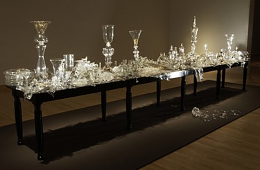
Beth Lipman: Bancketje, 2003.
Blown glass.
But then, never one to simplify, I offered two endings to my introduction, two endings that could be beginnings:
Ending Number One: Borderlands and blurs are zones of freedom.
The blur between craft and art makes some people uncomfortable because it stands for the blur between countries (and thus languages), and possibly the porousness and even the dismantling of all borders, all nationalities and perhaps, even more disconcerting, the separation and ranking of genders. Thus our blur is perfectly attuned to how the world is now.
Ending Number Two: Separating art and craft is a way of separating artists.
From some points of view, there is too much art being produced, and the art pile needs to be winnowed. Too much of a good thing can lessen economic value and/or profit. If we add to paintings and sculptures ceramic bowls, blown glass, art furniture, quilts and weavings, how will the art world be able to handle all this excess? How will it determine winners and losers? It can barely do that now, limited to painting and sculpture. There is too much competition already. Imagine doubling, perhaps tripling the competitors?
There are at least an equal number of craftspersons as there are art-world artists. If the two groups were to unite, that would be quite a political demographic. Artists of both kinds are thorns in the sides of those who have elected more boring, but perhaps more predictable and more lucrative, means of employment. How annoying it is to see someone actually enjoying his or her work. Truly, as we say in Artopia, there will not be happiness on earth until everyone is an artist, of some sort or another.
A Tourist Wherever I Am, Even at Home
In the meantime, the museums I passed were not exactly packing them in. Museum City has 60 or so museums of various kinds -- really, really various kinds. Near my hotel, the World War II Museum, not too long ago referred to as "the most successful new museum in the world," was empty. There is also a Civil War Museum in a massive fortress designed by H. H. Richardson, but it's closed for restoration. So far, no Katrina Museum, but in a tourist town such as Bus Tour City, I bet they're working on it.
Speaking of tours, Times-Picayune art critic Doug MacCash took me on a tour of the hard-hit Lakeview District, where he and his editor earned their Pulitzer with virtually real-time coverage of the flooding. Doug used to write reviews for me when I was editor of GLASS Magazine: he was our man in New Orleans. Thanks to glass and metal sculptor Gene Goss at Tulane, New Orleans can also be called Glass City. There are more than a few hot-glass studios. Even in the heat? If you can't stand the heat you can't be a glassblower. Glassblowers love the heat. At Urbanglass in Brooklyn we ran the furnaces right through July and August. I used to joke that just as Divine in Female Trouble needed her injection of liquid eyeliner, glassblowers need their hot-glass fix. The withdrawal symptoms even in July and August would have been horrendous.
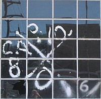
In Lakeview, the New Orleans Museum of Art was safe, but at slightly lower elevations housing wrecks were still evident. Doug pointed out a few of those spray-painted, coded Xs that government rescue teams use to mark people saved, pets saved, persons found dead.

Rescue workers and D-MOR, or disaster mortician teams, spray identifying codes in brightly colored spray paint on doors in flood zones. The "X" means a search has taken place. Date and time of search are also noted; "LB" with a number indicates number of living bodies encountered; "DB" with a number indicates the number of dead bodies. The teams carry GPS devices to identify and note the locations they've inspected.
Click here for picture and source.
Everywhere high-water marks are plain to see. But this was a mostly white, middle-class neighborhood, with patches of elevation and many more economic stilts than any of the black districts hit by flooding.
If I were to build a house in Disaster City, it would be miles from any levee, any lake or spillway. It would be made of bricks, and poised on stilts, brick stilts. All doors would have to point away from the water no matter how distant. MacCash pointed out that many garages and houses got swept away because their doors were open and facing the surge.
In case you didn't know, much of NOLA-Coaster, on the Mississippi Delta, is below sea level like Amsterdam. How come Dutch dikes hold up and our levees break?
MacCash told me he found one X that enumerated a nutria along with other animals saved. The nutria is an aquatic, nocturnal non-native giant rodent (from South America) and grossly invasive. Nutrias were imported years ago to start nutria fur farms. Nutria was to be the new mink. Some escaped and have multiplied beyond belief. They are born with their eyes open, have razor-sharp orange teeth, and have nipples on their backs. I don't know if it's true, but it is said in Myth City that there have been nutria culinary experiments in city schools. Can these rodents be cooked and eaten and part of a school lunch program or are they only good for dog food? How tasty is a nutria gumbo? How digestible are barbecued nutria cheeks?

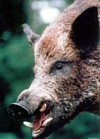
And what to do with feral pigs, which have been proliferating? Doug told me that one of his Katrina friends invited him over for a feral pig roast. His friend had shot the pig in Lakeview and soaked it in wine before barbecuing it in his backyard. Feral pigs were introduced in the 1600s, but recently they have gotten completely out of hand.
Further up the Mississippi and into the far reaches of the Ohio, said Lipman's husband that evening at dinner, there are feral-pig bounties. The wild hogs eat everything in sight, are amazingly thick-skinned, and have been known to attack not only children, but adults. They are ugly too, and fierce, but wouldn't you be if you were threatened with the possibility of becoming ham? But, here's the rub: they're as tasty and lean as Italian wild boars.
Tour Number Two
The Lakeview District was sad, but the Lower Ninth Ward, with no high ground at all, received most of the media coverage, and rightly so, admitted MacCash. This was the totally devastated black neighborhood that I toured the next day with Joy Glidden.
Some of Glidden's guests have tried to refuse her Lower Ninth tour on the grounds it might be too depressing. Too bad, says Glidden. People have to see the ward and get out the word.
Movie-star Brad Pitt's pink tents, put up to publicize his attempts to get "Green" houses built in the Ward, are now gone. Good for Pitt, he appears to be actually raising money. But otherwise I was shocked.
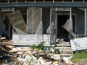 Nothing I had seen on TV prepared me for the horror of the Lower Ninth Ward. I didn't have a panorama lens and I wasn't in a helicopter, so I can offer only details that must stand for the whole. A collapsed shotgun house vomiting personal possessions on to a shotgun yard.
Ten-thousand partially buried woodsheds. I refer to Robert Smithson's Partially Buried Woodshed made at Kent State to commemorate the student massacre of 1969. Smithson would have liked the Ninth Ward views; he once valorized the industrial decay and ruined factories he called The Monuments of Passaic. Even three years after Katrina, the Lower Ninth Ward looks as if it had been hit by an atom bomb: It is mostly rubble and weeds -- acres of housing now scraped down to footprints of foundations.
As of last April: 1836 dead; 705 missing. And we know there were at minimum 140,000 homeless families. Where are they now?
President Bush has a lot to answer for. He flew over; he did not even touch down. Three years later the rebuilding is stalled. What is taking so long? Obviously, for most of Delta City's poor African Americans there is no Road Home to Shame-of-America City.
I felt ghoulish taking snapshots, but how else could I testify to the aching need, the tragic racism? You can bet an all-white neighborhood would have been rebuilt, resettled, refinanced by now.
Where's the Art?
Art goes on. Artists and art students have developed a local style based on the assemblage of Katrina debris. Art types are scooping up vacated shotgun houses here and there, moving ahead, turning some into studios, some into exhibition spaces. Or simply creating guerrilla galleries.
Cross your fingers. Where there's art there's hope. The first New Orleans Biennial opens this fall. Dan Cameron, formerly at the New Museum in New York and now the director of the New Orleans Contemporary Art Center, is initiator and commander-in-chief.
Meanwhile, Sunday painters and peddlers of tourist art set up easels in the picturesque ruins that stretch into distances like those of Dresden after it was bombed. Or Nagasaki.
* * *
The Expulsion from Acadia. Unidentified print. Intermission: Why Is N.O. So French?
When I checked in at my hotel, I said aloud that in New Orleans at least there'd be no difficulty pronouncing my name. Well, said the handsome young man on duty, "Actually I did not do too well in French in high school ... in Buenos Aires. "
My father, christened Jean Baptiste, was born in Massachusetts and grew up in a very tight French-Canadian enclave. French was his first language. My mother, also born in Massachusetts, did not speak English until she was 10. Her first language was Polish. When the families met, it was a bit like craft and art trying to speak to each other.
Wouldn't you know, cochon is the only foreign word I retain from my childhood when it seemed to mean:
I had made a mess playing with clay I had found on the bank of a stream.
Or I had drooled food on my shirt.
Or that my room was unusually cluttered with too many bird nests, strange stones, turtle shells, roadside debris tossed from speeding cars, blue jay feathers and other important relics.
The Cajuns in Louisiana are descendents of the victims of the expulsion from Acadia/Acadie. The British around 1755 decided that the Northeast Coast of Canada should be all-Protestant, all-English-speaking.
I visited Nova Scotia last fall, not to seek my roots, but to see the world's highest tides at the Bay of Fundy, but it was always low tide. We were also in search of rapie pie. We found it. It is basically chicken broth gelatinized by potato starch, then baked to turn part of the glop into a crust. If you close your eyes and also forget how it feels in your mouth, it's delicious. Today's Acadians top it off with maple syrup or American ketchup.
And when I was telling this tale to Joy Glidden, she revealed that she was actually French Canadian, from the really Acadian part of Canada. The French settlers who were not forced by the Brits to go south to the Louisiana Territory, before it was purchased for the U. S. by Thomas Jefferson, were exiled from Nova Scotia to northerly New Brunswick.
So you see, in Artopia everything connects; no one forgets.
In this world of ours, everyone is in exile.
Will the Katrina evacuees now in Houston and Atlanta ever return? Doubtful. Generations later, will their descendents still be eating Texas and Georgia versions of gumbo, crawfish pie and beignets? Will they come to the Lower Ninth Ward of Party City looking for their roots? Will the Ninth Ward have become the Montmartre of Dixie or be totally underwater after the Army Engineering Corp levees break again?
And, oh yes, Joy said, the beignets at Café Du Monde are exactly like those she had in her childhood in Canada: no green vegetables except fiddleheads, but lots of light-as-a-feather, sugar-coated, deep-fried beignets. Beignets are puffy, airy donuts without the holes, and who needs the holes anyway? What better way to start the day than beignets and chicory-spiked café au lait at an outdoor table on the banks of the swollen, muddy Mississippi.
New Orleans Is the New Brooklyn
Why am I writing so much about food? Food and art here are not artificially separated as elsewhere, and the foodiness of Foodie City is symptomatic of it also being artist-friendly. Is that because the checkered past of New Orleans nurtured a tolerance for eccentricity? Does that spring from engrained yet sometimes uneasy multiculturalism, or its history of sheltering pirates and privateers?
Artists like to eat; I mean they really, really get off on food. In New Orleans, said one new arrival, it is always food, drink, food, drink. You can't even take a business meeting without eating and drinking.
NOLA-Global is a small city with a relatively benign climate - give or take a few Katrinas and lots of mildew and mold. It has seven art museums, more than 50 art galleries and alternative venues sprouting like fungi amid the ruins of the sins of FEMA. It has glorious world-class food, a music and club scene, newly affordable acreage, housing stock for a song, fixer-uppers galore. It could be the new Williamsburg. only better. If Brooklyn is now too expensive for entry-level artists, go south, young man. Go south, young woman. Your trust funds, my little darlings, will go so much further.
Get a head start on experiencing Global Warming.
If you have a problem with the history of racism or slavery in the South, bone up on racism and slavery in the North. Slavery in the North? Yes, even on Long Island. And I don't mean the vanilla slavery of indentured servitude. And we won't even talk about present-day abuse of immigrant labor. Latinos may be replacing blacks in New Orleans, but up north the Russians are coming, the Russians are coming; the Russians have come.
And Here's the Art!
We stopped off unannounced in the St. Roch neighborhood (the new, newest art district) to drop in on Kirsha Kaechele's Projects - a.k.a. KKprojects. Founded before Katrina, KKprojects, now comprises a former bakery and three derelict shotgun houses. Concentrating on architectural and installation art, it aims to be a kind of DIA Foundation of the Delta, a Marfa of the Lower Mississippi.

Kirsha Kaechele: White Cottage, 2007. Painted shotgun house.
Kaechele herself is the essence of New Art City charm. Of course, she was born in Guam. And when I asked her where was the most exotic place she had ever lived, she said Lebanon. I told her about my own propensity for drama. I was in the Golan Heights -- it had something to do with a sculpture conference in Tel Hai -- when Israel withdrew from Lebanon. I was trapped in the Lexington Avenue subway at South Ferry when the first World Trade Tower fell.
As we spoke, I was hoping (but did not mention) that the enormous spring swell coming down the Mississippi would not break through the supposedly impervious 20-foot levees. "High Water Stops Work Along River" said the Times-Picayune headline; "River Riding High."
The current exhibition, "Allons Á Lafayette," in The Old Bakery, documents a Big Apple/Lafayette axis involving some well-regarded artists. Co-curated by saxophonist/artist Dickie Landry and Kaechele, Robert Rauschenberg silk-screen prints on Mylar (Star Quarters) are knockouts, as is Keith Sonnier's early neon piece in the adjacent garden. Documentation of Gordon Matta-Clark and Louisiana native Tina Girouard's historic Food installation/restaurant in SOHO is perfect for Culinary City. The opening of the exhibition came with a champagne brunch and Cajun dancing, but we were a week too late.
Kaechele then brought us over to the shotgun-house installations across N. Villere Street. Have I yet explained that shotgun houses have no hallways, but rooms from front to back with doorways lined up so you can fire a shotgun from the front porch to the back yard? Or is it from the backyard to the street?
The logic of exactly why would you want to do this escapes me.
Derelict Cottage II houses Margaret Evangeline's America. Although known for her artworks executed with rifle shots, here she has covered the floors with mud and periodically floods the cottage with water in order to see what will grow. This is much the opposite of Walter De Maria's iconic, historic Earth Room in New York City, which is purposefully sterile. But here in semitropical New Art City, there were already green fingers poking up. I took this to be a message of hope.
Next door, Derelict Cottage III has been transformed into a kind of latter-day Allan Kaprow/Claes Oldenburg environment by guerrilla artists Kim and Scott Pterodactyl and Anthony Carpenter. It's called Hot Pink Cape Sale or The Mallard. The back story is that Kaechele had hired the artists to do some repair work but instead, behind her back, they turned the entire cottage into an artwork.
First you have to step through a hole punched through the back of a closet; then there are mallard decoys everywhere, pink fabric salvaged from Brad Pitt's well-meaning tent stunt, and, best of all, a funky pool filled with 25,000 floating plastic bottle-caps.
Everything in Fat City has to have a story. Isn't there a place called Storyville where Dixieland was born?
But Kaechele and KKprojects are most famous in Feed-Your-Face City for chic, block-long dinner parties in which a single table seating a few hundred artists and art lovers runs down the middle of N. Villere Street, from Music Street to Art Street. The last art supper was in regard to A Course of Minerals (Kaechele in collaboration with artist Koan Jeff Baysa). An informant who was present tells me it was done with unbelievable style and great flare.
Back at The Old Bakery, Kirsha handed me the gold-on-black menu. The fanciful document seems to indicate that artist speeches and presentations were part of the feast.
Under "Salad": PLANT LIFE AND THE SUBTERRANEAN/ ARTIST MEL CHIN ON PHARMA-MYTHO-CULTURAL-RELATIONSHIPS. Or how about this one under "Death": SAVORY TREAT/LITTLE DEATH/ THE METALS AND THE DEATH OF THE SUN OR SACRIFICING THE SUN FOR GOLD.
The next block-long dinner party is in the fall; tickets are $150 and/or you can sponsor an artist: Annual Living Dinner. Six Curated Courses, 200 People, One Table. Nov. '08. For details and reservations: info@kkprojects.org.
While rug-dancing, I mentioned something about my Pork Report and Pigging Out in New Orleans.
"Oh, you must have this," said Kirsha.
And Kirsha, unknowingly giving further evidence for the Artopia braid ("artists may disappear but they always come back"), pressed on me a newsprint handout featuring '80s luminary Peter Nadin's recent pig-growing, pig-slaughtering, pig-eating project,Pig Mark Swine Stain, shown last year at Art Basel Miami www.peternadin.com
Sorry, Peter Nadin, pork is baaaad. Pork is not kosher or halal. Pigs have cloven-hoofs. I know because I have dined on trotters.
Nevertheless, I couldn't wait to have the Polish bacon BLT at a certain poets and actors food spot in the East Village; I couldn't wait to order my Easter ham at my local Polish butcher on Second Avenue; and then there are those perfect Italian pork sausages I can best get in Patchogue, out on Long Island.
Mr. Dennis Made Me Do It
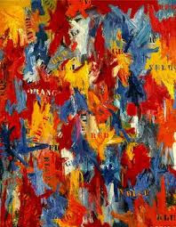
Tastewise, Porky Pig flesh, I have read, is the closest you can get or want to get to being a cannibal. Human flesh is sometimes called long pork because it is said to taste like pig. Like a hog, our flesh is not marbleized. We too carry most of our fat right under our skin, in an envelope of solidified grease.
Although I cannot cure myself of art, at home in New York I cured myself - at least temporarily -- of pork by metaphorically looking the pig in the eye. By chance, when I was doing my research on pork, I picked up John Thorne's Serious Pig, from Dr. Jeff's vast food library. I opened it to the pig chapter in which Thorne quotes a Nova Scotia tale from Tomi Ungerer's Far Outside Isn't Far Enough:
Pig killing is always a great topic of conversation. Actually they say around here that it is bad luck to use the word pig. The proper substitute is "Mister Dennis." My mother, when she killed Mr. Dennis, she locked herself in the house and played the harmonium.
On the other hand, my sainted mother insisted that we not give pet names to our chickens, ducks, geese, or even our two goats. It was my job to chop off the heads of the hens when their flesh was required for Sunday dinner, holding onto their twitching zombie corpses so they wouldn't run around the backyard like "a chicken without a head." My mother, who was a farm girl, insisted we never should give a pet name to an animal we might want to eat. No Mr. Dennis for her.
But here is Thorne's Pork Cure summary in Serious Pork:
Ungerer and his wife wanted to kill their pig by the old-fashioned method of "sticking," which produces the best-tasting meat. To do this, the pig must be hoisted up on a rope until it hangs upside down. Then its carotid artery is punctured by a sharp, single stab from a butcher's knife. With all the blood cut off from the brain, it is immediately rendered unconscious, but its heart continues to pump until all the blood circulating through the body has been forced out the wound.
Poor Mr. Dennis. No more Mr. Dennis for me.
For an Automatic Artopia Alert when new entries are posted
contact perreault@aol.com
I am entertaining myself with a list of critics and artists who will hate "©Murakami," a retrospective of the Japanese artist Takashi Murakami (b. 1962), at the Brooklyn Museum (200 Eastern Parkway) to July 13, 2008.
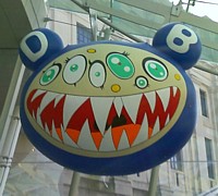
Takashi Murakami, DOB's March, 1995 © Takashi Murakami/Kaikai Kiki Co., Ltd.
All Rights Reserved
Or, if they have passed on, would have hated it. The list is composed largely of those who despised Pop Art the first time around -- mostly because of an emotional, poetic, and/or economic stake in Abstract Expressionism. The fear was that Pop would replace the well-worn, familiar feeding-trough, the A.E. hierarchy, and hard-won standards of seriousness -- and machismo. At the same time, Minimalism, neither friend nor foe of Pop, was another threat that needed to be squashed. How could you have art without obvious self-expression? Without the traces of the artist's hand?
Long Live Pop
I will not share my list with you, because some Anti-Popsters are still alive, if not exactly alive and kicking. You can come up with your own. Suffice it to say, I myself was prepared to hate Murakami's slick and oddly sticky offerings. How dare this artist appropriate manga and anime -- two well-known Japanese mass-media forms -- with such cynicism, such determination both to shock and please? How dare he, like a certain mastermind of marketing, place some of his paintings on top of his own wallpaper?
I hated Murakami's Reversed Double Helix (2003) when it was shown at Rockefeller Center a few years ago. It seemed gaudy and small. There was no way it could reach the grandeur of Jeff Koons' miraculous flower puppy.
But I hope I am not giving too much away right here at the start. I'll begin by saying that I was greeted by a Reversed Double Helix doppelganger called Tongari-kun (Mr. Pointy) smack in the middle of the BMA's silly glass entrance. I've said it before and I will say it again (art critics never forget, never forgive): when is the next hydrofoil ferry leaving? And for this they ruined the grand stepped entrance?
Although the sculpture was iffy, the floating DOB's March balloon at least has some teeth to it. The cute but snarling DOB figure is said to be the artist's surrogate. On the way in, I was already warming to the forthcoming charming but disarming stew.
But not quite yet.

The exhibition begins in the fifth-floor rotunda. I breezed by some Murakami paintings that did not at first impress and took a quick look at the ultra-cute Miss ko2 (1997), a painted fiberglass statue of a perky, fetishized waitress. My exploration of anime (rented from Kim's Video on St. Mark's) of over a decade ago had clued me in to the salaryman's schoolgirls-in-uniforms fetish. Cute nurses-in-uniforms also figure in anime soft-core. So I guess I need to add cute and perky waitresses-in-uniforms to my useless list.
Smack in the middle of the rotunda was Murakami's three-part Second Mission Project ko2 Advanced (1999-2007). Miss Cute Waitress, in three steps -- Human Type, GA-Walk Type, and, yes, Jet Airplane Type -- is transformed into a scary, deadly, no longer cute jet airplane. Well, that bears thinking about. Nevertheless, my first response was that I had already seen such things in the second-floor Japanese toy store a block from where I live: transformers are now universal, right? But what does it mean to transform a cute and perky waitress into a jet airplane? That stopped me in my tracks. I'm still not sure.
Takashi Murakami
Installation view of Miss ko2 (Project ko2) (1997)
at Wonder Festival, Summer 2000
Oil, acrylic, fiberglass, and iron
100 x 46 x 36 in.
Courtesy of Marianne Boesky Gallery, New York
Blum & Poe, Los Angeles, Galerie Emmanuel
Perrotin, Paris and Miami, and Tomio Koyama Gallery Tokyo
Photo by Kazuo Fukunaga
©1997 Takashi Murakami/Kaikai Kiki Co., Ltd. All Rights Reserved
I have been to Japan a number of times on various projects -- as the U.S. commissioner for an international survey of figurative painting, to write a text about a contemporary ceramics artist, and once to attend a glass-art conference in the little city of Seto. I should also point out that I live in a colonized East Village. There are so many Asian students at nearby NYU that the area could be called Little Tokyo. Strange fast-food chains with names like Very Berry and T-Kettle are dotted along St. Mark's Place, no doubt soon to edge out tattoo parlors and other tidewrack.
Bubble tea is not my favorite thing in the world, nor is any of the Japanese pastry, which has more eye-appeal than taste. But I shop routinely in the totally Japanese, Stuyvesant Place Sunrise Mart above the St. Mark's Bookshop on The Bowery. I also seek out the latest secret ramen joint, occasionally have exquisite sushi at Hasaki on 9th Street, and will happily slurp cold noodles or hot udon at Soba-ya, also on 9th.

Promo for rapper Kanye West, designed by Murakmi (not in exhibition)
Cuteness-hating, salaryman-hating, good old me, I wandered into the Murakami films, which are being shown in a dark room just off the rotunda. The first one up was a music video for rap star Kanye West's Good Morning, called not surprisingly Good Morning. A cuddly-cute bear wearing cute shades barrels through a number of cute and not-so-cute ultra-urban encounters.
Wait a minute. Those are my sunglasses, white ones with slats instead of glass. The cute teddy bear is wearing my new glasses. I bought them at a sidewalk stand on St. Mark's and Second Avenue in front of Gem Spa just a month ago, but after a great deal of debate. Would I actually wear them to the beach this summer? Would they protect my eyes? I think not, said the Indian man stationed at the outdoor sunglass rack. They are for parties. And what color should I get? I looked at orange and Day-Glo green, but settled on stark white as much more becoming. They were only $5. Alas, upon minute inspections mine are slightly different from those in Murakami's music video. Mine were designed in Italy and "hand-polished in China." Nevertheless, I will keep them forever, even if I do not wear them to Ho-Hum beach.
You can see Murakami's "hip-hop" music video on (click here) Myspace and I am sure you will agree that although I may now fear I will look like a cute anime teddy bear, my nearly identical sunglasses must be extremely cool.
Next on the bill were two episodes of Murakami's Kaikai & Kiki (2007). Bunny-cute Kaikai has protrusions on his/her head that could be mistaken for bunny-cute ears. Kooky-cute Kiki has three and sometimes five cute-Keane anime-type eyes.
When I was back in the East Village, I decided I needed to look at some anime again: not Akira or cute perky-breasted porn featuring cute nurses nursing (each other), but Sailor Moon (barf!) and Demon Beast Invasion (surprisingly lewd and violent). You see, in terms of the latter, muscular demon giants on steroids once ruled the earth and had to leave when the atmosphere changed and now they are back trying to impregnate cute human girly-girls so their demon offspring will be born acclimatized...The big demon seems to have not-cute tubes coming out of his not-cute nipples and other places that he uses to... Well, never mind. Until he meets the cute heroine who can't get enough of those demon tentacles, his stock response to his own failure to implant his demon seed is: "Another inadequate earth girl." Earth girl dead, bloody dead, gruesomely unpregnant and dead.
What happened to cute? Did I miss something?
Demon Beast Invasion did have an extra that tried to explain some anime conventions to the uninformed. Yes, Japanese men have a schoolgirl fetish. The weird hairdos are so we can easily differentiate all the cute and perky, squeaky-voiced teenage girls. The big eyes? They come from Betty Boop, which was an early cartoon import from the U.S., and not from Margaret Keane's bug-eyed children.
Long Live Poop
Oddly enough, Episode I of Murakami's Kaikai & Kiki is called "Planting the Seeds." No, not those kind of seeds, not demon seeds, watermelon seeds. It is really all about poop.
Poop Alert! Poop Alert! Click here for a preview.
The seeds need poop to pop. The sophisticated audience giggles on cue every time the word poop is used. When the seeds refuse to pop up, Kaikai provides some human fertilizer. Very educational.
Infantilism! It's as if that other favorite of mine -- the cunningly cute, British-born Teletubbies -- somehow got crossed with some coprophilic Japanese daydream. Episode II features even more poop. I've heard that body functions are treated cavalierly in Japan, but not pubic hair, as I myself found out when a Philip Pearlstein painting for the exhibition I was curating for a Japanese department store was stopped by Japanese customs. Or is Murakami just being naughty? Will we ever see episodes of Kaikai & Kiki on PBS?
Next we are treated to the "preview trailer" for Murakami's first live-action feature, to be called Dharma. The film, which so far looks very, very chic indeed, will feature an impotent assassin who meets his doppelganger in Tokyo.
The films - and I am being serious -- set the right tone for the exhibition, and I recommend that you see them first. Don't even look at Miss ko2 until you've seen the films.

I am not sure if it is the exhibition layout over two floors -- in and out of rotundas and some odd side rooms, here and there, and even down a staircase, papered with Murakami wallpaper -- that is non-linear, or the oeuvre itself. The highly publicized Louis Vuitton boutique featuring Murakami's not very original handbags is dead center. The staff is immaculately white-suited. That's the most interesting thing about the embedded boutique, certainly not the handbags. And then there's a cheaper gift shop with Kaikai & Kiki souvenirs and $100 stuffed toys, all more to my liking than the logo-speckled bags. But I don't remember seeing my white, slated sunglasses. That is a retailing mistake.
The exhibition feels immense, but to me -- at least the first time around -- there were two highlights. I count the two statues called Hiropon and My Lonesome Cowboy as one piece, at least the way they are here installed, facing each other, in a room "decorated" with "cream" splashes.
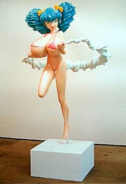 I was amused to see the mom of a well-heeled mom-and-pop team trying to explain to her seven-year-old daughter (and with a straight face, while daddy shrank to nothingness nearby) why the young lady with the enormous breasts was squeezing her cute cherrylike nipples to spurt a cute circle of milk that was like a dairy hula-hoop. While poised on one foot.
If you can't explain Hiropon to your seven-year-old, then you probably can't explain her companion, My Favorite Cowboy, who is spurting a rope or whip of "cream" from his erect, hand-held penis. Leave your seven-year-old at home.
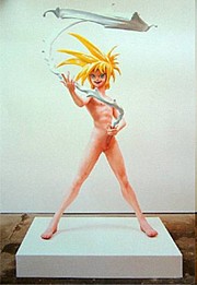 You can hear the artist himself trying to explain his My Lonesome Cowboy by dialing 718-362-9589, followed by 10#. This is the BMA's cellphone gallery guide, which can be called from anywhere. Here you will learn that Murakami has never seen the film Lonesome Cowboys. Guess who made that film?
My second highlight is Tan Tan Bo Puking (718-362-9589, 21# for Murakami's explanation). Made in 2001, it is a large painting about...puking. Like pooping, everybody does it, but Murakami blows it up to Peter Saul proportions: throwing-up on acid, I suppose. But without disgust.
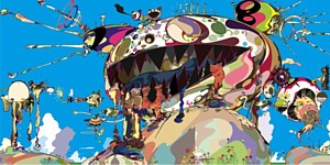 Takashi Murakami
Tan Tan Bo Puking - a.k.a. Gero Tan, 2002
Acrylic on canvas mounted on board
141 3/4 x 283 7/16 x 2 5/8 in.
Collection of Amalia Dayan and Adam Lindemann
Courtesy of Galerie Emmanuel Perrotin, Paris and Miami
©2002 Takashi Murakami/Kaikai Kiki Co., Ltd. All Rights Reserved
If you want more of Murakami's "explanations" or the sound is just not good enough on your cellphone click here for MoCA's artist tour. MoCA is where the exhibition originated.
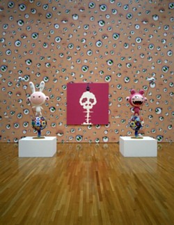
Murakami: Summon Monsters? Open the door? Heal? or Die? and Kaikai and Kiki
©2001 Takashi Murakami/Kaikai Kiki Co., Ltd. All Rights Reserved
And then there are the cute "flowers" and the very Miro/Kandinsky-cute "jellyfish." Even the "death's head" A-bomb blasts are radioactive cute. In writing about Murakami, nearly everything has to be put inside quotation marks. Even "Murakami" has to be put in quotes marks, for he has a huge staff. He is a huge staff. The crawl for one of his films goes on and on for an eternity.
And throughout the survey there are countless cross-references.
The early mushroom death's head cloud (both on canvas and on wallpaper) rimes with the saccharin toadstools that come later. Somewhere well into the exhibition you will come across the Inochi cycle (c.2004). Inochi is a kind of hydrocephalic space alien. One loony theory is that the real aliens look like this because the oversize head will remind us of infants with their big heads, and thus we will go all warm and protective. But there is a Inochi on a flat screen in what appears to be a TV ad promoting milk as a healthy beverage. Did the Hiropon and Cowboy manikins start out as proposals for a national drink-milk ad?

Here are some generalizations:
1. Pop did not go away. It was only in hiding. Since art history is most productively seen as a braid with several strands, it is obvious that Koons first and now Murakami have ended the Pop occultation. Murakami has appropriated image types and even themes from Japanese popular culture and used them to create a weird, off-center language to address fecundity, mortality, infantilism, and, yes, commerce.
2. Although one way to make new art is to apply old principles to new materials and thus generate new images and new thoughts, I still wonder if Murakami's obvious success is due to exoticism more than innovation. We have already seen artists appropriate comic-strip and cartoon material from Western mass media. Is referencing Japanese mass-media imagery a big step forward or only a shuffle sideways? Does it matter?
3. In the days when the only "mouse" other than the trappable kind was Mickey, I am told that pornographic versions of Walt Disney offerings and Looney Tunes escapades were made sub rosa. And lewd Dagwood and Blondie comic books. But would paintings or videos of Minnie and Mickey pooping and puking instead of doing the old in-and-out be as effective as Murakami's Nippon-centric efforts?
4. In terms of Japanese culture, one is initially attracted to the austerity of the tea ceremony, sumi ink drawings, Zen rock gardens, or the dry tearjerkers of Ozu, which, for all their focus on the quotidian, are in their own way as mysterious as any koan. They are so ordinary that they're almost not there, even while you are watching them. And yet we are forced to care about a daughter growing up or some other banal family crisis. But in Japan there is a gaudy, bawdy shadow that balances restraint. Think of all that neon putting Times Square to shame. I can see how austerity can become oppressive, and one might be driven to seek excess to keep sane. Extreme decorum needs to be balance by extreme décor. Murakami represents that excess.
On my way out -- obviously brainwashed by too many flowers, too many Betty Boop eyeballs, too many mushrooms, too many jellyfish, too many colors -- the Mr. Pointy sculpture at the entrance now made perfect sense. Psychedelic Buddha? Why not. But shouldn't he be pooping and puking?
Footnote: For samples of manga comics in English click here. The titles of these comics are in themselves poetic: Bleach, One Piece, School Rumble, Vampire Knight Air Gear, Eyeshield 21, Full Metal Alchemist, Bitter Virgin....There are highly segmented manga categories: boys, girls, of course, but also salaryman, "ladies" and, yes, adult (meaning porn). No porn here, sorry, but most you usually have to read them back to front and from right to left. There's a diagram on the site to help you out. There are also on-line manga shrines devoted to particular comic books, but you will have to search for them yourself.
If you want a taste of anime, click here. The site is a little bit difficult to figure out and full of pop-ups and ads, but if you can find them, I recommend a 23 minute episode of the sugary Bleach (an anime version of the comic book) with English subtiles and the pro-peace Soul Eater.
FOR AN AUTOMATIC ARTOPIA ALERT FOR NEW ENTRIES
CONTACT: perreault@aol.com
The most thoughtful, thought-provoking and provocative gallery show this season has to be "Dan Flavin: The 1964 Green Gallery Exhibition" at Zwirner & Wirth, 32 East 69th Street, to May 3, 2008.
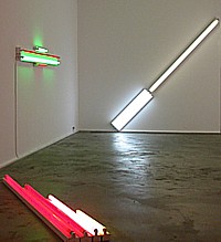
Installation view (detail) at Zwirner & Wirth.
Flavin Redux
I remember the original well. I even wrote about it for the now long defunct Art International, coming out of Berne, Switzerland. If a gallery can appropriate a long-ago exhibition, then I can certainly feel free to re-deploy my equally ageless and at last uncensored review:
Dan Flavin is no doubt the most irritable man alive. To make matters worse, he tends to rage and rant in the form of single-spaced, badly typed missals, often five or six pages in length on airmail paper, to save money on postage or to make it seem he's writing from the front. But the battleground is only in his mind.In spite of the enormous chip on his shoulder, at last Flavin has had his breakthrough moment at the Green Gallery this month. This doesn't mean he'll stop his tirades. The kind of work he does leaves him with lots of time on his hands to get angry.
We were previously aware of his fluorescent light "sculptures" and now there's an array of seven recent pieces that marks out some of the possibilities of his readymades-on-display. Calling them readymades risks evoking one of his letters, for, like the critic Don Judd, I am told Mr. Flavin despises Marcel Duchamp. Perhaps because Marcel has always been a gentleman of the worst sort.
Well, Flavin's ultra-cool fluorescents are really about placement rather than semantics, but like the 1917 urinal signed R. Mutt, Flavin's store-bought tubes are also philosophical. Clever choices and specific display in art contexts is what makes these obdurate propositions art, but not self-expression.
But how many ways can you vary the placement of fluorescent light fixtures?
Let me count them: 1. the diagonal of May 25, 1963 (to Robert Rosenblum) is an eight-foot fluorescent light placed - you guessed it - diagonally; 2. a primary picture is a square on the wall made up of red yellow and blue fluorescents, the colors of which wash the inside of the square like the pastels in a Jules Olitiski painting but also bleed out along the wall; 3. gold, pink and red, red is an eight foot configuration placed directly on the floor; 4. red and green alternatives (to Sonja) is a symmetrical wall arrangement that could be a minimalized Chevy or Frigidaire logo; 5. alternate diagonals of March 2, 1964 (to Don Judd) is a 12 foot, diagonal wall piece; 6. the nominal three (to William of Ockham) is one vertical fixture/tube next to two next to three; 7. pink out of corner (to Jasper Johns) is a fluorescent standing in a corner, washing the two walls with pink.
So here you have the ingredients: number of fixtures, arrangement of fixtures (either vertical, horizontal or at a 45 degree angle, colors of the fluorescent tubes. One wonders if Flavin will come up with more variations, but I doubt it. For all their austere (here comes that letter!) Platonism, this ultra-cool exhibition in Dick Bellamy's hot-spot is a serene antidote to the Claes Oldenburg, James Rosenquist, and George Segal exhibitions that came before, but can also be seen as Pop. Hardware Pop. Or Color Field paintings painted with light directly on the walls. It is no doubt extremely difficult to strip light of metaphysics, but Flavin has done just that. Almost. Now if he would only drop his sentimental or suck-up titles....

Dan Flavin: pink out of a corner...(1963). Exhibition Copy, Courtesy of Stephen Flavin.
True Confessions
Now that I have had a second look at that 1964 exhibition, I still stand by my words. Of course, I wrote them today and not 34 years ago. Since 1964 he came up with many variations. Just search Google Images for a taste. But I could have written the above review in 1964. I was already writing about art then, but not for Art International, which came a bit later. In any case, next week I fully expect to receive a single-spaced badly typed letter from the Beyond.
I wish, however, I had saved the one I really received from Flavin (1933-1996) while he was alive. I don't remember the occasion or the horrendous offense against art and Flavin's ego I had committed. I immediately tore it up and flushed away the shreds. If I had saved it, I could quote from it and it would give him back some of his humanity, now that he is fully sanctified. We do wonder how an artist who made such sublime work could have been so paranoid.
Although I hate to admit it - since I am Mr. Antiformalist - in some cases it might be better not to have ever met a particular artist, or received a letter from him (or her) or better not to know anything biographical. Aesthetic intentions or critical program? Any artist can put his foot in his mouth; but to be born with your foot in your mouth is truly a curse. You know what they say: time wounds all heels.
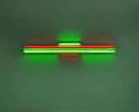
Flavin, red and green alternatives...(1964). Collection of Sonja Flavin.
In the Neck
The first thing, however, I did think of when I turned off classy East 69th Street into Z & W was that something was wrong. I had indeed been in the Green Gallery ages ago and I assure you it was not on street level. It was also one large room, which is not the case with the Z & W which has a small front room with a roll-up window onto the street then a narrow trunk or neck or hyphen to a larger back room.
The drawings opposite the reception counter in the neck were not shown in the original exhibit, but someone saved them; someone found them. One is a sketch made by Flavin of the installation he wanted. There is one room and one room only. Suspicions confirmed.
We have to refine our description of the current exhibition; it is not a recreation of the 1964 show because the space is different and anyone who knows Flavin's work appreciates how important installation is and how placement in a specific room cannot be divorced from the component or components involved. What we are really seeing is the works from 1964 reassembled, reunited in a totally different space. And as such, they are different works.
You cannot step into the same stream twice, even when it's art you are stepping into. The fact that the 1964 fluorescent works are being shown on the chic Upper Eastside and not 57th Street where the Green Gallery was, makes the work look different. If the recreation were in any other of the Z & W galleries, whether in Chelsea or Zurich or London, other attitudes would apply.
And art has changed. The art world has changed. And I have changed.
Most importantly, unless this is the first Flavin fluorescent pieces you have ever seen, you will see these knowing what came later: more of the same. And more and more. He stuck to his guns.
Back then we thought of Flavin as stubborn, obstinate, stuck in one place or, more positively, as dedicated, committed, forthright, uncompromising, even anti-artworld. Certainly anti-Pop as well as anti-Abstract Expressionist. The works could even be interpreted at anti-commercial, for who would spend good money for a few fluorescent lights?
We did not think Flavin was merely establishing a brand. Nowadays if you were limiting yourself to fluorescents that is exactly would you would be doing. And you would, alas, be praised for it, for that is what the customers currently understand and want.
We cannot see the work afresh. It is like seeing art entombed, which is the destiny of all art that is honored enough to be saved. Or, because it is so timeless, is this art perpetually fresh? Timeless? Who ever would have guessed.

Flavin: the diagonal of May 25, 1963...Private Collection.
Serious Games
This week's art game: Are there other exhibitions you would like to see re-created?
I, myself, would like to see the 1950 Jackson Pollock exhibition at the Betty Parsons Gallery once on 57th Street, but only if the space itself could also be recreated so we could experience the much touted shock of scale. But also for another reason. My friend Lil Picard (1889-1994) artist, critic, and what she called a Wiemar Republic Coffee-House Girl, long lamented not buying a small Pollock out of that historic exhibition. It was only $100 and she circled the block several times before deciding it was too expensive for her budget. I want to see the original price list.
Then I could really go for the 1953 Rauschenberg/Twombly exhibition at the Stable Gallery once on 58th and 7th Avenue. It included the first New York showing of two of Robert Rauschenberg's all-white paintings made in 1951 at Black Mountain, and came with a text by his friend John Cage: "..No subject/No image/No taste/ No object/No beauty/No message/No talent/No technique...I have come to the conclusion that there is nothing in these paintings that could not be changed, that they can be seen in any light and are not destroyed by the action of shadows..."
I would certainly want to revisit Robert Smithson's 1968 "Non-Site" exhibition at Virginia Dwan's 57th Street venue. There were geometrical bins of rocks brought in from mapped sites. The pieces look better and better every time I see them, although at the time I thought Smithson was "cheating" by bringing Earth Art indoors---which is not really what he was doing.
And are there ancient and nearly forgotten but important museum exhibitions I would like everyone to see or see again? Here's my initial list:
Marsha Tucker and James Monte's 1969 "Anti-Illusion" at the Whitney. I remember Rafael Ferrer's pile of leaves and blocks of ice at the entrance to the museum. Ferrer was an Artopian before there was an Artopia. Will time have tamed the art?
Kynaston McShine's 1970 "Information" at MoMA. Would I now crawl into Helio Oiticica's "nest"?
Thomas Hess' 1971 Barnett Newman retrospective at MoMA, but with the Stations of the Cross in a room with an entry that would allow them to be read left to right, not from right to left, as shown in '71.
Alanna Heiss' 1977 "Rooms," the inaugural exhibition at P.S.1. Could that old schoolhouse be returned to its inspiring state of crumble and decay so that the recreated site-specific works would once again make sense?
FOR AN AUTOMATIC ARTOPIA ALERT FOR EACH NEW ENTRY
CONTACT: perreault@aol.com.
AJ Ads
AJ Blogs
AJBlogCentral | rssculture
Terry Teachout on the arts in New York City
Andrew Taylor on the business of arts & culture
rock culture approximately
Laura Collins-Hughes on arts, culture and coverage
Richard Kessler on arts education
Douglas McLennan's blog
Dalouge Smith advocates for the Arts
Art from the American Outback
For immediate release: the arts are marketable
No genre is the new genre
David Jays on theatre and dance
Paul Levy measures the Angles
Judith H. Dobrzynski on Culture
John Rockwell on the arts
Jan Herman - arts, media & culture with 'tude
dance
Apollinaire Scherr talks about dance
Tobi Tobias on dance et al...
jazz
Howard Mandel's freelance Urban Improvisation
Focus on New Orleans. Jazz and Other Sounds
Doug Ramsey on Jazz and other matters...
media
Jeff Weinstein's Cultural Mixology
Martha Bayles on Film...
classical music
Fresh ideas on building arts communities
Greg Sandow performs a book-in-progress
Exploring Orchestras w/ Henry Fogel
Harvey Sachs on music, and various digressions
Bruce Brubaker on all things Piano
Kyle Gann on music after the fact
Greg Sandow on the future of Classical Music
Norman Lebrecht on Shifting Sound Worlds
publishing
Jerome Weeks on Books
Scott McLemee on books, ideas & trash-culture ephemera
theatre
Wendy Rosenfield: covering drama, onstage and off
Chloe Veltman on how culture will save the world
visual
Public Art, Public Space
Regina Hackett takes her Art To Go
John Perreault's art diary
Lee Rosenbaum's Cultural Commentary
Tyler Green's modern & contemporary art blog


