Artopia: April 2006 Archives

David Smith with Australia, 1951
Three More Painters
Poet John Ashbery, who had published my poems in both Locus Solus and Art and Literature, was back from Paris and seemingly in charge of recruiting a new batch of starving poets to write reviews for Art News. So I had my interview with king-maker Thomas Hess. What do you think of Action Painting? Answer: Some of it's good; some of it's bad. What do you think of Pop Art? Answer (this was in 1964): Some of it's good; some of it's bad.
I was hired. But then Hess gave me advice I shall never forget. Never write about your friends, he said. Whatever you write will never be good enough for them. This was from the man who wrote about his friends de Kooning, Alex Katz and a host of others. And then he said: Never compare artists; artists hate it.
Well, he was wrong about that one too. Artists may indeed hate comparisons with other artists; they are brought up to think they are unique. They need to believe they are, but one should not let that get in the way of a fine strategy of contrasts and connections; similarities and disconnects. Comparisons, like category changes (such as labeling a critic an artist), are figures of speech, and if you don't understand the power of figures of speech or think they only include metaphors and similes, then you are missing a great deal.
Opposing or connecting two apparently disparate bodies of work is difficult enough; comparing three is fun. David Smith, Donald Judd and Betty Woodman on the surface would appear to have little in common. "David Smith, A Centennial" is at the Guggenheim (1071 Fifth Avenue) until May 14; Donald Judd, oddly enough, can be seen to great advantage at Christie's (1230 Sixth Avenue) until May 9 when there will be an benefit auction of the works now on view in a stripped down Chelsea-like space 20 floors above Rockefeller Plaza; "The Art of Betty Woodman" is at the Metropolitan Museum of Art (1000 Fifth Avenue) until July 30.
Smith and Judd, representing different generations, seem to be in two different worlds. Yet if you look a little closer they might be seen --- and have been seen --- as father and son in as Oedipal a feud as can be imagined, at least from the Judd perspective.
On the other hand, it is instructive that Smith's relationship to Picasso (his direct predecessor) is tame indeed. Smith saw Picasso's open-work sculptures (and the welded works of Gonzalez) and ran with the ball. As far as I know there was no anxiety of influence, there was no guilt. Smith merely produced the sculpture that Picasso could have produced if he had stopped painting -- minus myth, politics, sex and anger. But don't get me wrong; in terms of my infamous gift test, I would not turn down any Smith in the exhibition now at the Guggenheim. Smith was certainly the master of improvised form --- or form that looks improvised. Welding and the use of readymade bits and pieces (and sometimes tools) allow this. Woodman's ceramics look improvised too, but the improvisation is based on deeply somatic skills and is only the beginning of what it takes to make one of her flights of fancy, one of her battles between taste and nerve.

Donald Judd, Untitled, 1989
The Writing Is On the Wall
Judd's work is about as far away from improvisation as one can get. You make the diagrams then construct the bins, boxes and shelves. Or, more often than not, hire others to meticulously fabricate the bins, boxes and shelves. The odd thing is that there is more madness in Judd than there is in Smith, where you would expect it, in terms of his influences (Picasso, Picasso and Picasso).
So is Smith's art, unlike Picasso's, all about form? Not entirely, although formalists would prefer this to be the case. Smith did take up a bit of Picasso's playfulness. But the difficult part to grasp is that many of his sculptures are "written." Some early works are directly inspired by cuneiforms and hieroglyphs. There is definitely a feeling you should read them from left to right or vice versa. Here the horizontal connects with horizons and landscapes. And since the sculpture is usually flat and frontal, the air they hold becomes a page, like a landscape too.
Smith's works are not really as sculptural (i.e. three-dimensional) as they ought to be. They are, as often described, drawings in space. Smith himself thought he was operating somewhere between paintings and sculpture; but given the few painted sculptures in the current exhibition that go beyond monochrome, he had no talent for that other art form, and certainly no eye for color or interrelationships of colors, or interrelationships of colors and forms, as does Betty Woodman, the third artist we are considering.
Woodman, now in her '70s but two or three art generations away from Smith, in triptychs and even wall installations made up of clay "fragments" is also engaged in a kind of writing. First there is this, then there is that, and then there is thus. By "writing" I mean narrative too, so that, without pressing the issue, we can similarly see Judd's repeated boxes taking a leaf from Gertrude Stein's storytelling technique: and, and, and, and, & and.
Smith's written sculptures are all fronts; whereas Woodman's big, free-standing vase-forms are about fronts and backs. Neither Smith nor Woodman seem to be interested in sides. She thinks of herself as a sculptor, but one could also profitably see her as a painter who likes to paint on both the front and back of her clay canvases.
And Judd? Yes, the simple way of looking at his work is to see his bins as open, lined-up, rather than "composed" versions of Smith's cubes in the late Cubi Series. But Judd's wallpieces, which I think are his best and most beautiful, have the frontal, horizontal, landscape feeling of Smith's welded writings in air. They too have no backsides that you can or want to look at. Going deeper, Smith was depicting landscapes; Judd was showing vaginas and breasts, on the wall, like trophies or like feeding stations/ storage units. I never though I would think that Judd was better than Smith; but there you have it.
Like Woodman, Judd however has the container problem. Many will only want to stick flowers in Woodman's sculptures; in fact, she has provided "painted" sculptures for the flower displays in the Metropolitan's lobby, even larger than the ones she once created for MoMA's front desk. In this regard, I confess I cannot look at a Judd wallpiece without imagining it with books all lined up or tasteful arrangements of bud-vases and perhaps a figurine or two.

Betty Woodman, Diptych, n.d.
An American Picasso
Many have spent years looking for the American Picasso, and here she is. Woodman's illusion vs. materiality trope; her surface vs. substance trope; her color vs. structure trope; and above all her exploitation of multiple points of view make her Neo-Cubist. Or is she the American Matisse?
Her works, in clay and otherwise, have the look of passion (Picasso) with a daring yet infallible sense of color (Matisse). Unlike Picasso (or Smith, or Judd) her dream is of the voluptuous and the gorgeous. Time after time that dream comes true. If you want more meaning than that, you will be befuddled; for there is none. Well, there are historical references and appropriations that will be obvious to students of ceramics. And there is the struggle with the vase and utility. But that is the dark side of her work, a shadow that gives the beauty more weight than we have the right to expect.
Woodman and Judd deal with beauty in opposite ways, but without opposite results. This is ironic, since Woodman early on was aligned with the Patterning and Decoration movement of the '70s which was anti-minimalist to the core: more is more, not less is more; fill in that boring grid; bring back beauty. Because it is so distanced by history and talent, Woodman's work (and we have been following it for 25 years or so) is colder than we at had imagined; whereas Judd's has a lot more emotion then was visible at first. Withdrawal into perfection is Platonism served up on a silver plate. Or in a galvanized steel or sheet metal box. Restraint these days looks positively inflammatory.
All three artists deal with the problem of polychrome sculpture: Smith in a minor and, I feel, unsuccessful way; Judd by conflating colors and materiality; Woodman by full-blown painting. Painting is painting, whether you are using clay slips, glazes or pigments suspended in oil or acrylic. You might even, like Woodman, use all three. No one has ever claimed that the support must be canvas.


The Greenbergian Stake
This week I have a few thoughts about Clement Greenberg, not that we need another nail in his coffin or stake through his heart. All the dirty work was done upon the occasion of Florence Rubenfeld's 1998 Clement Greenberg: A Life. Aside from the claim that he alone discovered and nurtured Jackson Pollock, there is little to praise or dispute. Oh, yes, his writing style was clear although his logic was warped. And he did make value judgments.
Besides, he was cremated in 1994, so nails and stakes are irrelevant. Alice Goldfarb Marquis's newly released Art Czar: The Rise and Fall of Clement Greenberg, a definitely more measured biography, provides the excuse for my no doubt long-awaited take on Devil Clem. I was never a fan, preferring his arch-rival Harold Rosenberg, but, let's face it, both lost it when Pop displaced their painterly pals and neither understood Dada or Duchamp.
If Rosenberg ever really looked at a painting it never showed in his writings. Greenberg looked and it showed. But I sensed more poetry in Rosenberg, more complexity, more culture and even more philosophy. Greenberg, I did however meet. Late in his career and early in mine, we were jurors together for a Syracuse University drawing show. Syracuse University was his alma mater. After the first session, during which he voted too enthusiastically for any drawing that showed a woman's breasts, the third juror hatched a plan to hide his ever-present bottle of vodka. He was, nevertheless, quite jolly, quite avuncular, and one could see why many male artists loved his studio visits. Where was the bully? Where was the moralistic thug?
Almost simultaneously, as curator of the Everson Museum of Art in Syracuse, it was my duty to make studio visits to see the works of the locals. A group of Greenberg's guys was stranded in that once lively Erie Canal hub. He visited once a year and gave them advice, some would say orders. Through that experience I learned the drill. His visits were long and intense and there had to be a bottle of booze. The artists, to a man, expected me to pick and choose and even edit. There was also what one of them called "the around the clock thing." Clem would sit there besotted and, as the lucky painter rotated one abstract gel-painting after another, he would announce which end was up; and that end stayed up. That artist expected me to also tell him which end was up, but since no end was better than any other - Day-Glo gel is Day-Glo gel, no matter how you smear it around -- I was out the door.
Greenberg may have mellowed in his dotage, but even Marquis' well-balanced biography makes it clear that in his prime Clem was a first class rat. There was a reason Clement was eventually disowned by his successful businessman father. Moody and lazy, young Clement obviously despised his father for being too Jewish and, more importantly, because he did not see his oldest son's artistic talent, a gift that was certainly not manifested in any actual drawings, paintings or watercolors. Clem's artistic talent took another form, as we shall see later. It must be said, however, that the few artworks of his I have seen are not quite as bad as his attempts at poetry quoted by Marquis, such as, from1935: "If you ruin your life at 26, can you ever pick it up again/ Will you ever find someone to love you?/ Time isn't big enough. It takes years to find a loving heart/ For yourself. Love's Pilgrim. Oh weary road."
This was about the time he abandoned his first wife and newborn son in California. But let's not go into his many personal disasters. Suffice it to say, that when he chose a shrink it was a certain Ralph Klein, who created a kind of cult around the idea that close personal relationships were the cause of emotional problems and should be ended. Let's not go into the odd fact that Greenberg's best friend and constant correspondent for twenty years (Harold Lazarus) was a gay man he met at college. Some have accused Greenberg of homophobia, but two gallerists whose ears he had were gay: John Bernard Meyers and Betty Parsons. And, of course, he was a womanizer who seemed to dislike women as artists and as intellectuals. And that...
We can blame the times. We can blame the Depression and Greenberg's battle with depression (not helped by alcohol and sleeping pills).
The writings, some of which I have dutifully assigned students over the years, are, when closely examined, supremely muddled. They read as if they are logical, but they are not. Assertion is not argument. No matter what the cause, he was a bully even in his writings and that served him well. He knew the truth about art, or so he claimed. He had taste, which was all that was needed to judge art. There is indeed something attractive about merciless conviction; there is something seductive about a world where it is only high abstraction vs. kitsch. Who wants to be told that what he or she likes is kitsch? Greenberg virtually invented the use of the word in English but seemed never to realize that some of the paintings he had begun to promote was abstract kitsch or pastry for the eye.
We do not mourn Greenberg's simplistic view of modernism. That he was once right --- about Jackson Pollock --- gave him immense clout, because, then as now, the art world was made up of conformists. Once right, it turns out is not right enough; once right might have been luck. Also, at that time American art needed a hero. De Kooning, in many ways a more likely candidate, was foreign-born, and although incredibly handsome spoke with an accent. He looked like an ad for Dutch Boy paint, whereas Pollock looked like James Dean.
Which do you think is more interesting as a photo-op: de Kooning patiently scraping oil paint off a canvas on an easel or Pollock flinging house paint on a canvas rolled out on a floor? Which is more dramatic? It was a battle between the arm and the body, and the body won. Images of Pollock painting said freedom writ large. It was that "freedom" that the State Department used to sell America around the world, sending Greenberg here and there, to lecture about Abstract Expressionism as artistic freedom, implying it was a stand-in for political freedom.

Jackson, Clement, Helen, and Lee at the beach.
Changing Canada, But Not the World
But then Greenberg failed. In terms of his Post-Painterly Abstraction ploy to repeat his Pollock win, he was right -- for the wrong reasons -- about Barnett Newman but, I fear, misguided about all of the others in his Post-Painterly stable. Without Papa Clem to provide guidance, the painters he directed floundered, weakened, lost it. And his main man Jules Olitski could have used much more editing. Pretty is not beauty; pretty is not sublime. But, as far as I can see, Greenberg was not much interested in the sublime.
What can we possibly think about Kenneth Noland now? Surely he is in the long run better than Frank Stella whom Greenberg had no interest in at all. But is that saying much? Isn't there really more in a Jasper Johns target (even though it is "representational") than in a Noland target (even though it is "abstract")? The best we can say about Noland is that, unlike Johns, he has never been sarcastic.
As we have seen, Greenberg made extremely aggressive studio visits, choosing and editing paintings, basically telling artists what to do. By the time the Sixties rolled around we had entered the realm of the MFA artist, accustomed to being coached and cajoled. Connections, then as now, were everything. Greenberg could get you a gallery. He had good relationships with a network of art galleries and curators at museums. Because of the latter, America's museums are still stuffed and stacked with worthless Post-Painterly Abstract paintings, most mercifully in storage. It's doubtful there will be a shift in taste; that tide-wrack is slowly rotting (or fading away in the case of all that Day-Glo gel). One can almost chart Greenberg's lecture engagements by the Post-Painterly residue. Canada itself has become lopsided because of the weight of bad abstractions inspired by Greenberg repeated studio visits.
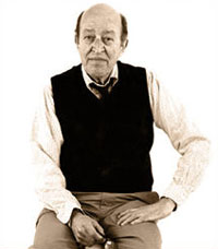
Why the Art World Turned Against Clem
Nevertheless, Greenberg --- and I have been saying this in classes and lectures for years -- was one of the better post-Pollock artists. Not a Johns or a Rauschenberg, but certainly in the disguise of or in his de facto collaborations with Noland, Olitski, Larry Zox, Morris Louis, Larry Poons, and even Gene Davis (who should have known better) he was a better artist than Larry Rivers, Marisol, and most of the Second Generation Abstract Expressionists.
Greenberg is one of the most undervalued, under-acknowledged artists of the '60s. The key to understanding Greenberg as an artist (whose criticism thereby becomes totally self-serving) is to grasp that art is collective. You don't have to actually make it yourself to be the author. Everyone drinks out of the same stream; no one goes it alone. And once you move from the myth of self-expression to the myth of pure form, it is possible to see collaborations, even unacknowledged ones between artists and their critics, as radical -- in a way that even the minimalists and their successors, the conceptualists, barely touched or fully plumbed. The heroic artist is left behind.
The artist as prophet, chained to self-expression or transformed by same is toppled. There might, of course, be a group subjectivity. Indeed some art posits and might even demonstrate such a transpersonal consciousness. I am thinking of the Surrealist Unconscious and the Spiritual Superconsciousness. But so-called objective aesthetics is the point here, in a discussion of Greenberg's role in artmaking, his "philosophy" of taste.
Greenberg's struggle was against the subjectivity (and inter-subjectivity) of the dreaded Surrealist Decadence, with its alchemy, fraternity and liberty - and its playing around with various Exquisite Corpses. It was a bourgeois struggle against yet another False Messiah. But this time the False Messiah was first Andre Breton and then Marcel Duchamp. For all of Greenberg's undigested Hegelism, he behaved like a logical positivist of the worst sort. That late in his career he can be caught reading Wittgenstein is telling. It is now generally conceded that the apodictic is a mysticism of the lowest kind, as pernicious in its own way as the notion that history itself has a will, is a kind of inescapable all-controlling entity -- or should we say demiurge? Now we know better or should. Nothing is self-evident; nothing is predetermined. That is our terror, and our freedom.
That Greenberg fell victim to a psychoanalytical cult indicates his childish need for absolutes. At least when he was a Trotskyite in the late '30s he was in good company; many of the best and brightest had made that error. Trotsky, the deposed head of the Red Army, let on that culture-workers had a part to play in the coming world revolution. Stalin offered no such hope; and proved it by his systematic repression and the Moscow Trials.
Greenberg, it turns out, is not all that important as an art critic. Although it was obviously difficult for him to deal with the fact that everyone but he himself was making money from his pronouncements, his subsequent bad behavior is simply a question of ethics. Talk about value judgments! More important is his role as artistic collaborator, because this destabilizes art and, yes, individualism. Art gifts? The French did it way before him. Critic as art dealer? Who cares. The shocker is his role as a fixer. Not as in horse race, but as in fixer-upper. He had a hand in the art! Suddenly all roles were blurred. And that was easily repressed by focusing on his love life, his double-dealing, and other shenanigans.
If the truth be told, the moment we recognize something as art we are in collaboration with whomever has presented the art proposition. But even before this mystical communion, other collaborations have taken place. Do not art professors, either through inspiration or force, co-create the works of their students and, in a not-so-subtle way, long after graduation? Does not the critic or curator who comes into a studio and says "this one, but not that one" co-create the results?
Greenberg did more than point. We have seen photographs of his masking tape edits on unstretched canvases of painters he was promoting as the next great thing. And critic Rosalind Krauss, once a Greenbergian herself, startled the art world with before-and-after photographs of Greenberg's alterations of David Smith sculptures. He ordered paint stripped from at least ten sculptures, having always disliked Smith's attempts at polychrome. This is what did him in. The artist is sacred; art is sacred and death is a sacred seal. The artist, even after death, must have the final say. But what if the person involved, like Greenberg, has been a collaborator, a co-creator all along? If Gilbert altered what he and Sullivan had created would that have been a mortal sin? If Abbot went on to change an Abbot and Costello joke would that have resulted in hellfire?
Here's the rub: Greenberg was right. If you look at where he taped the Louis paintings, there is no better cut. Smith's painted sculptures were really bad.
FOR AN E-MAIL ART0PIA ALERT WHEN A NEW ENTRY IS POSTED: PERREAULT@AOL.COM
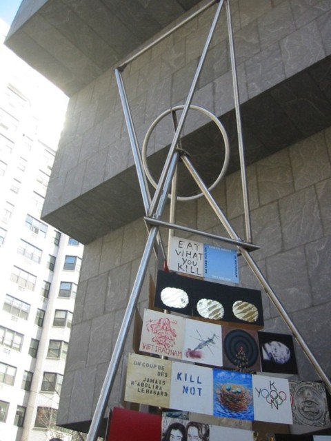
Tiravanija and deSuvero, etc.: Peace Tower, 2006
Better Than An Art Fair; Faster, Bigger, Darker
What is there left to say? The Whitney Biennial (through May 28) always has enough for everybody ... to hate. I, however, being of an infuriatingly sunny disposition, always find something to love.
Two innovations this time are of note. The Biennial has a title: "Day for Night," after Francois Trouffaut's film (not his best) L'Nuit Americaine. "Day for night," translated into French as "American night," means filming in daylight with filters to create the look of nighttime. Does this mean that what some now perceive as The American Night is an illusion? Is the war in Iraq only a Hollywood fantasy?
These are dark times.
I have taken to this proclamation, whispering it in my deepest, most ominous voice, directly into the ear of my victim, usually someone who is complaining or ranting. I don't think I have to explain.
So if the two Biennial curators, Chrissie Isles of the Whitney and Philippe Vergue of the Walker Art Center, intend to capture this darkness (as they seem to indicate) then there is indeed a sociological and perhaps a political statement being attempted.
"Day for Night" is a catchy title, open to many meanings. The prevalence of films, videos, and mass media in the Biennial offering, is the most superficial. But the theme is not rigorously (or rigidly) defined orworked out. The Biennial, if nothing else, is a large group show and prey to all the difficulties inherent in that form. A title (or a theme) is only a partial solution to the inherent incoherence of multiple art sensibilities forced to sit and behave under one tent. The title/theme must be provocative, which is certainly not a problem here. But although ourtendancy is to be indulgent to a first-time slant, we are dealing with a catch-all phrase. Almost anything could fit under this poetic rubric.
Are there other, perhaps less poetic themes that might prove more useful? Future Biennial might be media-specific. In the deep dark past the Whitney alternated painting and sculpture surveys, annually. A painting Biennial? A projected-art Biennial? Why not? Do we really want, as is presently the case, to be forced to compare soup to nuts? Paintings to full-scale Hollywood-type film-art? Pierre Huyghe's truly weird penguin movie A Journey That Wasn't to Francesco Vezzoli's delicious trailer for a non- existent remake of Gore Vidal's Caligula? In terms of the former, this viewer's love of arctic and Antarctic landscapes (rapidly melting, it turns out) was undercut by an afterimage of that stupid, other penguin movie, The March of the Penguins, beloved by right-wing proponents of so-called family values. In terms of the hilarious Caligula, it's always worthwhile even just to get a glimpse of Karen Black, the only movie star (other than Dan Duryea) I have ever wanted to meet.
Ironically both products are flawed by production values. As with a Matthew Barney film, I see dollar signs imbedded in every take, cut, costume, prop. Production values, may we be saved from production values by a strong dose of Arte Povera, soon! No one ever said it was cheap to be an artist, but it seems to be getting increasingly expensive, and I do not mean merely the cost of lofts. We always suspected that what we call art is art for the rich, but it is now dawning on some that perhaps now art can only be made by the rich or those with immensely creative fundraising capabilities.
Geography could be another Biennial theme. Artists of the American South, the Southwest, the Pacific Northwest. Or, since we are consciously international (i.e. global) why not a Biennial made up entirely of Latin American artists? Or Australians?
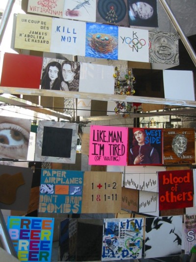
Peace Tower (detail), 2006
But Is It International?
The Biennial is now officially "international." But, by the way, when you go to the Biennial on-line catalogue the statistics are less than awesome:
East Coast - 34
West Coast - 17
Central U.S. - 9
Puerto Rico - 3
International - 11
No Region - 7
"No Region" is my favorite, and not only because it includes jazz great, the late Miles Davis and the Artopia-approved Critical Art Ensemble. "No Region" suggests a parallel universe, which more and more, like Artopia, may be the best place to be.
Traditionally the Biennial has been limited to U.S. artists, which always involved a little nit-picking. Out of necessity foreign-born artists (de Kooning, Rothko, etc.) were included. Modern art has always had an international or at least a North Atlantic bent. The term Euro-American Modern would be a blatant redundancy. Yet some important artists, although residing in the U.S., but technically not citizens, were excluded from the Whitney in the past.
Art is nomadic. Artists are nomadic. We are all citizens of Continental Airlines, Time-Warner, and Microsoft. The daily Existentional question is no longer "who am I?" but "where am I?"
National is international and local is national. In Phoenix last month, what did I see? Two splendid exhibitions: Pat Steir at the Bentley Gallery and a Petah Coyne survey at the Scotsdale Museum of Contemporary Art. Where was I? Hadn't I just seen (and written about) Coyne at the Sculpture Center in Queens? Three years ago when I was in Berlin, whose work did I see at the Berlin Guggenheim? Richard Artswager. I had to go all the way to Berlin to see Artswager?
There is no longer any regional art or any national art; it is all "American" art even when it's not made by an American. Is this why all Chinese installation artists produce works that could have been made at the Chicago Art Institute or Yale or in Dusseldorf? That's what globalism means. The dark side of globalization is that everywhere art is the same.
In the late 19th and early 20th centuries art and artists came from Russia, Italy, Spain, Scandinavia, The Netherlands, Latin America and so forth, to Paris. Then modern art moved to New York. Now, building on what happened here, modern art spreads out again, around the world, and even back to Europe. It is one big, gigantic conversation; members of one big family at each other's throats. All commodities are by their very nature global; art is a commodity. Global is not news; the end of the gallery system, struck down by art fairs, is.
Or may be soon.
Dealers will always be required. A dealer once explained to me why artists selling directly out of their studios might not only be breaking implied contracts and cheating their reps, but were risking doom: collectors really didn't like to deal with grubby artist types. I think it is the other way around: artists prefer not to deal with up-tight, uninformed, money-grubbing, investor/collectors. Better to let the dealers do the dirty work, bless their souls. Nevertheless, I predict that art dealers, like artists, will be homeless, stateless, nomadic. As an art sales rep, moving from one art fair to the next, your website is your only permanent address.

Peace Tower (detail), 2006
Elder Art (You Heard It Here First!)
Finally, I suggest that a larger number of older, accomplished artists be included in future Biennials as was once the case in ancient times. It was always a big boost for newcomers to be shown next to elders, rather than just among other tots and toddlers. Here the best we can say is that we have an anti-war poster by Richard Serra, Mark diSuvero's recreated 1963 peace tower (with Rirkrit Tiravanija) and scattered work by musicians (Tony Conrad), filmmakers (Kenneth Anger and Michael Snow) and an underground celebrity (Taylor Mead).
L.A. Noir


Servo: Untitled Projection Apparatus, 2006
Like many, I lack the patience to watch most time-locked, media presentations in galleries and museums. Is it hyperactive me? The form? Or the ill-begotten mini-movies themselves? I was also in L.A. last month and did see "Dark Places" (through April 22) at the Santa Monica Museum of Art. There, a 76-artist, time-art presentation beguiled me. As at the Whitney, darkness is a theme, but the moving images are presented simultaneously on monitors at the ends of the tentacles of the central presentation module, or projected from same. This strange structure by the Servo architecture collective, is the new Medusa. The art part shifts from the individual offerings to curator Joshua Dechter's overall bath of moving images, which --- although probably unfair to the artists --- is deliciously overwhelming. The sum is more than the parts.
FOR EMAIL ARTOPIA ALERTS: CONTACT PERREAULT@AOL.COM.
AJ Ads
AJ Blogs
AJBlogCentral | rssculture
Terry Teachout on the arts in New York City
Andrew Taylor on the business of arts & culture
rock culture approximately
Laura Collins-Hughes on arts, culture and coverage
Richard Kessler on arts education
Douglas McLennan's blog
Dalouge Smith advocates for the Arts
Art from the American Outback
For immediate release: the arts are marketable
No genre is the new genre
David Jays on theatre and dance
Paul Levy measures the Angles
Judith H. Dobrzynski on Culture
John Rockwell on the arts
Jan Herman - arts, media & culture with 'tude
dance
Apollinaire Scherr talks about dance
Tobi Tobias on dance et al...
jazz
Howard Mandel's freelance Urban Improvisation
Focus on New Orleans. Jazz and Other Sounds
Doug Ramsey on Jazz and other matters...
media
Jeff Weinstein's Cultural Mixology
Martha Bayles on Film...
classical music
Fresh ideas on building arts communities
Greg Sandow performs a book-in-progress
Exploring Orchestras w/ Henry Fogel
Harvey Sachs on music, and various digressions
Bruce Brubaker on all things Piano
Kyle Gann on music after the fact
Greg Sandow on the future of Classical Music
Norman Lebrecht on Shifting Sound Worlds
publishing
Jerome Weeks on Books
Scott McLemee on books, ideas & trash-culture ephemera
theatre
Wendy Rosenfield: covering drama, onstage and off
Chloe Veltman on how culture will save the world
visual
Public Art, Public Space
Regina Hackett takes her Art To Go
John Perreault's art diary
Lee Rosenbaum's Cultural Commentary
Tyler Green's modern & contemporary art blog
