Artopia: April 2005 Archives

Last week, a well-attended memorial for Leon Golub (1922-2004) was held at Cooper-Union's Great Hall (where Lincoln spoke). Personal talks and reminiscences were offered by Nancy Spero, the artist's wife and a fine artist herself, as well as by Kiki Smith, the poet Clayton Eshleman, and many others. I was reminded of an appreciation I wrote for N.Y. Arts magazine in June of 2001 on the occasion of the artist's retrospective at the Brooklyn Museum. I couldn't find it online, so I thought I would insert it here, with only a few changes in tense.
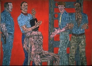
Leon Golub: Interrogation I, 1981
Mercenaries and Mad Dogs
Can we look at the paintings of Leon Golub with fresh eyes? Forget the kind of seeing that has to do with the postage-stamp reproductions in books and magazines. There's an idea: Golub U.S. First Class stamps! When that day comes, rest assured it will have to be when war is over, when police states have been eliminated; when torture and terrorism have been abolished; when racism is no more.
But even if the reproductions of Golub's masterpieces take up the whole page, you can't get the sweep of his gargantuan paintings. Only in the biggest lecture halls or in an old-fashioned movie theater could you get slide projections anywhere near the size of something like Vietnam II, 1973, which is 40 feet wide. This is Cinemascope, or even Cinerama. This is the way movies used to be; this is the way of the Rivera or Orozco or Siquiros mural---bigger than any Pollock drip painting, bigger than Guernica (and I use these latter examples for a reason) and bigger than life.
In regard to my reference to Pollock and Picasso, any comparison to the former is a strange one, for Golub's work, be that as it may, has no delicacy or mysticism, and his anger and angst is in your face; Pollock's agony now seems to exist primarily in his biography and in sentences written by Tom Hess or Harold Rosenberg. One might be better off comparing Golub's Vietnam paintings to Picasso's Guernica. They have that kind of wrath.
And, as with the print replicas, something just as crucial as scale would be lost: texture. You can't talk about the classic Golubs without remarking that they are on unstretched canvas hung on the wall, like circus banners, or that he scraped away at the paint with a meat cleaver. What you may not have thought of is that the lengths of unstretched canvas convey a sense of emergency that is compounded of urgency and despair. The Soldier of Fortune imagery is bad enough; the reality of the presentation and the execution is visceral. The empty zones in some of the big Mercenaries or Interrogation paintings, depending upon the pigments used, are fresh blood or dried blood. The jagged cutouts along some edges and even the irregularities of the elongated rectangles of these anti-flags further underline the sense of improvisation motivated by outrage at atrocities and abuses of power.
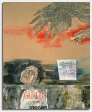
Prometheus II, 1998
I Am the Hero; I Am the Law
The exhibition of Golub's work at the Brooklyn Museum of Art (2001) was one of those rare shows that anyone passionate about art could not afford to miss. The ambition, sadly lacking in much art, was there to behold: from his myth-inspired, paint-encrusted works done in Chicago early in his career, through his Greco-Roman period when he and Nancy Spero were expatriates living in Paris, through the Vietnam paintings begun when they moved to New York, and on down to the present.
Golub used the sign system of heroic art to make violently antiheroic paintings. He traveled from Greek tragedy to the tragedy of the banality of violence; from Oedipus to the ordinary Joe as both bound and gagged victim and assassin holding a gun to someone's head. He, as we shall see, moved from the Sphinx and back. But up until the paintings of the last decade, everywhere there lurks the obscene suspicion that notions of the heroic are the root cause of a whole lot of trouble: I am the hero; I am the law; I kill and torture for a higher truth. But then one also thinks: My gun is for hire.
Can we see these works without readings? Try. Forget the Golub Brooklyn Museum retrospective catalogue quotes, e.g. "If I had to give a description of my work I would say it's a definition of how power is demonstrated through the body and in human actions, and in our time, how power and stress and political and industrial powers are shown."
Forget the thorough catalogue essay by curator Jon Bird, e.g., "To look and to be seen are not only issues of position and visibility, but historical and psychic processes embedded within social structures which contribute significantly to our cultural perceptions and evaluations."
Forget the fey subtitle of the exhibition: "Echos of the Real." In fact, before going to the exhibition, I gave myself the assignment of forgetting everything I have ever written about Golub. I am not sure I succeeded. When you write something--perhaps even when you read something--it seems to form a channel or a pathway that doesn't go away. Let's face it, there is no such thing as the naked eye.
Even Golub played with cultural and media memory: his image sources were ripped from "special" magazines and the headlines that have made us numb. In the mid-'70s he even perpetuated a whole series of political portraits: small head-shot paintings of Franco, Pinochet, Kissinger.
Nevertheless, during my first walk-through, when the preview hordes, black-clad and mostly gray-haired, had not yet swarmed into the official exhibition reception, I tried to imagine what a 20-something from Williamsburg might think. Given the state of art education and the lack of textbooks, no doubt he or she would not even have heard of Golub.
In several places there were comment books, a sure sign that someone is expecting negative reactions - and of course its better to let the yahoos blow off steam. As a curator, I have used this trick myself, only to realize that it encourages stupidity and/or sentimentality. I took a deep breath and leafed through one of the books. Gottcha. Someone had just written something like: Mr. Golub haven't you ever had a nice, happy day even once in your life? And this was a expert-selected preview audience!
No, my imagined Williamsburgian would not have written that or even thought such a thing. I think he or she would think...War, death, anger. But where's the irony?
Fortunately, there is not one ounce of irony in anything that Golub has ever painted, and this is one of the characteristics that makes him a great artist. He is our Goya, and if there isn't much of a market for deeply felt, deeply articulated protest art, then we had better stop thinking about the market.
The level of passion in Golub's work is high and, oddly enough, although there is no irony, there is certainly ambiguity. I would even risk saying that the level of ambiguity is existential. No amount of analysis or deconstruction will get rid of this level of fear and rage. He throws a monkey wrench into the art-historical machinery. He is not a Greenbergian formalist, but that kind of formalism is long gone and, at best, is a generator of intense looking at what is at hand; at worst, it's a kind of art fascism. More to the point, Golub did not participate in the modernism/postmodernism false dichotomy; he had no tricks up his sleeve.
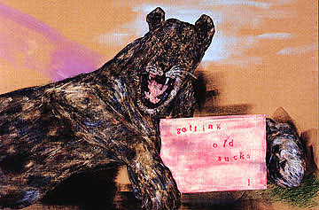
The Blue Tattoo (detail), 1998
Getting Old Sucks
And now we come to the works of the last decade. Golub, in his seventies, hadn't stopped. In fact, one might say he had come up with an entirely new body of work, on the surface more personal. The chapter in the catalogue that treats this work with great insight is aptly titled "Beware of Dog." Dogs play a large part in Golub's late vocabulary: snarling, vicious dogs. And then there are lions and skulls, and certain Greek myths are out in the open again.
Clearly, as Bird points out, Golub seems to have been influenced a bit by his wife Nancy Spero's use of archaic imagery and words. There is even an acrobat figure that is a direct quote. Nevertheless, the vision is all his: Apocalypse Now. It is not just that death is on his mind. That would not be new. The snarling dogs and the tattoos exhibit anger, yes, but a rage that is more personal than political. But perhaps in previous works the political was always personal, and that was what caused the shock.
Bird quotes Theodor Adorno at the head of the "Beware of Dog" chapter. Adorno, a leading light of the Frankfurt School and, some think, an important player in Continental Philosophy, shall always in my book be remembered as the man who totally misunderstood jazz and trashed it with a vengeance, favoring twelve-tone music instead.
Here he is quoted from his essay on late Beethoven: "In the history of art late works are catastrophes." Of course, when Adorno wrote this, Matisse had not yet arrived at his late, great style. But Adorno probably would not have even noticed.
I assume that Adorno was being ironic or rhetorical. At least I hope so, for it is generally conceded that Beethoven's last works are some of his best.
Golub's late paintings are magnificent and scary and, I firmly believe, will also eventually be seen as some of his best. The dogs are mad dogs. The death's heads and the tattoos not only recall motorcycle regalia. but point to what lies beneath these cult insignias. The Sphinx has reappeared and is as always the embodiment of mystery, riddles and doom -- but also of the interstitial. Prometheus is back, and there's a roaring lion that holds a sign lettered with the words: "getting old sucks."
In Strut, complete with a trio of buxom babes, one can make out "color and death" in Spanish but in larger, more visible red and white lettering is "ANNOUNCING the End of the World." Who could ask for anything more?
Just remember that any theory of art, any critical methodology, any overview of contemporary art that doesn't have room for Golub is not worth having.
(c)John Perreault 2001
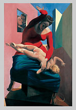
Max Ernst: The Blessed Virgin Chastizes the Infant Jesus Before Three Witnesses, 1926
Why Surrealisms Now?
Three exhibitions prompt this question: "Dal�" at the Philadelphia Museum of Art (to May 15), "Max Ernst: A Retrospective" at the Metropolitan Museum of Art (1000 Fifth Avenue, to July 10) and "Surrealism USA" at the National Academy of Design (1083 Fifth Avenue, to May 8).
I would not accuse the Metropolitan and certainly not the National Academy of Art (see below) of pandering to the public in pursuit of box-office bucks. And one should never wave a cautionary finger at the Philadelphia Museum of Art just because it has instigated or attempted to instigate one annual, crowd-pleasing blockbuster after another.
Museums are expensive to run. Blockbusters bring in new members and sorely needed cash, or so it is claimed. It depends on accounting.
Nevertheless, one wonders why there's this sudden interest in Surrealism, that most academically despised branch of modernism? Could we have run out of Impressionism and Post-Impressionism packaging ideas? "Manet, Monet and the Caf�"? "C�zanne vs. C�zanne"? Or is it just that the safe modernist masters are now just too costly to ship and insure?
I am afraid to say that by all accounts the Salvador Dal� show at the Philadelphia Museum of Art has proved a success. The Max Ernst is not packing them in, and neither is "Surrealism USA," although in the latter venue, even a handful of people on a Tuesday afternoon is probably a plus.
So somewhere soon we will be treated to "Dal� vs. Delvaux," "Dal�'s Dal�s," "Dal� and the Seashore," "Dal� and Hollywood," "Dal� and the Christ."
"Dal�" also has the virtue of inspiring full-service gift-shop offerings, whereas "Max Ernst" inspires: books about Ernst and maybe an excellent book of poems by his wife Dorothea Tanning. Ernst's paintings are really too creepy to inspire note cards, pillows, sofas, paperweights, key chains, ties, scarves, potholders, shopping bags, place mats, telephones, et al. You could get away selling lobster-flavored macaroni in honor of Dal�'s lobster telephone, but it would be hard to get away with selling nightingale-flavored macaroni in honor of Ernst's much more surreal Two Children Are Threatened by a Nightingale (1924).
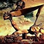
Salvador Dali, Soft Construction with Boiled Beans, 1936
Goodbye, Dal�
When I went to see the Dal� show a few weeks ago, the Philadelphia Museum of Art was jammed, booked solid on a Saturday. You had to have reservations, but even so there were too many people. Those audio tours make people cluster around certain paintings. I looked at eyes. Most people were listening, not looking, which was just as well. The paintings - even the early ones that I was prepared to like - have not worn very well.
Dal�'s crowd-pleasing photo-Surrealism so influenced bad illustration that his works now look even worse than the commercial art he influenced. Although I still think the PMA's Soft Construction with Boiled Beans (Premonitions of War), 1936, is one of his best works, in general I enjoyed the gift shop offerings more than the paintings.
That's it! Dal� was the best commercial artist of his time. I prefer his Mae West lips sofa to his soft watch and his stage sets to his paintings of imaginary stage sets. I prefer his film collaborations with Luis Bu�uel and his sequence for Hitchcock's Spellbound to his ghastly variations on the pseudo-theme of William Tell. His shenanigans were better than his paintings: throwing himself though the window of a department store was more important than the paintings he left. We love the blather of his autobiography and, of course, his mustache. He may have been the first artist to try to use media as an art form, but since the media used him to confirm middle-class definitions of the nutty artist, his fate in art history should be a lesson to all new art-world superstars. All the world loves a clown, for about 10 seconds.
But Dal� is great. Dal� is liberating. Dal� is endlessly fascinating. Dal� is a good antidote to Impressionism, to Cubism, to Abstract Expressionism ... if you are 14.
I have nothing against being 14. I loved Dal� when I was 14. There is a part of me, thank goodness, that is still 14. But when I look at Dal� now I think: Why did anyone ever think that someone who was pro-Franco could be taken seriously? And his latter-day mixtures of Catholicism and physics? Let's not even bother with that.
The Surrealists who were in bed with the Soviet Communists at least knew enough to move from Stalin to Trotsky and then out. Their hearts were in the right places; it's just their brains that were wrong, for awhile. Dal� had a dollar sign for a heart, and as the paintings prove over and over again, not much of a brain.
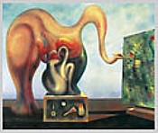
Max Ernst: Surrealism and Painting, 1942
Was Jackson Pollock a Surrealist?
The three exhibitions currently on view bring up anew the question of Surrealism's validity.
Limited formalism, now long past, promoted the idea that Surrealism was primarily literary. Since according to these lights the arts were best when separate and ideally self-referring, Surrealism was not sufficiently modern. Even MoMA modernism didn't buy that. Too many collectors would have had to throw out their Ernst errors, their Dal� dalliances, their Magritte mistakes.
But we shouldn't complain too loudly. Some Surrealism, no matter how flawed, is better than none. At least we are reminded that you may take Surrealism out of modernism, but it just won't go away. Why? There simply no better way to express, or at least emblemize, anger and fear.
A variant of MoMA modernism, apparently the invention of curator William Rubin, held that there were two kinds of Surrealisms: illusionistic and abstract. The abstract form was fine since it could be shown that Mir� and Masson were the probable sources of a certain splashiness that came to be favored in New York art.
At the Metropolitan, we could look now to a specific painting by the otherwise questionable Max Ernst -- who, like his illustrious predecessor Georgio de Chirico, was generally more on the side of poetry than form -- for further confirmation of how clever Jackson Pollock was at appropriation. The specific work is Surrealism in Painting, 1938. In it, a canvas is being painted by one of Ernst's strangest of creatures (a kind of polymorphous blob), but what is important, as pointed out by the adjacent wall text, is that the painting-within-the-painting was created by what the artist himself called "oscillation." After pouring paint into a can with a hole punched in its bottom, he swung the can from a string, creating flung lines. Pollock saw this painting in 1942.
But we could also look to a 1941 three-way collaboration now revealed for the first time by "Surrealism U.S.A." William Baziotes had the idea of dripping and throwing white paint on a small canvas, and Pollock and Gerome Kamrowski joined in. It's a gem. Kamrowski's 1945 Part I -- The Great Invisibles, by the way, is also worth looking at. Are there more where these came from? Knud Merrild, with his "flux" paintings, is another discovery: paint poured on a surface and then manipulated without a brush.
But there is also that famous Navajo sand-painting demonstration at the Museum of Modern Art that Pollock certainly must have heard about. And then there is that late-starter Janet Sobel, who, coming out of nowhere at the age of 52, showed dripped and splashed paintings at Peggy Guggenheim's The Art of this Century in 1946. Clement Greenberg, Pollock's promoter, says that Pollock knew her work.
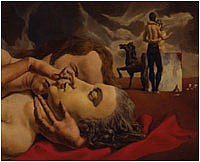
Frecerico Castellon: The Return of the Prodigal, c. late '30s
The Score: See Them All
The Dal� exhibition is predictably abysmal, and the Ernst is predictably marvelous. "The marvelous" is a technical term within the annals of Surrealism, meaning something like glorious, weird, never-before-seen, fabulous (as in fable). A waking dream. Something that unifies the conscious and the unconscious. Ernst started in Dada and then was the most adventurous of the surrealists. Even hisoften criticized American paintings have moments of great terror and joy.
Although there are some antireligious paintings (The Blessed Virgin Chastises the Infant Jesus Before Three Witnesses, 1926) and one or two anti-Fascist ones, it will not do to try to see personal expression in Ernst's artworks and then, of course, to bemoan its lack. That is not what Surrealism was about. You might be able to read into the paintings your own personal feelings, but Surrealism was an attempt to be objective.
"Surrealism USA" at the National Academy -- in spite of mylar in the hallway, dress-shop dummies, and the Duchampian string installation in the last room -- is refreshing. It is at long last a serious exhibition at this weird, but historically interesting, venue. I take it back; the recent Edwin Dickinson show was also serious. But in terms of the current survey, all of these almost-interesting American Surrealist paintings needed to be flushed out, once and for all. The exhibition shows why we really needed Abstract Expressionism. And fast. Sometimes the bad guys, meaning the formalists, were right. Or half right. Or right for the wrong reasons.
American versions of representational Surrealism was inconsequential or barely worth saving. I, of course, would buy any work like this I found at a yard sale. It is all very interesting historically, if not artistically. But Peter Blume and Louis Gugliemi? One can agree with their left-wing politics without approving of their paintings. The Los Angeles Post-Surrealists? Helen Lundeberg's Double Portrait of the Artist in Time from 1935, which one may have been intrigued by when represented by a reproduction in an art-book survey, here pales when placed in the context of other Post-Surrealist efforts. Even Adolph Gottlieb's 1939 Picnic is weak.
American Surrealism, as catalogued here, is boring not because it is representational or because it aped a far grander original, but because it was mawkish; because it offered fantasy rather than the fantastic; because, alas, it was illustration and not revelation.
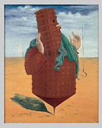
Max Ernst: Ubu Imperator, 1923
The Poet's Dream
When I was thinking about Surrealism and whether or not I should write something, I had a dream. Wearing my poet's hat (no two sides of which are alike), I was being interviewed. The Interviewer, who was unknown to me, asked, "Has Surrealism influenced you as a poet?" He must have known that a few of my poems were once published in an anthology of British and American Surrealism.
My answer was this: "Not in its results, but in its one idea."
Even in the dream, I pondered the meaning of this answer. What was that one idea?
I woke up wondering what I had meant and came up with "the idea that it is possible to experience other realities, other levels of reality, other worlds." I immediately wrote this down in my notebook. My notebooks are a bit odd. In one direction I write poems; upside down, from front to back, I jot down dreams, ideas, phrases for Artopia, plans for artworks. So now I look at my notebook and see that I continued:
Interviewer: So you are interest in Surrealism as mediumship?
JP: No, I am interested in poetry as mediumship.
But I interrupt myself because the dream of a few nights ago started up again.
Interviewer: You said you were interested in Surrealism's one idea. What is that idea?
JP: That it is possible to create other realities.
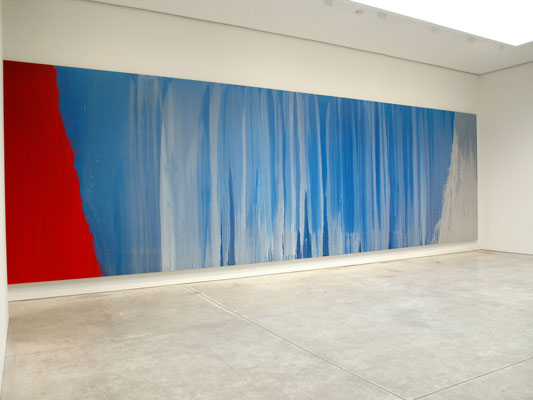
Pat Steir, Blue River
In Praise of Painting
If someone were to ask me who the best underrated painter is now, I'd have to say Pat Steir, who started exhibiting in 1964. Brice Marden is not underrated; he's having a show sometimes soon at MoMA. There, when it happens, we will have to deal with the caesura between his early monochromes (sometimes leaving thin, spattered strips at their bottom edge, giving the effect of a window shade almost-but-not-quite pulled to the sill) and his "painterly" paintings we now celebrate.
Pat Steir, who is yet to have a retrospective at MoMA or the Whitney or anywhere that I know of, presents a similar Act II. We remember her early grid paintings, replete with signs and images; but now the paintings we love are nearly abstract -- great waterfalls, of a sort. The "nearly" is their edge.
For instance, I caught myself writing about Steir as "the best underrated abstract painter." Her new show at Cheim & Read (547 W. 25th Street, to May 7) is called "Moon Paintings & a River." The so-called Moon Paintings have centrally located gashes (vaginas?) or, in two cases, eloquently awkward squiggles on or in fields or veils of paint. The river of the exhibition's title is the spectacular 26-foot Blue River. Well, she certainly is not a realist in terms of representation, or even presentation of space. She offers a lot of paint for the money. Yet who could doubt, with or without "waterfall" titles, that her veils of running paint, her rivulets and her splashes have something or another to do with water: thin, liquidy paint = water. Furthermore, water = blood; water = life. These are paintings you can hear.
Who is there after Morris Louis? Rather, since critic Clement Greenberg cropped most of the Louis paintings, who comes after Morris Louis-Greenberg?
Why, Steir, of course. This generational skip-and-jump is an almost perfect illustration of my braid theory of contemporary art (and of the strands of my own life; maybe everyone's, since we live much longer now). Each strand disappears behind the other strands for awhile, and then comes back.
Art nowadays gets absorbed so fast that, if styles and methods are to develop, they - and we the voracious consumers - need a rest. After some breathing space, Pop came back as Jeff Koons and then Damien Hirst. And now. painterly paintings have reappeared, refreshed and repositioned. It's all about reincarnations; if you don't solve all the problems you are supposed to solve, then you come back. The history of art is really the history of unfinished business.
The usual story of so-called totally abstract painting is a kind of reductive, unicursive march. My version this week is a little different. Kandinsky turned his fairy-tales upside-down; Mondrian transformed his famous tree into an aerial view of Dutch farms. No, I'm sure I have the last part wrong. It was the Manhattan grid, right?
And then in '50s, when Pollock seemed so much more abstract, and therefore more intellectual, we were scolded if we kept seeing fields of amber grain in his drip paintings or, as I have recently deduced (and celebrated in my own paintings), tangles of seaweed. I remember too that de Kooning once made fun of his old buddy Barnett Newman's "zips" by describing to me with his hands a pair of elevator doors closing down to one narrow crack. And didn't someone christen some of those Louis poured paintings "veils" and "unfurleds"? Those fields in Color Field paintings were actual fields.
The distinction between abstract (non-objective) art and representational art is theological and not in the least bit cut-and-dry. Sometimes there is oscillation back and forth, and that is very exciting indeed.
Oh, and did I forget to say that Steir's paintings are beautiful? And smart? The critic Tom Hess used to say "dumb like a painter," in spite of his friendship with de Kooning and more than nodding acquaintanships with Barnett Newman and Ad Reinhardt. If Hess were alive, he would have to eat his words. Again. Even Steir's prints at Pace Prints (now closed) were worth seeing. Her drawings at Cook Fine Art (1063 Madison Ave., to May 11) are insouciant splashes on penciled grids. The five tall drawings in the "Winter Group" are my favorites.
Blue River, like all of her rivulet paintings has great drama, a kind of theatrical presence not seen since Pollock, Newman and Louis. In terms of scale, Steir has perfect pitch. Whether or not Blue River signals a new turn in Steir's oeuvre; its enormous field (not quite fitting into the gallery room that attempts to contain it) is breathtaking.
Are Chelsea Art Spaces Too Large?
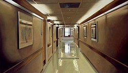
Damien Hirst, Hospital Corridor, 2004
At Artopia, we are cheerful. After all, our motto is Art As It Ought To Be, or words to that effect. So as spokesperson - in Artopia there is no king - I am emboldened to state that the Damien Hirst exhibition of paintings at Gagosian is not the end of the world, the art world or any other world. Paintings of pills, operating rooms, crack addicts, hypodermic needles, and one blood splattered car hood do not upset me because of their grisly subject matter. That they have been mostly painted by hired hands doesn't bother me in the least: this is a tradition that reaches back from Warhol to Reubens. That most of the images have been badly painted, might. But then again, they are not really about painting or paintings, are they? Being attacked by both Kimmelman of the Times and Saltz at the Voice is definitely an achievement. So Hirst, of preserved-shark fame, reportedly sold every "painting" for big bucks. So what.
The Gagosian space in Chelsea is still a fabulous venue. Perhaps too fabulous, since even in Artopia it is obvious that Hirst had to produce too much that was not fabulous in order to fill the fabulous space. In Artopia the artist always knows best; but the Gagosian gallery is not really in Artopia this time around.
Another artist I rather admire has also misjudged his own space-filling talents: Robert Gober at Matthew Mark. His headless, crucified Jesus, spouting water from its nipples, flanked by two doors partially revealing a naked man in a bathtub on the left and a naked woman in a bathtub on the right, plus the two hermaphrodite corner pieces, would have been enough. As it is, there is a lot of trompe l'oeil filler, perhaps explained by Brenda Richardson's catalog, but otherwise irrelevant.

Robert Gober installation at Matthew Marks, 2005
AJ Ads
AJ Blogs
AJBlogCentral | rssculture
Terry Teachout on the arts in New York City
Andrew Taylor on the business of arts & culture
rock culture approximately
Laura Collins-Hughes on arts, culture and coverage
Richard Kessler on arts education
Douglas McLennan's blog
Dalouge Smith advocates for the Arts
Art from the American Outback
For immediate release: the arts are marketable
No genre is the new genre
David Jays on theatre and dance
Paul Levy measures the Angles
Judith H. Dobrzynski on Culture
John Rockwell on the arts
Jan Herman - arts, media & culture with 'tude
dance
Apollinaire Scherr talks about dance
Tobi Tobias on dance et al...
jazz
Howard Mandel's freelance Urban Improvisation
Focus on New Orleans. Jazz and Other Sounds
Doug Ramsey on Jazz and other matters...
media
Jeff Weinstein's Cultural Mixology
Martha Bayles on Film...
classical music
Fresh ideas on building arts communities
Greg Sandow performs a book-in-progress
Exploring Orchestras w/ Henry Fogel
Harvey Sachs on music, and various digressions
Bruce Brubaker on all things Piano
Kyle Gann on music after the fact
Greg Sandow on the future of Classical Music
Norman Lebrecht on Shifting Sound Worlds
publishing
Jerome Weeks on Books
Scott McLemee on books, ideas & trash-culture ephemera
theatre
Wendy Rosenfield: covering drama, onstage and off
Chloe Veltman on how culture will save the world
visual
Public Art, Public Space
Regina Hackett takes her Art To Go
John Perreault's art diary
Lee Rosenbaum's Cultural Commentary
Tyler Green's modern & contemporary art blog
