Artopia: January 2005 Archives
Coyne of the Realm
At first one might not know what to make of the mass of wax ("specially formulated," at that) and "human and horse hair, ribbons, pigments, black spray paint, fabricated rubber, wire tree branches, curly willow, chicken wire fencing, wire, acrylic primer, silk flowers, bows, acetate ribbons, wire, feathers, plywood, metal hardware, pearl-headed hat pins, and tassels." So goes the list of materials on the press sheet. But that's only for Untitled #1103 (Daphne).
Daphne happens to be the first piece you see when you enter Petah Coyne's "Above and Beneath the Skin," a survey of this artist's work at the SculptureCenter (44-19 Purves St., Long Island City, to April 10). Part II of this traveling exhibition will be at Galerie Lelong (528 W. 26th St., Jan. 29 to March 12). Future sites: Chicago Cultural Center; Kemper Museum, Kansas City; Scottsdale Museum of Contemporary Art; and the home base of curator Douglas Dreishpoon, the Albright-Knox in Buffalo.
The SculptureCenter, located in a former trolley repair shop four blocks from P.S.1, is obviously not big enough for the exhibition, and the old gentlemen's agreement that exhibitions at museums and nonprofits should not be accompanied by related manifestations at commercial galleries has long been superceded; in the past it would have been too vulgar to admit that there might be a relationship between a museum or nonprofit exhibition and actual sales of art.
Although Lelong is Coyne's commercial representative, nowadays with arts fundings down we might look at such gallery/nonprofit collaboration as inevitable. Lelong is in Chelsea with a particularly serious stable of artists; whereas the SculptureCenter is in windswept Queens, in an area that, in spite of P.S. 1 as perennial would-be anchor, has not taken off as a full-blown art district.
There are not, I fear, enough suitable buildings to create the art density needed, and the Citibank skyscraper looms over all. But maybe I'm wrong again and the area will blossom. Transportation is fine. Vis-a-vis Chelsea, where transportation is problematic, maybe that's what's wrong with Long Island City: it's too easy to get to. You just get on the #7.
In Search of Grandma's Pearl Necklace
In the meantime, in the dead of winter black wax roses are in bloom. Coyne's Daphne is covered with them. There's apparently also a "wax statuary" underneath the trailing pile of flowers.
Coyne, who has to be one of the most adventurous artists around in terms of materials, is here represented by 14 sculptures, nearly half of which hang from the rafters. The materials further include: black sand and baby powder (Brides in Mourning-Medium), 1989-91; shaved car hair (?) and chicken wire (Ghost/First Communion), 1991; silk flowers, pearls, and candles (Buddha Boy), 2002; hair dye, shampoo, conditioner, taxidermy, picture hangers, and tacks (BZ-CD-Put-Put), 1997-98. There is also, somewhere (or so the artist admits), her grandmother's pearl necklace. And in the forthcoming Lelong installation, a statue that weeps.
The finicky will note that in the above I have dropped the full titles - Untitled with one number or another appended plus a parenthetical identifier; I prefer to emphasize the latter. Artworks need titles for reference and tracking. Artists traditionally use numbering so viewers won't have preconceptions about the work, allowing more freedom of interpretation. On the other hand, Ghost/First Communion and Buddha Boy, for instance, more clearly identify the sculptures and, although poetic, help the viewer to get a handle on some very complex sculptures that have a lot of covert content. Concealment is the prevalent strategy.
To some it may come as a great relief from this accumulation of materials to discover, in the small room off the main "shed," six of Coyne's photographs, cool and blurry silver gelatin prints. I, however, still prefer the gloppy pile-ups, cover-ups and air-borne nests of wax and such. And then there's that wall piece made primarily of hair (BZ-CD-Put-Put). I would go anywhere to see that. And Daphne. And Mary/Mary and MIT Peacocks.
I like the white-wax pieces better than the black ones (with the exception of Daphne). It's not just a matter of taste: the white wax, with or without actual candles, is elevated by the ecclesiastical and ritual connotations that are at the heart of Coyne's work. She admits to being a "lapsed Catholic," but no amount of assertion that her primary influence is Japanese culture will convince me. As an army-brat she spend some formative years among Japanese-Hawaiians, and in 1991, funded by the Asian Cultural Council, she traveled about Japan for six months. But the Catholicism of her vision overwhelms all else.
When Coyne admitted to Lynne Tillman in BOMB magazine that she was a lapsed Catholic, the novelist mused:
"I wonder what lapsed means. It's one thing not to be a practicing Catholic, but to lapse is something else, to disconnect, not be involved."
"You can't disconnect," Coyne answered.
When Tillman offered that "Bataille writes sex scenes on altars; only someone still connected would care," Coyne parried with:
"But that is what Catholicism is about. You're kneeling in front of this naked man up on a crucifix."
Waxing Poetic
Coyne is not, definitely not, a minimalist. So what is she? Is her work just more antiform? No formalist anitformist would allow such rampant use of connotation. Is she a feminist? If so, she seems to hold on to essentialism in a very peculiar way. In Sculpture Magazine (June '03), she told interviewer Jan Garden Castro that all of her pieces seem fragile:
But that is deceiving, because they're all begun with steel understructures. Yet I want each one to look incredibly delicate and to have that feminine sense of appearing soft and seductive. But as any number of women have shown, we have an internal strength and drive that is hard to fathom.
Women and men are so different, and I think that we address different issues in our writings and in our vision. Because this is the first century of women sculptors of any kind of quantity, the differences between the genders are more apparent. I enjoy looking at and thinking about these differences.
In many of the art schools, it seems 75 to 80 percent of the sculptors are women. Why is that? Possibly because we have no history, we're totally free to make our own history. And we're making a different history, which is thrilling to me.
Never mind that some women would be offended by the phrase "the feminine sense of the soft and delicate." How Japanese: Women are or should be soft outside but tough inside; men, the reverse. Never mind that according to some the difference between the genders has become thankfully less apparent. Never mind that art by woman does have a history, but until recently suppressed. Never mind that both women and men are free as artists to make their own history, must make their own history. Never mind that gender definitions and stipulations, no matter how outwardly benign and consensual, whether based on essentialism or socially constructed, only serve to limit human freedom
In the meantime, Coyne's sculptures will startle, will puzzle, will please, will cause you to look at the history of sculpture in a different way: Schwitters, Rauschenberg, Conner, Coyne.
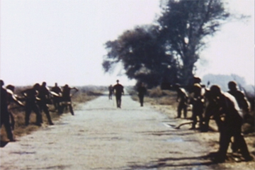
Bruce Conner: Luke
Not Lukewarm
You get beautiful blurred images, motion streaks, bare-chested male "zombies" shoveling dirt, moody music, behind-the-scenes views of a movie scene; nearly Muybridge-ian, almost dancelike motion-analysis of lumbering extras, key grips, gaffers, best boys, and script girls in jagged slow-motion; punctuating shots of empty canvas chairs and big reflectors; all in chalky and/or glowing colors, plusPaul Newman. In 22 minutes flat. Who could ask for anything more?
Although the projected film as gallery art has not yet outworn its welcome, I hate coming in in the middle of a film, which usually happens. A film, a movie, a DVD, a video is not a painting. Why is it so difficult to get rid of the linear? Beginnings and endings? We prefer loops.
Nevertheless, Bruce Conner's Luke at Barbara Gladstone (515 West 24th St., to Jan. 29) goes far to justify that trendy mode of presentation.
Also featured are two rooms of Connor's 1978 San Francisco punk-scene photographs. I like individual shots (the messier and the more rambunctious the better), but I see them all together as a film, each photograph a single frame, passing by in the blink of an eye. Like Punk itself.
Unless you are a diehard black-and-white photo fan, Luke is the main draw.
Because he was a buddy of the young actor/photographer Dennis Hopper, Conner was able to film one day of a shoot during the making of Stuart Rosenberg's 1967 Cool Hand Luke, using his wee 8mm camera. Conner recently told poet/critic John Yau in theBrooklyn Railthat since he limited himself to one reel and did all the editing in the camera, his entire production cost was three dollars.
The first time around, Conner showed his footage five frames per second rather than the standard 24, thus stretching the two-and-a-half minute filmed running time to 15 minutes of projection time. Two years ago -- at the request of composer Patrick Gleeson, who wanted to add music -- the 16mm version was transferred to DVD at three frames per minute, yielding the current 22-minute length.
Conner was born in 1933, and Luke in its present form is one of those career-confirming mature works of art. And although we may yearn to see some of the artist's moldering assemblage sculptures -- using nylon stockings among other things -- Luke in the meantime will send you running to your local video store's avant-garde section to catch up on this West Coast artist's masterful found-footage films.
I rented one compilation (Bruce Conner Films II, Facets Video) that has, in this order:
Ten Second Film (1965). Spliced leader adding up to 10 breakneck seconds of film leader. START, the one-armed clock. Numbers. This is not only the best 10-second film ever made, it is also one of the best found-footage films. It's abstract without being nonrepresentational.
Permian Strata (1969). A collage of found scenes from a silent Biblical epic to the tune of Bob Dylan's Everybody Must Get Stoned, featuring the hero being stoned and thenSaul (soon to be St. Paul) being struck down by God.
Mongoloid (1977). With a charming soundtrack of the offensive ditty "Mongoloid was a mongoloid and it determined what he could be." Footage of science demonstrations, animated diagrams, and (!) a man pulling a bus with his teeth, but also a similar "square" being transported in a giant suitcase.
America is Waiting (1981). People entering bomb shelters, advertising for a toy gun, an Arid Roll-on clip, Mount Rushmore, and at least two superimposed full-screen titles: "What Can Be Done About Larry's Personal Problems" and "No Will Whatsoever." And, oh yes, appliances rolling past the silhouette of a jazz band; all to tick-tock music by David Byrne and Brian Eno.
A Movie (1958). Although it started as a sculpture component, this is the Conner movie masterpiece. At the beginning is THE END; the title A MOVIE is interposed throughout. Conner THE END sandwiches atom-bomb explosions, A MOVIE bridge collapse, Teddy Roosevelt BY and, during footage BRUCE CONNER of cowboys chasing Indians, suddenly there is an elephant.
Suddenly There Is an Elephant. That says it all.
Conner, in his classics, juggles context and time. A Movie is a symphony depicting the dreamlife of TV addicts, movie junkies, a movie for us and of us. Even the "hopeful" ending of sun on water is probably a metaphysical, anti-Hollywood joke.
In comparison Luke is cool. There is no elephant. For 22 minutes the camera seems to hold its breath. You too hold your breath.
Many projected digital films are like watching paint dry. Here, this is not the case. Nor is Luke a Sundance wannabe, waiting eagerly for Cineplex exposure.
Time reads as space.

Conner, Luke (Dennis Hooper as himself/as Babalugats)
Saint Luke
Of course, I immediately had to track down Cool Hand Luke to find the exact scene depicted in Conner's film. It's the road-gang shoveling race. Fresh tar needs to be covered with sand and smiley Luke inspires an insane speed-up.
I don't know if you've seen Cool Hand Luke lately. Hopper has a small part, but somehow, as a young man, looks better, more real, than the blindingly but conventionally handsome Newman. Current taste prefers a far less smirky Newman replete with macho wrinkles. And George Kennedy, as Luke's friend and eventual Judas, is...George Kennedy.
The movie is now unbearably arch.
Newman plays a decorated vet incarcerated for "cutting off the heads of parking meters," becomes a hero to the chain-gang boys, who spend a lot of time bare-chested, lounging around in their bunk beds. He's a hero because, against all odds, he keeps escaping from the chain-gang. He gets caught and escapes over and over again.
After the shoveling race, in what has to the nadir of the buddy-movie gone wrong, Kennedy says to Newman: "Oh, Luke, you wild, beautiful thing." It still makes me giggle. In my set, that was the preferred tag-line, rather than the widely appropriated "What we got here is a failure to communicate."
If you look at Cool Hand Luke, do as I did. Fast-forward it so it becomes a digitally created silent-movie in color and Panavision. You won't miss the dialogue, the acting, the sappy music. You can still follow the plot, such as it is. Is it a parable or shaggy-dog story? You tell me. And, if you must, you can freeze-frame all those banal bunk-bed tableaux.
Moral: How a movie is made is more interesting than how most movies end up.
Conner's Luke shows this. It takes a lot of workers, and a lot of reflectors, behind the scenes to make a chain gang composed of actors in the sun look real or what passes for real -- i.e. Hollywood Real. Conner's analytical take on a shoot is itself a movie and therefore moves, albeit very, very slowly. One thing missing is the waiting around each take takes. Movie-making is boring; Conner makes that boredom interesting by slowing everything down as if he is searching for clues. Clues to what? Reality? Time?
What you will notice when you see Luke will vary; its density is brilliant. Will it be a reflection in a puddle? The fleeting, over-the shoulder actor-smiles? Or, alas, only the beer-can opener on a chain around Lucas Jackson's neck? That is Paul Newman, isn't it?. And is that really Dennis Hopper? Or maybe you'll fasten on that particular blue of someone's screen-filling polo shirt; the Warner Bros. logo on the sound truck; or something really subtle like the aura of work as opposed to the aura of style.
Note: In terms of last week's column, several informants have offered the good news that there is a DVD tour of the Barnes collection listed on the foundation's website. One correspondentremarks that at $35 it cost less than two adult visits to MoMA. Assuming this disc really does capture the ensembles, now all the foundation needs to do is make this record totally pan-and-zoom interactive and have it available for free online.

A Prison for Art
I have always found the Barnes Foundation just a bit too hard to get to and some of its rules strange. There's not enough parking. You have to pay in advance by credit card when you book and there are no cancellation refunds. With your online confirmation, you will learn:
All coats and similar bulky garments, which do not fit flush against the body, must be checked in the Coat Check Room.
Galleries are kept at a constant temperature of 70 degrees.We recommend that you wear a sweater or long-sleeved shirt for comfortable viewing, since coats/jackets cannot be worn.
[But I thought they could be worn if they "fit flush against the body."]
Visitors must remain at least 18 inches from all objects displayed in theGallery.
And most bizarre of all:
Shoes with heels smaller than 2 inches in diameter may not be worn in the Gallery.
Since high heels have heels smaller than two inches, I can only conclude that this rule is to protect women from the deleterious effects of these once-again fashionable torture instruments. Or is someone afraid women will use their stilettos to attack the Matisse paintings? Or other visitors?
Sure, maybe it's the soft floors, but hasn't anyone heard of gymnasium wax?
I cheer the new court-approved relocation of patent-medicine tycoon Albert C. Barnes' celebrated collection of paintings by Matisse, Renoir, and Cézanne from proper main line Merion, where apparently it was not particularly appreciated, to downtown Philadelphia proper. It is hoped tourists will flock in droves, bringing life and money to the Haussmann-type boulevard called the Benjamin Franklin Parkway.
Now that Barnes' eccentric will has been broken by a judge of the Orphans Court, the move will be financed with $150 million promised to be raised by the Pew, Annenberg, and Lenfest foundations. There is no need here to go into back-story detail. The possibly elitist community of Merion restricted visitor parking, which therefore restricted visitor income, and the small Barnes board, dominated by nonart types from nearby Lincoln University, somehow...Well, there was so little money left, they had to tour some of the more famous paintings for cash, in spite of Barnes' will that disallowed such traveling shows. The board still couldn't make a go of it. Never mind, a new, expanded board with some art experience might take care of things.
And the relocation site?
I was in Philadelphia for Christmas, so I checked out the designated property, the Youth Study Center, a juvenile prison across the street from the Whole Foods supermarket I sometimes frequent. Around the other side, the detention center is indeed on Benjamin Franklin Parkway, between the public library and the wee Rodin Museum, but nowhere near the Philadelphia Museum of Art. The PMA lords it over the entire expanse from a hill at the end-point of the Parkway. On foot it is too far away. A proposed Calder Museum may be sited along this thoroughfare as well, but the idea that art tourists will walk from museum to museum along such an off-putting expanse has to be a joke. No Philadelphian will.
Many still believe that the PMA was placed outside the center of town on a hill at the end of the specially built parkway to protect the art from citizens still unfortunate enough to live in formerly plague-ridden, certainly immigrant-infested, Center City. Those claustrophobia-inducing row-houses look charming now, but in the 18th century they were tombs. Charles Brockden Brown, America's first novelist, gives a first-hand account of Philadelphia's 1793 yellow fever epidemic in his 1799 Arthur Mervyn. Malaria and cholera are not soon forgotten. Immigrants, of course, were a bother to Anglo-Americans everywhere.
Contrary to its publicity efforts, Philadelphia is not a walking city. Try walking from Independence Hall to the PMA. Little boys may see dead people, but after six no one else is around. Except for the Avenue of the Arts before and right after showtime, you don't see anyone in the streets.
I admit that when I was a youth I periodically trudged from the Greyhound Station to the Museum on the Hill, and gladly so. But only in broad daylight. Let us hope that a free tram or a monorail will materialize along the dreaded Benjamin Franklin Parkway, and not just a windswept, isolated outdoor café, such as now planned for the sidewalk in front of Moore College of Art. Moore College isfamous in my mind for having torturedAlice Neel (or so she told me), Philadelphia's most famous painter since Thomas Eakins. Eakins was kicked out of the Philadelphia Academy of the Fine Arts (nowhere near the Parkway) for using fully nude male models in his drawing classes.
Of course, people do get around the Mall in D.C., but I think it will take more than a parade of outdoor cafés to get them to stroll the Parkway of deadly crossings and zero inhabitants. No doorways means no lurking beggars, but it also means no shelter for the skittish.
I'm sure the Barnes relocation will all fall into place. However, I think the juvenile prison should not be razed, but instead be converted to museum use. It is strangely postmodern just as it is. Money saved could be used for more free days for the workers whom Mr. Barnes tried so desperately to educate about art.
But my second idea is more important. And because it is so important it will take us a little while to get there.
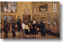
The Barnes Ensemble
I agree that ideally Barnes' eccentric installations should be replicated as exactly as possible. He placed tools and other decorative or useful objects alongside his precious Matisse and Renoir paintings to make formal and subject-matter connections. He put together paintings of all sizes and even included African art. He was a friend and supporter of philosopher John Dewey, who became his first education director.
Dewey was one of the leading lights of Pragmatism, a much misunderstood philosophy. His Art and Experience, with its effort to show a real and even a practical connection between art and life, was an early influence on yours truly and thus instrumental in the founding of Artopia. So I suspect Barnes' violation of the strict hierarchy of art, usually practiced by museums, was intentional. In fact, the foundation is a school as well as a museum, teaching his view of art to a dwindling number of students.
We salute and wish to continue to honor Barnes' chutzpah. And there is another reason for retaining his special arrangements or ensembles.
How tedious indeed is the march of paintings across white walls. Once in awhile we like things skied and categories mixed up. We also like to see some suggestion of the history of display in museums and homes; which is why we like the Isabella Stewart Gardner Museum in Boston and the Frick in New York, and we even like nonart museums like the glorious Mütter Museum, also in Philadelphia (but not on the Parkway and probably never to be so positioned). The Mütter, whose director Gretchen Worden just passed away, is an intact medical college teaching-museum, replete with wax versions of skin diseases, trays of things found in people's throats, and a whole display on Siamese twins, not to mention a corpse that has turned to soap.
The Barnes is not only a museum but was meant as an art school and has been one since it was founded. Here, as an example of Barnesian art education, are two of the classes currently being offered:
The Active Eye: Art and Sense - Ability
Learn to tap your natural creativity, recognize it in others and incorporate creative thinking in your life and work. Students will experience painting and sculpture using their active eye and discover how artists think and create. The class will attempt to integrate visual phenomenon with sensory awareness, investigating how thoughts, emotions, and sensation can determine how and what we see.
Poetic Structure and Natural Elements in Art
Explore the theme of natural elements: earth, air, fire and water through philosophy, literature, poetry and the art collection of The Barnes Foundation. Students will study themes in Barnes's installations, and the relevance of natural elements in the arts of diverse cultures.
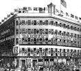
P.T. Barnum's American Museum (1841-65)
This Way to the Egress
Yes, the ideal would be to replicate exactly the Barnes art ensembles. But you and I know that only in Artopia are ideals achieved. In real life, time goes by and there are emergencies, fancied and otherwise. Someone might come up with a new way of teaching art that is much more effective than Barnes' juxtapositions. Or people may just become bored with the same old arrangements. So, not only as an educational creation in itself but also as a fallback, the Barnes should create a virtual tour of the museum to record exactly the way the founder of the foundation intended the art to be shown.
Do the required panoramic digital imaging now, before it's too late. The rooms and their educational ensembles can then be available online, even during the move to the Benjamin Franklin Parkway..
How did I get this idea? In my last installment, which investigated some museum issues in a satirical way, I needed a marker for the origins of museums in the U.S. and googled P.T. Barnum's American Museum, which you may remember was set in place at Anne Street and Broadway in1841 and burned to the ground in 1865.
A site called the Lost Museum allows you to pan a 360-degree digital reconstruction of three floors of this lost museum. It's like those 360-degree apartment, bed-and-breakfast or hotel panoramas on the internet, except this one is "bigger," educational, more fun. You cannot really find Chang & Eng or the infamous FeJee Mermaid, and I would like the many paintings on its walls zoom-able and identifiable. Even though you might not be able to locate George Catlin's painting An Iowa Addressing a London Audience, you are looking nevertheless at much more than kitchens or headboards. You are in a museum.
Elsewhere on the site (prepared by the City University of New York), you can access some fascinating documents:
Here's an excerpt from Barnum's letter to The Nation dated July 29, 1865, answering an attack, but relevant to the notion of for-profit museums (see last week's entry below) and museum rules (see above):
I am not thin-skinned, and I know my Museum was not so refined or classic or scientifically arranged as the foreign governmental institutions, for mine had to support my family, while those require annually from the government thousands of pounds. "That class for which it [my Museum] would seem to have been originally intended" would not support a proper museum pecuniarily. More's the pity-but such is the stern fact. Hence, to make it self-supporting, I was obliged to popularize it, and while I still held on to the "million of curiosities," millions of people were only induced to see them because, at the same time, they could see whales, giants, dwarfs, Albinoes, dog shows, et cetera...
I permitted no intoxicating liquors in the Museum. I would not even allow my visitors to "go out to drink" and return again without paying the second time, and this reconciled them to the "ice-water" which was always profuse and free on each floor of the Museum. I could not personally or by proxy examine into the character of every visitor, but I continually had half a score of detectives dressed in plain clothes, who incontinently turned into the street every person of either sex whose actions indicated loose habits
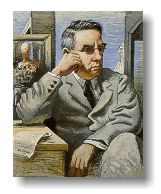

Albert Barnesby De Chirico P.T. Barnum
The Virtual Barnes
This week I looked for other online museum tours. Many listed as virtual tours are not sideshows like the Barnum Museum's, but only slide shows. I prefer the interactive. I want to pan and zoom. Why can't museums use a system (like a screen-saver I once had) that will allow you to turn corners and go down hallways as well as pan and zoom?
Yet there are some remarkable virtual tours. I would cite as visit-worthy the virtual Metropolitan Museum of Art, the virtual Louvre and the virtual Ringling Museum. At the Met online you can not only pan 360 degrees around the Frank Lloyd Wright room, but zoom in for details and then click for multiple views and see a drop-leaf table in action. There are also some little bits of strangeness here and there: the virtual San Jose Museum of Art features the museum's store and café!
All the virtual tours are, of course, a bit ghostly, since no people are seen. No heads, hats or stupid remarks get in your way. Or docent prattle.
The solitude is refreshing at first, but then uncanny, making one think about museum visits as social functions. I may now have to rethink my priorities. I am I confess quite irritable when there are people around me at museums and there's noise. It's the difference between watching a movie in a theater and watching it home on a DVD. Which is more real?
Nevertheless, pedagogically a virtual Barnes might have its place. It would reach millions who can't come to Philadelphia. It would spread the Barnes art gospel world-wide. Visitors could get drunk, have "loose habits" and even wear high-heel shoes and/or cowboy boots.
But we can't stop here; we have to extrapolate.
Why not have a museum that only exists online? We could conjure up our own ideal museum with the art we like, in arrangements we have designed.
Using those little pointers, we could "walk" through gallery after gallery without moving an inch. We could walk through all of art history, or create an alternate art history at will. Every art teacher could design his or her own Museum of Modern Art or Louvre. We can invent museums that no one has ever thought of before. And not have to deal with architecture, architects, parking, board members, climate control, archival standards, and other tedious things.
With all this in mind, I have invented The Curator Game (registered trade mark) that would allow you to rearrange the MoMA galleries at will, using virtual paintings and sculptures in the virtual spaces. The same could be done for the Whitney or SF MoMA or the Metropolitan Museum of Art. It would be even more educational if you could play with all the works in these collections, not only the ones that happen to have been selected for display. Or make up ideal exhibitions, thematic or otherwise, from any number of collections.
There would be a special edition for artists: you could design your own museum exhibition and include your own art. Where would you put your best artwork? Next to Pollock or Duchamp or next to Brice Marden? You could mount your own retrospective too, perhaps made up of works you have never made.
Note: When I was establishing the links for the various virtual museum tours, I noticed that the Metropolitan Museum already has a site called MyMet Gallery. You have to register, but then you can "gather your favorite works of art from the Museum's online collection." The resulting display, however, is not a virtual, interactive panorama.
AJ Ads
AJ Blogs
AJBlogCentral | rssculture
Terry Teachout on the arts in New York City
Andrew Taylor on the business of arts & culture
rock culture approximately
Laura Collins-Hughes on arts, culture and coverage
Richard Kessler on arts education
Douglas McLennan's blog
Dalouge Smith advocates for the Arts
Art from the American Outback
For immediate release: the arts are marketable
No genre is the new genre
David Jays on theatre and dance
Paul Levy measures the Angles
Judith H. Dobrzynski on Culture
John Rockwell on the arts
Jan Herman - arts, media & culture with 'tude
dance
Apollinaire Scherr talks about dance
Tobi Tobias on dance et al...
jazz
Howard Mandel's freelance Urban Improvisation
Focus on New Orleans. Jazz and Other Sounds
Doug Ramsey on Jazz and other matters...
media
Jeff Weinstein's Cultural Mixology
Martha Bayles on Film...
classical music
Fresh ideas on building arts communities
Greg Sandow performs a book-in-progress
Exploring Orchestras w/ Henry Fogel
Harvey Sachs on music, and various digressions
Bruce Brubaker on all things Piano
Kyle Gann on music after the fact
Greg Sandow on the future of Classical Music
Norman Lebrecht on Shifting Sound Worlds
publishing
Jerome Weeks on Books
Scott McLemee on books, ideas & trash-culture ephemera
theatre
Wendy Rosenfield: covering drama, onstage and off
Chloe Veltman on how culture will save the world
visual
Public Art, Public Space
Regina Hackett takes her Art To Go
John Perreault's art diary
Lee Rosenbaum's Cultural Commentary
Tyler Green's modern & contemporary art blog
