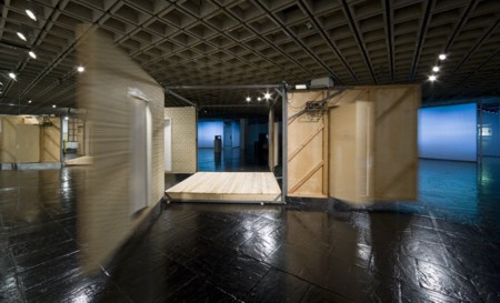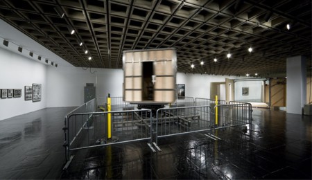
Paul McCarthy: Bang Bang Room, 1992. Collection Fondazione Sandreto Rebaudengo, Turin.
Courtesy of the Artist and Galerie Hauser & Wirth
Photo: Sheldan Collins
Disorientations
Who is Paul McCarthy? Not having the good grace to simmer down like a few other once-sensational artists I will not deign to name, McCarthy has never gone away, never graduated to the curious art Valhalla comprising those who are still here but gone. Or, alternatively, those gone but still here.
In short, professor McCarthy, who has taught art at UCLA since 1982, continues to annoy, and in the process resists either art-rag or art-establishment packaging. A West Coast rather than an East Coast favorite, he is neither the last of the Destruction Artists nor the first of the shamans. “Paul McCarthy: Central Symmetrical Rotation Movement” at the Whitney until Oct. 12 offers up a disconcerting chunk of his sometimes clownish but almost always provocative/evocative anti-art displays. His 2001 New Museum extravaganza was nearly destroyed by faint praise. His most disconcerting works – e.g. a performance involving sticking a Barbie doll into his rectum or the 2007 Santa Clause with a Buttplug inflatable — are nowhere to be seen. Someone is cleaning up his act.
Nevertheless, even Whitney curator Chrissie Isles when she tries to confront the pared down McCarthy can’t quite pin him down. In her catalogue essay, she traces McCarthy’s work to the influence of Destruction Artists such as Ralph Ortiz and Hermann Nitsch, but then connects him to everyone under the flag of darkness, from Francis Bacon to Vito Acconci. Isles does her best to weave all available references and citations together in a critical fiction that almost reaches coherence, yet still misses the convulsive nature of McCarthy’s art. Convulsive art deserves a convulsive text. If it can still be said that there are Dionysian and Apollonian extremities of the art spectrum, McCarthy belongs with those of the Dionysian persuasion.
And, of course, he is uneven. We no longer like artists who are even, never venturing out of their brand look, never wavering. That was so ’60s, so Donald Judd — whose work was unbelievably elegant but ultimately corporate. Alas, sometimes corporate is best. Frank Stella, venturing from his pin-stripe paintings, took one giant step to the protractor paintings and then fell further and further off the map with every banal shaped canvas and every unspeakable sculpture he came up with.
But even in the tightly curated McCarthy selection now at the Whitney, there is too much. I would have eliminated Spinning Room (conceived 1979, created 2008) with all of its moving projections. It achieves a kind of dizzy spectacle, but does not have the visceral impact of the other two large pieces: Bang Bang Room (1992) and Mad Room (1999/2008).
Both are kinetic rooms, full scale. They are one-part amusement park and one-part Dante’s Inferno brought up to date, an unstable mix not previously achieved by any artist I know.
Bang Bang Room is composed of four hinged walls forming a square, each wall pierced by a door at it center. When this machine is at rest, you are free to walk on the platform within. And then the motors start, the walls flap open, as do the doors — which then bang shut with a sound like a rifle shot, again and again, or like a body falling out of an airplane and landing on a tin roof.
When I first walked into the big and partially mirrorized third floor space, I saw/heard the Bang Bang Room loudly banging, doors and walls opening and closing. The question to myself was not what the hell is this, but what hell is this?
As the mechanism came to a halt, coward that I am, I did not venture onto the platform. I certainly didn’t want to be caught inside. Have viewers been caught, or do the guards shoo them away before the timer kicks in? Even watching from the outside, you get the feeling of being trapped by housing, by domesticity, by art.
Mad Room spins, but spins in a variety of ways. A chair that could be an electric chair or a chair used to subdue a maniac or a murder suspect or a caught spy/secret agent or a plague carrier spins inside … a spinning room. Sometimes chair and room spinning at different speeds spin in opposite directions but all speeds and speed and direction changes coming far too fast and far too furiously for comfort so that you may have to check yourself check yourself to make sure you yourself are not spinning too and your head is spinning and then it spins off into space and you are strapped to the chair in some other universe that is beyond art where you are trapped until the damned diabolical machine turns off.
Nearby is a photo of the artist with his arms outstretched. That image stands for his 1979 performance called Spinning. It almost has as many semantic and expressive layers as another Doc Art piece nearby: The Veil (1970), identified as “photograph of a mirror through a veil.” The artist took it of himself in a mirror, covered from his head almost to his knees with a large gauzy veil: portrait of the artist as ectoplasm.
Do you remember spinning around and around as a child until it seemed as if you had left your body? Wasn’t there something sexual going on? Correct me if I am wrong. Looking at Mad Room and Bang Bang Room gave me a similar experience, except the propulsion comes with a big dose of horror. The loud noise of those walls and doors flapping open and banging shut is disturbing enough. I had the feeling that Bang Bang Room was exorcizing some hideous domestic demon; whereas Mad Room was summoning up a demon of an even more horrifying sort. This is not art; it’s exorcism.

Paul McCarthy: Mad House, 1999/2008
Courtesy of the Artist and Galerie Hauser & Wirth
Photo: Seldan Collins
* * *
Eliasson Falls
Art is not a contest. Or is it?
No critic can write about everything and always has to pick and choose, so underneath each byline there are always winners and implied losers — the latter overwhelmingly outnumbering the former. Or sometimes we spoilsports just have to go on record to contradict the hype.
When I finally saw some of Olafur Eliasson’s East River waterfalls, I thought them more impressive than most of his work at MoMA and P.S. 1, which is not saying much (see: Artopia review).
Because of its site beneath the iconic Brooklyn Bridge, that particular incarnation of Eliasson’s free-standing waterfall idea works best. It also has high visibility from the Lower Manhattan shoreline. You can see it beautifully from the tip of the South Street Seaport pier. It is a strange and unseemly (therefore poetic) presence. Now only if he had limited himself to this one peak moment. But, no. In the world of almosts, one spectacular artwork is never enough.
* * *
Bourgeois Fails
Then I turned my laserlike, razorlike gaze to the needlessly gargantuan Louise Bourgeois exhibition at the Guggenheim: hundreds of works up and down the spiral, adding up to … ? Well, there are several good pieces: the totemic Personnages (1947-1951), the many-legged The Blind Leading the Blind (1947-49) and certainly the truly creepy Spider Couple of 2003. But otherwise, haven’t we seen enough of her half-baked Surrealism to last the rest of our lives? She had a MoMA retrospective in 1982 and represented the U.S. in the Venice Biennale of 1993, with a large exhibition of work at the Brooklyn Museum (“The Locus of Memory”) that same year. Add a few diamond necklaces, and the celebrated “nests” would be perfect Late Surrealist window displays.
FOR AUTOMATIC ARTOPIA ALERTS: perreault@aol.com.

