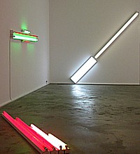
The most thoughtful, thought-provoking and provocative gallery show this season has to be “Dan Flavin: The 1964 Green Gallery Exhibition” at Zwirner & Wirth, 32 East 69th Street, to May 3, 2008.

Installation view (detail) at Zwirner & Wirth.
Flavin Redux
I remember the original well. I even wrote about it for the now long defunct Art International, coming out of Berne, Switzerland. If a gallery can appropriate a long-ago exhibition, then I can certainly feel free to re-deploy my equally ageless and at last uncensored review:
Dan Flavin is no doubt the most irritable man alive. To make matters worse, he tends to rage and rant in the form of single-spaced, badly typed missals, often five or six pages in length on airmail paper, to save money on postage or to make it seem he’s writing from the front. But the battleground is only in his mind.
In spite of the enormous chip on his shoulder, at last Flavin has had his breakthrough moment at the Green Gallery this month. This doesn’t mean he’ll stop his tirades. The kind of work he does leaves him with lots of time on his hands to get angry.
We were previously aware of his fluorescent light “sculptures” and now there’s an array of seven recent pieces that marks out some of the possibilities of his readymades-on-display. Calling them readymades risks evoking one of his letters, for, like the critic Don Judd, I am told Mr. Flavin despises Marcel Duchamp. Perhaps because Marcel has always been a gentleman of the worst sort.
Well, Flavin’s ultra-cool fluorescents are really about placement rather than semantics, but like the 1917 urinal signed R. Mutt, Flavin’s store-bought tubes are also philosophical. Clever choices and specific display in art contexts is what makes these obdurate propositions art, but not self-expression.
But how many ways can you vary the placement of fluorescent light fixtures?
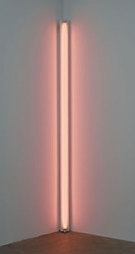
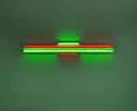
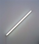
Let me count them: 1. the diagonal of May 25, 1963 (to Robert Rosenblum) is an eight-foot fluorescent light placed – you guessed it – diagonally; 2. a primary picture is a square on the wall made up of red yellow and blue fluorescents, the colors of which wash the inside of the square like the pastels in a Jules Olitiski painting but also bleed out along the wall; 3. gold, pink and red, red is an eight foot configuration placed directly on the floor; 4. red and green alternatives (to Sonja) is a symmetrical wall arrangement that could be a minimalized Chevy or Frigidaire logo; 5. alternate diagonals of March 2, 1964 (to Don Judd) is a 12 foot, diagonal wall piece; 6. the nominal three (to William of Ockham) is one vertical fixture/tube next to two next to three; 7. pink out of corner (to Jasper Johns) is a fluorescent standing in a corner, washing the two walls with pink.
So here you have the ingredients: number of fixtures, arrangement of fixtures (either vertical, horizontal or at a 45 degree angle, colors of the fluorescent tubes. One wonders if Flavin will come up with more variations, but I doubt it. For all their austere (here comes that letter!) Platonism, this ultra-cool exhibition in Dick Bellamy’s hot-spot is a serene antidote to the Claes Oldenburg, James Rosenquist, and George Segal exhibitions that came before, but can also be seen as Pop. Hardware Pop. Or Color Field paintings painted with light directly on the walls. It is no doubt extremely difficult to strip light of metaphysics, but Flavin has done just that. Almost. Now if he would only drop his sentimental or suck-up titles….

Dan Flavin: pink out of a corner…(1963). Exhibition Copy, Courtesy of Stephen Flavin.
True Confessions
Now that I have had a second look at that 1964 exhibition, I still stand by my words. Of course, I wrote them today and not 34 years ago. Since 1964 he came up with many variations. Just search Google Images for a taste. But I could have written the above review in 1964. I was already writing about art then, but not for Art International, which came a bit later. In any case, next week I fully expect to receive a single-spaced badly typed letter from the Beyond.
I wish, however, I had saved the one I really received from Flavin (1933-1996) while he was alive. I don’t remember the occasion or the horrendous offense against art and Flavin’s ego I had committed. I immediately tore it up and flushed away the shreds. If I had saved it, I could quote from it and it would give him back some of his humanity, now that he is fully sanctified. We do wonder how an artist who made such sublime work could have been so paranoid.
Although I hate to admit it – since I am Mr. Antiformalist – in some cases it might be better not to have ever met a particular artist, or received a letter from him (or her) or better not to know anything biographical. Aesthetic intentions or critical program? Any artist can put his foot in his mouth; but to be born with your foot in your mouth is truly a curse. You know what they say: time wounds all heels.

Flavin, red and green alternatives…(1964). Collection of Sonja Flavin.
In the Neck
The first thing, however, I did think of when I turned off classy East 69th Street into Z & W was that something was wrong. I had indeed been in the Green Gallery ages ago and I assure you it was not on street level. It was also one large room, which is not the case with the Z & W which has a small front room with a roll-up window onto the street then a narrow trunk or neck or hyphen to a larger back room.
The drawings opposite the reception counter in the neck were not shown in the original exhibit, but someone saved them; someone found them. One is a sketch made by Flavin of the installation he wanted. There is one room and one room only. Suspicions confirmed.
We have to refine our description of the current exhibition; it is not a recreation of the 1964 show because the space is different and anyone who knows Flavin’s work appreciates how important installation is and how placement in a specific room cannot be divorced from the component or components involved. What we are really seeing is the works from 1964 reassembled, reunited in a totally different space. And as such, they are different works.
You cannot step into the same stream twice, even when it’s art you are stepping into. The fact that the 1964 fluorescent works are being shown on the chic Upper Eastside and not 57th Street where the Green Gallery was, makes the work look different. If the recreation were in any other of the Z & W galleries, whether in Chelsea or Zurich or London, other attitudes would apply.
And art has changed. The art world has changed. And I have changed.
Most importantly, unless this is the first Flavin fluorescent pieces you have ever seen, you will see these knowing what came later: more of the same. And more and more. He stuck to his guns.
Back then we thought of Flavin as stubborn, obstinate, stuck in one place or, more positively, as dedicated, committed, forthright, uncompromising, even anti-artworld. Certainly anti-Pop as well as anti-Abstract Expressionist. The works could even be interpreted at anti-commercial, for who would spend good money for a few fluorescent lights?
We did not think Flavin was merely establishing a brand. Nowadays if you were limiting yourself to fluorescents that is exactly would you would be doing. And you would, alas, be praised for it, for that is what the customers currently understand and want.
We cannot see the work afresh. It is like seeing art entombed, which is the destiny of all art that is honored enough to be saved. Or, because it is so timeless, is this art perpetually fresh? Timeless? Who ever would have guessed.

Flavin: the diagonal of May 25, 1963…Private Collection.
Serious Games
This week’s art game: Are there other exhibitions you would like to see re-created?
I, myself, would like to see the 1950 Jackson Pollock exhibition at the Betty Parsons Gallery once on 57th Street, but only if the space itself could also be recreated so we could experience the much touted shock of scale. But also for another reason. My friend Lil Picard (1889-1994) artist, critic, and what she called a Wiemar Republic Coffee-House Girl, long lamented not buying a small Pollock out of that historic exhibition. It was only $100 and she circled the block several times before deciding it was too expensive for her budget. I want to see the original price list.
Then I could really go for the 1953 Rauschenberg/Twombly exhibition at the Stable Gallery once on 58th and 7th Avenue. It included the first New York showing of two of Robert Rauschenberg’s all-white paintings made in 1951 at Black Mountain, and came with a text by his friend John Cage: “..No subject/No image/No taste/ No object/No beauty/No message/No talent/No technique…I have come to the conclusion that there is nothing in these paintings that could not be changed, that they can be seen in any light and are not destroyed by the action of shadows…”
I would certainly want to revisit Robert Smithson’s 1968 “Non-Site” exhibition at Virginia Dwan’s 57th Street venue. There were geometrical bins of rocks brought in from mapped sites. The pieces look better and better every time I see them, although at the time I thought Smithson was “cheating” by bringing Earth Art indoors—which is not really what he was doing.
And are there ancient and nearly forgotten but important museum exhibitions I would like everyone to see or see again? Here’s my initial list:
Marsha Tucker and James Monte’s 1969 “Anti-Illusion” at the Whitney. I remember Rafael Ferrer’s pile of leaves and blocks of ice at the entrance to the museum. Ferrer was an Artopian before there was an Artopia. Will time have tamed the art?
Kynaston McShine’s 1970 “Information” at MoMA. Would I now crawl into Helio Oiticica’s “nest”?
Thomas Hess’ 1971 Barnett Newman retrospective at MoMA, but with the Stations of the Cross in a room with an entry that would allow them to be read left to right, not from right to left, as shown in ’71.
Alanna Heiss’ 1977 “Rooms,” the inaugural exhibition at P.S.1. Could that old schoolhouse be returned to its inspiring state of crumble and decay so that the recreated site-specific works would once again make sense?
FOR AN AUTOMATIC ARTOPIA ALERT FOR EACH NEW ENTRY
CONTACT: perreault@aol.com.
