Gustave Courbet The Desperate Man, 1844-45
Private Collection, courtesy of Conseil Investissement Art BNP Paribas
The Greeks Had a Word for It
The two current museum exhibitions that should have been physically juxtaposed are not “Jasper Johns: Gray” (to May 14) and “Gustav Courbet” (to May 18), now cheek by jowl at the Metropolitan Museum of Art, but the Johns and “Color Chart: Reinventing Color, 1950 to Today” (to May 4) at the Museum of Modern Art.
The easy trick would be to oppose Johns and Courbet; the first all intellect, the second all fury and sleepy pink, plump sex. Although with more than two centuries and the Atlantic between them, both were innovators and realists.
Johns, inspired by Duchamp, early in his career understood the realism of things through his refusal to separate objects and images, emblemizing both — whether flat like paintings (flags, targets, maps and less successfully arrays of flagstones or zones of hatching) or fully three-dimensional like beer cans, plaster casts, flashlights.
According to the textbooks, Courbet invented realism because he proposed that what he was depicting — which was slightly outside the salon and academy conventions of the time — was how things really looked rather than how they were imagined. Well, sort of.
On the other hand, both artists wallow in allegory, so how realist is that? One of the artists (Johns) has been studiously apolitical; the other (Courbet) supported the Paris Commune, refused the Legion of Honor, and indulged in self-imposed exile.
At one period in my career I wrote a great deal about contemporary realism, even a tome on the drawings and watercolors of Philip Pearlstein, so I know that Courbet has many descendents. Nevertheless, I love only the deranged oddities of his oeuvre, for instance The Desperate Man (1844-45), the self-portrait logo of the exhibition. Was the artist having yet another bad-hair day? But even darker is the unfinished self-portrait called The Man Mad With Fear, from the same period. Courbet’s painting of his sister (The Clairvoyant or The Sleepwalker) is also creepy.
And then — to demonstrate how various subjectivites determine what we see — I will confess I named my 1980 cube, constructed of six inwardly facing square mirrors, The Origin of the World, in homage to Courbet’s female crotch-shot of the same name. Courbet’s Origin should not, cannot, be missed. You should of course see it in real life, rather than Google it. It is definitely not on the Met’s website. And now that I am making art out of jejune found-seascapes. I was particularly interested in Courbet’s four seascapes of 1869, all called The Wave. They are really trashy.
The art dealer Marcel Duchamp (yes, he seems to have survived by selling Brancusi sculptures and arranging exhibitions for his artist friends) once denigrated the acclaimed and much-loved art historian Meyer Schapiro. “I don’t like Schapiro’s approach to art in general,” wrote Duchamp to his patron Walter Arensberg, “… because he uses art to write about Schapiro.” I found this stupidity in the recently remaindered Affectt Marcel, The Selected Correspondence of Marcel Duchamp. Now I know why Surrealist pope Andre Breton once referred to Duchamp as the most interesting and the most irritating man he had ever met.
But enough about me and Courbet. At the risk of exposing you to what no doubt is yet another classical Greek rhetorical device, instead of comparing Johns and Courbet, I prefer to compare the Johns exhibition with “Color Chart” at MoMA.

.
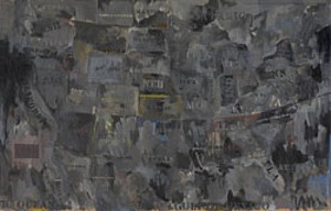
Jasper Johns, Map, 1962.The Museum of Contemporary Art, Los Angeles, Gift of Marcia Simon Weisman. © Jasper Johns/Licensed by VAGA, New York, NY Photo: Brian Forrest
The Attack of the Grays
Johns’ relationship to Duchamp is old news. His breakthrough works were first referred to as Neo-Dada. Now we are offered instead a narrow formalist view or a more psychological view. We are led to believe that over the years Johns used so much gray in order to drain his pieces of the emotions that colors inevitably evoke. Or so proclaims the introductory wall text. Whether this idea is a curatorial conceit or a conceit of the artist himself, it is an odd notion indeed.
Gray is somber, withholding, sad, moist and foggy, and even wise — as in gray beard. Or scary, which is why the aliens among us are called the Grays. In fact, once you look at gray as a color rather than the absence of color, there is a rainbow of grays, a color chart that encompasses (although I know not in what order), elephant gray, marine-dress gray, lead gray, pot metal gray, greyhound gray. Fedora gray, mouse gray, Grey Gardens gray,
Gray, no matter of what hue, as a surface covering reduces the play of illusionary depth that the juxtaposition of various colors inevitably constructs.
Johns’ grayed-out objects, cast from real-life things, paradoxically look more sculptural than the originals. This is because, although lead gray, they evoke the monochrome of Roman marble sculptures, or Greek works seen, as is now the case, with all their original paint removed.
Would any other color work as well? Think of the blues of Picasso’s blue period; think of Cubist browns and tans. Think of Yves Klein’s sponge paintings — sponges and grounds uniformly soaked with International Yves Klein Blue (or pink or gold). Think of George Segal’s all-white plaster casts, which are not surrogate marble sculptures but solidified ghosts.
I will leave for some other time why Johns’ efforts declined around 1972 with the hatch mark and flagstone paintings, and then the disappointing “Four Seasons” paintings and on downward, to rally suddenly with the Catenary Series (beginning in 1997). The current investigation would have been much better if it had stopped in 1972, when somehow Johns got off-course.

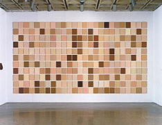
Bryan Kim, Synecdoche, 1991-08
Color Me Dead
On the surface, “Color Chart” at MoMA is related to the Johns show because the theme is equally trivial, although more entertaining because of the gaggle of artists.
Color charts are designated as the jumping-off point of the exhibition, and this apparently allows color chart colors, paint sample colors, and other readymade hues in various arrays and displays.
The MoMA web version of “Color Chart,” unlike the Met samplings of the Johns and the Courbet, is complete and is certainly worth visiting if you want a preview or you really want to avoid the crowds (see below). The found colors of the exhibition are simple enough to read well on computer screens. Scale is lacking, but texture (except for the Duchamp and the Rauschenberg) is not an issue.
The puritanical fear of color and the related fear of emotions that may not fit commercial schemata are the subtexts, whereas in the Johns show the fears are more personal, more existential. At MoMA what is really being charted is the undermining of mixed color/invented color as the norm, and along with it perhaps the denial of uncharted emotions. If we accept readymade objects as art, then why not readymade colors? Well, we already have.
It is significant that Duchamp, who invented the readymade with his prescient (see immediately below) urinal titled Fountain, also pioneered the use of readymade color charts, as proved by the magnificent Tu m’ (1918) shown here. Later, in The Bride Stripped Bare by Bachelors, Even he would turn the groom of his disembodied bride into a group of mechanical bachelors, not catching up with Courbet’s crotch shot until his last work, a peephole view of Eve.
In 1954 Duchamp had his enlarged prostate gland removed, because it interfered with urination. He reported the success of the operation in a letter to his old buddy Henri-Pierre Roche (author of Jules and Jim): “I must admit that being able to pee just like everybody else is a new-found and immense pleasure (one I haven’t known for 25 years).”
But enough of Duchamp and back to the business at hand…
Although there is wit in “Color Chart,” the context sometimes makes otherwise honorable works look as superficial as the theme.
Surely monochrome and/or the use of readymade colors or a found color system/chart are both part of the contemporary art identikit. Do we need exhibitions to tell us this?
The outstanding works here (aside from the Duchamp and Rauschenberg) are Yves Klein’s Peintures (1954), a pamphlet that “documents” his “Monochromes” before he painted them; Sherrie Levine’s version of Le Corbusier’s samples for a line of painted wallpaper; Byron Kim’s Synecdoche (1991-2008), which charts skin colors.
The problem with theme shows is what I call the stamp-collecting fallacy. The job is simply not done until we — the institutional “we” — have an example of every postage stamp issued in the United States that has an airplane or a beaver or a vice-president on it. Or every gray artwork by Johns and every artwork that uses readymade colors, regardless of achievement. Just because I have not been to Norway but have been to every other Scandinavian country doesn’t mean I have to visit Norway. Or does it?
Artopians Unite!
Seeing all three shows in one week was a revelatory exposure to art tourism. Both museums were packed. I did not come down with a case of Stendahl’s Syndrome. Instead, at a certain point I was afflicted with an nearly overwhelming sense of sadness. What were all these people doing here — people of all races, ages, genders, nationalities, heights and avoirdupois — studiously reading explanatory introductory texts, moving eagerly, inquisitively, even joyfully from painting to painting? Why aren’t they home making art? Why are they consumers rather than creators? Is it a lack of talent? Surely, many so-called artists whose products are on display in museums and galleries have no talent at all. And then I remembered the Artopia motto (one of many): “There will be no happiness on earth until everyone is an artist.” Or its variant: “….until everyone realizes he or she is already an artist.”
Correction: Alexandra Peers on portfolio.com wrote that the Whitney Biennial “omits or slights some of the art world’s usual suspects — superstar dealers such as Barbara Gladstone, David Zwirner and Jeffrey Deitch” — not that they were totally unrepresented, as I indicated in the previous Artopia entry by saying that aside from Deitch, neither had a single artist in the show.
Should I have changed this the moment I heard from Peers (who was delighted to be mentioned in Artopia) so you’d never suspect I was being inaccurate? One can do that, you know, but it would be a slippery slope. Or should I have done the more acceptable “update” – which sounds less like a mistake? What would keep me from going back to something I wrote in March ’07 and changing my opinion, not just some dumb error? Online archives are forever; Artopia is about honor.
Missed something? Search the Artopia Archive. But for an Automatic Artopia Alert with each new posting, contact: perreault@aol.com
