As Far As The Mind Can See
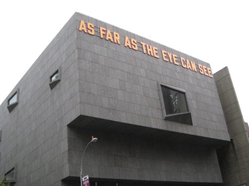
While sauntering through the fourth floor of the Whitney (“Lawrence Weiner: AS FAR AS THE EYE CAN SEE,” 945 Madison Avenue, through February 10), I was jotting down words in my notebook. The person I was with said: I can tell which ones you like by where you stop and write down the titles. You like the early pieces that involve something physical.
Right.
My favorite: A 36″ x 36″ removal to the lathing of support wall or plaster or wallboard from a wall (1968); closely followed by A wall cratered by a single shot-gun blast (1968).
Here is Weiner’s 1969 “Statement of Intent”:
1. The artist may construct the work.
2. The work may be fabricated.
3. The work need not be built.
Each being equal and consistent with the intent of the artist the decision as to condition rests with the receiver upon the occasion of receivership.
Although this loaded statement now seems like a Condition of Sale decree, at the time it was almost a call to arms, both extending Minimalism into contradictory anticapitalist realms and criticizing art’s market profile. Or so it seemed to me.
Now it looks like just another avant-garde test or tweak. Nevertheless, by no account is Weiner considered a raving commercial success. I will give him that. But works are for sale, works are sold. I am not sure there is much of an auction record yet, but at least the adventurous collector can sport a green badge of courage.
Most of the art in the current retrospective consists of Statements, artworks that are manifested only as words. The words can be on manhole covers, as in front of the Whitney (IN DIRECT LINE WITH ANOTHER & THE NEXT, 2000), across the top of the Whitney building (AS FAR AS THE EYE CAN SEE, in yellow letters outlined in red), or the untitled take-what-you-want pad (1970), credited to the collection of H. & N. Daled, that offers, on separate oracular sheets: RIGHT OF CENTER; MIDDLE OF THE ROAD; AND LEFT OF CENTER.
Most of the art surveyed, however, consists of words stuck to walls, e.g. FERMENTED, WATER UNDER THE BRIDGE. AT SOME GREEN TIME. TO THE EXTENT OF HOW DEEP THE VALLEY IS AT SOME GIVEN TIME. A GLACIER VANDALIZED…..
There are too many words, too many artworks on each wall, in too many colors, in too many sizes of type.
We love words, but we like them naked.
I left thinking that the exhibition should have taken up all floors of the Whitney. The words and sentences could have been allowed to breathe; the instructions would have had space to grow in your imagination. The words do not have to be deployed at angles, in color. They can speak for themselves. As I left I couldn’t help imagining the same words — which singly can be very effective — in some vast Dia-like display; one piece to a wall.
Since I am a poet (as well as critic, artist, etc.) I am attracted to words. I like the way they look, sound, feel, along with how they mean various things. Words are not immaterial. Contrary to the long-forgotten cultic language therapy of General Semantics, words are things.
Weiner is not a poet. He actually thinks he is saying something with his words: that art need not be any more material then letters on a wall. He is right, of course, because art is not what it is materially, but what it does.
How do Weiner’s words relate to Aram Saroyan’s severely reductive, one-word poems of the 1960s? These were recently reprinted by Ugly Duckling Press, in their Lost Literature Series, as Aram Saroyan: Complete Minimal Poems. One reviewer was enthusiastic about the 12 minutes of reading time this 280 pager requires. Some will prefer the trickier poems, like the National Endowment Award-winning “lighght.” But I prefer the severity of “Shakespeare!” “guarantee,” “Judd…” (!), and “oxygen.” Saroyan once published a “book” of poetry that was all empty pages and took the form of a ream of blank typewriter paper.
Words in art are not an issue. There are sometimes words in Cubist paintings, in the early work of Marsden Hartley, and certainly in Stuart Davis. And then in Pop Art too, when the comics are appropriated, as in early Warhol and all of Roy Lichtenstein.
Words as art is something else. Weiner’s instruction pieces are not a problem, because there is something physical that completes the picture: a hole in the wall, a stain on the floor. My solution to the problems posed by the wallworks is that Weiner’s words are not in themselves the artworks; instead they are instructions or hints meant to stimulate various kinds of mental activities, some of them quite abstract.
The obverse universe is made of poems that are not printed out, but are spoken from a score or, in the case of my own “whisper poem,” according to an instruction: for instance, “Whisper the following into someone’s ear or into the ears of many different people, one at a time, at a gathering of any kind, the phrase: no one is drowning in the beautiful lake.” I performed this in 1967 at a poetry event (Michael Benedikt, John Giorno, and myself) in the chapel of the former orphanage that was then Robert Rauschenberg’s New York studio.
* * *
Kara Walker at the Whitney too is also worth seeing, for a different kind of politics — more overt. Walker continues to address racism and sexism through silhouettes that are blunt and sometimes lewd, befitting the subject matter. My only criticism is that by ironically exploiting the Victorian and extremely ladylike silhouette tradition – exploding it with irony, as it were — Walker is more or less locked into cliché images of the Deep South. We do not take this to mean that racism existed only in 19th-century Mississippi, Alabama, etc., but one now begins to wonder if the silhouette leaves the North and the present too much off the hook. Agitprop does not work by implication.

The Building Is New, But Is the Art?
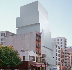
Yes, I have visited the New Museum’s new Sejima and Nishizawa building in the Lower East Side (235 The Bowery at Prince). The building is as striking as its photographs: irregularly stacked “cubes” of different sizes. The insides are yet to be proved. The narrow and I assume heavily U.V. protected, sliver-like skylights on each floor are unnecessary. They do not abate the claustrophobia inherent in the closed, or nearly closed, rooms. In fact, they only tantalize. They remind you that you are in fact in a closed space. We do not like the fluorescent lighting at all. If they do not flicker perceptibly now, they will. And in any case, it’s a bit like being in the Whole Foods basement on Union Square. (There is fluorescent lighting there, too.) The difference at the New Museum is that the food has been removed.
And the exhibition? There are some outstanding works here and there in “Unmonumental,” but the universal scale – taller than persons, but not by much; or smaller — and the casual jumble of materials wears everything down. The exhibition looks like a solo retrospective of an artist who has looked too long (but not hard enough) at Rauschenberg’s combines and loosened up the components to no particularly effect. But, to be fair, I will take another look when collages and sound installations are added to the mix.
I cannot really judge yet how the three cubic galleries are going to work. How will paintings look? Will there be false walls here and there? Right now the spaces seem to drain the art of energy, but that may be just a trick of inflated expectations. Later, in terms of programming, we will find out if we need an art venue that will be to the New Museum what the New Museum once was to the Whitney.

The Worst of Hirst
Finally, to end on a cheerful note. This is what naysayers have been waiting for: a truly wretched showing by Damien Hirst, now probably one of the world’s richest artists. At Lever House on Park Avenue at East 54th (one of the icons of modernist architecture in Manhattan) is a commission by the Lever House Art Collection called School: The Archeology of Lost Desires, Comprehending Infinity, and the Search for Knowledge. Love the title; hate the installation.
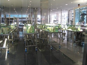
Dead lambs (and a lone shark) in separate tanks of formaldehyde are hooked up to “intravenous tubes” in front of “the teacher” in the form of a 12-foot tank, containing two sides of beef but also, alas, an umbrella, a birdcage with a dove, and an armchair.
First question in our art-student quiz: which two artist is Hirst referring too? Which one is associated with sides of beef? And which artists with the objects? Essay question for extra credit: Why is Hirst referring to these artists at all?
School is on display in the glass-enclosed Lever House ground-floor space just beyond the open court that sports Hirst’s monumental sculpture The Virgin Mother (based on a fetus-revealing medical model), which I think is “sensationally” good, as is his $8 million signature pickled shark titled The Physical Impossibility of Death in the Mind of Someone Living (1991), now on display at the Metropolitan Museum for three years. School also includes a big sampling of Hirst’s undistinguished medicine cabinets filled with drug packaging, placed around the periphery of the tanked-up “schoolroom.” All the display lacks are his bad spin paintings and his equally uninspired dot paintings. The slaughtered lambs by themselves – sans shark, sans teacher-tank – would have resulted in a stronger installation. We remain confident that art history will weed out these lesser efforts along with the medicine cases. Actually, we are hopeful, but not confident.
To be notified of new Artopia postings, e-mail perreault@aol.com
John Perreault's art diary
