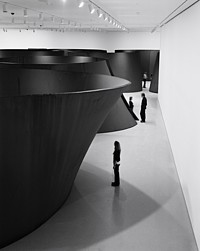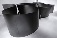
Richard Serra, Sequence, 2006. Weatherproof steel. Overall: 12’9″ x 40′ 8 3/8″ x 65′ 2 3/16″ (3.9 x 12.4 x 19.9 m). Collection the artist © 2007 Richard Serra / Artists Rights Society (ARS), New York. Photo: Lorenz Kienzle
Sculpture Returns
The highly focused Richard Serra survey now at the Museum of Modern Art (to September 10) is at last the justification for that institution’s cold and unpopular expansion. There’s only 27 works, and the whole deal is outweighed — if you will excuse the pun — by three recent pieces: Band, Sequence, and Torqued Torus Inversion (all ’06). They are massive.
Apparently the late Kirk Varnedoe had Serra in mind when, as head of painting and sculpture, he ordered a great girding up of the second floor. And it shows. As much as I like them, MoMA-owned Circuit II (’72-’86) and Intersection II (’92 ’93), on view outdoors, do not have the drama of the mighty torqued prows and their inner hallways displayed in opposition to the straight-walled galleries.
All other sculptures should have been removed from the garden… and the trees put in storage. The sculpture garden, in any case, is now totally dwarfed by surrounding glass towers. Someday perhaps Serra could make a sculpture specifically for this site and rescue it for art again, the way he has rescued the second-floor rooms.
One hopes that the Serra survey will mark the long-awaited return of sculpture, after too many years of the easy stuff — i.e., paintings. You know: Easy to display, easy to move, easy to store. And easy to display in auction houses. I find a great deal to like in the sarcasm of Jeff Koons’ flower puppy and Damien Hirst’s shark and his recent headline-grabbing, diamond-studded skull. But in both camps the mixed messages outweigh the forms. It is not that abstract sculpture must exclude entertainment values; Serra’s don’t. It is just that there remains a lot to be said about and with abstract sculpture per se. Serra proves this.
But when did Serra enter the picture?

Richard Serra, Sequence, 2006. Weatherproof steel. Overall: 12’9″ x 40′ 8 3/8″ x 65′ 2 3/16″ (3.9 x 12.4 x 19.9 m). Collection the artist © 2007 Richard Serra / Artists Rights Society (ARS), New York. Photo: Lorenz Kienzle
Catching Up
Behind Clement Greenberg’s back in the early ’60s, Simple-Minded Formalism became or was replaced by Minimalism. Greenberg was stuck in a rut, preferring painter Jules Olitski and, in sculpture, Anthony Caro — whom he saw as David Smith’s proper heir. Pop for him was beyond the pale and almost as bad as Dada and Surrealism. And although Greenberg did promote the grand zip paintings of Barnett Newman, he did not really get Ad Reinhardt, who, like Newman, was beloved of the Minimalists and their spawn. Was it that Newman’s take on the Kabbalah was O.K., but Reinhardt’s Buddhism not so hot? Most now would rank Newman higher than Reinhardt, but perhaps we should see them as healthy oppositions, the way we see Pollock and de Kooning. Or for that matter Greenberg and Harold Rosenberg.
Minimalism generated Anti-Form and then Earth Art too and, let us not forget, the influence upon Conceptual Art and Performances. This proliferation of art tags was a multiplication of art dialects rather than languages and a way of keeping tabs on what some talented artists were up to. It was not, strictly speaking, an orderly march from material over form to idea over material. Some artists dabbled in all formats, but not always in succession, not necessarily in a linear way. Robert Morris went from Neo-Dada to Geo-Minimal (with memorable dances and performances thrown in) to Informal Minimal (Anti-Form) and even some Earth Art Minimalism. And then out the door.
Serra skipped cold Geo-Minimalism, but leapt in with remarkable contributions to Anti-Form Minimalism. Some of these early works are on display on MoMA’s sixth floor in the form of hung, strewn, propped pieces that still hold their own in the continued world of the hung, the strewn and the propped. Curiously, his famous splashed lead piece is not in sight, which is a shame because it would reestablish a certain continuity with Pollock.
And, although he helped his buddy Robert Smithson execute the Earth Art’s iconic Spiral Jetty, as far as I know, Serra never delved into Earth Art Minimalism in any significant way. To my mind, slabs stuck into the ground don’t quite count.
What I am doing here, by the way, is recasting Minimalism as a larger category than Geo-Minimalism. This is not a tweak or a weak rewrite, but an effort to subvert Post-Minimalism as an entrenched category.
The Post-Minimalism trope looks like it was invented to take advantage of the critical, historical construct that has Impressionism followed by and, it is implied, improved by what Roger Fry called Post-Impressionism. Impressionism was formless and gushy, whereas Cézanne, van Gogh, and Gauguin could pave the way for Picasso and Matisse. Oh, the logic of it.
Was Post-Impressionism really better than Impressionism? Was Post-Minimalism better than Minimalism? Evolution has polluted our brains, from Darwin and Marx to Madame Blavatsky, particularly when it is transferred to inappropriate realms like art and history. And religion. The latest religion is not necessarily the best. Also the Post-Minimalism formula implies that up until 1967 or so there was nothing but Minimalism. Happenings and Pop Art? Fluxus? Realisms? They don’t count.

Richard Serra, Band, 2006. Weatherproof steel. Overall: 12′ 9″ x 36′ 5″ x 71′ 9 1/2″ (3.9 x 11.1 x 21.9 m), plate: 2″ (5.1 cm) thick. Los Angeles County Museum of Art. Gift of Eli and Edythe Broad © 2007 Richard Serra / Artists Rights Society (ARS), New York. Photo: Lorenz Kienzle.
* * *
The sculpture of Richard Serra, I maintain, cannot be fully understood without citing the context of Anti-Form Minimalism. Unlike Geo-Minimalism, Anti-Form was about materials and their properties. This context includes works of the period by Keith Sonnier, Eva Hesse, Allan Saret, Morris, Rafael Ferrer and others. Artists, even great ones like Serra, do not come out of nowhere.
This foregrounding of materiality — and in many instances, place and placement — is never the case if we look at, let’s say, the elegant work of Donald Judd. When he gained fame and more resources, painted wood was replaced by galvanized steel, but the forms were not significantly different. You don’t look at a Judd and say, gee whiz, it’s made out of plastic and galvanized steel. You say, oh my gosh, it’s just a line of five-sided, empty boxes, in a row or a stack.
Anti-Form Minimalism with its drooping forms, out of Claes Oldenburg’s drum set and other relaxed sculptures, and its use of chance out of Duchamp and Cage, let gravity do the work. The informal groupings highlighted the actual materials: felt, rubber, glass, wood, metal, plastic — whatever. The artist were still in control, but once removed like a Cagian composer. Serra married Geo-Minimal’s hard-edge, “industrial” forms with Anti-Form’s attention to gravity.
On MoMA’s sixth floor the prop pieces underline Serra’s interest in gravity and weight. Geometric slabs of metal are held up against the wall by rolled metal props; and in the center of the room slabs are propped against each other, held up by their own considerable weight like various houses of cards. For safety reasons and I assume insurance purposes, the props are fenced off. I remember once I had to show Ana Mendieta’s floor pieces on aesthetically inappropriate platforms because in a previous exhibition at the New Museum some idiot had crawled under a glass table and broken the glass. That no one has yet jumped off of or been pushed from MoMA’s vertiginous fifth-floor “air-bridge,” looking down on the second-floor atrium, amazes me. But then too it is amazing that no one has done themselves damage on a Giacometti or a Brancusi or become poisoned by licking a Monet.
Scary stuff? Fear was part of Serra’s sculpture vocabulary. But when he moved from propping and balancing to weight, fear was transformed into questions of logistics. How did they indeed manage to get the great torqued works into the building?
Unlike Judd (or the Morris of the plywood boxes), Serra persistently forces you to become conscious of matter and weight. How the damned things stand up is really what you are looking for and looking at and to a large extent the cause of what you are feeling — along with some degree of claustrophobia once you are inside one of the curving, leaning things.
A considerable part of understanding of sculpture is the perception one may have of how it has been made, what it is made of, how it stands — and, we shouldn’t forget, what it took to get it here. These are sculpture’s primary subjects. Is this true too of painting? Less so, since every line, shape, color is an illusion waiting to be denied.
Intended use may be a factor too, but you cannot separate the statues of Easter Island from their quarries, their apparently miraculous transport across hill-and-dale and their uprighting. These facts may be more important than the knowledge that they once had eyes and their backs were to the sea.
You cannot separate a Picasso or David Smith sculpture from the welding torch. You cannot separate the Spiral Jetty from the bulldozer used to move those rocks into place.
This is why Serra, unlike the Geo-Minimalists he came in on, is more like Smith and Caro. Here, however, the radically reduced forms foreground materiality at the expense — thank goodness — of the kinds of fussy composing that sculptors used to feel they had to perpetuate. That’s all over. Serra is a Minimalist, not a Cubist.
And then there is the sheer poetry of the tonnage.
In an artist’s statement written for the catalogue of his 1989 Pace Gallery exhibition, Serra recalls visiting a ship-launching (on his birthday in 1944 at the age of four) with his father, who was a pipefitter:
….the shoring props, beams, planks, poles, bars, keel blocks, all the dunnage, was removed, the cables released, shackles dismantled, the come-alongs unlocked. …Freed from its stays, the logs rolling, the ship slid off its cradle with an ever increasing motion. …(and then) transformation from an enormous obdurate weight to a buoyant structure, free, afloat and adrift. My awe and wonder of that moment remains. All the raw material that I needed is contained in the reserve of this memory which has become a recurring dream.
The language, as specific as Melville’s best, is charged. But more important to understanding is Serra’s subsequent paean to weight:
Weight is a value for me, not that it is any more compelling than lightness, but I simply know more about weight than lightness and therefore have more to say about it, more to say about the balancing of weight, the diminishing of weight, the addition and subtraction of weight, the concentration of weight, the rigging of weight, the propping of weight, the placement of weight, the locking of weight, the psychological effect of weight, the disorientation of weight, the disequilibrium of weight, the rotation of weight, the movement of weight, the directionality of weight, the shape of weight…
Before you visit, you might want to look at the excellent video tours, Serra interview, and other materials, including installation footage, at the MoMA website.
For an Automatic Artopia Alert when there is a new entry email: perreault@aol.com
John Perreault's art diary
