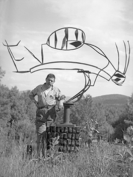
David Smith with Australia, 1951
Three More Painters
Poet John Ashbery, who had published my poems in both Locus Solus and Art and Literature, was back from Paris and seemingly in charge of recruiting a new batch of starving poets to write reviews for Art News. So I had my interview with king-maker Thomas Hess. What do you think of Action Painting? Answer: Some of it’s good; some of it’s bad. What do you think of Pop Art? Answer (this was in 1964): Some of it’s good; some of it’s bad.
I was hired. But then Hess gave me advice I shall never forget. Never write about your friends, he said. Whatever you write will never be good enough for them. This was from the man who wrote about his friends de Kooning, Alex Katz and a host of others. And then he said: Never compare artists; artists hate it.
Well, he was wrong about that one too. Artists may indeed hate comparisons with other artists; they are brought up to think they are unique. They need to believe they are, but one should not let that get in the way of a fine strategy of contrasts and connections; similarities and disconnects. Comparisons, like category changes (such as labeling a critic an artist), are figures of speech, and if you don’t understand the power of figures of speech or think they only include metaphors and similes, then you are missing a great deal.
Opposing or connecting two apparently disparate bodies of work is difficult enough; comparing three is fun. David Smith, Donald Judd and Betty Woodman on the surface would appear to have little in common. “David Smith, A Centennial” is at the Guggenheim (1071 Fifth Avenue) until May 14; Donald Judd, oddly enough, can be seen to great advantage at Christie’s (1230 Sixth Avenue) until May 9 when there will be an benefit auction of the works now on view in a stripped down Chelsea-like space 20 floors above Rockefeller Plaza; “The Art of Betty Woodman” is at the Metropolitan Museum of Art (1000 Fifth Avenue) until July 30.
Smith and Judd, representing different generations, seem to be in two different worlds. Yet if you look a little closer they might be seen — and have been seen — as father and son in as Oedipal a feud as can be imagined, at least from the Judd perspective.
On the other hand, it is instructive that Smith’s relationship to Picasso (his direct predecessor) is tame indeed. Smith saw Picasso’s open-work sculptures (and the welded works of Gonzalez) and ran with the ball. As far as I know there was no anxiety of influence, there was no guilt. Smith merely produced the sculpture that Picasso could have produced if he had stopped painting — minus myth, politics, sex and anger. But don’t get me wrong; in terms of my infamous gift test, I would not turn down any Smith in the exhibition now at the Guggenheim. Smith was certainly the master of improvised form — or form that looks improvised. Welding and the use of readymade bits and pieces (and sometimes tools) allow this. Woodman’s ceramics look improvised too, but the improvisation is based on deeply somatic skills and is only the beginning of what it takes to make one of her flights of fancy, one of her battles between taste and nerve.

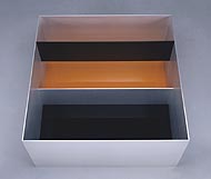
Donald Judd, Untitled, 1989
The Writing Is On the Wall
Judd’s work is about as far away from improvisation as one can get. You make the diagrams then construct the bins, boxes and shelves. Or, more often than not, hire others to meticulously fabricate the bins, boxes and shelves. The odd thing is that there is more madness in Judd than there is in Smith, where you would expect it, in terms of his influences (Picasso, Picasso and Picasso).
So is Smith’s art, unlike Picasso’s, all about form? Not entirely, although formalists would prefer this to be the case. Smith did take up a bit of Picasso’s playfulness. But the difficult part to grasp is that many of his sculptures are “written.” Some early works are directly inspired by cuneiforms and hieroglyphs. There is definitely a feeling you should read them from left to right or vice versa. Here the horizontal connects with horizons and landscapes. And since the sculpture is usually flat and frontal, the air they hold becomes a page, like a landscape too.
Smith’s works are not really as sculptural (i.e. three-dimensional) as they ought to be. They are, as often described, drawings in space. Smith himself thought he was operating somewhere between paintings and sculpture; but given the few painted sculptures in the current exhibition that go beyond monochrome, he had no talent for that other art form, and certainly no eye for color or interrelationships of colors, or interrelationships of colors and forms, as does Betty Woodman, the third artist we are considering.
Woodman, now in her ’70s but two or three art generations away from Smith, in triptychs and even wall installations made up of clay “fragments” is also engaged in a kind of writing. First there is this, then there is that, and then there is thus. By “writing” I mean narrative too, so that, without pressing the issue, we can similarly see Judd’s repeated boxes taking a leaf from Gertrude Stein’s storytelling technique: and, and, and, and, & and.
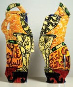
Smith’s written sculptures are all fronts; whereas Woodman’s big, free-standing vase-forms are about fronts and backs. Neither Smith nor Woodman seem to be interested in sides. She thinks of herself as a sculptor, but one could also profitably see her as a painter who likes to paint on both the front and back of her clay canvases.
And Judd? Yes, the simple way of looking at his work is to see his bins as open, lined-up, rather than “composed” versions of Smith’s cubes in the late Cubi Series. But Judd’s wallpieces, which I think are his best and most beautiful, have the frontal, horizontal, landscape feeling of Smith’s welded writings in air. They too have no backsides that you can or want to look at. Going deeper, Smith was depicting landscapes; Judd was showing vaginas and breasts, on the wall, like trophies or like feeding stations/ storage units. I never though I would think that Judd was better than Smith; but there you have it.
Like Woodman, Judd however has the container problem. Many will only want to stick flowers in Woodman’s sculptures; in fact, she has provided “painted” sculptures for the flower displays in the Metropolitan’s lobby, even larger than the ones she once created for MoMA’s front desk. In this regard, I confess I cannot look at a Judd wallpiece without imagining it with books all lined up or tasteful arrangements of bud-vases and perhaps a figurine or two.

Betty Woodman, Diptych, n.d.
An American Picasso
Many have spent years looking for the American Picasso, and here she is. Woodman’s illusion vs. materiality trope; her surface vs. substance trope; her color vs. structure trope; and above all her exploitation of multiple points of view make her Neo-Cubist. Or is she the American Matisse?
Her works, in clay and otherwise, have the look of passion (Picasso) with a daring yet infallible sense of color (Matisse). Unlike Picasso (or Smith, or Judd) her dream is of the voluptuous and the gorgeous. Time after time that dream comes true. If you want more meaning than that, you will be befuddled; for there is none. Well, there are historical references and appropriations that will be obvious to students of ceramics. And there is the struggle with the vase and utility. But that is the dark side of her work, a shadow that gives the beauty more weight than we have the right to expect.
Woodman and Judd deal with beauty in opposite ways, but without opposite results. This is ironic, since Woodman early on was aligned with the Patterning and Decoration movement of the ’70s which was anti-minimalist to the core: more is more, not less is more; fill in that boring grid; bring back beauty. Because it is so distanced by history and talent, Woodman’s work (and we have been following it for 25 years or so) is colder than we at had imagined; whereas Judd’s has a lot more emotion then was visible at first. Withdrawal into perfection is Platonism served up on a silver plate. Or in a galvanized steel or sheet metal box. Restraint these days looks positively inflammatory.
All three artists deal with the problem of polychrome sculpture: Smith in a minor and, I feel, unsuccessful way; Judd by conflating colors and materiality; Woodman by full-blown painting. Painting is painting, whether you are using clay slips, glazes or pigments suspended in oil or acrylic. You might even, like Woodman, use all three. No one has ever claimed that the support must be canvas.
