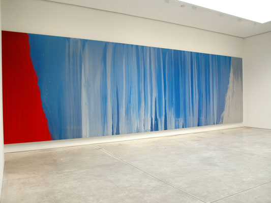
Pat Steir, Blue River
In Praise of Painting
If someone were to ask me who the best underrated painter is now, I’d have to say Pat Steir, who started exhibiting in 1964. Brice Marden is not underrated; he’s having a show sometimes soon at MoMA. There, when it happens, we will have to deal with the caesura between his early monochromes (sometimes leaving thin, spattered strips at their bottom edge, giving the effect of a window shade almost-but-not-quite pulled to the sill) and his “painterly” paintings we now celebrate.
Pat Steir, who is yet to have a retrospective at MoMA or the Whitney or anywhere that I know of, presents a similar Act II. We remember her early grid paintings, replete with signs and images; but now the paintings we love are nearly abstract — great waterfalls, of a sort. The “nearly” is their edge.
For instance, I caught myself writing about Steir as “the best underrated abstract painter.” Her new show at Cheim & Read (547 W. 25th Street, to May 7) is called “Moon Paintings & a River.” The so-called Moon Paintings have centrally located gashes (vaginas?) or, in two cases, eloquently awkward squiggles on or in fields or veils of paint. The river of the exhibition’s title is the spectacular 26-foot Blue River. Well, she certainly is not a realist in terms of representation, or even presentation of space. She offers a lot of paint for the money. Yet who could doubt, with or without “waterfall” titles, that her veils of running paint, her rivulets and her splashes have something or another to do with water: thin, liquidy paint = water. Furthermore, water = blood; water = life. These are paintings you can hear.
Who is there after Morris Louis? Rather, since critic Clement Greenberg cropped most of the Louis paintings, who comes after Morris Louis-Greenberg?
Why, Steir, of course. This generational skip-and-jump is an almost perfect illustration of my braid theory of contemporary art (and of the strands of my own life; maybe everyone’s, since we live much longer now). Each strand disappears behind the other strands for awhile, and then comes back.
Art nowadays gets absorbed so fast that, if styles and methods are to develop, they – and we the voracious consumers – need a rest. After some breathing space, Pop came back as Jeff Koons and then Damien Hirst. And now. painterly paintings have reappeared, refreshed and repositioned. It’s all about reincarnations; if you don’t solve all the problems you are supposed to solve, then you come back. The history of art is really the history of unfinished business.
The usual story of so-called totally abstract painting is a kind of reductive, unicursive march. My version this week is a little different. Kandinsky turned his fairy-tales upside-down; Mondrian transformed his famous tree into an aerial view of Dutch farms. No, I’m sure I have the last part wrong. It was the Manhattan grid, right?
And then in ’50s, when Pollock seemed so much more abstract, and therefore more intellectual, we were scolded if we kept seeing fields of amber grain in his drip paintings or, as I have recently deduced (and celebrated in my own paintings), tangles of seaweed. I remember too that de Kooning once made fun of his old buddy Barnett Newman’s “zips” by describing to me with his hands a pair of elevator doors closing down to one narrow crack. And didn’t someone christen some of those Louis poured paintings “veils” and “unfurleds”? Those fields in Color Field paintings were actual fields.
The distinction between abstract (non-objective) art and representational art is theological and not in the least bit cut-and-dry. Sometimes there is oscillation back and forth, and that is very exciting indeed.
Oh, and did I forget to say that Steir’s paintings are beautiful? And smart? The critic Tom Hess used to say “dumb like a painter,” in spite of his friendship with de Kooning and more than nodding acquaintanships with Barnett Newman and Ad Reinhardt. If Hess were alive, he would have to eat his words. Again. Even Steir’s prints at Pace Prints (now closed) were worth seeing. Her drawings at Cook Fine Art (1063 Madison Ave., to May 11) are insouciant splashes on penciled grids. The five tall drawings in the “Winter Group” are my favorites.
Blue River, like all of her rivulet paintings has great drama, a kind of theatrical presence not seen since Pollock, Newman and Louis. In terms of scale, Steir has perfect pitch. Whether or not Blue River signals a new turn in Steir’s oeuvre; its enormous field (not quite fitting into the gallery room that attempts to contain it) is breathtaking.
Are Chelsea Art Spaces Too Large?

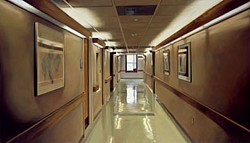
Damien Hirst, Hospital Corridor, 2004
At Artopia, we are cheerful. After all, our motto is Art As It Ought To Be, or words to that effect. So as spokesperson – in Artopia there is no king – I am emboldened to state that the Damien Hirst exhibition of paintings at Gagosian is not the end of the world, the art world or any other world. Paintings of pills, operating rooms, crack addicts, hypodermic needles, and one blood splattered car hood do not upset me because of their grisly subject matter. That they have been mostly painted by hired hands doesn’t bother me in the least: this is a tradition that reaches back from Warhol to Reubens. That most of the images have been badly painted, might. But then again, they are not really about painting or paintings, are they? Being attacked by both Kimmelman of the Times and Saltz at the Voice is definitely an achievement. So Hirst, of preserved-shark fame, reportedly sold every “painting” for big bucks. So what.
The Gagosian space in Chelsea is still a fabulous venue. Perhaps too fabulous, since even in Artopia it is obvious that Hirst had to produce too much that was not fabulous in order to fill the fabulous space. In Artopia the artist always knows best; but the Gagosian gallery is not really in Artopia this time around.
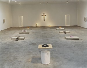
Another artist I rather admire has also misjudged his own space-filling talents: Robert Gober at Matthew Mark. His headless, crucified Jesus, spouting water from its nipples, flanked by two doors partially revealing a naked man in a bathtub on the left and a naked woman in a bathtub on the right, plus the two hermaphrodite corner pieces, would have been enough. As it is, there is a lot of trompe l’oeil filler, perhaps explained by Brenda Richardson’s catalog, but otherwise irrelevant.

Robert Gober installation at Matthew Marks, 2005
