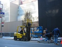
Six Ways of Looking at the New MoMA MoMA from 54th Street 1. Cash-Flow
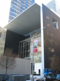
A former director of a nonprofit art institution might look at the newly expanded MoMA — Super-MoMA, MoMA IV, and MoMA Redux — in a particular way. He or she would see income-generating party spaces. Earned income equals cash-flow solutions.
(How the Museum of Modern Art became The Modern and then MoMA is another story. Branding is all. For a more friendly tag, I suggest the name be reduced to Museum of Modernism, i.e. MOM, the Museum That Loves You Back. (Sorry, Philadelphia, we are going to appropriate your weird substitution for the apparently sexist City of Brotherly Love.)
In the meantime, MoMA’s brand new pass-through lobby, joining 53rd and 54th midblock, is great for cocktail receptions. The slightly expanded garden is perfect for really upscale weddings.
But the second-floor atrium space, with Barnett Newman’s Broken Obelisk looking bigger and grander indoors than it did outdoors, is for the totally serious occasion. Does it really matter that Monet’s Water Lilies seem to have shrunk to postage-stamp size in a niche just off of the atrium’s four stories of air? Given the right camera angle, the panorama still makes a great backdrop.
Nevertheless, the primo space is the sixth floor. Keep Jim Rosenquist’s F-111 on permanent display. Keep Ellsworth Kelly’s Sculpture for a Large Wall ! I know the sixth floor is supposed to be for changing exhibitions. But I’d otherwise keep it bare. Think how many tables the Kelly room alone would hold for sit-down dinners. Think of the high-cost product debuts you could host, or even the small exposition or two. Is this where we are going to put the Elizabeth Murray painting show in fall of 2006? Will her oddly popular paintings hold the space? At least MoMA is featuring a woman artist for a change. But since it doesn’t look like we can substitute the worthy Pat Steir, better to leave up the Rosenquist and Kelly.
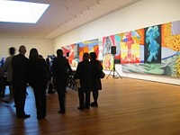
James Rosenquist: F-III (during a press conference)
2. Back Stage
A former museum curator might look at Super-MoMA in terms of curatorial logistics. How are we going to get the damned artworks in and out? I remember when I worked across 53rd Street at the American Craft Museum, struggling with the registrar to get artworks into that highly honored piece of architectural garbage. Anything that could not be carried in a suitcase had to be jimmied in along a torturous underground passageway that led from the CBS loading dock down the block or, if too big for that route, unpacked on the sidewalk and carried through the space allotted for the removable revolving door. At pre-Neo-MoMA one day I saw their crew gingerly pop out one of the big plate-glass windows on 53rd Street to get a very large crate inside. Now they seem to have a real loading dock and certainly some way to get the Broken Obelisk inside and up to the second floor. The rest I will believe only when I see some monumental Richard Serras on the sixth floor.
Otherwise, the walls look good. I love the slight, illusionistic float; instead of baseboards, there’s a narrow recess. The lighting works, although as usual I prefer at least 15 percent more light. Can’t the light-bulb people come up with brighter lights that will not damage paint on canvas, works on paper, fabric? Galleries and slide projections or, nowadays, PowerPoint or just our computer screens have accustomed us to many more lumens poking right at us, into us. And — a real miracle — there seems to be a certain amount of built-in flexibility in terms of gallery spaces. You don’t want to have to show a Joseph Cornell in a four-story atrium, or a Monet. (Oops, sorry, I forgot.)
Above all, there are walls. Too many new museums have too much glass. Here architect Yoshio Taniguchi has made just enough openings to let you glimpse the city outside or, more often than not, the other wings of MoMA (for we are talking about an artful cluster, not a singular, stand-alone building) or the garden below to overcome the claustrophobia that would result from the generally curatorially preferred no-window art chamber. Taniguchi did not make what I call the Getty Mistake: blinding natural light that has to be constantly scrimmed. Of course, we are in New York and most light is already scrimmed. (Dare I mention how a Rothko in another museum a train ride from New York is ruined by a window directly above it? The daylight, even in winter, makes your pupils shrink.)
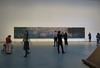
Claude Monet: Water Lilies
3. Where Is the Building?
As a reluctant architecture critic, I find most buildings disastrous. Like everyone else, I like Gehry, in principle; and, unlike many, I also like his opposite Peter Eisenmann, whose signature building at the Waxner Art Center at Ohio University in Columbus is better in actual experience than it reads. You can perceive the two contradictory found-grid systems that underlie the structuring. Everything felt as if it made sense, even the “historical” split tower. Would I want to hang art there? Listen, if I could hang art in I. M. Pei’s leaky atrium, I can hang art anywhere and make it look good.
I had the privilege of working in Pei’s first museum; the Everson Museum of Art in Syracuse, N.Y. It is also one of the first designer-museums. Built in a downtown oxymoronically devastated by urban renewal, someone seemed to have thought that a fortress was necessary; to this day you can’t find your way in without a guidebook. Surprise: in a high-snow zone, the flat roof was prone to leaks.
No one will have a difficult time finding the Ultra-MoMA entrances. And I doubt the roof will leak, although the mega-minimal façade on 54th Street may not be entirely immune to pigeon droppings. I just hope that, unlike at the Everson, there are enough electrical outlets in the offices.
There are, certainly, many more serious things to say. I was surprised that the complex is as successful as it is. It’s all a 3-D grid, fittingly so, given the midtown street grid. If the truth be known, neither façade is much to look at. But once inside, except for the atrium, the building disappears. This is an artist’s and an art-lovers dream.
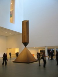
Barnett Newman: Broken Obelisk
4. Post-PoMo MoMA
An art critic might look at the art but also what may or may not be going on under the choices. The second-floor contemporary galleries are sumptuous, underlining Ultra-MoMA’s renewed commitment to the new. This is a particular kind of new, an Artforum, old-news new, cover-story new, a blue-chip gallery new, an informed but unadventurous consensus new — but, compared to the dark ages of William Rubin when Dada was a dirty word, it’s new all right.
Well, sort of seminew but not quite old-hat new. For instance, the first room features a big, free-standing wall piece by Gordon Matta-Clark (sections cut from a real house), and we even have a special area for projected art, not a particularly thrilling selection, but at least it’s there. And then there’s even glass, not only a glass work by Kiki Smith but also one by Josiah McIlheney. And ceramics: a case of tiny vessels by Charles LeDray. Of course, in this context none of these pieces is really glass or clay. They are not craft-art, they are sculpture-art.
The other plus is that the newish work is not divided up into modern and postmodern as it is at SF MoMA, which I visited this fall. Because SF MoMA has so many fine Robert Rauschenbergs, he is the dividing line, landing squarely on the PoMo side. Ultra-MoMA in N.Y. will have none of that silly PoMo stuff, since we all agree that PoMo was simply the latest version of Modern once Modern was purged of Greenbergiana.
The installation is sort of chronological, like the history floors above, but even more “by eye,” with some slight bowing here and there to formal juxtapositions. As upstairs, the juxtapositions never go quite far enough. Shouldn’t the Matta-Clark have been in the same room with the Whiteread cast room? Good taste rules. This looks good next to this. The selection will change annually, so we wait with bated breath for further revelations, puzzles.
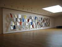
Ellsworth Kelly: Sculpture for a Large Wall
5. It All Begins With Paul Signac?
Art historians, theoreticians, and educators might look at how MoMA’s historic collection is presented. For as MoMA goes, so goes the world. I am not at all upset that, as we were warned by an article in the New York Times Magazine, we begin our journey through modernism with Paul Signac’s Opus 217: Against the Enamel of a Background Rhythmic With Beats and Angels, Tones and Colors, Portrait of M. Félix Fénéon in 1890. This is a fractional gift from Mr. and Mrs. David Rockefeller. I am not sure how big “fractional” is, but surely they could have afforded the whole thing. Otherwise, my motto is that beggars should be choosers.
We do not begin with Cézanne’s The Bather or Picasso’s Les Demoiselles d’Avignon. We begin with Signac! As usual MoMA, for better or worse, creates the official history of modernism; as the best museum of modern art in the world, it cannot do otherwise. Everything it does is exemplary. Beginnings determine everything, so one would assume that the Cézanne or the Picasso (since MoMA owns no major Manet that I know of) would be a logical, albeit overly didactic, start. No, we need a little surprise, a little wit.
And, after all, why not honor the Rockefellers right at the start and get it over with. It was once their family museum, and one assumes the donations have never stopped. In terms of Signac, is MoMA at long last honoring followers as well as leaders, workers-in-the-trenches, as it were, as well as the four-star generals of art?
Yes, Signac’s subject Félix Fénéon was an art dealer. Are we also honoring the evil demons of art commerce? Or since Fénéon was also an art critic, are we, perish the thought, honoring goads and flunkies?
Always trying to put a good face on things, I will assume that the gentlemen in question, like myself, was an excellent and virtuous critic, and at long last MoMA is honoring this strange and unfairly denigrated profession so important to art and culture. And even sometimes important to literature, poetry and philosophy.
And after the entrance? The masterpieces we love shine. As for the much-publicized freedom to take various pathways, it hardly seems much freedom at all. Objects have to be arranged somehow, and no matter how you arrange them, since pathways are always linear, dialogue among them is never really going to work. Unless, of course, you wrench them out of time and context. This is called formalism. What we need is some better way to show a dialectic between, let us say, the form-driven and the content-driven. Or art and life. Or images and words. Or the personal and the spiritual. Or even money and art.
MoMA Gets Ready: Down to the Wire
6. The Twenty-Dollar Question
As an ordinary museum-goer might look at Mega-MoMA a bit suspiciously. The $20 fee is scary. Director Glenn Lowry is quoted as saying MoMA receives no government money. Excuse me, I think a press release in my packet clearly states that MoMA recently got $65 million from New York City and $10 million from New York State. Perhaps Lowry means not regular, line-item money, as the Metropolitan or the Queens Museum receive.
Andbecause MoMA is a nonprofit educational institution, it pays no income or property taxes. Taxes not paid end up being made up by taxes you pay. Someone has to pay for the police force, the fire department, and the army and navy. MoMA does collect sales tax in its various gift shops. I suppose you could argue that Our Holy Mother of Art is a tourist lure and tourist eat in restaurants, stay in hotels, and shop in department stores, all of which pay taxes.
But, speaking as a former administrator, admission is cash. Unlike promised gifts, cash is there every day at the end of the day. So…I’m sorry to say, knowing how invaluable a resource MoMA is….
…if I did not have press credentials and American Association of Museum membership, I’d go for becoming a MoMA member, like the rich. It’s cheaper by far than paying single admissions. Paradoxically, if you can afford membership and go more than four times, you get in for less than the ordinary Joe or Joan. Most movies are $10, an average of $5 an hour. Will you spend four hours at MoMA? MoMA is a better entertainment deal than most movies and, besides, at MoMA you can be seen, unlike in a dark movie theater. You can pose against various panoramas or modernist icons. You can be the star of your own movies. Even in terms of what it costs to go to church, this is a bargain; at least you don’t have to give up your sexuality or your soul.
Seriously, when asked if there should be an admission to The Museum of Modern Art, John D. Rockefeller supposedly said there had to be, or no one would value the art. It is odd that once the Metropolitan and the Whitney started charging admission, their attendance shot up.
And the poor? The students? The retired? I hope more and more corporations will, like Target, subsidize free hours or, better yet, memberships for all of us. Your membership card would have the name of your sponsor on it: K-Mart, Dog-Chow, McDonald’s, Oxford-MedCo-AOL-Time-Warner.

