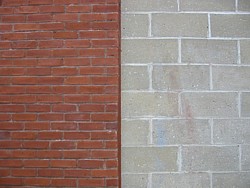
Exterior Noguchi Museum (Detail), 2004. Photo: J.Perreault
I prefer to take my own pictures. It helps me get closer to (or further away from) the art. Sometimes with my digital I take dozens of images, more than I can use and more than necessary to cover the shot. Is this a way of making notes? The camera accomplishes several other things. The man with a camera is off-bounds, thus ensuring both visibility (you don’t want to bump into the photographer) and privacy (you don’t want to talk to him or her). There is also the fear that the camera will turn on you, thus interfering with your own invisibility and privacy in public.
I was at the press preview for the renovated Noguchi Museum in Queens, so no one stopped me from taking pictures. Usually you cannot take photographs in museums and galleries, even if you are an art critic.
Is it a matter of copyright? Flash-damage? Annoyance to other viewers? Not using a flash would solve the latter. It’s really about image control, which is close to eye control, and therefore mind control. Museums and galleries want you to see the art in a certain, carefully designed way.
Proof of this is that press photos are sometimes very deceptive; artists, galleries and museums pay big money for glamorous photographs. Now, it is true that I too intend to take glamorous photographs of art. If I am writing about something, it usually means I like it and I want it to look as good as possible. I want the photograph to convey my affection or attention.
The situation here in ARTOPIA is unusual; I choose the picture. Thanks to the little darkroom in my computer, I can even crop it myself, improve the focus, et al. In print media, the critic usually does not select the photographic illustration, never mind actually take it himself. He may pass along whatever photo handouts are provided, but the editor decides. Some newspapers eschew the handouts and send their own photographers, probably because they do not want to be beholden to the source or because they do not want to run the same publicity photographs as everyone else. When I was at the Village Voice, the staff photographer for some reason had total control and my columns were usually accompanied by photographs of works I had not even mentioned. Worse, although he was good at documenting “the scene,” he had bad taste and tended to photograph the artists themselves peeking through or from behind their sculptures, a form he favored.
The truth is that even when I am allowed to use my camera, I may never use the images. I ruthlessly delete. But at least I will have had the experience of seeing the difference between what the object looks like, warts and all, as opposed to what it looks like in the rectangle of my camera, flat and wartless.
The things left out of the picture, or are heard but not seen, are often more important than what the rectangle holds. This is why we still need words, which, although they do impose their own kind of rectangles, have a certain flexibility, generosity, vividness.
For instance, when I was in Berlin last year for an exhibition of my art, I had a chance to run around some spectacular museums. As long as you don’t use a flash, you seem to be allowed to take photographs. I had a field day. But friends asked: why did you take a photograph of the scaffolding and not of the Pergamon Altar itself? The Pergamon Altar is a Hellenistic masterpiece housed in the Pergamon Museum on Museum Island in Berlin (in what formerly was East Berlin) at the end of the famous boulevard called Unter den Linden. Ah, to walk along Unter den Linden in the footsteps of E.T.A. Hoffmann or Walter Benjamin. The Brandenburg Gate is at the other end. When I returned to New York, I actually rented Billy Wilder’s super-silly One, Two, Three to see how the German Democratic Republic looked before the wall fell. Except for the Brandenburg Gate, there wasn’t much to see. But I noted that unlike now, there was no Starbucks just beyond the ceremonial arch. (I have a photo of a Starbucks window reflecting the Brandenburg Gate, just to prove one is there).
The Pergamon Altar is enormous, with a huge tier of marble steps that makes it look bigger than the building it’s in — which no photograph can convey. Of course, that very week they closed for repairs because the skylight was in danger of falling in. I got in just under the wire, but I suppose, camera in hand, I could have been killed, leaving behind a digital image of glass shards, blood and rubble on marble. Fixed up, the Pergamon is open again.
I read today that the Guggenheim, the flagshipin New York (not the mingy little room in Berlin on Unter den Linden) is set for a major overhaul too. It is about time. Peeling paint and rust stains do not make a good impression. I don’t think the skylight is in danger is falling in, but presentation is all.
When subjected to my Berlin photos, my friends kept asking the reason for all the shots ofchip-board. And the grass growing between the cracks of the pavement in the courtyard of the Bauhaus Archive? Why that neatly piled caterers’ cube of folding chairs under a form-fitted red wrap?
My answer: If you can buy a postcard of the Pergamon Altar, why not photograph the people looking at it instead, using the altar as an excuse? Or the pile of chip-board stacked like minimalist sculptures, or the Judd-like chipboard doorway-protectors? Signs of life are more important than postcard views.
Oddly enough,it’s a spoken word that is my best souvenir. In another Berlin museum, I was reading the English version of a German wall text about a so-so Expressionist artist. He grew so depressed by conditions in Berlin under Hitler that he withdrew to a remote island. An older woman standing next to me, reading the German text, blurted out, “Dummkopf.” What did she mean? Should he have stayed and fought Hitler? Should he, as a Jew, left the country entirely? Did she realize that “Dummkopf” is one of six GermantermsI actually know? Had she read my mind, since I too construed he had been a total idiot?
Did she really say “Dummkopf”? The ears can be as deceptive as the eyes or the camera.
But in the visual arts the eyes usually rule. When I was teaching at the School of Visual Arts, I developed a student exercise that is worth repeating: Ruin the Art. In your imagination, reinstall (relight, etc.) a gallery or museum room that displays acknowledged masterpieces, but make the art look really bad and uninteresting. I would liked to have done this with real art, but that was logistically prohibitive. The corollary assignment would be: Correct the Art. Make really, really bad art look good by placement and lighting.
My new assignment would be photograph the art to (a) make it look better than it actually is and then (b) worse.
Of course, some artworks simply do not photograph well no matter what you do. Could it be they are not really art? Most people know artworks from photographs. It would be as if we rejected certain plays simply because they could not be turned into decent movies.
Dale Chihuly, famous for his glass art, once scandalized a certain art school where he was teaching in the ’60s by refusing to look at actual student work for an MFA critique. He would look only at slides of the work, on the grounds that this was how all art was usually judged and communicated. Some artists spend more money on photography than they do on art supplies, and I am sure it pays off.
Photographs of art can also cause disappointment. How many times have you been chagrined when a beloved painting, known to you only by postcard or slide projection, turns out to be grimy and forlorn? It takes a real connoisseur to understand that up close and real, Mondrians are not as neat as they look in reproductions. And that Blue Period Picasso you once adored (when you were 14) is actually kind of small and stupid-looking in real life.
Photography has influenced sculpture as much as it has painting, although it took sculpture longer to adjust to the camera. The pure, pure minimalist idea that you should be able to grasp the shape of a sculpture (or “specific object”) from one point of view — hence the justification for simple, familiar geometry — is camera-induced as much as crypto-Platonic.
Photographs in art magazines are particularly influential.The so-called finish-fetish painting and sculpture that once characterized California art was generated by the clean-look of Hard Edge New York art as presented in the art magazines, rather than the friendlier surfaces one might know in real life.
And slide projections, like images on your computer,are so vivid and glowing that how can any art live up to them?
* * *

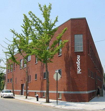
Exterior of Noguchi Museum, 2004. Photo: J. Perreault
All of the above came about because I was viewing my digital snaps on my computer, trying to figure out which one would make the best illustration for a short piece on the newly reopened Noguchi Museum.
Does the image above distort the Noguchi Museum? Make it look better or worse? Does it tell you anything about how I feel about the museum?
Next week: Is the Noguchi, near the East River in what some of us know as the working end of Queens, worth visiting? How did the $13 million renovation turn out? Is Noguchi a great sculptor?
