Another Bouncing Ball: June 2010 Archives
If this were Saltz before editing:
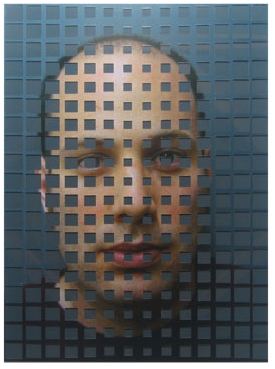 This would be him after:
 (Both images details from Drew Daly's altered photographs via Greg Kucera Gallery)
In my previous post about this show, From Bravo: the next barely adequate artist, I wrote that the show would depend on Saltz. Wrong. Others have emerged in the forefront, and by that I mean the artists. Out of 14, four shouldn't be there, and three are gone. (One to go.) The rest are capable of working within the framework of a reality TV show and putting their stamp on it, and I love that they can't be counted on to stand there and be judged.
Best line from the show still belongs to Nao Bustamante, who told the judges on the first episode, "I'm not responsible for your experience of my work." On the second episode, artist Miles Mendenhall went further. Refusing to accept that the judges are the only ones whose opinions matter, he joined the panel to offer his own. For making an entirely accurate remark about the work of another contestant, he has drawn ire from critics, naturally enough. Judgments are their job. On Culture Monster, critic David Ng called Mendenhall an "emo-hipster backstabber." Why? Because Mendenhall said something smarter than anyone else in the room.
Ng also noted that Mendenhall "talks endlessly about his obsessive-compulsive disorder and chronic insomnia." On this show, it's impossible to say who talks endlessly and who makes a couple of necessary observations. It's called editing.
Speaking of chatter, there's a lot of it currently about OCD. People who are a little distracted claim it, as if it were an honor. Mendenhall has it. Ng appears to have nothing but contempt for the artist, even though he's moving mountains to make his appearances.
Personally, I'm sad to see someone that young and afflicted struggle with what looks like an untreated disability. Isn't this the 21st Century? I'm also thinking of Tobias Wong. And I'm thinking of my father, a paranoid-schizophrenic novelist who self-medicated with alcohol and still managed to be both a terrific dad and artist. Such careers are necessarily short. I'd like to think there's more help out there now, but I don't see it.
On a lighter note, the excellent Sharon L. Butler (Two Coats of Paint) is hosting her own version of Work of Art on facebook.
(via)
 Tobias Wong 24 Hours of Pure Silver Leaf 1998 (Image via New York Times: NYT obit here and possible reasons for the death of the 35-year old artist who misidentified himself as a designer here.)
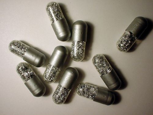 Damien Hirst Medicine Cabinet (one of many)
Among the multipliers:
Tara Donovan Toothpicks
 John Grade (at Suyama Space)
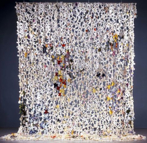
 Jim Hodges, Silk Flowers (image via)
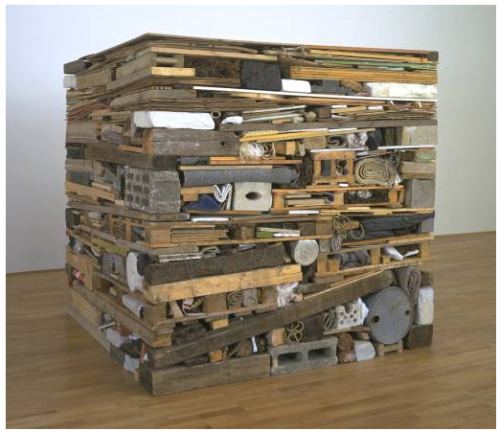
 Tony Cragg, Stack 1975
 Bradd Skubinna
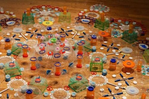 Mark Menjivar
 Louise Bourgeois
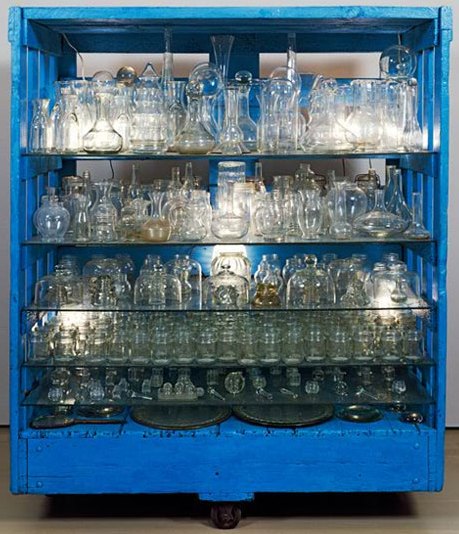 Jason Rhoades
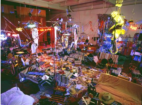 Annette Messager at the Pompidou
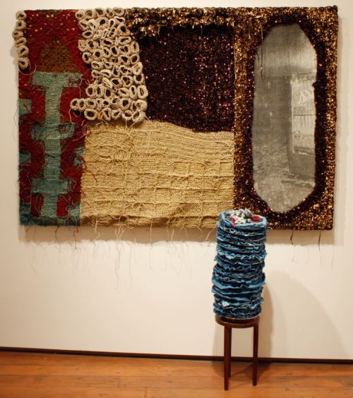
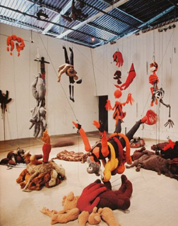 Josh Faught
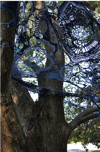
 Mandy Greer
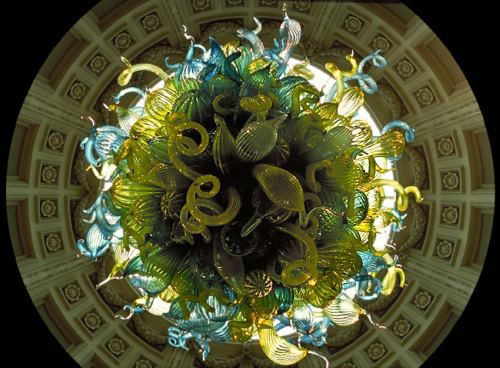
 Dale Chihuly, Victoria and Albert Museum, 2001
 Juniper Shuey
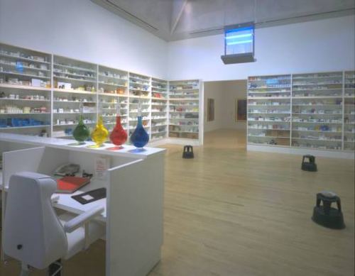
 Damien Hirst Pharmacy (Image via)
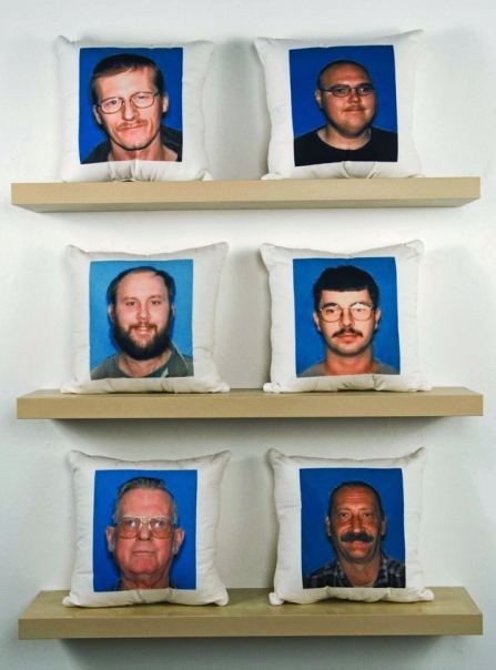
 Mike Simi Sex Offenders From My Hometown:Throw Pillow Series (Ongoing)
Printed fabric, found images
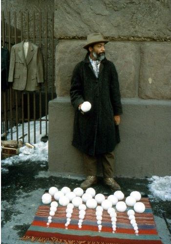
 Finally, the greatest example of simultaneous addition and subtraction in contemporary art, David Hammons' Bliz-aard Ball Sale on Cooper Square in NYC, 1983.
Nguyen, Migration, detail, 2010
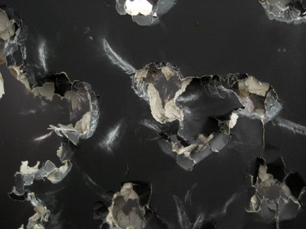 Nguyen's best installations derive from teamwork with Wade Kavanaugh, who had his own solo show at Suyama Space in 2008. (Examples here.)
 A lot of punching through the wall takes place in the name of painting. (See Target Practice: Painting Under Attack, 1949-78. Nguyen pales next to these primary sources.)
Nguyen at Suyama through Aug. 6.
Never doubt that a small group of thoughtful, committed citizens can change the world. Indeed, it is the only thing that ever has. Margaret Mead
When I met Chris Jordan, he was a Seattle lawyer representing a now-defunct pipe line company. Its product had ruptured on June 11, 1999, allowing 236,000 gallons of gasoline to pour into the Whatcom and Hannah creeks near Bellingham, turning them into fireballs. Two 10-year-old boys playing by the riverside were killed. Jordan's job was not to help anybody deny guilt. That trial was over. His more limited goal was to keep his clients out of jail. He did not succeed.
Some lawyers are able to recover from a case like that, and some have nothing to recover from. They are, after all, just doing their jobs. Haunted by the deaths and the river on fire through human negligence, however, Jordan didn't give up his cushy corporate job and switch to the other side. He withdrew completely, never to practice law again.
But while he was still on the case, he cold called me to introduce himself as a lawyer, not an artist. When he couldn't sleep, he said he liked to take a 4-by-5 camera on the streets of his Belltown neighborhood late at night to photograph the trees. I don't ordinarily do studio visits with lawyers who happen to pick up a camera. But there was something compelling about him, even over the phone.
Here's part of the story I wrote in 2001, the first in what is now a long and international list.
With no flashes or other lighting equipment, Jordan uses long exposures to take advantage of the light that's there: traffic signals, street lamps and neon signs. Granted, city trees have tough lives. That's what interested Jordan in the first place, their circumstances and secret beauty.
This is their secret: Stranded in urban jungles, they are still able to shine. Neon light gives them a gorgeous glow. In his photos, royal blues and jittery yellows, magentas and silver-gold bathe long trunks, clustered leaves and twisted branches in an artificial radiance.
"Planted in straitjackets of nutrient-poor, compacted soil, surrounded by asphalt and haphazardly pruned to protect buildings and phone lines, they struggle to live," said Jordan, 37. "Yet at night," he continued, "the colored glow bathes them in wild colors. They could be modern dancers on stage."
Jordan's most recent project is E Pluribus Unum, 2010 24x24 feet, laser etched onto aluminum panels
From his website:
Depicts the names of one million organizations around the world that are devoted to peace, environmental stewardship, social justice, and the preservation of diverse and indigenous culture. The actual number of such organizations is unknown, but estimates range between one and two million, and growing. To decode the strands, click here and click on the image. (Via Eyeteeth)
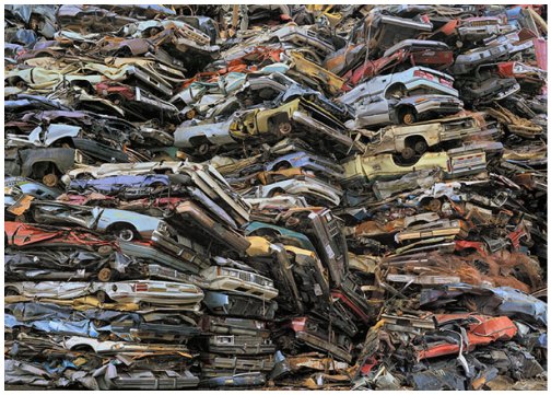
 In 2004, Jordan photographed in a Seattle scrap salvage yard and printed the results large, 4 feet by 6 feet, aspiring to the kind of scale he'd admired in Andreas Gursky.
In Jordan's mind, he was still following the thread of color bursting from trees.
His friend and fellow photographer, Subhankar Banerjee, saw the new print and said, "This is a portrait of America." The idea turned on the lights in Jordan's head. From it came his giant prints of consumerist waste products. Rivers of cell phones. Mountains of crushed cars. Circuit board moonscapes and sawdust cathedrals. Worlds of scrap metal.
 But even after the breakthrough, he was still just a guy with a camera.
After trying unsuccessfully to get noticed in Seattle, he self-published a book and distributed it to every curator and gallery dealer he thought might respond. One did, Paul Kopeikin Gallery in Los Angeles. In 2005, at a dinner arranged by another dealer, Jordan found himself sitting next to New York Times editor and photography writer Philip Gefter.
 In 2005, Gefter's essay on Jordan's work appeared on the front of the Sunday Arts and Leisure section, with a photo taking up nearly a third of the page. Jordan was a classic outside who created opportunity where there wasn't one, but the force and clarity of his work, the audacity of the manipulated printing process, carried him into the future, documenting what he calls the "slow-motion apocalypse" of a use-and-discard society.
The drive behind his environmental subject matter is a memory of two boys turned into living torches by the side of river. His challenge is to avoid didacticism, and if he can't, set it aflame. E Pluribus Unum catches him in a quiet and entirely celebratory mood. It won't last.
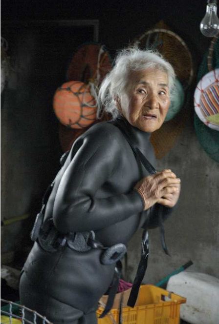
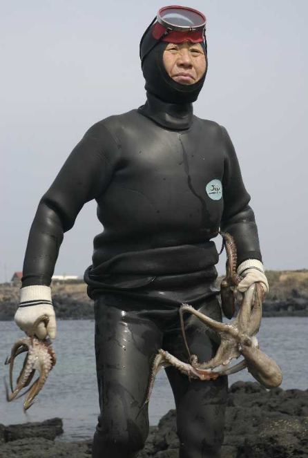
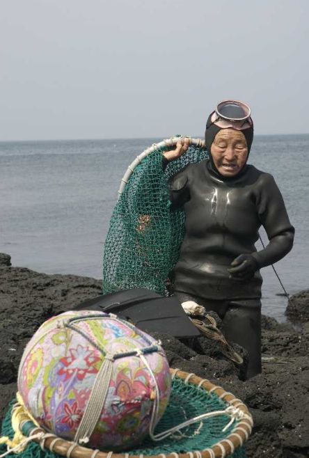
I deemed the weather offensive, the way the air lay on me like a giant tongue - clammy, warm and gritty as embers.
Galveston Nic Pizzolatto
Sometimes the weather that isn't there is all the weather you need.
Buddy Bunting 2004 ink on paper
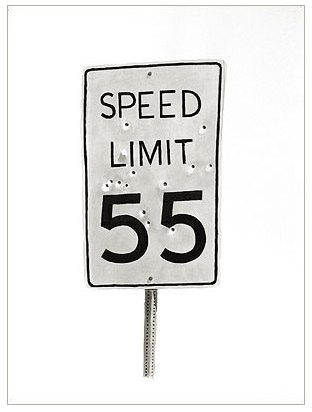 You can drown in it, even it you're already dead.
Andres Serrano Piss Christ 1987
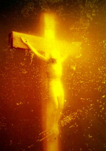
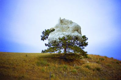
Sky to land: Drop Dead. In the photo that documents
sky's insult to land, a loogie hawked out of the sky lands with a muffling thud on a pine tree. The tree tops a mountain, with white air
surrounding the tree as a reverberation.
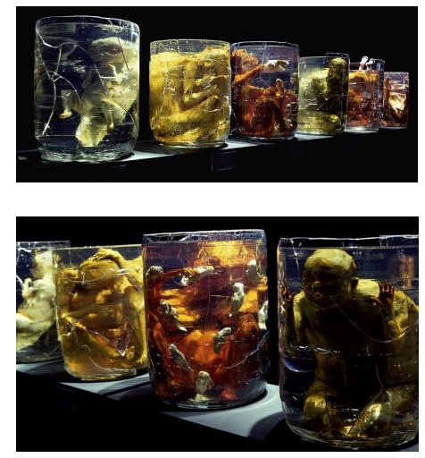
Debra Baxter, Spent, late 1990s
 If your world is the inside of a jar, what surrounds you is your weather.
Lauren Grossman, 1989
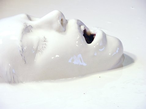
 Too wet to plow: Juniper Shuey Untitled
c-print
12.5" x 15.5"
edition of 3
2005
 John Cheever once said he "missed the sky" in the novels of a contemporary. Elmore Leonard isn't likely to say the same. One of his rules of writing is, "Don't start with the weather." Visual artists can make the weather primary without the burden of adjectives.
Grant Barnhart Killing Time with Sleeping Pills and Holding On 16×20, Acrylic on canvas (2009)
 In honor of Pizzolatto, whose debut novel Galveston is excellent noir, I'll end with its weather equivalent.
Grant Barnhart, Two Road Agents Meet at an Impasse 48×48, Acrylic on canvas 2009 (Ambach & Rice)
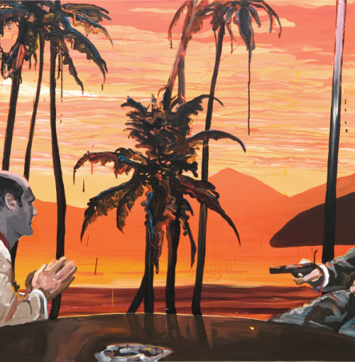
Debra Baxter, Spent, late 1990s
 If your world is the inside of a jar, what surrounds you is your weather.
Lauren Grossman, 1989
 Too wet to plow: Juniper Shuey Untitled
c-print
12.5" x 15.5"
edition of 3
2005
 John Cheever once said he "missed the sky" in the novels of a contemporary. Elmore Leonard isn't likely to say the same. One of his rules of writing is, "Don't start with the weather." Visual artists can make the weather primary without the burden of adjectives.
 Grant Barnhart Killing Time with Sleeping Pills and Holding On 16×20, Acrylic on canvas (2009)
 In honor of Pizzolatto, whose debut novel Galveston is excellent noir, I'll end with its weather equivalent.
Grant Barnhart, Two Road Agents Meet at an Impasse 48×48, Acrylic on canvas 2009 (Ambach & Rice)

Instead of Project Runway's Michael Kors and Nina Garcia, Work of Art has art dealer Bill Powers and dealer/curator Jeanne Greenberg Rohatyn. Instead of make-it-work Tim Gunn, auctioneer Simon de Pury muttering into his manicured hands. Instead of Heidi Klum, "art enthusiast" China Chow.
As with Runway, the possibilities were determined before the first episode. By then, unnamed judges had picked the 14 contestants, unlike American Idol and So You Think You Can Dance, both of which offer a survey of the field and the process judges use to narrow it.
Work of Art judges, host and artists, image via Bravo
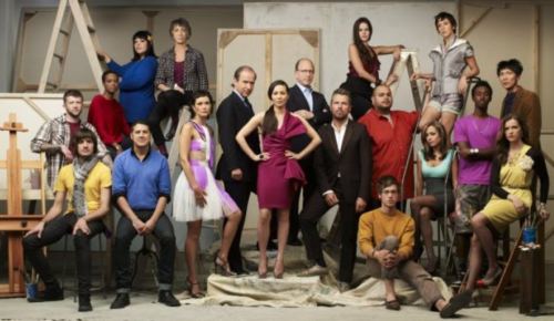 Each week there's a challenge; one person wins and one goes home. The only person on Work of Art without a Runway equivalent is critic Jerry Saltz. Although rigged against them, the show rides on his abilities.
The other judges fall short of their Runway relations. To date, Greenberg Rohatyn's judgments are absurd. Powers is vulgar. He actually said he couldn't "get off on" one contestant's piece. With his lecherous-logger looks and intense-for-no-reason demeanor, his phrase creates an unwelcome image. Not that he was trying to create it. He's one of those people who uses phrases without thinking about them.
Note to Powers: Read George Orwell's Politics and the English Language. The next day, read it again. Underline this part:
As soon as certain topics are raised, the concrete melts into the abstract and no one seems able to think of turns of speech that are not hackneyed: prose consists less and less of words chosen for the sake of their meaning, and more and more of phrases tacked together like the sections of a prefabricated hen-house.Chow's confidence gives self-esteem a bad name. Born wealthy and raised around art, she acts as if she earned it. De Pury appears to be bewildered, as well he might be. The artists on the show are outside the range of his consciousness, steeped as it is in the price points of masterpieces.
Ain't nothing like that here. After a nationwide search, the overall quality of artist-crew is at best uneven. Who picked them? In his running commentary in New York Magazine (so far here and here), Saltz was quick to point out he didn't. (Even if you're not watching the show, reading Saltz react to it is worth the click.)
The first challenge, to create a portrait of a fellow contestant, showed the judges' deficiencies in bold relief. They seem to believe that a portrait has to be a recognizable likeness. (See Martin Bromirski's on his blog, Anaba, particularly...)
hey judges - Felix Gonzalez-Torres, Untitled (Portrait of Ross in L.A.), 1991, Louise Bourgeois, Torso Self-Portrait, 1962-63, David Hammons, Esquire (or John Henry), 1990... etc etc blah blah blah...It's major not to realize how diverse the contemporary meaning of a portrait is, and yet Saltz did nothing to clarify, either in his (heavily edited) remarks on the show or later in his NY Mag commentary. Instead, he sweats the small stuff. Talk about eye not on the prize:
Note to Saltz: You and the 10 people with whom you like to dine might have decided that the terms "figurative painter" and "abstract painter" are dead, but I assure you they are still in use by tip-top art-smart people around the world. For you, their use indicates out-of-it, but nobody else cares. Sounds like you're describing your secret handshake. Move on.
No one in the art world calls themselves a "figurative" or "abstract" painter. They just say they're an artist or a painter. It was a sign that the producers didn't know the art-world lingo.
A great moment from episode one came from contestant Nao Bustamante, who told the judges, "I'm not responsible for your experience of my work."
The tops and bottoms were hard to tell apart, aside from the artist who went home and deserved to via her leaf-strewn wallpaper. The judges liked Abdi Farah too much and Erik Johnson too little. Powers said Johnson's face-on-a-palette painting resembled one of John Wayne Gacy's clowns. I guess that's where we are with clowns. Paintings of them used to remind people of Red Skelton. Now, a serial killer comes to mind.
Gacy and Johnson have nothing in common besides the subject matter, which means they have nothing in common. Gacy was a demented folk artist. Johnson is an expressionist. His figure looks like phlegm from a tubercular's handkerchief, and I mean that as a compliment.
The second challenge went better: Make something from electronic junk. Guest artist Jon Kessler raised the tone, telling contestants to remember that objects have a memory. The bottom three richly deserved their status. I would have liked to see Peregrine Honig in the top three, but no quarrel with the two-time winner, Miles Mendenhal.
Miles Mendenhall, Worst place, 2010, mixed media
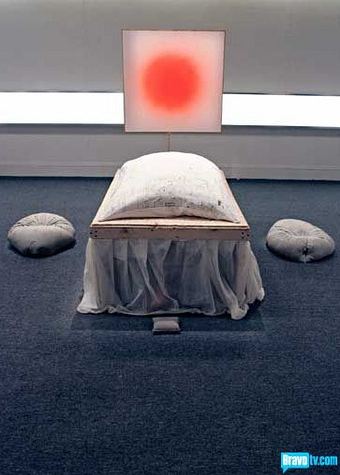 In its glory days, Project Runway was a don't-miss, art-world cult classic. I'm not sure this show will get there. Saltz aside, the judges need to be smarter and de Pury more forceful. He could help the artists in the studio, but his old-world manners prevent it.
 One thing you can say about So You Think You Can Dance. Everybody who makes it on the show has every reason to believe it, and the judges, while frequently annoying, know from whence they speak. Responding to Alex Wong's brilliant work in a piece choreographed by Sonya Tayeh, judge Nigel Lythgoe said:
Sometimes we concentrate on the architecture of dance...and forget to dance because the steps get in the way. Tonight you've shown you have that structure and artistry melded together.None of the judges on Work of Art have come close to that, but, of course, they're not dealing with Wong's equivalent. (Good question: Why aren't they?)
More on Work of Art - recaps from Christopher Knight, Paddy Johnson and Jen Graves. Third episode Wednesday night.
Teacher: What's 2 plus 2, Michael?
Micheal: 4.
Teacher: That's good, Michael.
Michael: It's not good, it's perfect.
Joe Deal's photos are perfect. They are what it is, images of an Etch-A-Sketch state that keeps erasing and repeating itself, without Bill Owens' hapless charm or Ed Ruscha's consolation of the cool.
Deal, Watering, Phillips Ranch, California, 1983 from Subdividing the Inland Basin 14 x 17 inches vintage silver print (Image via)

For the hiring committee, 10 suggestions:
1. Don't limit yourselves to PhD's. We all know PhD's who get the job, sit down and rarely rise again.
2. Good contemporary is not skin deep. How well does the candidate know the permanent galleries at the Met? The Frick? Ask who has the best American historical collection on the West Coast. (It's the de Young.) Make it/break it question: Who is Robert Farris Thompson? (Extra credit: What are his links to the SAM? Answers here and here.) In short, don't pick a person who's all about who's hot and who's not.
3. No divas. The Northwest flattens their feathers. They're not happy, and yes, we talk about their huge egos behind their backs. On the other hand, glam's fine. High-heeled sneakers and wig hats welcome.
4. Reach for the sky. When Max Anderson left the Whitney, who would have guessed he'd take a job at the Indianapolis Museum of Art? At the time it looked like a demotion, but he's a bigger deal now than he was then. Get the back story, and pick somebody with something to prove.
5. Consider art dealers. Jeffrey Deitch broke that ice. If he can be director of MoCA, why can't an art dealer be curator at SAM? Ask Donald Young if he's available. What's next for Scott Lawrimore? Greg Kucera? Marian Goodman would be an amazing coup, and so would Paula Cooper. Maybe one of them is secretly sick of the commercial world. Thinking less commercially, on the commercial/nonprofit divide, how about the team of Shelly Bancroft and Peter Nesbett? How about Matthew Higgs?
6. R-E-S-P-E-C-T. Find out what it means to peers.
7. Don't think you can't get a big name. That person might have private reasons to make a move. But fame alone doesn't mean he or she will have anything genuine to offer in the NW.
8. Pick somebody who can find the global in the local. That person will get behind the region and push. He or she will inspire donors and attract diverse audiences. When she doesn't have money for a necessary exhibit, she'll be someone others write checks for.
9. Tough skin is a requirement. Nobody who collects grievances, please.
10. Without vision the people perish. Find somebody who has one and can make it matter.
(Photo, Mike Urban, Seattle PI 2007, accompanying my profile of him, here.)
 A curator on the job for three years is cracking open the territory. Darling has the wit, energy and vision to connect part of what's genuinely of merit in the NW to art globally. He is capable of breaking the isolationist bubble of regionalism to move artists who move him onto a larger stage. He's leaving in part because he can't do it alone. Having brilliant chops is not enough in the NW, either for artists or curators.
 Darling's Target Practice: Painting Under Attack, 1949-78 (June 27 to Sept. 7, 2009) is extraordinary by anyone's measure. From my review in Modern Painters:
Target Practice focused on artists who saw painting as a closed world and attempted to pry it open. With single and multiple works by 40 talents from Europe, Japan, North America, and South America, it engaged what remains a fresh chaos of ragged representation and stands as the best contemporary-art survey in the museum's history.
And yet Target Practice did not travel. Darling tried. The economics were against it, but the primarily reason it went nowhere else is that it originated in Seattle. Later, when working on Kurt Cobain's impact on visual art (Kurt), Darling tried less, if at all. It too isn't going to travel. At least Target Practice has a catalog. Kurt doesn't. Its record will be the reviews it attracted, largely from Seattle.
Kurt has everything desperate art museums need. Through it they can achieve an attendance boast without sacrificing substance. (No disgraceful Star Wars exhibit, no dubious Tim Burton.) Kurt is rigorous art straight up, with a built-in bridge to popular culture. Had Darling organized this exhibit for Chicago's Museum of Contemporary Art, it would have a catalog, and it would have a touring schedule.
At SAM, Darling has no help. What he does, he does without assistance. His exhibit's ideas, paperwork, phone calls and other legwork come from him. Nearly all art museums outside of Texas have financial problems, but SAM has the additional problem of a deal with a failed bank. While it's not as bleak as formerly, 60,000 square feet of space SAM needs to rent out remains vacant.
Plus, the cuts continue. In May SAM announced...
In Seattle, Darling works with deeper and wider collections than will be at his disposal in Chicago. He is not a curator of the last five minutes. SAM's range is a boom for him. His curatorial peers at SAM may not all be the hippest, but they are all masters in their territories, and yet Chiyo Ishikawa, SAM's Deputy Director for Art & Curator of European Paintings and Sculpture, says that the Chicago offer was just too good to pass up.
What's so good about it? A rosier financial picture, assistants on his team and, above all, the cache to secure the right sort of attention for his efforts. Darling will be great in Chicago. In Seattle, he had the chance to be historical. He could have undermined the art-world prejudice that continues to view the city as a backwater. In the national view, Portland is DYI cute, but Seattle is overblown and underfed. It's not true, but no points accrue from being misunderstood.
Next: Ideas for Darling's replacement.
Kurt has everything desperate art museums need. Through it they can achieve an attendance boast without sacrificing substance. (No disgraceful Star Wars exhibit, no dubious Tim Burton.) Kurt is rigorous art straight up, with a built-in bridge to popular culture. Had Darling organized this exhibit for Chicago's Museum of Contemporary Art, it would have a catalog, and it would have a touring schedule.
At SAM, Darling has no help. What he does, he does without assistance. His exhibit's ideas, paperwork, phone calls and other legwork come from him. Nearly all art museums outside of Texas have financial problems, but SAM has the additional problem of a deal with a failed bank. While it's not as bleak as formerly, 60,000 square feet of space SAM needs to rent out remains vacant.
Plus, the cuts continue. In May SAM announced...
Immediate reductions to staffing levels, other compensation-related expenses, and a two-week furlough and museum closure...The reductions were achieved through a combination of attrition and the elimination of current positions. Additionally, after the completion of the Pablo Picasso exhibition in late January 2011, the museum plans to close its three principal buildings for a period of two weeks (January 31-February 13, 2011) as an additional cost-saving measure. Several top level administrators at SAM will accept a 10% reduction in pay for the coming year only, and (director Derrick) Cartwright has planned for a still larger reduction to his own executive compensation next year.(Jen Graves story on cuts here.)
In Seattle, Darling works with deeper and wider collections than will be at his disposal in Chicago. He is not a curator of the last five minutes. SAM's range is a boom for him. His curatorial peers at SAM may not all be the hippest, but they are all masters in their territories, and yet Chiyo Ishikawa, SAM's Deputy Director for Art & Curator of European Paintings and Sculpture, says that the Chicago offer was just too good to pass up.
What's so good about it? A rosier financial picture, assistants on his team and, above all, the cache to secure the right sort of attention for his efforts. Darling will be great in Chicago. In Seattle, he had the chance to be historical. He could have undermined the art-world prejudice that continues to view the city as a backwater. In the national view, Portland is DYI cute, but Seattle is overblown and underfed. It's not true, but no points accrue from being misunderstood.
Frances Bacon, Of Truth, 1601:If there's any doubt about Seattle's standing, the New York Times' story announcing Darling's departure from SAM eliminated it. Amid minor errors concerning where Darling was when, the writer asserted that Darling was only the second to hold the position of modern and contemporary curator at SAM. He's the sixth. I wrote about the error here, and the Seattle Art Museum requested a correction. To date, no correction has appeared in the paper of record.
What is truth? said jesting Pilate, and would not stay for an answer.
Next: Ideas for Darling's replacement.
William Ivey (1919-1992) Untitled, 1976 Oil on canvas
Howard Kottler (1930-1989) Portrait Vase, 1988 Ceramic with whitewash and luster
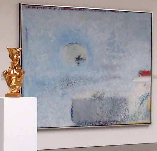 Ivey painted not what he saw but what he felt about what he
saw: windows, waters, hills and dales, bridges, tables,
ledges and restless passages of sky as they poured themselves out through the window in his
studio.
Like Joan Mitchell, he continued to explore the premises that first inspired him. He wanted to push
representation to the edge, hammer the hard contours of the world into
submission and infuse their shadowy forms with blunt yet atmospheric
radiance. He never became what Lester Young called a
``repeater pencil," producing Iveys by the truckload.
Ivey painted not what he saw but what he felt about what he
saw: windows, waters, hills and dales, bridges, tables,
ledges and restless passages of sky as they poured themselves out through the window in his
studio.
Like Joan Mitchell, he continued to explore the premises that first inspired him. He wanted to push
representation to the edge, hammer the hard contours of the world into
submission and infuse their shadowy forms with blunt yet atmospheric
radiance. He never became what Lester Young called a
``repeater pencil," producing Iveys by the truckload.Like the Bay Area's Robert Arneson, Kottler believed in the aesthetics of bad taste. Cheap consumer goods ignited flames in the fake fireplace of his imagination. Marbled contact paper stirred him more than marble, and simulated wood grain meant more than wood. He was part of a generation that dispensed with the high/low divide, which meant, in his case, that art history also drew his magpie eye. Portrait Vase is a tribute to Italian futurists, especially Umberto Boccioni. The fractures that were life and death for Boccioni became party favors for Kottler. During his lifetime, some saw Kottler as trifling, which did not disturb him. When challenging the high/low divide, protests from its adherents are expected. At least he wasn't barking mad like the futurists. (Yeats: The best lack all conviction, while the worst /Are full of passionate intensity.)
Because Ivey and Kottler are always high points, that's what they are in A Corporate Legacy - A Continuing Cultural Gift at the Wright Exhibition Space, curated by Beth Sellars.
Aside from the coma-inducing title, the exhibit is a fine time capsule for a certain kind of NW art: strong in painting, ceramics and glass, barely there in photography and nonexistent in video, installation and anything that rests uneasily in a specific medium.
The collection tends toward the conservative, bringing to mind Wallace Stevens' reflections on his neighborhood.
Disillusionment of Ten O'ClockAnother thing about that neighborhood: Stevens lived there. Days, he worked in a managerial capacity for an insurance company. Nights, he reinvented the language. Conservative is not a synonym for irrelevant.
The houses are haunted
By white night-gowns.
None are green,
Or purple with green rings,
Or green with yellow rings,
Or yellow with blue rings.
None of them are strange,
With socks of lace
And beaded ceintures.
People are not going
To dream of baboons and periwinkles.
Only, here and there, an old sailor,
Drunk and asleep in his boots,
Catches tigers In red weather.
The collection from which the exhibit is drawn came from Safeco Insurance. The company began to acquire art in 1973 and did so with a regional focus. By the time Liberty Mutual acquired Safeco in 2008, its glory days in aesthetics were past, but as a final goodwill gesture the corporation donated 840 of the strongest works to the Washington State Art Consortium, a support group for seven art museums in the state.
Once abundant, corporate collections are now a rarity. Safeco's rewarded artists, art at its source. In the 1980s, it was easy to take it for granted. Now, it appears to represent a better time.
(Show list after the jump.)
Continue reading Time capsule of Seattle art.
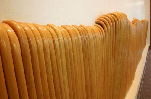
 Harriet Saunderson Walking Wall, 2007
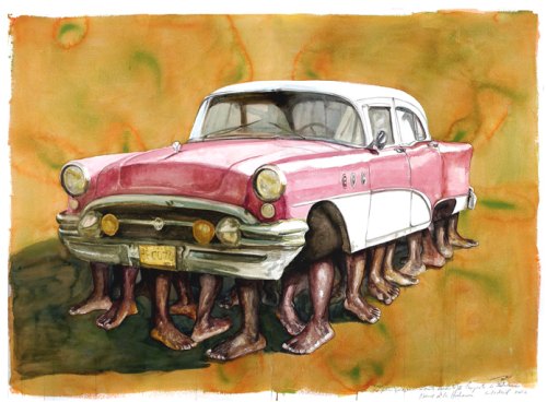
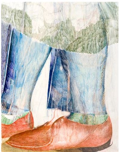
 Christian Weihrauch Kleine Schritte (Small Steps), 2005
Colored pencil on paper
12.5 x 10 in.
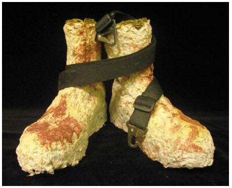
  Jon Michael Turner, from the Combat Paper Project
 Do-Ho
Suh
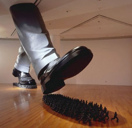 Karen Ganz
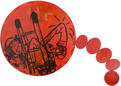 Jennifer Campbell
Jennifer Mao Figure Ground
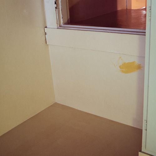 2. Subvert verisimilitude.
Glenn Ligon Malcolm X (small version 1) #1, 2001; painting; paint and screen print on primed canvas, 48 in. x 36 in. (Image via)
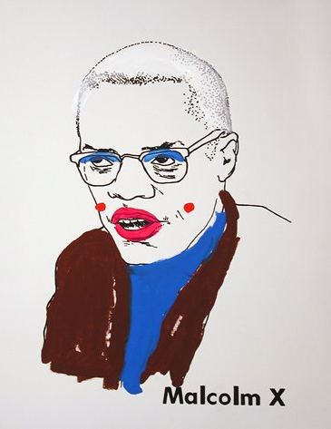 3. No line unchallenged.
Sigmar Polke, Over the Rainbow, 2006 (obit here)
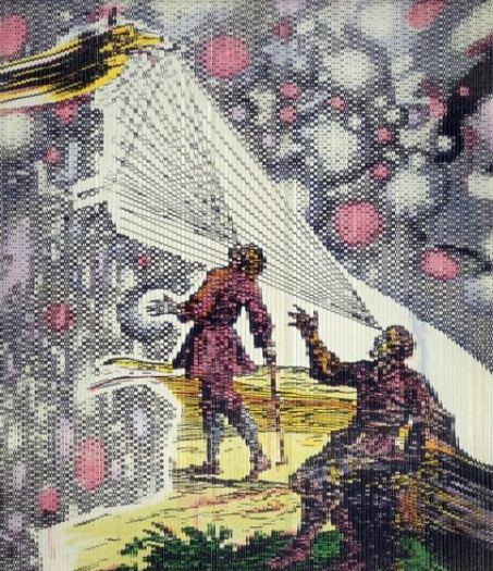 4. No dead edges.
Andrew Dadson, Plank Lean Painting #2, 2010. (detail) Oil on canvas. 60 x 60 x 10 inches
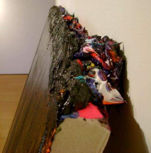 5. Color needs a crew.
Robert Ryman (His white on white in white qualifies.) Ledger, 1982. (Image via)
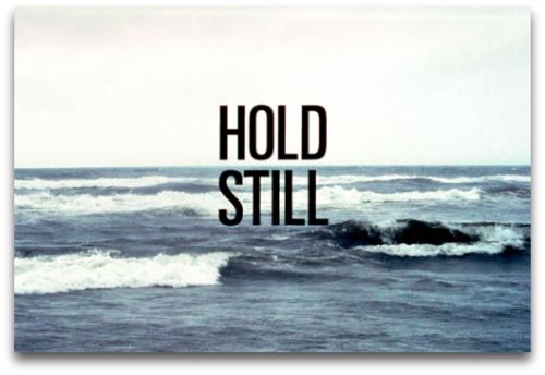
 6. How carries what.
 Mark Mumford, Hold Still, 2003 Ink on paper
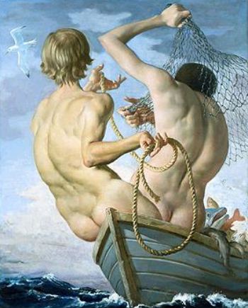
 7. Ransack the past (be a chop shop).
Gatsby believed in the green light, the orgastic future that year by year recedes before us. It eluded us then, but that's no matter - tomorrow we will run faster, stretch out our arms further... And one fine morning - So we beat on, boats against the current, borne back ceaselessly into the past.
F. Scott Fitzgerald The Great GatsbyJohn Currin
 8. Let ripe go rotten.
Joan Snyder Rain, 2009 oil, acrylic, burlap, seeds, paper mache, on linen 39" x 54"
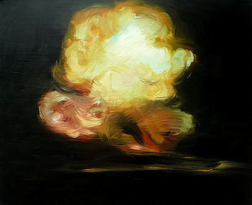
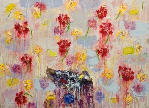 9. Like a thermos, contain heat without radiating it.
Joy Garnett, Explosion, Black & Yellow
2009
Oil on canvas
26" x 32"
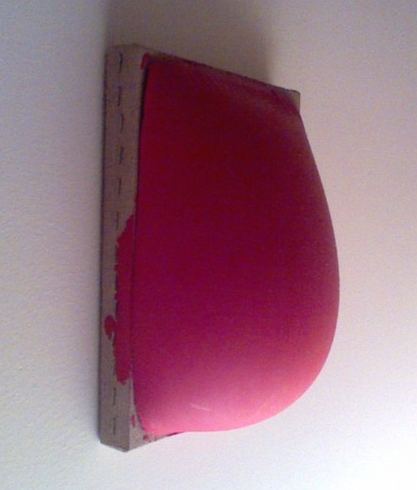
 10. Flat out, flesh in.
Flesh is the reason oil paint was invented - DeKooning
 10. Flat out, flesh in.
Flesh is the reason oil paint was invented - DeKooning
Sample:
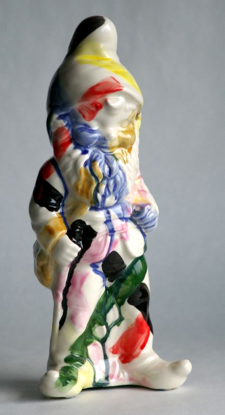
 Not that trolls (and gnomes) don't have their uses. Below, a fine one by Nicholas Nyland in the spirit of Tang Dynasty.
Mao:
Map-making is an assertion of the finite - an attempt to physically embody knowledge of structures and boundaries...They are created with the implicit understanding that the depicted space holds a degree of permanence. In asking individuals to map familiar places from memory and embroidering the results, I am interested ... in creating a non-reproducible illustration of a subjective memory, inverting the traditional practice of mass-production associated with conventional maps. I am also interested in the points where memory fails - the blank spaces, unevenness, and skewed proportions that reflect our own hindsight biases and remembrances.
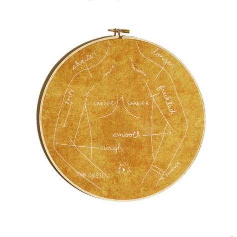 To participate:
Make a map of a familiar place from memory on a piece of paper up to 8.5"x 8.5". Send scans/images to:
jennifer.s.mao[at]gmail.com
Or, if anonymity is preferred, by post to:
1140 18th Ave, Apt #205
Seattle WA, 98122
To participate:
Make a map of a familiar place from memory on a piece of paper up to 8.5"x 8.5". Send scans/images to:
jennifer.s.mao[at]gmail.com
Or, if anonymity is preferred, by post to:
1140 18th Ave, Apt #205
Seattle WA, 98122Adam Helms, image via
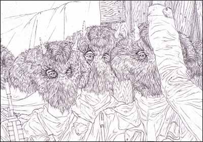 Byron King
Polar Brokers is a series of drawings where I took the bio pics of big oil executives and morphed images of polar bears into their silhouettes.
Trophy Soldiers is a web project made in 2007 that became a reaction to my own personal desensitization to the imagery from the war in Iraq.
 Sherry Markovitz Boots Are On The Ground gouache on vellum, 36 x 47 inches, 2001
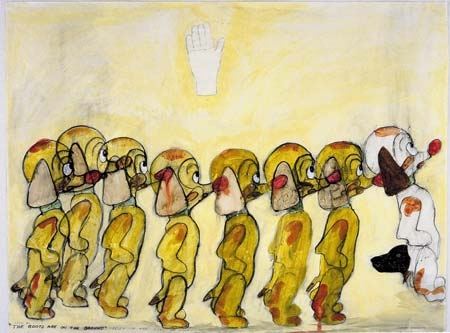 Peace
PeaceGala Bent
 Claire Cowie
 Elizabeth Sandvig
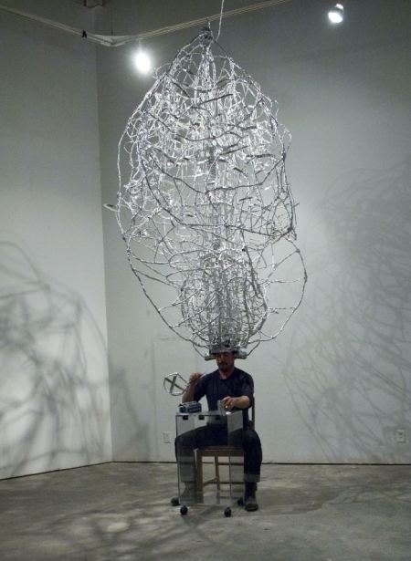
Bryan Schoneman Communicating with the B Horizon. 2010 Aluminum foil, dirt, Plexiglas, wood, glass, steel, rye grass, video monitor Dimensions variable (Flash Gordon meets Kim Jones but manages to stay presentable.)
 An exhibit is the last thing tuition buys you. Using as evidence the University of Washington's MFA survey at the Henry Gallery, the program of digital arts and experimental media is worth the dough, as is sculpture, especially ceramic sculpture. Painting is less so. Although there are artists graduating who know how to move paint around, their modes range from bombast to nostalgia. Nobody appears to have spent any time in the church of what's happening now. (Denzil Hurley is on the faculty, and yet there's no sign these students had the benefit of his counsel.)
On the other hand, who knows? Some artists are sleepers who wake up later, while others who come on strong are never heard from again.
Below are a few of those I hope to hear from again.
If Alwyn O'Brien stops making art, she'll be missed. Starting with a lumpenproletariat material base familiar from the abstractions of Franz West, she gives us the old world radiant in decorative ruin. I can't think of a UW graduate working in clay who has mattered this much since Michael Lucero in 1978.
O'Brien, image via Best Of . Objects of Unknowing: Somewhere between the Propped and the Picturesque. 2010 Slip cast porcelain, photographic decals, foam core, plaster, paper, wood, wheel, paint, wallpaper
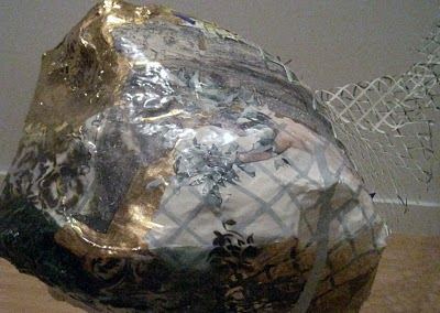 (Images via
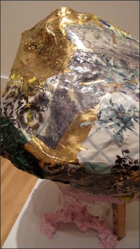
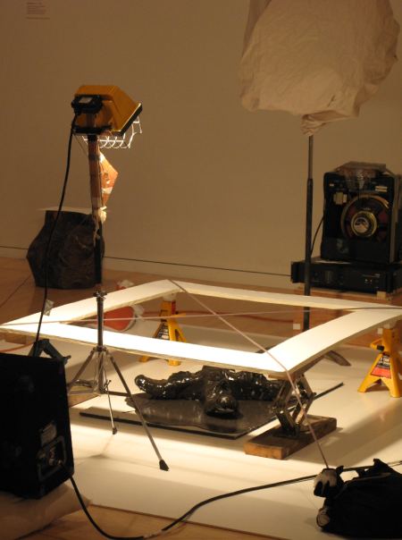
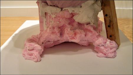 When in doubt, build something. Samuel Payne's installation is a piece of high-flying overkill, a forensic examination of an ominous black smeary thing that remains hearty, despite a laboratory's efforts to isolate it.
 Drawing Construction #2 (Shadow Boxing Compass). 2010 Sandbags, ax, jack stands, car scissor jacks, music stand, wood, light, tape amplifier, speaker, cart, shoes, rope, hand-sewn sandbags from clothes, canvas, paper, C.V. joint grease, tree stump, sound of chopping wood
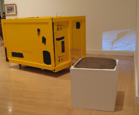
 Hanita Schwartz took an object, did something to it, did something else to it.
Schwartz, Elsewhere under the Monochrome. 2010 Mixed media Box: 64 x 42 x 40 in. Print: 50 x 40 in.
 Peter Nelson, still from Mr. and Mrs. Nelson. Oodles of charm here. Puppets with paper mâché heads and hands struggle through the issues of late middle-age confronting the artist's parents. Killer text. I especially appreciate the stunned expression on the dad's face. He thought everything was dandy but found out his wife has long contemplated an exit.
 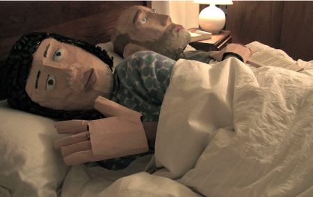 Nelson video here.
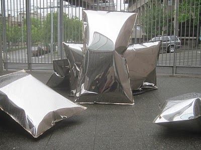
Lisa Rickey's pillows look light as air, a la Warhol. They're not. Kick one if you want to break your toe. Any way the Henry can buy these and leave them in the courtyard? That courtyard needs all the reflections it can get.
Rickey Pillow Talk (Reflection). 2010 stainless steel Approximately 8-10 ft. x 10-12 ft. x 8-10 ft. (Image via) Lisa Rickey Pillow Talk (Reflection). 2010 stainless steel Approximately 8-10 ft. x 10-12 ft. x 8-10 ft. (Image via)
 Maggie Carson Romano grew up in Arizona. (As the B-52s said about Idaho in 1980s, Get Out Of That State!) Using an experience she knows well, she charted the freckles that have appeared on her young body as sun damage and turned them into a sky. I love this piece, deeply and madly. (Sunblock, everybody, sunblock.)
Romano, Self-trace, for pressing against. 2010 Embossed photograph 44 x 90 in.
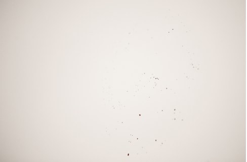 Romano:
I see my freckles as an emergent physical record, mimicking photographic film by darkening from exposure to sunlight. The map is life scale showing the full space of my body while revealing only its trace. I embossed each freckle by hand, creating a relief map that can be read by touching the surface of the image. The title, Self-trace, for pressing against refers to my act of tracing my markings and also to the freckles being a physical trace of my body. The title also invites the notion of pressing against the surface of the map, suggesting that another body could absorb my particular pattern of visual markings as physical indentations on their own skin, amidst their own freckles.
One more complaint: The design graduates need their own space. They are not well served when the art crowd shows up and says, What? It isn't saying that about Stephen Cummings, however. His shrunken-head Heineken Label is fabulous, no matter what program produced it. (2009
Heineken label
1 1/15 x 3/16 x 1 1/8 in.) Update from Cummings: Turns out, he's from the painting program.
Through June 27.
Through June 27.
But even the very hairs of your head are all numbered. Fear not therefore...is a threat in the age of surveillance.
William S. Burroughs, Naked Lunch:
I can feel the heat closing in, feel them out there making their moves, setting up their devil doll stool pigeons, crooning over my spoon and dropper I throw away at Washington Square Station, vault a turnstile and two flights down the iron stairs, catch an uptown A train...Evidence can be gathered on any life. If the state seeks, it will find, and hope of oblivion will be a romance.
Sade, from Marat Sade:
And when I vanishKevin Van Aelst tracks the trace evidence of himself, as if he were his own detective examining his own crime scene.
I want all trace of my existence
to be wiped out...

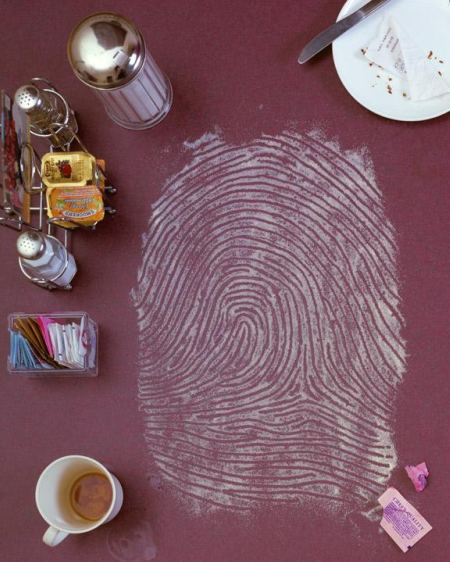
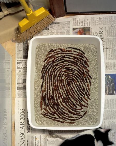 I first saw Van Aelst's work accompanying Virginia Heffernan's NYT's blog, The Medium, her excellent examination of Internet culture which after today will be part of the NYT's ArtsBeat, the NYT's attempt to compete with the LA Times' Culture Monster.
Van Aelst obliterates the distinction between art and illustration. Below is his take on the subject of art theft (Heffernan's story here.) An illustration needs the story. Van Aelst's illustrations are the story.
From NYDailyNews.com. Full story here.
Artists who painted a mural at an elementary school in Prescott depicting four students, with the most prominent being a Hispanic boy, were asked to lighten the faces amid taunts and tensions. R.E. Wall, the artist who heads the Prescott Downtown Mural Project, told a local newspaper passersby regularly shouted racially charged comments at his group while they were creating the mural at the Miller Valley Elementary School. "You're desecrating our school," "Get the ni---- off the wall," "Get the sp-- off the wall," were common, Wall said. "The pressure stayed up consistently," Wall said. "We had two months of cars shouting at us."Hinshaw/AP Pamela J. Smith and R.E. Wall sit on the scaffolding in front of the Miller Valley School Mural titled "Go on Green" in Prescott, Ariz.
Wall said his artists began touching up the mural earlier this week. "They want us to lighten up the forehead and the cheeks [of the boy in the center], and make him look like he is coming into the light," he said. The school told Wall they want the children to appear more "radiant and happy." The school's principal, Jeff Lane, told the newspaper he asked the artists to "remove some shadowing that made the faces darker than they are."
Wall said his team began lightening forehead and cheeks earlier in the week. Way to go, artists. Way to (not) fight the good fight.
UPDATE: School reverses itself after getting international attention. (Story here.) Artists will restore original brown hue to boy's face. Right-wing shock-jock who rallied racists against the mural fired. Even in Arizona, being the subject of worldwide scorn can have a salutary effect on behavior.
UPDATE: School reverses itself after getting international attention. (Story here.) Artists will restore original brown hue to boy's face. Right-wing shock-jock who rallied racists against the mural fired. Even in Arizona, being the subject of worldwide scorn can have a salutary effect on behavior.
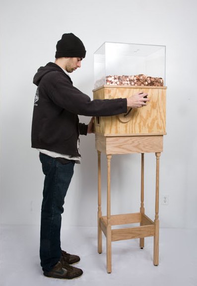
Blake Fall-Conroy Minimum Wage Machine (Work in Progress) 2008 Custom electronics, change sorter, wood, plexiglas, motor, misc. hardware, pennies (approx. 15 x 19 x 72 inches)
The minimum wage machine allows anybody to work for minimum wage. Turning the crank will yield one penny every 5.04 seconds, for $7.15 an hour (NY state minimum wage). If the participant stops turning the crank, they stop receiving money. The machine's mechanism and electronics are powered by the hand crank, and pennies are stored in a plexiglas box.
In my youth when visiting friends, a photo of the host on the wall was worrying but not conclusive, especially if some other person, place or thing shared the frame and could be considered the point: a favorite haunt, horse, child, lover, dead parent. Two or more photos of the host alone? No need to ask which way that wind blew - into a full-blown case of narcissistic personality disorder. I might wrap that person up but never take him home.
Today guileless youth post hundreds of photos of themselves on Facebook. They carry themselves in their phones and on their laptops, never far away from the chance to take more photos of the subject dearest to their hearts, as if they were each their own church, genuflecting at their own altar.
Someone peripherally involved with a struggling chamber orchestra recently confided that the problem is the music director. He tries to sell the idea that art is worth an encounter rather than the reassurance that the community already owns the art and has a home there.
Again and I know I'm being an old fart: For me the appeal of art was that it offered something greater than myself, and that by engaging it, I could find my way into the deep end of the pool.
Enter Warhol, whom I long resisted. I used to think he made the idea of the deep end obsolete, and I mourned its passing. In time I realized that he made the idea of the shallow end obsolete, that everything can open up and contain a world.
Now at the Seattle Art Museum, Love Fear Pleasure Lust Pain Glamour Death: Andy Warhol Media Works is Warhol at his most unguarded. He loved the people represented here, and they loved him. For him, they dispensed with the shellacked smiles of the camera ready, caught the mood of their moment and reflected it back to him.
Himself he didn't spare. Why is it that Warhol's version of himself as an old drag queen has a Wife-of-Bath elan while Cindy Sherman's self-portraits as aging matrons are dry at their root? Adrian Searle wrote of the series that Sherman's work is "more durable than it looks." Searle is brilliant, but what does that mean in the context of now? Like Oscar Wilde before him, Warhol taught us to judge by looks.
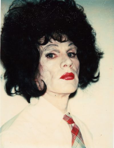 Curated by Marisa Sánchez, Love Fear Pleasure Lust Pain Glamour Death is a clean, straight shot of Warhol, including his Screen Tests projected large across two galleries, photobooth strips, sewn photos and Polaroids. The man who had a lot to say about being alone was almost never alone. These are his people, his team pre, during and post Factory. On the evidence of this show, despite being shot, being the subject of endless bad reviews and in possession of many personal foibles, it was great to be him.
Only one quibble: the title. Why Love Fear Pleasure Lust Pain Glamour Death? Isn't that title taken already? I refer of course to Bruce Nauman's 1983 neon circle: Life, Death, Love, Hate, Pleasure, Pain.
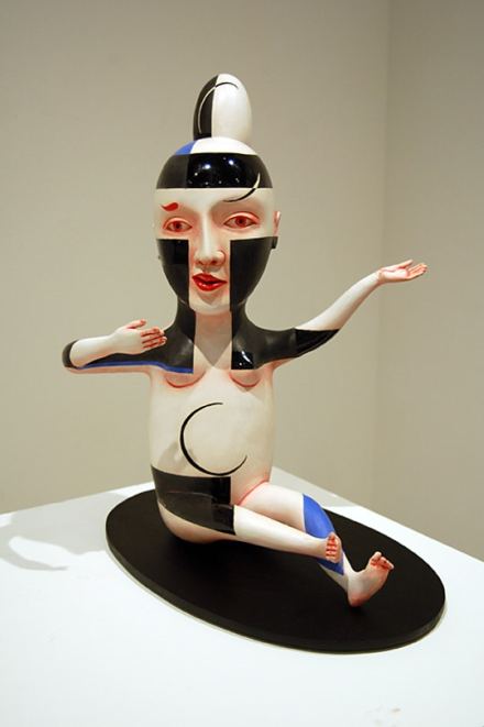
Howard's last exhibit is Patti Warashina, a pioneering figure in West Coast ceramics, one of a trio who brought Seattle ceramics to national attention in the 1970s. (The others - all from the art faculty at the University of Washington - are the late Howard Kottler and the late Robert Sperry, the latter her husband.)
Kottler had no false moves. Sperry had one great one - cracked, sea-foam surface plates. Warashina is the most erratic - across her long career scoring big and striking out. The nerve and wit of her best work derives from a fundamental simplicity. Her worst is overworked, sporting surface decoration that has little to do with the figure underneath it.
Besides being way too crowded (the gallery's fault), the current show presents Warashina at her most festively inert.
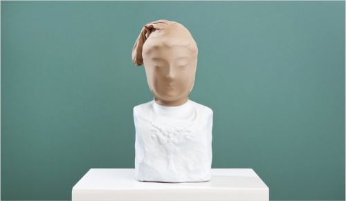
Patti Warashina Figure D 2010 whiteware and mixed media 22" x 18.5" x 17"
 For comparision, consider how Claudia Fitch uses color on a ceramic figure. (There's a hole in the world like a great black pit/ and it's filled with people who are filled with shit....via)
TORSO (2), 2006 Ceramic porcelain 13.5 x 7.5 x 6.5 inches, Greg Kucera Gallery
 Through June 12.
 Peter Sutherland is drawn to places that are filler on the country's psychic map, places where time lags between meals, and nothing in particular looms on the horizon. What drew him to the hole above was not the possibility of a bear within but the youth without. They decorated the edge of the dark as a homage.
Boredom interests him. Sutherland makes art of odd games, twists of light, lying around. Ordinary burdens and accidental beauties pause for him to take their picture. About his exhibit last year at the ATM Gallery, Blame It On The Dog, Roberta Smith wrote:
Mr. Sutherland is something of a multitasker. In addition to writing rather well (in the show's small catalog), he is also a filmmaker. Whatever he does seems to celebrate the potential for inspiration in even the most pedestrian and barren facts of American life. Every instant is a possible image; every image a likely story.
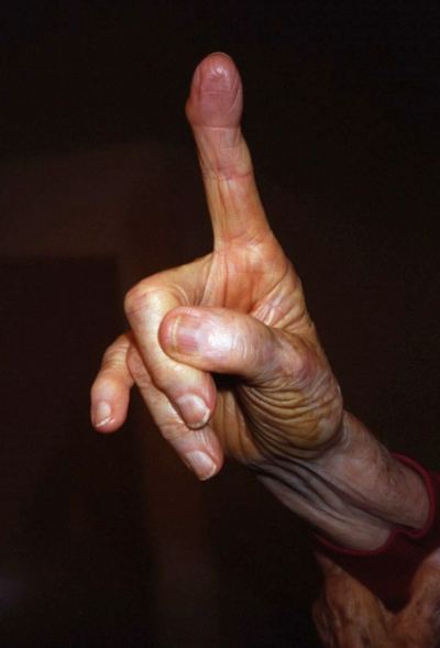
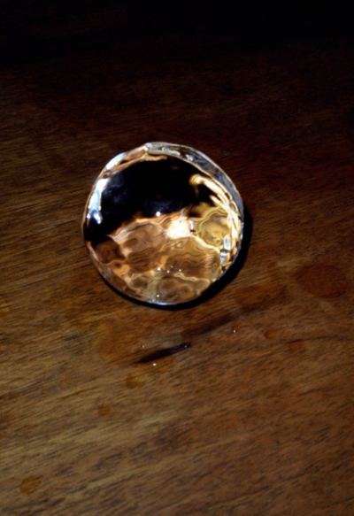
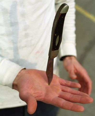 The last image, of the artist balancing a knife on his palm, is a still from a video. It's the first thing you see upon entering Lawrimore Project. If you're not planning to enter Lawrimore Project, you can see the video online by going to Sutherland's Website, here, and clicking the last word of his essay, which is joy.
Through June 26.
Andrew Dadson Plank Lean Painting #2, 2010. Oil on canvas. 60 x 60 x 10 inches
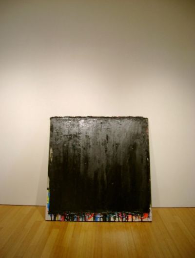 Plank Lean Painting, detail
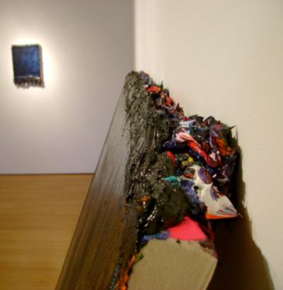 What symphonies of old-time push and pull are buried underneath the black? Leftover colors gather at the painting's edge like clues at a crime scene. And this is the truth about painting. Dadson's attempt to kill it gave it license to rise again in another form, from bloom to blight, channeling Rothko.
Voter's Ink, 2008 Iraqi voter ink on canvas framed with UV Plex 42 x 32 inches (reversible vertically)
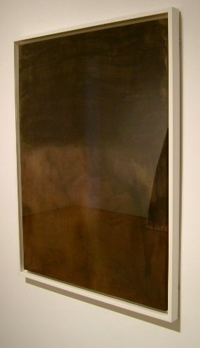 Making a painting from Iraqi voter ink embraces accelerated change. The piece will continue to develop in the light, losing purple and gaining gold, its specifics lost in an atmosphere over which the artist has no control. For someone who is not primarily a painter, his contributions to a medium that only momentarily has his attention are extraordinary.
 Through June 26 at Lawrimore Project. Jessica Powers on Dadson here.
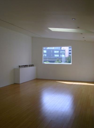 In the middle of the worst environmental disaster since the Ice Age, Browning's modesty is appealing. Appealing and deceptive. It takes a major artist to pull off this kind of scale shift.
And down in lovely muck I've lain,But begin the game anew...too little, too late, but imperative nonetheless.
Happy till I woke again.
Then I saw the morning sky:
Heigho, the tale was all a lie;
The world, it was the old world yet,
I was I, my things were wet,
And nothing now remained to do
But begin the game anew.
A. E. Housman
 Browning, detail:
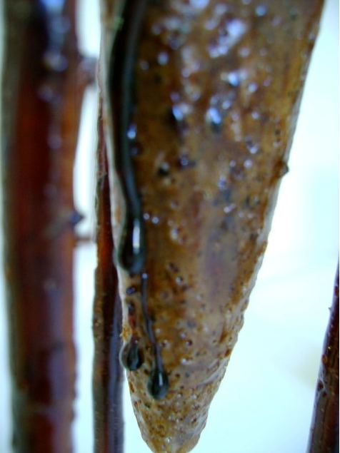 Titled Tradition as Adapative Strategy, Browning's foray into the world of back-porch whittlers builds the conceptual from a foundation of masculine craft. Each piece comes from one block of wood he carved into a cone suspended from a brace. He poured the pitch into the cones, which are also funnels.
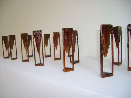 And time machines. Like oil in water, the pitch will continue to move at its own leisurely imperatives. (See Thomas Parnell's Pitch Drop Experiment at the University of Queensland.)
Browning conceived of his show before the Gulf of Mexico promised to become a dead zone, but surely he saw it coming. A consumer society consumes itself. After eight deregulated years of the Bush administration, the self-consumption is an orgy. Browning's adaptive strategy offers no solutions, save for the most basic.
In the face of ruin, the handy man make something. He jerry-rigs a repair and failing that, fashions a memorial. Drawing on skills passed down from generations, he speaks to future generations with his actions: Take up your bed and walk, or, as Fergus said in The Crying Game, pick up your teeth with broken fingers.
Jen Graves on Matt Browning here. Through June 26.
Chartier:
It's what all the galleries seemed to prefer after many conversations, and the energy is already way better than it's been for a long time.Ben Beres, Seattle artist and part of the art team SuttonBeresCuller, catnaps in 2005 on the second floor of the Aqua Hotel during Basel/Miami. Adam L. Weintraub photo, Seattle PI
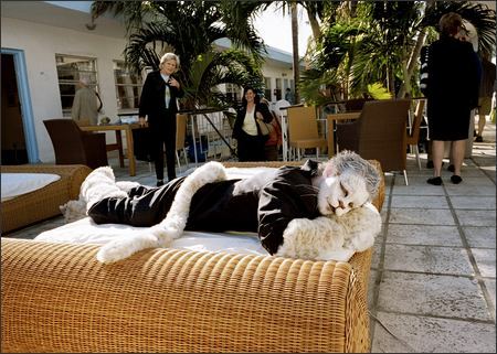
detail (2009) color photograph mounted on aluminum and plexiglass 43 5/8 x 43 5/8 in. (110.8 x 110.8 cm)
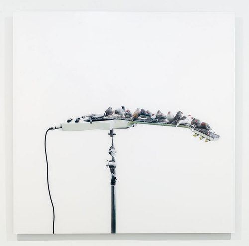
Boursier-Mougenot's birds in concert:
Ron Tran's pigeons (The Peckers, 2004) are better musicians, but they have backup on piano.
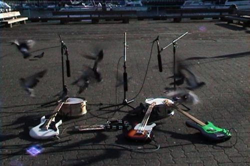 The Peckers in concert here. It's a NYT's video and you have to watch a short ad first, but it's well worth it. This piece was featured in Michael Darling's Thermostat: Video and the Pacific Northwest at the Seattle Art Museum in 2008.
Céleste Boursier-Mougeno (France, b. 1961) Untitled (Series #2). 1999 Inflatable plastic pool, porcelain bowls, glass snifters, pump, immersion heaters, water, and Clorox Henry Art Gallery, gift of Kate Elliott
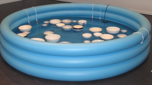 The sound's the thing, a random clack-clack fused with bells. Reminds me of a fragment of a F. R. Higgins' poem about Jezebel, whom the dogs of the street eat. "Though her ghost lacks a back, there's music in the old bones yet."
A prime example of this sort of thing is currently at James Harris: Robert Davis and Michael Langlois' Into the Void: The Battle of the Martyr as Told by Ingres.
James Harris:
Robert Davis and Michael Langlois are collaborators who make paintings together, redefining the conventional notion that paintings are made by a single artist and embody a singular essence or "hand." They met while at the School of the Art Institute and have worked together since 1997, each taking an equal role in developing ideas, choosing subjects, and executing the works.Davis & Langlois:
Both paragraphs are Grade A Prime nonsense, but hey, nobody's perfect. The exhibit also comes wrapped in a ridiculous narrative: a resurrected Ingres narrates the tale of a 15-year-old Palestinian-American girl thinking of Chief Seattle when he was forced out of his land, text translated into Soundgarden lyrics translated into Arabic. Again, bad but not fatal.
For us, representational painting always includes a deferred relationship to the painting's event. In this sense, we see our paintings as historical and symmetrical to our own relationship to the past-defined by an ever-renewing dynamic between memory, its representation and the synchronicity brought about in the object itself. Our vocabulary is derived from popular and sub cultures and while we use the oldest trick in the book (mimesis), we are committed to making classical techniques viable options in contemporary art.
What's fatal is the work itself, the painting. It's gutless, with all the gears of its machinery clogged and dry.
The Resurrection, 2009 Oil on canvas 40 " x 50"
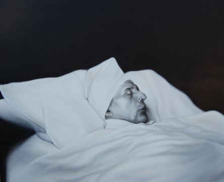 These people are going to make "classical techniques viable options"? Ingres would have laughed them out of his studio. They're going for the silky sublime, of which the 19th Century French NeoClassicist was master. What they deliver is competent sign painting. From a distance and viewed from a moving car, their mimesis might pass muster.
 In a gallery, a good gallery, it's a disgrace. Painting is not limping along, needing an assist from whatever rotten crutch is on offer. Painting needs Davis & Langlois like a fish needs a bicycle.
Into the Void, 2009 Oil on canvas 96 " x 104"
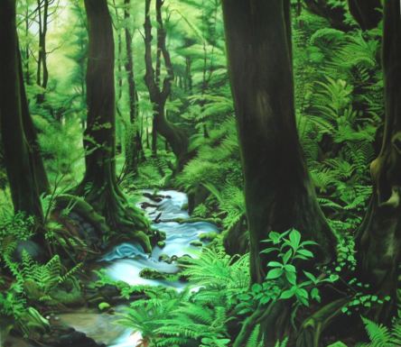 The core of this exhibit made a previous appearance at the Museum of Contemporary Art Chicago (September 5 - 28, 2009). That's a big venue for a trifling product.
 How Can You Buy Or Sell the Sky, 2009-10 Watercolor and silver paint on wall Dimensions site specific
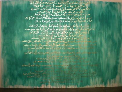 Through June 19.
  The room around you is a house. Your house is your body bubble. Invaded by misfortune, fortified by paranoia, your house is your thickest hide. It's shaped in your image, if you have an image and aren't just living there, having nowhere else to go.
Whiting Tennis MASTODON, 2010 Acrylic and collage on canvas 46 x 65 inches
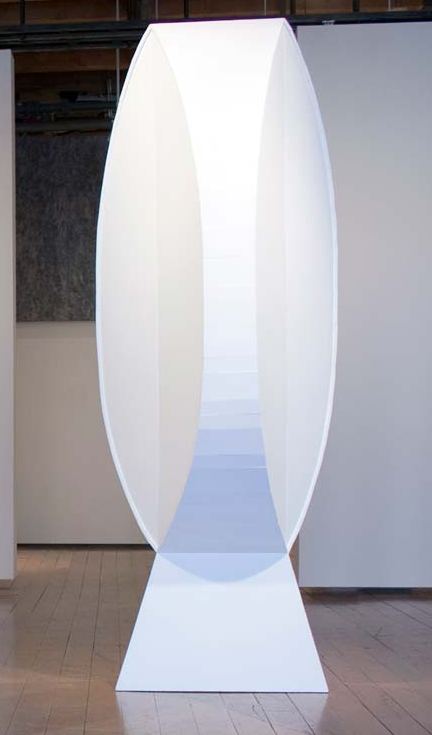
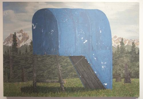 Whiting Tennis builds and/or paints shelters that are spiritual containers for the thing contained. Their oddity derives from the inability of their inhabitants to focus their projections. His current exhibit at Greg Kucera Gallery is called Walleyed, used in a sense that moves beyond sight into essence.
TRICLOPS, 2010 Paint on plywood 114 x 55 x 55 inches
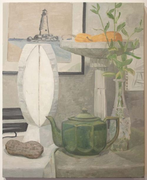
 STILL LIFE WITH BIRDBATH, 2010
Oil on canvas
30 x 24 inches
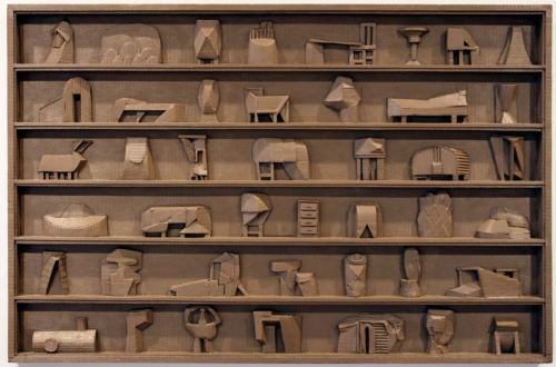
 BROWN SHELF, 2010
Oil on cardboard collage
29 x 43 x 1.75 inches
 Through June 26.
About
Blogroll
AJ Blogs
AJBlogCentral | rssculture
About Last Night
Terry Teachout on the arts in New York City
Terry Teachout on the arts in New York City
Artful Manager
Andrew Taylor on the business of arts & culture
Andrew Taylor on the business of arts & culture
blog riley
rock culture approximately
rock culture approximately
critical difference
Laura Collins-Hughes on arts, culture and coverage
Laura Collins-Hughes on arts, culture and coverage
Dewey21C
Richard Kessler on arts education
Richard Kessler on arts education
diacritical
Douglas McLennan's blog
Douglas McLennan's blog
Dog Days
Dalouge Smith advocates for the Arts
Dalouge Smith advocates for the Arts
Flyover
Art from the American Outback
Art from the American Outback
lies like truth
Chloe Veltman on how culture will save the world
Chloe Veltman on how culture will save the world
Life's a Pitch
For immediate release: the arts are marketable
For immediate release: the arts are marketable
Mind the Gap
No genre is the new genre
No genre is the new genre
Performance Monkey
David Jays on theatre and dance
David Jays on theatre and dance
Plain English
Paul Levy measures the Angles
Paul Levy measures the Angles
Real Clear Arts
Judith H. Dobrzynski on Culture
Judith H. Dobrzynski on Culture
Rockwell Matters
John Rockwell on the arts
John Rockwell on the arts
State of the Art
innovations and impediments in not-for-profit arts
innovations and impediments in not-for-profit arts
Straight Up |
Jan Herman - arts, media & culture with 'tude
Jan Herman - arts, media & culture with 'tude
dance
Foot in Mouth
Apollinaire Scherr talks about dance
Apollinaire Scherr talks about dance
Seeing Things
Tobi Tobias on dance et al...
Tobi Tobias on dance et al...
jazz
Jazz Beyond Jazz
Howard Mandel's freelance Urban Improvisation
Howard Mandel's freelance Urban Improvisation
ListenGood
Focus on New Orleans. Jazz and Other Sounds
Focus on New Orleans. Jazz and Other Sounds
Rifftides
Doug Ramsey on Jazz and other matters...
Doug Ramsey on Jazz and other matters...
media
Out There
Jeff Weinstein's Cultural Mixology
Jeff Weinstein's Cultural Mixology
Serious Popcorn
Martha Bayles on Film...
Martha Bayles on Film...
classical music
Creative Destruction
Fresh ideas on building arts communities
Fresh ideas on building arts communities
The Future of Classical Music?
Greg Sandow performs a book-in-progress
Greg Sandow performs a book-in-progress
Overflow
Harvey Sachs on music, and various digressions
Harvey Sachs on music, and various digressions
PianoMorphosis
Bruce Brubaker on all things Piano
Bruce Brubaker on all things Piano
PostClassic
Kyle Gann on music after the fact
Kyle Gann on music after the fact
Sandow
Greg Sandow on the future of Classical Music
Greg Sandow on the future of Classical Music
Slipped Disc
Norman Lebrecht on Shifting Sound Worlds
Norman Lebrecht on Shifting Sound Worlds
The Unanswered Question
Joe Horowitz on music
Joe Horowitz on music
publishing
book/daddy
Jerome Weeks on Books
Jerome Weeks on Books
Quick Study
Scott McLemee on books, ideas & trash-culture ephemera
Scott McLemee on books, ideas & trash-culture ephemera
theatre
Drama Queen
Wendy Rosenfield: covering drama, onstage and off
Wendy Rosenfield: covering drama, onstage and off
visual
Aesthetic Grounds
Public Art, Public Space
Public Art, Public Space
Another Bouncing Ball
Regina Hackett takes her Art To Go
Regina Hackett takes her Art To Go
Artopia
John Perreault's art diary
John Perreault's art diary
CultureGrrl
Lee Rosenbaum's Cultural Commentary
Lee Rosenbaum's Cultural Commentary
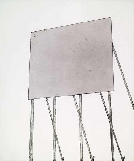
 Ed Ruscha,
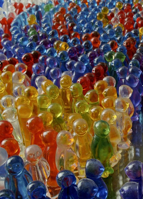 Not so happy:

Recent Comments