Another Bouncing Ball: March 2010 Archives
High artistic standard · Conceptually enduring · High technical standard · Cohesive body of work · Ability to work at scale appropriate to public art · Demonstrates experience · Site and/or context responsive · Potential or ability to work in media appropriate for public art · Good image quality · Current work, 1995 to present · Potential to successfully create a commissioned artwork with a minimum budget of $25,000 · Not commercialAs long as they apply to new candidates instead of being retroactively applied to artists accepted under different rules, these criteria sound reasonable until the last item. Not commercial. Not commercial? If the commission is going to avoid losing future lawsuits, it's going to have to define its terms more precisely. I think the phrase intends to exclude whoever designed the Nike swoop or MacDonald's golden arches, but the result is to bar anybody who sells work in galleries or out of a studio.
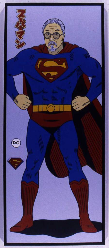
Even if the commission better articulates its reasoning, however, that reasoning is hopelessly out of date. Take Geoff McFetridge. He is one of many artists who've helped close the gap between business and art. He's not only a designer for Nike, Pepsi, Stüssy, Burton Snowboards, Girl Skateboards and Patagonia, he created film title sequences for The Virgin Suicides and Adaptation. The Washington State Arts Commission would be lucky to have him, but according to its rules, he'd be barred from applying.
Geoff McFetridge, detail of mural at Olympic Sculpture Park, image via Damion Hayes
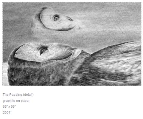
Robyn O'Neil
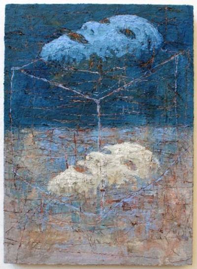
 James Deitz Dream, Dream oil / canvas, 2009
26⅝ x 19⅛ inches
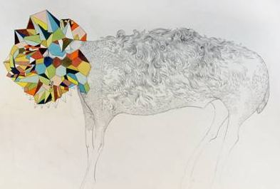 Bent is in Transubstantial at Catherine Person, along with Colleen Hayward, Renee Zettle-Sterling and Heidi Schwegler, opening Thursday night as part of Pioneer Square's First Thursday Gallery Walk, 6-8.
Also opening Thursday night in the Square:
Made in the U.S.A., group show of gallery artists at Greg Kucera. Sean M. Johnson at Howard House. Marianne Pulfer at Grover/Thurston. Michael Kenna at G. Gibson. Margot Quand Knight and Mirror Mirror at James Harris. Elias Hansen at Lawrimore Project. Adam Satushek at Platform. Jennifer Beedon Snow at Linda Hodges. Sol Hashemi & Jason Hirata at Punch. Chauney Peck and Ben Hirschkoff at Soil. Rachel Maxi at Some Space.You're So Cool at Ohge.Troy Gua (and 50 collaborators) at Monrach.
Sean Johnson at Howard House:
 Opening Thursday outside the Square: Ray Ray Mitrano at Joe Bar. Strange Coupling at Ouch My Eye. Catherine Grisez at Traver Gallery. Julie Speidel and Tracy Rocca at
 Winston Wachter.
Joey Veltkamp from Strange Coupling:
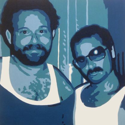 Already open:
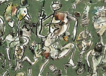
 Ron van der Ende at Ambach & Rice, through May 2. James Diez and Michael Dailey at Francine Seders, through April 11. Lush Life 2 at Roq La Rue through May 7, and Alden Mason at Foster/White Gallery, through April 27. Note to Foster/White: Please don't describe Mason's work. Your quote: "At age 90, Alden Mason returns to Foster/White Gallery with his ever-enchanting sense of humor and whimsy." Ever-enchanting sense of humor and whimsy? Shoot me. Mason is much better at locating his terrain. "My paintings are a private world of improvisation, spontaneity, humor and pathos, exaggeration and abandon." Go with that and end with that.
Alden Mason at Foster/White:
 Opening later in the month: 5 x 5 at Grey Gallery, opening April 8. Benton Peugh at Fetherston Gallery on April 9.
 Think Caliban as band master, not Ariel, playing winds, strings and all manner of percussives. They are the Anti-Fascist Marching Band, Artesian Rumble Arkestra, BeatCrunchers, Bolting Brassicas Marching Band, Brass Messengers,The Carnival Band, Emperor Norton's Stationary Marching Band, Environmental Encroachment, Extraordinary Rendition Band, Garfield High School Bulldog Drumline, The HBC Brass Band, Hubbub Club, Hungry March Bank, Leland Stanford Junior University Marching Band (LSJUMB), Minor Mishap Marching Band, Orkestar Slivovica, Orkestar Zirkoniu, Samba Ja, Seattle Sounders FC Soundwave Band, Seattle Seahawks Blue Thunder Drumline, Titanium Sporkestra, Vamola, Yellow Hat Band and Yesterday's Chonies.
Environmental Encroachment

John Wesley, 2009. Painted Bronze, 24 x 17 x 7 in. (Image via)
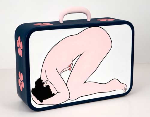 Henry Taylor
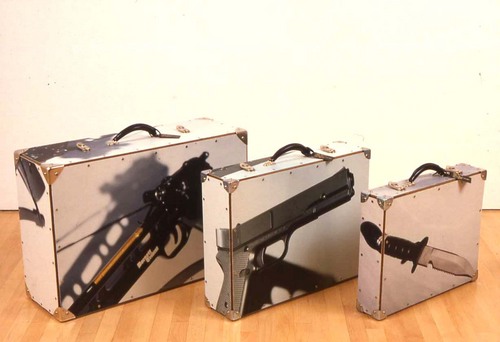
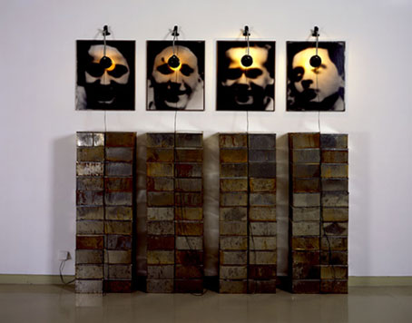
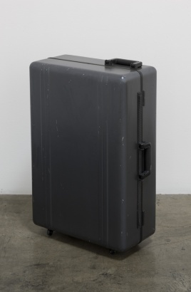 Alan Bechler Gun, 1987 color photos mounted on canvas, masonite, hardware, life-size
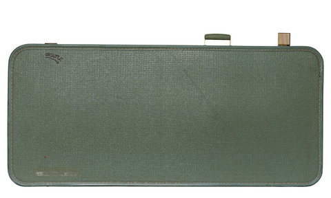
 Todd
Simeone Suitcase, 2003
Ultrachrome Inkjet Print
Ed. of 5
24" x 40"
You get punk-indie-soul-defiant-bleeding-heart love children with large vocabularies who forsake their business suits and shake their tail feathers.
Imagine Stephen Crane's dream world. When he reads a poem, his horse applauds. When his horse reads a poem, Crane applauds. Horses don't read poems, but if they did, Crane would have wanted to hear them. He was interested in fostering a place in which desire counted for more than good breeding, otherwise known as technical skill.
There was a man with tongue of wood(Poem via)
Who essayed to sing,
And in truth it was lamentable.
But there was one who heard
The clip-clapper of this tongue of wood
And knew what the man
Wished to sing,
And with that the singer was content.
Dead at 28 at the dawn of the 20th century, Crane would have been a hell of a karaoke singer, assuming he found the right bar. He'd flourish in a karaoke free-for-all run by intellectuals but open to whoever wanders in, where the silky support the awkward and even those who live entirely in their heads get a chance to revel in the life of their body.
Karaoke night at On The Boards would have been his home away from home. Called Speak & Sing, it's run by Eric Fredericksen, an art critic who currently serves as director of Western Bridge. Wednesday night, the crowd was a spontaneous ensemble. Pros were there, yes, real singers and dancers, trading off with soulful amateurs and those who by right of natural or cultivated talent have no business on stage.
The intensity of their desire made the poverty of their abilities an asset. Any extrovert who can carry a tune can step onto a karaoke stage and be instantly forgotten. What makes this art bar worth its weight in lost keys and broken pitches is the collective commitment from the brilliant and the dim. All were willing to take their moment and turn it inside out, sometimes at a cost. A viral strain of musical longing came from a man who opened by saying, "I'm not that interesting to watch. Please look at something else."
Mick Jagger imitations are a karaoke staple. At Speak and Sing, somebody imitated the Senator from Minnesota imitating Mick Jagger, possibly unintentionally, adding 30 pounds and 20 years to become a more intense version of his own Seattle self.
With Fredericksen on hand to offer the solace of French philosophy, the audience/performers pushed past imitation to inhabit their own experience. Hoarse from singing (he can't sing), Fredericksen read from Michael De Certeau's The Practice of Everyday Life: "The presence and circulation of a representation tells us nothing about what it is for its users."
(Fredericksen's intro to a Jay Z song: "Or Jay Zed, as our English friends call him.")
My brother once had a dog who could sing like a saxophone. On a visit and hoping for a concert, I sang a few notes shaped like a howl to get the animal in the mood. It looked at me with a detached interest that verged on pity. Part Lab and part wolf with something extra furry clinging to its chromosomes, it declined to join me. "You have to put your heart into it," my brother said.
Do the fans at a baseball game watch themselves pitch, catch a fly and slide home? That's not quite Fredericksen's karaoke. In his version, stars take turns with the audience to create a new game.
The stars carry dark matter, but dark matter also carries the stars. One of the stars was SoulChilde (Okanomode) singing early Prince better than Prince is willing to sing it now, committed as he is to the hardcore body-hating religion of his youth.
"SoulChilde looks like a sculpture," I said to Matt Richter, thinking of Brancusi. "We all look like sculptures," Richter replied, "but from different eras. I'm from the textile era."
Another star was dancer Amy O'Neal, who slid all over everybody else and hit every hot note. What she said in this YouTube interview explains her presence:
Dance is not just being in the studio. It's the way you express yourself physically with your friends in the world. It's about the way you walk down the street, about the way you open a door, about the way you wash your dishes, about the way you put your clothes on in the mornings: the rituals you have in order to feel like yourself through the day. That's all movement, that's all dance.
1. Lighten up: Let people take notes using a pen. Major museums in New York have no problem with pen users, but in Seattle the guards say no. Let people take photos in the galleries. There might be outdated and tiresome copyright issues for contemporary art, but surely the work in SAM's own collections can be photographed. Why is it OK to photograph anything at the Metropolitan Museum of Art in New York and off limits at SAM? Let people sketch the art using pencils, crayons, oils, watercolors, wired sketchpads or ashes and spit, like James Castle drawing in his room. Worried about safety concerns? That's what guards are for. Last year at the Seattle Asian Art Museum, I saw a woman in her early 20s snap a photo of a wood-carved Buddha on her cell phone. A guard rushed over to chastise her for breaking the museum's rules. He forced her to delete the picture while he stood over her to check. His voice was loud, and her posture was one of humiliation. I can't be sure, but I'm willing to wager she has not become a museum regular. (more)
Sheila Klein and Ries Niemi met at art school in 1972.
Klein:
Now sharing the gallery space at Punch, they both started out in Seattle as part of Larry Reid's Rosco Louie Gallery before moving to L.A. to make a mark in public art. When they moved back, went for the rural experience in Bow, near La Conner, to raise two sons (Rebar and Torque) whom Niemi feels obligated to embarrass.I thought he was cool, but he was so androgynous in those days, super skinny with so much jewelry and long hair in braids, that I didn't think about him (romantically) until I did, and then I really did. He was 17, I was 20. We got together in '76 and married in '78. Because we have such a long history, it's impossible not to be influenced by each other. We have two sons. Marriage is a problematic institution, but we try not to get in each other's way. (more)
He dresses like he's on his way to a party, and he's the cake. Instead of a cake, he's a metal worker who likes to while away spare hours with needle and thread. His interest sewing, knitting, crocheting and embroidery dates to his teens. In sharp contrast to his metalwork, color tends to abound in his version of the male domestic.
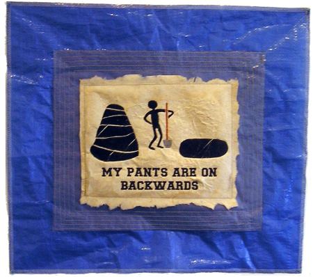
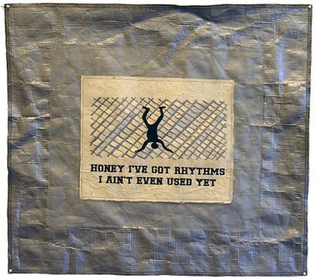
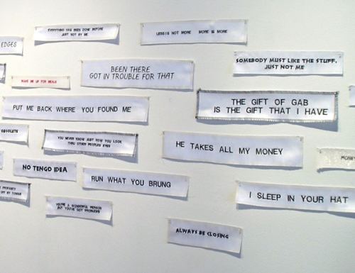
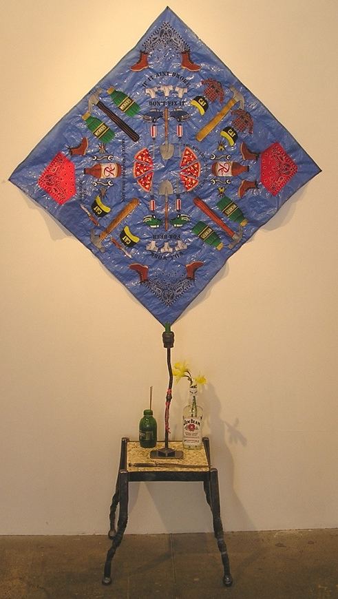
Sheila is her own autonomous country.That may be, but by exhibiting together, they invite comparisons. If this show were on stage, she would serve as alienated straight man, which is odd. Klein is known for her high-flying cheap charm. She makes formally deft but materially flagrant use of fake fur, black flocked netting, pink taffeta, peacock feathers, Indonesian lace, fish net, crinkled ribbons, metallic silver, purple velvet, floral cloth and pompoms.
Her color sense ranges from bold to subtle, but color is always there, until now. Her new work is the monastic version of her old party favors. As I attempted to concentrate on it, the artist on the other side of the room was dancing on top of the table. Who'd put them in the same gallery? I could pick out pieces from each at different stages of their careers that would go boom together, but the ones in this show aren't even on speaking terms.
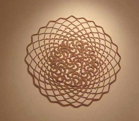
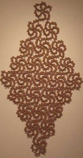
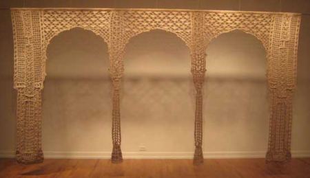 Through March 27.
 A theme is not enough to tie a group of artists together, and the 76 featured in nice, full-color images do not belong together. Nor do they engage the quotes that hang beside them, pithy thoughts from the mostly dead and mostly famous. Observations from the artists tend to be the book's high point, but there is little sense of shared engagement, of ideas played out in a variety of forms.
 Still, in a doctor's waiting room, it would be worth picking up, not that any doctor will share it with her customers. Too many would promptly steal it. I know a receptionist who spends her day surveying a holding tank of patients tearing articles out of magazines. Yesterday she observed a sickly soul use one as a handkerchief. When the culprit's name was called, he returned the soiled publication to the rack.
Created by Andria Friesen of the Friesen Gallery, proceeds from the book's sale go to the Esalen Institute in California and the Findhorn Foundation in Scotland. What worthy causes! By all means let us help the wealthy be here now. ($80 hardcover)
The Seattle version of the Friesen Gallery will host a selection of artworks from Speak For The Trees, April 1 to May 29. Missing from the lineup announced on the Web site are the books stars, such as Mark Ryden, Mike + Doug Starn and David Hockney.

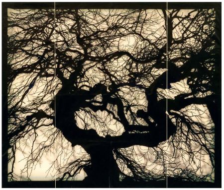
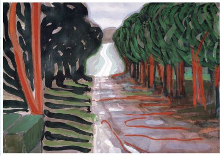 (The phrase, between cocktails and dinner, comes from Grace Paley. As her sole contribution to art history, she observed that the paintings of Helen Frankenthaler look as if she tossed them off between cocktails and dinner. )
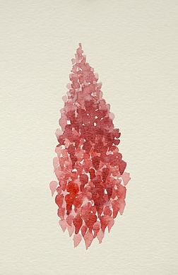
 Elizabeth Jameson Red #3, watercolor on paper, 5.25in x
3.375"
 Teresita Fernandez (Image via)
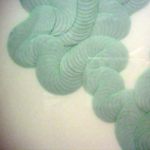
 Katy Stone SPILLING STREAM (ODE), 2005 Acrylic on duralar, pins 73 x 7 x 3 inches
 Tara Donovan
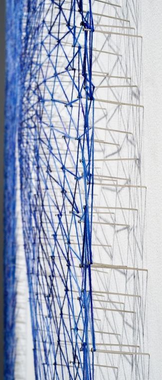
 Alyson Shotz Detail of Untitled (3 Views of an Object) # 1, 2009
yarn and pins on wall
183 x 132 inches
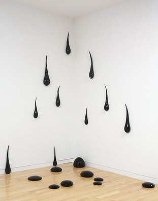
 Some waterfalls are barely there.
Fred Wilson Viscous Risk, 2005 21 blown glass elements 120" x 204" x 84" (304.8 cm x 518.2 cm x 213.4 cm)
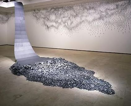
 And other waterfalls are also clouds.
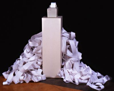
Claude Zervas, Cumulus, 2002 Receipt printer, computer, roll paper 48" x 48" x 48" variable
I am from a family of fishermen who migrated from the South in the early 1940's, specifically Louisiana, Texas and Florida. While they left much behind, what they brought with them was a love for being out of doors on the lakes fishing for food to feed the family and sometimes the whole neighborhood. What set us apart from the Native Americans and the Scandinavians who came before us was our ritual of fishing for bottom fish. For years after my family's arrival in the Northwest in the 1940's there was no concept or talk of trout or steelhead. It was catfish, crappy and perch that lived in our dreams. Hence my narrative starts with a search for night crawlers and earthworms.
Thomas, who studied at the University of Washington with Jacob Lawrence and remained a life-long friend, naturally leans toward a myth-making narrative. Working with egg tempera on paper, she creates dense worlds in which wind and water embrace the figures that are rocking in and spilling out of small boats. Her color tends to be chalky and somber, with moments of bright exception, such as the golden fish gleaming in the hands of a fisherman.
A small series of prints from 2006 deserve another look. In a newspaper, there would be no reason to give it. What appears in print is driven by the most basic question: Why now? Blogs lack that imperative. On a blog, what is relevant now opens to include whatever can be defended.
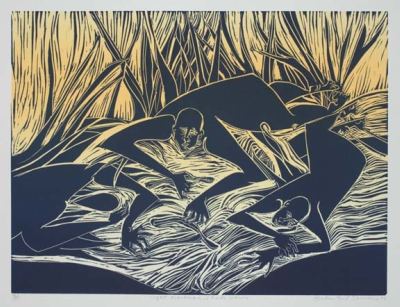 Thomas' parents drowned in a fishing accident in 1988. While many of her paintings and prints appear to allude to the tragedy, there is a calm, benign atmosphere overall.
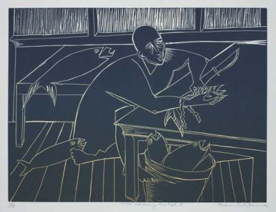 Her figures aren't drawn from the world of flesh and blood and can't suffer its reverses. Thomas is not painting her parents' story, she's recreating it and giving it a different ending, a life everlasting.
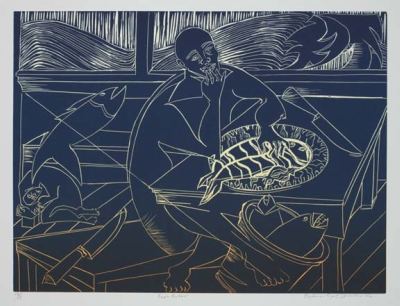 Thomas is represented in Seattle by the Francine Seders Gallery.
His colors are orchestrated, but he makes a fetish out of flatness. Like Japanese scroll painters, he conveys distance in layers. He paints wolves the color of sage who contemplate a deer drinking in a fish-filled stream. Buffalo, crickets, fish, dogs, cats, deer, bears, crows and magpies muscle Hansen's stand-in, the Kernal. When fish play him, he plays along. When the sun bears down, he carries an umbrella.
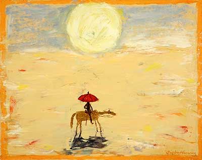 Now 89, Hansen continues to be a bright spot in the art terrain of rural Eastern Washington. He moved there in 1957 to take a teaching job Washington State University and give up on getting anywhere in the art world.
 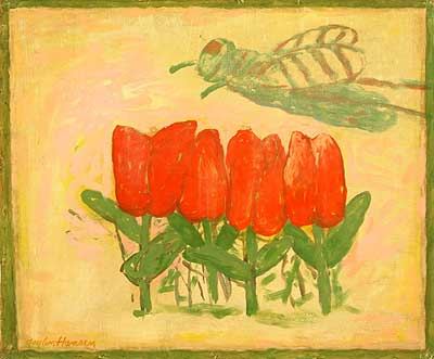 The act of giving up, he said later, freed him to fully inhabit his own experience. His new work on view at the Linda Hodges Gallery is small, with less inflected brush strokes than previously. He has reduced it to its color-struck essence - the wild West as comic still life.
 Through March 27.
The Road to Hell is Paved (Whole Foods and Target) 2009 Installation View: vintage millenery tubing, vinyl, reflective fabric, lame, tubing
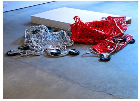 reminds me of an earlier series.
Cris Bruch 93 Pieces 1988 Hammered shopping cart
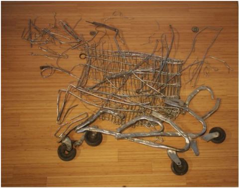 Next to Holstad's silky fabrications, Bruch's 93 Pieces is raw evidence of the poverty, bad luck, mental illness, alcoholism and outcast eccentricity that collided with the Reagan administration to produce the homelessness we now take for granted.
 In his shaggy youth in the 1980s, dressed as a cook, Bruch liked to boil onions to barter or give away on a fantastically overladen shopping cart.
Street Activity, Vegetable Currency 1987 Photodocumentary Photo: Savak
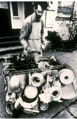 Roller Roaster
1987
Shopping cart and found objects
39 x 60 x 36 inches
 Bruch's Attention Shoppers (1985) is sealed with burnished steel. Shake it and it
rattles with an impressively deep gong. It's a shopping cart that's a dead end, a container that shuns contents, a
tomb of consumer desire.
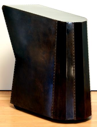 The artist moved on without changing the core of who he is, a formalist with a tragic view of the world.
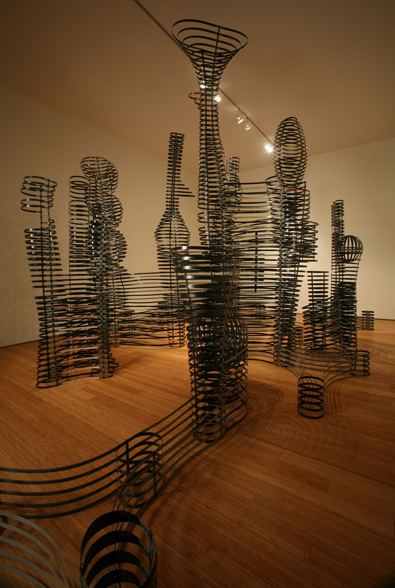
Don't Feed It from 1993 (Richard Nicol photo) is a Constructivist city that belongs to the future, long after we're gone and buildings have begun to become transparent.
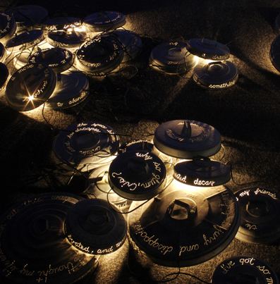
 With light streaming under garbage lids, How Did I Get Here? from 2001 features sentences spit out through what look like bullet holes, humor and grace mastering the rage of a living in a spiritual war zone.
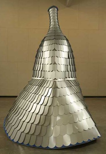
  The thin, scalloped sheets of aluminum he used for Mutterhulse (2007) are typical of ones found wrapping fast food drive-bys, offices on used car lots, churches for the video Christ in strip malls that are here today, gone tomorrow. The piece a tribute to his German mother, once a musician but reduced in later life to sitting in a chair staring out the window, unsure of her own identity. Hunkered down around itself, it features a spiral-shaped top, a place for energy to go after it leaves the shell of the body.
 Pattern reveals the beauty of the physical world. Roofscape, 2008, mahogany plywood, paper tape, 48 x 33 x 16"
 Represented in Seattle by Lawrimore Project.
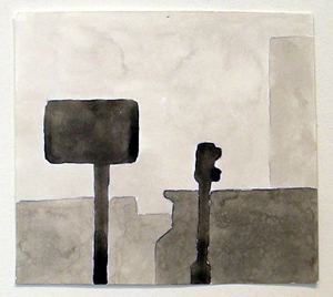
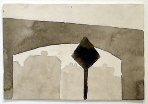
sign painting is (for my money) the true secret brotherhood of graphic design everywhere. when pompeii wand herculaneum were excavated, guess what they found painted on the walls of those ancient buried cities? murals? beautiful artworks? no, they found ads. painted by professional sign painters.
for the last 150 years, sign painting has been the bedrock of american graphic design. without it , there would have been no training, no skill set, no place to learn the aesthetics of typography and design. where did "graphic designers" (a term that wasn't in common use until the 1950's) and 'commercial artists' learn their trade?
why, in the back of those popular mechanics pages, those little ads in those little trade magazines that said "learn sign painting in your own home." that was the training ground for american design for generations. it was a mail order business. one thing that was guaranteed was that if you could paint a decent sign, you'd always have work....
this is one of my favorite home-made signs. it was fastened above one of those 1920's vintage cement one-car garages that pepper the seattle environs. it was on california ave in west seattle. it was there for years (this photo is over 20 years old). some of you may even remember it.The Xmas lights are what make it. Too true, although the red X is also a nice touch.the xmas lights are what make it. this sign puts the lie to everything i've ever learned about "good design" and "design culture". basically, we're all hacks making our versions of this crappy sign.
Only one person could make it to both.
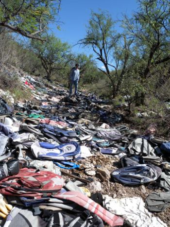 Shoes are especially ominous. Where do they go without them?
De Leon has collected at sites around the Mexican border in his work to better understand one of the world's largest ongoing modern-day migrations--the exodus of millions of Latinos into the United States. More than half a million immigrants attempt to cross the border in southern Arizona each year...While this phenomenon is often debated and argued about, the process of migration has attracted little rigorous academic attention. (more)
Until now. De Leon's Undocumented Migration Project (UMP) uses anthropology to decode a mystery obscured by politics and passion, the human cost of a boundary created by historical illusion. The land a people once owned is denied to them, and they, now called illegal immigrants, are intruders.
A few days after 9/11, Sherman Alexie was walking on a Seattle street when a pickup truck festooned with American flags pulled over. The white driver rolled down his window and yelled at him to go home, presumably mistaking him for someone of Middle Eastern ethnic origin.
"You first," the Spokane/Coeur d'Alene Indian writer thought to say after the truck had sped away. People who hurl insults out of windows rarely wait for a reply.
The Mexican town of Alberto is building a simulated border-crossing theme park:
Seven hours south of the US/Mexican Border lies the small town of Alberto, where the local community, like many pueblos across Mexico, has lost 80 percent of its population to migration into the United States. But Alberto has a plan to revive their community, the creation of a theme-park event - a simulated border crossing, complete with balaclava-clad "coyotes" as guides and "border patrol" that chase "migrants" up and down rough terrain through the night. They call this event the Caminata (translation: journey, hike, trek). The organizers designed the experience as a tool for compassion and consciousness-raising, showing the largely middle-class Mexican tourists who attend the difficulty and dangers faced by those crossing the border. (Watch movie here.)Also related: Guillermo Gomez Pena's La Pocha Nostra, via. Writes Gomez Pena:
(Thanks to Jackie Goodrich for the link to Jason De Leon.)
La Pocha Nostra is by nature anti-essentialist and anti-nationalist. We claim an extremely unpopular position in post-9/11 U.S. "No homeland; no fear; no borders; no patriotism; no nation-state; no ideology; no censorship"....Our America is still an open society with porous borders; our America is neither "Red" nor "Blue;" it is brown, black, yellow, pink and transparent. Always.
Update: Although there is credit given on the links, some of those involved in the referenced story in the University of Washington's Alumni Magazine, Columns, feel that credit needs to be more specific. To wit: The Anthropology of Garbage was written by Jeff Bond with photos by Jeff Corwin. At Corwin's request, I deleted his photos.
 Curtis Erlinger single file (detail) 2005
file drawer, slides, eraser shavings, watercolor, paper (each slide: 1.5 x 1.5")
 Carlos Vega, Clean-up Site , 2007
Acrylic and collage on canvas
18 3/4" X 10 3/4"
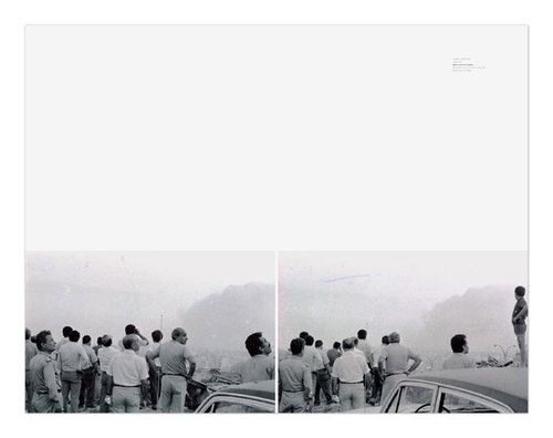
 Walid Raad and/or onlookers 2005
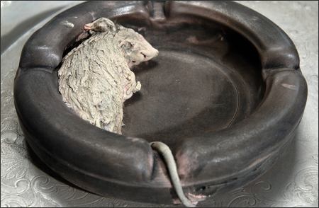
 Liz Magor Mouse on Tray
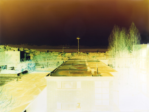
Bailey Russel - Space Needle 1
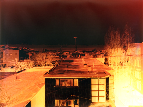
 Russel, Space Needle 3
 Curtis Erlinger Sound
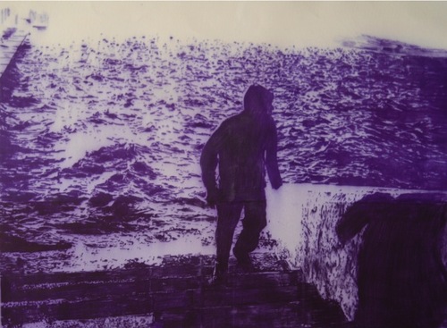 Claudia X. Valdes (Image via)
 Kenji Yanobe Atom (Image via)
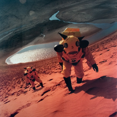 Yanobe is not conjuring with a potential crisis or one averted. The light to which he refers rocked his country. Twice.
 She counted it not as the beginning of her life as an artist, but the beginning of her life as an artist with a career. When she died last May at age 96, her work had become firmly ensconced in the region's art history.
Last month Howard House hosted a survey of recent paintings. This month, the gallery delves into her well-documented past. Turns out, she saved everything, not only paintings but prints, playbills, correspondence and journals.
The star of the show are paintings from the 1960s and 1970s, when she was freshly divorced with her two children nearly grown. An antic spirit of high-flying fun entered what was formerly a sober and almost academic engagement.
These paintings represent now what they did then: freedom; the joy of being able to spend uninterrupted time in her studio buoyed by feminism, late 1960s rock 'n' roll and the loosening effects of a joint or two rolled at breakfast and enjoyed throughout the day.
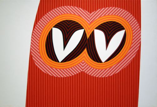
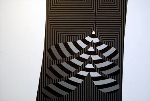
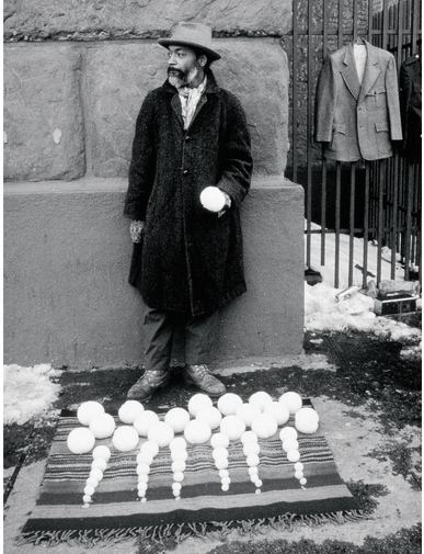
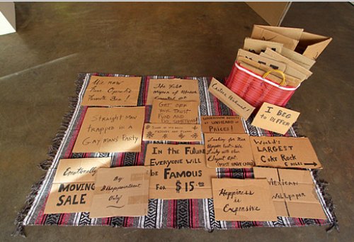 Every 30 years or so, a sidewalk sale hits the spot. (David Hammons. Note the blanket. Image via)
Superior Court Judge Richard J. Hicks of Thurston County, Washington, recently handed down a verdict that so ably parses the issue of the meaning of art as to be required reading in contemporary art issues classes.
When the Washington State Arts Commission culled its list of artists eligible to be selected for public projects, one of the culled was Simon Kogan. After his appeal was denied, he filed suit and won, with legal costs paid by the Commission.
(Spokesperson says the Commission has no comment till it determines if it's going to keep the legal ball rolling with an appeal.)
 The culling process was not capricious. The Commission assembled a panel to go through everybody's slides. Kogan was eliminated because the panel felt his work was "not cohesive." (The panel got that right.) Kogan objected, pointing out that cohesion was not part of the criteria for inclusion.
 That's a fact. If the Commission doesn't have to follow its own rules, why have them? People like to bemoan the existence of lawsuits, but they provide a means for individuals to contest an injustice handed down by a bureaucracy.
Judge Hicks' writing is a pleasure. If he tires of his role as adjudicator, he could be a contender as an art theorist. He could have simply noted the Commission's nonexistent legal position. Instead, he waded into the tricky ground of aesthetics. I especially appreciate his astute use of poetry to bolster his position. Well played, Judge Hicks.
Judge Hicks Desision Kogan v WSAC
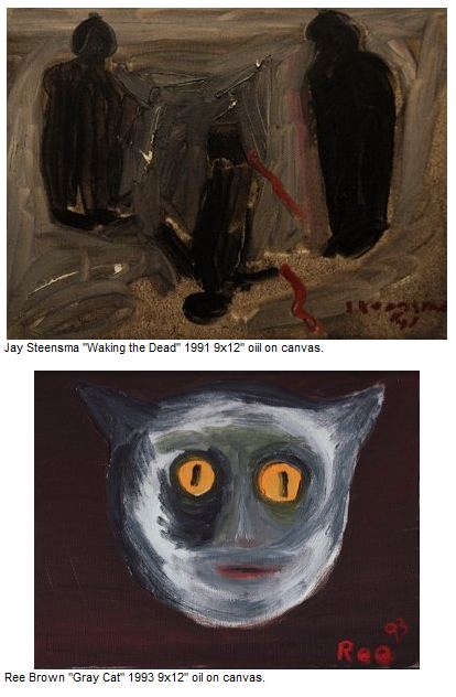
Steensma died in 1994 of heart disease. He was 53. Although he struggled with manic-depressive disorder for most of his life, it was under control for several years before his death, time he used to good effect. He painted solitude and weather, with small figures on barren gray plains, abandoned houses, ravaged trees. His grays were creamy, his whites begrimed and his blacks full of shadows. In the 1960s, he studied with Morris Graves, whose influence is detectable in his paintings of streaky birds and fish on brown paper bags.
Brown began painting to have something to do while Steensma was painting. He paints stark figures on blank grounds, usually cats but also lovely little ladies in frilly dresses. Brown will be at the opening.
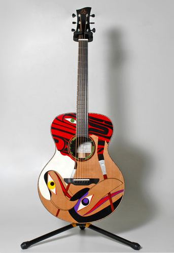
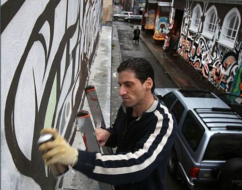 Also innovating off the same deep source, Shawn Hunt and Luthier Rob Bustos of Paragon Guitars. (via)
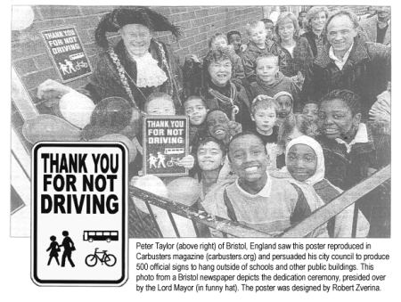
4Culture is helping to fund artists to work with a Low Impact Vehicle exploration (aLIVe). The deadline was January.
Here's the pitch:
A Low Impact Vehicle exploration, invites artists to submit ideas that will inspire and engage the broader community in a conversation about transportation. Produced in collaboration with artist Cheryl dos Remedios and Great City, the project seeks artists' thinking in solving energy, transportation and livability issues facing us all.
Following the application deadline, a selection panel of experts from the fields of art, applied design, technology, public health and transportation selected eight ideas for implementation of "low impact vehicle" design from a field of 21 submitted applications.
Here are the winners:
Michelle Arab: A series of drawings made from sediment and debris collected from catch basin filter inserts into the storm drain system.
Vaughn Bell: Sculptural walking sticks and a series of performances that reinforce the sensory experience of the traveler and the notion that the ultimate low impact vehicle is the human body.
Julia Field, Undriving.org: A series of 6 short documentary videos that chronicle the choices made by individuals who have made an Undriving pledge and received their Undriver License.
Melissa Glenn and Matt Inpanbutr: Bi(K) o garten - a kit that transforms parking spaces into a temporary "park."
Michael Hintze, Alisha Dall'Osto, David R. Dall'Osto and Nadine Smith: Magnetic Mass Assist table-top model that illustrates a mechanism to harness the kinetic energy of descending vehicles to assist the riders going up the hill, making bikes more practical for a wider range of riders on steep Seattle terrain.
Dominic Muren: Production Cycle, a mobile, micro-factory in the form of a pedal-powered sewing machine. Muren will make reusable cloth shopping bags for give-aways at local farmers markets. The currency for the bags will be information about other waste stream products that can be recycled into goods. A website that employs Google mapping technology will illustrate the sources of all contributed recycled materials.
Johnnie Olivan: A fleet of 6-8 "Bike-Cars" that are constructed from reclaimed bikes and other materials and designed to offer pedal-powered alternatives for transporting goods and people.
Some of these ideas seem too goofy for words. Others, substantial. Familiar with the work of a few, I'm in no position to assess. One thing strikes me, however. In Seattle, there is one artist who stands way above all others in his examination of a non-car life: Robert Zverina. If he didn't apply, shouldn't somebody at some point in the process have asked him to? This grant had his name on it.Stokley Towles: A one-person performance and temporary exhibition based on interviews with individuals involved in transportation infrastructure design, storm water systems and public perception and behavior research. The goal of the project is to stimulate ways for the public to engage in "transpiration" - re-imagining how we travel around the city.
Brown:
No matter how deeply he observed, empathized with, and enthused about his female subjects, Moore had a decidedly phallocratic perspective that he never came close to shedding. Both women and landscape represented territory to be explored and appropriated to bolster the strength of the nation. In fact, the biggest obstacle to recuperating Moore's reputation is his objectification of women. Intrinsic to his iconography and a product of his time, this male chauvinism needs to be reexamined, recontextualized, and read critically and deeply before we will be able to see Moore clearly once again.It pains me to agree with The Wall Street Journal on anything. However, it is precisely the obsessively sexualized aspect of Moore's production that keeps it in the game.
Adrian Searle made a similar point last month in the Guardian:
So used are we to Henry Moore, we hardly give him the time his art deserves. This aim of this exhibition, which takes us from the 1920s up to the 1970s, is to show us his morbid and sexual undertones. (more)In art if not at a dinner table, morbid sexual undertones can be a good thing. Brown dislikes what she calls the phallocratic, but women whose work demonstrates an obsession with female bodies are A-OK.
Hence, her excellent exhibit currently on view at the Henry: I Myself Have Seen it: Photography and Kiki Smith. If there's any objectifying to be done, women artists like Smith are the ones with permission to do it. Male artists can keep their objectionable desires to themselves, or, better, check into a feminist reeducation camp to become more enlightened citizens of the human community.
Does it need to be said that good people don't necessarily make the best art, and that art awash in objectifying desire should not be censured for that quality? On the other hand, almost everybody has limitations beyond which subject matter is unendurable, popping him or her out of the art context and back into the world. At that point, the viewer doesn't care about how, because what has become an insurmountable barrier.
Those who make a living looking at art need to be certain their barriers are low ones. If Henry Moore is a hurdle, the problem is with the looker, not the looked at. Let's save the moral objections for those who earn them. Very few are artists.
Related: Review of I Myself Have Seen It here. (Where are the other reviews? Wake up, Seattle. This exhibit deserves attention.)
Case in point, Hebru Brantley. Judging entirely by images on his Web site, his Lions Disguised as Lambs promises to be an event.
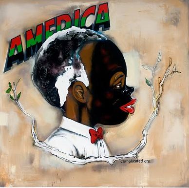 Brantley is also an illustrator.
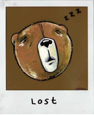 What's the difference between art and illustration? The artist gets paid for the latter. When not painting, Brantley takes photos. That flash is the glow of him.
 I'm stopping by Friday night to say hi. (705A East Pike St., 8-11 p.m. DJ in the house.)
I don't think my work is particularly about art. It's really about me, being here in this life, in this skin. I'm cannibalizing my own experience, my surroundings.Clearly this is true, but after looking at her work for 30 years, what do I know about her? Nothing personal. I know she appreciates animals both real and mythic, and that she thinks of fairy tales as a mother lode from which she extracts a mutable range of meanings.
 In the 1970s, feminism was for her decisive. Through its lens she became an
artist. Whatever it is that the official art world
rejected, she embraced: small works on paper, coy/lurid/loose subject
matter, unreliable structures, the homemade and the handy: what she
could put together on her kitchen table.
 Like a mole burrowing into a hole, she digs into the specific experience of women and animals in the world. (When a male makes an appearance, he is frequently a corpse.)
 She's interested in paws and feet; in heads, bellies, hands and claws;
in tongues, eyes, blood and drool; in breasts and genitals, in skin
(both furry and bare); in ribs, breath and gesture: in lives lived under the
starry skies. Her idea of personal is treating herself as part of this image stream. When she appears in her work, it is as archetype
instead of individual.
 Like a magician who can saw a woman in two without benefit of a box, she disappears in full view of the audience into her flagrantly candid depictions. In her youth she portrayed herself as a banshee girl, the one game enough to be wrestling on stage at the Kitchen in with David Wojnarowicz, or, as she put it, "beating each other up." Before hitting 50, she rushed to embrace middle age, opening as it does the possibilities of the crone and harpy.
 In his 2006 review of her mid-career retrospective at the Whitney, Holland Cotter found the essence of her gory yet exacting production:
The tone is at once light and grievous; dreamlike dramas recur. There are miracles and martyrdoms, bursts of cruelty and hilarity. In a kind of boomerang karma, humans merge with animals, and animals have spiritual lives. Crystal tears pile up in corners; bones and worms are served up for meals.
Fanciful as it is, Ms. Smith's art is also deeply, corporeally realistic. Step off the elevator on the Whitney's third floor, and you're in a wonderland version of a pathology lab. Empty glass jars carry the names of bodily fluids they are meant to hold: urine, sweat, saliva, mucus, milk, semen. A rib cage hangs on the wall near sets of internal organs. What looks like a flayed skin sits folded on a pedestal.
Each item has a freakish beauty. The ribs, cast in pale terracotta and held together by string, suggest chimes. The organs -- male and female urogenital systems -- are of a prettily patinated bronze. The folded skin looks plush and warm; it is made from panels of sheep's wool stitched together with human hairs. (more)Her approach to materials is inclusive, with no distinction between major and minor media, and yet, considering that she is best known as a sculptor, photography is a constant. Because it has always been there, at first incidentally and later with purpose, Elizabeth Brown's exhibit at the Henry Gallery stands as a core inside the artist's core: I Myself Have Seen It: Photography & Kiki Smith.
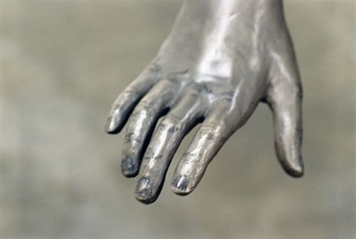 More is more: Many hundred postcard-size photos line the baseboards of the galleries. There are just enough sculptures to hold the show together, in glass, ceramic and bronze. Amid the photos are prints, some large-scale. Small black harpies perch above doors and on moldings, easy to miss but essential once seen, drawing the eye upward to engage the space, ceiling to floor.
Smith likes to shoot at the edges of things, in her studio or at a foundry, in friends' homes (never identifiable), in her yard. Her sculptures are just one element amid the smear of everything else: the worms on newspaper, the cat on its back, the hand of a sculpture, blue dusting its fingers.
In Brancusi's photos of his work in his studio, he located the sculptures in a space they dominated. Smith uses photography to present her work as part of the wider world - an inflection instead of a narrative.
Within the fluidity of her range, however, she is the one who emerges, this woman who never lost a child's awe and discomfort about the singular consciousness alive in her own body.
This is a show designed for repeat viewings, for skimming across the surface and for digging into particulars. I Myself Have Seen It runs through Aug. 15. It's is a triumph for the Henry and a personal milestone for Brown, the Henry's senior curator. Images do not by accident unfold with such inevitability, gallery to gallery.
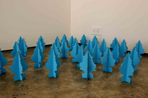 Gretchen Bennett, Williamsburg Bridge 2006
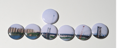 Matt Browning Portrait of the Outdoors, 2008
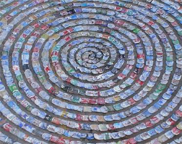
Aluminum cans, fiberglass, epoxy
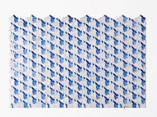 Robert Zverina, 1,000 flattened cans as a rising sun
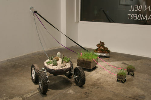
 Claude Zervas Log and Beam, 2009
 Vaughn Bell, Personal Landscapes (Don't leave home without one)
Today's changes won't be noticed by readers.
(Story via AJ)
Reaction quote of the day, from Roger Ebert, same story:
RIP, schmucks.
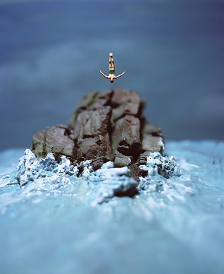
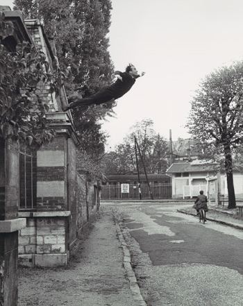 Have leaps into voids lost their exuberance?
Has I-can-fly become I-can-die?
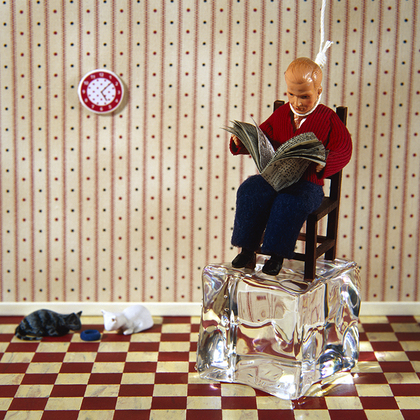
Grace Weston, Current Events (G. Gibson Gallery)
 Jonah Samson, On the Rock, 2008
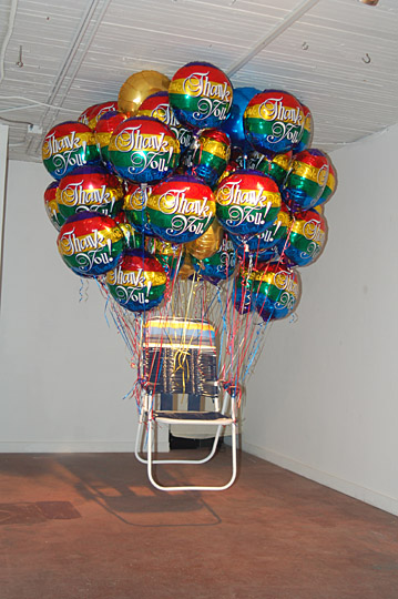
 Gratitude needs helium to stay afloat.
Sean M Johnson Thank You 2008 lawn-chair, balloons, string (via Howard House)
 I am lonely, lonely./ I was born to be lonely./ I am best so!
Joel Biel Tap Dancer, 2004
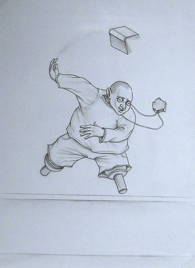 After Bladerunner...
Mike Simi, Hummingbird Sneeze, 2009 (Play video here)
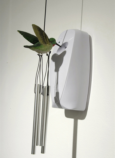 The past isn't dead. It's not even past. (William Faulkner
)
The past isn't dead. It's not even past. (William Faulkner
)Jack Daws Strange Fruit, 2007
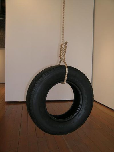 At least we can still throw our hats in the air.
Barbara Noah Eureka, 2007

In baking tins and cardboard boxes painted to resemble baking tins, Robert Mirenzi's loony assortment of doll heads, doll hands and toy innards rise, as if full of yeast. Some dolls are doubles of themselves, pink plastic casting plaster white shadows. Some have lips sewn shut. Some are smeared with pale primary paints. Tiny hands pop out of pull toys. Some heads are veiled, as if wrapped to cool on a kitchen counter. What distinguishes them from a century of similar surrealisms? Their rigorous code, the structure that charges these oddball materials with formalist rigor. Mirenzi likes to start in the middle of a fairy tale and blunt all suggestion of coherent narrative. The birds have eaten the crumbs leading out of the forest. This point of paralysis inspires his art, which is inventive, absurd and unforgiving. (via)The toys are gone now. What's left is what was there from the beginning, an industrial approach to aesthetic rigor inspired by the process artists of the 1970s. What he brings to their base is a comic air of insufficiency, a refusal to take up more space than he absolutely needs, an inclination to subtract rather than to add. Now that the dolls, frog's legs and other broken toys are not there, it's easy to see how unnecessary they were. For Mirenzi, the plainer, the better.
Nearly all of his current sculptures are small, from palm-size to arm's length. Some sport some kind of old metal frame or industrial pipe serving as frame.
Untitled mixed media construction, 2009 6 x 7 x 1¼ inches
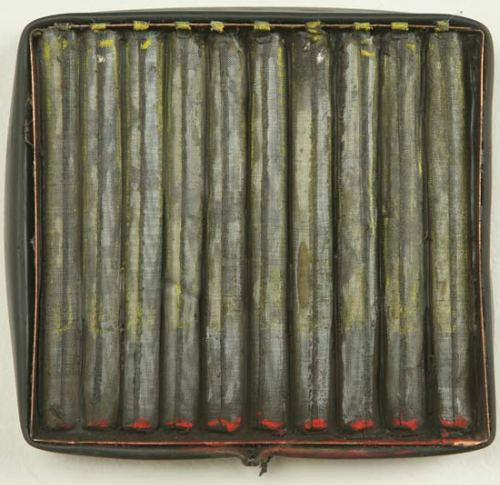 Whatever polish he brings to bear never obscures the down-and-out nature
of his enterprise: funk on the cheap, industrial process sculpture
produced in the shadow of dying industries.
Color, usually an exhausted primary, is used sparingly.
Whatever polish he brings to bear never obscures the down-and-out nature
of his enterprise: funk on the cheap, industrial process sculpture
produced in the shadow of dying industries.
Color, usually an exhausted primary, is used sparingly.Untitled mixed media construction, 2009 15 x 45½ x 7¼ inches
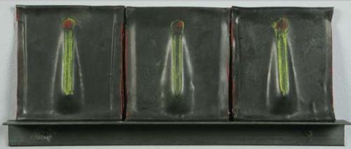 Detail:
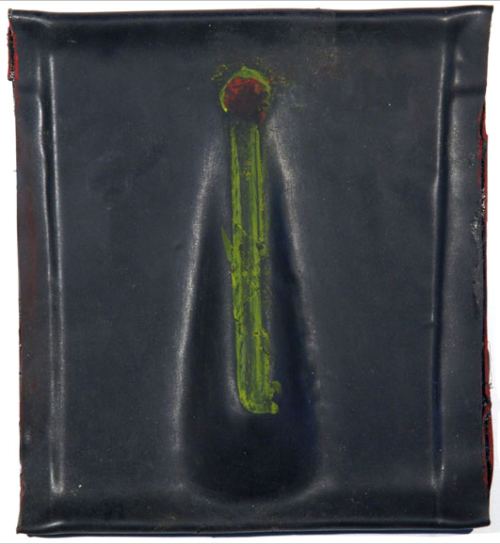 He is a poet of comic insufficiency - toys gone bad,
hobbies ridden off the deep end and work a delusion.
As a theme, insufficiency has inspired its share of art, but not often
visual art. Writers have claimed it (Dostoevski, Kafka, Samuel Beckett,
Richard Wright, Donald Barthelme) and actors have embodied it (Buster
Keaton, Peter Lorre, Al Pacino, Lily Tomlin) but even the most humble of
physical materials acquires authority when structurally organized into
an artwork.
Artists seeking to glorify the shabby, from Kurt Schwitters and Louise
Bourgeois to Robert Rauschenberg, invariably transform
it into focused beauty, even elegance. And art made from coarse
materials that does not rise to elegance usually lacks a compositional
imperative and for that reason is hard to consider art at all.
Untitled mixed media construction, 2009 8 x 19¼ x 1¼ inches
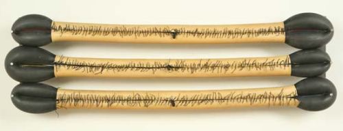 Here's where Mirenzi shines. He can
manipulate his unlikely combinations of crafted and found objects into
sculptures whose aesthetic power never undermines their projected sense
of powerlessness.They limp along out of anyone's spotlight, even their own.
Here's where Mirenzi shines. He can
manipulate his unlikely combinations of crafted and found objects into
sculptures whose aesthetic power never undermines their projected sense
of powerlessness.They limp along out of anyone's spotlight, even their own.At Francine Seders through March 14.
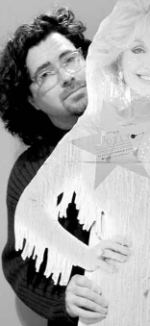
 On Sunday, I became the person I pretended to be, shoe-horned into the camp locker room that passes for a theater at the Re-bar. It's a holding tank for enemy insurgents, rimmed with pink tinsel. Said Dina, looking around with admiration: "Who doesn't love mid-century modern?"
 Space is limited. How much space is there for portly men impersonating glam women? Not much, and that's where Dina begins, with nothing to prove and no apparent consciousness that such proof might be required after Divine, Leigh Bowery and Eddie Izzard; after the less-portly lovely ladies in Paris is Burning, from Pepper LeBeija and Dorian Corey to Anji Xtravaganza and Willi Ninja; after the adventures of Priscilla, Queen of the Desert.
Honey, we've seen it. And yet Dina Martina shines in her Goodwill high heels. Admittedly, the greatness she seeks is out of her reach. She's more like the principal of a nursing home donning drag for the annual fundraiser. She wants to cover the world in radiance but has none to offer. She's queen for a day on a broken TV. She's a fish being clubbed on a pier that imagines it's swimming free.
What is drag but over-sized desires? Although modest, Dina's are unattainable.
Mother of an enraged teen, she wants more children. "I have child adopting hips." She'd like to lose weight. (Her new diet, only-eat-while-driving, is working, she said, her search-light smile faltering as she looks down at her blubbery self.) Almost instantly, her demented optimism engages anew in her search for a one-true-love.
At the Re-bar, she found it. A request for hands revealed few first-timers. Dina's been holding court at the Re-bar since 1993. In Seattle, she's a lot like a fundamentalist church. Believers would crawl through glass to get to her. (To a Sunday afternoon crowd, she said, "Thanks for choosing me over the Lord.")
Some jokes are chestnuts. Most are new. The show constantly renews itself without breaking new ground, except in its videos. Dina grows older, still snapping her fingers to the beat and looking for gold in dumpsters. But the videos that began as scene changers have evolved into real scenes. Dina pasted her painted fish face over Rhett Butler's. That's her ogling Scarlett O'Hara as the Southern beauty climbs the stairs. Dina is the new kid on the block visiting The Brady Bunch. To its lobotomized cheer she brings crazed relish. She's Shirley Temple dancing with Bill Bojangles as American racism squirms in its seat.
The melancholy undertow rarely breaks the surface of her gay patter. For that act of bravery, for the perfect timing of her shrill songs and brazen dances, the audience continues to love her, and not just in Seattle. Dina has taken her bad act on the road, achieving success across the country, in Canada and Europe.
March 20 and 27, she's at the Re-bar. Have a drink with her during the show ("As they teach you in AA, you can't change anything, so why bother?") and salute what Hunter S. Thompson called the broken chromosomes of the American dream.
Snow Tracks graphite on paper, 22 x 30 inches, 2009
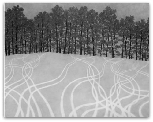 His drawings are not a final scene but what comes after, either as summary (Snow Tracks) or coda (Untitled below, 8 x 11 inches, graphite on paper 2009). Even if an ending proves grim, lead balloons can still lift a dump truck into the air - heavy things joining to defy gravity.
 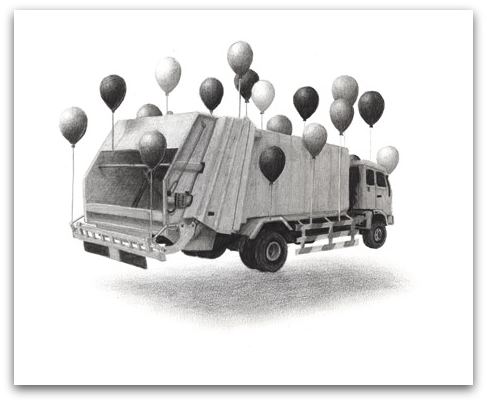 At Platform Gallery through March 27.
 Born in Japan, Seattle artist Paul Horiuchi (1906-1999) used collage much as his forebears did: to set a meditative mood and to orchestrate color, form and texture into a harmonious composition.
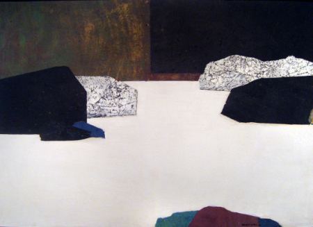
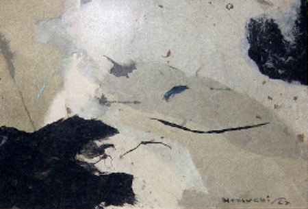
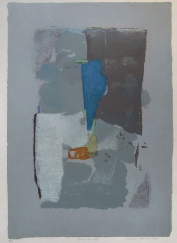
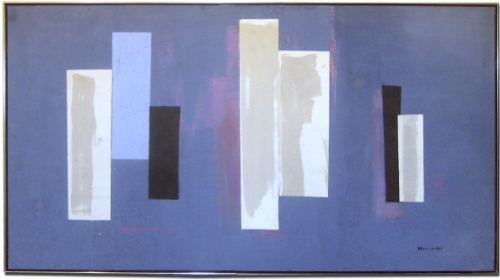 Horiuchi fused the sensibility of the Japanese rock garden with Western modernist expressive abstraction.
Seattle artREsource is host to a small but fine survey of his work, from the 1950s to the 1980s. Run by Jena Scott, artREsource is a gallery devoted to the secondary market. Rarely has she a chance to organize an exhibit, but once she had half-a-dozen first-rate Horiuchi's, she sought more to make the show.
 Horiuchi came to the States in his teens. He was working for the railroad in Rock Springs, Wyoming, when FDR signed Executive Order 9066. Because he, his wife and two young sons weren't on the West Coast, they escaped detention. Instead, isolated from other Japanese-Americans and hearing rumors that they would be arrested or even killed, they burned a collection of old Japanese books and prints that had been in their family for generations.
Fired by the railroad for being of Japanese descent, he and his family lived in their car and later in a homemade house on a truck, making a living through janitorial and gardening work. The paintings and drawings he made during and before this period were stored in a friend's basement and lost in a flood.
By the time he arrived in Seattle, he was a 40-year-old railroad man, auto mechanic, sign painter and artist. Mark Tobey was for him a catalyst, although when Horiuchi began making collages in 1956, Tobey told him to stick to watercolors, because his watercolors were so spare and beautiful.
In 1962, he created the 70-foot-long Mural Amphitheater for the World's Fair in Seattle. During his career, he was awarded prizes and purchase awards from the Ford Foundation, the Rome-New York Foundation and the Carnegie Art International. Japan designated him a sacred treasure.
The tumult of his life does not appear in his work. Instead, there's a serene balance of color and weight with a strong, underlying vitality, a sense of dynamic forces being brought into line.
Through May
Viola Frey's giant ceramic sculptures of men and women are among the underappreciated wonders of late-20th-century art. Rising 11 feet and higher, wearing business suits and ties and nondescript dresses, they have a spookily imposing physical presence and a clunky, cartoonish ugliness.
Roughly glazed in strident colors and made in sections that fit together like blocks in a stone wall, they could be mistaken for a species of Outsider art. Because of their size and their blank or seemingly angry expressions, they may remind you of what it was like to be a child among grown-ups troubled by incomprehensible problems. (more)I share the conventional view, that her work was the same thing over and over, that she was a kind of folk artist living in the eternal present. Viewed in the context of mainstream contemporary art, she had nowhere to go and didn't manage to get there.
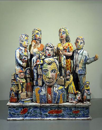 Although he calls her a "true original," he locates her among her peers, where her work falters. On the other hand, besides the artists mentioned below, he throws in Joan Brown and Robert Crumb.
 Robert Crumb? I'd love to see Crumb and Frey together in a gallery. Crumb would be the kind of excellent sideman who makes a questionable soloist look good. Johnson's review doesn't change my mind, but thinking about the Crumb-Frey combination begins to. Stranded in her own company, she's like a lonely person talking to a mirror. (No was all she said.)
A resident of San Francisco for most of her adult life, Frey belonged to a generation of artists who made ceramic sculpture a force to be reckoned with in the 1960s and '70s. Peter Voulkos started the revolution in the late '50s with his raw, nonrepresentational clay works made in the spirit of Abstract Expressionism. Robert Arneson's jokey narratives and Ken Price's small, adamantine abstractions expanded the field.Putting her work in a room with that of the endlessly inventive Robert Arneson or the "adamantine" (good word) Ken Price would do her no favors. Who else in West Coast clay from the 1960s and 1970s could use the Crumb assist?
Not the Rabelaisian Howard Kottler. He belongs with Robert Arneson, who would not be able to wipe the floor with him. (Image via)
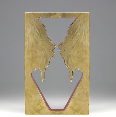 To Crumb and Frey I'd add Patti Warashina...
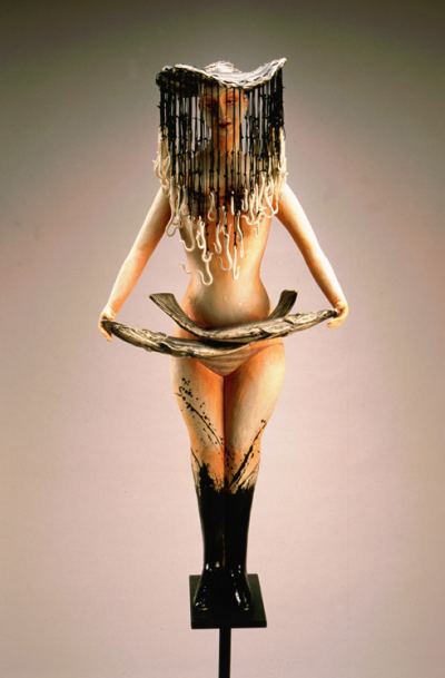 And Lauren Grossman. (Like Warashina, at Howard House.)
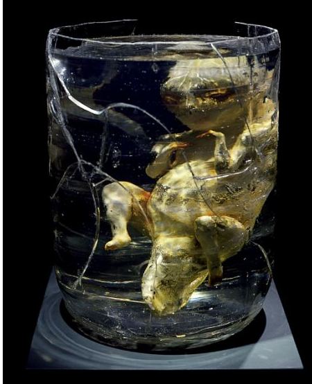 Grossman was just starting out in the 1970s, but she would not only shine in a Crumb-Frey-Warashina exhibit, she'd make the others shine too. She'd bring out both the mournful melody of the collective theme and the relish in its depiction.
 Some artists do best alone. Others need a crowd. Most need the kind of curatorial and critical attention that allows them to be the best version of themselves, to make the case that they do not deserve to be forgotten. In seeing past the opinions of others, Ken Johnson has begun the work necessary to keep Frey's legacy alive.
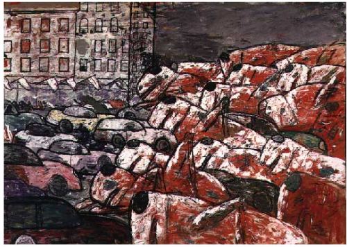 Silky as perfumed employees of the pleasure quarter: Sarah Emerson.
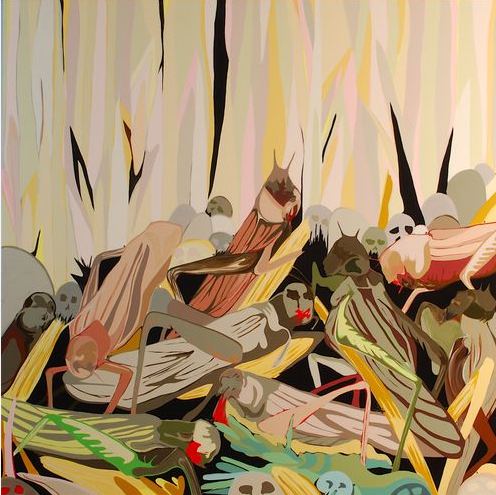 Why swarm?
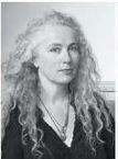 When Smith spoke Thursday night to a packed house, many who showed up probably thought she'd talk about the exhibit. She touched on it but turned away, saying only that she began using photographs of her work as work when she needed to fill a space and improvised the photos into a kind of serial narrative.
Instead, in a voice that's close to music with her curly gray hair streaming around her, she digressed. Each topic became a stepping stone to different parts of her mental garden.
The University of Washington did not help. Her slides were constantly out of focus and did not improve unless she asked the person in booth to do something. The lights were too bright to see the slides well, and the microphone during the questions period was unreliable. She remained serene. Gently, she said about one slide, "I don't think you can see it, and it's upside down."
Below, in her own words, random quotes from the endlessly quotable Ms. Smith.
I don't know what I'm going to say. I hope to jar my mind into having a thought. I basically don't have any necessity to talk in my life.
My greediness, in the end, is to show you something completely different.
Refuse to be owned by style. Do not be strangled by your own history. Flip the meaning. Explore the facets. What holds up for you at one time doesn't have to hold up for the rest of your life. Your work can be conflicted. I used to be interested in how much skin a body had, how much blood. I'm not as exact now.
You get to cannibalize your own work to get as much mileage out of it as you can. While creativity is given to you freely, it's not given every day.
The feminist moment radically changed what art could be. I looked to Nancy Spero, who worked on paper, made prints and made art out of being a woman; Eva Hesse, who made the body abstract, and Barry Le Va, who is so good at the difference between two dimensions and three dimensions. When I was young, I'd see something by Bruce Nauman and want to throw in the towel. A few days later, I'd think, there's still a little space he isn't in.
You can't wait around for other people to want or need you work. There were times that making paperweights kept me afloat financially. I wanted to be an artist whose work would wind up (on sale) at Macy's.
The only time my father (Tony Smith) touched his sculpture is when a photographer came and asked him to put his hands on it.
Richard Tuttle is our greatest American artist, maybe, according to me.
I hate all this junk they teach in art school, where you're supposed to know what you're doing. It's only in the unknown that we get to blossom.Why her colors tends to be muted:
I was around the process sculptors, like Richard Serra and Alan Saret. Color seemed indulgent. That's my American Puritanism, I think. I could change that.On collaborations:
I collaborate with people when they do want I want them to do, people who have some super facility in printmaking or blowing glass. They have something in their bodies I'll never have in my body.
Guillaume Apollinaire, from Shadow:
As a hundred furs make only one coatSiegfried Sassoon, from Repression of War Experience:
As those thousands of wounds make only one newspaper article...
You're quiet and peaceful, summering safe at home;Osip Mandelstam, from The Stalin Epigram:
You'd never know there was a bloody war on!...
He rolls the executions on his tongue like berries.George Oppen, from Route, Part 5:
He wishes he could hug them like big friends from home.
There was an escape from that dilemma, as, in a way, there always is. Pierre told me of a man who, receiving the notification that he was to report to the German army, called a celebration and farewell at this home. Nothing was said at that party that was not jovial. They drank and sang. At the proper time, the host got his bicycle and waved good-bye. The house stood at the top of a hill and, still waving and calling farewells, he rode with great energy and as fast as he could down the hill, and, at the bottom, drove into a tree.Bertolt Brecht, Motto
This, then, is all. It's not enough, I knowJoseph Brodsky, from Elegy:
At least I'm still alive, as you may see.
I'm like the man who took a brick to show
How beautiful his house used to be.
A ruin's a rather stubbornIrina Ratushinskaya, from Try to cover your shivering shoulders
architectural style...
At sunrise, when nobody stares at one's face, I often
set out on foot to a monument cast in molten
lengthy bad dreams. And it says on the plinth "Commander
in chief." But it reads "in grief," or "in brief," or "in going under."
'You must die' - but is that so distressing?
You just feel slightly sick,
As you enter the stain on the wall.
W. H. Auden, from September 1, 1939
I and the public know
What all schoolchildren learn,
Those to whom evil is done
Do evil in return...
Faces along the bar
Cling to their average day:
The lights must never go out,
The music must always play,
All the conventions conspire
To make this fort assume
The furniture of home;
Lest we should see where we are,
Lost in a haunted wood,
Children afraid of the night
Who have never been happy or good.
Benjamin Peret, from Hymn of the Patriotic War Veterans
Even though I threw down my rifle butt
The Tauben still spit in my eye
that's how I got decorated
Long live the republic
I got rabbit punches in the ass
I was blinded by goat turds
asphyxiated by my horse's dung
then they gave me the Cross of Honor
Paul Celan, from Black Fugue
we shovel a grave in the air there you won't lie too cramped
A man lives in the house he plays with his vipers he writes
he writes when it grows dark to Deutschland you golden hair
Marguerite...
he writes it and steps out of doors and the stars are all sparkling
He whistles his hounds to come close
he whistles his Jews into rows has them shovel a grave in the ground
he orders us to strike up and play for the dance...
A man lives in the house he plays with his vipers he writes
he writes when it grows dark to Deutschland you golden hair
Marguerite
you ashen hair Shulamith we shovel a grave in the air....
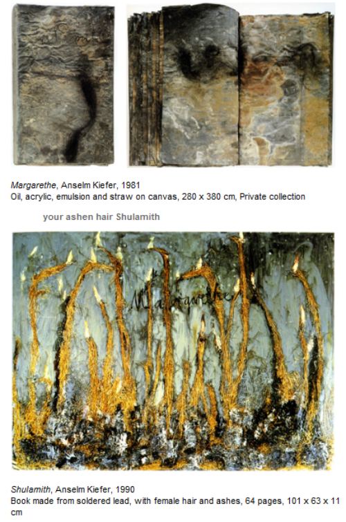
Celan's poetry anchors the work of Anselm Kiefer, especially Black Fugue, with its reoccurring images of the blond German (your golden hair Marguerite) and the Jewish dead (your ashen hair Shulamith)...(Images via)
Even though President Barack Obama promised during his election campaign to call a mass murder a genocide when it is/was genocide, his administration has asked a Congressional panel not to do so, fearing to insult an ally.
The Obama administration has called on a Congressional panel not to describe the killing of Armenians by Turkish forces during World War I as genocide. US Secretary of State Hillary Clinton urged the chairman of the House Foreign Affairs Committee to hold off a vote on the issue, the White House said. She said the non-binding resolution would harm talks between Turkey and Armenia. The resolution is fiercely opposed by Turkey, a key ally of the US. In 2007, a similar resolution passed the committee stage, but was shelved before a House vote after pressure from the George W Bush administration. Turkey has warned of consequences for US-Turkey ties if the latest resolution is passed. During his election campaign President Barack Obama promised to brand the mass killings genocide. (more)Why dredge up past evils? Given the precarious state of the world, isn't getting along with a valued ally more important than quibbling about history's record? There is no country on earth whose citizens can claim a history free of human rights abuse. Why pick on Turkey?
As an answer, Carolyn Forche edited a collection of 20th-century world poetry: Against Forgetting, Twentieth-Century Poetry of Witness, published in 1993.
Forche:
Any twentieth-century history of human rights and genocide must begin with the massacre of Armenians, then the largest Christian minority population of Turkey. Between 1909 and 1918, approximately 1.5 million Armenians were massacred by order of the Ottoman Turkish government....Historians call it the first "modern" genocide," because it appears to be the first instance of political mass murder made possible by advanced technology and modern communications implemented by a centralized state bureaucracy.
Days before the invasion of Poland, Hitler posed a question to his military cabinet:
Who, after all, speaks today of the annihilation of the Armenians?Arshile Gorky, a little history:
Gorky fled (the town of) Van in 1915 during the Armenian Genocide and escaped with his mother and his three sisters into Russian-controlled territory. In the aftermath of the genocide, Gorky's mother died of starvation in Yerevan in 1919. (more)Gorky, The Artist and His Mother (ca.1926-1936). Oil on canvas. 60"× 50". Collection, Whitney Museum of American Art
 Gorky, How My Mother's Embroidered Apron Unfolds in My Life Oil on Canvas 1944, Collection, Seattle Art Museum (image via)
 Part 2, the poems, here.
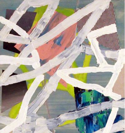 Kroll works small, usually in oil and enamel but occasionally with some element of collage. Ambitious paintings that span no more than two joined hands used to be unusual, back when Thomas Nozkowski was consistently underrated for producing them. He said a single 16 x 14 inch painting could fill a wall but didn't insist on having a wall for each one, and that was also held against him. (No ego, no glory.)
Since the mid-1990s, thanks in part to Nozkowski, big no longer has a corner on best. If we're not quite at William Blake's definition of enlightenment, to see eternity in a grain of sand, we generally accept that a painting of modest dimensions can possess an enormous sense of scale.
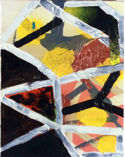 Some look at Kroll's work and see nothing but sources: He owes everything to Gerhard Richter, they say. He's Terry Winters without the seedpods. Doesn't Tomory Dodge do this better?
 A friend asked that question about Dodge at Kroll's James Harris Gallery opening, not loudly, to be boorish, but in the spirit of evidence proffered toward a conclusion already reached: not that good. I could have said I thought Dodge leaned more toward Richter and Kroll toward Nozkowski but didn't. What I wanted to say was an unacceptable question: What is it that you are seeing? Can you see these particular paintings? Can you forget pedigree for a moment and let the moments the paintings themselves create carry you toward their own conclusions?
Broad yet broken diagonals crisscross the surface, creating a foreground that serves as a failed barrier, a collapsed grid. Behind it is the kind of push-pull the Abstract Expressionists used to advocate, an animated, energy exchange carried by color.There's nothing earth-shaking in Kroll's premises, but their elaborations are a rare and engrossing pleasure.
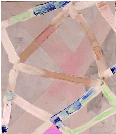 Through March 27.
 From Anna Callahan :
(Image via)
From Anna Callahan :
(Image via)There are less than two weeks left in this session and we need legislation to move. If bills are not passed this year, we just heard confirmation that 4Culture is going to start planning dramatic staff, services and funding programs cuts that will begin as early as January, 2011.
This is the first this reality has truly sunk in and we're panicking. Since the session started in January, we've seen at least 6 different bills proposed that would generate the support needed for 4Culture to continue to thrive.
Unfortunately NONE of these bills has successfully moved through both the House and the Senate and time is running out. What we need now is for every arts and heritage advocate in the state to write to their legislators with a general letter of support in the next few days.
Even if you've already written a letter supporting specific bills, we need one last push to make sure that legislators understand that whatever name and number you put on the bill, we need ARTS and HERITAGE funding to be secured THIS YEAR. Please ask friends and family to do the same. Senators and Reps from all over the state will get to vote on this issue, so we need non-king county legislators to understand that their constituents are excited about strong funding.
Thursday night, 6-8, is a chance to participate in a pro-4Culture laptop rally in Pioneer Square. The 4Culture Gallery? Best guess is, it's going down, unless funding comes through at the last minute.
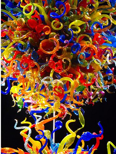
A version of that is poised to happen. Jen Graves noted today that a large Chihuly Museum is slated for the spot. In her reaction, City Council member Sally Bagshaw proves she isn't living on earth with the rest of us:
"I took one look and said, 'If that's something you have to pay some money to go see, then that really isn't right,' because I want Seattle Center to be Seattle Central Park, where you can go even if you don't have money.Ever been to the fun forest, Sally? Many's the time I've dropped $40 there while trying hard not to, as the children in my charge become more desperate to experience the fun they think they should be having.
Chihuly will be able to fill fun forest shoes with his own kind of carnival barker. More later.
(Image via)
She does everything well, including just being in a room. When she's in a room with you, everything else in the room (including you) has a rare and purposeful shine. Like many in her generation (a hefty portion of the 1980s took place without her), Powers multitasks as curator, organizer and critic. To each endeavor she brings the depth of her concentration.
Here's a passage from her review of Sol Hashemi's Object History Awareness at Gallery 4Culture:
There's a current thread in philosophy that uses the sciences (math, physics, chemistry) as tools and metaphors for explaining entirely unscientific things about the world. The opposite of existential, objects don't need to know how they interact with other objects or events or conditions, they're simply always doing something.
Always playing, always passing time, always in contact or out of it. This is how Sol's art feels - it is proof that a piece of art bent or folded or creased or left to lie has just as much relation to the space it is in and the people who see it and the currents of air that pass over it and to everything within and without. If you know better, or get bumped just right, you'll literally feel the web - the things you can do that he's done, the things that he's done so you don't have to, the things that his creations (are they even his?) are doing, and the entirely unrelated clashes of conditions and events and objects on the street, in the gallery, stacked in the studio. (more)My Hashemi review here. She's inside the experience, while I, an incorrigibly non-participating observer, am not. She and a few friends run the exhibition space known as TARL in her basement. Rob Smith's installation concludes there on Saturday.
Other news:
How to "wrestle with distinctive, battered American ideals" - Christopher Knight reviews American Stories: Paintings of Everyday Life, 1765-1915 at the Los Angeles County Museum of Art, here, excellent as usual.
More Knight: Toyota of Hollywood faces a crises of context, here. Directly across the street from the company that makes cars with sticky accelerators and faulty brakes is the Museum of Death.
 Judith H. Dobrzynski reports on thuggery against artists in
China, here.
Golden egg in hand, developers want to kill the goose as police arrest (who else?) the artists. (Support Human Rights in
China. It's a stellar organization that works every day to move a
mountain.)
Judith H. Dobrzynski reports on thuggery against artists in
China, here.
Golden egg in hand, developers want to kill the goose as police arrest (who else?) the artists. (Support Human Rights in
China. It's a stellar organization that works every day to move a
mountain.)Amazing story about how lightly old journalism takes its responsibilities when on a digital platform from music critic Larry Blumenfeld on NAJP's ARTicles blog:
Last week, someone pointed out to me that they'd found a piece of mine for the New Orleans Times Picayune on the paper's site, but underneath the byline of some woman I've never met. Huh? My inquiry was met with this:
"We "upgraded" our blogging platform in the fall, and when we did, the bylines switched to the name of the person who posted the story - usually XXXXX, the features online coordinator. Impossible to correct them all. I'll see if she can get to this one."
I've deleted her name, nor need I mention the editor, a genial guy who didn't take the buyout. And my polite demand for corrections to my work (more than just the one piece) was heeded. (What about all those other bylines that didn't get fixed?) I'm sure there was nothing intentional going on, but there was also no apparent alarm at such a serious glitch. Does anything beyond "getting the content up" matter online? This one I didn't see coming.Related: Nick Simmons, son of Gene, finds the cost of alleged plagiarism is high, thanks to the sounding board of the Web, here.
Greg.org on Gerhard Richter wallpaper, here. By a wide margin, my favorite wallpaper is Kelly Mark's: - (Auden - In the prison of his days/Teach the free man how to praise)
 Finally, Kenneth Baker interviews Robert Irwin, the question addict, here.
I realized that if I stayed in the studio I'd probably just do things similar to what I'd learned to do. And I loved being in the studio, it's a great refuge for an artist, but I decided to divest myself of all those investments I'd made. ... For a couple of years, I just wandered around in the Southwestern desert because there you really can get away from objects. ... One of the things I was doing was questioning the whole system of signs to which art objects belong. I've since been trying to make the case that the reason art gets done is to step outside the system of signs, to work phenomenologically. ... Mine is really a philosophical inquiry. I've become a question addict.
Panelists are tip top.
1. Scott Watson, director/curator of the Morris and Helen Belkin Art Gallery, professor in the Department of Art History and director and graduate advisor for the Critical Curatorial Studies Program at The University of British Columbia
2. Jonathan Middleton, Vancouver-based artist, director/curator of the Or Gallery, sessional instructor at Emily Carr University of Art and Design, and a founding member of the Projectile Publishing/Fillip Review
3. Liz Magor, Vancouver-based artist and associate professor at Emily Carr University of Art and Design
4. Rock Hushka, curator of contemporary art, Tacoma Art Museum
5. Matthew Offenbacher, Seattle-based artist and editor of La Norda Specialo
6. Jen Graves of course, art critic for The Stranger and adjunct faculty in art history at Cornish College of the Arts
Issues will include but are not limited to:
1. Effects of governmental funding for the arts on cultural production
2. Geographical location in relation to individual and cultural senses of identity
3. Distinct relationships to the broader, global art world
4. Regional art histories and legacies
Graves suggested that Vancouver might be more of fertile terrain than other points Northwest. Say organizers:
The forum's purpose is to enhance cross-border communication and consider broader questions of identity in the age of globalization.I had a few problems with Graves' premise when it came out. Still, as a conversational catalyst, her piece can't be beat.
If you are what is missing from the center of your attention, this artist is for you. (The first piece could be titled, After Robert Gober.)
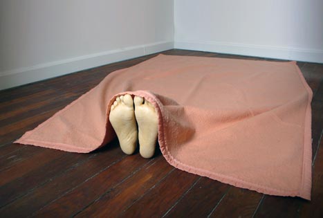
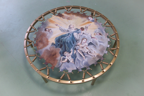
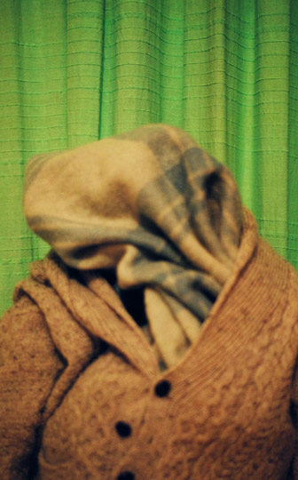 Raised Catholic but think you're put it behind you? Catholicism is like polio. If you contract a powerful case in your youth, it can rebound into your consciousness late in middle age, no matter what you think. (Like a rubber ball it comes bouncing back to you. Don't expect Buddy Holly to sing it.)
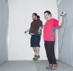 Our bodies, ourselves: In the 21st century, the legacy of 1970s
performance continues to flourish. Take Jason Hirata. Making abstract
art is hard work.
Our bodies, ourselves: In the 21st century, the legacy of 1970s
performance continues to flourish. Take Jason Hirata. Making abstract
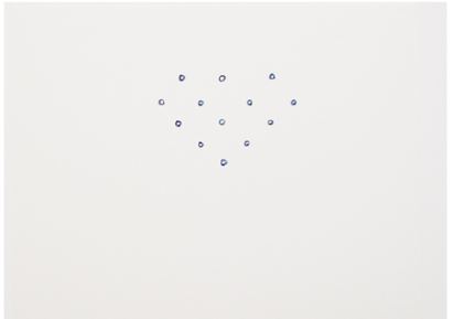
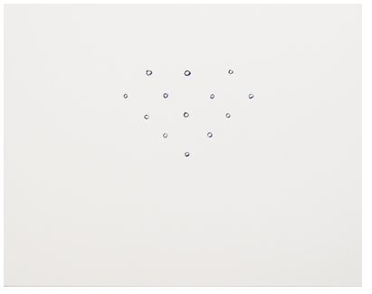
art is hard work.For his current exhibit at the James Harris Gallery, Hirata (left) asked Harris (right) to join him in a storage facility rented for the purpose. They jump roped, sat up, pushed up and ran in the hallway to produce the sweat the artist and dealer collected from their foreheads, backs and necks.
Hirata mixed the liquid in each container with raw Prussian blue pigment to make paired drawings - one using his own liquid as a base and the other using his dealer's. Although Hirata says he hopes that the quality of the line is not the focus of the work's attraction, it is the line that makes the project work. Ghostly, vulnerable, his drawings show up to the best of their exhausted ability, leaving an impression that's barely there but won't go away.
diamond(Hirata), 2010 Sweat and pigment on paper 11 3/8" x 14 1/2"
 diamond(Harris), 2010 Sweat and pigment on paper 11 3/8" x 14 1/2"
 Through March 27.
 I'm a sucker for Plagens' writing. Even when I know I'm being conned, I eat it anyway, enjoying its blunt relish. Here's his lead:
Way back smack dab in the middle of the last century, Americans still liked their popular literature to have, if not gravitas, at least some pretentious heft and coffee-table profundity.That's Plagens' version of the kind of literature overthrown by a caustic teenager. Plagens' quotes Caulfield's opening line:
"If you really want to hear about it," Holden says, "the first thing you'll probably want to know is where I was born and what my lousy childhood was like, and how my parents were occupied and all before they had me, and all that David Copperfield kind of crap, but I don't feel like going into it, if you want to know the truth."Plagens' asks who that sounds like and answers his own question: Andy Warhol.
Of course, Warhol--probably destined to be known until the end of time adolescently as "Andy"--did not actually speak like that. In fact, he never spoke much in public at all. But Warhol, too, never felt like "going into it." The last thing he wanted to go into was that he was a Czech-American, mass-attending Catholic boy from Pittsburgh. Nowhere in his flat, crass and affectless silkscreened pictures of Marilyn, Liz or Jackie lay the slightest hint of what his childhood was like or how his parents were occupied before they had him or any of that David Copperfield kind of crap.Gert Verhoeven Andy Laquered steel, sheepskin, foam L 160 cm x W 60 cm x H 70 cm Edition of 15 (Image via)
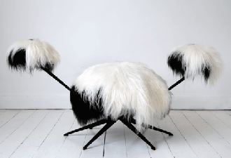 Verhoeven's wiggy chair is more Warholian than any line ever given to the hell-with-it hero of just-say-no. Warhol embraced and Caulfield rejected. Aren't they opposites? Besides, what pre-Pop visual artists of that era engaged the subject of their childhoods? (Remember Jackson Pollock talking about the influence of mom and dad? It didn't happen.)
Plagens loses the audience, picks it back up and shakes it like a puppy with a chew toy. Doubt patrols the edges of his text to keep the reader simultaneously at bay (the chew toy would get away if it could) and engaged (no help for it). In the end, however, none of his premises rings true. But art criticism has more to offer than the truth.
Francis Bacon:
What is truth? said jesting Pilate, and would not stay for an answer.Art is not a religion. Although there is room for the leap of faith, art is built on cognitive engagement. Plagens offers it. He roughs up his readers, challenges what they know by going too far and circles back to slap some pseudo-sense into his argument, just when it was down for the count. Who needs a gym, when we've got Peter Plagens?
From SherFilms, a music video for Sam Bisbee's Oxygen.
Even if his byline were missing, I'd recognize his magisterial tone. His opinions impersonate facts. Because he states them, they are true. Beyond their imperative, they need no supporting evidence. I haven't yet seen this show, but the solemn clarity of Kangas' intelligence doesn't carry me through this piece without a few quibbles.
First, he doesn't think the museum's plan to expand its definition of Northwest art to include British Columbia is sound.
The TAM Board of Trustees approved a 10-year plan for the collection in 2009 that included a "strategy" to "expand the definition of Northwest art to include British Columbia and Alaska." Although noble and sensible in principle, this is one aspect of U.S.-Canada cultural relationships that has never been truly reciprocal. We exhibit and acquire their artists; BC art museums never show Seattle artists let alone acquire their work (their state-funded cultural policies won't allow it). Maybe Hushka and Bullock have miscalculated in this sense: better to stick to the continental US.The Vancouver Art Gallery owns the work of American artists. VAG's focus is B.C. first and Canada second. That's a focus, not a rule. Even if there were such a rule, TAM is right to consider the Northwest within a context of geographical reality. TAM is not horse trading. It's building a record of art in this region. Leaving out B.C. is consigning the collection to parochialism.
Second, he decrees that TAM needs to rely less on donations, which he calls "hand-outs," as if the museum had lined up at a soup kitchen, empty bowl extended. Nearly all art museums rely on donations. The job of curators is, in part, to shape those donations, inspiring patrons to make gifts of what the museum most desires. If museums had to buy what they wanted, they'd all be hunger artists.
Third, he tosses off opinions of individual artists. In this review, there are no other kind. Why does Christian Staub "stand head and heels" over all other photographers in the show? I love Staub's work and think it's fearsomely underrated, but in a review, shouldn't at least one reason for its value be given?
An attack on Claire Cowie needs a little more than this:
Sky Village (2005), by Claire Cowie, seems a typically vacuous example of her thin, overrated watercolor paintings.Yes, they're thin. They're watercolors. If he's going to call them vacuous, isn't he required to back it up? No, he isn't. He's Matthew Kangas, the art critic equivalent of Moses. He comes down from his mountain with the rules in his hands. Not his rules. The rules. On the other hand, I appreciate his confidence, which is not entirely misplaced. If he bothered to articulate the basis of his thinking, it would be worth reading.

What: Art Klatch at Cafe Presse When: 8-10am, Every Tuesday (drop-ins/drop-outs welcome)
Where: CAFE PRESSE - Capitol Hill, SW corner of 12th and Madison
TOMORROW's PROGRAM... We are pleased to have as our special guests at 8am: TIVON RICE, Ph.D student at DXARTS at the University of Washington, & KENNETH ALLAN, Ph.D, professor of Art History at Seattle University. They will be discussing Rice's current exhibition at Lawrimore Project, "A Macrocosmic Zero," touching on the history of video art and new media work, the legacy of its main practitioners, and Rice's unique positioning within the field.
Review on this blog of Tivon Rice's The Macroscopic Zero currently at Lawrimore Project.
Earlier work featuring his dog, asleep. (Osteotomy 2005 CRT monitor, wood 10 x 14 x 10 inches Edition of 3)

The answer lies in its age. The site is jerry-rigged from an outmoded system that is falling further and further behind, even though reviews are currently supported with a 4Culture grant.
Jim Demetre is responsible for the site's content. In response to an email, he generously provided me with the following:
Artdish is run by Eric Gould and myself. Eric is the web developer and I am responsible for the content. I have known him for sixteen years (we met at the Reflex office in Pioneer Square) and I consider him to be one of my very best friends. Eric built the site ten years ago for Victoria Josslin and has been responsible for maintaining it ever since.The real mystery of Artdish is that Demetre and Gould have run it for a decade without compensation. A big thanks to 4Culture for recognizing that cultural commentary cannot float in the air like a hair or a feather but needs support. (Unfortunately, thanks to state budget cuts that grind on and on, 4Culture itself needs support. Joey Veltkamp story here.)
Neither of us receive compensation for our efforts and Eric has worked full time at Microsoft and elsewhere through most of this decade, so his ability to spend time on the project has been limited.
At this point I feel we need to make large-scale changes to Artdish to improve its functionality and take better advantage of the aesthetic potential of the web today. There is currently no search function for the entire site and it is very difficult for writers to post their reviews on the homepage, let alone add multiple images or video.
Artdish is so structurally fragmented I think it would be best to simply start over and build a new site with an already existing, easy-to-use blog engine while archiving the all the existing content on a searchable database. What we have been doing instead is making slight and ineffective modifications to what is outdated or was poorly-conceived from the start.
My fear is that these problems have relegated us to the sidelines while other art websites have flourished in the public arena. When our forum page was very active a few years ago (I have over 2,500 posts there), the system should have been replaced with a more current version and moved to the less frequently updated homepage, where we were posting longer reviews. But the change was never made and we're still using the old version from 1999.
Five years ago I had ambitions of transforming our now-shelved 'community' pages (with links to galleries and artists) into a modest social networking platform that could link artist pages with gallery pages and content from across the web. Today I'm just focusing on publishing reviews and holding out hope that we can create a site that lives up to basic 2010 expectations.
Saul Bellow, from Humboldt's Gift:
Humboldt wanted to drape the world with radiance, but he didn't have enough material. His attempt ended at the belly. Below hung the shaggy nudity we know so well.
Grant Barnhart, at Ambach & Rice
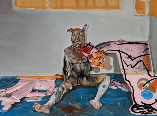 Opening Oct. 8 at the Seattle Art Museum, Masterpieces from Musée National Picasso.
Suit of Armor #2, recyclable plastic containers and lids, glue, spray paint and clear glaze, 2010
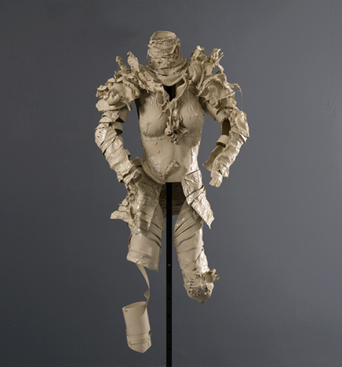 Dan Webb, Skin, 2009. Rawhide
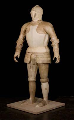 Webb again, Mr. Fixit, Duct Tape
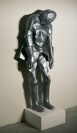

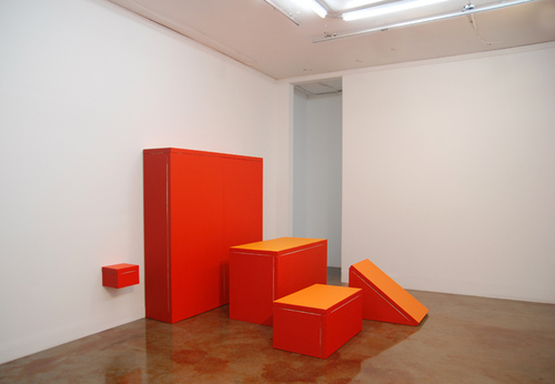 Once upon a time, a sculpture stand woke up as a painting. (Little lamb, if you are able, turn yourself into a table.)
 Levin's backsides cue storage or even construction, the crew on its lunch break.
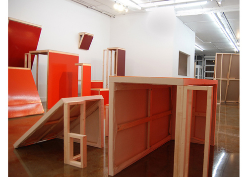 The artist thrusts the bit players of the museum experience into starring roles. They puff up into primary structures but trail a history of their servitude.
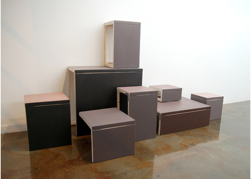 They are also fun forests for purists.
 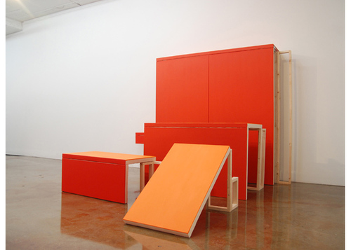 Levin's Art for the Masses at Ambach & Rice through March 21. (Related: Roy McMakin, also at Ambach & Rice.)
About
Blogroll
AJ Blogs
AJBlogCentral | rssculture
Terry Teachout on the arts in New York City
Andrew Taylor on the business of arts & culture
rock culture approximately
Laura Collins-Hughes on arts, culture and coverage
Richard Kessler on arts education
Douglas McLennan's blog
Dalouge Smith advocates for the Arts
Art from the American Outback
Chloe Veltman on how culture will save the world
For immediate release: the arts are marketable
No genre is the new genre
David Jays on theatre and dance
Paul Levy measures the Angles
Judith H. Dobrzynski on Culture
John Rockwell on the arts
innovations and impediments in not-for-profit arts
Jan Herman - arts, media & culture with 'tude
dance
Apollinaire Scherr talks about dance
Tobi Tobias on dance et al...
jazz
Howard Mandel's freelance Urban Improvisation
Focus on New Orleans. Jazz and Other Sounds
Doug Ramsey on Jazz and other matters...
media
Jeff Weinstein's Cultural Mixology
Martha Bayles on Film...
classical music
Fresh ideas on building arts communities
Greg Sandow performs a book-in-progress
Harvey Sachs on music, and various digressions
Bruce Brubaker on all things Piano
Kyle Gann on music after the fact
Greg Sandow on the future of Classical Music
Norman Lebrecht on Shifting Sound Worlds
Joe Horowitz on music
publishing
Jerome Weeks on Books
Scott McLemee on books, ideas & trash-culture ephemera
theatre
Wendy Rosenfield: covering drama, onstage and off
visual
Public Art, Public Space
Regina Hackett takes her Art To Go
John Perreault's art diary
Lee Rosenbaum's Cultural Commentary

 Chris Boyle, Spotted Lake, Canada, via


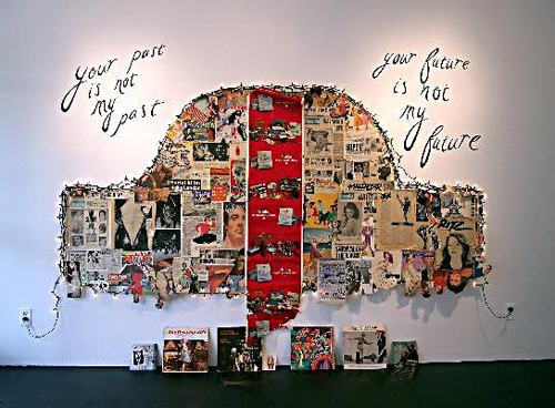

Recent Comments