Another Bouncing Ball: February 2010 Archives
Leviathan is the title of Thomas Hobbes' 1651 work on social order and the creation of an idea state. The cover art illustrates a giant made of individuals in the form of a monarch. In the book, Hobbes argues for a social contract and absolute sovereignty.

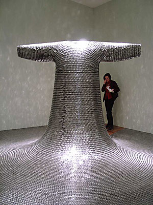
Some/One, 2001 Stainless steel military dog tags, nickel plated copper sheets, glass fiber reinforced resin, stainless steel structure, rubber sheets. Some/One in the collection of the Seattle Art Museum. (Image via)
 Alon Levin's Art for the Masses is at Ambach & Rice through March 21. Review to follow.
From Jason Kottke:
Image via:Steven Levy on how Google's search algorithm has changed over the years.
Take, for instance, the way Google's engine learns which words are synonyms. "We discovered a nifty thing very early on," Singhal says. "People change words in their queries. So someone would say, 'pictures of dogs,' and then they'd say, 'pictures of puppies.' So that told us that maybe 'dogs' and 'puppies' were interchangeable. We also learned that when you boil water, it's hot water. We were relearning semantics from humans, and that was a great advance."
But there were obstacles. Google's synonym system understood that a dog was similar to a puppy and that boiling water was hot. But it also concluded that a hot dog was the same as a boiling puppy. The problem was fixed in late 2002 by a breakthrough based on philosopher Ludwig Wittgenstein's theories about how words are defined by context. As Google crawled and archived billions of documents and Web pages, it analyzed what words were close to each other. "Hot dog" would be found in searches that also contained "bread" and "mustard" and "baseball games" -- not poached pooches. That helped the algorithm understand what "hot dog" -- and millions of other terms -- meant. "Today, if you type 'Gandhi bio,' we know that bio means biography," Singhal says. "And if you type 'bio warfare,' it means biological."
Or in simpler terms, here's a snippet of a conversation that Google might have with itself:
A rock is a rock. It's also a stone, and it could be a boulder. Spell it "rokc" and it's still a rock. But put "little" in front of it and it's the capital of Arkansas. Which is not an ark. Unless Noah is around.

Seattle painter Robert Hardgrave created Drum of the Draw to be a bridge between artists and audiences. Participants tonight at Grey Gallery include Joel Astley, Rachel Maxi, Julie Alpert, Diane
All artwork will be available for purchase, and will be priced from $20- $200. Grey Gallery is a lounge and stocks a full bar and menu, so come join us!Hardgrave:
You live in the Northwest, you've heard it, but not, apparently, if you hail from New York. That's why Northwest context is the only thing lacking from Charles McGrath's elegant essay on Theo Sim's conceptual Irish bar in Vancouver, with real alcohol served inside by two real Irish bartenders.
VANCOUVER, British Columbia -- This city is not just temporary home to the Olympics, it's a hotbed of conceptual art and conceptual artists. There are also a lot of bars here, some so crowded during the Games that people have been spilling out onto the streets. Fittingly, a new installation on the third floor of the Playwrights Theater Center on Granville Island, the touristy, artsy part of town, examines the subtle conceptual difference between drinking and "drinking" and between the bar as mere watering hole and as self-activating performance space.The biggest Northwest name in art impersonating architecture is SuttonBeresCuller. Lawrimore Project debuted in July, 2006, with the group's Chinese restaurant inside the central gallery space.
Titled 3 Dragon, it was a homage to the neighborhood. Because SBC built it inside a crate, Scott Lawrimore was as surprised as anybody else to see a restaurant inside his gallery. When the three artists were ready, they collapsed the walls and stepped out. Inside the restaurant, people were eating. (What else would they do in a restaurant?)

 Also from SuttonBeresCuller, an art gas station still in the works, progress slowed by underground sludge left over from the real gas station. If they solve this problem, they'll be the patron saints of the EPA. One more in the same vein: SBC's There Goes The Neighborhood.
Justin Colt Beckman, Honky-Tonk, 2008 An installation and performance as a bar, with sawdust on the floor, a deer head bought on eBay and real beer in the fake bar. The paintings of mountains came from Goodwill and the light came from candles in jelly jars. Beckman was on stage in a video, lip-synching to Hank Williams III and looking like the cowboy he isn't.
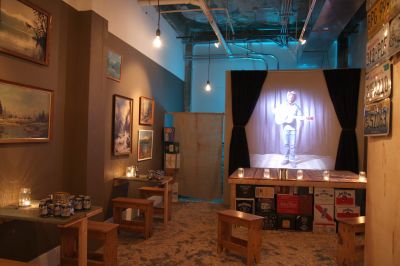 After the gift shop at the Henry Gallery closed and the space went dark, Seattle painter Matthew Offenbacher proposed
turning it into an artist space. (Story here.)
Different teams of artists continue to run it on themes of their devising. My personal top pick is The Gift Exchange by Claire
Cowie, Sol Hashemi
and Jason Hirata.
After the gift shop at the Henry Gallery closed and the space went dark, Seattle painter Matthew Offenbacher proposed
turning it into an artist space. (Story here.)
Different teams of artists continue to run it on themes of their devising. My personal top pick is The Gift Exchange by Claire
Cowie, Sol Hashemi
and Jason Hirata.It was based on a come-one, come-all version of a potlach. Anyone could bring a gift and take one, or bring several and take several. Cowie, Hashemi and Hirata set a high standard for the exchange by seeding the original stock with their work. Inside a museum gift shop was the art version of a gift shop, a success inside a failure.
Back to Scott Lawrimore: At the Aqua Art Fair in Miami in
Lawrimore in green shirt with his artists and one collector. Right to left, Tivon Rice, Susie J. Lee, Ben Beres, somebody who looks like collector Ben (Swallow Harder) Krohn but isn't, John Sutton and Zac Culler. Behind Sutton and Culler, a landscape by Chris Jordan.
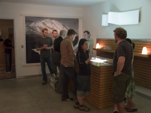 Lastly, from the department of credit where it's due: None of this would be possible without Ed Kienholz's Barney's Beanery from 1965.
 Indoors at Lawrimore Project, Tivon Rice's installation, A Macrocosmic Zero, offers a claustrophobic version of De Maria's exhilarating vista. Instead of poles sunk into the ground, there are tubes hanging from the ceiling in a circular maze. Inside it, viewers see themselves in some kind of motion drag, being processed into the blurred center of the experience and heading toward oblivion.
 There's still awe, but it's heavily laced with apprehension - the implication of a disaster covered by a televised feed, with a motorized panning tripod stabilizing robotic feedback. Nobody comes to the experience fresh or leaves unsullied. Rice agrees with what Francis Bacon said about the mediated image:
I think one's sense of appearance is assaulted all the time by photography and by film. So that, when one looks at something, one's not only looking at it directly but one's also looking at it through the assault that has already been made on one by photography and film.
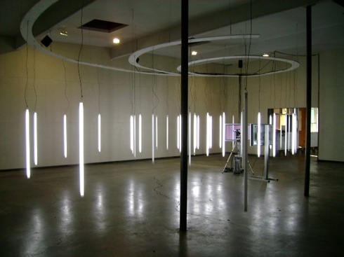 A series of videos in a portrait gallery offer a series of faces that lose their grip on their molecule structure.
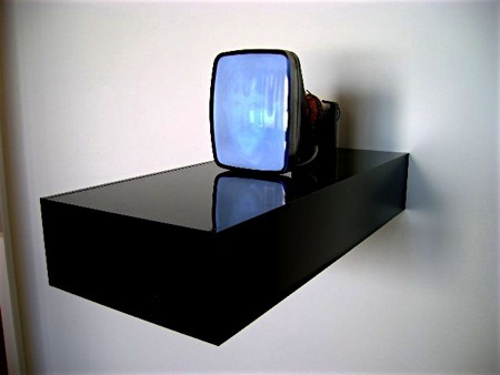
  One screen located outside the gallery features the artist. Rice
permanently burned his own image into the screen, where it hovers,
ghostlike, after the video is turned off.
  Through March 27.
The non sequitur is an infrequently used but fertile stratagem. I thought of it while reading about Bookseller magazine's prize for the oddest title of the year, via Diane Mapes.
Calling an individual piece the Afterthoughts of a Worm Hunter would guarantee it a second look. Other potential winners in the name-that-artwork game include Collectible Spoons of the Third Reich, Governing Lethal Behavior in Autonomous Robots, and, my personal favorite, Reusing Old Graves.
If Anne Siems had called her painting Reusing Old Graves instead of Velvet Forest, I would have begun to look in a better frame of mind. (At Grover/Thurston Gallery)
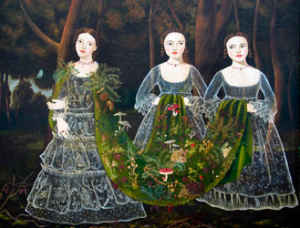
Jane Hammond:
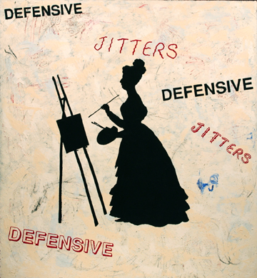 Patrick Lakey:
 SuttonBeresCuller: They sandblasted every word of a patronizing, crap review onto Mexican beach pebbles.
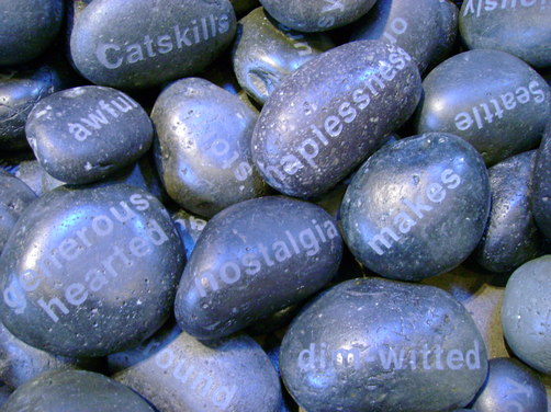 Ries Niemi uses a phrase from a withering essay as a tag to his signature:
 Bad Ideas, Bad Imagination, and Bad MotivesThe three bads also appear on Niemi's Web site under the headline, the critics are raving about Niemi. Other samples:
"Dad is a Fool." -Torque Niemi
"Lounge Lizard gone Country Boy..."
-Regina Hackett"You're not that funny." -Sheila Klein
The depth of his work comes from its translations. A dandelion wilted and past its prime in the back yard is an annoyance, a reminder that there's work to do or the yard in question is beyond work and past care. Let weeds flourish till the plot falls into other hands or is left to its own devices, eating a hole in the human hunger for order.
Webb's weed rises to glory from a block of wood, fire burnt at its bottom with a pale, perfect tap root touching the floor. I saw this piece unfinished in the studio, as Webb was chiseling under the leaf rising on the left. "Stop," I said, as I'd say to someone about to run out into traffic. I feared for the life of the thing.
Webb's carving has a show-off quality. It's a high wire act with no net, performed in front of an audience that is no longer sure such dazzling feats are worth watching. Isn't excessive skill a trap for the unimaginative? When cameras can count every hair on your head, what is the point of verisimilitude?
WOODYLION, 2009 Carved Redwood 32 x 14 x 11 inches
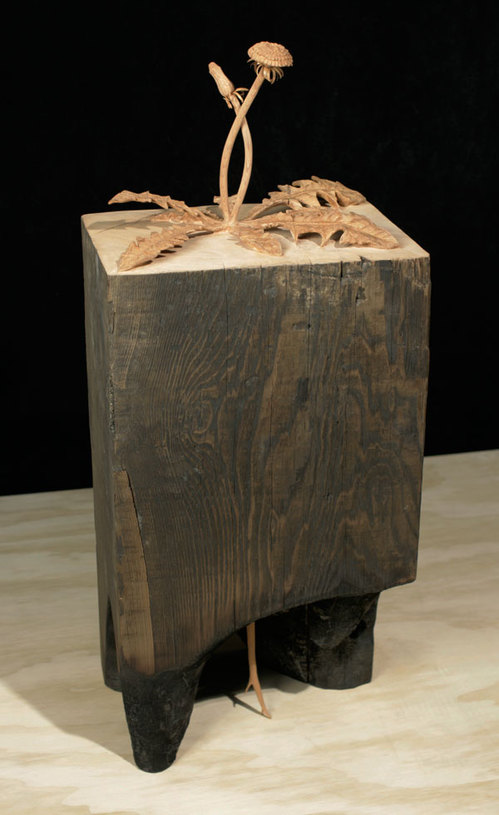 The surface of the world is the world. Skill is a trap when it is excessive to the thing expressed. Webb lives in the precision he brings to bear on what is battered. It's his signature. He's breathing inside his homage to whatever is begotten without pleasure, born without care, and dies alone.
Stephen CraneInto that vast indifference, Webb asserts a form of recyling that he raises to the level of the alchemical. His sculptures would mean nothing without the skill of his rendering. He didn't attach the tap root to the bottom of the wood block and glue the carved weed to its top. Through the oldest process of sculptural subtraction, he found a spent weed inside a stump and let it out.
- A man said to the universe:
- "Sir I exist!"
- "However," replied the universe,
- "The fact has not created in me
- A sense of obligation."
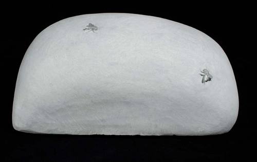
STONE FLY (FOR PETRUS), 2010 Carved gray marble 8.5 x 19 x 11 inches (Petrus is a mid-15th century painter famed for his ability to fool the eye, in this case, with a fly painted at the edge of his painting's frame.)
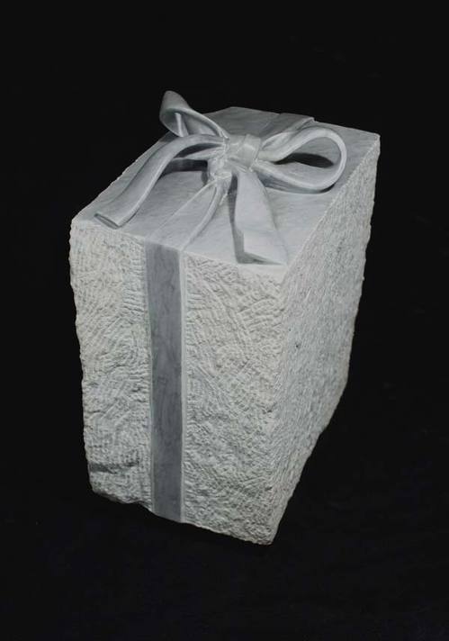
 DOUBLE KNOT, 2010
Carved gray marble
15 x 8 x 12 inches
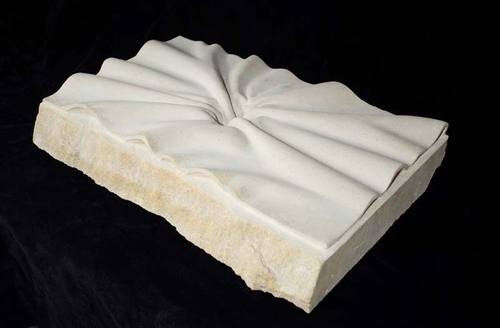
 SUCKED IN, 2010
Carved limestone
4 x 24.5 x 16 inches
 Webb's Stones and Flowers is at the Greg Kucera Gallery through March 27.
I know whenever I say anything regarding auctions I get a lot of folks who misunderstand my point. To be clear, I am a huge fan of Artist Trust, in fact, I am currently trying to create a scholarship fund for one of their programs, so do don't get your undies in a bunch about this. It's just an opinion.
So here goes: When I was on the PONCHO art acquisition committee, one of my suggestions was that all the proceeds from the visual art auction go to visual art organizations and that the other disciplines should do their own "donating for fundraisers" but my idea did not fly. As a visual artist, I would love to afford to go to the opera and the ballet and the symphony and I do want them all to thrive but I have little access to any of them. Any ballet dancer, opera singer of symphony musician can go to any gallery and some museums (at least on certain days) for free yet I don't see any of these organizations (Ballet, Opera, Symphony, etc), individually or collectively, doing anything to benefit the visual arts.
The boundaries between disciplines are porous, and artists work freely across them. The essential thing about artists is that they are artists. Artist Trust embraces and supports all equally. But visual artists are most likely to create a product that can be sold. For that reason, they are the ones who support all others through the Artist Trust auction.
Hence, Alonso's excellent point. It's worth noting, however, that Leslie Chihuly is head of the Seattle Symphony's board of directors. She is more likely to favor an all disciplines approach. A cynical version of the Golden Rule (S/he who makes the gold makes the rules) isn't always true.
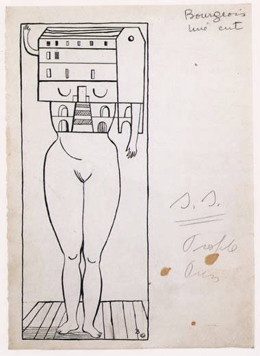
 It's the male version of Louise Bourgeois' femme masion, from 1947, who "shows herself at the very moment she thinks she's hiding." (via)
 There's also the far more elaborate piece by Janine Antoni, One Another, from 2008.
She remembers the exact moment she figured out subtraction, sitting on the small ledge dividing the backyard into lawn and concrete, staring at the paper in her hand and the numbers on it, thinking of subtraction as another kind of addition and both as ways of counting.Berger, Mathematics #57, 1976
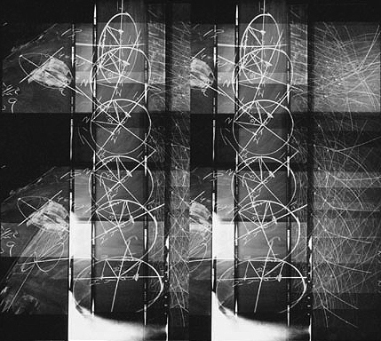
Latest outrage: Parallel Universe, curated by artists Francisco Guerrero and Joseph Park at Grey Gallery.
It's the best group show in the city. The idea came from a deep familiarity with artists' studios. Guerrero and Park started thinking about what they saw in studio corners, work that represents paths not taken that still could be: ideas abandoned, on hold or too recent to represent anything other than a stray idea.
Claude Zervas shows these lights at the James Harris Gallery. At Grey are lights not found at James Harris, gleaming out of the eye sockets of chainsaw bears.
 Jeffry Mitchell's touch is a miracle of deft. When he draws, he draws silks in the air. Not this time.
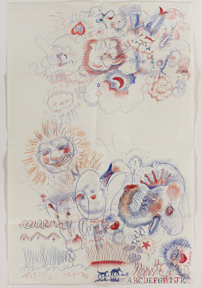 Joseph Park is not a black velvet painter, except when he is.
 What is this twerpy little piece by the ever-elegant Leo Saul Berk, something like a diseased mouth and something like a doughnut? Titled Cloud Flower, it's nothing like a cloud. More like a drain with tea leaves matted around its rim.
  Dan Webb is not a cartoonist.
 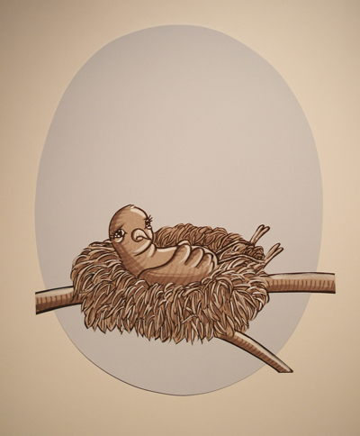 Claire Cowie finishes what she starts.
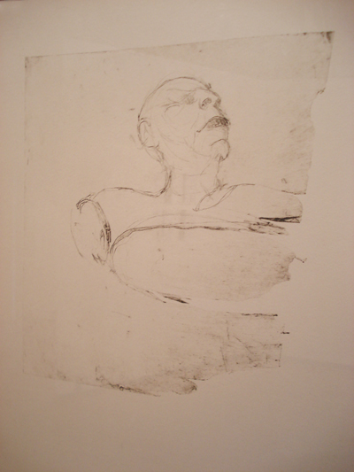 Dawn Cerny does not do abstract art.
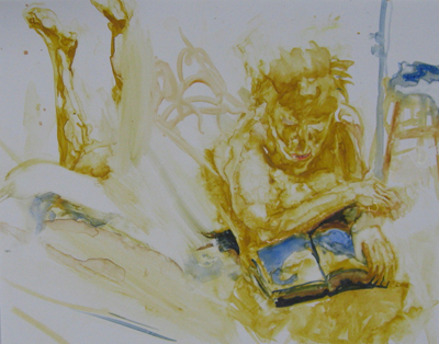
 I don't know Josepf Vascovitz's work well enough to know what is and is not his pervue, but these drawings are splendid, with a golden yet mucky glow. (I love the reader, reading water, and Adam with Eve, bulky as the first couple must have been, so recently associated with apes.)
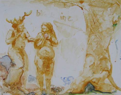 Also scoring in Parallel Universe: Gretchen Bennett, Eric Elliott, Harrell Fletcher, Francisco Guerrero, Alfred Harris, Victoria Haven, Jenny Heishman, Nicholas Nyland, Lead Pencil Studio and Joey Veltkamp.
Through April 2.
 Gallery Hours: 4pm - 2am everyday, by appointment and by chance.
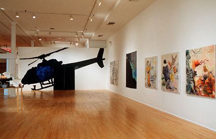
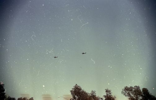 Living under helicopter rotation is not good for the nervous system. I moved. What about those who can't move, who grow up in American neighborhoods that are under regular overhead surveillance?
 The anti-war movement in the 1960s gave participants (and bystanders, trying to get out of the way) an experience impoverished people of color continue to endure as a matter of course - the chance to be under served and over policed.
From Paul Beatty's 1997 novel, The White Boy Shuffle:
I turned onto Whitworth Avenue and suddenly found myself engulfed in a blinding waterfall of light. Instinctively, my hands shot above my head as I waited for the standard drill--"Face down on the ground, hands behind your head, ankles crossed. Move!" But no instructions were forthcoming. I waited a minute or two and looked for a police cruiser; nothing. No beat cops, only the helicopter hovering overhead and me standing in a fifty-foot circle of light, becoming more appreciative of the moon.Beatty's novel inspired Kori Newkirk's mural in Freestyle. Made of black pomade applied to a white wall, Newkirk's rendition of the species ghetto bird smelled like hair product. Its title, All Over, links it to Jackson Pollock, even though the latter's fields fail to suggest a similar soundtrack.
 After 9/11, of course, the entire country became suspicious of what might come from the sky.
Euan Macdonald, "Untitled, (three falling pianos), 2006, triptych, gouache on paper, 101x76 each (Image via)
 Macdonald's A Little Ramble is at Western Bridge through April 17.
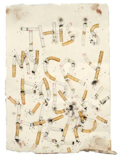
Cry for help 2009 pencil, colored pencil, acrylic, blood (Via)
Jones:
My practice is both a comment on and a continuum of the conceptual ideology of jazz, an honoring of the deep radical legacy of its experimentation, of hybrid modernist forms, of wit, of riff -- the turning of a phrase onto itself.
Her sculptures and drawings are improvisations on the cassette tape, transistor radio, boom box, Walkman, from intimate long play to the impersonal present. In her hands, old style records with their pop and fizz beat the immaculate conception of new style downloads. You can't hold a download in your hands. Downloads move from computer to ear bud without taking your body into account, your care or disregard, how you treat your cultural legacy.
Formally, her work is subtle, with a wit that does not translate online. There, her work becomes one thing. In person, it's myriad-minded.
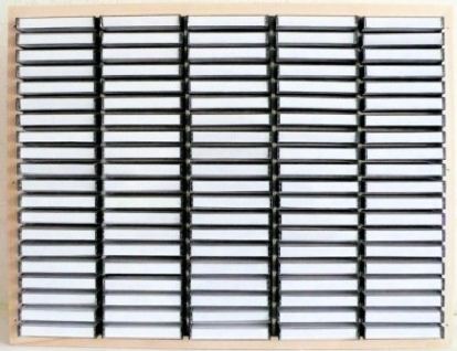
Top 100 jazz Lps 1969-79, (2010) Paper, cassette cases, plywood, album list presented as title card. 18 x 24 x 3 in.
 Top 100 jazz Lp's 1969-79
has a one-two punch. First, it's a primary structure - Donald Judd-like with a backbeat of the domestic. A second look delivers the literal. It's a homage to cassette tapes, a mimicking of their form for abstract effect. Online, the piece looks like a photo of an industrial kind of window shutter.
Top 100 jazz Lp's 1969-79
has a one-two punch. First, it's a primary structure - Donald Judd-like with a backbeat of the domestic. A second look delivers the literal. It's a homage to cassette tapes, a mimicking of their form for abstract effect. Online, the piece looks like a photo of an industrial kind of window shutter.Holland Cotter called Jones' installation, Homage to an Unknown Suburban Black Girl, one of the highlights of Freestyle at the Studio Museum in Harlem in 2001.
Cotter:
Based on a found snapshot of a young black girl sitting in what looks like a suburban interior, the piece focused on how two different strands of African-American history coexist in a single picture. One history is of assimilation, implied by the middle-class setting. The other, suggested by the girl's Afro hairstyle, is of Black Power politics, which arose in response to a racism that integration alone could not change. In short, in Ms. Jones's reading, the photograph was a document of people who remained, consciously or not, tolerated guests in the house -- American culture -- that they had helped to build.
In the same review, he described Jones' sculptural foray into Bebop at Artists Space as "even subtler."
Cotter:
This time the document she presents is aural: the sound of Charlie Parker's music as informally recorded by another saxophonist, Dean Benedetti, who was obsessed with Parker's life and art. The tapes surfaced in 1988 and were regarded as treasured relics despite their poorly recorded and distorted sound. In the gallery, an edited version of the recordings plays from two large speakers, and small collage-drawings by Ms. Jones hang on the wall. At first glance, the drawings are classic Modernist-style abstractions composed of squares and rectangles. But wirelike black ink lines that emerge from the geometric forms turn them into something else: clusters of tiny microphones or speakers. Positioned around the room, they seem to be at once recording and projecting Parker's music, music that is, Ms. Jones seems to suggest, not a distorted ghost from the past or the obscure object of someone's desire, but the very sound of Modernism itself, loud, clear and everywhere.Common objects she burnishes into relics, like slivers of the True Cross:
Blanks (45, LP and cassette liner notes), (2007) Hand-brushed aluminum Artist Proofs. To be editioned in stainless steel with an additional 8-track sleeve.
 What is the shape of musical memory?
from Blank series, 2009-10, collage and ink on paper
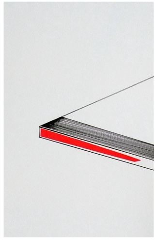 To March 27 at Lawrimore Project.
 What made this post so objectionable to many appears to be my distaste for whimsy. Who could be against whimsy? I must be a monster. Possibly I needed more context. I associate the word, which comes from whim, with the kind of art that's deliberately impersonating the drawings of children. It's a step backwards to achieve an innocence not possible for adults.
No matter how technically inept, drawings from real children have a purity and grace. Fake children can no longer inhabit that experience. They can't be what they once were, with chubby little fingers holding their crayons.
Certain folk artists draw in a style associated with childhood, but there's a crucial difference in delivery. They're serious. They have whittled away at their form, battered it down to a primal event instead of borrowing it from the five-year-olds in their lives.
For me, Ward is a prime offender in the we-won't-grow-up art whimsy movement. His calcified cute clogs arteries. Even so, I don't mind that he has a mural or two around Seattle. Had he done a few, I wouldn't have said a word. But he's big into volume, volume, volume. Fifty murals, 70 murals: He keeps changing the number. In a recent email, he said (contradicting an earlier one), that he has completed 48 public murals in Seattle and plans to do more.
What makes him think he's entitled to that much public space? The business people who pay him don't own the city. Everyone who lives here does. There are street artists/muralists I love, but I wouldn't presume to suggest any one of them blanket Seattle with his wares. In public art, diversity is essential. There's room for Ward, but not as much room as he insists on taking.
One more phrase to consider: ad hominem, or arguing through personal attack. You sweetness and light people appear to have hair-trigger tempers. A sizable number of you quickly devolve into playground name calling. No wonder you like artists who impersonate children.
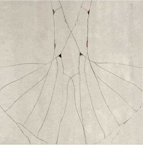
Do you want to pick up your teeth with broken fingers?Jim Melchert, Flip, graphite on broken porcelain, via Moon River
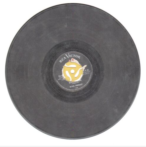
First up is a 78 rpm of Elvis Presley's "Blue Moon". Back in the early 1950's , when 45 rpm records were first entering the market, those little 7" plastic disks with the big holes were way cool. You wanted to impress your pals with your latest technology (sorta like the i-pad, ya know?) This person decided to crudely grind out the center of the 78 rpm (10") record and then pop in a 45 adapter. That way he could actually fool his pals into thinking he was hip to the latest tech savvy universe!
Three years from now, we'll all be coming up roses, right? Better a sizable check in tight times than the same amount extended over a longer period. I'll drink to that.
The Chihulys could have limited the award to glass artists. I'm glad they didn't. They could have limited it to visual artists. I wish they had, not because I begrudge dancers, writers, musicians and theater workers their chance at temporary financial security, but because artists in all disciplines benefit from what visual artists continue to provide, every year, at the Artist Trust Auction. That's 23 years of giving away their work to support everybody's work.
This year's auction was a big success, says Artist Trust. It raised
The highest bid of the night was $5,000 for Alan Fulle's Freedom Space (23" x 52" oil and acrylic on canvas within epoxy resin from 2008). At the Traver Gallery, this piece lists at $7,500. The high-water bid was a bargain.
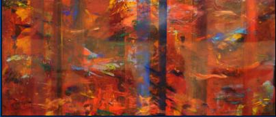 Fulle is underrated, but apparently not by those drinking champagne and waving bid paddles over their heads. Although he's a dazzling and materially adventurous painter, he shows at a gallery known for glass. Its audience is a gated community, with little follow-through traffic on the street.
At any rate, congratulations to Artist Trust, and big thanks to the Chihulys.
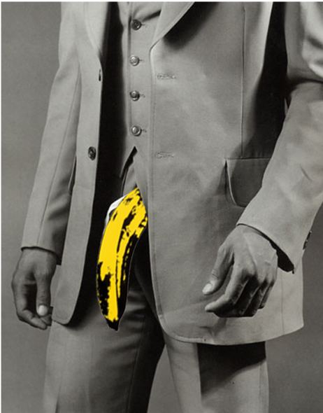
Mapplethorpe image here. The update, by David B. Smith, below. (The Velvet Polyester, 2008)
Illustrator militancy is relatively new. Formerly, the breed took its second-class status for granted. If illustrators were discussed, they were the ones talking. In the art context, nobody gave them much thought. Illustrators were around (some good, some clever, most bland or annoying), illustrating things - advertisements, company announcements, greeting cards, t-shirts, comic strips.
Cartoonists proved the most unruly. Between R. Crumb and Art Spiegelman, they battered the opposition into a puddle, becoming a rising tide carrying all (drawings of) boats.
The question now is not whether it's illustration or art. It's what kind of illustration it is, and what kind of art.
Friends of the Nib at Vermillion Gallery features the drawings and prints of 31 Seattle illustrators (mostly cartoonists) who meet weekly "to chew the fat and scratch the paper. "
As a group, they're a wonder.
Take David Lasky: His ultimate graphic novel is one page, six panels. Lasky draws as if his pen swallowed a ball. All of his lines have bounce. What's really distinctive is his writing. He channels Kafka by way of Donald Barthelme - pared to the bone, funny with a low-grade fever of the tragic.
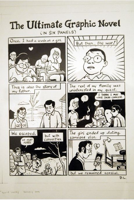 Then there's Kaia Chessen, busting out of the frame but with a feeling of heirloom.
  Nobody puts Ellen in the corner. For big, clean and sexually charged graphics, she can't be beat.
 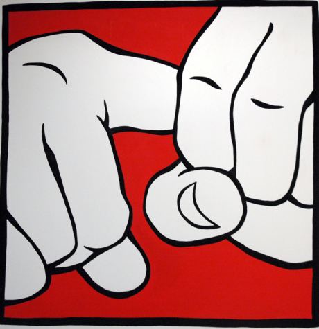 Through March 4.
Paul Berger became interested in the visual world of prey animals after reading Temple Grandin, who redesigns slaughterhouses to take away the terror. According to Grandin, prey animals do not feel anxiety or regret, but they have a fast trigger on fear. When nothing is wrong, they are calm as Buddha, even when seconds from their death.
McDonald's hired her not because the company is swell in every way but because calm animals die more quickly, more cleanly. Also, with her on the payroll, McDonald's has something to say in its own defense when criticized by animal rights groups.
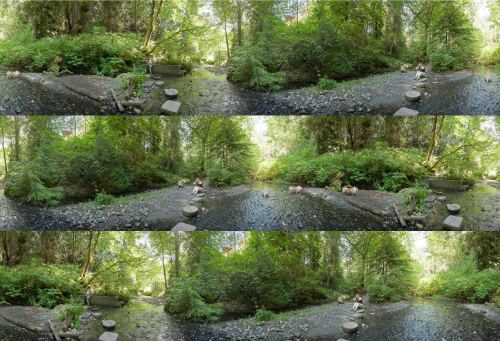
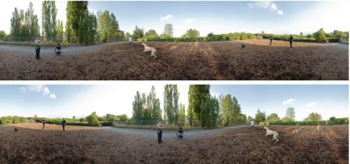
Back to Berger and his wide span. (PANORAMAS SERIES, 2008-2010) He offers something rare those whose vision is selective in its focus. In his photos, the world shifts, becomes elastic and enlarged beyond the frame with which we were born, the narrow frame that helps us zero in for the kill.

 Berger:
I have been exploring extended synthetic panoramic imaging, wandering into a kind of "bovine vision" of visual horizon grazing between 240 and 360 degrees. It is the camera vision of choice for those who scan the horizon wide, eschewing the specificity of the pointed gaze for the more generalized awareness of a uniformly focused peripheral vision.
Technically, this series, as has been the case with most "straight" photography in the past, at first appears to be a seamless, straightforward transcription of the three dimensional world. However, they are, in fact, the result of a highly processed data stream. This stream begins with a sequence of seven to ten wide-angle (24mm) individual photographs, taken with a digital camera attached to a tripod on a head that allows for rotation about the "nodal" point of the lens. The resulting images are merged, in software, into either a cylindrical or spherical digital space. After adjustments, a two-dimensional frame is imposed within this space (the final "photograph") and the result is exported back into a conventional digital file.
Responding to my question about his (to me) invisible career, Berger replied with unruffled patience:
I have been published in Light and Lens, Photography in the Digital Age, by Robert Hirsh, 2007; Nash Editions: Photography and the Art of Digital Printing, ed. Garrett White, 2007; Photography, 8th Edition; London & Upton, 2004, Criticizing Photographs, An Introduction to Understanding Images, Terry Barrett, 2002; and Seizing the Light: A History of Photography; Robert Hirsh, 2000.
Also, photographs from the Panorama series will be published in the spring as part of The Digital Eye by Sylvia Wolf. For someone who is well known in Seattle because he is on the art faculty at the University of Washington, his work is rarely discussed. His 2003 retrospective at Chicago's Museum of Contemporary Photography traveled, but not to Seattle. (Artforum review of that show here.) There is more than one way to have a career.
Cast in point. Fabulous video artist Amy Greenfield was kicked off the site for "violating community standards." Whoa. Protest letter from the National Coalition Against Censorship and the Electronic Frontier Foundation here.
Money quote:
For all of their pronouncements in favor of free speech, Google and other Internet intermediaries are fast becoming the new arbiters of morality - and setting the tone of what is acceptable and what is not. There is no First Amendment to protect our speech in such communities, but that is why it is much more important to get involved and express our outrage when artistic expression using a female body is booted off the site - or put in a special X-rated section - as pornographic and offensive.
I saw Matt Sheridan Smith's Flotsam and Jetsam late Saturday afternoon, the last day. It was riveting, but fortunately for those who failed to stop by, his is the kind of riveting that can be appreciated online through images. One of Sol LeWitt's better gambits was to bury a drawing, refuse to say where but offer a certificate of ownership to whoever was smart enough to snap it up. Of all his drawings, this is one I think of most, the one I never saw.
Flotsam and Jetsam is a remake of a sculpture Smith presented at Lisa Cooley in 2009, Self-portrait (golden sections). Reviewing that show, the astute Marie-Adele Moniot is worth quoting:
Self-portrait (golden sections), the "heart of the show" according to the gallery's press materials, is a series of pedestals arranged in a sort of postmodern Stonehenge in the center of the room. Smith made each pedestal according to the "golden ratio," measuring the proportions of his own body and transferring them to plywood. Though he literally puts himself on display, the various shapes and sizes still seem to conceal something essential about the artist, his process and the works' import as stand-ins for the body. (more)At Western Bridge were the same arrangement of pedestals:
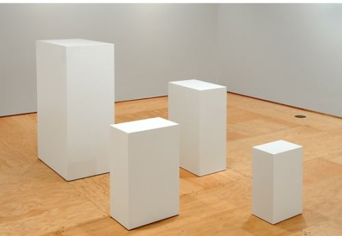 This time out, however, they're going down. In the corner of the room was a sack of cement.
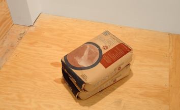 At the end of the day on Saturday, as the exhibit drew to a close, Smith mixed the cement, opened the pedestals and poured it in. Two he dumped in the Sound, as jetsam. One might have been rescued, to serve as a bench in front of Western Bridge. (Flotsam.) Whether he'd dispose of the final pedestal or recycle it had not, late Saturday afternoon, been determined.
As with his exhibit in New York, the pedestals served as stand-ins for his body.
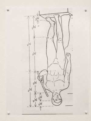 The shift in meaning, from last year to the present, when the recession grinds on and opportunities for artists to make any sort of living recede before us, is haunting.
F. Scott Fitzgerald: (via)
Gatsby believed in the green light, the orgiastic future that year by year recedes before us. It eluded us then, but that's no matter - tomorrow we will run faster, stretch out our arms farther ... And one fine morning - So we beat on, boats against the current, borne back ceaselessly into the past.Unlike Gatsby, artists are rapidly losing faith in that future. They see losses - what they can no longer afford, what they'll never have, what they'll have to do to survive and continue to be artists. Will they jetsam their work or park it to be retrieved later, like flotsam left after a wreck?
Heart's Needle, Part 5And while on the subject of the melancholy passage of time, the invaluable, essential Western Bridge is six years old. When launched by Bill and Ruth True, they said they saw it as a 10-year project. Recently, they speculated that it might conclude at eight. That leaves two years. Tick, tick.
Winter again and it is snowing;
Although you are still three,
You are already growing
Strange to me.
You chatter about new playmates, sing
Strange songs; you do not know
Hey ding-a-ding-a-ding
Or where I go
Or when I sang for bedtime,
Fox Went out on a chilly night,
Before I went for walks
And did not write;
You never mind the squalls and storms
That are renewed long since;
Outside, the thick snow swarms
Into my prints
And swirls out by warehouses, sealed,
Dark cowbarns, huddled, still,
Beyond to the blank field,
The fox's hill
Where he backtracks and sees the paw,
Gnawed off, he cannot feel;
Conceded to the jaw
Of toothed, blue steel
Here's a history of who stands out.
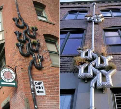
1. Buster Simpson: In the late 1970s, he was key to coming up with the public art concept of the design team. Now that the concept is ubiquitous, it generates more than its share of timid art, but Simpson's version continues to stand out. He changes partners with nearly every job and makes the process of collaboration part of his performance.
Vertical Planters. (Image via)
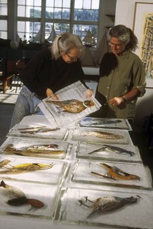
 2. The studio glass movement is nothing but teamwork, yet a single star almost always tops the credit line. Not in Flora Mace/ Joey Kirkpatrick's studio. Life and art mates, they have made it work for more than 30 years.
 After the debut of Mace and Kirkpatrick, years went by. Not a peep from anything close to a successful team. Then, in 2002, a couple appeared who named themselves after a tool known for its usefulness in first drafts.
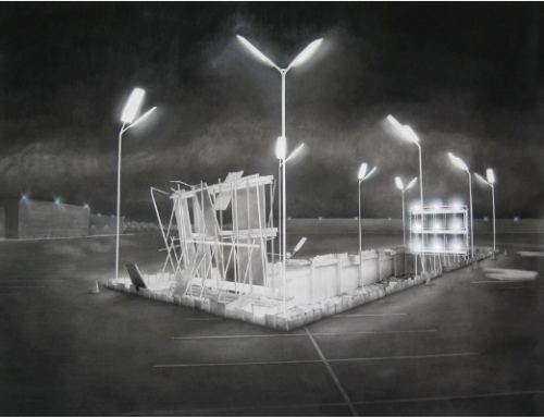
3. Lead Pencil. (Annie Han and Daniel Mihalyo) Skating on the line edge of art & architecture and claiming both. Like Mace and Kirkpatrick, life partners.
Under the Surface, 2008, charcoal/paper, 72 x 60 inches
 Since 2005, more good collaborators have been making their mark than at any time in the city's art history. Aside from two artists who joined forces briefly, these new group thinkers are all male. Not a female in the bunch, or even a female on a team.
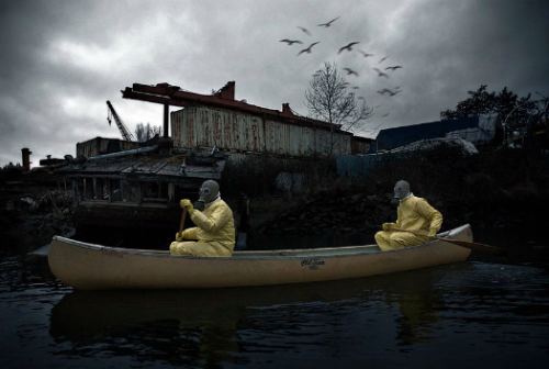
4. Sutton/Beres/Culler: (John Sutton, Ben Beres and Zac Culler) Comedy from the heart, formalism from the brain: Their performances, documentary photos and installations are moving them onto the national stage.
Dumanish 1 2009 - rowing on a local river that makes non-musical use of the term, heavy metal.
 5. Eli Hansen. Because Hansen made his Seattle debut working with his already famous brother, Oscar Tuazon, many felt he was little more than Tuazon's assistant. Two Seattle galleries (Howard House and Ambach & Rice), offered to represent him, but only if he brought his brother along.
 Here is where Scott Lawrimore (Lawrimore Projects) shines. He is not distracted by resume. He could see right past Tuazon's glow to Hansen's gold. Lawrimore offered Hansen representation by himself and with any partners he wants to take on. So far, these partners have included childhood friends Joey Piecuch and Herman Beans.
Notes Hansen on the LP Web site:
We are brothers and friends first, artists second...We know each other's weaknesses, sadness, and confusion...We work in the same way we have always worked together--as a community and as a family.Hansen and Piecuch, I'm not paranoid because I'm high, 2009
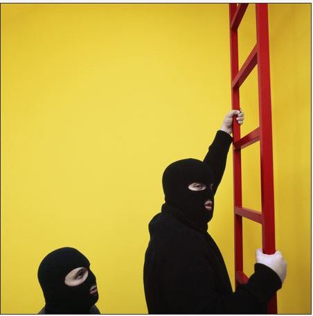
 6. Fred Muram and Mike Simi: They want to be art partners, but it's hard when they each do their best work alone. Unlike its members, this team has yet to prove itself. If they do, it will have to be by long distance, as Muram has moved to Chicago.
(Muram left, Simi on ladder. Image via)
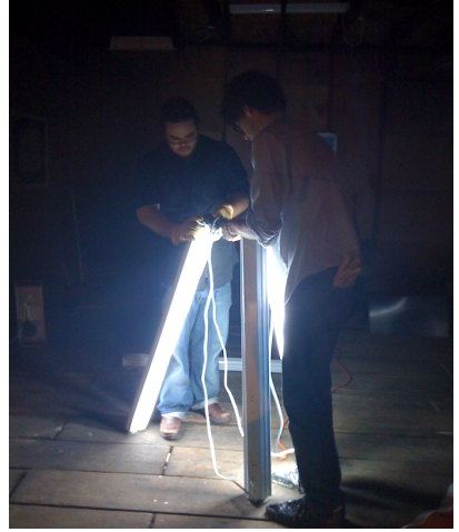
 7. Sol Hashemi and Jason Hirata: Brilliant both alone and together. The James Harris Gallery recently picked both up, but as individuals. Harris said he isn't interested in collaborations, which leaves the pair free to work together wherever else they choose.
 Hirata & Hashemi, The Dirty Shed Project.
 Know others I've forgotten and/or missed? Please note them in the comments.
Thanks!
Know others I've forgotten and/or missed? Please note them in the comments.
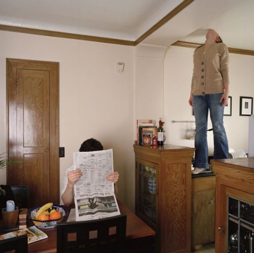
Thanks!Fred Muram, from his series, Kissing the Ceiling.
Art from Emily Pothast and Mark Grotjahn. The jewelry from Spinthread on Etsy. (Via Shaun Kardinal)

Roger Shimomura spent his toddler years in Idaho at Camp
Currently at the Greg Kucera Gallery is an exhibit of small acrylic paintings titled, Minidoka on My Mind.
 (Previous on this blog: Roger Shimomura, What racists see.)
Having so recently written about Shimomura's work, I want to defer to his analysis of it. He proves it any proof is needed that an artist statement can be a model of clarity, depth and humor.
I have often told my students that if making art is of paramount importance in their lives and that if they are willing to commit themselves to hard work and maintaining an engaged mind, they will eventually be able to free themselves o f everything they learned about art. I know from my experience that I have found this to be true.
After years of studious concern over content, I feel that I have either reached or sunk to a level of security where ideas for my work flow, unconscionably. It seems that at some point I no longer felt compelled to project my own point of view toward the things that concerned me. I found myself more interested in creating a visual forum that expressed ironic and contradictory attitudes towards these concerns.
This direction required many new resources and led me to practicing a form of self-legalized visual larceny. Using images from my past and immediate environments, from earlier and current work and using them as cultural metaphors, I became a dispassionate viewer of my own layering system.
My writings in performance art have provided me an opportunity to extend some of these ideas through a new medium. With the added features of time, sound and linear logic, interfaced with film, poetry and video, I discovered new possibilities in which to play with a lifetime's accumulation of images. Suddenly I saw the relationship between the merchandise I used to covet and draw from old Sears catalogues and the bizarre collection of objects that now fill my house. So did I see the relationship between misleading reproductions from art history books and my mom's old issues of Woman's Day, between the music of the John Coltrane Quartet and the Salvation Army Band, between the stories that my grandmother left and the editorials in the local newspaper, between a meal of steamed black cod and the Colonel's Wingdinger, between vintage Kurosawa and Johnny Socko, between Masterpiece Theatre and Pee-Wee's Playhouse, between an Oreo cookie and a Chiquita Banana and between Minnie Mouse and one of Utamaro's beauties.
Engman is represented by Kucera, where the artist's early photos, such as the found one, typically sell in the $1,200-$1,600 range. Turns out that Engman made only two prints of the image in question. One he gave to a friend, who still has it. The other he donated to Artist Trust.
What happened after that? Artist Trust is no more responsible for the art it sells than galleries are. In the case of Engman's print, it got lucky. Its new owner is not just pleased to have found an Engman in his price range, he is not likely to mistreat the work of a peer.
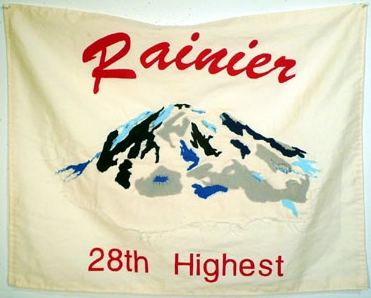
This year's Artist Trust auction takes place Saturday night. Choosing one artist out of the hundreds donating their work, I hope whoever buys Dawn Cerny's We Get High (Not Very) (19" x 24", Muslin, felt, silk) values it enough to take care of it. The prospect of it popping up at Goodwill in a banners' box leaves me anything but high.
They have juice. They are not, in the end, casual, no matter how casually conceived. Currently at 4Culture Gallery is Hashemi's Object History Awareness, an assemblage of photos and installations. Hashemi believes in the alchemical attraction between people, places and things. If he were answering a personals ad, he'd say yes to everybody. Any x standing next to any other y is instantly in a serious relationship.
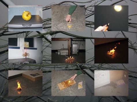
Within his vast sea of connections, he allows for individual goals. Everyone wants to light fires in the studio, for instance, and almost everyone fails. Hashemi feels for those failures. His grid of comic efforts at ignition buries metaphor under the weight of the literal.
Studio fires
 How about a birthday
party? Each one marks progress towards the grave. Why not, since we're
going there anyway, die faster? (Hope I die before I get old.)
 Cake with Fast Lit Candles
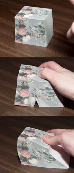
 Page through any book
on the history of art, and you'll find flowers. Below, in an interaction with a note pad, are both the flowers
and the flipping through a text to find them.
Page through any book
on the history of art, and you'll find flowers. Below, in an interaction with a note pad, are both the flowers
and the flipping through a text to find them.Bouquet of Flowers (After Pissaro)
 "Let a hundred flowers
bloom," said Chairman Mao. What followed was the flower-filled paradise of the Cultural Revolution. Even
though Hashemi is an artist instead of murderous thug and Communist Party Sun
God, his goals have a similarly lofty ring: Let a hundred forests
bloom. He's starting with nine. Everyone has to start somewhere.
 Potted Plants
 Last year, at an exhibit honoring graduating B.F.A. students at the University of Washington, one of Hashemi's sculptures disappeared during the opening party. Hashemi later found it beside a trash can, waiting for removal. Apparently, a volunteer doing a last bit of tidying up had mistaken it for rubble. How could that have happened? Below, a representative of Hashemi's sculptural prowess:
  I think it's terrific. Through Feb. 26. (Previous on Hashemi and his frequent art partner, Jason Hirata, here. Michael Upchurch in the Seattle Times on the current exhibit here.)
It may also be the only Northwest gallery to apply to either fair. The recession is receding slowly in the Northwest. I profiled A&R a year ago January in the Seattle PI, back when there was a Seattle PI. Art fair admissions aside, A&R is an ambitious undertaking by anyone's measure. Congratulations, Charlie and Amanda.
Who you going to believe, me or your lying eyes?
Richard Pryor came to mind last night at the Greg Kucera Gallery, as per the following conversation:
Other person, talking to me:
Me:
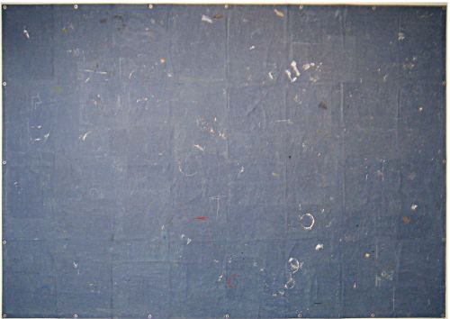
Greg Kucera can sell anything, even a blue tarp.
Other person:
It's not a tarp. It's a painting.
Whiting Tennis, BLUE TARP, 2007 Acrylic and paper collage on canvas 96 x 144 inches. Purchased by the Tacoma Art Museum.
Nonsense, Regina
 Detail:
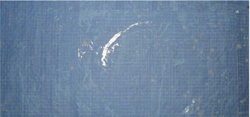 It isn't a painting on a tarp. It's a painting of a tarp. This piece keeps fooling people who ordinarily know better, partly because Tennis isn't thought of as an artist interested in trompe l'oeil. He's drawn to what is battered by the world but makes versions of it in his studio instead of picking them up off the street.
 To date, the only other painting in the Tennis' lineup that falsely swears to tell the truth, the whole truth and nothing but the truth is titled, Go Hawks, New Menus, from a diner. (2008 Acrylic, collage and pencil on canvas 36 x 48 inches)

Impersonating a cookie has risks. Janine Antoni made art history out of satiated desire - her teeth marks left in a 600- pound mound of chocolate. Thanks to her, addiction took sculptural form (Gnaw, 1992).
I have observed with pain that my signor Ludovico and his court gobble up all the sculptures I give them, right to the last morsel, and now I am determined to find other means that do not taste as good, so that my works may survive. (more)
What follows is a small survey of artists who explore the issue of food as the odious cost of staying alive.
Alex Schweder, Still-life of Beefsteak and Cheese Paper, Ink, & Scented Varnish, each sheet 34" x 21.5", 2004 (Lawrimore Project)
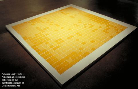
 Walk on this - The Art Guys (Cheese Grid,
1993)
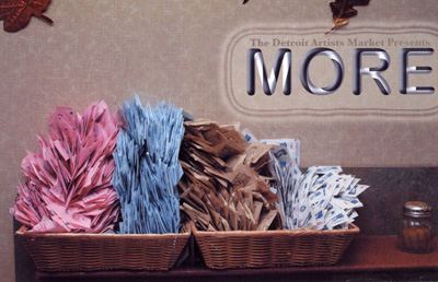
 Marc Horowitz
"brings his research of socially acceptable narcotics to more's r&d
lab in efforts to help increase demand for and sweeten M.O.R.E.'s
services
."
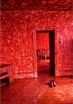
 Mr. Brainwash
 Here's looking at you,
potato eyes: Ryan Horvath - P.M.S.
(detail)
MEDIA potatoes, glass, light
SIZE 18" x 18" x 80"
DATE 1997
DESCRIPTION potato mosaic structure, one month duration
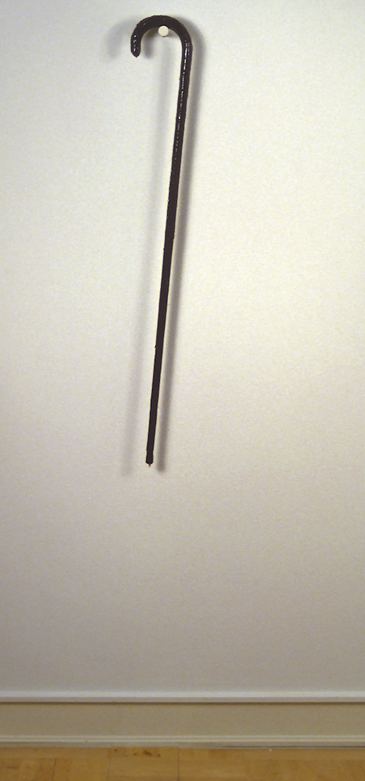
 Also from Horvath, the
cane you can't count on, made of sugar. Cane 36" x 5" x 1"
2004
 Blast from the past:
Alfred
Gescheidt
Untitled
1949
vintage gelatin silver print
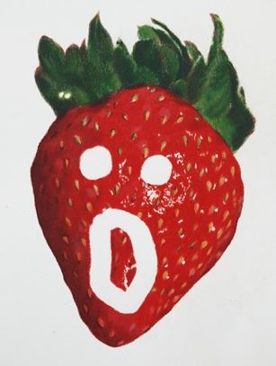
  Aesthetic grandson of Gescheidt: Eric Yahnker, Berry Astonished, 2009 Colored pencil on paper
 Related post from this blog - The banana downfall, a visual survey
Music and photography he likes to conflate.
When I look at Ansel Adams's print Moonrise Over Hernandez I can feel the basses and cellos in the shadows - I can hear the violins in the clouds. (via)Ansel Adams. Nash is not afraid to buck the trends. The stately perfection of Adams, his pristine view of an immaculate natural world, parallels the harmonies of CSN. Both Adams and CSN are out of date but not discredited. They hold their place, ready to shine when the time is again right for their lucid reassurances.
As a photographer, Nash favors a refined Surrealism that showcases his technical prowess - more Jerry Uelsmann than Ralph Eugene Meatyard.
Nash, Self-Portrait at the Plaza Hotel, New York, New York 1974
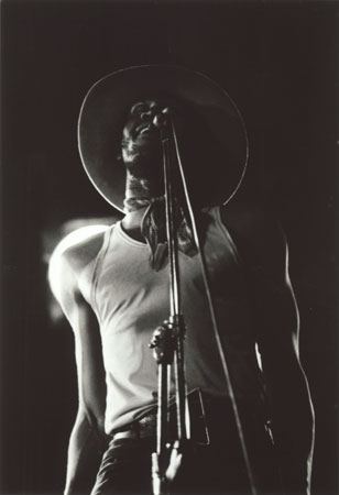
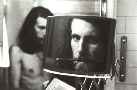 When he dispenses with the elaborate set up and just takes the shot, however, he can be convincing. His performance portraits are pure but not corny.
Nash, Taj Mahal at the Mariposa Folk Festival, Centre Island, Toronto, 1970
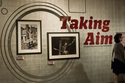
 Nash also has the rare ability to look beyond his own practice, which is why he's an excellent choice to curate a survey of rock 'n' roll photographs at the Experience Music Project in Seattle, titled, Taking Aim. There are 96 photos from 40 photographers. The vast majority are black and white, and the majority feature musicians from Nash's era. (His view is wide but not unlimited.) All but a few were printed by Nash Editions, which means, they're crisp.
These photos track Nash's story: where he started (looking up to Buddy Holly), his high points (when he knew everybody), and his appreciation of what came after (less of this). EMP says the show will travel. Great. Without knowing where, I can confidently predict it will look better there. As Frank Gehry carefully explained to the press at EMP's opening, he designed the exterior only.
The inside is a techie-music-science fiction curio shop. Cluttered and cramped, it has one decent performance space but nothing that comes close to adequate for looking at art. Imagine an exhibit inside a Radio Shack with the batteries missing, and you're there.
Other issues that might cause rancor: Not only are the 1960s overrepresented, so are white males, both in front of the camera and behind it.
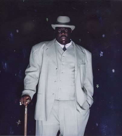
 What this show has going for it is the veracity of its inclusions, from portraits to performance shots and casuals snapped when the artists were taking a break, letting off steam or presuming (wrongly) that they were alone. Some of the photographers rate in the art world (Nash, Annie Leibovitz, Richard Avedon, Charles Peterson, Alice Wheeler, Mick Rock and Dennis Hopper). Most are working stiffs, on the scene and elbows out. The shots they took are amazing.
Barron Claiborne, Notorious B.I.G. New York, New York, 2003
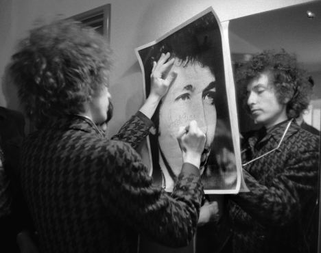
 Barry Feinstein, Bob Dylan, 1966 Paris (He's signing "God Bless" as Feinstein turned him into his own personal trinity.)
 Two from Seattle:
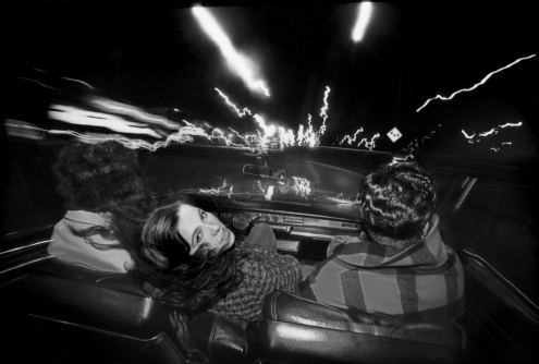
Alice Wheeler, Neko Case and Her Boyfriends, Tacoma, Washington, 2000
 Charles Peterson, Crowd with body surfers during Mudhoney's set at the KNDD Endfest, Kitsap County, Washington, 1991
 At EMP through May 23. The catalog is worth having.
  Related:
 Other news:
Just what is it that makes today's art bloggers so different, so appealing? (image via)
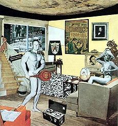 Our tact, of course. ANABA art blogger Martin Bromirski offered a choice example of blogger good manners in his attack on Jerry Saltz, calling him an undead zombie for repeating himself.
 Saltz responded the way class acts do when at fault, here. Yes, Saltz recycled a few comments and/or phrases. Just how big is this fault? Grand Canyon or sidewalk? In essence, he plagiarized from himself. Wholesale reintroductions of past bon mots disguised as fresh insights are a problem, but that's not what Saltz did. It was a comment here, a phrase there. I'd like to meet the art critic who has never done something similar. When I look in the mirror, that person does not look back at me.
(Third story with zombies in it, Dawn of the Literary Mash-up from Escape Into Life.)
Jaron Lanier on why writing for the Web makes you poor, here. (Read it and weep, former newspaper staffers.)
Second link from Chicago Art Magazine, The Rebel Sell: Why Culture Can't Be Jammed.
Roberta Smith explores the currently high level of testosterone in art, titled, Swagger and Sideburns: Bad Boys in Galleries. Smith is in excellent form these days. Also notable is her Post-Minimal to the Max. Lead from the latter story follows:
TO paraphrase Jerry Lee Lewis, there is a whole lot of art making going on right now. All different kinds. But you'd hardly know it from the contemporary art that New York's major museums have been serving up lately, and particularly this season.
The current exhibition of Gabriel Orozco at the Museum of Modern Art along with the recent ones of Roni Horn at the Whitney Museum and of Urs Fischer at the New Museum have generated a lot of comment pro and con. So has the Tino Sehgal performance exhibition now on view in an otherwise emptied-out Guggenheim rotunda. But regardless of what you think about these artists individually, their shows share a visual austerity and coolness of temperature that are dispiritingly one-note. After encountering so many bare walls and open spaces, after examining so many amalgams of photography, altered objects, seductive materials and Conceptual puzzles awaiting deciphering, I started to feel as if it were all part of a big-box chain featuring only one brand.
Geoff Edgers profiles the late great director of the Rose Museum, Michael Rush. (I didn't know he'd been an actor on Law and Order and Spencer: For Hire. No wonder he was comfortable in front of the cameras.) Real Clear Arts expands on related themes.
Rebecca Brown, gorgeous prose stylist, sings a love song to failure in The Stranger, here.
Bad news: The Department of Transportation Security plans to crack down on those who ship art by plane. It opens up the possibility that "airline employees could open carefully crated works of art to search them the way checked baggage is sometimes searched now, poking around Picassos instead of sweaters and socks."
Usually, however, art made by any one person changes over time. New attractions and repulsions play a role, sometimes known as the question of influences. If critics tend to make the issue sound straightforward, artists provide a corrective.
Robert Gober
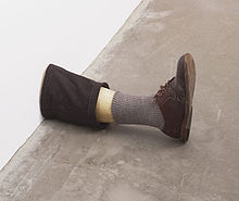 The point of this post is the first quote from Gober, below. I could have posted it by itself, but I succumbed to the temptation to window dress.
 Robert Gober, via
Whenever I give a talk about my work I am invariably asked who my influences are. Not what my influences are, but who. As if the gutter, misunderstandings, memories, sex, dreams, and books matter less than forebears do. After all, in terms of influences, it is as much the guy who mugged me on Tenth Street, or my beloved dog who passed away much too early, as it was Giotto or Diane Arbus.
Giotto, Arbus or Magritte.
For an artist of Gober's generation, growing up in the 1960s and 1970s, Magritte was an inescapable presence, visible everywhere on posters and album covers as well as museum walls. Gober's original ambition was to be a painter rather than a sculptor. "In high school," he recalls, "I wandered into the Yale Art Gallery. I remember looking at my first Magritte painting--the one of a man in a bowler hat. I thought, 'I could do that.'" Years later, when he was preparing an installation for a 1991 exhibition at the Jeu de Paume, in Paris, he remembered Magritte's 1959 painting State of Grace, which depicts a cigar at the same scale as a bicycle. The centerpiece of his installation became a sculpture of a giant cigar, eight feet long. More recently, when Gober was invited to organize an exhibition in Houston at the Menil Collection by combining his own works with objects from the collection, he included three pictures by Magritte. (more)Or Duchamp.
Beginning in 1982, Gober executed a series of sinks that became his first "trademark" images. These look as if he might have bought them at a plumbing supply store, much like the one where Marcel Duchamp bought the urinal for his 1917 readymade Fountain. But in fact Gober's sinks are sculptures, made from plaster over lathing and painted with enamel to simulate the look of porcelain.
In some cases he has altered the shapes of the sinks, but even where they look perfectly "normal" there is something unsettling about them, beginning with the fact that they have no faucets or pipes attached. They are conspicuously nonfunctional in a way that makes us think twice (or three times) about everything they might recall or suggest. (more)
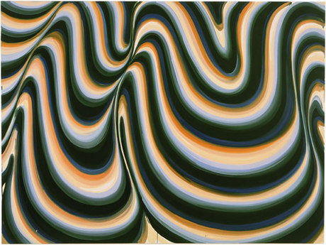
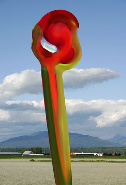
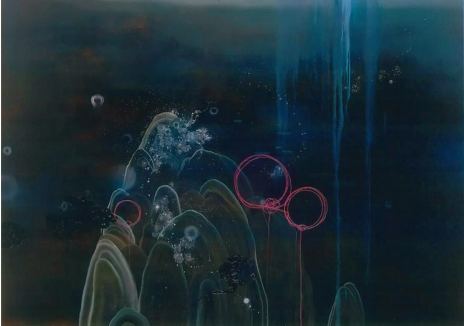
They're following now. These artists favor curved over straight lines, rebounds over splats. They seek the painterly sweet spot, a place where the ball bounces without bothering to articulate a ball. They infuse into their colored grounds the comic spirit of up and at 'em.
Karin Davie (her Web site here)
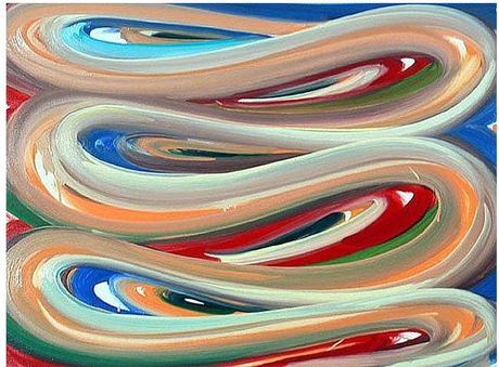 Davie is so crucial I'm going to reproduce her twice. If her paintings were particle physicists, they'd pop gum at the podium.
 Claude Zervas - comic abstraction imitating a flower.
 Darren Waterston - sci-fi spiritualism meets Chinese landscape painting merged with George Herriman to beget gorgeous goo.
 Susan Dory: Comparing her to mid-20th century Color Field figure such as Morris Louis is useful. His transparent, overlapping mounds of color are art in art about art. Hers, less transparent, have roots in thought bubbles, Internet tubes and tunnels made by moles planning to surface in Elmer Fudd's garden.
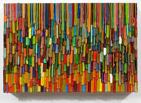
 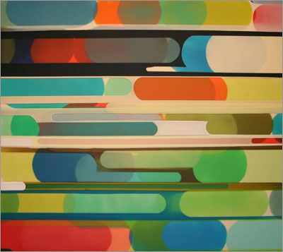 Omar Chacon - It's raining in Toon Town
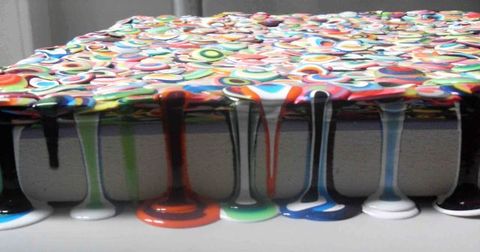
 More Chacon, detail:
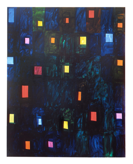
 Mary Heilmann - life in a comic strip highrise
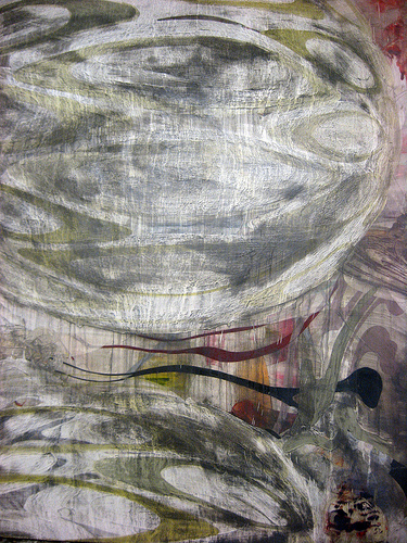
 Harold Hollingsworth - When comic weather takes a dark turn, forked tongues serve as rain.
 Aaron Bagley - up, up and away
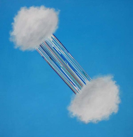
It's an interconnected and anatomically defined brain system that preferentially activates when individuals focus on internal tasks such as daydreaming, envisioning the future, retrieving memories, and gauging others' perspectives....Its subsystems include part of the medial temporal lobe for memory, part of the medial prefrontal cortex for mental simulations, and the posterior cingulate cortex for integration, along with the adjacent precuneus and the medial, lateral and inferior parietal cortex....The default network has been hypothesized to generate spontaneous thoughts during mind-wandering and believed to be an essential component of creativity. (more)
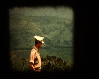
Vancouver
B.C.'s Isabelle
Pauwels is the first winner of the Brink
Award. Administered by the Henry Gallery, the Brink was conceived and funded by Seattle collectors/art
patrons
John and Shari Behnke. It's intended to offer encouragement to a Northwest artist who might be poised at the beginning of a substantial career. Besides the honor of it all, winners get $12,5000 and a solo exhibition at the Henry. Pauwels' installation is now on view and titled, Incredibly, unbelievably/ The complete ordered field.
The title itself is unbelievable. If hers is an ordered field, chaos has competition. Her work appears tossed off - notebook entries, not novels. Instead of dipping into her subject matter - reality TV, talk shows, candid snapshots, family films and cultural documentaries - she lets it flow around her. Should she fashion a figure, it will have no spine. The viewer who is looking for a narrative thread can find it, but probably not without cue cards, otherwise known as background information.
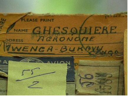
Pauwels:
My work attempts to interrupt the audience's familiar reading of a genre in order to alter its expectations of what content should do, and what its reaction should be.
Born in Belgium herself, Pauwels' grandparents were part of the last generation of that country's colonials.
A little history:
Belgium itself had only been independent since 1830, prior to that it was part of the United Kingdom of the Netherlands. By the time independent Belgium might have been in a position to consider an overseas empire, major imperial powers already had the most economically promising territories for colonisation within their spheres of influence. Leopold II tried to interest his government in establishing colonies but it lacked the resources to develop the candidate territories and turned down his plans. Leopold II exploited the Congo for its natural rubber which was starting to become a valuable commodity. His regime in the Congo operated as a forced labour colony, with murder and mutilation as punishment for villagers who did not collect and supply the rubber quota they were given. It is estimated that millions of Congolese died during this time, although many of these could be attributed to the introduction of new diseases. (more)
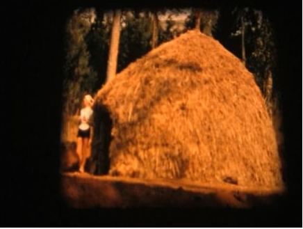
History, of course, is that nightmare from which Stephen Dedalus is unable to awake. Joseph Beuys confronted his Nazi past with personal myth. Unlike Beuys, Pauwels was not a direct participant in a time notable for its horror. Neither were her grandparents. They were post Leopold II - paternalists, not murderers. They existed in a still poisonous aftermath, and she was born long after that. If she doesn't bring it up her connection to the colonial past, nobody else will.
Her touch is so light, her subject is barely there. The gallery includes notes and fragments of notes, a grass hut with a flickering film inside, another stuttering film and other detritus. She can be unexpectedly funny. A series of postcards framed blank-side out feature only a line drawn as a cross, meant to separate the space between address and message. These crosses become a series of backs - victims of colonialism lined up and disappeared on postcards no one sent.
Salman
Rushdie, from The Moor's Last Sigh:
The trouble with the English is their history happened overseas, so they don't know what it means.
My first encounter with this installation triggered an instinctive and stubborn hostility. Her work struck me as glib, coded in-group and embedded with a vast sense of its own entitled worth (how blind and ignorant be our detractors). By the second and third visit, however, I began to lose faith in my reaction. I relaxed a little inside the mental default mode of her fragile vessel.
Instead of purposefully seeking connections, I disengaged, slipping out of gear to see where viewer passivity might get me. In the end I got a kind of acceptance, an admiration for her truth to materials. She promised no greater revelations. How close can we get to her grandparents? How close can we get to our own? For most of us, there's nothing left besides romanticized anecdotes, a few photos, a letter or two; maybe a suit, a hat or a wedding ring. If her film stutters in its projection, so does memory's.
Ezra Pound, from Hugh Selwyn Mauberly.
These fought, in any case,
and some believing, pro domo, in any case ..
Some quick to arm,
some for adventure,
some from fear of weakness,
some from fear of censure,
some for love of slaughter, in imagination,
learning later ...
some in fear, learning love of slaughter;
Died some pro patria, non dulce non et decor" ..
walked eye-deep in hell
believing in old men's lies, then unbelieving
came home, home to a lie,
home to many deceits,
home to old lies and new infamy;
usury age-old and age-thick
and liars in public places.
Daring as never before, wastage as never before.
Young blood and high blood
Fair cheeks, and fine bodies;
fortitude as never before
frankness as never before,
disillusions as never told in the old days,
hysterias, trench confessions,
laughter out of dead bellies.
V.
There died a myriad,
And of the best, among them,
For an old bitch gone in the teeth,
For a botched civilization.
Back to the Brink Award: The selection committee included Henry director
Sylvia Wolf and
curators Elizabeth Brown and Sara
Krajewski; Seattle artist Joe Park; Portland artist Harrell Fletcher;
Vancouver's Contemporary Art Gallery director, Christina Ritchie; and
the Behnkes.
Pauwels continues through May 9.
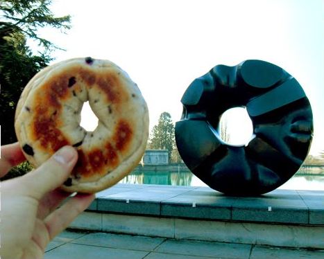
 Stefan Steins
Remember those photos you took of your friends pretending to be the wife and husband from American Gothic? Or the one where you imitated Edvard Munch's The Scream? Now we have a name and a website for that - it's called art bombing and you can post them at And Now That's Art.Below, a person with a bagel next to Isamu Noguchi's Black Sun, 1969, in front of the Seattle Asian Art Museum.
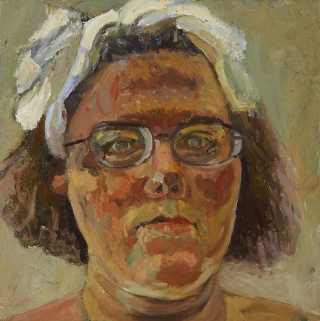
1. Assert it. (Carol Adelman, Self-Portrait)
 2. Remember it. (Virginia Ivanicki)
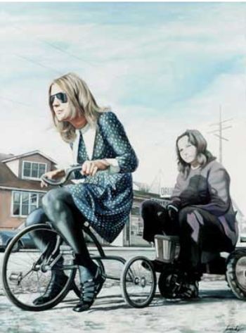 3. Threaten it. (Jennifer Campbell)
 4. Locate it (Anne Mathern)
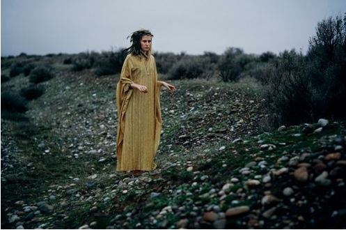 5. Acknowledge it. (Jennifer Zwick)
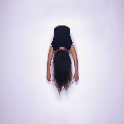
Mandy Greer crocheted the weedy banks of a urban river and floated them high in the trees. Filtered through forest light, her webbing became a kind of stained glass even as insects were eating it away.
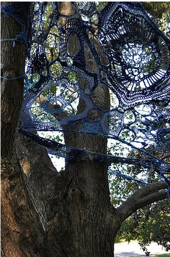 From last summer's performance, Mater Matrix Mother and Medium, Greer constructed her current exhibit of performance artifacts at Ohge Ltd. Gallery, obscurely titled Zuster Sweostor Systir, it's a crocheted installation that overwhelms a dresser's dummy and runs up a wall, along with photos, a documentary film, paper quilts and sculptures made of sewn leaves.
It's hard to collaborate with nature when nature has the home field advantage, out in the stage-set semi-wilds of a park, and even harder to assemble fragments from that engagement into an exhibit inside a small gallery.
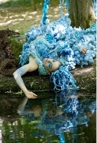 Greer breezed through both challenges. Born too late to participate in the back-to-the-land communes that sprang up across Europe and the Americas in the late 1960s, Greer embodies the spirit of that time as an aesthetic but not just an aesthetic. She's a mother-earth hippie, the sort of person who has become a sitcom figure of fun. The ideas her work espouses cue the laugh track in our heads, but her work shakes off cynical reactions like a dog bounding back with a stick shakes off the sea.
  Nature was not her only collaborator. She made the film that features performances of Zoe Scofield and Morgan Henderson with Ian Lucero; the photos with Jennifer Zwick (performance photos by Juniper Shuey), and sculptures with her husband Paul Margolis and her son Hazel.
Greer:
During my six weeks of residency at Camp Long in Seattle, spending long hours crocheting a fabricated river into the trees, I spent a great deal of time in quiet, face pressed to bark, watching ants travel, ducks tend to ducklings and watching small changes take place every day in my pond. A giant Barred Owl watched me, and it all felt very viscerally wild. But in between the quiet was the blast of horns from ships, a low hum of cars on the interstate and the weekly visit of the grounds keep with a leaf blower.Note: In the original draft, Miss Havisham was mistyped as Havishman.
This forest, like most in Seattle -- save for a few trees in Seward Park, has nothing to do with the deep mystery of the forest that was once here. It is fabricated, tended, groomed, minded, the old pond filled with a hose when it gets too low. An early photograph in the lodge shows the landscape barren, stripped of its organic past.
Zoe Scofield, on an early site visit, astutely observed how like a stage set it all was, and we intended to draw that out. The theatricality of the park is like that of a 18th-century folly, a ruin, at once referencing a romantic vision of nature as well as the human longing to experience something more sublime. I felt something of that sublime, following that great owl that watched me midday, I went off trail until I stood below it. And when its head glided around so that it could glare at me, warn me, I felt a jolt of instinct or electricity.
In the fabricated, tiny forests we tend, there is still buried the pull the human animal has always felt, to go back. As the summer came to ending, and I cut down the river, folded it up, I came back to my site over and over again as the forest turned to fall. With my son, I sifted for skeletal leaves on my hands and knees, just as we had sifted through dead leaves at the bottom of the pond looking for salamander egg sacks, finding the perfect lacy forms like Scandinavian lace discarded after a flood. I wanted to sew the forest together into a blanket, organize it all, to prepare for the winter, the leaves the same color as my hair, everything going red to brown.
We found nurse logs feeding Turkey Tail fungus like crocheted ruffles, and orange mushrooms under which we buried a mouse. On our hands and knees, it wasn't urban recreation, but fairy tale. I collected my hair and Hazel's hair, had it spun into yarn, and we each took on our roles in a landscape both out of our reach and right there with us, as organic as it is artificial.
Jasper Johns:
Publicly a work becomes not just intention, but the way it is used. If an artist makes something - or if you make chewing gum and everybody ends up using it as glue, whoever made it is given the responsibility of making glue, even if what he really intends is chewing gum. You can't control that kind of thing. (more)Gum or glue: Given that any number of elements can be used to define, including but not limited to peer association, psychological projection, philosophical inquiry and product similarity at a particular time and place, those elements can give way to others, heretofore not thought of, that could help artists emerge from whatever hole they've been forced into.
The words that surround an artist's practice are a key, a code, a misdirection or a muffling device. What's true of criticism is true of the labels employed in criticism as well as marketing. What matters most? Location, location, location.
I'm thinking of Ken Johnson's review of the Outsider Art Fair in New York. Who is or isn't an outsider is hard to define, which means the category is wide open. An artist going nowhere fast might get there faster should he or she be placed in the outsider context. Getting there is not the point for outsider artists. Because they are never out of date, they need no destination. Because they don't register in the play of current aesthetics, they are better served in the outsider's ever-present, never-changing now.
For others, a less radical change in conceptual geography might do the trick.
Why can't, for instance, Dale Chihuly's more madcap ventures be grouped thematically with the exuberantly lustful? Critics are only as good as their sales pitch. Assume for a moment that a critic exists who could close this deal, who could slip Chihuly into a lineup with the likes of Marilyn Minter and Ben Weiner, just for starters. That critic could give glass art's main man a way for a wider audience to think about him that is not what it thinks already.
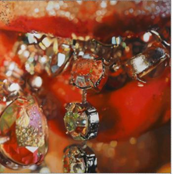
Minter, Chewy (image via)
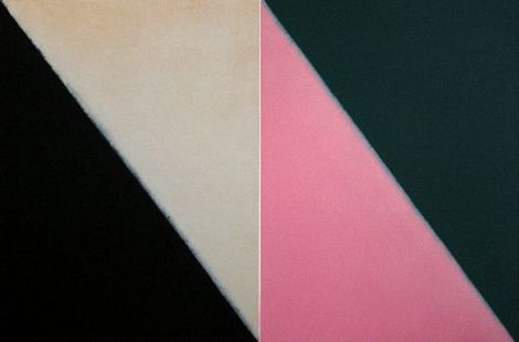
 Weiner - The Crimes of Paris (Pink Hair Gel), 2008, oil on canvas, 64 x 197 inches
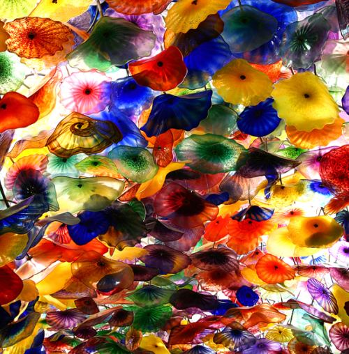
 Chihuly, detail. (image via) If he had called the piece partially reproduced below a homage to pink hair gel or even an explosion in a shingle factory, would the change his narrative be enough to bump him onto a new track?
Simply put: No one in the current art world championed local and Northwest artists as passionately and consistently as Russo, whose 23 year-old gallery is a de facto museum for regional artists, past and present: Lucinda Parker, Jay Backstrand, Fay Jones, and the estates of Louis Bunce, Robert Colescott, Carl Morris and her uncle, Michele Russo, among others, are represented by the Russo business.Row noted that Martha Lee, manager of the Laura Russo Gallery, will continue it. Its strengths have always been its painters. Highlights include:
But Russo was more than the seemingly shy yet quietly tough art dealer on Northwest 21st Avenue. She was an embodiment of a specific mid-century lineage whose spirit and heritage continues but whose active champions are now few.
"We will never see this kind of lifelong commitment again," says Bruce Guenther, a longtime Russo friend and chief curator at the Portland Art Museum. "Laura was literally raised in this town. Her knowledge of the history of the cultural scene here, and her connections -- social and personal -- with the artists of this city can't be matched." (more)
Betty Merken, Torque, monotype, 2009
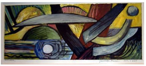
 Lucinda Parker, Outlook, December 1, 2007 gouache on paper 2007
 Fay Jones, Forget, Forgotten, acrylic/paper, 2009
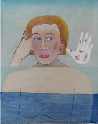 Gregory Grenon Me and My Ethereal Dress oil on plexiglas 2008
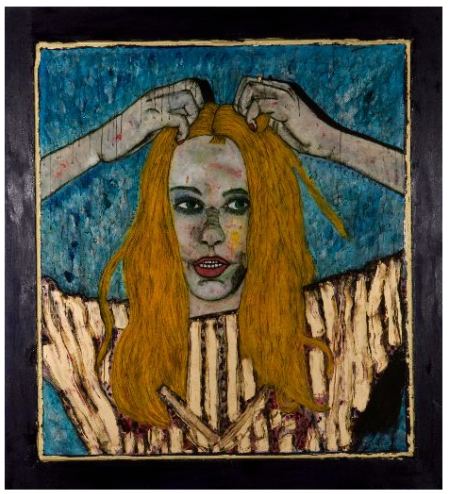 Michael Brophy, Silence 2, oil/canvas 2009
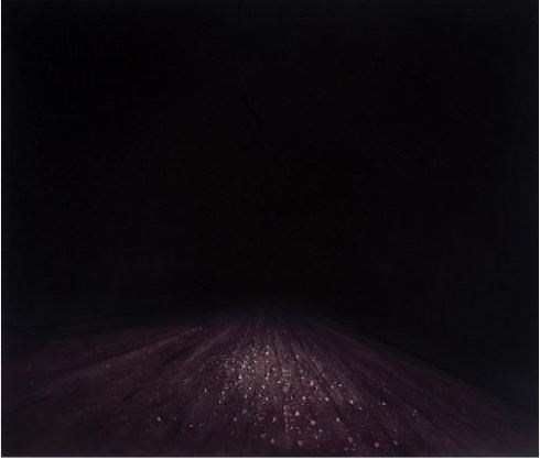 Francis Celentano Cirque Variation 11 acrylic on canvas 2006
 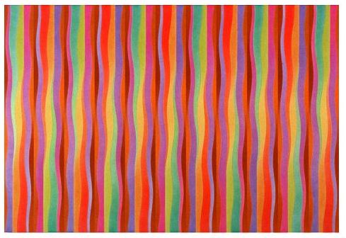 Jan Reaves Dutchman's Britches mixed media on flax paper 2009
That's why Picasso: Masterpieces from the Musee National Picasso Paris is a big deal. It opens in October at SAM with 75 paintings and sculptures chosen to document all phases of his career, plus a survey of prints and photographs.
Portrait of Dora Maar, 1937 Oil on canvas, 92 x 65 cm Pablo Picasso, Spanish, worked in France, 1881-1973 Musée National Picasso, Paris © 2010 Estate of Pablo Picasso / Artists Rights Society (ARS), New York. Photo Credit: Jean-Gilles Berizzi / Réunion des Musées Nationaux / Art Resource, New York.
 For more information, go here.
Try not to let your lust to denigrate Valentine's Day (bitter, much?) affect your art judgment.What? I object. To prove my heart is far from bitter, I offer two Valentine's Day tributes.
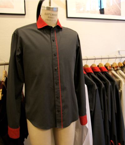
First, from an email by Michael Cepress, artist and men's clothing designer.
Just in time for your favorite or most hated holiday, we've designed a shirt for a special Sunday. Want to impress your sweetie with something new in your closet? Or would you rather settle in for a night alone with your favorite bottle? Either way, add a little style to your date!
The quick back story: At my very first Little Richard concert in 2000, I met the man himself as he took the stage in black and red sequined silk pajamas. The moment stuck with me, and I've translated spirit of that look into this Valentines Day design. We're calling this shirt "King Richard." ON SALE - 25% OFF THIS SATURDAY ONLY - FEB 13, 2010!
he's happy, she's not
Michael Drebert beat them to it. Last month he lit a cigarette in Vancouver and drove south to Seattle, firing one cigarette from the butt of the previous until he reached Western Bridge, where he offered to light others' cigarettes from his. Hanging in a gallery was his hand-drawn poster of the plan, which he calls Ember.
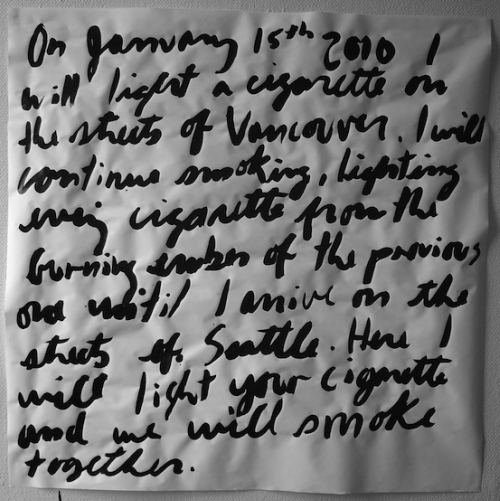 Drebert was the first artist invited by Western Bridge to participate in its new seires titled New Year. He's one of 13 commissioned to do whatever they want in the upstairs gallery, within the limitations of the space, time and budget. Western Bridge isn't kidding about the limitations of time. Each show is two weeks, open Thursdays to Saturdays. That's a 6-day run.
 Jen Graves called Drebert's performance and drawing "boundless, funny and sweet." Sweet? Really? How many dead smokers does she know? How many with emphysema, trying to breathe through the wet tissue that used to be their lungs?
Yes, this down-at-the-heels version of the Vancouver Olympic Torch is wry commentary on a winter show that lacks snow. It's wry commentary on the Olympics themselves, and how sponsoring it affects (erases) a city's down and out. And yes, it's chummy, especially for those who ignore the chill buried inside it. I know at least one former smoker who relapsed in order to participate. (Talk about hunger for community.) For those who aren't even trying to quit, Drebert offered a moment of solidarity with a bad choice, if it is a choice for the hardcore addicted. Show them a film of people smoking through a hole in their throats after cancer surgery. With trembling fingers, the addicts in the audience will light their next one.
Art has no obligation to be good for you. No doubt Drebert aced his own assignment, but calling that assignment "boundless, funny and sweet" is at the very least insufficient. Drebert provided thin ice. To pretend all was well was to fall through it.
Currently on view is Matt Sheridan Smith's Flotsam/Jetsam, through Feb. 20.
 Its colors were
precise, and its leaves so crisply constructed they looked manufactured.
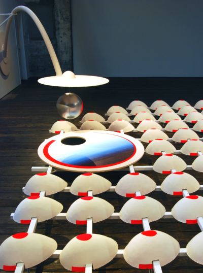
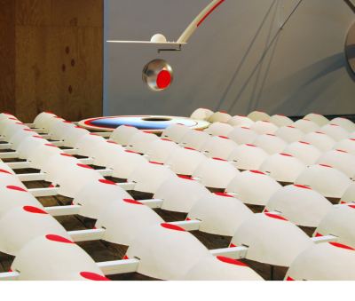
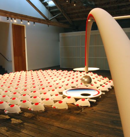
FLOATING MECHANISM (nightshade) is the result, an installation
at Suyama Space
curated by Beth Sellars.
 Fitch has a
longstanding interest in
the theme of manufactured gardens, specifically topiary, using steel and
AstroTurf for the
purpose.
Her gardens led to figurative abstractions: breasts, hips and hairdos
made from welded metal armatures and Styrofoam covered in velvety
flocking.
Fitch has a
longstanding interest in
the theme of manufactured gardens, specifically topiary, using steel and
AstroTurf for the
purpose.
Her gardens led to figurative abstractions: breasts, hips and hairdos
made from welded metal armatures and Styrofoam covered in velvety
flocking.She engages art history as if the artists in it were in the room, having a conversation with her.
Umberto Boccioni Unique Forms of Continuity in Space 1913 (cast 1931). Bronze, 43 7/8" x 34 7/8" x 15 3/4" (111.2 x 88.5 x 40 cm). Image via Museum of Modern Art
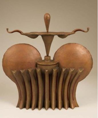
 MANTEL PIECE #2
(pleated), 2007 (Patinated bronze with oil paint 21" x
20" x 6" Ed/3) Her version has a touch of Art Deco that tones down
Futurism's inherent hysteria.
 For FM (nightshade),
she engaged the landscape as a floating world, following Hiroshige.
Instead of following him into anything close to a literal terrain, she
took her tribute into the comics. Is there another artist who turns the
jaunty emblems of comic strips into abstraction without losing their
wisecracking verve?
 The lens-like object on its cantilevered armature hangs over a pool, seeing itself. Hanging over the floor is a production line of blooms, quite breast-like. What is the fate of a breast in the age of mechanical reproduction? Each is perfect. Each one rises, dotted with red at its tip. None lies flat or sags on its side. FM (nightshade) is a hat tip to Fitch's fellow makers, those who, like her, fabricate fantasies from the world's raw material.
Through April 23.
Partly because Dave Hickey and Christopher Knight believe that non-major metropolises do not offer enough room for conflict, they think art can't thrive there.
Knight:
In an October lecture at the Smithsonian, critic Dave Hickey noted that, in the Internet's vast territory, niches are the equivalent of villages. And art does poorly in the homogenized, provincial ether of a village. To thrive art needs cities, where cosmopolitan diversity, conflict and sheer accident are the norm. (more)There are other, more genial models for significant arts journalism. Calvin Tomkins, for one. An art critic once told him that if he weren't willing to shoot, he needed to get off the firing range. If the art world were nothing but a firing range, nobody would thrive there.
Back to Bluhm.
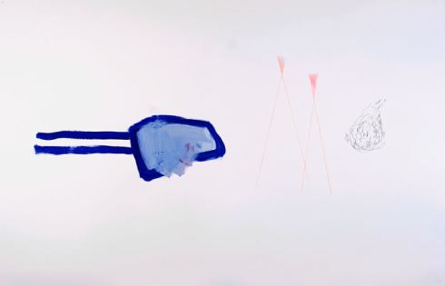
I'd Never Seen Your Kind Before, Your Every Word Was A Poem 26" x 40", Mixed media on paper, 2007
 She is one of ten new
artists recently selected to join the Seattle art collective known as Soil. Story on Joey Veltkamp's Best
Of.
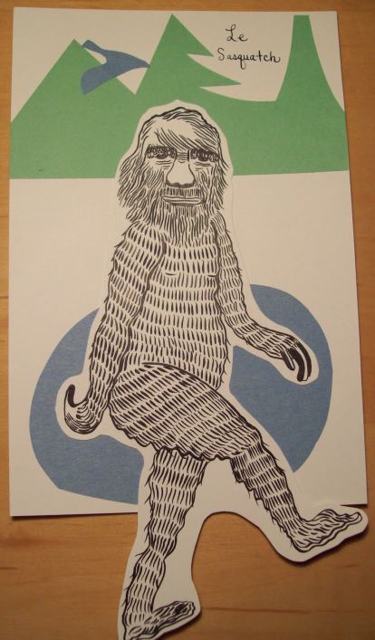
Ghada Amer's happy-ever-after jumpsuits are just right for Valentine's Day. Write it often enough, it will sound like the truth: Ken Loves Barbie. Barbie Loves Ken.
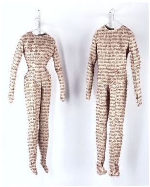
Jarbas Lopes
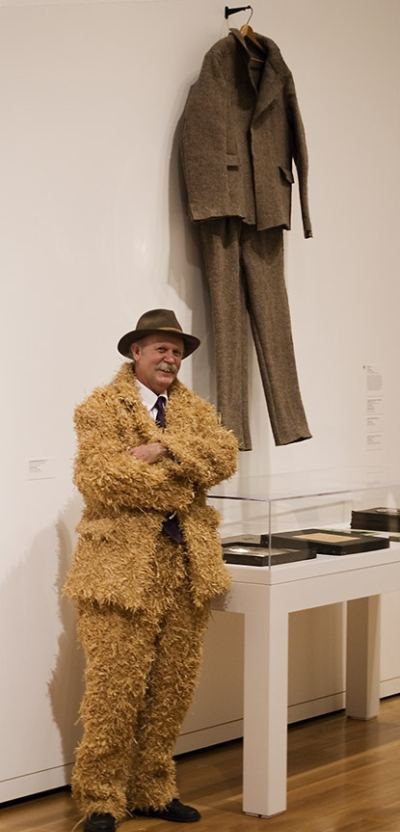
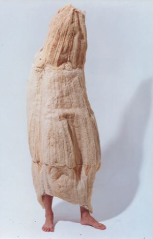 Carl Smool, a Joseph-Beuys suit worn by Michael McCafferty. (Beuys felt suit in the rear, collection, Seattle Art Museum. Photo, Robert Wade)
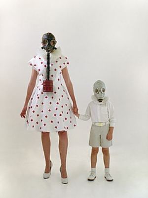
 Tomiko Jones, from The Bunny Chronicles
 Alice Wheeler, Self-Portrait as the Wicked Witch
 Zack Bent, Clean Break
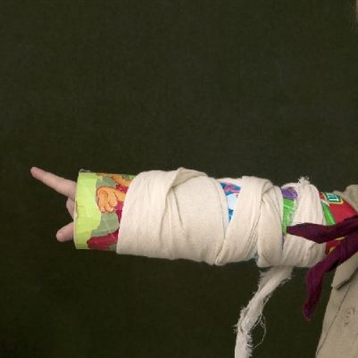 Elizabeth Jameson
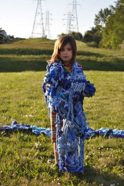
 Mandy Greer, Hazel River
 Lastly, Michael Cepress, crossover artist. Anna Wintour might well call him.
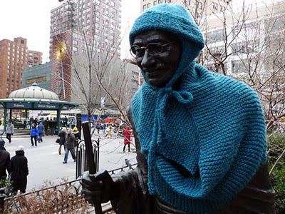
Gandhi, braced for winter, via
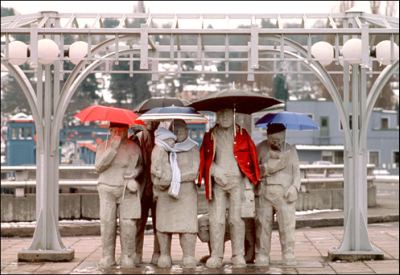
 Waiting for the Interurban, image via
My staff and I called a meeting of them on January 2nd last year and explained our feeling that we were all in for a tough year. We related our experience at ArtMiami 2008, just a month earlier, and the collector paralysis we saw there. My response to this was to set our artists free from their contractual obligations to send all local sales through the gallery. I advised them to sell work as they could to family members, friends, the postman, their plumber, whoever they could sell work to without any commissions coming back to the gallery. Still, though a few artists took me up on that permission, others sent sales back through the gallery.Kucera has a great Web site, which wouldn't be true had he built it or insisted on running it. He pays for it. That suggests he appreciates what online can do for him. Left to his own devices, however, he's hardly in the forefront. Here's what he said about arts coverage in Seattle:
We saw the press and media coverage for the arts diminish. With the demise of the Seattle Post-Intelligencer, we lost print reviews by our most active art critic, Regina Hackett. Her blog, Another Bouncing Ball, can now be found on ArtsJournal.com. The Seattle Times retired its art critic, Sheila Farr. The Seattle Weekly hasn't made a commitment to the visual arts in years. Jen Graves, art critic for the Seattle Stranger is now the last critic standing and still writing regularly for print publication. Her writing also appears on The Stranger's Slog.Only because Kucera values writing that is printed on paper above all other kinds can he say coverage for the arts has diminished. Instead, it has never been more robust. Why?
The art blogs. (Go to my blog, look right just below the scroll of recent comments for a list.) Despite what he wrote, Kucera knows this. He mentioned them, but he composed his first draft in his email account, failed to save and accidentally pushed delete. His second draft, written in haste but admirable anyway, omitted these tributes only by accident.
And the other reason for the currently robust critical scene is not online but is printed in newsletter form - Matthew Offenbacher's La Norda Especialo, a zine of artists' writing. (Althpough not online, it can be downloaded as a pdf. ) Like Kucera, Offenbacher values print on paper, not quite ready to believe that what's online only is the same real deal.
There are other lines he is
Other news:
Blake Gopnik on Brian Junger. Not just no, but hell no. Just because Junger's work has wide cultural resonance doesn't mean it lacks a primary connection with the Native North American experience.
Christopher Knight on LA City Council arts funds cuts, promised to be deep. Ditto government cuts in B.C., and ditto in Seattle at 4Culture.
The problem of art plagiarism, again. I'd say in this case, photographer Alex Brown has good reason to complain.
By planting clues to their location on facebook and Twitter, Patrick Skoff gives away his paintings to get attention, making his relational aesthetics the point and his non-too-engaging paintings a byproduct. (Chicago Tribune report here, via AJ) Donald Young is quoted in this story. Does the Trib review Young's shows? Rarely. Instead, it quotes him on an art party trick.
Finally, Tyler Green is unable to write the word dickish, even in a quote. He writes it, d*ckish. How remarkably arch of him. Did George Carlin live in vain? (On the subject of Green's post, Jerry Saltz vs. John Yau, I side with Saltz. Yau's slam that Jeff Koons appeals to rich people is boring, as well as a gross misunderstanding of the history of art.)
Back to Carlin. Tyler, this one's for you.
1. Personal attacks. Try to refrain.
2. Unsupportable ranting. (You're boring and/or scaring me.)
3. Non Sequiturs. Comments that see the light of day tend to be about the subject at hand. If yours is wildly entertaining, however, I might post it anyway. I'd like to come up with a way for people to introduce topics rather than respond to the ones I raise, but I'm not there yet.
4. Falsehoods. As Senator Al Franken (D-MN) likes to say, everybody is entitled to his own opinions but not his own facts. I will publish comments that contain assertions of fact I know to be errors and then reply to them, but not if the error is too ugly to air.
5. Incoherence. (In not posting, I'm doing you a favor.)
Thanks to everyone who reads the blog and everyone who comments, even those whose comments I alone see. They are evidence of engagement, which I appreciate.
In response to other comments on this post, Dan Webb wrote:
'To say that painting is dead, in the faintly apocalyptic cadences of deconstruction, is not so much to contest modernism as to accept its progressive and developmental narrative, and to say in effect that since that narrative is over with, there is nothing for painting to be-as if, unless it fell under the narrative, it could not really exist.'--Arthur Danto In this era without a name we live in, free of modernism, or any ism at all for at least a generation, artists have the unprecedented freedom to make art in anyway shape or form we choose to make it. The result of that freedom means that painting is every bit as legit a path as anything else, unless the goal is to be fashionable, which is the replacement part for the avant-garde in our era.
After 1978, and probably well before then, there was no longer a dominant narrative in art. The ending of Modernism and a Greenbergian view of eliminating things as irrelevant because they didn't fit into that narrative swept painting almost immediately back into the discussion (neo-expressionism, neo geo, etc.). It kind of makes me think I should really take up painting.
Photo, Michael Falco, New York Times, featuring Bill Traylor.
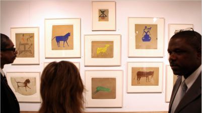 Outside is the place
for the driven end of folk art. It has its stars, but they remain as
isolated from the mainstream as they are from casual whittlers and
house-proud quilters. Mainstream artists account for their time and
place. Outsiders don't have to. For them, the action is inside their
heads. (Maybe it should be called Insider art.) Bill
Traylor's paintings would have been equally at home and not at home
in any time in the last 1,000 years. That's a freedom no other kind of
art achieves.
Ryan Henry Ward wants to paint
(Photo, Mike Kane, Seattle PI)
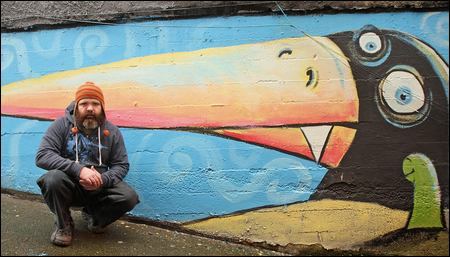 One mural would be tolerable. Even two. The number he has done is an outrage. If I wanted to live inside a sentimental children's book, I'd be well on my way to starkers, and I'd ask him to paint the walls of my padded cell. Ward is whimsical. A sense of whimsy is fine in toddlers, but by the age of reason, children are ready to move on to more substantial fare.
 Coverage of his project is uniformly positive from what's left of the press. (Examples here.) As Ward spreads his message of brain-dead cheer across the city, will no one speak up for those of us who prefer blank walls and/or those graced with a collage of graffiti? Let Seattle be a city, and let Ward paint the inside of Barney's rumpus room.
Many of us who love music share a vague idea that audiences should be open to new things, and that they should be convinced to give them a try. But is this true? I've observed before that classical music, particularly opera companies and orchestras, are unusual in that they repeatedly try to force things on its audience that its audience doesn't necessarily want. Someone who comes to the movie theater to see "Avatar" is not necessarily going to be thrilled if I show him "Pan's Labyrinth" instead, even if I'm convinced that he would really love it if only he would watch it. And yet this is what's going on in classical music, all the time: audiences are being asked to pay lots of money in order to be taken out of their comfort zone. (more)I thought of Midgette while looking at Isabelle Pauwels' exhibit at the Henry Gallery titled, Incredibly, unbelievably/The complete ordered field. There is so little pleasure to be had from its stuttering films, dry photographs and fragmentary collages, the idea must be that viewing them is good for the audience.
 I also thought of David Pagel's review of Diana Thater in the L.A. Times:
Making a movie about movie magic is not the same as making some of that magic. At the Santa Monica Museum of Art, "Diana Thater: Between Science and Magic" goes so far out of its way to extinguish the magic that you can't help but wonder why movie magic was brought up in the first place.
The answer is that Thater's brand of art is opposed to all forms of entertainment, which it sets itself apart from. (more)
I don't think the review is one of Pagel's best. Instead of being specific to Thater's work, it's a generalized complaint about art that appears to disdain anything that could be called entertainment. At Pauwels' show, however, I could see Pagel's point. Pauwels is Exhibit A in audience neglect. The onus is on the viewer to prove worthy of the artist's ragtag moments.
Should pleasing an audience be an artist's responsibility? Artists who worry about how their studio work will strike others don't get anything done. They repeat their greatest hits, if they have any. They temporize and shilly-shally. They lose their nerve and doubt their understanding of their own visual thread.
On the other hand, Pagel's problem with Thater and mine with Pauwels is the suspicion that the artist has confused the didactic with the challenging.
And yet, there is something there. I'm going to take a fresh look with none of the above on my mind. After that, review will follow.
The day I learned about art, I was just another kid skipping class in high school.Here's what he saw, flipping through a book on modern art:
Via
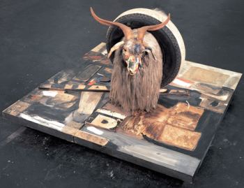 His reaction?
HAHA
Webb is a great carver in all materials by anyone's measure, but there are better. What makes him an essential artist is not the level of his skill, which is high, but his ability to use his skill to be (in Kafka's phrase), an ax for the frozen sea within us, what Rauschenberg did with a stuffed goat, tire and paint, using odds and ends as a floor.
Hiding out in the library stacks in high school, himself a maker, he realized there were makers who triumphed beyond literal depictions, and that the essence of art is exactly what he craved - freedom. Webb talks about his work tomorrow at noon in the gallery, free admission.
Samples of it include a pair of desks, with gum chewed by the artist. Hanging in threads, it looks suspiciously like paint thrown on the beard of a goat.


Allen foreshadowed the entire story through that chord. The chord is also the point for Justin R. Lytle, currently showing in the hallway at Cornish College of the Arts, not that the exhibit is anywhere on its Web site.
Lytle, Deviations
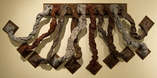 Trajectory
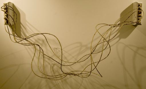 Lytle graduated from Cornish in 2009. He's off to a good start.
 On my recent road trip I got inspired by a huge FRESH CHERRIES sign in eastern Washington. The letters in the photo are just a mock-up, but I plan to make it real.
This is what happens when you take your house for a walk.
February 27th 2010, 6:00 pm - 11:00 pm 1723 S Lander Street Seattle WA 98144Open House : Nepo (A HUMOROUS APPROACH TO THE SERIOUS ART OF LIVING)
Please come curious and prepared to use you investigative skills. Expect a homespun, high-end affair: a visual experience perched on the threshold of spontaneous creative experience and perfected mastery. Among our auditory attractions will be Live Poetry Juke Box and The Purple Dots, a five piece band of eight-year-olds (band name is subject to change). Not Decent Docent will be available for those needing a little interpretative help.
Explicit views of women's pudenda have never been in short supply in New York City but one found them on 42nd St. (before Disney arrived), not in established art galleries. Inspired by Eve Ensler's Vagina Dialogues, Francis Naumann began collecting work for an exhibition and when it grew too large, enlisted David Nolan to join him; the exhibition, The Visible Vagina, continues at both galleries through March 20. The results include the entire range of responses one might expect from women to their own most singular parts, and respectful, appreciative study by men of the most mysterious parts of women. This is an important exhibition.What if this were a penis show? Would Kirsch approve only of "respectful, appreciative attention" from women artists? And would she indulge men who are in awe of their "own most singular parts"? The vagina is not the most mysterious part of a woman. That honor goes to the brain, as it does for men.
These exhibits might be swell, but surely not because their artists' treatment of the content is "respectful." Art cannot be judged on its manners, good or bad, or its attitudes.
Below, a watercolor on the theme by Seattle's Amanda Manitach from her blog, My Heroes Died of Syphilis. I like it not because I have a weakness for the genitalia of female syphilitics, but because it makes its own atmospheric world, both ruined and lovely.
An Aesthete's Lament noticed the floors in The King and I:
My family and I were watching Yul Brynner and Deborah Kerr in The King and I a few weeks ago and one aspect of the sets caught our mutual attention--the high-gloss floors. Jet black, pale blue, jade green, and shocking pink, King Rama IV's residence in Bangkok, the Grand Palace...was all about super reflective, boldly coloured floors and masses of airy chinoiserie. For one mad moment we discussed painting our wood floors similarly, then remember what hell was wrought when we coated them with shining white epoxy paint, and the feeling passed.Just as I suspected: An exposure to luxury goods can turn you into a shit. (Via AJ) For those who are confused, art is not a luxury good. Think Rolex, not Tim Rollins.
The mere exposure to luxury goods can have a corrosive effect on decision-making that pushes individuals to put their interests over the interests of others, according to a Harvard Business School study. (more)Best art blog lead, from Art Fag City:
If the Meet the Biennial Curators press breakfast is any indication -- and it never is -- this year's Whitney Biennial will be really great. (more)Best new online art magazine - This Is Tomorrow. For the images alone, it deserves a prize, but there are also excellent reviews with a global reach.
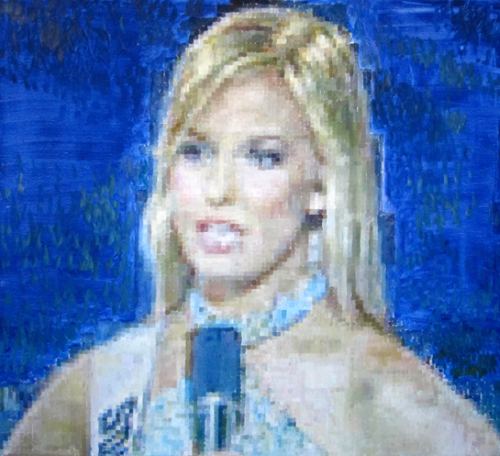 Detail:
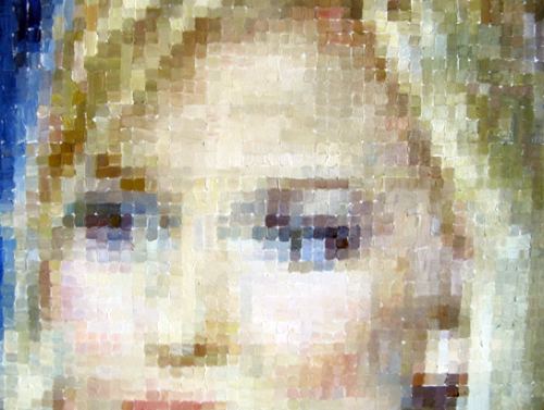 Pageant (oil on linen
40 x 36 inches) was part of Edwards' show at Flatcolor Gallery last month. I saw it on the last day and didn't intend to write about it, but it stayed with me.
 The rap against Edwards in Seattle is that he's all over the map. It's true. Then there's the fact of him. Below, the opening of a profile I wrote in 2006:
Jesse Edwards lives in a downtown studio that is packed with his paintings. They lean in stacks and protrude in piles. His bed is a sack on the floor, which is littered with fast food packaging, art books and objects he uses for his still lifes, including a skull, a skateboard, pop cans, bongs, porn magazines, shredded dolls, a toy cop car and the odd piece of fruit.His landscapes look as if they're sweating - open stretches of summer fields working hard for the money.
He has a computer covered in graffiti on a wrecked table beside half an office chair, foam spilling out, that he found on the street. Creature comforts are not his thing. "I'm an artist," he said. "I want to paint in oils like the old masters."
An aspiration to old master painting is not the first thing that comes to mind on meeting him. He looks like a thug. At 29, he's tall and lean with thick muscles running up his tattooed arms and down his torso. His smile doesn't often reach his eyes, which bore into people.
"I'm an ex-thug," he said. "In the old day, I'd stomp people who disrespected my tags."
Stomp?
"Put them down so they don't get up. I was a kid. I didn't know any better."
Landscape oil on linen 60" x 40"
 Some of his ceramics are tributes to his adventures as a graffiti writer. (Image via)
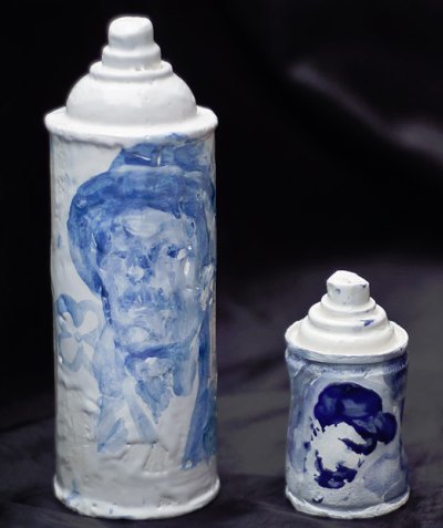 The art world breaks artists' hearts. First to break are those who ring wrong bells when they walk into a gallery. Edwards can't change that, anymore than Caitlin Upton can, but she could learn a lot from him. He's stout-hearted and keeps on keeping on.
 White Fear, oil on linen, 38 x 28 inches

About artists and serious books, Robert Storr sees a divide.
There are some artists who read theory seriously but not all that many.Increasingly, however, artists treat books as objects. They empty them out or roll them like stones against the mouth of a cave.
Jill Sylvia
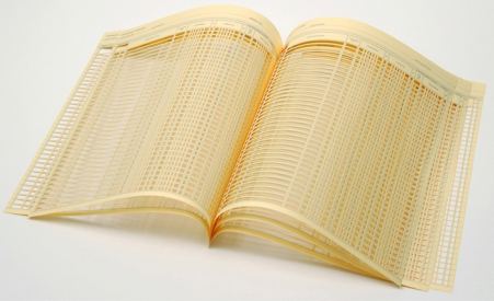 Stella Waitzkin
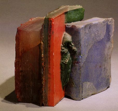
Yes, I expect that if any group is invisible in certain organizations or societal settings it's worthy of question. For, you may be the one who is excluded at some point in the future. If you are a curious person you'll notice that older women artists are invisible in the art world and most other arenas of life, unless they're generous philanthropists or volunteers - which I call work without pay.Mendel, Wear Masks and Missing Pages II
I have actually experienced this invisibility/exclusion recently. A Chelsea gallery owner saw my work on a website. She made an appointment to see the actual work. She saw me in person when I visited her gallery to check out the space where my work might be shown. I said I was looking forward to her visiting my studio and she canceled the appointment by email the following day pleading sickness and never rescheduled.
Women are even more biased against older women than are men. That's just the most obvious incident. I recently did a series on age with one piece called Wear Masks and have been asked to write a piece against this invisibility for an art publication.
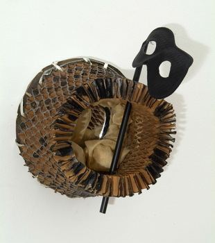
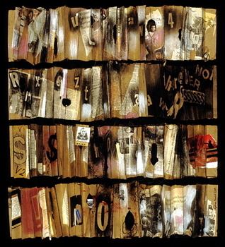
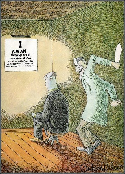 Fantagraphics gallery director Larry Reid adds:
Also on display on February 13 for one night only is a recently completed sculpted portrait of R. Crumb by Seattle artist Mike Leavitt. Commissioned for a private out-of-state collection, this is only opportunity to view the fully articulated wood carved figure - the latest addition to Leavitt's ongoing Art Army series.
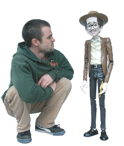 The reception on the 13th coincides with the Georgetown Second Saturday Art Attack, featuring visual and performing arts throughout the neighborhood.
 The wrong Steve McQueen: (image via)
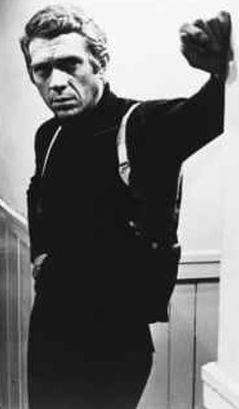 The right Steve McQueen: (image via) Profile here.
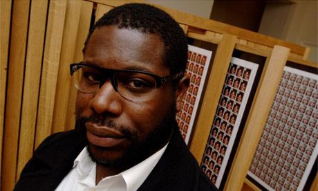 Of course people want to see the wrong Steve McQueen. I like him too. But SAM is an art museum. Wouldn't it be great if visitors could go there to see at least the right McQueen's shorter films from a library of video/film artists available for screening by appointment? I'd like to see Bear (1993), Drumroll (1998) and Deadpan (1999), the last being homage to Buster Keaton's Steamboat Bill, Jr. Deadpan was at
The Northwest Film Forum screens a fair sampling of films and videos that are art straight up. Last April it featured McQueen's Hunger, about Bobby Sands. At the time, I couldn't force myself to go. Having lost my job a month earlier, I was trying to hang out on the sunny side of the street. I'd love to see it now, and where is it?
The theoretical advantage of film & video is that anyone can see it anywhere. Alas, that is far from the case. In the meantime, SAM is screening the Steve McQueen who is already ubiquitous. Something wrong here.
Here's the big difference. Coughlin appealed to those who had nothing and wanted someone to blame. Fox appeals to the well-fed.
Maynard Dixon's Forgotten Man from 1934 (image via) is not a portrait of a Glenn Beck supporter.
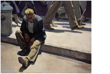 Tebaggers aren't worried about scabs.
Dixon, Scabs (image via)
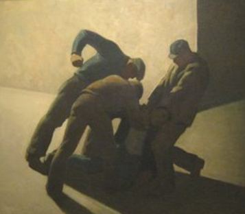 Nor are they likely to break factory windows. Their goal is to prevent a just and multicultural America from emerging. Since the last election, they have managed to convince a growing number of the disenfranchised to join them. The phenomenon makes the violent strikers of the 1930s look like sages. They at least knew who was on their side and who wasn't.
Vachel LindsayFACTORY windows are always broken.
Somebody's always throwing bricks,
Somebody's always heaving cinders,
Playing ugly Yahoo tricks.
Factory windows are always broken.
Other windows are let alone.
No one throws through the chapel-window
The bitter, snarling, derisive stone.
Factory windows are always broken.
Something or other is going wrong.
Something is rotten--I think, in Denmark.
End of factory-window song.
I'm writing to enlist some help drawing attention to a silent auction to help a Seattle business owner from Haiti (David Pierre-Louis of Lucid Jazz Lounge in the University District) provide direct assistance to the survivors of the earthquake in his old community. The deadline for dropping off work with coordinator Leilani Lehman (lani.lehman@gmail.com) is this Sunday, February 7. Participating artists include Allison Manch, Gala Bent, Celeste Cooning and myself.
Pothast, L'Origine du Monde, college/drawing, 6 x 6 inches

Donna Stack
Princess and the Pea (the pea), Down feather brocade Asian floor pillows, monitor and video. The video is looped to display a single pea as it slowly dries out and becomes plump again.
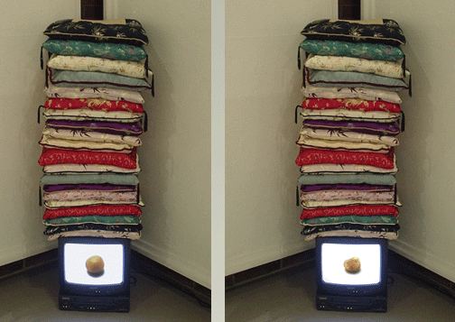 Or wrap it in a rug.
Fred Muram, Rug
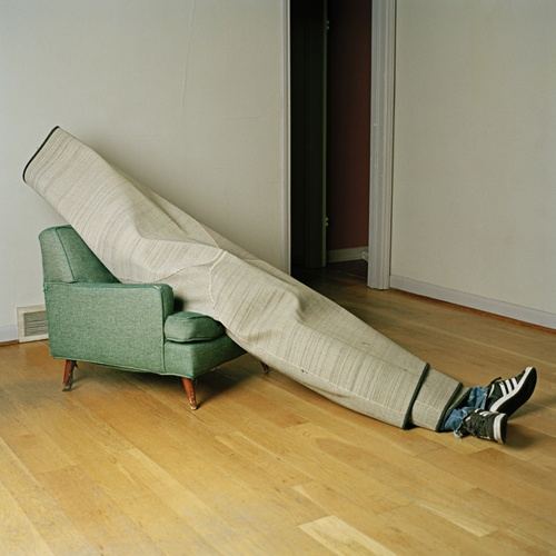 You can banish it to the back pasture in your mind.
Grant Barnhart, Way of the Warrior
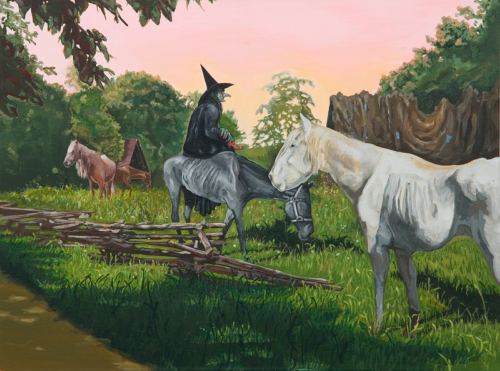 You can set it on fire...
Lauren Grossman, The Pentecost
 Or turn it into a joke.
Grossman again. Drunkard
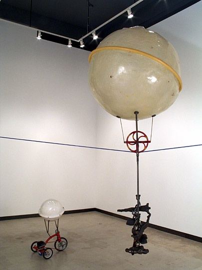 You can wipe your personal slate clean.
Ingrid Lahti
 If all else fails, you can praise it.
Jack Daws, Nike Branding Iron
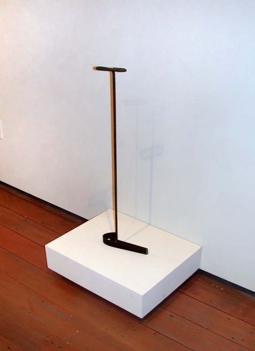
 Chang:
 After Helsinki's first big snow, the City sprinkles pebbles on the sidewalks to give pedestrians grip over the ice. How many pounds or kilograms of pebbles they must have, I'm not sure, but they continue to add more after each snowfall until the Spring (who am I kidding, Summer) when they sweep it, store it, and use it again next year. This means no contamination of the groundwater. This also means that many winter walks involve you, your thoughts, and one tiny pebble caught in your shoe.
Opening Wednesday night in Bellevue, 6-9 p.m.
Open Satellite launches a biennial of architectural model making titled Supermodel, featuring students and Allied Works Architecture, AWA image below. (Clothespins are finally getting the respect they deserve.)
 Opening Thursday (10 a.m.-2 p.m.) at Wright Space, 407 Dexter Ave. N.
BIG IS BETTER (or so some claim) Large-scale paintings from the Virginia and Bagley Wright collection, 1960s-1980s, featuring Jennifer Bartlett, Al Held, Al Jensen, Donald Judd, Robert Longo, Larry Poons, James Rosenquist, Susan Rothenberg, Julian Schnabel and Frank Stella.
Opening Thursday night in Pioneer Square, 6-8 p.m.
The late Mary Henry at Howard House - abstraction as echo chamber.
 Gaylen Hansen at Linda Hodges. These ducks matter.
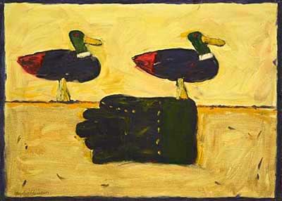 Mandy Greer at Ohge Ltd - If a little is good, more is so much better.
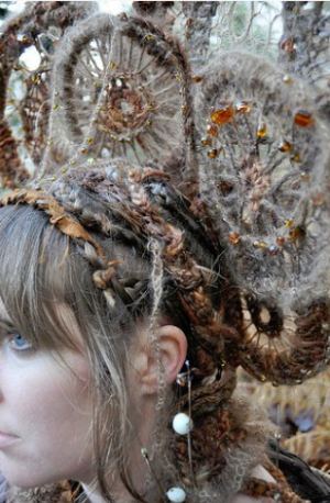 Fertilizing Utopias at Soil, with Claire Johnson's tree portraits in the back space. In Fertilizing Utopias, Vaughn Bell:
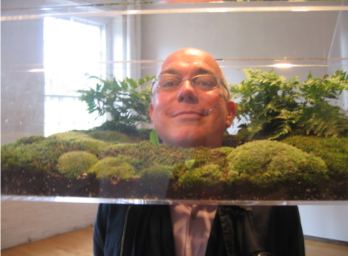 Jason Hirata at James Harris (pigment mixed with sweat, image in previous post). Also at Harris, Alexander Kroll - small scale, intimate gestures.
SAM presents three films that spotlight the comic brilliance of Richard Pryor (1940-2005). Tickets for all three films: nonmembers $20, SAM members $17. Tickets for individual films: $7.
February 5 Silver Streak (Arthur Hiller, 1976). Gene Wilder, Jill Clayburgh, Patrick McGoohan, Scatman Crothers. In 35 mm, color, 113 min. In this Hitchcock-style comic thriller Silver Streak, Pryor tries to teach uptight businessman Gene Wilder how to "move like a black man."
Whatever humor Silver Streak had in 1976 has leeched away in time. It was never more than the race version of Some Like It Hot, a better movie by light years.
February 12
Blue Collar (Paul Schrader, 1978). Yaphet Kotto, Harvey Keitel, Ed Begley Jr. In 35 mm, color, 114 min. Blue Collar features Pryor's best acting performance as a fed-up auto worker who helps rob his bosses.Great movie, but it has nothing to do with Pryor's comedy. It's a crime story, and he burns through it.
February 19
Richard Pryor Live on the Sunset Strip (Joe Layton, 1982). Cinematography by Haskell Wexler. In 35 mm, color, 82 min. Rated R for language. Richard Pryor Live on the Sunset Strip gives us Pryor's artistry as a stand-up comic as he transmutes personal problems into improvisational narratives that groove like jazz riffs.
If you're looking for the comic brilliance, go to this one.
It hasn't on Hannah Wilke. (image via)
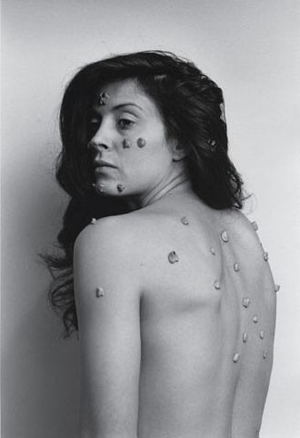 Or in Dan Winters' photo, Chewing Gum on Theater Seats, Electra, Texas, March 27, 1995, archival pigment print, (image via)
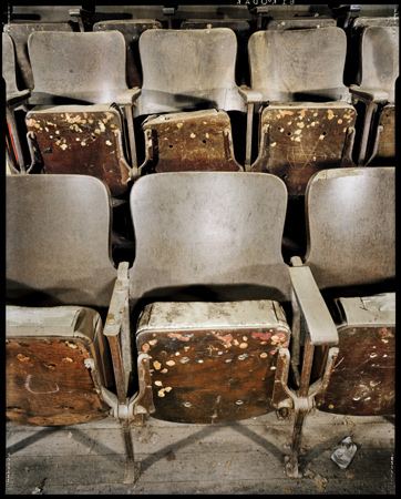 Or in Simone Decker's melting Medievalism, Chewing in Venice.
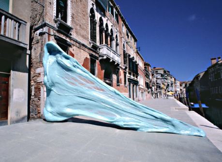 More Decker:
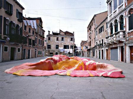 Ben Wilson paints the pieces ground into the pavement. (image via)
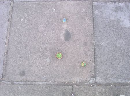 Finally, in Seattle, The Gum Wall, a collective project. (image via)
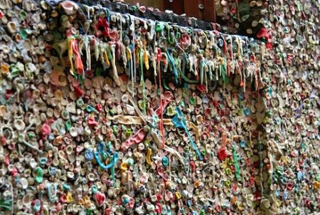 All these people would be in big trouble in Singapore.
Three years and several short films later, Mr. McQueen won the 1999 Turner Prize, Britain's most prominent art award, in part for Drumroll (1998), a massive three-screen video that puts viewers in the midst of urban cacophony. He made it by attaching three cameras to an oil drum and rolling it down Fifth Avenue; he once called it "a musical."In an earlier story, McQueen elaborated:
In Drumroll, for example, the central idea was that three cameras would be rolling through New York City inside some oil drums. This was the best way for me to document a very specific urban situation. Everything was filmed. People in the street, I myself. Everything was perfect, I could do no wrong. I felt almost like a musician. All I had to do was to keep this oil drum roll almost like keeping a beat. The chaos that was recorded of people, cars, trucks, etc. was almost like improvisation. Everything that slipped into frame was permitted, it was impossible to make a 'mistake', everything is allowed.It's possible to see still images from the piece online, as in this one, from The Guardian:
 I was unable to find even a portion of the piece live. The same is true for David Hammons' Phat Free from 1995. (Hammons is always first.)
From Artforum, no writer given on the link. (What's that about?)
Phat Free is only seven minutes long, but it works on the mind like a musical composition that takes days to digest. Once I'd realized that the video wasn't about a band playing, I began searching for other clues. "Kicking the bucket" is a euphemism for dying; so I started looking for other metaphors of morbidity in the video. It was late and the streets were foggy and deserted, other than the protagonist. He looked ghostly in the blue light of the morning; perhaps he was the figure of death visiting the neighborhood.(Image via)
But the video was simply too playful to support that reading. Clearly the man was kicking the bucket the way a drummer plays a drum. The bucket rolling on the concrete established a steady rhythm, and the man - Hammons himself - repeated the same steps to reach and kick it again. I thought of the Surrealist creed that adventure is on the corner of the street - the man could be a homeless person who had found his adventure in the game and was enjoying it to no end. By the time the video was over, I was finally getting it. Or was I? Had Hammons planted recognizable narrative motifs like "kicking the bucket," as well as allusions to jazz and homelessness, just to keep us working endlessly in pursuit of meaning? That may be the case, since what seemed to count most was the energy of the piece. The narrative motifs were mobilized to contribute to this energy, and when the video ended, it was like putting an end to all these stories and letting the playful rhythm and movement take over as an abstract sign of the black good life.
Clearly, for Hammons, there is no good life without a measure of absurdity. After the video, Hammons told us he felt that younger black artists lacked the "black confidence" of jazz musicians. They have no control over the definition of the art they're making. For him, black artistic confidence means a willingness to transform blackness into a higher level of abstraction. (more)
 I'm fortunate to have seen both pieces, the McQueen by lucky accident and the Hammons by dint of determined effort, but I'd love to be able to see them again. Sitting in my living room is ideal, but also good would be in a nearby library, museum or arts center. In the future that is almost here, we won't be restricted by what's on view but can make our own shows out of video/art film videos near at hand. For that service, I'd be willing to pay, and not just flash my press card to get in.
 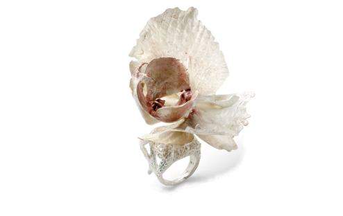 For the beast - Debra Baxter's Crystal Brass Knuckle (I am going to realign your chakras motherf*****)
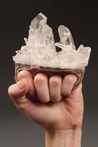
I respect Pagel, but this review sounds as if he wrote it from his lizard brain. There's a big group of artists ("fourth and fifth generation Conceptualists," in Pagel's condescending phrase) he can't abide. Why go to their shows, then? Every single time out, as Marat told de Sade in another context, critics have to pick themselves up by their own hair, turn themselves inside out and prepare to see the world with fresh eyes. If they can't entertain the possibility that an artist they don't admire will surprise them, they need to stay home.
Diana Thater: Between Science and Magic
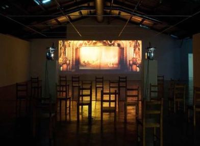 Pagel is King Solmon compared to Thater, however, who logged into the comments section to fight back:
Ahhhhhh this is all SO interesting! But ...would you like to know why David Pagel actually wrote this incredibly personal, mean-spirited and low so-called "review" of my show? I've posted a factual account of my 13-year history with David Pagel and Christopher Knight on my website. Read it and ask yourself why these people actually have jobs at a major newspaper if this is how they use their positions and the power they've been accorded. Thanks to those of you who have defended me and my work against the rabid anti-intellectuals. (And will anyone ever tell me what a 4th-generation conceptualist is?????) (I'd be satisfied just to know what everyone thinks they're talking about when the use the word "conceptual"). And is everyone who is not dumb an intellectual by default or is there an IQ minimum? Didn't Pol Pot make a point of putting the "intellectuals" to death? Hmmmm seems like a bad road to be going down...but if that's what Pagel is about - let's just be glad he doesn't have an army.Pagel is not against intellectuals. He's one himself. And to compare him to Pol Pot in Los Angeles, where people who survived Pot comprise a large community ...I'm speechless.
On her blog, Thater recounts the time that Pagel and Dave Hickey sent a funeral wreath to the opening of a group show featuring artists whom Christopher Knight, Pagel and Hickey had all panned. That was the point of the show, that these critics wrote them off.
The wreaths were on stands and had wide ribbons draped across them. Both said; "With Deepest Sympathy" and the cards were signed by David Pagel and Dave Hickey. The message? These two art critics didn't just hate us and our work - they wished we were DEAD.
 Note to Thater: I wasn't there, but I don't have to be a weather man to know which way this wind blew. Sending a funeral wreath didn't mean Pagel and Hickey wished you were dead. It was a theatrical gesture, intended to provoke a response. They don't like your work, but they like you and the artists in this show enough to engage. In the future, think Dada, not death threat. And leave Pol Pot out of this. You want to compare a critic to a killer, go with Attila the Hun. No one alive has a stake in his story.
 Back to Pagel: It's interesting that he wrote the review without any mention of a back story. This is not the first time he has come down from the mountain with this set of injunctions. He owes his readers the context for his comments. Once he sent the wreath, it's part of his story. He's now a participant on stage, not a member of the audience. To pretend otherwise is dishonest.
I understand how tricky this is. An artist once threatened to sue me. It didn't get far, but lawyers were involved. I wondered ever after how I was going to write another review of his work. After he had filed papers in court attacking me, he gave me a reason to be way past grumpy. Fortunately for me, the occasion for a second review did not arise. Big history needs to be acknowledged, especially big negative history.
Other news:
From Slate - Michelangelo did not whistle while he worked.
My stomach's squashed under my chin, my beard'sJustice is done - Christoph Büchel prevailed against Mass MoCA on appeal. From John Silberman's The Art Law Blog:
pointing at heaven, my brain's crushed in a casket,
my breast twists like a harpy's.
Today the First Circuit reversed his decision, holding that "the record permits the inference that ... Museum staff members were disregarding [Büchel's] instructions and intentionally modifying 'Training Ground' in a manner that he did not approve." (more)And justice is not done - From Culture Monster, Shepard Fairey will face a criminal investigation in the AP case. When did the Associated Press begin to stink of sulfur? Surely in a country brimming over with criminal conduct in high places, there are better people to investigate than Fairey.
About
Blogroll
AJ Blogs
AJBlogCentral | rssculture
Terry Teachout on the arts in New York City
Andrew Taylor on the business of arts & culture
rock culture approximately
Laura Collins-Hughes on arts, culture and coverage
Richard Kessler on arts education
Douglas McLennan's blog
Dalouge Smith advocates for the Arts
Art from the American Outback
Chloe Veltman on how culture will save the world
For immediate release: the arts are marketable
No genre is the new genre
David Jays on theatre and dance
Paul Levy measures the Angles
Judith H. Dobrzynski on Culture
John Rockwell on the arts
innovations and impediments in not-for-profit arts
Jan Herman - arts, media & culture with 'tude
dance
Apollinaire Scherr talks about dance
Tobi Tobias on dance et al...
jazz
Howard Mandel's freelance Urban Improvisation
Focus on New Orleans. Jazz and Other Sounds
Doug Ramsey on Jazz and other matters...
media
Jeff Weinstein's Cultural Mixology
Martha Bayles on Film...
classical music
Fresh ideas on building arts communities
Greg Sandow performs a book-in-progress
Harvey Sachs on music, and various digressions
Bruce Brubaker on all things Piano
Kyle Gann on music after the fact
Greg Sandow on the future of Classical Music
Norman Lebrecht on Shifting Sound Worlds
Joe Horowitz on music
publishing
Jerome Weeks on Books
Scott McLemee on books, ideas & trash-culture ephemera
theatre
Wendy Rosenfield: covering drama, onstage and off
visual
Public Art, Public Space
Regina Hackett takes her Art To Go
John Perreault's art diary
Lee Rosenbaum's Cultural Commentary
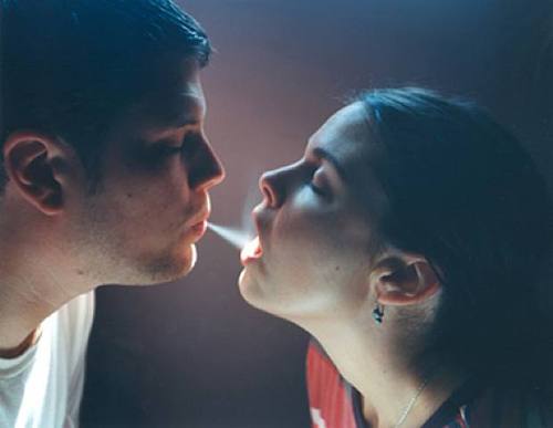
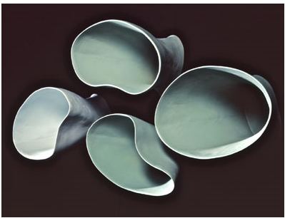
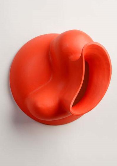

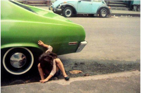

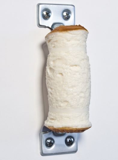
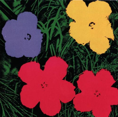

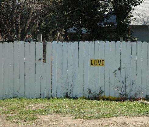
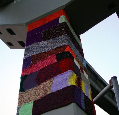 Tran:
Tran: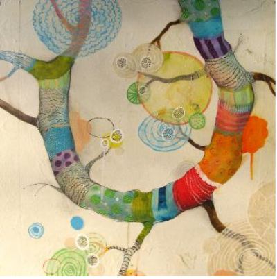
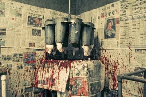
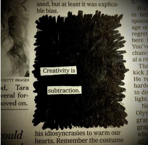

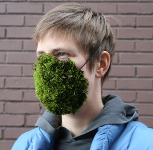

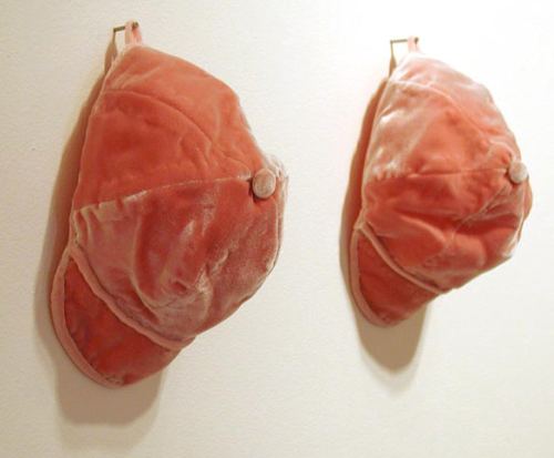 The rest keep a record of their tears.
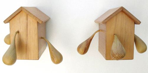
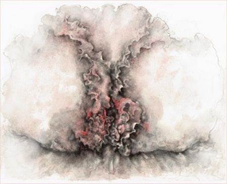
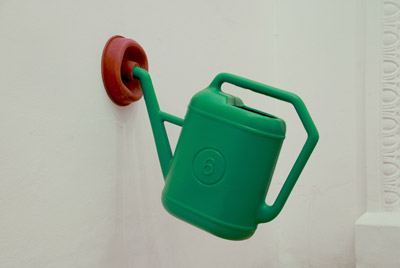
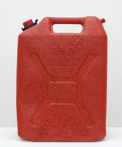
 More
More 