Another Bouncing Ball: November 2009 Archives
While still in Japan he apprenticed with a master folk potter producing utilitarian ware. After coming to the U.S. in the mid-1970s, he fell under the influence of Montana ceramist Rudy Autio, whose vessels made from intertwined figures of women and horses repeat themselves.
Takamori's do not. Bluntly made with deft, loose color washes, his version floats. Even the stoutest forms are light on their feet. Working through Autio, Picasso's ceramics, pre-Columbian pottery and late Ming dishes fired in the shape of horses, birds, squirrels and fish, he creates his own theater populated by characters who need no text to tell stories. It's in the sag of an old woman's shoulders, the self-possession of a young intellectual, the fierce command of a dowager. Her chin may be weak, but her eyes glitter and her hair, painted in whirls of black ink, rises over her head like a planet.
His current exhibit James Harris Gallery includes 12 small porcelain figures paired with their photographic portraits, the latter inspired by Danish photographer Rigmor Mydtskov, plus five large figures in stoneware.
 The photos reveal different aspects of the character: the modest concrete and the marquee.
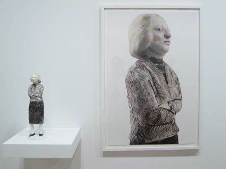
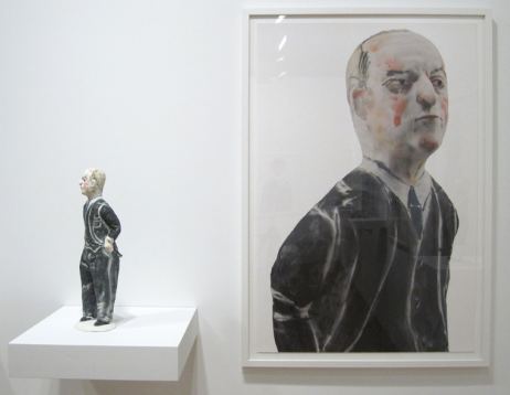 Through Dec. 19.
 Einarsson:
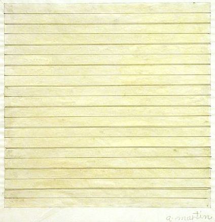
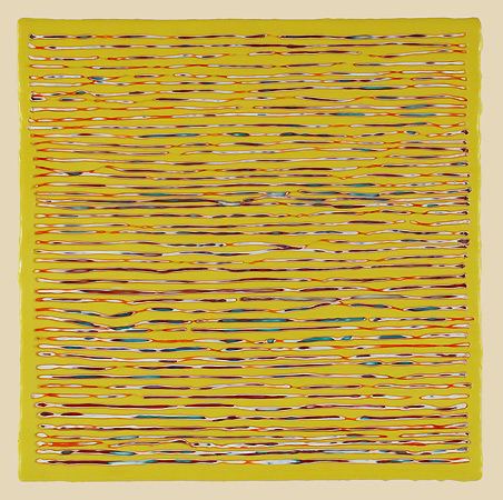
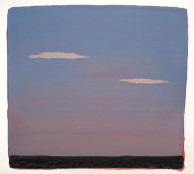
Agnes Martin, 1979
 Joanne Mattera, 2008
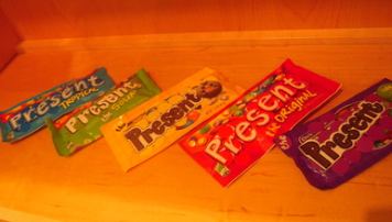 From
the Indian point of view, wrote Hyde, the Pilgrims might have been
called "white man keepers (or maybe capitalists, that is, people
whose instinct is to remove property from circulation, to put it in a
warehouse or museum or, more to the point for capitalism, to lay it
aside to be used for production)."
From
the Indian point of view, wrote Hyde, the Pilgrims might have been
called "white man keepers (or maybe capitalists, that is, people
whose instinct is to remove property from circulation, to put it in a
warehouse or museum or, more to the point for capitalism, to lay it
aside to be used for production)."Northwest Coast Indians turned this principle of gifts in motion into a banking system, known as the potlatch. What was given away bestowed prestige and power, not what was hoarded.
Hyde:
The Indian giver...understood a cardinal property of the gift: whatever we have been given is supposed to be given away again, not kept. Or, if it is kept, something of similar value would move on in its stead, the way a billiard ball may stop when it sends another scurrying across the felt, its momentum transferred. You may keep your Christmas present, but it ceases to be a gift in the true sense unless you have given something else away. As it is passed along, the gift may be given back to the original donor, but this is not essential. In fact, it is better if the gift is not returned but is given instead to some new, third party. The only essential is this: the gift must always move. There are other forms of property that stand still, that mark a boundary or resist momentum, but the gift keeps going.After the gift shop at the Henry Gallery failed and the space went dark, Seattle painter Matthew Offenbacher proposed turning it into an artist space. (Story here.) Different teams of artists run it on themes of their devising. Through Dec. 13 is The Gift Exchange by Claire Cowie, Sol Hashemi and Jason Hirata, based on a come-one, come-all version of a potlach. Anyone can bring a gift and take one, or bring several and take several. Cowie, Hashemi and Hirata set a high standard for the exchange by seeding the original stock with their work.
Since it opened Nov. 14, the audience has risen to the occasion. Although some people tear open corners of wrapped gifts and keep going until they find treasure, many, many others bring treasures and take what they're given in a blind exchange. Not all gifts are blind. Some lack wrapping, in the interests of making sure a gift goes to someone who will value it.
As a profile of the community, The Gift Exchange proves that people raised in an individualistic, me-first, capitalistic system can transcend their training and rise to higher ground. Since the 1980s and accelerating ever since is the assumption that art equals money, that its value can be translated into cash on the secondary market. The Gift Exchange argues for an older, truer version of art, that it is in essence a form of grace. To all concerned, well done.
Note: Remember the hours. Thanks to budget cutbacks, the Henry is open only Thursdays to Sundays.
 On Facebook, Cable Griffith wrote, "You could gut a unicorn with that." Eric Fredericksen added, "I'm going to realign your chakras, motherf*****!"
According to Liss, she told him she "despised the outdoors, rural environments and any thing and any activity associated with nature such as insects, dirt, inclement weather, swimming in lakes, etc, and any situation that lacks a full complement of domestic amenities, utilities, appliances and facilities." (more)
Her contribution, A Little Piece of Heaven, was a set of instructions. She told the curator to plant and maintain the equivalent of a residential lawn in the middle of the site's wilds.
 I'm not sure if the piece passed the Woody Allen test. Allen hates lawns too. Nevertheless, Kelly continues to define her position. From 2009, No Tofu, No Yoga Matt.
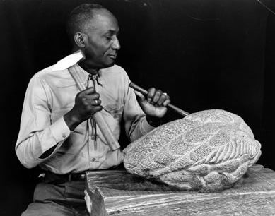 A survey of smaller sculptures is at Woodside/Braseth Gallery through Dec. 31..
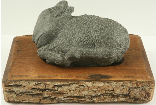 Washington was 91 when he died in 2000, having proved to be a fiercer artist in his old age than in his youth. In his 80s, his work became bigger and more brilliantly festooned. In places he painted his stones with colored encaustic and set his symbols of ancient life flowing across the surface, as if the stone were supple and easily yielding to his chisel.
 Washington:
I visualize the subject within and feel it out as I go. I am the medium, just like copper wire is the medium for the current of electricity turning on a light bulb.
I was speaking with some ministers a few years back. There were preachers of all things. I asked, how many of you can tell me how many times you've drunk your own bath water? Life goes in cycles. The last breath of a minister may turn out to be the first breath of a pig. Life exists and continues. It uses everything.
Case in point, Margie Livingston. Ordinarily, she paints in oils from models she constructs to explore the relationship between three-dimensions and their translation onto canvas. Her end results tend to look like forests fractured by colored light.
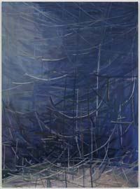 Her exhibit at the Greg Kucera Gallery include forms that reverse that process. She's now using paint to construct objects. They're paint as objects, either on the wall or rolled and folded onto shelves or draped in shreds from the ceiling.
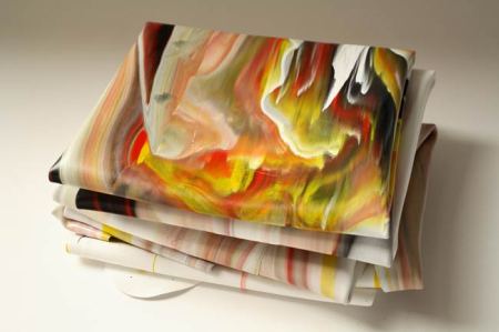
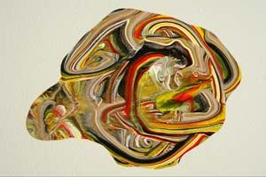
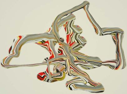
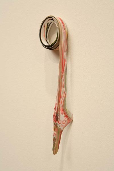 Lynda Benglis preceded her, and so did Charles Ray. Livingston's Paint Line brings to mind Ray's Ink Line from 1987. She is in their debt but not their shadow. Her interactions with paint map her thinking about her endlessly flexible medium. She uses it to dissect her representations, to pool her resources and to chart a lyrical course through light, space, form and time.
 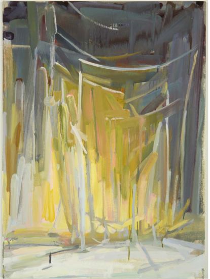 At Greg Kucera through Dec. 24.
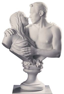 Lifetime achievement for best sex in an art context?
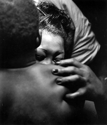
Wayne Miller, from The Way of Life of the Northern Negro, Chicago (embrace), 1946-48. Sixty-plus years later, nobody has topped it.
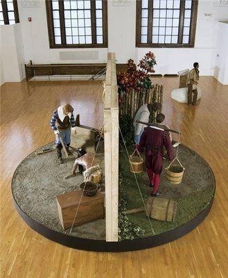
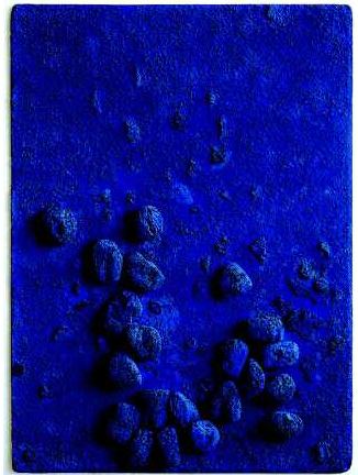
 Online, it looks a lot like Yves Klein blue, but it's safe and (when generics appear) cheap.
  Glasstire's Top Ten art activists.
The boom in Doomsday.
Artists and the pain of recession.
In Seattle, NUBE opens at the Odd Fellows Hall.
Also Seattle, Jeffry Mitchell wins a Joan Mitchell.
In New York, the Homeless Art Museum makes an appearance.
Armenians celebrate the opening of the Cafesjian Center for the Arts.
Jeff Shang's "Don't Ask, Don't Tell" portraits via Culture Monster.
MoCA revs up Chris Burden's Big Wheel. (At the Henry Gallery 1985-86)
Allen Ginsberg's Tips for Artists.
Roger Ballen, profile of the geologist/artist.
Finally, Holland Cotter on Saints at a Culture Crossroad:
At monasteries on Mount Athos in northern Greece, you wake in the night to the sound of Greek Orthodox monks chanting Byzantine prayers. It's an unforgettable sound, distant and unearthly, but also inside you, like a buzz in the blood.
The painter Domenikos Theotokopoulos, better known as El Greco, almost certainly heard it growing up far to the south on the island of Crete. You can hear it today when you visit "The Origins of El Greco: Icon Painting in Venetian Crete," a lustrous exhibition at the Onassis Cultural Center in Midtown Manhattan. (more)
Finally got a chance to see the play on the final day, and I must say I liked it -- with reservations. I agree with Regina that if you weren't on the inside, you might find it confusing and disjointed. But I thought it captured the quirky character of the P-I quite well (kind of like the Adcock review that's quoted). And it works as metafiction -- the play as newspaper story, reported and written well or poorly, depending on your viewpoint, whether you were skewered. I would like to see the play refined and leaned-out, because there are some fantastic moments. The reporter-politician exchanges were just perfect. The Green River segment was poignant. The comment by the victim's mom who is grateful to the reporter for not describing her daughter by job or crime -- it's the same care that this play shows to the P-I.The same care this play shows to the PI? Aegerter is fluent in quadratic equations, reads classical philosophy for fun and could front a band good enough to hit the road. As a theater critic, however, he comes up empty.
Note to Gil: You worked there for years. Did you inhabit your own experience?
If the PI resembled the paper dissected on stage, Aegerter wouldn't have worked there for a day. Former PI reporter Tom Paulson, who advised the playwright team, told them not to turn reporters into heroes. There's a lot of ground between hero and nonentity, and this play didn't find it. Nothing on stage mattered. Yes, Gil, the reporter-politician exchanges were good, but they concerned some harried public official having an affair. Since this is the only moment that explores a reporter doing the real job, why was the theme chosen so trivial?
I'll agree that the play (more or less) attempted to capture the paper's quirky character but cut that quality free from its roots, the business of providing the public with news and opinion of consequence. Trivial stories appeared in the PI. Of course they did. Breath and depth gave way to quick and dirty. But every day there was something and usually several somethings I was proud of, something enterprising, hard won and well played.
The PI was unusual in one respect: Despite cutbacks, the addition of good management at the top coupled with a tipping-point infusion of fine reporters woke the place up in its final years. I know they woke me up. Thanks to them, we did not fade away but went down strong.
It's Not In the The PI wasn't written as an elegy for the PI. What its fact-based fiction tried and failed to be is an elegy for a newsroom. Not a single character interested me, save for the brief (and entirely accurate) appearance of theater critic Joe Adcock. If these characters were a newsroom, it would be one that deserved its demise. Its occupants are self-indulgent, dim-witted whiners. What could they write (draw, photograph, design or edit) that could possibly interest anyone?
The best elegy for newsroom culture arrived this year in the form of a thriller: Michael Connelly's The Scarecrow. The paper is the LA Times, which is diminished but not yet dead, despite the efforts of its owner to kill it. Connelly doesn't get into that, wisely. He has a monster killer to deal with and doesn't need Sam Zell, the monster Capitalist, cluttering up his copy.
The Scarecrow does not address why we're losing breath and depth, just that we are, in Matthew Arnold's phrase, "wandering between worlds, one dead, the other powerless to be born." In the meantime, there's a great newsroom fallen on hard times. We meet the narrator, reporter Jack McEvoy, just after he'd been laid off.
Every eye in the newsroom followed me as I left Kramer's office and walked back to my pod. The long looks made it a long walk. The pink slips always came out on Fridays and they all knew I had just gotten the word.
From a newsroom friend:
Holy fucking shit, you got pinked!...Man, this ain't right.
The world ain't right, Larry.
Like the paper itself, my time was over. It was all about the Internet now. It was about hourly uploads to online editions and blogs. It was about television tie-ins and Twitter updates...The morning paper might as well be called the Daily Afterthought. Everything in it was posted on the web the night before.
Editor and McEvoy exchange:
Continue reading It's Not In The PI, but it is in "The Scarecrow".
Sloth's best. Lolling on a sofa
In a Chinese dressing gown
With the windows open in the heat,
The breeze rousing the leaves.
The flies dozing on the ceiling.
The silky hush of a summer afternoon,
Like floating on one's back
With eyes closed in some pond
Clogged with water lilies,
Inhaling their scent as they nuzzle close.
The light and shade dillydallying,
The leaves sighing again.
Afterward, not even that.
Majestic stupor. Stirring only at midnight
To click on the yellow table lamp.
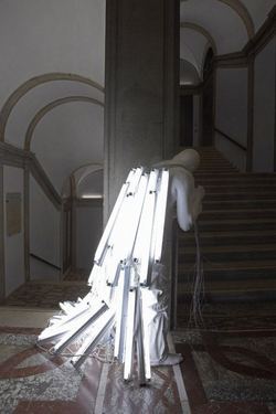 Charles Simic, The Secret Of The Yellow Room
Images: 1. Geoffrey Chadsey. 2. Fred Muram 3. Glenn Rudolph 4. Chadsey 5. Eric Elliott 6. Bernardi Roig
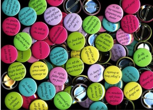 Previous in the same vein, Zwick's 100 Answers To What Might Go Wrong.
The Answer, My Friend..., 2009 Acrylic, electric fans, 56 cubic feet of circulating air 88 x 34 x 34 inches
 Every fan whirs away, generating nothing. It's not easy being the joker in the pack, the sane man in King Lear's court, the forward momentum surrounded by inertia. Even artists who play it straight are surrounded by what opposes them, be they those rarities encased in success or the more common breed, hearing the echo of their actions bounce off the walls of empty rooms.
Nobody called, nobody came in, nothing happened, nobody cared if I died or went to El Paso.Raymond Chandler's Philip Marlowe, talking to himself in The High Window.
SuttonBeresCuller cannot claim to be talking to themselves. The admiration that is strong in Seattle increasingly extends beyond it. One stage performance which I didn't see earned them the honor of a take-'em-out review by Jen Graves.
Their response is in the current show. On beach stones they incised every single word.
A Dissent, 2009 Sandblasted Mexican beach pebbles.
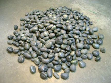 Crouching down for a better look, I found shallow, hoax and my name, the last because her piece included an attack on me, for this review. (Its headline is unfortunate. Critics employed at newspapers don't write their own and yet, if their reviews live at all, they live on their headlines.)
Incised words on stones are a sweetness-and-light stable in gift shops. The art world has even more reason to look favorably on piles of precious things, trained to do so by Felix Gonzalez-Torres. A Dissent is both funny and effective. Change the joke and slip the yoke, what Ralph Ellison called "a kind of jujitsu of the spirit, a denial and rejection through agreement."
In 2002 at the now defunct ConWorks, SuttonBeresCuller offered a giant pencil suspended from the ceiling which audience members could push in order to draw. When Lawrimore Project opened in 2006, SBC installed it as a stand-alone sculpture.
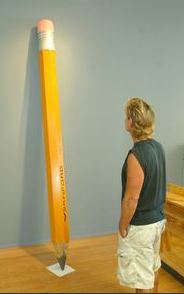 What a difference a day (or two) makes. Here's their current version:
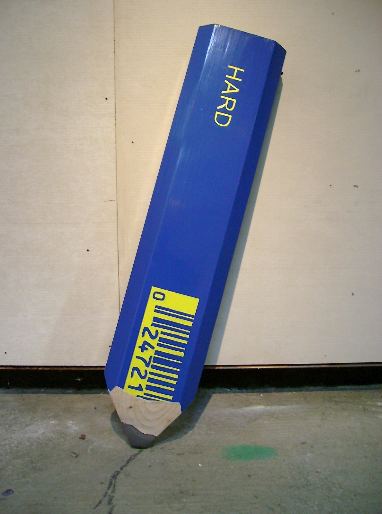 In her review of the current show, a backpedaling Graves noted the work is marked by frustration and exhaustion. To make art about exhaustion is not the same as producing exhausted art. But I digress as well as sympathize. Backpedaling is frustrating and exhausting too.
Barely in Need, SBC panhandling performance. 2003
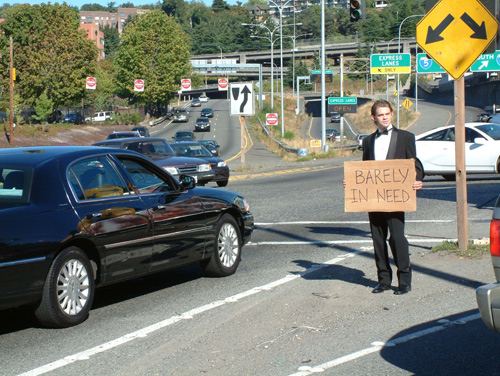 SBC's most ambitious foray into public art, an attempt to turn an abandoned gas station into a park, has been blocked at every turn. And yet, four years in, they're still at it, with a model of the ultimate result in the show. (My story about the ecological complications here.) They may be insane, but they are not exhausted.
Onward, into the future.
Flight Path, 2009 Mixed media (always installed facing the highest concentration of U.S. military forces)

Of the three artists showing currently at Vermillion, painter Ryan Molenkamp has almost sold out. With one exception, it's been a long time since that many red dots appeared in the Square.
If I were going to imagine a stage set for college professor's suburban interior in mid-20th Century America, I'd put one of Molenkamp's paintings over the sofa. The people who lived there would have loved high and loathed low. The abstraction they'd like best would be European, as the New York School would have seemed a trifle crude. Robert Rauschenberg and Jasper Johns, showing up later in the decade, would not have qualified as artists at all. Yes to Satie, no to Chuck Berry.
Early in the 21st Century, Molenkamp's style of painting is most frequently found in Goodwill. What goes around comes around, but possibly because I remember the off-putting originals from my childhood, Molenkamp's updates are a problem I'm not equipped to solve. He's a better painter than the anonymous stereotype I have in my head, but that stereotype blocks my view.
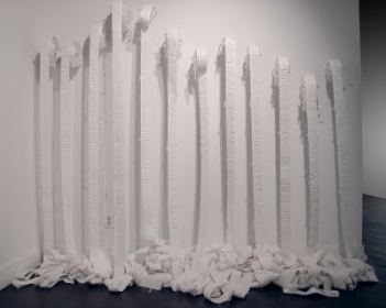
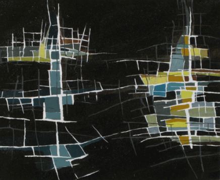 Sharon Arnold weaves and cuts with a gentle hand. Because her work evokes more exuberant versions by others, the word that I couldn't push away is timid.
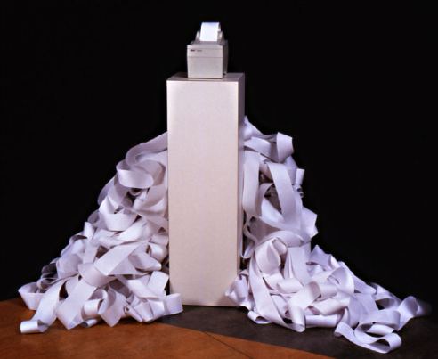
 Here's Claude Zervas' version of an adding machine spitting out clouds, from 2002.
Cumulus, Receipt printer, computer, roll paper 48" x 48" x 48" variable
 And here's Arnold's:
Continue reading Belly up to the art at Vermilion Gallery.
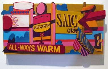 Her collages are her signature, but not her only one. Advertising in other contexts becomes less benign.
 Incised into bottles are messages pulled from the country's vast stash of cliches: Up and at 'em.
 Ramirez's Ghosts of Commerce Past is at Grey Gallery through Dec. 5.
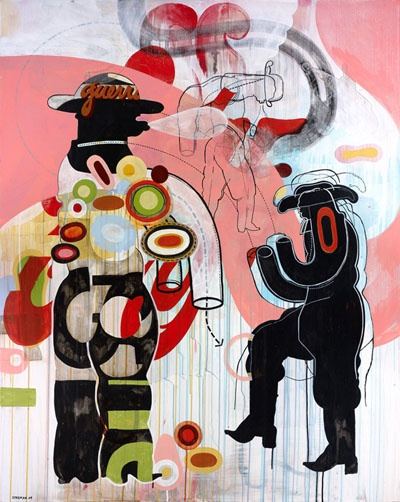
Continue reading Warren Dykeman's bad boy boogaloo.
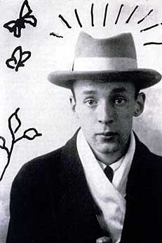
Once upon a time there lived in Berlin, Germany, a man called Albinus. He was rich, respectable, happy; one day he abandoned his wife for the sake of a youthful mistress; he loved; was not loved; and his life ended in disaster.Art is not plot. (Image via)
Joe Johnson, from Mega Churches, via

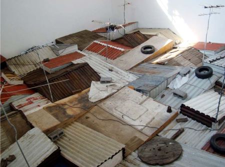 Kader Attia's installation Kasbah is in Los de Arriba y Los de Abajo at Sala de Arte Publico Siqeiros in Mexico City, through Jan. 10.
Attia's piece reminds me of what David Hammons called negritude architecture.
I JUST LOVE THE HOUSES IN THE SOUTH, THE WAY THEY BUILT THEM. THAT NEGRITUDE ARCHITECTURE. I REALLY LOVE TO WATCH THE WAY BLACK PEOPLE MAKE THINGS, HOUSES OR MAGAZINE STANDS IN HARLEM, FOR INSTANCE. JUST THE WAY WE USE CARPENTRY. NOTHING FITS, BUT EVERYTHING WORKS. THE DOOR CLOSES, IT KEEPS THINGS FROM COMING THROUGH. BUT IT DOESN'T HAVE THAT NEATNESS ABOUT IT, THE WAY WHITE PEOPLE PUT THINGS TOGETHER; EVERYTHING IS A THIRTY-SECOND OF AN INCH OFF. (more)
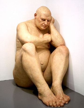
It would be so easy to just poke fun, or dismiss this as a publicity stunt. But you know what? The sun's shining, I'm feeling generous, and I'm going to say that maybe Shaquille O'Neale has a genuine interest in art and his co-curation of a show for the Flag Art Foundation is a mutually enjoyable and beneficial enterprise.It is a stretch to think O'Neale would find anything to admire in a man who cowers in a corner. (Image via Hirshhorn) Museum publicity stunt? These are desperate times, Mrs. Lovett.
Titled 'Size Does Matter', the show has a line up of artists who I wouldn't kick out of the gallery for eating crackers, including Maurizio Cattelan, Chuck Close, Andreas Gursky, Jeff Koons and - of course - a big naked guy from Ron Mueck (on loan from the Hirshhorn). In an icing-on-the-PR-cake move, the catalogue features an essay by (in)famous author James Frey.
 Carol Diehl has a roundup on her blog, which is suitably titled Art Vent, of critics going sexist-berserk. I've been reading on other blogs various snippets from Blake Gopnik's Washington Post review of Anne
 Sexist? Not even a little bit. It's jaunty, and jaunty doesn't work if a few pushing-the-edge sentences are plucked from the whole. I found it insightful, especially this part:
When Jasper Johns and others had found the abstract in the ordinary, Truitt seems to find the everyday in the abstract -- a much stranger thing to do.Knocking Blake Gopnik is the art bloggers' national sport. He has written a few things that made my eyes pop (Exhibit A here), but he startles not because he's a fool but because he's trying to enliven what his editors might well feel is the stale form of the art review.
Editors at newspapers rarely appreciate reviews. Gopnik is working to interest them in his, them and presumably other people who do not think of themselves as part of the art world. Anyone pushing a boundary is going to fail on occasion, but he does not fail Truitt.
As for Charlie Finch, whom Diehl also hangs in her gallery-of-shame for his sexist post on Triutt, also no. He's Truitt's son-in-law. (We know this because he titled his piece, "Mother-in-Law.") His point of view is personal and affectionate, ending with:
The Hirshhorn retrospective should vault her into a special pantheon of her own, one which she occupied in privacy during her own life and in public now that her work belongs to the world.What a canine. Did Gloria Steinem march in vain? Women artists can't get a break. His fellow dog, Blake Gopnik, called Truitt a genius. It's a wonder women don't riot in the streets.
Continue reading Friday links - slam-dunk curation.
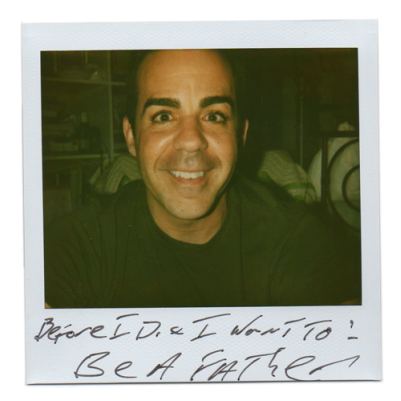
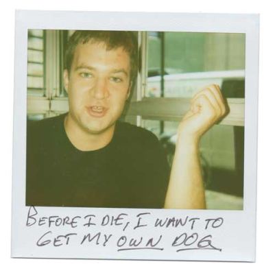

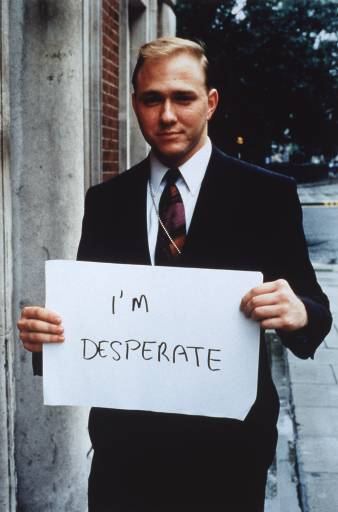
This project and plenty like it owe a lot to Gilliam Wearing, and before her, to Jim Goldberg, neither of whom tends to make it to the credit line. Their ideas have spread beyond them, influencing even those who've never heard of them.
Gillian Wearing, from Signs that say what you want them to say and not signs that say what someone else wants you to say, 1992-93
 Jim Goldberg, We are a very emotional and tight family, 1979
 Recently in Seattle at a reputable space I saw a video in which the voices didn't match the subjects. Again, Gillian Wearing. Her 10-16 was at the Henry Gallery in 2003. Remember the only joke in Pulp Fiction? Catch up.
Gillian Wearing, from Signs that say what you want them to say and not signs that say what someone else wants you to say, 1992-93
 Jim Goldberg, We are a very emotional and tight family, 1979
  Recently in Seattle at a reputable space I saw a video in which the voices didn't match the subjects. Again, Gillian Wearing. Her 10-16 was at the Henry Gallery in 2003. Remember the only joke in Pulp Fiction? Catch up.
 In the late 1960s, soldiers coming home from Vietnam rarely found anything but contempt from artists addressing the war. (He's the universal solider and he really is to blame.) Forty years later, anti-war sentiment among artists is as strong as it was then, but denunciations of soldiers are rare.
Below, a sample of what's out there, from the U.S. and beyond.
An-my Le, from 29 Palms, 2003-present. (Image via)
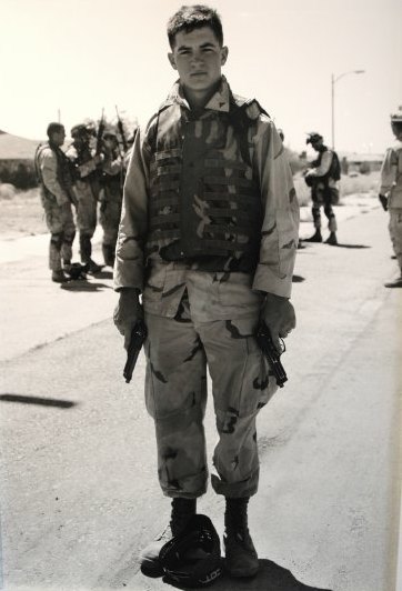 Eli Wright, from the Combat Paper Project, 2009
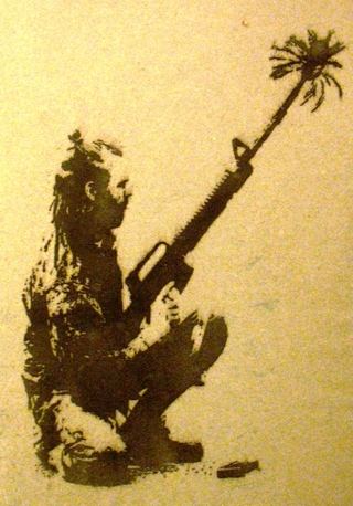 Jon Michael Turner, from the Combat Paper Project, 2008
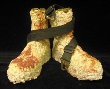 Emily Prince, from her series, American Servicemen and Women Who Have Died in Iraq and Afghanistan. Included by Robert Storr in his 2007 Venice Biennial.
 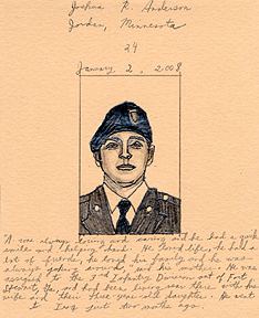 Prince:
 The numbers kept coming up in the daily reports. Five here, fourteen there, one day after another. And then the growing figure mounting over a thousand. Peripherally it was ever-present, but still only an abstraction. It was no longer enough to know how many. I needed to see pictures of them, to familiarize myself just a tiny bit more with what was happening far from my warm home. And it really isn't much. It too is a mere summary, just one more step beyond bare numbers.Krzysztof Wodiczko, The Veterans' Project, 2009, ICA Boston
Yet for me it is something. It means spending time with each one. It is looking into their eyes to see who is now gone. It is following the line of their brow and trying to perceive the expression there. It is a visual and visceral exploration of these individuals by way of their faces. It is my own eyes and my hand tracing out some very slight acquaintance with what's occurring.
Wodiczko to Boston Globe art critic Sebastian Smee:
"The work I have made so far about veterans has been kind of 'out there.' I want this one to be more about 'in here,' '' he says, tapping his head.(more)
 Eros Hoagland, from Soldiers Fighting Our War In Iraq, ongoing. Eros is the son of famed war photographer John Hoagland, who died in El Salvador in 1984. He was 36.The bullet that killed him was U.S. Army issued.
Continue reading Sympathy for soliders.
There are no art critics on staff at daily newspapers in Seattle, Chicago, Miami, Dallas and Houston, among others. The admirable Douglas Britt works for the Houston Chronicle on contract. Even though he has the output of two staffers and has brought the paper back into the national discussion, the Chronicle has not said it will restore the position.
A newspaper art critic differs from colleagues at art magazines in one essential, and it's not that the former is less savvy than the latter, although that is frequently the case. A critic at the newspaper aspires to a general audience. The chance to hook somebody with a review who's flipping pages to get somewhere else is tantalizing.
Without newspapers, those accidents appear to be less likely to happen, but there is more depth and range in each separate field, with Web sites available to run on a constant scroll across the face of cell phones.
In that context, art coverage in Golden State newspapers remains golden.
Here's Knight on MoCA. As ever he's making the case for Los Angeles:
But this is not just a promotional treasure-house show. Installed chronologically by chief curator Paul Schimmel, it also tells a story -- although one that's rarely heard. The postwar rise of American art is paired with the simultaneous rise of Los Angeles, from shallow backwater to cultural powerhouse. (more)Kenneth Baker is more detached. He makes his case artist by artist and doesn't care about regional positioning:
Continue reading Newspapers with art critics: California shines.
Drop off contributions at 2324 Second Ave. till Dec. 1. Need pick up? Call 206-256-0809. Sale Dec. 5, 9 a.m.-5 p.m.
Sample wares:
Continue reading Support Suyama Space.
Q: How many feminists does it take to change a lightbulb?We fall all over ourselves in our haste to tell Portland's Jim Riswold that he's not funny. I've done it. Jen Graves has done it. Chas Bowie is doing it now, in response to Riswold's show at Augen Gallery.
A: That's not funny.
Me:
He doesn't have the depth to compete with Mexican graveyard humor, even under the utterly false guise of a Hirst tribute.(Not just false but utterly false. more)
Graves:
Riswold makes big, glossy, colorful photographs that reach for satire but amount to little more than low-calorie artistic cannibalism. (more)Bowie:
It doesn't take a degree in art history to get Riswold's one-liners. One of the show's better photographs, for instance, a small still life titled "Damien Hirst Gets a Fish for His Seventh Birthday," alludes to Hirst's infamous sculpture of a dead shark by imaging the artist's boyhood fish tank, occupied by a singular fish skeleton. Seeing as Hirst first exhibited his 14-foot tiger shark in 1992, Riswold's commentary is as culturally relevant as a Monica Lewinsky joke. (more)Mike Leavitt cannot claim to be any more nuanced, but his home town (Seattle) hearts him. I post examples of his art toys on a semi-regular basis. In New York, William Powhida is as subtle as a sledge hammer. Reaction? Pant, pant.
What's wrong with Riswold? Why do critics rain shock and awe down on his head? He moved to art after a big career as an ad man. Could it be (at least partly) the oldest of NW critical tropes, that commercial success, especially in a commercial field, is suspect?
Riswold's Retired Jesus is pretty funny and, dare I say, well done.
Q: How many art critics does it take to change a light bulb?
A: That's not funny.
To wit, his review of Whiting Tennis in 2000:
WHITING TENNIS' new work is dumb. Dumb as in dumb luck, dumb as in mute, dumb as in the best solution to a problem is the simplest one. In these forms, dumb is good. And in art, this kind of dumb is rare.Before he was an art critic, he was a singer, as in, he sang in the shower. Years of singing in the suds led logically to karaoke, and karaoke left him with theories he plans to share Wednesday night at 7:30 at On The Boards. Interview with Eric about his performance here.
Art is rarely free of gamesplaying, of a strategically marked-out position that the artist can work from, of some role that defines readings and defends the value of the work. Tennis' position for this show is dumbness. In his cogent, helpful artist's statement (these two adjectives apply to almost no other artist's statement) he writes that he's "the kind of person who's struck dumb by a child's painting or a little canvas-board winter landscape with birds, and thought it odd that after 15 years or more of 'painting' I'd never sat down and tried to make a 'picture.' So I did, literally sit down and try."(more)

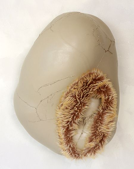
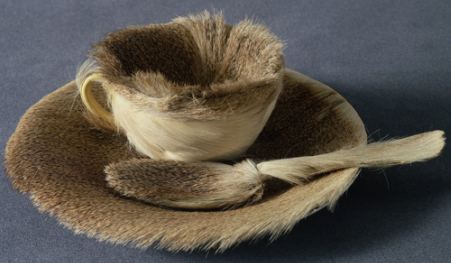 Its origins, from MoMA:
This Surrealist object was inspired by a conversation between Oppenheim and artists Pablo Picasso and Dora Maar at a Paris cafe. Admiring Oppenheim's fur-covered bracelet, Picasso remarked that one could cover anything with fur, to which she replied, "Even this cup and saucer." Soon after, when asked by André Breton, Surrealism's leader, to participate in the first Surrealist exhibition dedicated to objects, Oppenheim bought a teacup, saucer, and spoon at a department store and covered them with the fur of a Chinese gazelle. (more)Its influence continues.
Jennifer McNeely:
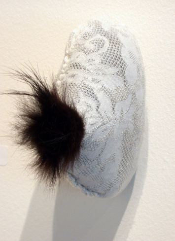 Sandra Doore:
 Taro Hattori
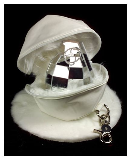
Personally, I'm all about snappy. And instead of possessing concepts which I bring to bear on the art, I respond to the ideas in the art. Paul Valery called it the equivalent of playing a card game whose rules change with every hand.
Undoubtedly, that approach is generational. I started at the tail end of the anti-Clement Greenberg era and never left. (Marat/Sade: We're all normal and we want our freedom.) But there are limits. No, there aren't, but there should be. Critics who free associate in front of an artwork aren't critics. They're flying kites in their heads. They're taking a test for a psychology course.
Few artists attract as much snap, crackle and pop nonsense as Luc Tuymans. His paintings are slippery blanks, unpleasantly representational without being dark. His moments are worth missing yet there they are, the thin-lipped equivalents of gray days.
The Secretary of State 2005 oil on canvas, 18 x 24-1/4 inches David Zwirner Gallery
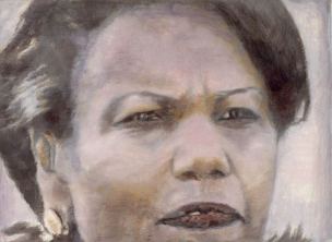 The image above is perfectly transportable. Seeing it reproduced online is not significantly different from seeing it in person, which is, of course, remarkable for an oil painting. Note the tooth and the Buddha ear. The tooth on the left is like one slightly-longer table leg tipping the balance out of true. The long earlobe? Not in this case an old-soul signifier.
 Pigeons 2001, oil on canvas 128 x 156cm (Image via)
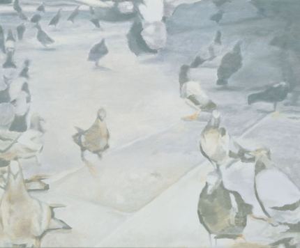 Exhibit A, part of an essay on Tuymans from the online Saatchi Gallery:
Luc Tuymans's pigeons bop in dumb disarray. Dirty and disease-ridden, they're a strangely curious mob, a metaphoric stand-in for ourselves. Painted in the muted tones of history, Luc Tuymans offers a chilling ultimate truth about humankind. He makes a cold comedy of a terrifying thought.Dumb disrray? Who you calling dumb? Real life street pigeons can, when motivated by food, easily learn to tell the difference between Van Gogh and Chagall. (Abstract here.)
Dirty and disease-ridden? Not these pigeons. They're color inflections on canvas. In their price range, believe me they're cared for.
Muted tones of history? What? Stand-ins for ourselves? Says who? Chilling ultimate truth? Cold comedy? Come on.
Even the great Peter Schjeldahl flails around for meaning in his (as always) richly entertaining essay on Tuymans in The New Yorker. Schjeldahl claims Tuyman's work dramatizes the fallen state of painting since the 1960s. If anything, it dramatizes the reverse, that you don't have to be an angel to dance upon the head of a pin as the audience swells around you.
Evan Blackwell's paintings are the frames.
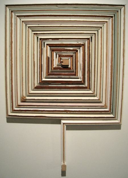
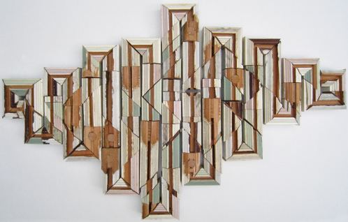 In his solo exhibit at Seattle's 4Culture Gallery, Lost in Space, Blackwell proves (among his many other material explorations) that Tara Donovan isn't the only artist coming up with new uses for drinking straws. Hers billow, like clouds. His are salvaged camouflage with a direct hit in the center. The center is your center, wherever you happen to be looking. It's the illusion of a ripple effect.
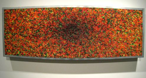 Blackwell graduated last year from the University of Washington with an MFA in sculpture.
 I am in the process of constructing forms, compositions, structures, and spaces that serve as lens to see both the materials from which they were constructed and world we live in with fresh perspective.Through Nov. 27.
Hello! FEMINIST FORM, a new screening series, is starting next Saturday. Please come, it would be great to see you there! And tell your friends, family, colleagues, neighbors, lovers, teachers, partners...
FEMINIST FORM presents video work by: Wynne Greenwood and K8 Hardy Saturday, November 21 Doors open at 7:30pm Screening begins at 8pm Hiawatha Artist Lofts Community Room 843 Hiawatha Pl. S Seattle $5 - $10 Sliding Scale Suggested Donation.
Chair seating is limited, please come early if you want to sit in a chair. Plenty of floor seating. FEMINIST FORM is a screening series of feminist and queer media from the Pacific Northwest. Wynne Greenwood and K8 Hardy have been collaborating since 2002. Included in the screening will be TV Lip Sync, 2002, and two videos from their ongoing project New Report, New Report, 2005, and the documentation of the live performance New Report: Morning Edition, in which the reporters hold an intimate deliberation on the objectification of the biological female body. This is the Seattle debut of this project. (This does contain graphic imagery.) Please forward this announcement widely! Looking forward to seeing you there. All my best, Wynne

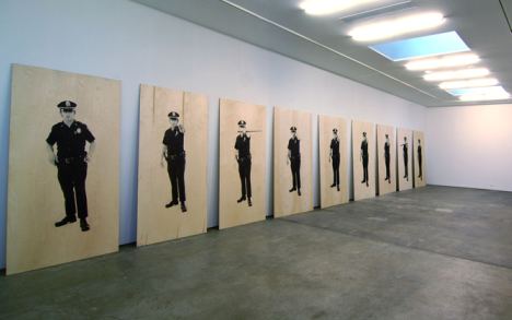
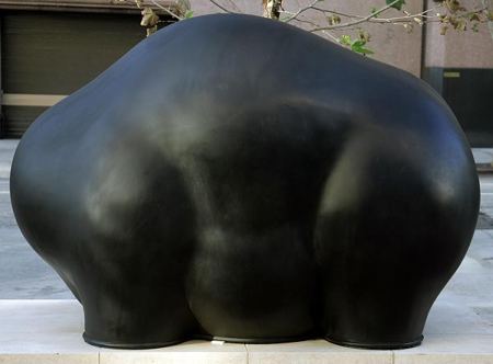
Despite the challenge of his subtlety, Shelton enjoys considerable success in the realm of public art. Controversies such as the current one over his sixbeaststwomonkeys, an ensemble of eight sculptures installed in front of the LAPD's new headquarters, are rare.
(Photos LA Times)

 One of two bookends:
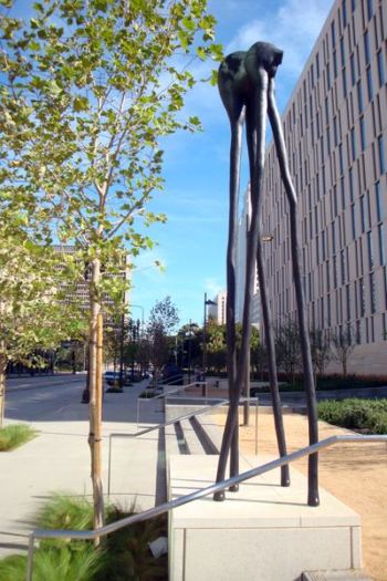 LA Times columnist Steve Lopez kicked off the commentary with one of his I-wander-the-city essays. In a similar vein, his columns on homeless musician Nathaniel Ayers became a book and later a movie starring Robert Downey Jr. and Jamie Foxx. (In case somehow you missed it, NPR story on their friendship here. Good movie.)
Here's Lopez on Shelton:
As luck would have it, the nearly completed LAPD headquarters is right outside my office window, so I've been bird-dogging the project from Day One to make sure taxpayers don't get ripped off. Which brings me to the $500,000 worth of public art that's just been installed on the west side of the building.Lopez's aw-shucks style appears to preclude research. If he did any, it's not obvious. LA Times art critic Christopher Knight had to respond, but such responses are tricky. Knight cannot shoot inside his own building. While he can be tough as he wants on targets outside the Times, inside he treads lightly.
The cast-bronze sculptures consist of six large black blobs, with two tall, skinny structures on either side.
I wasn't sure what to make of them, so I went straight to the top: It looks like "some kind of cow splat," said Police Chief William J. Bratton, who sounded as if he were personally insulted by the installation. Bratton said he first drove past the work and later walked back to see whether "it's as ugly up close as it is when you're driving by."
The answer was yes, and he sounded mad enough to have the artist arrested.
Continue reading Peter Shelton and the peanut gallery.
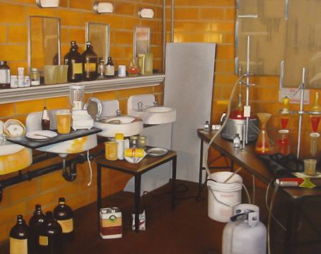
As installations, meth labs fascinate, which can't be said of PR. The problem with the current season is not the move to LA, although it didn't help. It's not the sporadic appearance of the New York judges, who are disinclined to make the trip. That didn't help either. And it's not the goofy challenges. There have always been goofy challenges.
It's the poor quality of the contestants. Where did PR get these people? Of the final three, only Carol Hannah Whitfield has possibilities, and they dim compared to finalists in previous years. As for Irina Shabayeva, she projects shallow luxury, while Althea Harper projects not much of anything.
Meth labs, however, always have possibilities, being made and wrecked at the same time.
Meth kills, but so does moralism. Think of where we might be if the U.S. government had paid Afghan farmers for their poppy crops instead of burning their fields. Once in control of the product, we could have used it for medical pain relief in the Third World, where surgeries without anesthetics are too common. For a fraction of the cost of killing them, we could have helped the poorest of the poor raise their standard of living.
And if, in the U.S., drug abuse were a medical and not a criminal problem, those who construct the labs would be reduced to making something else. Art, for instance.
Jonah Freeman, Justin Lowe and Alexandre Singh
Hello Meth Lab in the Sun #1, 2008
custom pigment print
 Eli Hansen, I'm not paranoid because I'm high, 2009
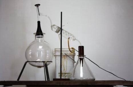 Davis Langlois Meth Lab, 2003, oil/canvas
From 1977 to 1982, she paired rocks she had picked up and saved with painted bronze replicas. Eleven pairs are at the Museum of Modern Art.
I got the idea for this piece while walking in northern New Mexico picking up rocks, as people do. I'd bring them home and I kept the good ones. I noticed that I kept a lot that had galaxies on them. I carried them around in the trunk of my car. I put them on window sills. I lined them up. And, finally, they formed a set, a kind of constellation. I developed this desire to try and put them into an art context. Sort of mocking art in a way, but also to affirm the act of making: the act of looking and making as a primal act of art. (more)
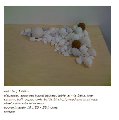
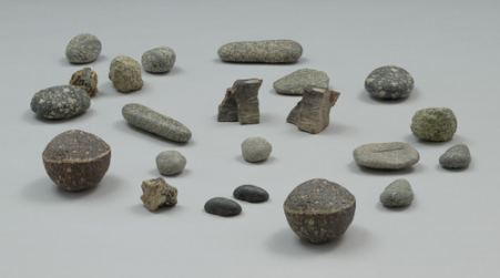 Fourteen years later, Andrew Witkin crafted his own pile of stones. Like Celmins', his assortment is full of ringers. Unlike Clemins, he created his bleached bone pile for beauty's sake. While hers is a challenge to the eye, his is a reassurance. All of it, from table tennis balls and bits of cork to stones and ceramic orbs, vibrates on the same visual frequency in order to fuse.
Seattle could be entering its golden age of art criticism. There are more good writers covering visual art than ever before.Jeffry Mitchell's art is ejaculatory, in every good and holy and dirty and wrong sense of the word. We are discussing this at church. Actually, we are outside church; we've just come from the pews of St. Ignatius at Seattle University, where we lifted our eyes up to the half-naked, tortured, and dead Christ, and kept quiet.
A psychotic need to deny: the Michael Jackson School of Art, here.
Beautiful math in architecture from Los Angeles County Museum on Fire, here.
Douglas Britt on Tilda Swinton, the actress most closely associated with the art world, here.
The best art is meaningless (Bob Dylan: "Walk tall and always carry a light bulb") here.
In what way did Margarete Heymann differ from other Bauhaus pioneers? She was a woman unattached to a powerful male. Hence, her invisibility. Story here.
Real Clear Arts praises the new Whitney Web site, here.
Two Coats of Paint rejoices: "In the hierarchy of art, painting has always been at the top of the heap ...," here.
Jeff Weinstein on Our Great-Grandfather's Butts, here.
Translinguistic Other salutes artist and art enthusiast Joey Veltkamp, here. If every town had a Joey Veltkamp, it would be a (much) better world.
Why is this piece from 2003 in The Guardian so much better than anything Sebastian Smee has written in the Globe?
Sample:
Sex has traditionally been the easiest way to distinguish between them: where art nouveau had been feminine, art deco, the style that succeeded it, was masculine. Feminine meant curves and organic forms, an orgy of ornament; masculine meant straight lines, vitality, speed and streamlining. When art deco kicked in before the first world war, around 1910, the fine arts were still giddy from the revolutions of fauvism, primitivism and cubism. But it really blossomed in the roaring 20s, the age of the flapper: in the collective imagination art deco means women smoking, drinking cocktails and dressing like men.He's too young to have gone slack. I'd hate to conclude it's a difference in editors. The Globe is famous for its editors.
What did that world look like?
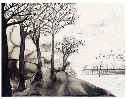
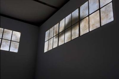
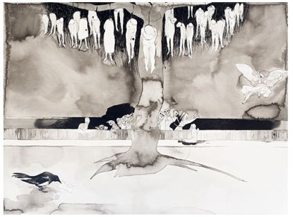 Claire Cowie's The Weeping and Gnashing of Teeth continues at Gage Academy through Saturday.
 Jen Graves:
Death has always stalked Claire Cowie's paintings and sculptures, but lately she's taken it in and given it a furnished room in the parallel universe she's been building for years.
David Dupuis - Lost on the Frontiers of Heaven and Hell
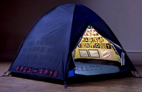
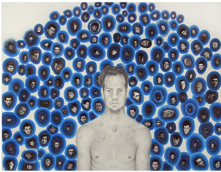 Tracey Emin - Everyone I have ever slept with, 1963-1995
Cartoons are supposed to be unfair, one-sided and vehement. Powhida delivers on all counts. Less successful is the journalism that has risen like a surface to air missile to share in the attack. I'd like to propose the Dick Cheney rule for art writers. Is the subject under investigation poisoning the waterways, stealing from the poor to serve the rich, starting wars and trampling the Constitution? In short, is that person Dick Cheney?
If not, wouldn't it be a good idea to explore the issue with a little more dispassion? In spite of what a handful of art bloggers insist, there are many sides to the so-called ethical questions raised by the museum's decision to feature the collection of one of its trustees, curated by Jeff Koons. (Good overview from the New York Times here.)
Purity police chief Tyler Green would prefer that we not see this show. I don't know Dakis Joannou and am not likely to be invited to his house. I do know about his collection and am grateful it will be on view to the public.
About those ethical problems: I have them with museums featuring trustee collections only when the collections are mediocre. In that case, the exhibit is just flattery. Joannou's collection is remarkable. I want to see it and don't care whose board he's on.
The hip bone's connected to the thigh bone. O, the horror. Trustees know collectors who know artists who know dealers who know museum curators. Some of them sleep together. Some of them are married. Rather than slamming Elizabeth Peyton and Urs Fischer for being connected, how about looking at the work? Both of them are extraordinary artists. I saw the New Museum's Peyton show. Like almost everything else at the the new version of the New Museum, it was badly installed (tough space), but I welcomed the chance to see that much of her work in one place.
There is no rule against museums devoting shows to the work of a single collector. If there were, that rule would be made to be broken. Yes, the rich and powerful are involved in museums. Those for whom this information is a shock and an outrage are too pure (and rigid) to live in the world. If New Museum founder Marcia Tucker did not have them on her team, her enterprise wouldn't have launched or lasted.
He builds models that he photographs as full-scale environments. After Thomas Demand, Oliver Boberg, James Casebere and Ross Sawyers, it's a popular strategy, but Finger's are unlike anyone else's. They were born worn out and anonymous, as if endless actors had been interrogated inside his police station...
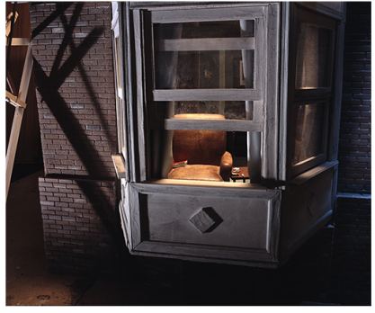
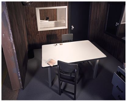 stared out his window ...
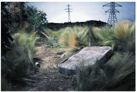
 or glanced at the extra sleeping on a mattress that had been distressed by the special effects department.
 Although he tends to avoid the particular, when he engages it, he goes all the way to iconic.
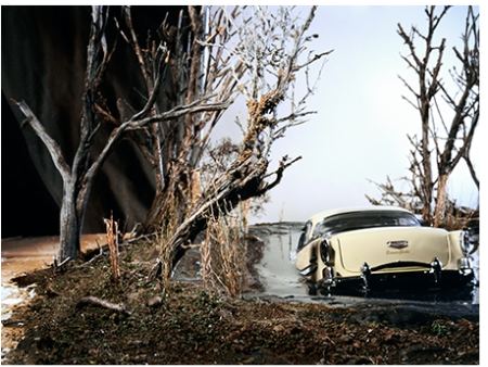 The stage sets Finger filmed and later recreated to photograph and dispose of resonate with moments of his childhood. They are memories potent enough to register outside his head and generalized enough to connect with similar memories of others. The only fox holes he dug, for instance, were in his childhood, playing war while Vietnam was ablaze on the nightly news. He was both bored and transfixed by what looked like his future. The ladder he made is missing a few rungs, giving its user a reason to continue to hide in his hole.
 At Punch Gallery through Nov. 28.
Each year since 2005, when Seattle artist Jaq Chartier and her husband, Dirk Park, rented a sweet little motel on Ocean Beach and invited 35 galleries to join them, Aqua Art Miami was a real contender among what were known as the hotel fairs, satellites to the main event, Art/Basel/Miami Beach. Not only was Aqua's lineup strong, the hotel itself was a draw: open, airy and full of light. Wandering through too many of the other hotel fairs felt like being transported to the hallway fire scene in Barton Fink minus John Goodman, tour guide to the life of the mind.
Scott Lawrimore, who hadn't yet opened his gallery in 2005 but was invited thanks to the quality of his lineup, called Aqua the "single most important event for Seattle artists since Life magazine published The Mystic Painters of the Northwest. "
(Photo, Adam L. Weintraub, 2005: Ben Beres sleeping off a late night of partying on Aqua's open-air second floor.)
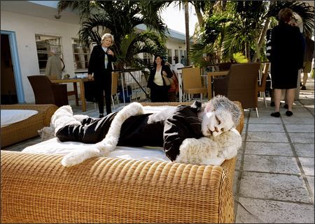 That was then. Lawrimore (who represents Beres) won't be at Aqua this year and wasn't in 2008. Thanks to the economy, turnovers in Miami are the rule this year, including at the main fair, with a 24 percent turnover. (Story here.) At Aqua, turnover is 75 percent.
Of the 8 Seattle galleries in the original Aqua lineup, none is returning, although Howard House will have its name on an artist project room featuring Robert Yoder, and Francine Seders has the same relation to a room featuring Juan Alonso.
Chartier said the issue this year was filling the space. She and Park called 40 galleries to reach one that was "even remotely interested." Attending Aqua for the first time from Seattle is La Familia Gallery. The chances of La Familia being previously accepted into Aqua hover around zero.
In 2007, just in time for the first inklings of the crash-to-come, Aqua split in two to expand, occupying the hotel and opening a warehouse space in Wynwood. While the hotel version of Aqua was inspired, the Wynwood space was easy to lose track of in the overall Miami glut. This year, there is no hotel fair for Aqua, and Wynwood, such as it is, will carry on.
The lease on the Wynwood space runs through this year. Dirk and Chartier had to participate. If they continue next year, they face a steep climb back to hotness.
At Nada, Ambach & Rice will feature Jeffry Mitchell and Karen Sargsyan, with a couple of drawings by Eric Yahnker.
Aqua coverage in the PI from 2005, 2006 and 2007. I didn't go in 2008 and (alas) won't be going this year.
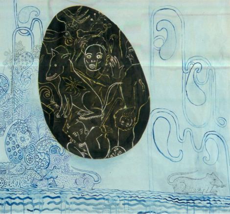
What other people like about oil I don't. It dries slowly. Others like the brush against the canvas. I hated to wait for the paint to dry. My paintings were mud. There's no romance to acrylics, but they're fast and worked for me right away. Oils have a life of their own. With acrylics, you have to mix them to get good colors. For me, watercolors are a sensuous experience. They are as close as I come to romance in the process.
By the late 1970s, she began painting larger than her hand's span but continued to work on paper. She made the leap to life-size figures after she realized she'd figured out everything she needed to know to work small.
I wanted to go beyond what I knew. I don't plan my work in advance. I figure it out as I go. The formal qualities that make the painting click I find as I'm working. When a painting is larger than I am, I have to keep moving. Everything changes. The eye stays in motion, and I feel freer. My paintings are weightless. When they're weightless, they're mine. I could roll 10 years worth of painting in a tube and carry it.
Continue reading Fay Jones and the School of Float.
Ken Kelly has worked his way out of a decade-long slump to bounce back at the top of his game. For years his paintings labored under the effort of their making. By the time they were done, they had gone dry. His new work is monochrome oil and enamel on a grid. Make that a subverted grid. Kelly offers Mondrian's Broadway Boogie Woogie married to African mud cloth and lace dollies. It shouldn't work but it does. As form snaps into place, you can almost hear the click. These paintings are both maps and places. In their densities there is also air. Their patterns allude to landscapes, and shapes are suggestions hovering on the edge of fact. Kelly is once again the painter he promised to be, capable of merging force with grace.Plot from the 2008 exhibit:
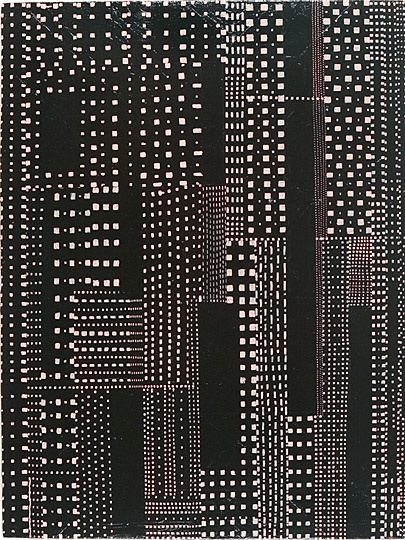 Second verse is not same as the first. The paintings in the current exhibit look like but aren't stretched letters. He moved on from Mondrian to offer constructivist typography in a fun-house mirror.
Go-Go
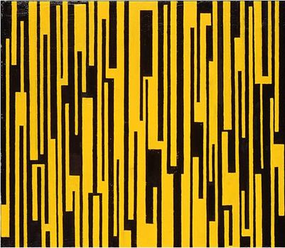 Kelly does not tape off. He pencils his shapes freehand onto canvas, which gives them, when seen in person, a tender intimacy that pushes against the loudmouth elan of their abstracted graphics.
Black and Tan
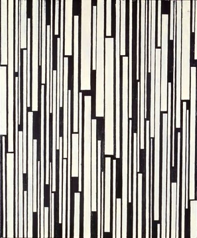 Through Nov. 28.Saturday, 1 p.m., Kelly talks about his work at the gallery.
Houston's Robyn O'Neil draws dense, dainty tableaus that make light work of heavy symbolism. Her heart's in the radical scale shifts and hallucinated oddities of art history: Hieronymous Bosch without his silky spatial connectives, or Pieter Brueghel without his interest in community. Her humans are loners and her animals lost causes. Even when she crowds her space, nobody's home.O'Neil, The Passing
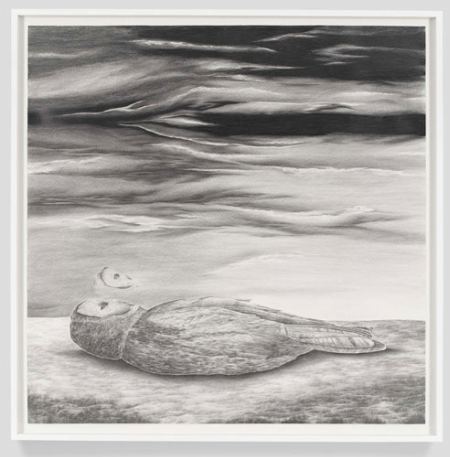 Jennifer Zwick managed to convey the same thing at the same time, wordlessly.
Zwick, Robyn O'Neil, Wall Text, 2006
 Zwick, Robyn O'Neil, Oh, How the Heartless Haunt Us All, 2006
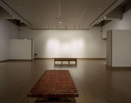
I'd seen his work at G. Gibson Gallery and thought, nice enough, but it doesn't inhabit its own experience. What Jasper Johns said about sculpture - Take an object. Do something to it. Do something else to it. - also applies to photographs. There's something loose and unresolved about Johnson's imagery. His are impressions too faint to score on their own. Had the Henry wanted to explore the myth of the West rattling around in the wrecked present day, it would have been far better off with Glenn Rudolph. Each of Rudolph's images is a world.
The exhibit turned out to be better than I imagined. Turns out, loose and unresolved can be virtues in the right context, like mist on a moor.
Chief Henry curator Elizabeth Brown gave Johnson the chance to rise to the occasion of his formidable backstory. In smaller galleries leading to his are 19th and early 20th century logging photos by Darius Kinsey and Carleton Watkins. They capture the grotesque sublime of a booming industry chomping its way through forests as if other old growths would rise magically in their wake to be logged in turn.
Magic is gone by the time Johnson shows up. He documents the makeshift instead of the magnificent.
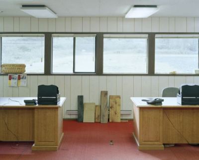

 He's one of those artists whose work resonates in its own company. He offers not soloists but a chorus.
 Johnson images via G. Gibson Gallery and Rena Bransten Gallery.
I was sold on this show until stopped by Morris Graves, whose Abandoned Homestead hangs in an adjancent gallery.
Graves, U.S. (1910 - 2001) 1934 - 1937, Oil on canvas 37 3/8 x 43 9/16 inches. Morris Graves Foundation -- Robert and Desireé Yarber
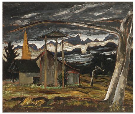 It knocked Johnson clear out of my mind, and I'd just seen him. Through Jan. 31.
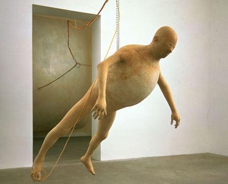
Tim Hawkinson - Bloat is beautiful.
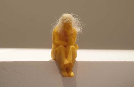
 Jeanne Silverthorne - Staring at her future, which is behind her.
 Christopher Rauschenberg - Feet in muddy water, head in a cloud. (detail)
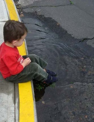 Juan Munoz -The isolation of the outsider.
 Claudia Fitch - Fear of heights, stuck in a high place.
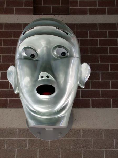
Given the recession, there's also less reason to buy nonessentials on a whim, which pretty much deals a death blow to the rest of the stock. Exit cash cow, enter space waster.
The problem used to be acute at the Henry Art Gallery, where two different vendors brought in to run the gift shop went belly up. Last year, the Henry stopped pretending it had a gift shop. There were books on a small cart near the admissions desk, and that was it. The room behind the cart was dark.
It's dark no longer. Painter Matthew Offenbacher proposed turning it into an artist project space, and the Henry said yes.
Offenbacher:
The Henry museum shop has been in deep hibernation since last year, an inaccessible space of institutional dreaming, a snoring lacuna in the museum's lobby--but not for much longer. Beginning the last week in August this project will turn up the temperature, transforming the shop into a hot house, a catalyst, an incubator for Northwest artists. Exhibitions will fall like dominoes: a cascading cavalcade of adventurous, collaborative, celebratory artistic energy. How do artists work together? What can an art exhibition do? What is an audience? Who are you? What can we learn from each other? I hope you'll join us.It didn't open in August, although the original date is still on the Henry's Web site. It opened in October and was worth the wait. Offenbacher assembles artist teams by picking their names out of his hat. First up are Joseph Park and Jennifer Zwick with a sad-sack video installation.
Gift shop shelves are empty, which adds to the dishevelment. All the action's in a corner in the dark, where the artists' images are projected onto their cut-outs on a makeshift stage. They spin on a pair of Lazy Susans, kick box, dance and stand with silver tinsel at their feet and sing.
Friviloity is hard to pull off in an art context, leading so easily into self-indulgence, but Park and Zwick are adorable.
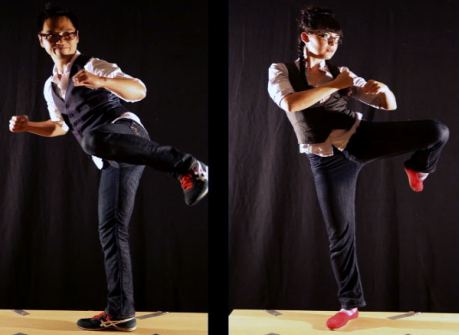 Next, Claire Cowie, Sol Hashemi and Jason Hirata open Nov. 14 with their version of a Northwest Coast Indian potlatch, The Gift Exchange.
Geraniums (from The Tremble Series). 2007-09
Chromogenic prints with vinyl text 20 x 30" Edition, 5.
The earthquake started so modestly only the geologists noticed.... (more)

It's not in this play, either. Plenty of former staffers at the Friday night opening slipped out at intermission.
(Photo, Josh Trujillo)
 The play is structured as a newspaper, with stories jumping inside. (Unlike a newspaper, they jump back out to the front again.) I can't imagine how anybody who didn't work there could make sense of it.
 That story about a feature writer and photographer sent to Detroit to produce a sports-related color story prior to a Seattle-Detroit big game? PI ace writer M. L. Lyke had the assignment in real life, with grizzled, always game photographer Grant Haller. They wound up in a strip joint. Lyke and Haller also went to Iraq as the embedded odd couple, but that story didn't make the theatrical cut. If you didn't know the origin of the stripper saga, you won't learn it from the stage. That version is just a muddle.
More from the stage: History stomps by as a procession in the rear. Some reporter is trying to cover it, and an editor tells him not to upset the advertisers. Never did I ever heard any PI editor telling any PI reporter not to upset advertisers.
Why did the PI fail? The play suggests it was bad management, the cold-hearted Hearst Corp. as well as the diminishing fortunes of the industry. The last factor is undeniable, but the other two are wrong.
The team at the top, publisher Roger Oglesby and managing editor David McCumber, were by far the best in my two decades at the paper. Class acts, they broke with the PI tradition of eccentric, even bizarre top managers. As for Hearst, it fought fiercely to save the PI when the Seattle Times tried to bury it through a court action in 2003. Instead, the PI triumphed in 2007. Justice was on our side, but that wouldn't have mattered if we didn't have Hearst's deep pockets to pay for it.
At that point, smart money was on the PI to survive and the Seattle Times to fail. What happened?
Dan Richman's story in the PI is as good as any.
Here's my version:
Continue reading It's Not In The PI.
"What are you doing?" I asked.
"I'm Twittering your comment about 20,000 new words."
"STOP," I cried in alarm. "I was just talking." (Turns out it was 2,000 words, give or take a word here or there.)
The exchange reminds me of this poem by Robert Creeley:
I Know a Man

As I sd to my
friend, because I am
always talking, -- John, I

sd, which was not his
name, the darkness sur-
rounds us, what

can we do against
it, or else, shall we &
why not, buy a goddamn big car,

drive, he sd, for
christ's sake, look
out where yr going.
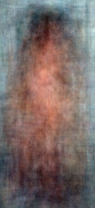
Jason Salavon, Every Playboy Centerfold, 1960s, 2002 (Image via)
 Benjamin's essay - one of the most beautiful in the history of art writing - remains essential for its ideas, cloaked as they are in the political realities of his time and place: Fascism as an immediate threat, Communism as a Utopian possibility.
 Michael Darling's Target Practice: Painting Under Attack, 1949-1978 opens 13 years after Benjamin's study and is informed by its premises.
Painting simply is in no position to present an object for simultaneous collective experience, as it was possible for architecture at all times, for the epic poem in the past, and for the movie today. Although this circumstance in itself should not lead one to conclusions about the social role of painting, it does constitute a serious threat as soon as painting, under special conditions and, as it were, against its nature, is confronted directly by the masses.Confronted directly by the masses....
The purpose of museums is to be safe havens for art and to present that art to the public. The real threat to the aura of an artwork in a museum setting, however, is the public itself.
That's why the most esteemed work is no longer visible there. To see the Mona Lisa amid the whir of cameras in a murmuring crowd is to not see it at all. The rich and influential can arrange private tours of the Sistine Chapel. I know someone who stood alone in that room, not even a guard to keep him company. He lay down on the floor and stared. Every time I've been there, the floor was a cattle pen and the cattle restless, eager for an experience they weren't sure they were having.
I'm all for visitors being able to take photos of art in museums, and also for them to draw, paint and sculpt their reactions to their encounters, even (shudder) organize their own tours led by themselves for their (inevitably rowdy) friends. Unless the community feels ownership of museums, they will not thrive. Patronage of the precious few is not enough. But the pleasures of seeing art with few or no others in the vicinity cannot be denied. It is in those solitary moments that real connections occur. Numberless times in museums and galleries I have yearned to tell those around me to shut the fuck up. Art museums must attract the public but also manage the public they attract. None of that is easy.
I'm writing this in response to an earlier post, If it isn't spreadable, it's dead, because that post made it sound easy. I can only add I'm glad I'm not in charge.
The rampage recalled other mass shootings in the United States, including 13 killed at a center for immigrants in upstate New York last April, the deaths of 10 during a gunman's rampage in Alabama in March, and 32 people killed at Virginia Tech, the deadliest shooting in modern American history.
The shooter, Maj. Nidal Malik Hasan, is a psychiatrist. Where did he get the guns and why did he have them?
Again, The NYT:
"He could have just brought (them) onto the installation," Colonel Rossi said.We know what will happen next. Any Muslim who knows Hasan, especially one who sympathized with his doubts about U.S. policy in the Middle East, will be in for a harrowing experience. All it takes is an email saying, "I hear you, brother." Who doesn't have doubts? We're in the wrong. Of course the government needs to investigate. What they won't investigate is the thing that makes carnage easy:
Chris Crites
 Justin Colt Beckman, digital collage of the artist's face on found photograph
 Karen Ganz, even in our dreams
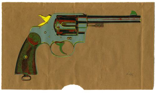
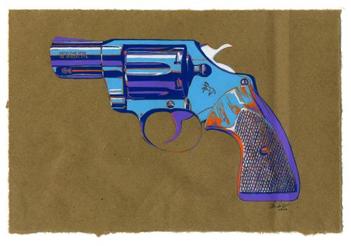
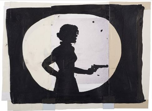 Speaking of carnage: today in Seattle, here.
Roy Lichtenstein, Gun in America
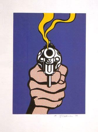 Update: From Orlando, more shootings today, here. Easy access to guns makes the entire country a war zone. Deadly violence can pop up anywhere, in any church, business, home or on any sidewalk. And from the department of stupid headlines, from the Houston Chronicle about the Fort
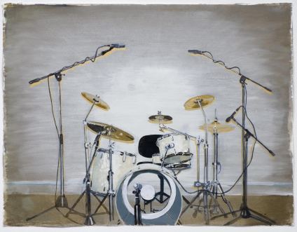
 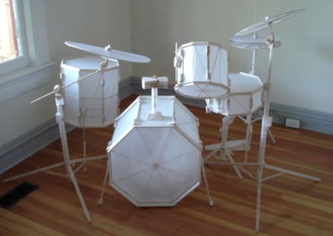 Arjan van Helmond's Drums (ink, gouache, acrylic on paper)
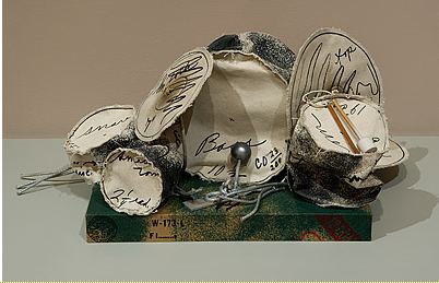
 Update: Expanding the theme to useless drums in other media, Scott Wayne Indiana suggests Claes Oldenburg's drums in canvas. (Image via)
Alas. His theatrical heart can find expression only through the work of his hand. In that hand is a scissors.
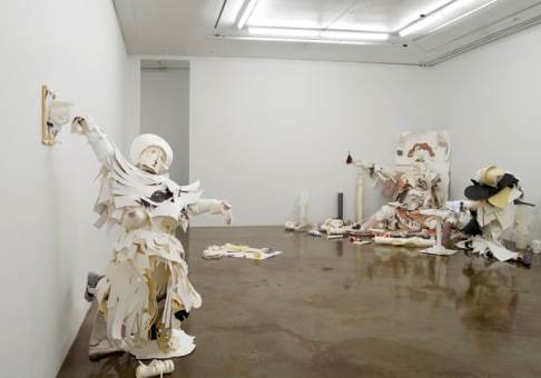 The queen flings her arms out in a slow-motion, dying fall, ignored by her rotund consort in the corner who prefers the company of his jester.
 Now at Ambach & Rice, Sargsyan's Abroad Understanding was created at the Hat Factory in upstate New York and exhibited earlier this year at the Hudson Valley Center for Contemporary Art.
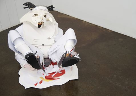 Sargsyan was born in Yerevan, Armenia in 1973 and lives in Amsterdam. At a time in which young artists are increasingly disinclined to commit to a single medium, Sargsyan has thrown his all behind heavy-stock paper, which he cuts into frenzied form and hangs on metal armatures, just as his Netherlands colleague, Folkert de Jong, focuses on painted Styrofoam.
 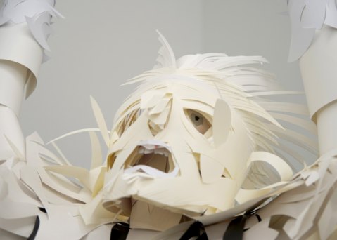 What Boccioni achieved in 1913 with bronze, Sargsyan updates and transforms with flimsier materials. Motionless, each of his figures is in motion, layered into a series of messy tableaus. As his figures are nothing more than large paper dolls, they should be trivial, but the elusive themes they sound are profound.
 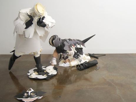 Through November 28. Ambach & Rice is expanding the idea of what a gallery can be in Seattle, not just a commercial space but an art center with a global reach.
  Nina Simon specializes in advising museums on how to deal with Internets and their audience spawn. (Her blog, Museum 2.0, here, via Betsey Brock.)
Simon's post about why museums should allow their audiences to take photographs is so obviously right it's remarkable that she wrote it down, except, most museums don't. Whip out a camera at the Seattle Art Museum only if you long to be chastised by a guard or two. Ditto the Henry.
Here's the first point of her 5-point argument.
As long as it does not promote unsafe conditions for artifacts or people or illegal behavior, museums should prioritize providing opportunities for visitors to engage in ways that are familiar and comfortable to them. Yes, some people (especially vocal museum staff!) hate the sight of people taking photos in museums. But what about visitors? If your argument is based on visitor comfort and distraction, it should be backed up by visitor research, not personal impressions.I'm happy to report that SAM doesn't engage in the prejudicial treatment Simon describes, allowing people to draw but not take photos. SAM won't let people draw either, except with pencil.
Would staff members who hate photography be comparably disturbed by visitors sketching in the galleries? Sketching takes up more space and is more distracting than photo-taking (and pencils could be used to damage objects!), and yet many museum professionals look benevolently upon that activity as a positive meaning-making visitor experience. This is prejudicial treatment. I know that many people are uncomfortable with the growing culture of self-documentation, but no one should let their own aesthetic preferences dictate others' behavior without good reason.
Simon wants museums to give visitors more freedom. Half a century ago, Frank O'Hara had something similar to say to mothers:
AVE MARIA
Mothers of America
let your kids go to the movies!
get them out of the house so they won't know what you're up to
it's true that fresh air is good for the body
but what about the soul
that grows in darkness, embossed by silvery images
and when you grow old as grow old you must
they won't hate you
they won't criticize you they won't know
they'll be in some glamorous country
they first saw on a Saturday afternoon or playing hookey
they may even be grateful to you
for their first sexual experience
which only cost you a quarter
and didn't upset the peaceful home
they will know where candy bars come from
and gratuitous bags of popcorn
as gratuitous as leaving the movie before it's over
with a pleasant stranger whose apartment is in the Heaven on Earth Bldg
near the Williamsburg Bridge
oh mothers you will have made the little tykes
so happy because if nobody does pick them up in the movies
they won't know the difference
and if somebody does it'll be sheer gravy
and they'll have been truly entertained either way
instead of hanging around the yard
or up in their room
hating you
prematurely since you won't have done anything horribly mean yet
except keeping them from the darker joys
it's unforgivable the latter
so don't blame me if you won't take this advice
and the family breaks up
and your children grow old and blind in front of a TV set
seeing
movies you wouldn't let them see when they were young
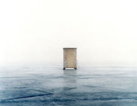
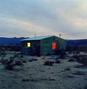
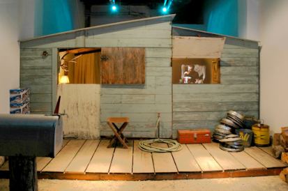
Some people don't aspire to spacious. Even if they had the funds to expand, they'd still wrap themselves in a home as if they were pulling on a sweater or wriggling into a shell. The inanimate becomes a layer of self with no room for another. Below, where solitaries go, both stationary and on wheels.
Scott Peterman
 Amir Zaki
 Andrea Zittel
 Kevincyr, suggested by Jennifer Zwick
 Buddy Bunting
 John Divola
 Justin Colt Beckman
 SuttonBeresCuller
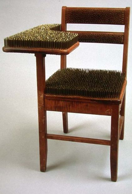
About the impression Daly made in the MFA exhibit at the Henry, I wrote:
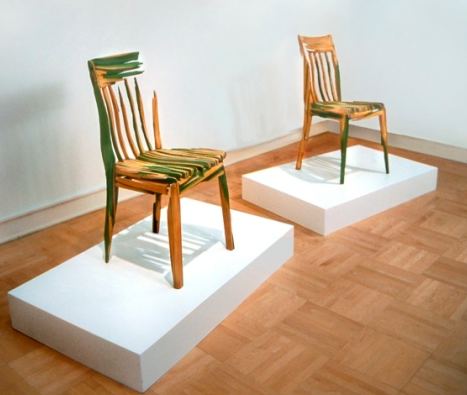
Just inside the galleries are two chairs by Drew Daley that aren't chairs at all. Keep looking at them, and they turn into rarified paintings, all scraped down and burnished to a soft green glow. They impersonate the useful as tribute to the uselessly beautiful.Later I learned that the two chairs started as one chair. By carving it, Daly doubled its presence. That piece:
 About Brown I wrote:
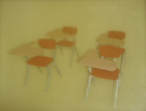
Timothy Brown's massive chunk of yellowing resin has four (schoolroom) chairs painted inside it. I love their spindly legs. With their platter tops and the ghostly contrivance of the resin layering, they are memories frozen in time.That piece:
 And more recently:
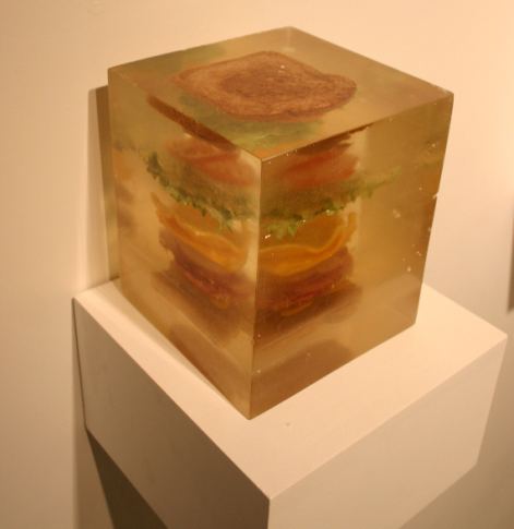 These artists were familiar with each other's work, at least
peripherally, as their studios
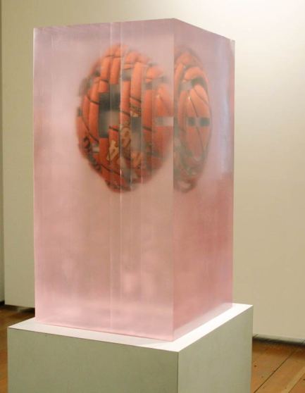
 As part of Daly's current exhibit, he too has turned to resin.
 Circulating around town are rumors that Daly plagiarized Brown. About Daly's current show, I wrote:
The dropped ball never hits the floor in Drew Daly's resin sculptures, which are surely a tribute to Jeff Koons' Three Ball Total Equilibrium Tank from 1985 in particular and to Lucas Samaras in general...Daly makes art as if the world were a bellows, breathing in and out. On the exhale, faces, furniture and (most recently) sports equipment pull apart in fragments. On the inhale, they reform, but not necessarily in their original shapes. Two chairs become one, or one becomes two. Twelve fuse as if through an electrical current. A chest of drawers bends and flares. (more)Brown's work didn't come to mind when writing that review. If it had, I would have been unlikely to mention it. There's a material similarity, but the focus is entirely different, Daly honing in on fracture and Brown on floating sense world memories.
Intentionally or unintentionally, Daly might well have borrowed the idea of resin casts from Brown, but he might also have been thinking of Rachel Whiteread. Art comes from art. What matters is not the what of materials but the how of their use.
In regard to who did what when and thinking strictly of subject matter, don't both artists owe Jack Daws?
Daws' Hollow Reed from 2001:
 No.
No.Does Daly need to acknolwedge Daws' Basketball Watermelon from 2002?
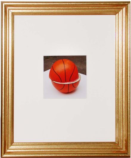 No. Brown deserves a far larger career than he has had to date. Daly did not, however, steal his play or render it invalid.
 Today in the New York Times: Brooklyn Woman Finds Counterfeit Penny Made of Gold, here. Also, Jen Graves logs in here. The story has legs. Now that Jack Daws is going to be known as Midas of Small Things, he's going to see his work reflected back at him from halls of crazy media mirrors.
One distortion is already in play: Daws shelled out $1,000 for the gold in 10 counterfeit pennies. My math has never risen to the status of elementary, but that means $100 per penny. It doesn't mean that each penny is worth $100. Each of his penny-shaped sculptures is currently worth $1,000. To say it's worth $100 is like saying a Brice Marden is worth the cost of its oil paint and canvas.
In an essay in Art and Culture published in 1961, Clement Greenberg observed that gold is art's umbilical chord.
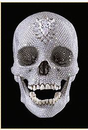
Daws' pennies are the disinherited kin of Damien Hirst's For the Love of God. Hirst's diamond-encrusted skull cost $14 million to produce but is worth whatever the market roller coaster says it is, at least $50 million.
 Artists from Gary Hill to Chris Burden
have been working gold into their installations. Only Daws uses what is valuable to impersonate the valueless. If gold is the umbilical chord of art, Daws suggests it is wrapped around the throat of the baby. On that most basic level of their meanings, both Daws and Hirst are on the same page.
Artists from Gary Hill to Chris Burden
have been working gold into their installations. Only Daws uses what is valuable to impersonate the valueless. If gold is the umbilical chord of art, Daws suggests it is wrapped around the throat of the baby. On that most basic level of their meanings, both Daws and Hirst are on the same page.-Walker Evans, lecture, Yale University, 1964
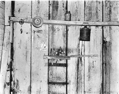
ViaWalker Evans, from Now Let Us Praise Famous Men, 1941
 Roger Ballen, Encroachment, 2001
Thursday night, 6-8 p.m.
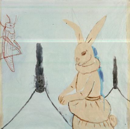
Rabbits dress better than you do: Fay Jones at Grover/Thurston Gallery.
 Now hear this: Ken Kelly at Howard House.
Continue reading Seattle galleries: November openings.
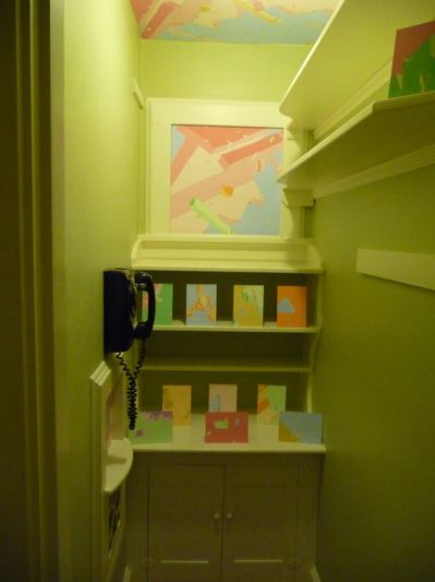
From its Web site:
It is located in a Dutch Colonial home in Tacoma and since 1930, its sole purpose has been to house a black rotary dial telephone. Until now...The Telephone Room is small, but its mission is big: to house artist-driven exhibits and programming. Big ideas in an intimate space.Opening tomorrow night are Blake Haygood's new drawings under the collective title of Is You Is, in gouache and graphite on ragboard.
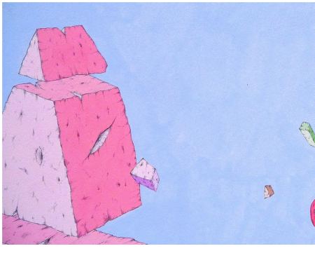 Haygood began as a printmaker and still paints in a modified printmaking style, incising form into wood panels and painting in layers through a process of erasure, laying on and partially wiping out. When he began painting earlier in the decade, acrylics in a mineral varnish woke up his
weightless world.
 Born in Athens, Ga., in 1966, he grew up in a smaller, more rural town nearby, spending a lot of time at his grandfather's farm bordered by woods. Untended, the farm had slid into disrepair. Beyond a barn with a caved-in roof and machinery rotting in the field was the woods, also strewn with broken machines.
A walk in the countryside meant a scramble over dumped refrigerators, cars and parts of cars, washing machines, buzz saws, bikes and bed posts. Wild grasses, mosses and tree saplings used the machinery as nurse logs, shooting up inside it and growing large enough to shoulder it aside or bury it.
Haygood's new work has moved beyond the semi-pastoral decay of the old South to explore more remote cosmologies. Inside them, densities of cut stone or wood linger on their blunt bases before pushing off into the air. His forms may be eroded, but his soft hues are always brand new. He is a master of the potent blank. He takes his cues from traditional Chinese landscape artists who created air, water and mountains largely by leaving them empty. Haygood's forms are lovely, but it's the colored air around them makes them matter.
Is You Is is half a line. Musically, it ends in a love song. Although Haygood uses the reference to mark a career turning point, no longer part-time painter and part-time art dealer but painter full-time, his paintings make the song their own. What is lost, ruined or left behind is desirable again in the redeeming space he makes for it.
Update: Better image via
What's more, it's a life in Portland. We in Seattle imagine Portland artists constantly having dinner. Even a resolute outsider such as Freeze would have plenty of friends in Portland, more than his narrative can keep track of. His friendships are the cushion he leans on to keep his solitary occupation in motion.
When Seattle artists look up from their work and realize they haven't talked to anybody in a month, Portland's collective comfort zone looks good.
Below, a few quotes from the book for its flavor, with images of paintings from a few of Portland's nonfictional finest.
David Andres was saying if he could just get the right people to object to something of his, to insist that it be removed from wherever it had been placed, it would be the making of him. It would mean a reputation, which is money in the bank. It would mean a better bottle of wine with dinner, a car with more horsepower, a house with more square feet, a girlfriend with fewer cats.
James Lavadour, Blue Back
I like my pictures to look crowded - sort of stuffed into the fame. The canvas should be full like your plate when you sit down to dinner - suggestive of emotional and/or metaphysical abundance.
Judy Cooke, Ice Melt
I don't want to be part of the perpetual revolution, the chasing after novelty. The freedom to go where you want is one thing, but the obligation to move on, move on - that is the demand made by a policeman. You are never saying anything; you are trying to say it. You never get to finish or to amplify a thought.
Anna Fidler, Correspondences
I hate watching people look at my pictures. I never like anything about the way they do it.
Adam Sorensen, Squall
My father claimed he could smell electricity, and my mother was always telling us how many hours it had been (plus or minus a quarter) since this or that person had bathed or showered. I myself am similarly sensitive. The stench of the studio is one of the things I like best about being a painter.
Storm Tharp, Approaching Thunderhead
I don't think of my pictures as small - I think of them as efficient.
Michael Brophy, Kitchen Painting #28
From the National Summit on Arts Journalism:
First Prize of $7,500 goes to Glasstire (www.glasstire.com) of Texas. Second Prize of $5,000 goes to FLYP Media (http://www.flypmedia.com/) of New York City. Third Prize of $2,500 goes to San Francisco Classical Voice (www.sfcv.org) . Additionally, all three projects, along with finalists Departures (a project of KCET in Los Angeles http://kcet.org/explore-ca/The purpose of the summit was not a search for content. Content is not what's broken. It was a nationwide call for new delivery systems for arts content, be it through criticism, photo essays, videos, forums and/or arts-driven social networking sites. Interesting, then, that NAJP voters chose to award first place to the site with the best content.departures/ ) and Flavorpill (www.flavorpill.com ), previously were awarded $2,000 each for being chosen finalists for the National Arts Journalism Summit.
Makes sense. NAJP members are mostly critics. Critics want a place to write and the opportunity to be paid for their work. With wit and energy, Glasstire provides both, although writers are largely freelance: few living wage jobs available.
Coming in second, FLYP Media is a design marvel, but so far tends to be weak on content. If the editors undertake to improve the writing (and that means also the thinking) of its offerings, it will be able to offer genuine employment to writers, who so far play a secondary role. A brainy FLYP would be huge.
The closest thing to favorable are Victoria Ellison's three paragraphs tacked on to the end of her Calder review. The decision to turn Michelangelo into a Calder postscript pushes in the opposite direction of her generous comments. (Whose work got the illustration? Calder's.)
(My Michelangelo review here. My Calder here.)
In his fine Calder review, Stephen Cummings reduced his reaction to Michelangelo to the following:
It may go without saying that SAM has a bit of a (deserved) reputation for mounting second rate shows. (Michelangelo certainly qualifies.)If SAM has this reputation, it is unearned. At the region's flagship museum I've never seen an exhibit as overblown and underfed. It's the kind of thing John Buchanan used to surround with superlatives when he was
Back to Walt Whitman:
The 1855 publication of Leaves of Grass was heralded by anonymous reviews printed in New York papers, which were clearly written by Whitman himself. They accurately described the break-through nature of his "transcendent and new" work. "An American bard at last!" trumpeted one self-review. (more)Anyone caught doing that today would surely share the fate of James Frey. He took a beating for his memoir, A Million Little Pieces, discovered after publication to be partly fictionalized. In response to his critics, Frey commissioned a painting by Ed Ruscha. (Story here):
Donald Barthelme, from The Dead FatherNo story ever happens the way we tell it, but the moral is always correct.
 (Previous post here.)
The chances of anyone noticing the penny Daws cast in gold and slipped into circulation at LAX more than two years ago are slim. On the side of discovery, it's slightly smaller than the ordinary one, because gold is heavier. If Daws' penny were the usual size, its weight would have given it away. As it is, it's three grams to a penny's two.
This weekend, Reed send Daws an email explaining how she found it.
 "This is a story about finding a penny, but it begins with a dime. As for how it all ends, of that I have no idea...
 On Monday of last week (the 26th), I was counting out the 44 cents I needed to complete a purchase when I spotted an unfamiliar coin in the lot. Looking closer, I realized that it was a U.S. dime, minted in 1924, but unlike any dime I'd ever seen. Once home, I did a Google search and identified the dime as a 1924 Mercury Head; not very valuable, but beautiful none-the-less.
Researching it reminded me that I had another unusual coin in my possession--a golden penny. I'd had it for a few months ( at least) having noticed it when I was paying for groceries at the neighborhood C-Town.
Continue reading On finding Jack Daws' penny.
My mother and father didn't work out; my mother remarried during a blizzard at the Old First Church in Bennington, Vermont, where Robert Frost is buried. This place, which around this time of year will smack you silly with beauty, is less than an hour from our house in small-town upstate New York, and on the way is a museum we'd often stop at, the Bennington Museum. That museum has just one claim to fame: its unparalleled collection of paintings by Grandma Moses. The headline of her obituary in 1961 in the New York Times read, "Grandma Moses Is Dead at 101; Primitive Artist 'Just Wore Out,'" and the obituary contained the remarkable line "Grandma Moses did all of her painting from remembrance of things past."The above paragraph is not a wandering path to a Grandma Moses review. The alleged subject has nothing to do with her. And yet, there's more:
Grandma Moses may be the first recognized painter whose paintings I ever saw. Her story is like my mother's. She lived on a farm. She started painting at the age of 76 because she couldn't stand the thought, as the Times put it, of being idle. My mother does not paint, but now in her 60s, she is on her second career, which is more strenuous than her first.Still more:
Despite all those visits to the museum, I do not recall any single painting by Grandma Moses, but that's not really how Grandma Moses paintings work. You remember them in aggregate--their belief in warmth despite snow, their belief in the delight of brightly colored sweaters, their belief in the togetherness of tiny amiable sticklike people (she squeezed them in last, working her compositions downward from the sky) who, as again the Times pointed out (it really is quite an elegy for being so offhandedly journalistic), "cast no shadows." You remember them for their belief, period. "You have no idea how much you can handle until it happens," my mother always says, promising the strength of the American character whatever might come. Conviction is the core of folklore, not style. Folk art is not just a matter of untrained marks, but of untrained marks imbued with an unwavering but not entirely plausible sense of their own worth against the odds.Once the review clears the hurtle of its preamble, it's terrific. There are slender metaphoric threads connecting the body of the text to the heavy weight of its opening, but why must the text carry this burden? Lucy Lippard used to do this in the 1970s. It went out of style, but it's back. Graves, who appears to be still upset by the breakup of her parents' marriage, has saddled herself with its practice.
Reviewing the same show for Glasstire, Laura Lark also took time to tell us about herself. Lark's lead works (unlike Graves') because her confidences serve as welcome mat to the subject she will in time get around to: The Old Weird America, now at the Frye Museum, its last stop.
A few years back a heavy package arrived at my door, addressed to my then-husband. Inside was a bronze statue of a realistically rendered cowboy riding a bucking bronco. Perfectly hideous. Think George H. W. Bush statue at Houston Intercontinental Airport. Who would send us such a thing?Even though Lark sold me this time out, critics who think the audience needs to be chatted up before it will tolerate the rigors of a review are mistaken. Better to aim for the rarities of rigor and momentum, and let the review carry itself.
I used it as a centerpiece for dinner parties. It got a lot of laughs. After the joke wore thin, I used it as a doorstop.
We later discovered that the statue had been intended for a wealthy and powerful member of the UT Longhorns alumni association who had the same name as my ex-husband. The man sent a special courier to pick it up and was none too pleased when I refused to re-package it.
Months later, my husband came home with an issue of Time magazine, opened to a picture of George W. in the Oval Office. In it, Bush grinned and shook hands with folks in his good ol' boy fashion. Behind him, on a shelf, was either the statue -- our statue -- or a replica by the same artist.
No doubt Bush viewed the statue as a symbol of American ruggedness and independence -- something he desperately wants to be identified with. I viewed that little slice of Americana as pure kitsch.
The Old, Weird America, currently on view in the main gallery at the Contemporary Art Museum Houston and organized by CAMH senior curator Toby Kamps, tells a more nuanced story.
Graves doesn't agree, and why should she? She's pitching in a different game. While my sort of critic wants to disappear into the art, she wants the art to disappear into her. A less biased way to say the same thing might be, she wants art to be metaphorically illuminated by her personal story. Her risks are grandiosity and self-absorption, but the nearly-impossible-to-achieve payoffs are essays that transcend their genre, in which a critic becomes an artist. I think she's good enough to get there. Surely it's brave to try. I'd rather lose a digit.
Steven Miller, self-portrait from the night in question:
About
Blogroll
AJ Blogs
AJBlogCentral | rssculture
About Last Night
Terry Teachout on the arts in New York City
Terry Teachout on the arts in New York City
Artful Manager
Andrew Taylor on the business of arts & culture
Andrew Taylor on the business of arts & culture
blog riley
rock culture approximately
rock culture approximately
critical difference
Laura Collins-Hughes on arts, culture and coverage
Laura Collins-Hughes on arts, culture and coverage
Dewey21C
Richard Kessler on arts education
Richard Kessler on arts education
diacritical
Douglas McLennan's blog
Douglas McLennan's blog
Dog Days
Dalouge Smith advocates for the Arts
Dalouge Smith advocates for the Arts
Flyover
Art from the American Outback
Art from the American Outback
lies like truth
Chloe Veltman on how culture will save the world
Chloe Veltman on how culture will save the world
Life's a Pitch
For immediate release: the arts are marketable
For immediate release: the arts are marketable
Mind the Gap
No genre is the new genre
No genre is the new genre
Performance Monkey
David Jays on theatre and dance
David Jays on theatre and dance
Plain English
Paul Levy measures the Angles
Paul Levy measures the Angles
Real Clear Arts
Judith H. Dobrzynski on Culture
Judith H. Dobrzynski on Culture
Rockwell Matters
John Rockwell on the arts
John Rockwell on the arts
State of the Art
innovations and impediments in not-for-profit arts
innovations and impediments in not-for-profit arts
Straight Up |
Jan Herman - arts, media & culture with 'tude
Jan Herman - arts, media & culture with 'tude
dance
Foot in Mouth
Apollinaire Scherr talks about dance
Apollinaire Scherr talks about dance
Seeing Things
Tobi Tobias on dance et al...
Tobi Tobias on dance et al...
jazz
Jazz Beyond Jazz
Howard Mandel's freelance Urban Improvisation
Howard Mandel's freelance Urban Improvisation
ListenGood
Focus on New Orleans. Jazz and Other Sounds
Focus on New Orleans. Jazz and Other Sounds
Rifftides
Doug Ramsey on Jazz and other matters...
Doug Ramsey on Jazz and other matters...
media
Out There
Jeff Weinstein's Cultural Mixology
Jeff Weinstein's Cultural Mixology
Serious Popcorn
Martha Bayles on Film...
Martha Bayles on Film...
classical music
Creative Destruction
Fresh ideas on building arts communities
Fresh ideas on building arts communities
The Future of Classical Music?
Greg Sandow performs a book-in-progress
Greg Sandow performs a book-in-progress
Overflow
Harvey Sachs on music, and various digressions
Harvey Sachs on music, and various digressions
PianoMorphosis
Bruce Brubaker on all things Piano
Bruce Brubaker on all things Piano
PostClassic
Kyle Gann on music after the fact
Kyle Gann on music after the fact
Sandow
Greg Sandow on the future of Classical Music
Greg Sandow on the future of Classical Music
Slipped Disc
Norman Lebrecht on Shifting Sound Worlds
Norman Lebrecht on Shifting Sound Worlds
The Unanswered Question
Joe Horowitz on music
Joe Horowitz on music
publishing
book/daddy
Jerome Weeks on Books
Jerome Weeks on Books
Quick Study
Scott McLemee on books, ideas & trash-culture ephemera
Scott McLemee on books, ideas & trash-culture ephemera
theatre
Drama Queen
Wendy Rosenfield: covering drama, onstage and off
Wendy Rosenfield: covering drama, onstage and off
visual
Aesthetic Grounds
Public Art, Public Space
Public Art, Public Space
Another Bouncing Ball
Regina Hackett takes her Art To Go
Regina Hackett takes her Art To Go
Artopia
John Perreault's art diary
John Perreault's art diary
CultureGrrl
Lee Rosenbaum's Cultural Commentary
Lee Rosenbaum's Cultural Commentary
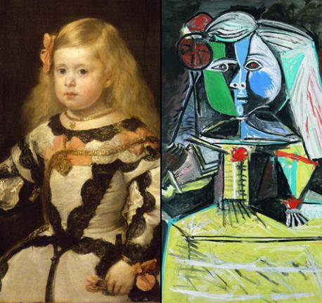
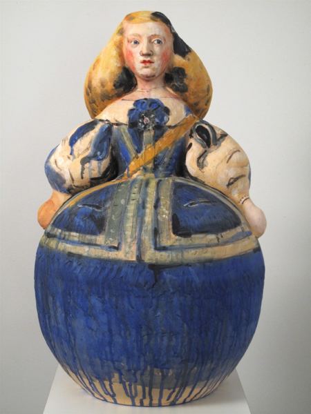
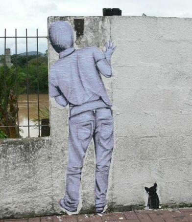
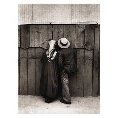

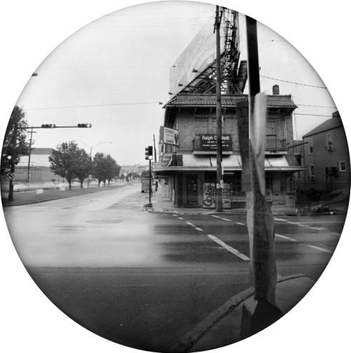
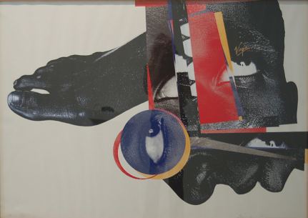
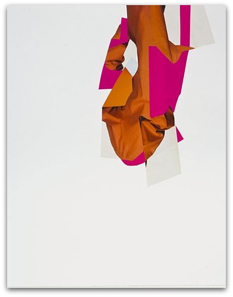
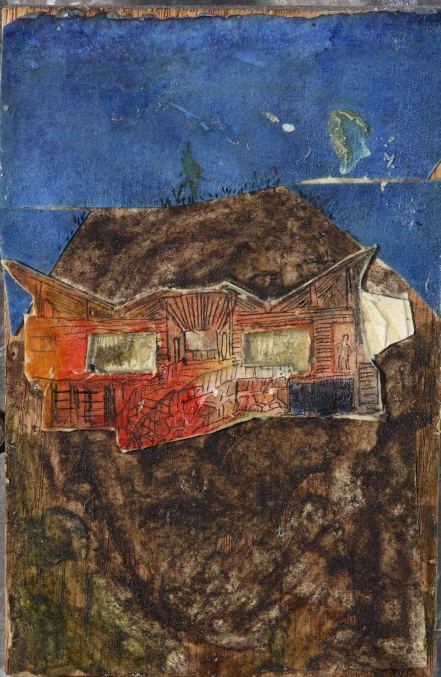
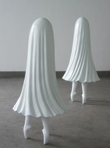
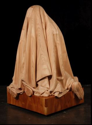
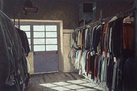
 '
'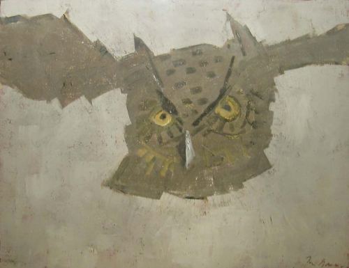
 The brothers
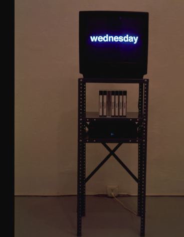
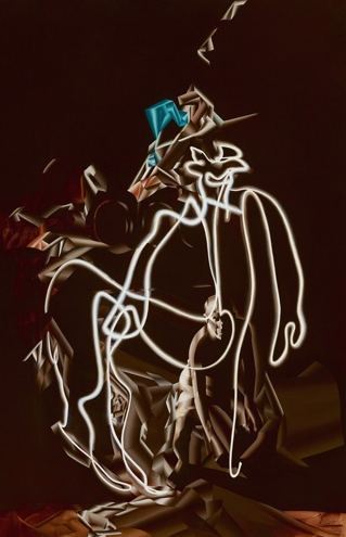
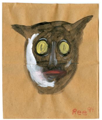


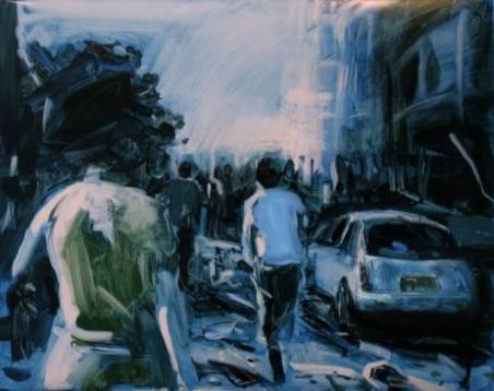
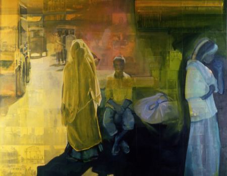
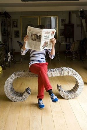
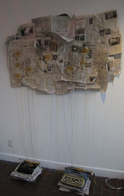
 Oil: (
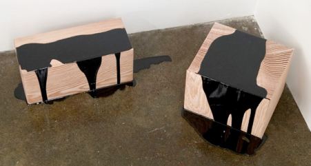
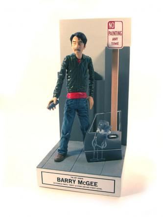
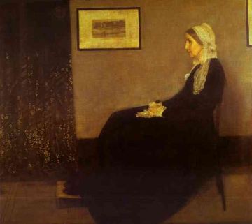
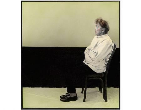

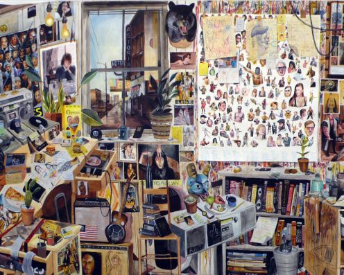
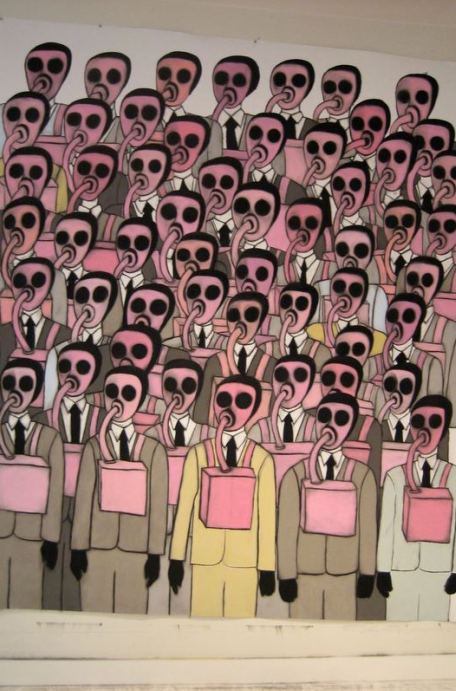

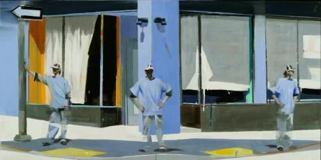 The light dissolves intention, starting at the legs and paralyzing upward.
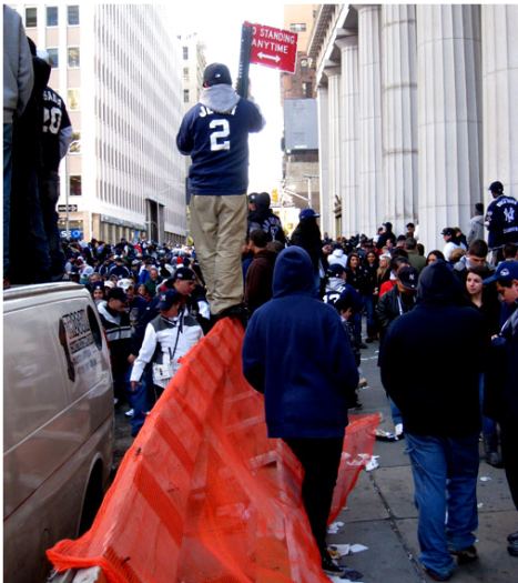
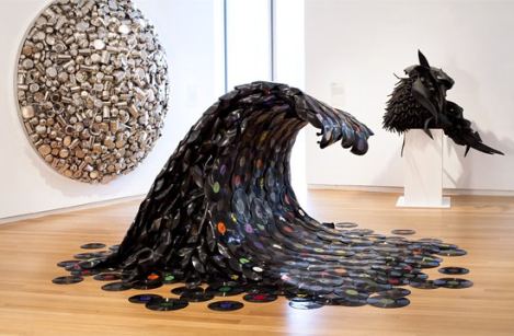
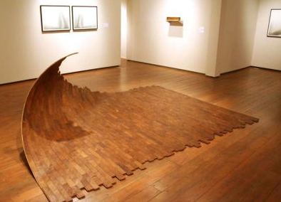



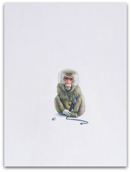

Recent Comments