Another Bouncing Ball: September 2009 Archives
 Ryan opens an exhibit at Fantagraphics Gallery Oct. 10, 6 -9 p.m., accompanying the launch of his graphic novel, Prison Pit.
 That 12-show a year schedule was tough to maintain. Too tough, plus, it didn't allow for the work to sink in. Some galleries drifted toward 6-week shows, and others began to open and close when they felt like it.
But never have so few galleries debuted on First Thursday.
What's there is top of the line. The usual others will be open as well, even though they are nearly all at the end of a run.
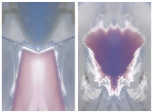
Matthew Offenbacher ...
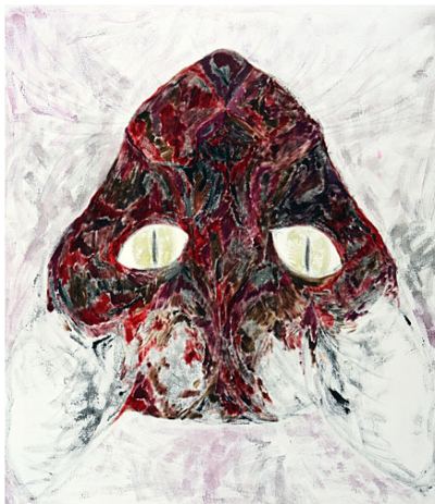 and Tony De Los Reyes...
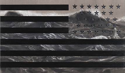
open at Howard House.
Also, Tim Roda ...
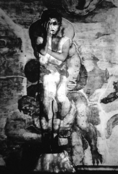
and Drew Daly ...
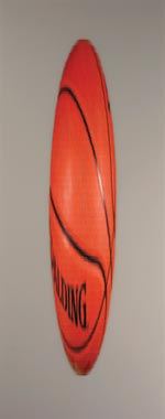 open at Greg Kucera. That's all in the way of mainstream galleries. Fortunately, mainstream galleries aren't the only ones in the Square. Soil opens what looks like a fascinating invitational lineup, and Punch is auctioning off its entire group show, $10 per ticket.
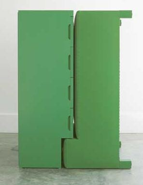
I'm in. Among other tempting offerings, the piece below, by Ries Niemi, is calling my name.
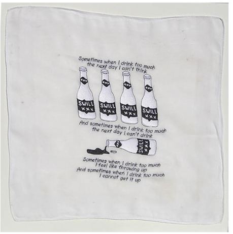
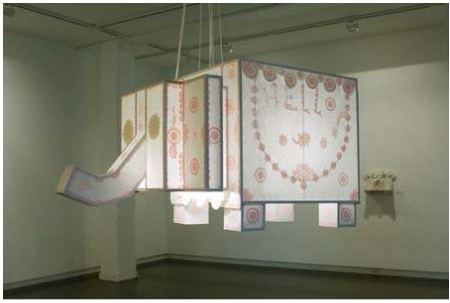 Jen Graves on Mitchell getting his Genius Cake here. This year's other awards here.
Ries Niemi:
Santino, 1977, at and/or in Seattle:
Okay, I am hopelessly biased - Pete has been a friend of mine for a long long time, and I respect his work immensely, and own a few pieces of it, too. But how is it so hard to comprehend that he is BOTH sincerely sorry, and ironic, sly, and making comments about the art world? Many of the best artists have not been 100% pure of art (or heart). The human brain, and soul, is perfectly capable of feeling two things at once. In fact, its probably incapable of NOT doing so.
At Roscoe Louie in 1979, in Seattle:Santino is sorry because he did not become recognized as an artist by the powers that be. And by the time we get to 50, any artist who is halfway honest with him or herself is probably sorry as well. Santino is sorry because he did not accomplish all his grand plans, the ones he had when he was young and snarky and commenting on blogs.
detail
Even without a Nazi echo in a piping voice, Clinton's plan assumed a fantasy, as DailyKos noted, that "hard work stocking shelves will lead Wal-Mart to pay you more than $7.50 per hour."
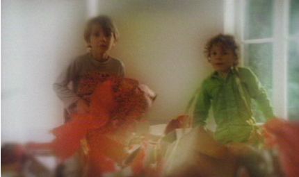 Maria Marshall's President Bill Clinton, Memphis, Nov. 13, 1993 charts a Sisyphean cycle. Unwrapping nothing reverses into clean-up before rolling on again. Still, the idea that the work parents do (or don't do) influences their offspring is undeniable.
Marshall is part of Parenthesis, an exhibit that examines the connective tissue between parents and children. It's art made from life's glue.
Because Parenthesis is largely video, its curator (Western Bridge director Eric Fredericksen) worried that sound overlaps would produce a muddle. Instead of retreating to headphones, he hired theater designer Jennifer Zeyl to shape the space to contain individual sounds as well as enlarge the theme.
She created a house with the trappings of home, based on the upper-middle class tract version she grew up inside. (Photo via Best Of)
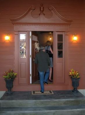 Before you enter, you're already inside, having passed by Ann Hamilton's video Still 3 from 2001 inset into a wall by the reception desk. Still 3 is small and easy to ignore, but once you stop, you're hooked. It features a mother's voice as she examines an ultrasound video of her baby.
I think a lot of the very abstract quality of my work - and the literal quality of it - is always dealing with a state or a place or an edge, a border, a threshold, a place that's in between. (more)Behind the Hamilton are a cluster of terrific photographs: Kerry Tribe's Dad's Books, My Film Equipment from 2006; Sally Mann's Burgers from 1988, when her children were young; Matthew Cox's impenetrable Family Portrait, shot in 2008 on a digital camera with the lens removed, and Tina Barney's The Son from 1987.
Instead of Barney's usual Upper East Side Manhattan wealth, she offers Upper West Side intellectuals, and yet the subject is the same: parents and children. (Image via) What could this kid have done to be subject to such heat? Missed an appointment with his S.A.T. coach?
Still from There Were Houses Here, 2007.
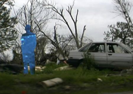 A primitive version of Tidal Wave here, which is stilted compared to the real thing but still good.
Info from Web site:
Visual artist Salise Hughes began experimenting with found film footage four years ago, creating her own unique process of digitally erasing and layering areas of the film image. Recycling is a major theme of her work, tearing apart existing 16 mm educational, and Hollywood genre films and rebuilding them, subverting the original material and giving the footage new meaning. Her films have screened in festivals around the globe including International Film Festival Rotterdam, Athens Greece International Film Festival, L'Alternativa-Independent de Barcelona, Seattle International Film Festival and the Ann Arbor Film Festival were she won an award for Technical Innovation in 2006. For this event composer Jason Staczek, and vocalists Alicia Dara and Mia Katerine Boyle will perform their scores live.
Peter Santino's contribution is a field of sand hemispheres that spell an apology in Braille. If the blind read it, they'll ruin it.
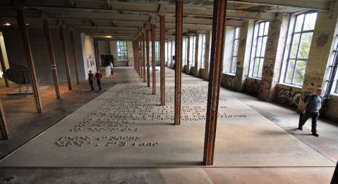 Ambivalent regrets are nothing new for the (former Seattle) Northern California artist. In various forms, his apology text has been in motion since 1995, when, presumably, he first realized the error of his ways.
Translation:
Whomever,Update: Dave Hickey discusses the reasons for art failure in a lecture taped by James Kalm, which the lecture hosts want to take down so watch them soon, part one here. Charlie Finch calls him a bulbous phony here. I don't agree with a lot Hickey has to say this time out, but whatever he's saying, he can't be written off as a phony. Finch and Hickey have more in common than either is likely to own. Both are good writers with a tendency to swing wide at the lip.
On January 25th, 1968, when I first began my creative work, I felt certain I
had something to offer, a vision, something to put into the world. Now, some 41
years later, it has become clear that what I must offer is my sincere apology.
Nineteen years ago, I recognized and embraced my failure; my failure to
achieve a measurable level of artistic communication. Despite numerous exhibitions
and more than sufficient opportunities to explain my vision, no thing has been
achieved.
I must apologize:
I am Sorry for allowing my ego to convince me of my cleverness.
I am Sorry for allowing that cleverness to permeate my work.
I am Sorry, Very Sorry for assuming my vision had merit enough
to conquer,
to change,
to dominate.
Peter Santino
Eureka, May 2009
First sad sack: We were raised in a corridor. We longed for a room.Not since 17th-century Chinese painters focused on the fluid connectives between forms has empty space been as riveting a subject as it is now.
Second sad sack: We longed for a corridor. We were raised on a road.
Rachel Whiteread is crucial in this context, but by the time she began to explore the space between legs of a chair, for instance, Bruce Nauman had already been there and gone. (The peerless Peter Schjeldahl described their relationship as Nauman's Chuck Berry to Whiteread's Beatles.)
In Seattle, Leo Saul Berk has his own version of the theme: empty space as landscape narrative. In his exhibit at Lawrimore Project, Deep, Dark, he maps the volumes of famous undergrounds, including the hole in which Saddam Hussein unsuccessfully sought refuge after the U.S. invasion of his country on trumped-up charges.
Spider Hole, 2009 Fiberglass, foam, resin and glass. 6 x 4 x 10 feet.
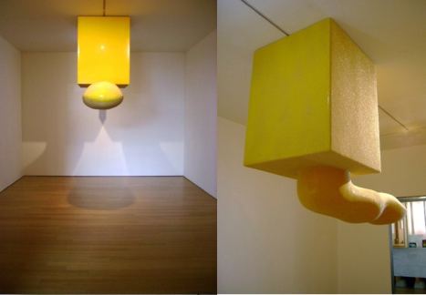 Berk gives volume to the photos, schematics and renderings of the box-cave trailing a partial tunnel that the U.S. military released to the media. Hanging from the ceiling and painted yellow to mirror U.S. ridicule of the sole occupant, Spider Hole is a positive projection asserting itself with a phallus, snake, tongue and weapon.
 Who's weapon? Not the butcher of Baghdad's. Glass beads ordinarily used for roadway strips give the piece its disco glitter.
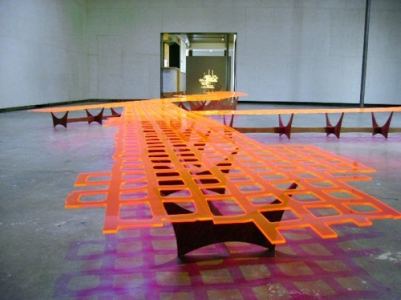
The Quecreek Mine collapse came after 9/11 and during the build up to the Iraq War. Nine men trapped 240-feet underground managed to run to the highest point of their three-to-five feet high coffin and find a bubble of air as water roofed the structure.
Thanks to the miners themselves and the rescue crew of engineers who did everything right, everybody got out alive. There was only one side to be on during the 78-hour ordeal. When that side won, it was a rare piece of good news for a rattled country. For a moment or two, everybody ignored the inherently flawed nature of an industry tearing up the earth and using humans as disposal parts.
Orange acrylic dips and rises as it tracks a layout through an echoing grid of purple shadows. Cracked in spots and porous throughout, the piece is tapped out, with empty squares where earth used to be. As Chinese landscapes move from earth to sky to water, Quecreek Mine also metaphor for the river that ran through it.

It's about the rats in your toilets (they're really there), about the invention of near beer (as a safe alternative to drinking water, since the low alcohol content supposedly killed germs), and about a local man named Mel who has walked 90 percent of Seattle's sewer pipes (the things he's found there: a tricycle; part of a canoe; a secret reading room with desk, chair, and plywood floorboard that somebody obviously set up as a private hideaway--Mel, Towles says, let it be).
Other topics discussed: secret tunnels leading to springs, accidentally demolished in Israel; what parts of Seattle have the most fat- and oil-clogged sewers; the etymology of "rival" (those who share a river or a stream); and Seattle's professional water tasters, whose palates are more accurate than microscopes in figuring out what kind of algae are living in the water. (more)
 Dan Webb
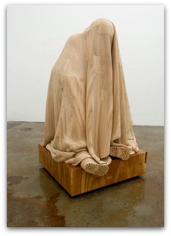 Webb's Fortress (above) is currently in From Whence that Rainbow Came at Ambach & Rice.
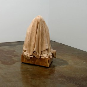
Another view:
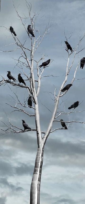 The tree you're less likely to know:
Chris Sicat, Redwood Tree Top (Tag a Log) 2009, Graphite on redwood, 14 feet tall (Image via)
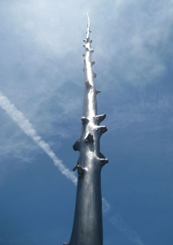 Sicat hand-colored a 14-foot Redwood log with pencil, which he intends as a dialogue between two natural elements: (from Otis)
I begin with looking at the wood form and the flow of the grain. I smoothen the wood to prep the drawing surface, which is a paradox in that it is a sculpture that is being imagined. At this point, I start to see a non-linear narrative script written out.... and this is where the moments of undefined deuce begins... a buzzing of the electric pencil sharpener... the scratching of the needle point of a soft graphite pencil onto a hard redwood log. The music plays.... miles and miles and miles of Miles Davis, lines after lines after lines til there is an infinite of graphite fibers making a collective mass... the grains finds their moment to rise and descend... the sounds of contemporary chamber music, Erik Satie, Hank Williams, Chemical Brothers, Scott Joplin and Snoop Dog... the crescendo brings the form of the woods and I find quiet moments in the knots and grooves... the hand plots to contemplate... concentrate... and converse back to nature... All this happens in between the engagement of the tag and the log.
Rick Araluce, Etsuko Ichikawa, Ken Kelly and Alex Schweder. Congrats all.
Constant nitpicking against it gets old. Reminds me of Olive Oyl's dad saying over and over in Popeye, "You owe me an apology!" Let me get my form letter of apology and sign a dozen in advance.
Spiders made this: (story here)
 Bill Viola was temporarily Jeff Weinstein's hero when he declined to participate in Pope Benedict XVI's conference on spirituality and art. Good piece by Weinstein, as per usual, although it ran under the mysterious subhead, Who Would Expect a Video Artist To Be a Hero? Why not expect a video artist to be a hero? Viola no longer is, as least as defined by Weinstein, because Viola changed his mind and will attend.
 Instead of his original statement, issued by his dealer and quoted by Weinstein, "Bill Viola doesn't agree with many of the policies put forth by the Vatican and the Catholic Church and this is his reason for declining to participate," Viola now says the issue is so important he'll show up, story here.
Like Weinstein, I cheered Viola's first impulse, but the best comment came from Jen Graves:
But seriously: Church, if you want to get the attention of artists, do like you used to do--throw money at 'em. (more)I'll believe the Pope is serious about engaging contemporary art when he commissions Eric Yahnker. (Yahnker was recently at Ambach & Rice. My review here.)
 Eva Diaz on Lisa Oppenheim's Dead Letter Office, an altered-photo series that sounds like a terrific 9/11 memorial:
Dead letter office. The phrase nags at me; it seems too direct, perhaps insensitive to use, given the context. The dead letter office is what happens to public artworks that have outlived their civic life and, due to the vicissitudes of time, taste, and politics, find themselves with no public. Their large scale makes it unlikely they'll find another home, so they may end up stored in the basement of the World Trade Center until 2001. Then, well, we know the rest. ...Now these forever absent works exist only in photographs: the death of the dead letter office. Oppenheim's series is, however, the birth of a gracious memorial to all that was lost. (more)Diaz wrote no more than a long paragraph but covered everything. An image would have been nice, however.
Did Jackson Pollock sign his name all over the all-over abstraction of Mural from 1943? I'd say yes. Fascinating to see what was there all along. (Story here.)
From dogs to the deep space of an eyeball: Douglas Britt interviews Keith Carter, here. Speaking of deep space, stars eat each other, story here.
In the interests of ending on a positive note, here's Andrew Junge with something you gotta have.

Regina. I read with interest your claim that Seattle has 10 top galleries. In what way top? Try as I might, I can come up with only four that even marginally live up to that description: Greg Kucera, James Harris, Howard House and Lawrimore Project.There are more than 10 I'd call top.
The first meaning of top is that I see every show, even the rare ones I'm not looking forward to, because I respect the dealer's record and know the opportunity exists to be surprised. These galleries are Ambach & Rice, Greg Kucera, Howard House, James Harris, Lawrimore Project, Francine Seders, Platform and Punch.
That's eight. Top also includes galleries that are good to great within their specialties, such as Roq La Rue for Pop Surrealism, Traver for glass, G. Gibson for photography and Martin Zambito for Northwest historical.
That's twelve. If art cooperatives can be included as galleries, then both Crawl Space and Soil make the the list. That's fourteen.
On a different list are Seattle's B galleries. I don't see every show, but I check their Web sites each month. The strongest of them is Davidson Galleries. In this group, galleries offer something I find engaging once, twice or even three times a year. (Davidson is more like six times a year.) They include Foster/White, Grover/Thurston, Catherine Person, Fetherson, Friesen, Lisa Harris, Linda Hodges, Winston Wachter and Woodside/Braseth.
There are two galleries that are also bars that show signs of turning out to be better than B-list. They are Grey and Vermillion. Joe Bar is not as good but still better than most on the B list.
There are galleries that are too new to judge but show great promise, chiefly, Ohge Ltd, adjacent to Lawrimore Project, and
If I absolutely had to come up with a top ten list, I'd add Crawl Space and Ohge Ltd to the first category and call it a day.
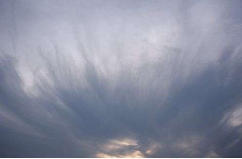
 Nan Goldin, Sunset Like Hair, 2003
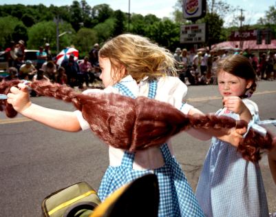
 Susana Raab, Hot Dorothies, 2009
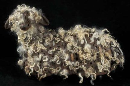
 Gala Bent, French Braided, 2007-2009
 Nayland Blake, Gorge, performance restaged in 1998.
 Lauren Grossman, Behold, 2003 via Howard House
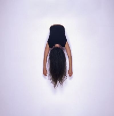
 Jennifer Zwick, Hanging, 2007
 Alice Wheeler, Self-Portrait as Wicked Witch of the West, 2002
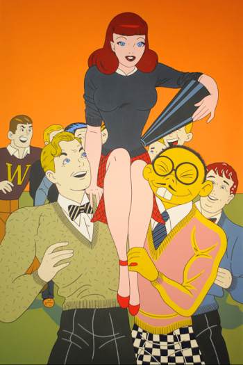 Shimomura paints racist incidents from the racist's point of
view. The Asian male posing for the camera is a buck-toothed lizard. His yellow hand wraps the slender ankle of an all-American girl. Anyone looking at his paintings is seeing through the eyes of a white person who fears and loathes all others.
 Not me, you might say, and you might be right. But you are the one looking.
Shimomura's cold, flat style -- a blend of Pop and Japanese ukiyo-e -- gets inside his hot subject to give it a deadpan edge. His paintings in his exhibit titled Yellow Terror: Always a Foreigner at the Wing Luke Museum are windows to a demented world.
(Yellow Terror, 2008, acrylic/canvas, 60 x 72 inches. That's Shimomura low in the center, making slant eyes.)
This year, three of the seven in the arts are visual: Mark Bradford for collage painting, Rackstraw Downes for oil painting, Camille Utterback for video.
That leaves Heather McHugh, who is a poet; Deborah Eisenberg, a short story writer; Edwidge Danticat, a novelist; and James Longley, a documentary filmmaker.
I can't speak to awards in anything but the arts, aside from saying that mathematician L. Mahadevan enthralled me in his interview on NPR. In the arts, however, there are no dancers, choreographers, musicians; nobody working in the recently reinvigorated public art realm.
With the exception of McHugh, there's nobody fusing forms to produce hyrid realities, and nobody whose efforts shape the moment and suggest the future. McHugh is the Attila the Hun of poetry. She sweeps down from the hills to claim all lowlands for verse. She claims all speech, turning it into a wisecracking sound stream, both precise and wide open.
Aside from her, the list has an elegaic feel. Eisenberg's stories are exquisite minuets. Danticat is a 21-century Proust, animating her past. Longley's films have a magisterial detachment, as if they cover not the Iraq War but the Trojan one. I love Downes' paintings. If I were on the committee, I might easily pick him, but again, his work looks backward.
The two remaining artists are mistakes. Bradford might still make a major contribution, but he's not there yet. What does he offer that Kurt Schwitters didn't long ago? Utterback has larger problems. Her work is labored and gee-whiz, look-at-my-special-effects.
From her Web site, describing Come to Pieces from 2001:
Imagine seeing yourself from four different angles at once.Picasso imagined that in 1907, far more powerfully. If I want to see myself from different angles in real time, I try on clothes in a dressing room.
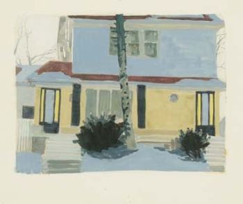
Michael Howard at Francine Seders through Sunday. His acrylics are paintings under construction of houses under construction. Earlier versions were more elusive in subject matter, featuring houses that could go either way, being built or torn down. Present ones look abandoned. Nobody's working on them, but there they are.
His watercolors are very Fairfield Porter but with a twist or two, such as the tree in the image below, which seems to be suffering from some tree plague instead of serving as surface for melting snow. The partially melted snow on tree and house has gone on strike and refuses to melt further. It will be there forever, as long as the image adheres to the paper.
 Upstairs, Gail Grinnell shares a gallery with her son, Samuel Wildman. He made a giant red skull in wax and plaster that had to be cracked in half to get out of the studio. On the way upstairs at Seders, it broke again. Francine thought he'd have to repair it and wondered if he had time, but he liked the pieces and left them on the floor, where they now resemble a broken heart. A shot of the whole head below, which did not turn out to be the finished product.
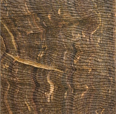 Alison Keogh is at Francine Seders Gallery through Sept. 27.
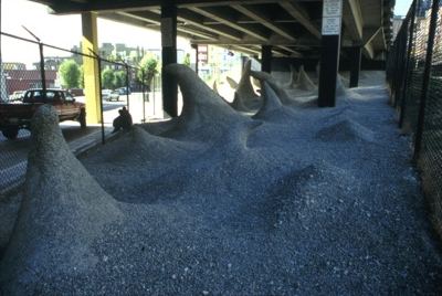
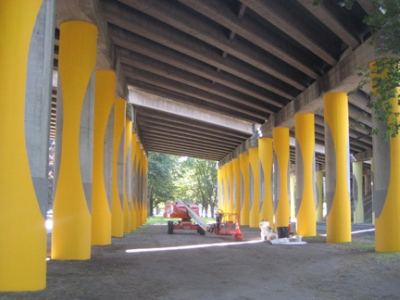
 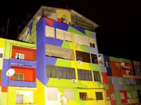 Two public projects tapping the same vein are among the most successful in Seattle's recent history: Dan Corson's Wave Rave Cave under a freeway off-ramp on Alaskan Way in Belltown, and Sheila Klein's Roosevennavelt: Columnseum, 10 acres of wasteland under the 1-5 freeway on Roosevelt near 65th St.
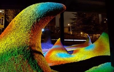
Corson's site is a strip between two chain-link fences. To overcome the impact of those barriers, he created wave-like mounds in concrete and covered them in gravel. During the day, their oddity is charming. They look as if a construction crew longing for the sea took license with company equipment during the lunch hour.
 At night, those waves become psychedelic stalagmites.
 Klein treated freeway pillars as dresser's dummies. Vertical lines are so slimming.

Thanks to the global consciousness of her curatorial vision and to architect George Suyama, who runs his firm around the gallery he donates to the public, Suyama Space has become one of the top art venues in the region. The price is right (free admission), but the hours (Monday-Friday) are tough for anybody with a standard-issue job. Even though weekends are out, the lengths of the exhibits are a saving grace. Most run for three months. Few people lack a spare lunch hour during that wide a time frame.
Currently on view, Dan Corson's Grotesque Arabesque is a thrill.
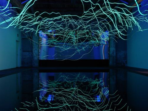 Instead of a room, it's a electric light cave, a Northern lights spectacle that hangs in the air and glowers from the ground, reflected in a pond. With indigo skylights and a 25-foot wide mirror to multiple the distortions, the bent, electroluminescent strips appear to be drawn in the air.
Through Dec. 18. Free admission
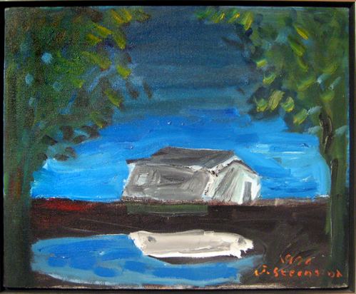 Others need community.
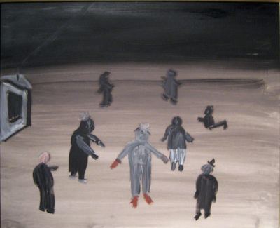 There are artists who don't care where they live...
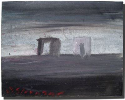 As long as they can work there.
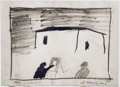 Seattle's Jay Steensma died in 1994 of a heart attack at age 52. Although manic-depressive, he was on medication to control it for his final seven years and his career blossomed, if such a career can blossom. Part of his problem was volume, volume, volume. If we are lucky, some curator is going to dig through his crazy, slapdash excess to find a stellar core of solitude and weather.
He painted small figures on barren gray plains, abandoned houses, ravaged trees. His grays are creamy, his whites begrimed and his blacks full of shadows. When used, bright color is a a shock value.
Paintings at Seattle artREsource.
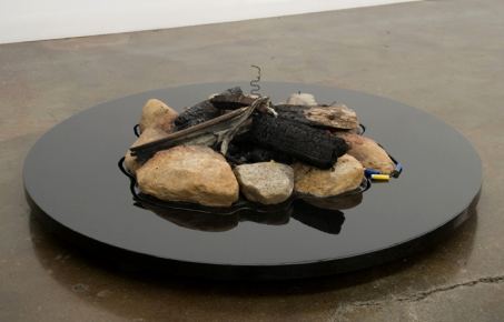
One he carried home in his truck, rocks and all. Besides the usual shotgun shells, it contained the charred remains of an upholstered chair. Who burns a chair in a forest? Somebody too drunk to forage, too wet to plow.
Most of the camps Zervas saw were well made, dug deep and surrounded by rocks, but scattered like chickenpox scars on a lovely face, their careful construction could suggest that human damage can be contained in a pit, and that scars don't affect the whole.
Claude Zervas, Black Hole, 2009
 What is constructed, found and constructed again is the theme of From Whence The Rainbow Came at Ambach & Rice, featuring four of the Northwest's top artists: Zervas, Joseph Park, Dan Webb and Jeffry Mitchell. It's the best group show in a Seattle gallery in years, proposed and shaped by the artists themselves.
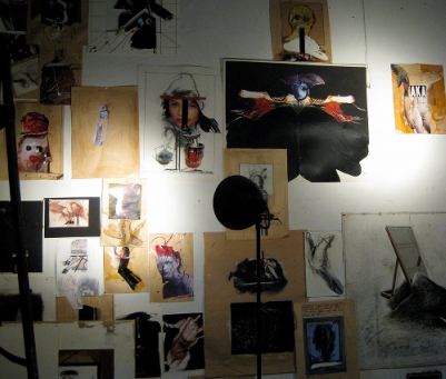 Jensen has been making his deformed scarecrows, ruined collages, deft drawings and ornately framed assemblages for more than 40 years. His paintings are scores for a disaster, giving mourning a shape and sealing it into art. Writing about Jensen's work in 1969, Tom Robbins (then an art critic), put his finger on the strengths of it, that it has "lyric subtlety" and "pictorial breath" while also being "brutalized, ugly and blatantly erotic."
(Photo, Harold Hollingsworth)
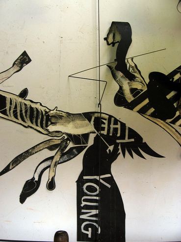 Brutalized, ugly and erotic are good words to describe Jensen's nuclear scarecrows. His spindly grotesques have some of the power that gargoyles perched on the entryway ledges of cathedrals must have had for the medieval faithful. They are genuinely frightening.
His assemblage drawings bring unimagined levels of delicacy to the horror of Jensen's position.
 (Photo, Harold Hollingsworth)
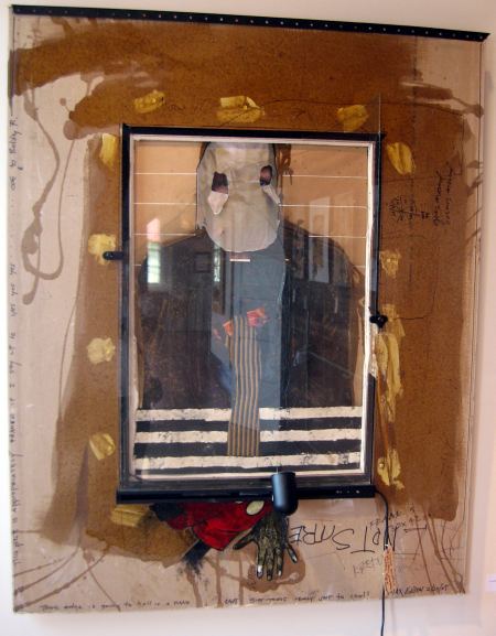 Death delicately done becomes a minuet, and the clatter of teacups reminds us of the razor's edge. Hollingsworth, a former student, wrote this appreciation in 2006.
 Attia opens Sept. 21 at Galerie Christian Nagel. On Nov. 3, Comedy of Change premieres in London, featuring the Rambert Dance Company. The piece is inspired by the thinking of Charles Dawrin, and Attia served as its artistic designer.
 Attia denies that he is a provocateur.
The word provocative has spectacular implications. I believe only in poetry.And I believe in him.
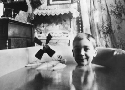 G. Gibson Gallery: Along with its exhibit of Lartigue, Marion Post Wolcott and Imogen Cunningham, the gallery offers on Sept. 30 at 6:30 films by Lartigue, Wolcott, Roy Stryker, the FSA photographers and
Imogen Cunningham.
G. Gibson Gallery: Along with its exhibit of Lartigue, Marion Post Wolcott and Imogen Cunningham, the gallery offers on Sept. 30 at 6:30 films by Lartigue, Wolcott, Roy Stryker, the FSA photographers and
Imogen Cunningham.Cunningham is also at the Seattle Art Museum through Aug. 29, 2010. Email from SAM curator Marisa Sánchez:
In support of Everything Under the Sun: Photographs by Imogen Cunningham, Christina DePaolo worked with the Imogen Cunningham Trust and Aaron Bourget to create the following video excerpt from an award-nominated documentary on Imogen Cunningham made by her granddaughter Meg Partridge.
The Chinese government hasn't filed suit yet, but it could. Its sweatshops produced a jewel-crusted skull before Hirst did.
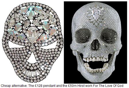 Expose of the China-to-Hirst link, such as it is, here.
 Mexico has a better claim and could use the money.
I know a candy company that could sue Jim Riswold.
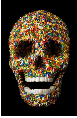 John LeKay thinks that Hirst got his skull idea from him (here, scroll down for image). LeKay says he in turn got the idea from a Mayan crystal skull. More about artists who say Hirst copied them here. (One won a settlement.)
Unless somebody's making knock-offs of your work, artists suing each other is insane. Hirst, of course, has positioned himself in the insanity and death of contemporary economics. He's the poet of poisoned individualism. Like Jeff Koons before him, he absorbs criticism as part of his strategy. His work both scrutinizes the art world and milks it dry. Will he manage to undermine not only the younger generation but the gallery system that offers free admission to art history's ground floor? If he helps to bring the house down, his unregulated greed will be late capitalism's cracked mirror.
Back to skulls. When human ones become aesthetic, their messages are indisputable, with a bottom line wide as a boardwalk.
1. Tick tick. Remember you must die.
2. Mourning. Alas, poor Yorick. (A subset of mourning is outrage, as in this map of Cambodia made of skulls.)
3. Party down, preferrably in the graveyard with your nearest and dearest, and then remember you must die.
By adding bling, Hirst was well within the formula. He peeled the familiarity from No. 1 (memento mori) and sweetened it with No. 3 (a party kick) for horror, which is back to No. 1.
Riswold skipped 1 and 2 to root himself in 3, and that's the problem. He doesn't have the depth to compete with Mexican graveyard humor, even under the guise of a Hirst tribute.
(For an excellent beyond-the-skull-but-dead-anyway image of Hirst satire, go here.)
4. Recycling. Matthew Day Jackson, I Like America and America Likes Me in The Violet Hour at the Henry Gallery, photo Richard Nichol. Jackson's muscle car rides on our fossils. Will Hirst sue? Probably not, because Jackson is an adult and can afford a lawyer.
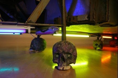
Hirst's presumption is that he's entitled to have it all. With meticulous craft and at astronomical expense, a human skull is encrusted with diamonds. This objet d'art, commissioned by Hirst, transforms the memento mori and invites us to see ourselves as creatures doomed to die, obsessed with money, and entranced by trinkets. It is intended to become his icon, his brand, his logo, like Warhol's can of soup. But more than just a way to enhance his artistic reputation--such as it is--the diamond-studded skull is primarily an instrument by which to increase Hirst's already considerable personal wealth.
And so,pouts the art star, how dare this upstart oik, this Cartrain person, appropriate the image of such a fabulously expensive, unique object--MY object!-- for his own purposes? He dares, sir, he dares! He does it because the image itself has already been commodified, reproduced endlessly in the media and on the net, and it has, for better or worse, entered the culture.
Accordingly, Cartrain and for that matter anyone should be entitled to use it to make whatever statements they want, and Damien Hirst should have nothing to say about it. Does the estate of Walker Evans sue Sherrie Levine? Does the estate of Pablo Picasso sue every cartoonist who sends up Guernica? The court decision is breathtakingly stupid. Let street vendors in Shanghai hawk blatantly cheap copies of the diamond skull to anyone with a few yuan to spare. Let children make Christmas tree ornaments out of it. Let the ironies proliferate and beget more ironies, world without end, amen!
...all thy passions, match'd with mine,
Are as moonlight unto sunlight, and as water unto wine--
Tennyson
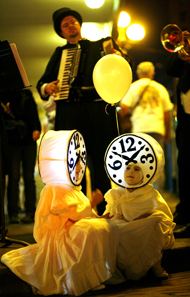 Tomorrow night, beginning around 6:30,
 While this event could easily fall into the dread category of a sprites-dancing, whimsical reverie, I know sane and sensible people following its once-monthly (on a
Wrote Josh Trujillo (his photo to the left) after last month's edition:
Like Alice in her Wonderland, the streets of downtown Seattle appeared to be overtaken by a dream on Thursday evening. Six-foot-tall rabbits danced with white cats while horses pushed carriages. Clocks skipped along the street and owls danced with their umbrellas. Those who knew what was happening smiled as they watched the street performance. Those who stumbled upon it looked amazed. The show, Lullaby Moon, was created by Lucia Neare and was the 11th in a yearlong series of magical shows that celebrate the lunar phase of the new moon. (more)Funded by 4Culture.
Trujillo:
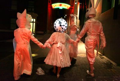 Kate Hailey, who went in May, took this photo:
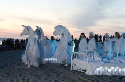
From C-Monster:
The graffiti artist who stole a buncha pencils from a Hirst installation at the Tate Modern is now threatening to sharpen them.In response to my reposting C-Monster, an artist emailed me:
That's cute, Regina, but you're missing the point. One artist vandalized the work of another. The pencils aren't just pencils, any more than Claes Oldenburg's bat is just a bat. In a more rational world than the one shaping up online, art critics would support the artist, not the vandal.I think it's worth remembering that Damien Hirst started this fight when he took teenage street artist Cartrain to court for copyright infringement, and, in an astonishing miscarriage of justice, won.
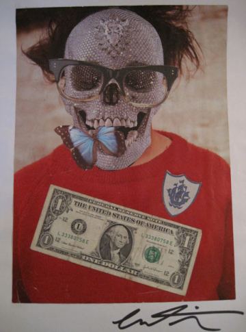
Copyright? Cartrain's collages are satires.
An example of what Cartrain was forced to hand over to Hirst's lawyers, posted by Jonathan Jones:
 I love Hirst's work, but he's in danger of becoming the Dick Cheney of the art world.
As Jones wrote:
Damien Hirst's feud with teenage street artist Cartrain could yet become the most controversial story of Hirst's career. It really is vile for a rich man to use his power to bully someone who, after all, is just trying to emulate him by making art with found materials.
Presumably, what irks Hirst is that Cartrain used Hirst's diamond skull in a series of collaged portraits of the skull's creator. Hirst successfully demanded that all the young artist's works incorporating the diamond skull should be handed over, presumably to be destroyed. (more)
(That's two presumablys in one paragraph. Doesn't the Guardian employ editors?) Of course Cartrain should give Hirst back his dick pencils. But Hirst needs to stop being such a dick. One Cheney is more than enough.
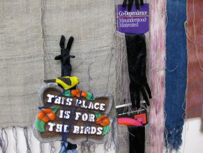 More on Betty Bowen Award for Northwest artists here, now in its 31st year. Faught receives $15,000. Seattle's Jenny Heishman and Matthew Offenbacher each get $2,500 special recognition awards. The trio will speak at the Seattle Art Museum Oct. 23, 6-7, followed by a reception. Free admission.
When it is time to pick up your kids, try pulling a root beer from the back of the refrigerator. Watch the glass milk bottle slip and fall. Try to catch it! Watch it break into large, clear pieces. Watch the milk, glass and blood pour through your fingers. Drop your keys into the recycling can. (You will find them in a few days! They will be sticky.)It could happen to anybody, but it tends to happen to glass artists, maybe especially artists who are only dabbling in the medium.
Run to the bathroom, leaving a trail. Decorate the entire bathroom in red. Watch the toilet paper disintegrate into bright red mush. Put on more and more toilet paper. Try to figure out how to stop the bleeding in two different hands at the same time. Try to dial a cell phone to call your spouse. Hear the fear you've put into her. Try paper towels. Watch them turn cherry red.
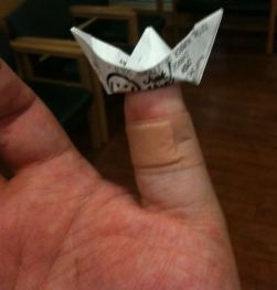
Ride shotgun and fetch the kids and a pizza. Watch as others clean up the milk and glass. (Clean up the crime scene yourself.) Study the wounds. Find slashes on pinky of left and thumb of right. Tape them up. Try learning to a) go to the bathroom b) wash hands effectively when the leftmost digit of each extremity is bandaged. That night, watch The Wrestler. Sit back and relax as our harassed hero begins to slice meat at the deli counter. Ahhhhhhhhhhhhhhh!!!!!!!
Take Jason Hirata at the Dirty Shed. (Story here.) Below, he and Sol Hashemi improvise with florescent tubes.
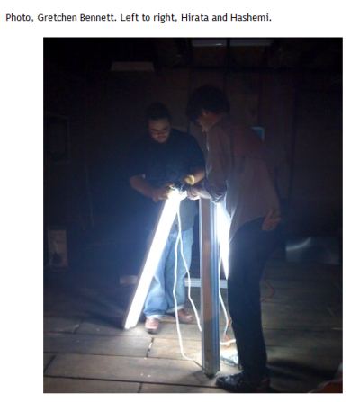 That's the told story. The untold story is that Hirata dropped a light tube and caught it as it crashed, turning the shards red.
 I know an artist who almost bled out when a glass shard cut into her thigh. Fortunately she called 911 before fainting. In Hirata's far less serious case, no harm done.
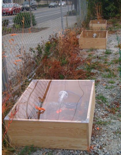
(A project for Capitol Hill Housing with assistance from Steve Zielke.)
Mitchell:
 McMakin :
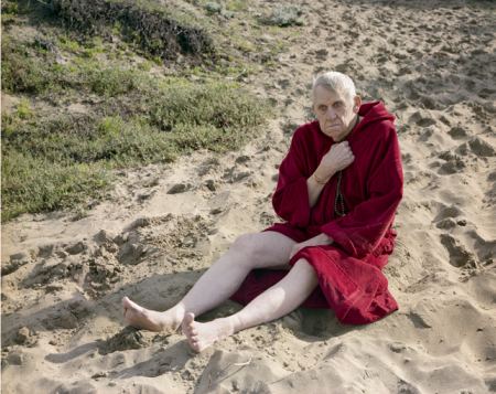
I will walk upon the beach... (via)
 Zoe Strauss
Bare ruin'd choirs where late the
sweet birds sang (via)

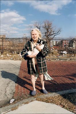
I have heard the mermaids singing, each to each.Sometimes they do.
I do not think that they will sing to me.(via)
Elizabeth Sandvig
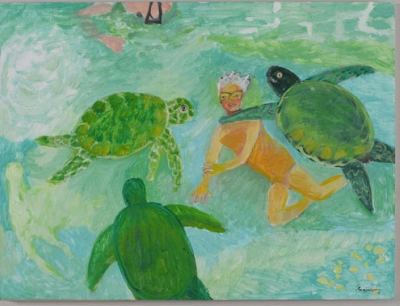
The NYTimes recently published an image of Ambroella trichopoda as the sole surviving member of the oldest extant family of flowering plants, "a small shrub found only on the island of New Caledonia in the South Pacific."
I am reminded of our good friend Wes and his accosting Kathryn Hepburn on the stairs of the Burke Museum, giving her a fossil flower from Republic, and in his charming but star-struck manner, inadvertently comparing her to same.
Ou sont les fleurs d'antan?

I responded:
Wes was so star-struck. Reminds me of the Leigh Bowery-Mick Jagger exchange. Late one night in a bar in London, Bowery turned around and bumped into Jagger. Jagger said, "Out of my way, freak." Bowery responded, "Out of my way, fossil." (Image via)
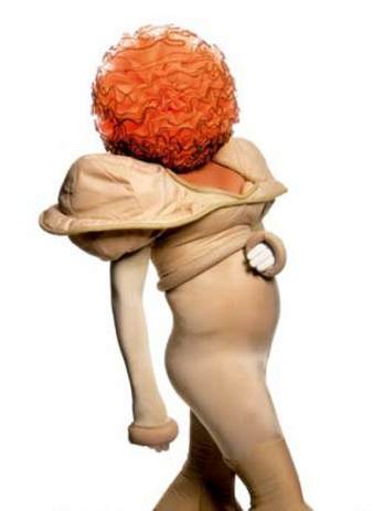
The graffiti artist who stole a buncha pencils from a Hirst installation at the Tate Modern is now threatening to sharpen them.
(Jonathan Jones opines. Art Observed.)
Rafael Lozano-Hemmer (via)
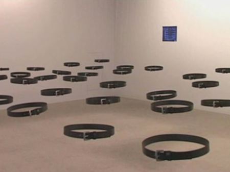
Standards and Double Standards is an interactive installation created by Rafael Lozano-Hemmer which is comprised of fifty buckled belts that hang from motors in the ceiling and a computerized tracking system. The belts will slowly turn so that the buckles face people walking by. If only one person is in the space, all the buckles will face him or her. If several people are present and moving around, there is more movement, as the belts closest are the ones influenced by each new presence. The belts are at waist height, so the effect is of a crowd of ghosts wearing belts whose invisibility wore off. An interesting idea presented by Lozano-Hemmer is that the belts represent a fetish of paternal authority.Debra Baxter, at Or Gallery through Oct. 17. Earlier review here.
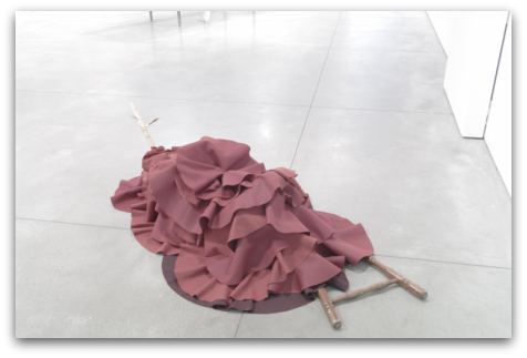
Cerny is well-known in Seattle for her drawings. What she's showing north of her home town is new.
Seattle Art Museum, opening Oct. 15.
Alexander Calder: A Balancing Act
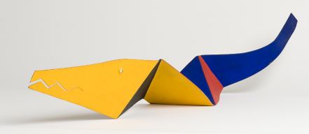 Plus, Michelangelo Public and Private: Drawings for the Sistine Chapel and Other Treasures from the Casa Buonarroti
Nice, but nothing people are going to fly in to see, especially considering the recent flurry of Calder exhibits in New York. The fly-in show opens May 13: Kurt.
Henry Art Gallery
Vortexhibition Polyphonica, opening Oct. 3. Great idea. The Henry looks for interconnections within its collections.
Though the Henry is recognized as the region's preeminent contemporary art museum, its holdings include 19th-century paintings, contemporary art and photography, textiles and costumes, ceramics, and many other art objects that are little known.You bet they're little known. If they're not photographs from the collection, the Henry rarely shows them, and there is a lot to see.
Alan Sekula: Waiting for the Tear Gas, photo survey opening Oct. 8. Take a trip down memory lane, back to when Seattle did the World Trade Organization to the sounds of breaking glass and the screams of the wounded, accompanied by the smell of tear gas in the morning.
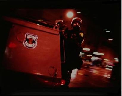 Polaroids: Mapplethorpe opens Oct. 24. Henry director Sylvia Wolf curated this show for the Whitney last year before she was Henry director, or she would have curated it for the Henry.
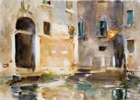
Below, Venice, 1903
 Charles LaBelle also makes art as he travels, but in his case, he makes it everywhere he travels, at least in places with structures on them.
Since September of 1997 I have maintained a database of every building that I have physically entered. A record of each building is made upon entering the building for the first time. This information is subsequently entered into the database. Additionally, the database is supplemented by a photographic archive of each building. Each building is photographed, if possible, before entering it. However if a building is not for any reason photographed, it is still recorded in the database. The database includes the date and time I entered the building and the building location (street, city, state and country). As of January 2009 there are approximately 9,200 buildings in the database with additional buildings being added almost daily. The photographs themselves are never to be shown. They exist as raw supplementary data only. Rather, the project, whose true site is the realm of perception and consciousness, is represented by the database itself and occasional drawings of individual buildings made from the photographs. When executed, each drawing is done in brown watercolor pencil on sheets of paper ranging in size from 4 x 4" to 9" x 12." It is not important that the drawing be done at all.Archaeologies of the future here, 268 drawings and counting. They are part of his continuing exploration of psychogeographics, the relation between place and the person in it, him. I love the rough drafts he's posting on Facebook:
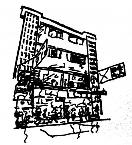 He describes them as:
 a limit of space, not a space: the limit where space becomes pure time, but where pure time annuls the event. No passage, no coming, no departure, no birth or death, no attraction or excitation of a new subject, and consequently no disappearance of the new, no abolition of its novelty in its other absolute novelty that is its empty place or its tomb. No not.
Joel Dean:
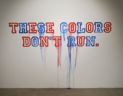
Chas Bowie's review of Jeffry Mitchell and Roy McMakin's collaboration in Portland:
"Joy and Reffry," on view at Pulliam Gallery, sounds at first like a curatorial sendup of "The Odd Couple" recast with two of Seattle's most highly regarded artists.
Playing the role of neat freak Felix Ungar in our contemporary incarnation is master craftsman Roy McMakin --artist, furniture designer and architect, whose impeccable sense of formal restraint and subtle humor have led to international success in both the art and design communities. McMakin's free-spirited foil in "Joy and Reffry" --his Oscar Madison, if you will --is genre-twisting ceramic artist Jeffry Mitchell, whose showy, neo-Rococo sculptures of pachyderm romance and irrepressible curlicues would seem stylistically antithetical to the deadpan austerity of McMakin's furniture-art.
McMakin and Mitchell's first collaboration, however, finds the unlikely duo's well-honed voices layered in a rich harmony, with "Joy and Reffry" humming a lovesick tune about long-lost objects, invented memories, mournful absences and tactile pleasures. (more)
I read it with interest and mounting dismay. To my knowledge, this show attracted only one other review to date - mine. Bowie's reached a deeper level and did it with ease. His Oscar and Felix conceit is on target. I comfort myself with the idea that having one day in Portland, I reviewed the show at the opening, always tricky. But McMakin and Mitchell are Seattle artists. I wasn't seeing their work for the first time. Maybe I'm posting too many images and not enough text.
Speaking of good reviews, there's also Douglas Britt's in the Houston Chronicle, titled, Houston can take cues from Seattle exhibit:
The Seattle Art Museum's Target Practice: Painting Under Attack 1949-78, which closed on Labor Day, was the kind of ambitious show that deserved to spend the next couple years on tour. Maybe in a better economic climate it would have. But other museums -- perhaps daunted by the cost of shipping major works borrowed from more than 70 lenders around the world -- passed. They missed a chance to present that rarest of birds: a crowd-pleasing survey of some of art history's most difficult material for audiences to understand, let alone appreciate and enjoy. (more)
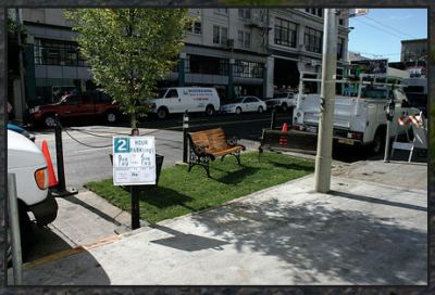 Origins here. Participants in Seattle include Crawl Space and the Seattle Art Museum, which is going all out:
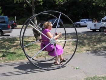
Parking spaces near the Seattle Art Museum (SAM), on University Street between First and Second Avenues, will be transformed into a temporary "park" replete with sod, art activities and exhibitions, performances and even a chance to test drive the "Walk and Roll" low-impact vehicle, on national PARK(ing) Day, Friday, Sept. 18, from 10 am-2 pm.
Game critic alert: Jen Graves tried out Peter Reiquam's Walk and Roll last month at aLIVe. (Photo credit and story here.)


 From Crawl Space:
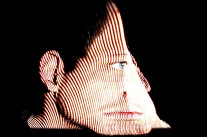
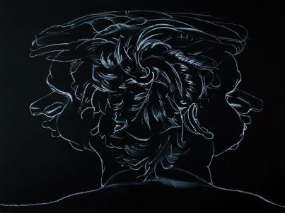
Jansen explores the space between premeditated experience and the choices that presuppose modes of depiction. As his title (No Chasm, No Cleft) alludes -- referring by way of negation to the location where ancient Greek oracles tapped into the unseen, mysterious, and infinite -- Jansen is searching for new ways of conceiving or understanding the world by breaking down the photograph, the most prevalent archetype of representation in the present day. Although the work in the show makes use of several photographic processes such as recording, scanning, slicing, editing and projecting, combined together in several unique techniques, Jansen captures not only the flat appearances of the picture plane but also structural information from multiple and fixed viewpoints. The work is also premised on the notion that how we choose to represent what engages us in the world is inextricably linked to how we understand our place in reference to it, conscious of the limitations of our points of view.There is a chasm, of course, but it's the uncertainty afflicting those who examine the unreliability of perception, a terra not firma. In art, few subjects are as well trod. Jansen stakes a believable claim, even if he's staking it in the wrong medium.
He began as a painter working from photos but lost faith in his ability to undermine the solidity of their depictions. Hence, video, which is in hands is a dubious prospect.
In the insistence of their flickering lights, his videos berate the audience with what it doesn't know, which being an art audience, it knows already. Unlike Doug Aitken's Electric Earth, scoring on the same theme in 1999, Jansen's videos are both painful and obvious. If they were just painful and offered something not done better elsewhere, that's one thing, but painful and obvious is not worth the anti-pleasure price he's asking.
What works are the stills from the videos. He's really a photographer, and video should be part of his process at arriving at his final product, a means to what could be his significant end.
His self-portrait in chalk, which glows in the dark:
 Through Oct. 11.
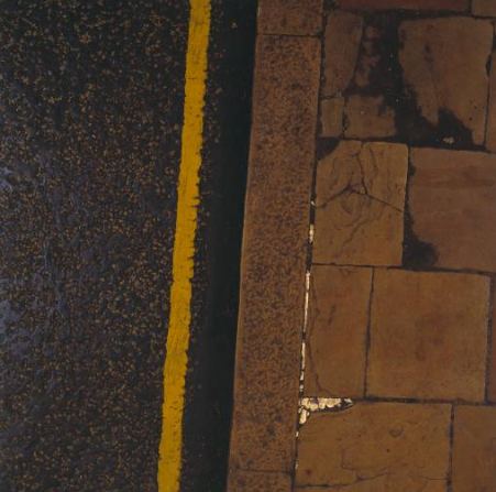
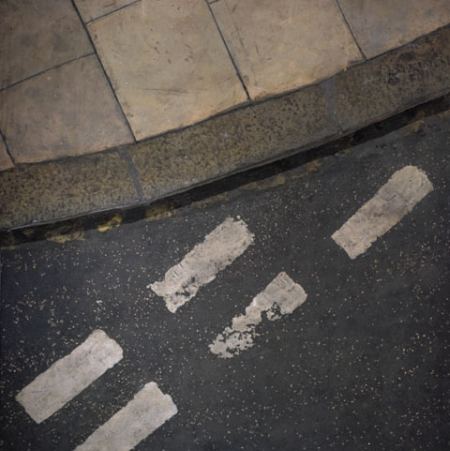
 The peerless Boyle Family. Not photographs. Random pieces of random streets recreated as sculptures on the wall.
(Image via)
 (Image via)
Contemporary visual artists see opportunity in what many bemoan as the twilight of the age of the book. John Latham (1921-2006), Hubertus Gojowczyk, Doug Beube and others have treated books as sculptural stuff. But no one whose work I have seen tops that of Atlanta artist Brian Dettmer at Toomey Tourell.Dettmer was featured this year in the Book Borrowers at the Bellevue Arts Museum.
In the mural-scale wall piece "Americana" (2009), Dettmer has carved up and layered the volumes of a vintage encyclopedia to produce something kaleidoscopic. World maps in polar hemispheric projection punctuate the array, with an occluding effect reminiscent of the changing images on an old View-Master. (more)

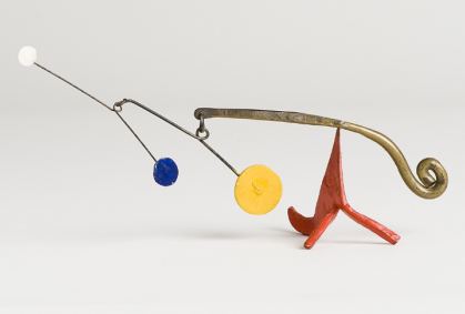 Not in the show: Jennifer Zwick:
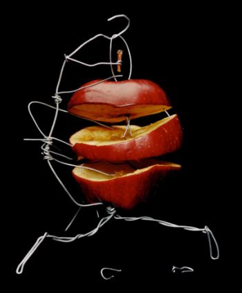
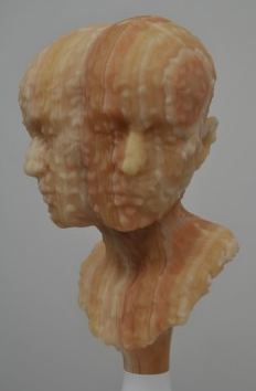
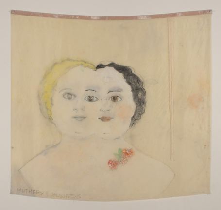
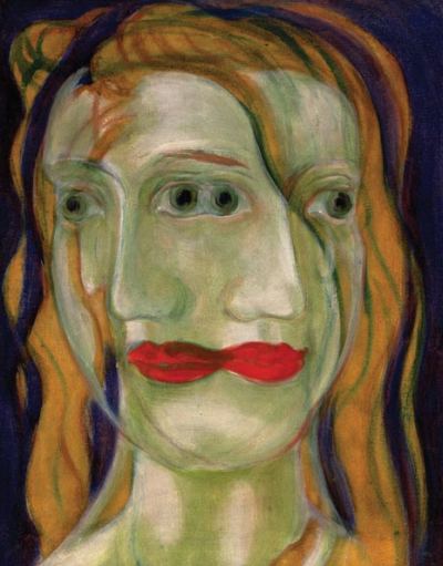
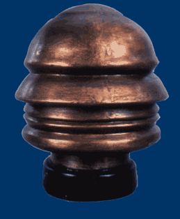 Aside from the Linda Blair head spin in The Exorcist (evil, evil, evil), the idea of a mind moving a head in directions its physical structure did not intend persists in art as philosophical speculation. Will the real head please stand up? (What real head?)
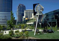
From 1989, Buster Simpson's Seattle George Monument is an emblem of the city's divided heart. Twenty-eight feet tall and 12 feet in diameter, its base is a trellis or open cube, above which hangs a Boeing 707 nose cone suspended on a tripod. Just above the cone is a multifaceted monument head - 24 aluminum profiles of Chief Seattle, an armature for English ivy. A sharpened template turning in the wind cuts the ivy into Washington's profile, which, when the ivy thickens, hides Chief Seattle in the greenery.
 From 1999, Kumi Yamashita's Video of Dialogue.
From 2005, Tim Noble & Sue Webster, Spinning Heads, (via)
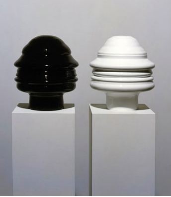 Tony Cragg (image via)
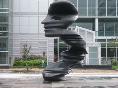 To evoke a burning candle, Barry X Ball (via)
 From 2007, memory merges you with others. Sherry Markovitz, Mothers and Daughters. (via)
 Time's inconsistent personal arc, Ari Young's portrait of Michael C. McMillen, (via)
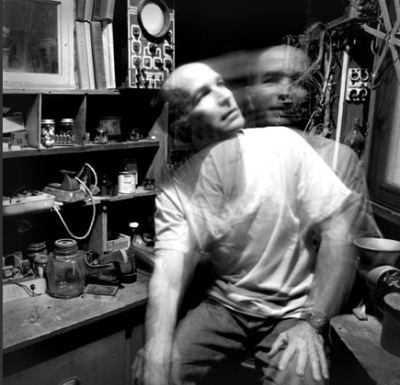 Jackie Anderson, via
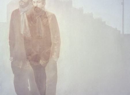 From 1996, sometimes the two of you are stuck with each other. Johan Urban Bergquist (via)
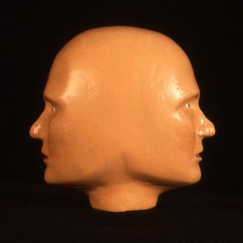 Which makes it hard to get through the day. Harold Haydon, Untitled, 1946. (via)
draws on that of an early-20th-century German biologist, Jakob von Uexküll, who proposed that "anyone who wants to understand the life of an animal must begin by considering what he called their umvelt . . . : their subjective or 'self-world.' " Hard as we may try, a dog's-eye view is not immediately accessible to us, however, for we reside within our own umwelt, our own self-world bubble, which clouds our vision. (more)Seattle photographer Ford Gilbreath cracked the canine umwelt in 2000 with a series shot from its point of view.
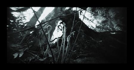
Just my own naked self and the stars breathing down, it's beautiful.The Basketball Diaries
Some artists are expected to die young. Hats off to Jim Carroll, one of their number. He stuck with it into his 60s and died last Friday, not of his volition.
If only Dash Snow had followed his excellent example. (Image via)
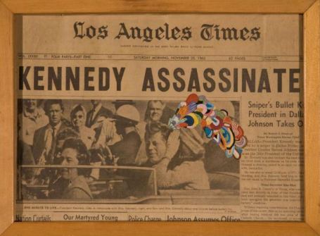 Among many others, Seattle poet Jesse Bernstein could have used more time.
 More Noise, Please!
I live on a street
where there are many
many cars
and trucks
and factories
that pump
and bang and
grind all night
and day.
It is a miracle
that I can write poetry
or sleep or
talk on the telephone
or that
my lover will
visit me here
In the velvet realm, everyone's a star or at least can gather together with others who are equally inept to become one: volume, volume, volume. Velvet in quantity dispenses with the notion of quality. Case in point, Velveteria in Portland, which attracts more national attention than any other museum in the region.
Seattle made a stab at a black velvet painting museum (Villa Velour) in the late 1990s, which still exists online. It went wrong by focusing on the classical best in bad velvet. (Cynthia Rose story here.)
Where does this leave more conventionally-defined good painters, as opposed to a version held by the velvet underground? If they're willing to be nappy, they're looking good. The mainstream is unlikely to embrace the racist, sexist cornball Edgar William Leeteg (see Villa Velour link), but others who add just a touch of Leeteg can ride out of time to a mythical carny world.
Julian Schnabel:
Did I ever tell you the story of the twentieth-century man in a third-century church, his hand resting on an eighteenth-century banister?No, but when he tells his tales on velvet, he has everyone's attention.
Schnabel, Portrait of Andy Warhol, 1982, oil/velvet, via.
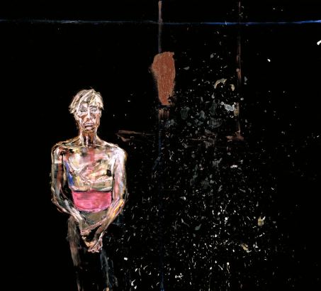 Colored velvet works if you're Polly Apfelbaum... (Image via)
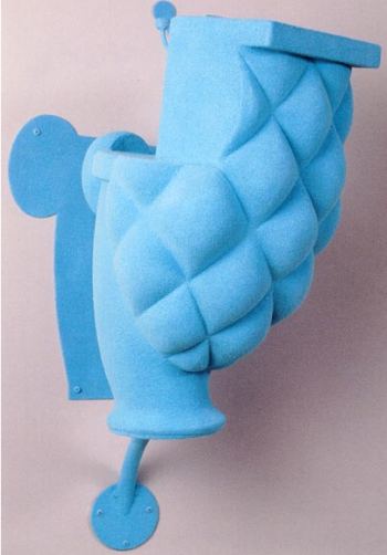
 Or Claudia Fitch. (sculpture covered in blue flocking, which is velvet's tighter twin. Image via)
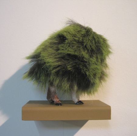
 Can a shaggy version of velvet ride its coattails? (Misako Inaoka)
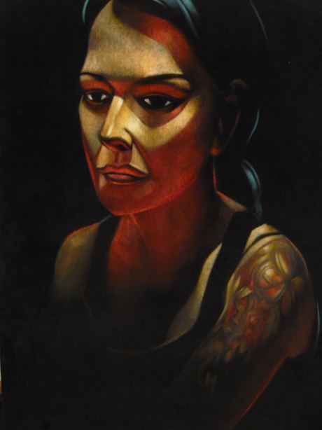
 Back to black, always in style. As Joseph Park aptly observed, "You cannot take this shit too lightly. I'm psyching myself up to try it again." Below, his gorgeous portrait of Seattle art dealer Kirsten Anderson.
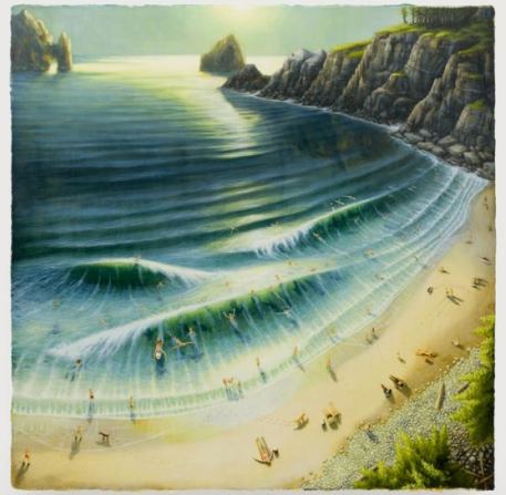
His title - Dumbfucks at the Beach, at Peres Project. Swimming with ducks qualifies you for inclusion in his title.
Not Robert Yoder:
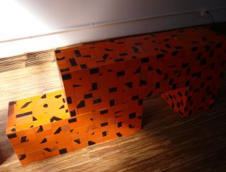 Robert Yoder:
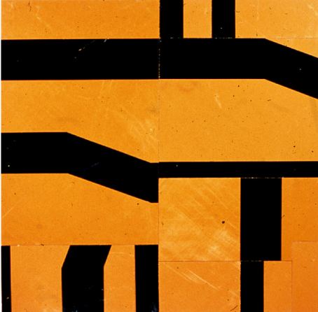
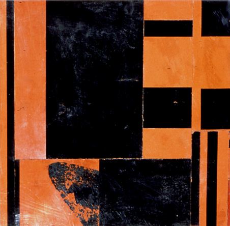 One artist unlikely to imitate Robert Yoder's early work is Robert Yoder. He has moved on.
 Akio Takamori creates figures that appear to be lost in thought, caught in that brief moment during any day when the body pauses and the mind drifts across its own mental sky. Born and raised in Japan, Seattle's Takamori pays his country of origin the honor of taking it lightly. Simply, even bluntly made with deft, loose color washes, his figures include spirit babies with oversize heads, priests, warriors, peasants and royalty with the folds of their gowns flapping. (more here)Or no gowns at all.
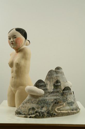
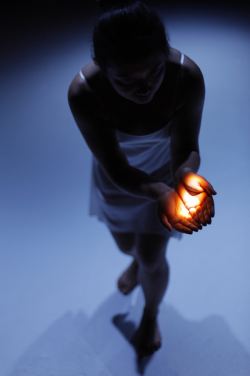 Lee's contributions to For these Unclosings at Seattle's Theatre Off Jackson last night (the last night) were riveting, but then there was everything else. Lee worked with a classy ensemble; nobody stank up the place. The problem arose in what they chose to do with their abilities.
 Emily Greenleaf accompanied herself on accordion with Meredith Monk-style vocalizations. Greenleaf is great, and I was grateful that I wouldn't have to hear her be great for more than the 45-minute duration. This is music for teenage intellectuals who think that pleasure is suspect and shallow. Somebody has to perform it for that audience; others need to be warned at the door.
Although Ying Zhou is a lovely dancer, she served as choreographer for a piece that is indistinguishable from Martha Graham-influenced mime. (Emote! Emote!)
Success was all about the light. It burned and fondled, quite beyond its station, in a real-time interaction with the dancer.
Below, Ying Zhou erases it with her toe.
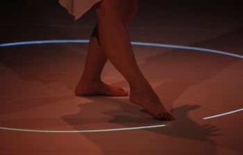 Photos, Cliff DesPeaux. Costume, Catherine Cabeen. Wizard-level video assistance, Andy Wilson, Emily Greenleaf, Keeara Rhoades and Reina Solunaya. Technical director, Okazawa M.
For a contrary view (including an elaboration on process), see Jen Graves.
DiCioccio
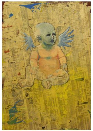
I make sculptures and paintings about my anticipatory nostalgia for obsolescing paper media objects. The softness of a read newspaper page and the glossy slickness of a fresh magazine page are sensations embedded in our physical memory -- the familiarity of touching these objects allows a relationship to form in the process of consuming the information they provide. When these objects disappear from our culture and assume the homogeneous texture of a back-lit screen, I fear that some of our intimacy with the process of reading will fade.
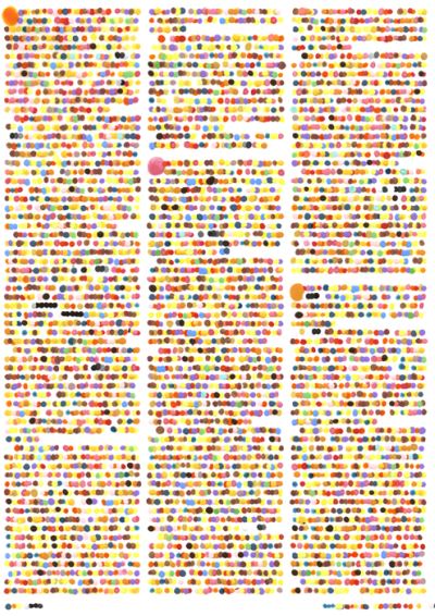
Ben Lawson
 National Summit On Arts Journalism takes place Oct. 2.
M. K. Guth's Terrain Change at Portland's Elizabeth Leach Gallery is a survey of aesthetic ideas realized more fully by others.
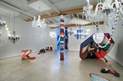 Pillars dressed in sweaters and jackets evoke Knitta. Guth's umbrellas made of clothing are the best thing about the show, although overly dependent on early work by Cris Bruch. About her chandeliers, little can be said. I've seen their better.
Guth:
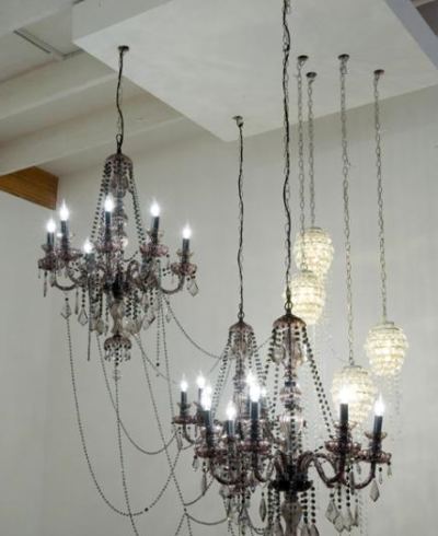 Fred Wilson:
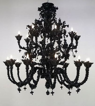 I wouldn't review this show were it not for the sorry fact that Guth was the only Northwest artist included in the 2008 Whitney Biennial, where she had a room which she called "a unique opportunity to this particular place." (Guth's Whitney video interview here.)
Her Whitney debut was a shabby (and didactic) version of Ann Hamilton in the 1980s, but I repeat myself, and I'm not the only one.
Guth's version of relational aesthetics comes down to patting the audience on the head and giving it a simple-minded chore, like Yoko Ono at her worst. While I realize Northwest curators and critics (as a group) could easily have a view of NW art not shared in New York, picking Guth was a slam on far more interesting artists who engage the Whitney's abject, multimedia installation theme, if it qualified as a theme.
Guth at Elizabeth Leach through Sept. 26.
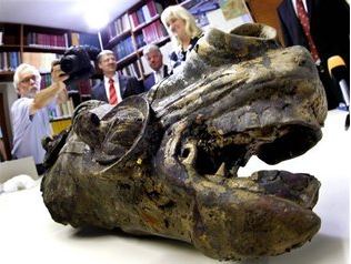
Roman horse head made from bronze and plated in gold (2,000 years old) found at an archaeological site in Germany. (Story here.)
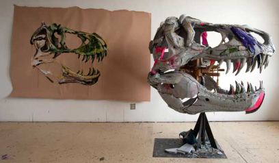
 Scott Fife, at Platform Gallery through Oct. 10.
Ficus #2, 2009, oil/canvas, 30 inches square
The reproduced image does not serve painters such as Eric Elliott, now on view at James Harris Gallery. Reproduced, what is fluid becomes static.
 Elliott is interested in where the viewer stands in relation to his painting. In shaggy, blue-gray to dark-green tones, he reexamines Seurat's working methods: daubs of color laid side by side that dissolve to abstraction when viewed up close but assume the contours of representational form in the distance.
 What doesn't interest him is Seurat's shimmering lights. Aside from Ficus 2, reproduced above, in his present show Elliott is happy to root around in painterly mud. Ficus 2 offers slender gleams of brighter shades buried subtly in the center, like fleeting hallucinations.
For Elliott, air is a contagion. It sticks to leaves and cramps their blooms, which press powerfully back to hold their own. He animates sludge, which is no small thing.
Through Oct. 3.
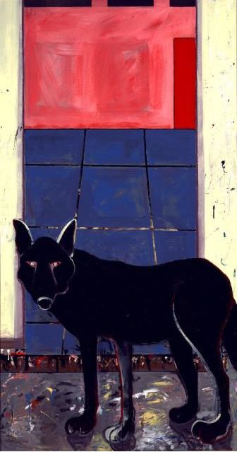 In Annie Marie Musselman's Finding Trust series (2002-2009) at the Sarvey Wildlife Rehabilitation Center, the wild thing is in trouble. (via)
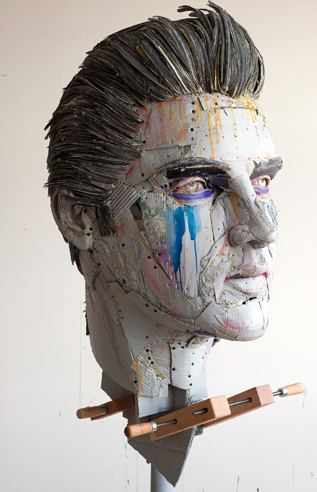 The rough scaffolding of Scott Fife's cardboard construction allows for complexity within the portrait of a notable. As Lear replied to the Earl of Gloucester, who had asked to shake the king's hand:
Let me wipe it first. It smells of mortality.And yet, painting is pivotal. Without it, what would Elvis be? Flat for all his volume. The streak of the blues that run down a cheek, the pinks for bloom and bloodshot, the yellow dripping from glue: They make him bloom.
At Platform Gallery through Oct. 10.
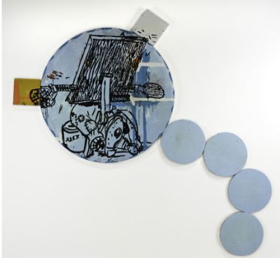
Laughing at bunglers is the best way to keep them at bay, looking down from an Olympian height at their hapless struggles to improve. Comic strip fools and fall guys are rarely allowed to rise to the level of tragedy, and yet the best strip artists, from George Herriman to Robert Crumb, play with the formula by forcing the audience to acknowledge - at least unconsciously - a kinship.
Comic or otherwise, artists always link to chains. Even the newest new is rooted in the old. Now on view at Howard House, Karen Ganz's paintings were begat by Herriman and Crumb, Philip Guston, Elizabeth Murray, Keith Haring and Michael Spafford.
In other words, her sad sacks have art-saturated, stumblebum rhythms.
Moving Target, #1 The figure seems to be a painter, buried her work, incapable of proceeding.
 Detail:
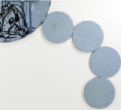 I love this show, her best pulp fictions in years. It's beautifully hung, and the paintings appear to be in forward motion, right off the walls.
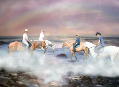
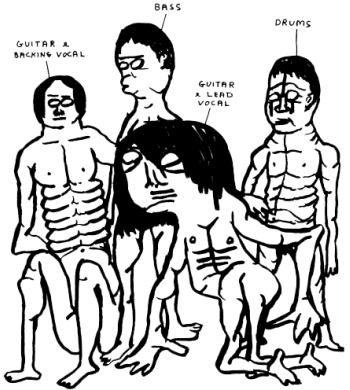
Opening at Ambach & Rice Saturday night, 7-9, From Whence the Rainbow Came. Rumor has it that the artists will play at the opening: Webb on power bass, Mitchell vocals, Zervas accordion and Park, who plays the violin and piano, on guitar or maybe drums? Guitar, I'm pretty sure.
David Shrigley's version of such events, descending the evolutionary ladder to a 4/4 beat.
 Charles Kitchings of Ambach & Rice:
This exhibit is a celebration of friendship and camaraderie among four artists who have stuck it out in Seattle, which as well all know, is no easy task. I told them from the beginning that I wanted the show to resemble having dinner or getting drinks with them, four distinct personalities connected and apart. It is my belief that this was their intention from the get go. Lots and lots of love between these guys...This team has one member missing: Leo Saul Berk. What happened? Did they run out of horses or guitars? He is the youngest, by far. As all younger people know, they're the first to go.
Update: Joey Veltcamp has images from the show with a group interview with artists, here.
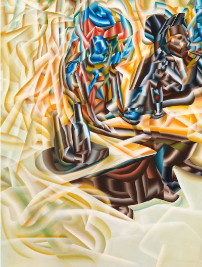 The subject of Joseph Park's Absinthe is, most obviously, a homage to Degas' Absinthe Drinker and to Picasso's Arlequin, but the subject of references is not his root subject. Park deals with the world that paintings make: how they can be constructed like crystallized
growth clumps or shards to accumulate over an image.
The subject of Joseph Park's Absinthe is, most obviously, a homage to Degas' Absinthe Drinker and to Picasso's Arlequin, but the subject of references is not his root subject. Park deals with the world that paintings make: how they can be constructed like crystallized
growth clumps or shards to accumulate over an image.With his immaculate surfaces, tightly controlled tonal range, fluid brushwork and ability to animate empty space, Park brings an embalmer's gifts to his cultural critiques. The first impression he makes is of vitality. The second is vitality strangled. It's that sinister backbeat coupled with an undertow of bleak beauty that moves us in the end.
Park's facility can be off-putting to those committed to more rugged representations. About Park's current exhibit at the Portland Art Museum, Chas Bowie wrote:
The critical hazard of making dazzling artworks, of course, is that you fall so in love with your refined flourishes that you fail to notice that you've drifted into the unseemly realm of razzle-dazzle. (more)Why is facility an unseemly realm? Fragonard put up with this sort of thing towards the end of his career. But who today looks at The Swing and sees only a razzle-dazzle version of an upper-class, covet dalliance? No, it's the slipper crafted on earth that floats in the air, pink rising above the larger pink of a desirable women to claim a place amid the artist's lights and shades.
Art requires the facility it requires, different in every case.
Waiting for Claude: (The Claude to whom the title refers is worth the wait.)
An artist was all I wanted to be; it was the obsession. A Working Woman in New York City, I instead maintained a wannabe status, if only in my mind. Help and time was the ultimate Nirvana. My boyfriend told me that any help came with strings attached and the whole thing was impossible anyway. He said he had given up the game and didn't even want to go to openings, which was sort of odd because that was where we met. My response at the time was that my job at Bergdorf Goodman had all kinds of strings attached anyway - I can dream, can't I? (more)
About the much-commented rantings of Glenn Beck as art critic: Christopher Knight offered the best reality check rebuttal (here), but Lee Rosenbaum (Culture Grrl) was tops on a bigger issue, one on which Beck is right. We don't want the NEA to become the National Endowment for Good Works. Culture Grrl below:
The Beck clip that deserves notice (below, via) addresses the Obama administration's attempt to rally the art brigades around its social-service agenda. Particularly noteworthy is the audio recording played about six minutes into the clip---the voice of Yosi Sergant, director communications for the National Endowment for the Arts, saying the following to the members of the arts community who participated in the White House's United We Serve conference call on Aug. 10:
Rosenbaum's update here.Bear with us as we learn the language so that we can speak to each other safely. And we can really work together to move the needle to get stuff done. (more)
Richard Dorment Charles LeDray in London:
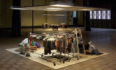
The enormous prestige accorded to American artist Charles LeDray over the years is closely correlated to the strangeness of his working methods and the rarity of his work. LeDray did not train as a fine artist. A former museum security guard, he's a self-taught craftsman whose work looks like no one else's I can think of. Mens Suits, sponsored by Artangel and shown in a disused Edwardian fire station in the depths of Marylebone, west London, is his first show in this country. When you see it, you will instantly understand why it took him three years of full-time work to make it. (more)Richard B. Woodward makes a good case against Jean Luc Mylayne, an artist I continue to admire:
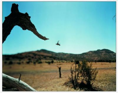
For an artist whose work is devoted to enlarging our sense of ourselves within nature, he seems rigidly focused on his own experience. Even his attention to unshowy species seems confined to showcasing them against rural backdrops. If nature in all of its humbling variety is his subject, where are his photographs investigating our urban relationship to gulls and pigeons? ...Brent Burket on the Met's inability to exhibit Damien Hirst, titled, The Aesthetic Possibility of Killing Something When It's Already Dead:
Just because an artist gets high on his own inflated oratory is no reason a curator has to participate in a folie à deux. The museum here neither serves a public skeptical about the opacity of contemporary art nor does Mr. Mylayne any favors by framing his modest, if persistent, achievement under crushing layers of grandiloquent hokum. ( more. In contrast, my review of an an exhibit last year here.)
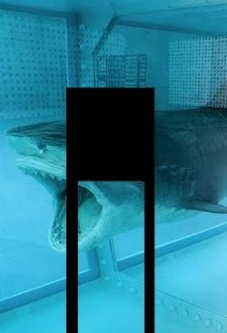
What is it about Damien Hirst's The Physical Impossibility of Death in the Mind of Someone Living that makes the staff at the Met--a seemingly intelligent group of people--so blindingly stupid? Is the formaldehyde leaking? Are all the thoughts about the physical impossibility of death snapping their synapses like gift shop cinnamon sticks?(more)Jen Graves on a Paul McCarthy and Richard Jackson interview at the Seattle Art Museum. She's killer good on setting up background and atmosphere, but what did they say? Did they rise above the shallow wisecracks listed here?
McCarthy is an art hero; he sort of took the soul out of Conceptualism and put it in a deeply messy and yet Hollywooded body, and he's been written about and emulated for years. In person he comes across as a regal dwarf. It's not that he's that short; he's just shaped dwarfishly. And it is impossible not to notice that his hands are so thick that they are obscene. ("They're penises on palms," someone said to me. "How were they when you shook them? Succulent?" They were. They were succulent. Yes, it is all magnificently disturbing. This is the guy who, wearing women's clothes, humped raw hamburger and ketchup in a 1975 performance.) (more)
Mark Hudson on Zhang Huan: (Below, Zhang Huan's My America at the Seattle Art Museum in 1999, a performance that featured a wide array of Seattle writers, artists, collectors, curators, an art book editor (Joseph Newland) no critics and one art dealer, the late Linda Farris, who was the ultimate game girl.) To judge from Hudson's piece, Zhang might be better known in the States than in London.
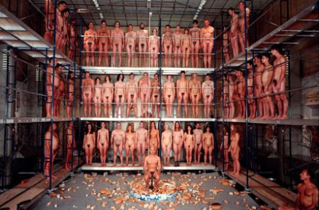
Kenneth Baker on Jenny Bloomfield and Jennie Ottinger: The S.F. Chronicle's art critic doesn't write a lot and can be disengaged and/or cranky, but when he's on, he's one of the best in the newspaper realm:You may not have heard of Zhang Huan, but he appears poised to be the first non-Western artist to become a truly global name -- on a par with Damien Hirst, Jeff Koons or even Andy Warhol. And the central element in an oeuvre encompassing painting, performance, installation and sculpture is his own extraordinary physical presence: the shaven head and stoic, monk-like features that have appeared in everything from wince-makingly uncomfortable performances to vast sculptures, such as Three Legged Buddha which filled the Royal Academy's forecourt in 2007. (more)
Even a generation ago, abstract painters might still view their discipline as an arena of struggle. Struggle with the inertia of materials, struggle for authentic expression within the tainted matrix of pop culture, struggle for originality with so many possibilities exhausted.Today, on the downslope of postmodernism, such ambitions seem more self-dramatizing than responsive to the realities.
British-born Bay Area painter Jenny Bloomfield stands out against this dispiriting background, making abstraction look alive again without nostalgia, triviality or bombast. Those who think this sounds easy ought to give it a try. (more)
Finally, offered as a small, charming note, Maira Kalman explains through drawings the history of life on Earth: Evolution to Irving Berlin.

Instead, wrote Maroney, Wood was only pretending to be narrow because he was gay and hiding it. Maroney's essay here.
From his email:
Your views on his art and his politics are essentially shared by virtually everyone in the art world including his biographers and unfortunately they are entirely wrong. Wood was not an "America first Bread basket regionalist" whatever that is. He was a swinging, Herbert Hoover, prohibition hating lefty. The man you think he was was his public persona, which he put up for his survival and which was so successful, the real Grant Wood remains hidden to this day.To repeat, my views of Wood's work are entirely appreciative. The only reason anyone might care if Wood were wide in his personal views or narrow is the quality of his work, which, after reading Maroney's essay, I'm not as certain as he contain so many clues to secrets of a personal nature.
Also, even if Maroney's premise is sound, few would agree with his apparent contention that being a closet case implies the (hidden) existence of empathy for others.
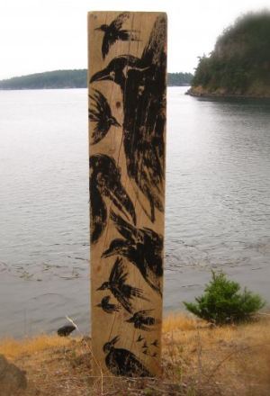
I found an old piece of driftwood, lay it down and painted some ravens on it. Standing, straddling the roughened board, 2x12", I stood it up -- balanced in the dried grasses, of a hillock overlooking the south reaches of Lopez Island. Watching them, a gathering, a murder -- as they are called, they study what's happening, all day...Girvin paints ravens not just because they're there but because he lives in Seattle, where a 17th century, six-panel, ink-and-gold-on-paper Japanese crow screen is a highlight at the Seattle Asian Art Museum.
I'm impressed that the Dispatch posted his remarkable essay and left it up on its site. I don't think the newspaper where I toiled till it ceased production would have done the same. Hell, I'm sure of it.
Bonetti:
As some of you might have heard, I am leaving the Post-Dispatch. Today is my last day and this will be my last Culture Club post. Although some of the Cherokee Street clique would like to think that I was fired by an enlightened management that wants reviews of inept artists showing their woeful attempts at self-expression in vanity galleries, that is not the case. I took advantage of advanced age and a benefits package and decided to retire...
I would be the first to admit that St. Louis and I were not a match made in heaven. Indeed, my editor Christy Bertelson for the past unhappy year and a half accused me of hating St. Louis. I do hate things about St. Louis: the willed ignorance, the racism, the smugness of the self-appointed social and cultural elite, the stupidity of the political class, etc. But it is hard to hate a city where you've lived for more than six years. Affection grows in spite of yourself.
He goes on to list 5 things he'll miss. Lots of drinking is one. There's not a single artist on his list, a single gallery, nonprofit space or art museum. He won't miss the Beckmanns at the St. Louis Art Museum? That can't be true. Obviously, he wrote this piece in a scorched-earth mood. Bonetti plans to move to Boston. I hope he keeps writing, because he's good.
Jonathan Middleton, director of the Or Gallery, said today that government funding cuts are "devastating" the Vancouver arts scene.
The liberal party has had a reasonably good history of supporting art in the past. During the last election, it promised to keep the deficit to $400 million. It's currently $3 billion. The government is cutting wherever it can. Arts funding came for a gaming tax, which is not out of the general fund. There was the idea that the social cost of gambling might be offset with charitable contributions, including to the arts.
Nonprofits have relied on this money for years and had no prior notice of cancellation. Instead, we were told we could continue to count on it. It wasn't a cut could could have contemplated.
Or Gallery lost $30,000, which is 15.6 percent of its annual budget. (The gallery canceled its November/December exhibit, which was to be on the theme of humor in art.) Helen Pitt Gallery lost 40 percent of its funding. Helen Pitt is going to lose its space. I don't know if it can continue to pay a director or continue programming. The irony is, the government has talked for years about the benefits of arts to the economy, that arts bring in $1.39 for every dollar spent.
BC Arts Council defends the cuts, which it says it regrets. The opposition is organizing, including here.
Sophie: A new authoring tool for multimedia developed by the Institute for Multimedia Literacy that suggests new possibilities for presenting critical response.
Indianapolis Museum of Art: With its Art Babble and Dashboard, the IMA is an example of a cultural institution extending its reach into areas that have traditionally been the province of journalism.
InstantEncore.com: An example of an aggregator attempting to gather up everything about an art form (in this case classical music) and making it accessible in one place.
NPR Music: An example of a traditional big media company that is reinventing itself across platforms. NPR Music blurs the lines between journalism, curation, presenting and producing.
Gazette Communications, Cedar Rapids Iowa: An example of a local media company trying to reinvent the idea of what it considers news and how it might be gathered and presented to a local community.
Taken together, I found the proposals heartening, even though few are financially robust. At best, they point the way towards a future that might achieve real jobs but are far from doing so now.
The Brookyn Rail does not pay its contributors. Living on air gets thin. Other favorites from the visual art category include:
Art Fag City, Triple Canopy, Departures, Big, RED & Shiny, Bad At Sports, Dinosaurs & Robots, Idaho Arts Quarterly, Glasstire, Of Note, Kung Fu Art Critic and a site under construction, East of Borneo, which will be edited by Thomas Lawson.
There are flashier sites on the list, most prominently, FLYP Media, which is gorgeous and technically inventive. Good luck to FLYP, which seems to be aiming for an undifferentiated audience, one that will be impressed by the site's click power and not put off by soft, feature-style arts writing.
People already in the game, on the other hand, aren't likely to want to read what they already know, even though production values are stellar. As a bridge builder between the art audience and everybody else, FLYP serves the purpose. Its texts are elementary, but its mainstream taste is reliable. If you've never heard of John Baldessari, this site's for you.
Nonprofits carry enormous weight, such as Or Gallery, Presentation House, Helen Pitt, Artspeak, the Contemporary Art Gallery and of course, the Vancouver Art Gallery.
According to BC's Alliance for Arts and Culture, 80 percent of public arts funding in the province has disappeared from the budget. If this money is not restored, the effect could be catastrophic. Story here. More to come.
Yoko Ott, freelance curator and laid-off member of the Frye curatorial team (heading a terrific program she originated for children's art engagement at the Frye) is going to be director of exhibitions at Open Satellite. (Review of current show here.) The founding director, Abigail Guay, is moving to the Henry to reopen a collections study center, which closed at the Henry more than a decade ago.
Guay will make artwork in the Henry collection available to students, scholars, critics and researchers. While it's good news about the reopening of the center, the job at first hearing doesn't sound as if it will be a good enough platform for Guay's talents. What shows will she curate?
Ott will get a real chance to shine at Open Satellite, which functions as a kind of Peace Corps for contemporary art in Bellevue. It's a go-forth-and-share-with-suburbanites aesthetic imperative. Funded chiefly by developer John Su, OS is applying for nonprofit status, which is reasonable. The profits reaped there are not financial.
No word yet on whether Ott will also continue to curate the lobby space at the Lee Center, or her job at 826 Seattle. Ott likes to do a lot of things at once, but even for her, handling all three assignments might be a stretch.
David Shrigley
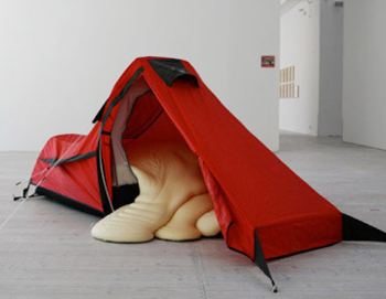 Dan Webb - Real Disguise, detail
 Eakins & Dombrosky
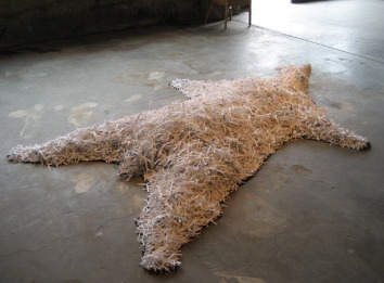 Dave Ellis
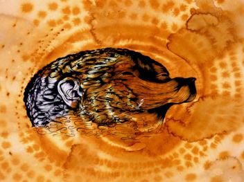 Karen Ganz (at Howard House till Sept. 26)
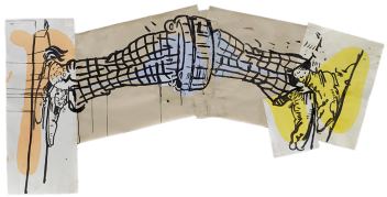 Will Ryman
 Nayland Blake- The Big One
 Jon Haddock- The Activist
 Tom Friedman
 Sean Duffy
Ruth Wallen
 Fred Muram
 Finally, for kicking the stuffing out of an advertising slogan, there's Chrissie White, a high school sophomore in the Seattle area. Her Flickr page here.
 The coy blooms came to town to promote the launch of the 2010 Prius. Seattle park administrators carefully scrutinize any projects artists want to install in a city park. Did a car company receive the same scrutiny? The good news is, the dippy flowers have a short shelf life. Jen Graves called them terrible, which just about covers it.
 Looking at the YouTube video below, however, featuring the Michael Clark Company, I know one thing that could have saved the day. Dancers. Check the stage set. It's a Solar Seating Power twin.
(Thanks for the video link to Tim Marsden, who described the piece as "Beckett meets German Expressionism via the unlikely route of Post Punk and classical ballet.")
Large forest fires have occurred more frequently in the western United States since the mid-1980s as spring temperatures increased, mountain snows melted earlier and summers got hotter, according to new research.Michael Brophy
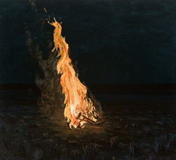
Almost seven times more forested federal land burned during the 1987-2003 period than during the prior 17 years. In addition, large fires occurred about four times more often during the latter period. (more)Brophy again:
Say your life broke down. The last good kissBuddy Bunting, Victorville, California, 2009, ink on paper.
you had was years ago. Richard Hugo
 Detail:
At Soil through Sept. 26
Bunting:
Late one night in the summer of 2005, while driving south on U.S. route 395 towards Los Angeles, I passed through the town of Victorville, California. At the time I was unaware of the new Federal Prison there, but approaching the town from the desert its presence was made clear by the distinctive illumination of prison lights visible on the edge of town.
Scott Reeder, Cops Ascending Staircase, 2009
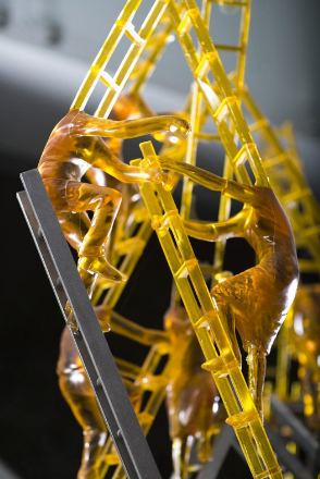
Dan Webb, Heads Up! (detail), 2005
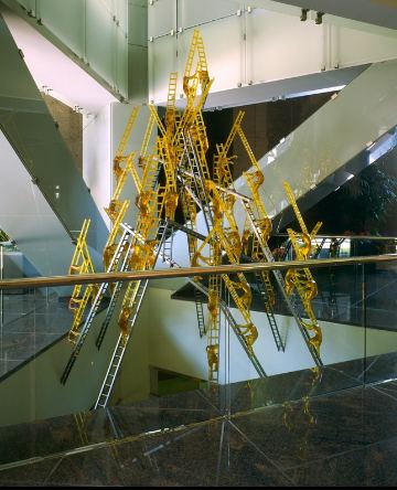
 Heads Up!
Thanks to the Depression, Hoover was one of the most despised men in America, but not by an America First, bread-basket regionalist like Wood.
 In
the end, his celebrations of his region transcended it. He might have
been a narrow man, but as a painter, the fine-lined, lyrical urbanity
of his landscapes remains a marvel. With a paint brush in his hand,
Wood had rhythm, and Wood had swing.
In
the end, his celebrations of his region transcended it. He might have
been a narrow man, but as a painter, the fine-lined, lyrical urbanity
of his landscapes remains a marvel. With a paint brush in his hand,
Wood had rhythm, and Wood had swing.Within the utter control of Wood's manicured grounds is an antic spirit. If Betty Boop came out the back door of his happy Hooverville to sing on the lawn and all the trees and shrubs swayed in chorus, who would be surprised?
Artists honor the past by improvising on it in the present. Currently at Punch Gallery are Nathan DiPietro's small paintings in a series titled, Neo-Suburban Palouse, an exploration of Wood's duality painted in the round on egg tempera on panel.
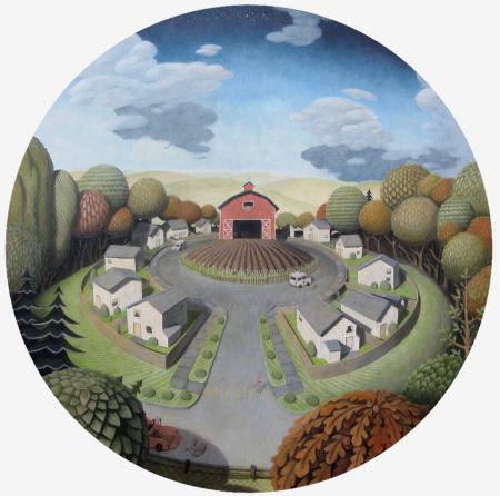 The
fantasy
 (DiPietro detail)
 "Give
me liberty or give me death," said Patrick Henry. Why is it that the
right who treat Henry as a saint seem to long for surveillance? Its
members can't wait to knuckle under, to be vulnerable to wiretap
without warrant, told what they can read, whom they can (and can't)
sleep with and when they have to have children.
"Give
me liberty or give me death," said Patrick Henry. Why is it that the
right who treat Henry as a saint seem to long for surveillance? Its
members can't wait to knuckle under, to be vulnerable to wiretap
without warrant, told what they can read, whom they can (and can't)
sleep with and when they have to have children.From the point of view of its proponents, what would a society regulated by the right look like? Wild nature would be gone, but tidy plots and man-made lakes would shine in the sun.
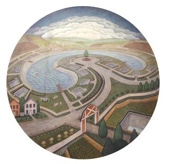 (Above, DiPietro's Lakeside. )
Another Wood link: Wood loved the pre-Renaissance Italian painters, especially Duccio, who modeled his mountains on rocks in his studio and populated his ground with strange little trees. There's more of the Duccio feeling in DiPietro than in Wood. It's only a matter of time before DiPietro paints Jesus in the Suburbs. Through Sept 26.
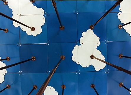 Tonya Solley Thornton, a disco waterfall:
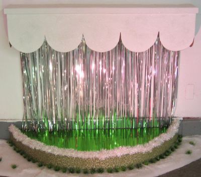 Jesse Edwards, waterfall during an explosion or just after:
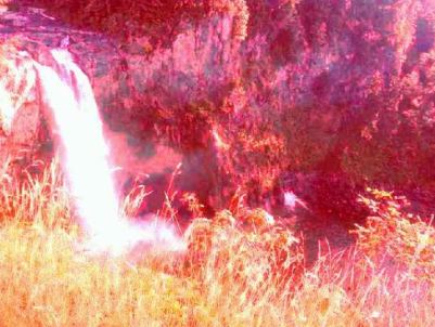 Claude Zervas, a river of light ("Nooksack"):
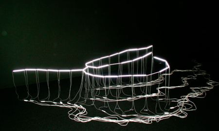 Joy Garnett, a river of flesh, flesh being, as de Kooning once said, the reason oil paint was invented:
 SuttonBeresCuller, a pond of goldfish (no goldfish were harmed in the making of this pond):
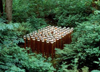 Mike Simi, a movable mountain of beef stew (custom fabricated robotics and software program) ...
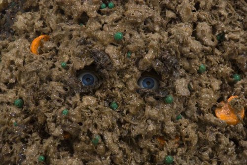 as a self-portrait. (I'd know those blue eyes anywhere.)
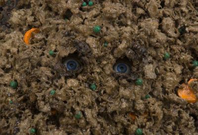 Gretchen Bennett, the spread of nature though stickers:
Created from drawings of hybridized landscapes from the Pacific Northwest, these stickers have been placed in Brooklyn, supplanting cement and brick with scenes of propane tanks draped by coniferous trees. In turn, images from the East Coast, such as junk yard dogs, are brought back to the Seattle-Portland area in the form of stickers, ultimately collapsing the space between the landscapes of the two coasts. The stickers can be downloaded and printed, spreading mongrel bits of landscape far and wide, continuing their viral migration to cereal box state lampposts, Canadian kiosks and Prague stucco.Elizabeth Sandvig, Rabbits at Sea, because we're so mean to them on land:
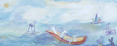 Vaughn Bell, Your own Mt. Rainier. You can take it for a walk.
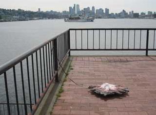 And speaking of mountains, Alex Schweder:
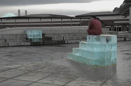
Is Murata moving through the history of art? Homestead Grays (below, 2008 still from video via) is pixilated Cubism.
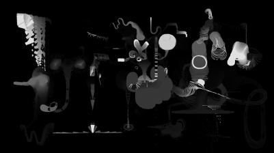
Juan Gris, Book, Pipe and Glasses, 1915
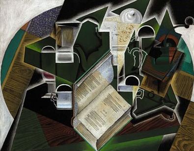
Take, for instance, Dennis Oppenheim's Theme for a Major Hit (1974).
To answer his own question - how to make performance art without being there? - he created a cadre of his own mini-me's. Dressed in hip suits, they assume various unruffled positions till a timer goes off and they dance.
Puppets are rarely cool. They're fall guys who are beat on the head but rise again, bits of their stuffing clinging to the cudgel. Oppenheim's make Andre Benjamin look awkward. They're light on their feet, with a heavy-metal gleam in their gun-gray eyes. (more here)
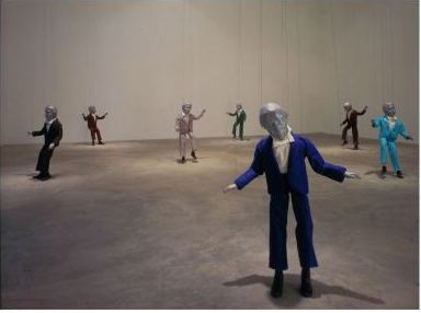 Free admission.
The consolation of things. McMakin and Jeffry Mitchell became friends 15 years ago over their mutual love of furniture, found objects, the shiny new and the well-worn, the turn of a phrase, art history. Both are devotees of fluid conjunctions and make work in their overlaps.
Earlier this year, they went shopping in Centralia (droopy lumber town rich in castoffs) and purchased 30 objects which they winnowed down to 12. Each created an object in response to the found one, all of which became an exhibit at Pulliam Gallery in Portland, titled, by exchanging the letters of their first names, Joy and Reffry.
The show is beautifully but not literally hung. The audience is free to group found object and responses as it chooses, turning observers into collaborators. Each set of three assembled by collector is for sale for $3,600, $1,200 each to Mitchell, McMakin and the gallery.
Below, three sets assembled by me, with an extra, eight-legged found object.
1. The
 McMakin made it (relatively) new again, a new broom sweeping clean.
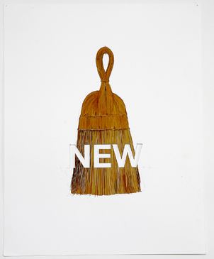 Mitchell's ceramic pair of guys who beam with fresh confidence is titled, The handsomest men in the world.
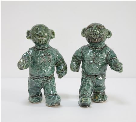 2. This happy ghost bank has seen better days. Although not evident in the photo, someone cracked open its base to get its undoubtedly meager store of cash.
 Mitchell's Ghost is a thin wash of white that rests on its own eyeballs.
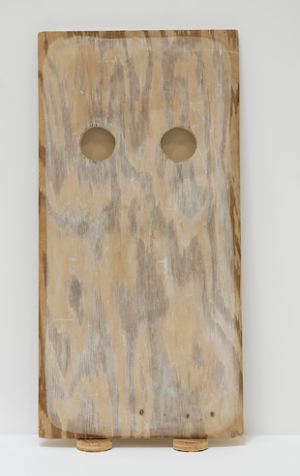 McMakin conceived of a ghost as a loss. The words in cut out and pencil lettering, are, "This world is borrowed and incomplete," from the lyrics of a Tift Merritt song.
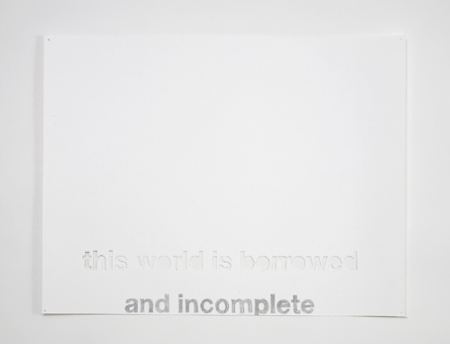 3. Tea pot as air freshner, once the scent is gone, and inset with a mirror.
 Mitchell turned the mirror into an absence, the open mouth of a jar.
 Classic McMakin word play:
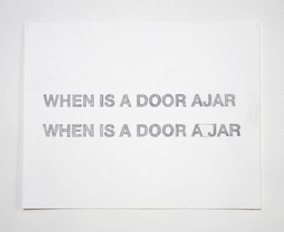
One more image, which I believe is the real model for Mitchell's Handsomest Men in the World. Anyone at all familiar with McMakin's furniture will marvel that he found these chairs in a junk shop. It's his work on the shabby cheap.
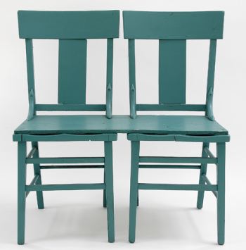 John Baldessari once observed that he shared large chunks of McMakin's vision:
A love of minimalism (while slightly poking fun at it), a Mattisean love of color, a goal of keeping others off balance, and a love of removal/absence, a quest for the paradox of simplicity and complexity. But overall, a mission to sharpen perception, it's a significant accomplishment to get one to really see and understand a chair (and not feel self-conscious in sitting on it). I don't think Roy has designed an ironing board yet, but I'm sure it would double as a painting. (from profile here.)About Mitchell, I've written, in various places:
Hairless bears in creamy slips...generosity and grace... conjunctions of feeling and form.... fusion of history and fleeting moment...His great gift is an ability to turn a chaos of sources into a coherent visual stream, what 16th-century Italian Baldassare Castiglione identified in "The Courtier" as a nobleman's highest grace, to have "sprezzatura," a casual manner of doing a difficult thing well... Mitchell's casual grace masks bountiful skill. He drapes the shaggy world in silks and puts a top hat on the tawdry... He's is a potter, but he's also a painter and faux-fur sculptor. He works in clay, oil paint, watercolor, glass, latex, plaster, monoprints, paper, paper cutouts and wood.
There's a two-part catalog from Publication Studio available through the gallery.
By contemplating the Stations of the Cross
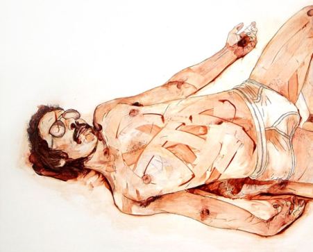 By shredder
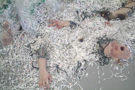 By spontaneous liquidation
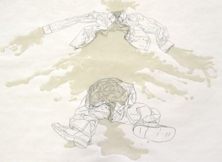
(Otto Muehl)
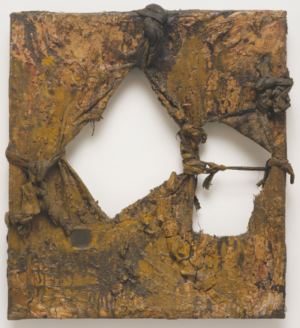 Douglas Britt, art critic of the Houston Chronicle, contributed three silent videos on the HC's entertainment blog, here, here and here. Jen Graves review here. Emily Pothast on Translinguistic Other here.
 My reviews here, here, here, here, here and here. This is the most important contemporary art exhibit in the history of the Seattle Art Museum. Why it is not traveling is beyond me.
If none of that appeals, you're safe with a totem pole, even though the tribes that created the original models never lived that far south.
Kenny Scharf made a smashing success of the last option. Starting with a cliche isn't a problem. It's where you end up that matters.
Say it, no ideas but in things. Patterson, William Carlos WilliamsIn Jameson Park at the edge of the Pearl District, New York Pop Shop tribalism:
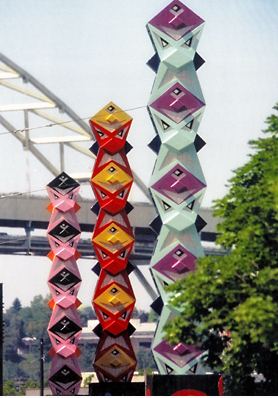 Detail, via
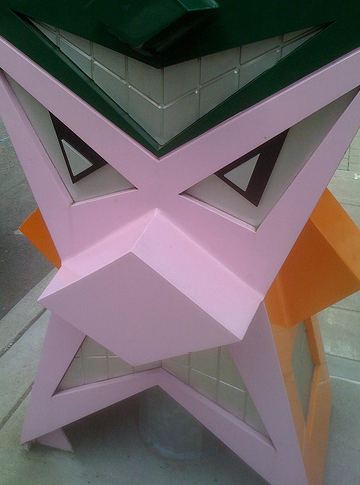 Detail, via:
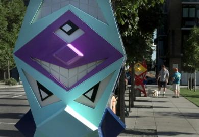
It's
Only artists who know their way around the weird can hope to win the 2009 Metropolis Art Prize: $20,000, a dedicated artist channel on Babelguym's Metropolis and a screening in Times Square. There are other cash prizes with a Times Square spotlight, including one for "best street art video." (Info on Two Coats of Paint)
Jurors say they want to be "inspired, challenged, excited, awed, moved, intrigued and weirded-out." Open to artists in all visual media, but entries have to be submitted on video.
Northwest artists who should put a video together (or use one they've already made) include:
Vanessa Renwick

Matt McCormick, detail from The Subconscous Art of Graffiti Removal
Laura Fritz (The cat, Laura. Put a stamp on it and slide it into a mail box.)
Tivon Rice (Osteotmy)

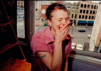
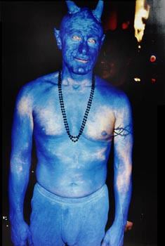 Dan Webb
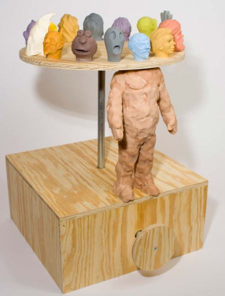
The Northwest has a rich vein of the strange to tap, and I've only just begun. I'll end with a glass artist.
Eli Hansen, Jack Pepsi
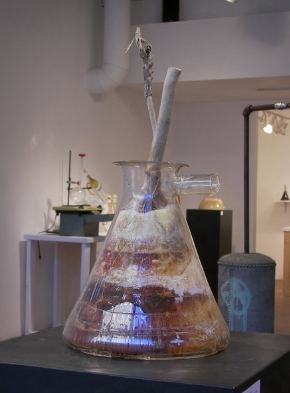 For the category of best street video, nobody's going to top Jessica Jobaris dancing as if she'd been shot.
 Street
pigeons have few friends, but one of them is a scientist. He claims
they can be taught to discriminate between Chagall, Van Gogh and
Picasso, here. The same scientist came to the same conclusion a decade earlier, here.
Street
pigeons have few friends, but one of them is a scientist. He claims
they can be taught to discriminate between Chagall, Van Gogh and
Picasso, here. The same scientist came to the same conclusion a decade earlier, here.Maybe he repeats himself because the first time around, he failed to raise their status. In the photo below by Regine Petersen, the bird pauses as it eats the soft center of a piece of bread. Once you know about its visual skills, doesn't the image also look as if the animal is contemplating the interior of a frame?
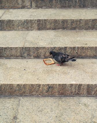
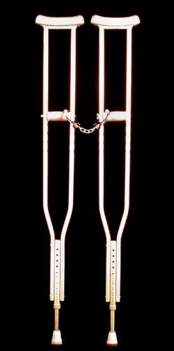 And once true romance is gone:
Heidi Schwegler
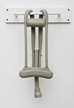 Mike Simi (for the serial dater)
If Unzipped decides to give art within its theme a longer run, here's two more suggestions from Seattle:
Jeffry Mitchell (Good Counsel)
 Steven Miller (Proof of Homosexuality in Nature)
 This is the body soon to be featured in a piece written by the peerless Dave White.
 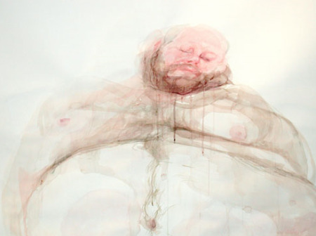 Have
devotees of the rock hard decided to lighten up on their
fat phobia? It's better than that. Their putting their phobias aside to
embrace art. Unzipped wants to add more substantial content to its theme, starting with Brian Murphy's self-portraits.
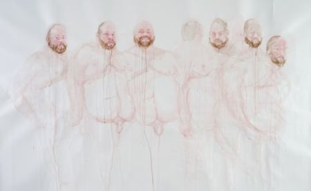 In a culture that fears fat the way ship captains
fear fatal storms, Murphy celebrates his bountiful flesh, turning his
face into a moon squashed against the picture plane and his torso into
a sky, with drifts of himself floating by.
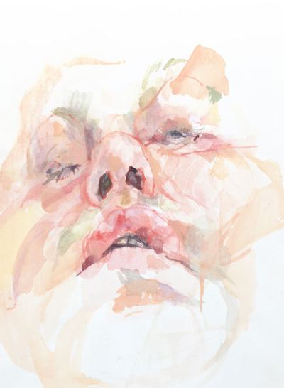 Within his theme, his range extends beyond the celebratory. He can render
versions of his body with the tender exactitude Kafka used to describe
Gregor Samsa after his metamorphosis.
Within his theme, his range extends beyond the celebratory. He can render
versions of his body with the tender exactitude Kafka used to describe
Gregor Samsa after his metamorphosis.Jenny Saville paints opalescent mounds of fleshy female (and pig) torsos, sometimes but not always attached to fleshy heads. She works from photos; he works from life. To paint himself, he peers into a small, hand-held mirror, memorizing as much of the results as he can carry in his head, painting that and repeating the process. Saville works with a grid. Murphy's internal balances are far more precarious. Saville paints slabs of meat; Murphy paints pieces of sky. His flesh floats. It's a massive volume with no weight, a pageant ready to melt into colored air.
Debra Baxter
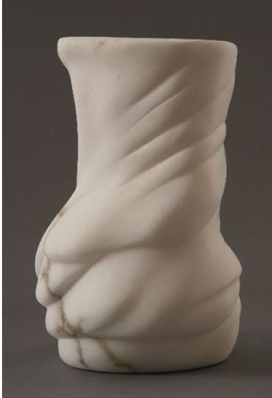
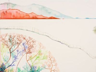 inspired by Hokusai's 36 Views of Mount Fuji.
 Inka Essenhigh, Blue Wave...
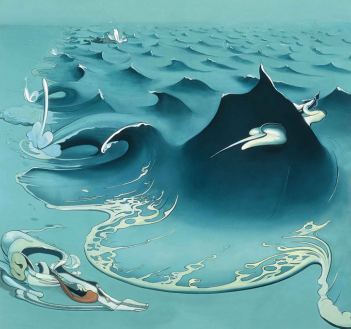 inspired by Hokusai's The Great Wave.
About
Blogroll
AJ Blogs
AJBlogCentral | rssculture
Terry Teachout on the arts in New York City
Andrew Taylor on the business of arts & culture
rock culture approximately
Laura Collins-Hughes on arts, culture and coverage
Richard Kessler on arts education
Douglas McLennan's blog
Dalouge Smith advocates for the Arts
Art from the American Outback
Chloe Veltman on how culture will save the world
For immediate release: the arts are marketable
No genre is the new genre
David Jays on theatre and dance
Paul Levy measures the Angles
Judith H. Dobrzynski on Culture
John Rockwell on the arts
innovations and impediments in not-for-profit arts
Jan Herman - arts, media & culture with 'tude
dance
Apollinaire Scherr talks about dance
Tobi Tobias on dance et al...
jazz
Howard Mandel's freelance Urban Improvisation
Focus on New Orleans. Jazz and Other Sounds
Doug Ramsey on Jazz and other matters...
media
Jeff Weinstein's Cultural Mixology
Martha Bayles on Film...
classical music
Fresh ideas on building arts communities
Greg Sandow performs a book-in-progress
Harvey Sachs on music, and various digressions
Bruce Brubaker on all things Piano
Kyle Gann on music after the fact
Greg Sandow on the future of Classical Music
Norman Lebrecht on Shifting Sound Worlds
Joe Horowitz on music
publishing
Jerome Weeks on Books
Scott McLemee on books, ideas & trash-culture ephemera
theatre
Wendy Rosenfield: covering drama, onstage and off
visual
Public Art, Public Space
Regina Hackett takes her Art To Go
John Perreault's art diary
Lee Rosenbaum's Cultural Commentary
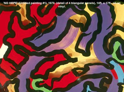
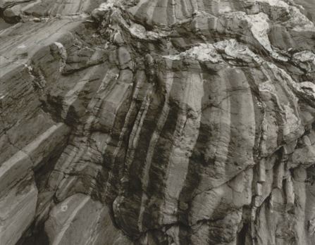
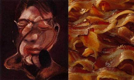 Thomas Moran
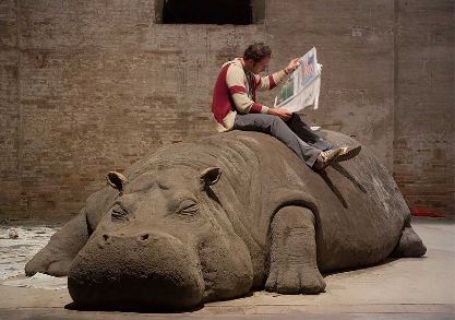
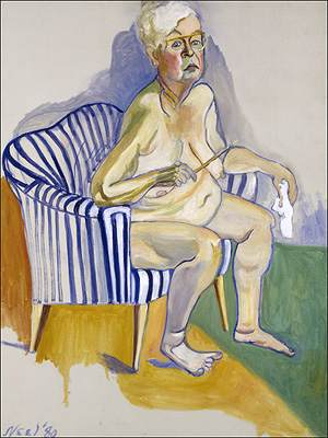
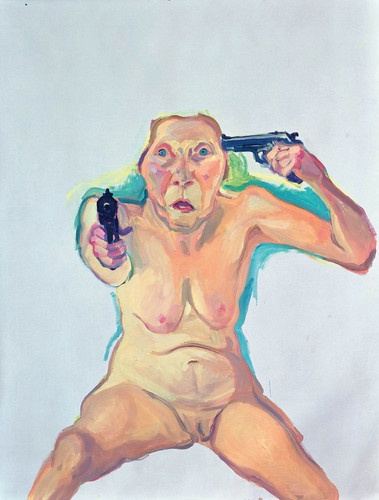
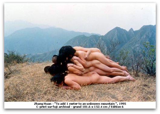

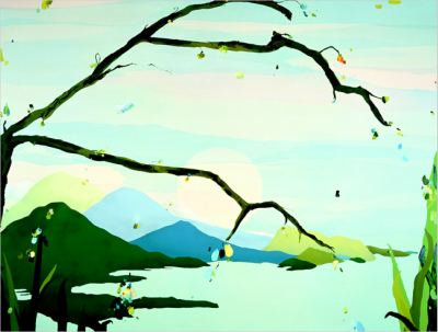
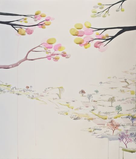
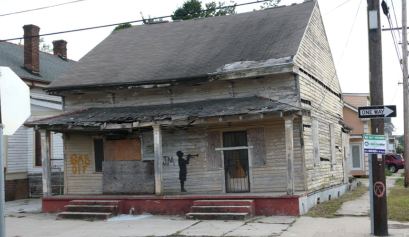
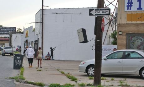
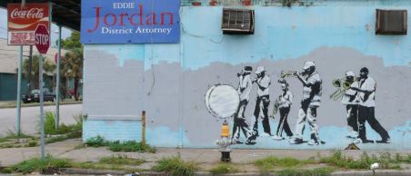
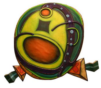

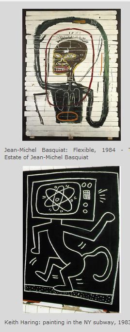
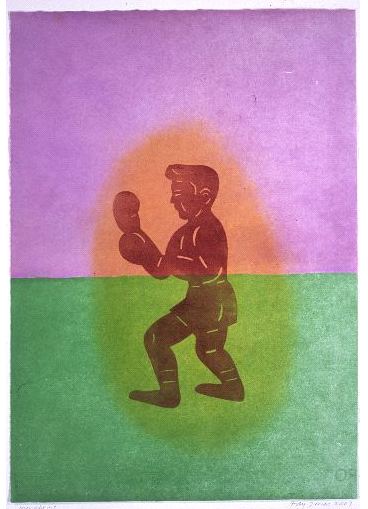
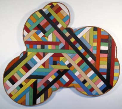
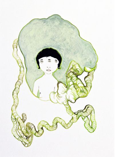
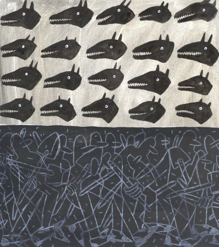
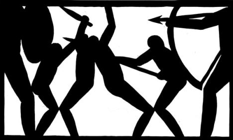
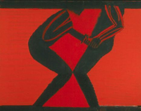
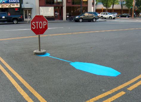
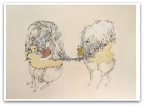
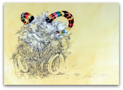
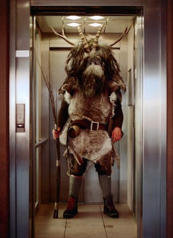
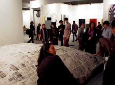
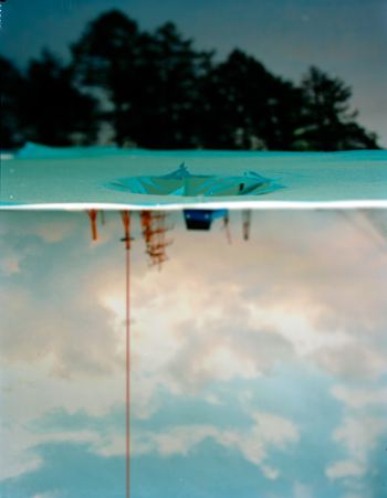
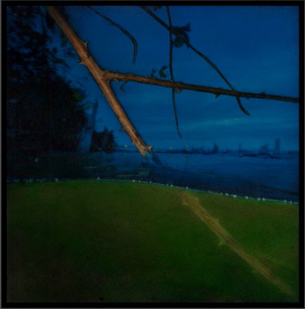

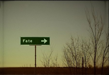
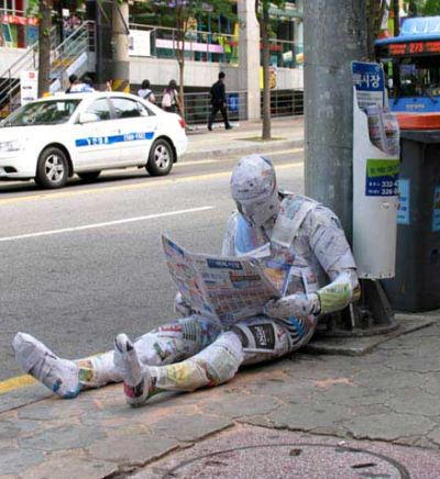
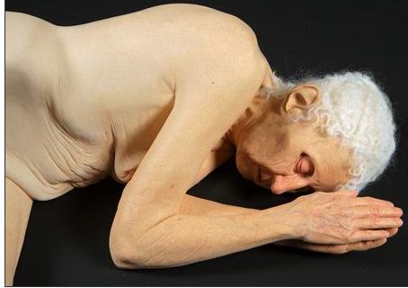
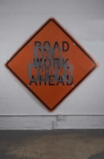
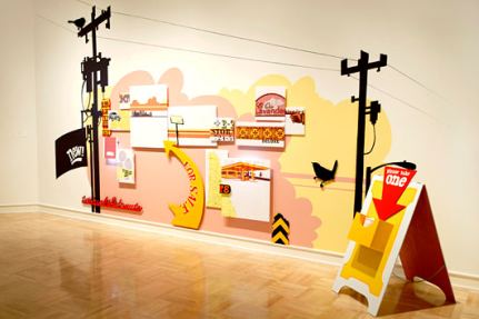
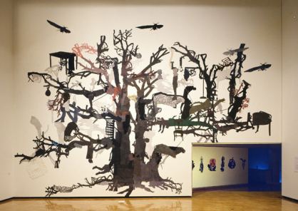
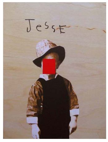
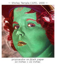

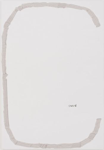

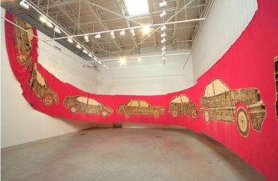
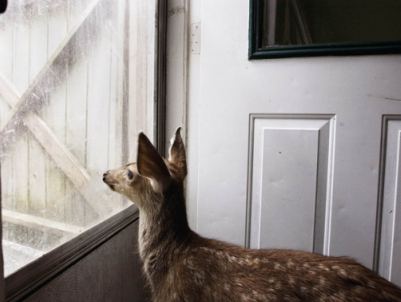
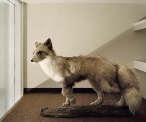
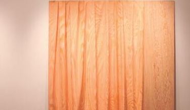
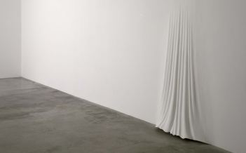
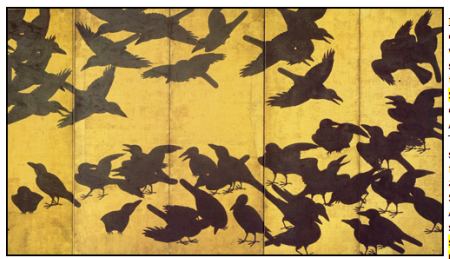
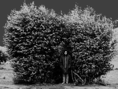
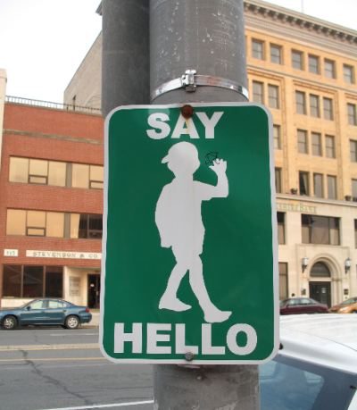
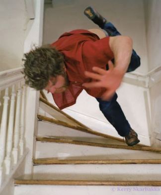
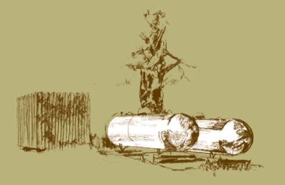

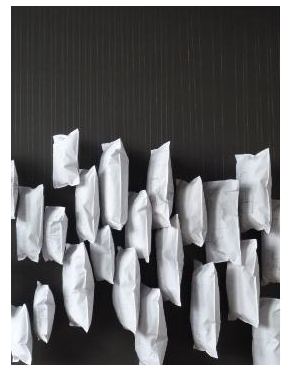
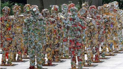
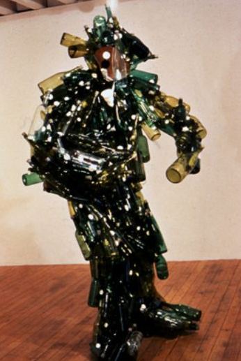
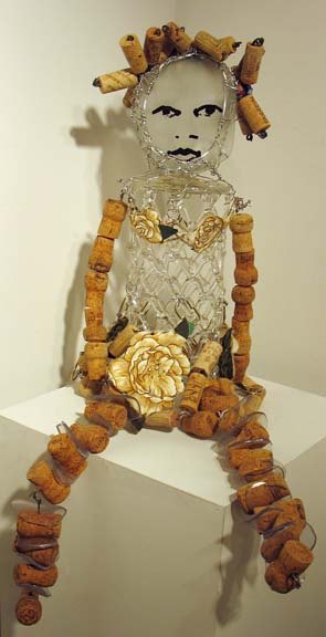
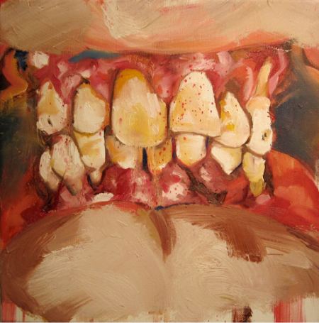
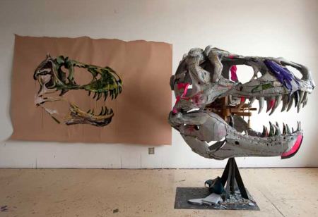
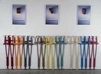
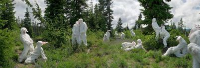
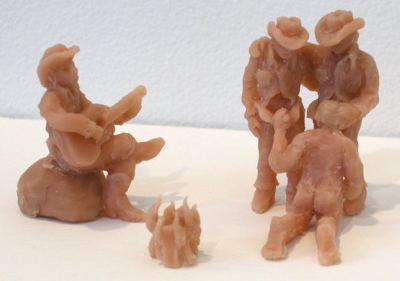
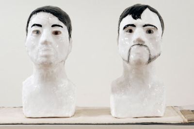

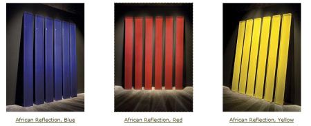
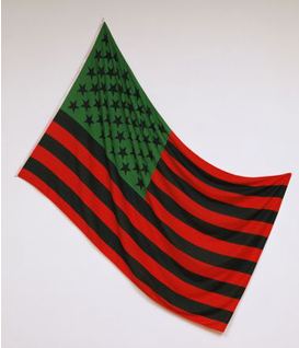


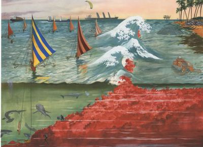

Recent Comments