Another Bouncing Ball: August 2009 Archives
Finalists this year are Jovencio de la Paz and Josh Faught from Oregon; Jenny Heishman, Sean M. Johnson and Matthew Offenbacher from Seattle. The Northwest's oldest award for visual artists is now $15,000 with two runner-up awards of $2,500. Jen Graves wrote that she thought that Heishman and Offenbacher were the "ones to beat."
I'm glad I'm not on the jury, because I'd want to give it to all of them. This is the strongest lineup of Bowen finalists in the history of the award. If I had to pick one, it would be Sean M. Johnson, but that's partly because I know his work best.
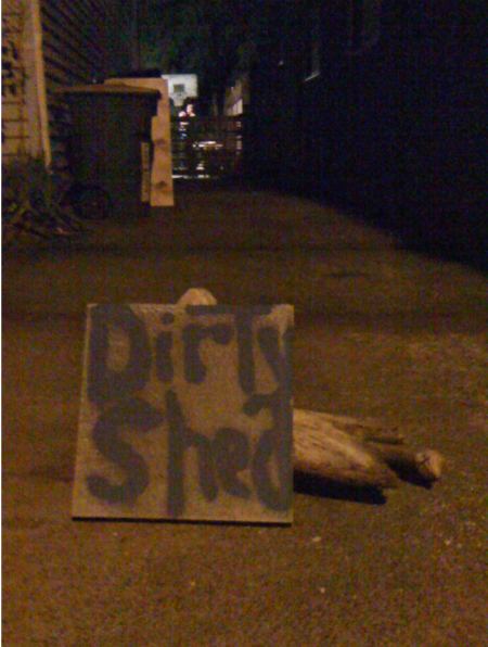 During the day at Seattle's Dirty Shed, an exhibit conventional in format if not delivery hung on the walls. On
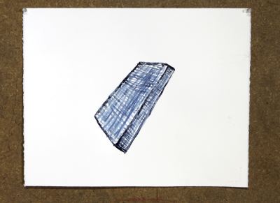
one side were paintings by Jason Hirata. He made them by mixing with
blue pigment the sweat he generated in cleaning out the space.
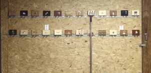
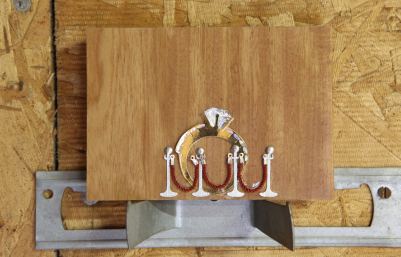
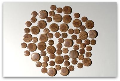
 Facing them were the tiny collages of Sol Hasemi. He made them using wood
samples from a flooring shop with keepsake-tags for scrapbooks ordered
online.
 One, in particular:
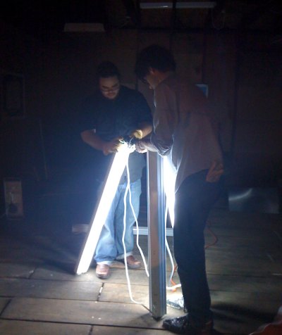
 At night, however, Hirata and Hashemi improvised with florescent tubes of light.
Photo, Gretchen Bennett. Left to right, Hirata and Hashemi.
Hoedown from Rodeo from Eleanor Stewart on Vimeo.
Throw Momma From The Train reaches a satisfactory conclusion with the presentation of a pop-up book. In 1987, when the movie came out, such books were slender threads in the world of literature, and their childishness could be assumed as a plot device.
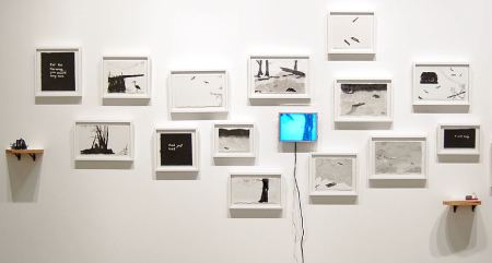
The connective between pop-up and moving image is the flip book. Twenty-two years after momma got the boot, artists have managed to create a form of everything at once: drawings, pop-up books, flip books and videos. William Kentridge comes to mind first of all, but there are many others, including Stewart and, in Seattle, Cat Clifford, her installation below.
Small world department: Edward Winkleman opened a thread this morning on the subject of dealing with bad reviews.
I've written my share, even though if I've freely chosen the artist (as opposed to being assigned), I've rarely picked someone whose work I find to be without consequence.
A review is an engagement, an examination of the specifics of a response written to evoke response in others. Who wants to dance with the dead? Nothing will come of nothing. As Grace Paley noted, where there is real disagreement, there's no point arguing.
At worst, a review articulates the limits of a critic's imagination. (I can't see you.) A negative may be intended by critics as a prod, but it always serves as their mirror.
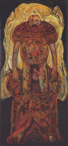 Selma Waldman died last year in Seattle at age 78.(My obit here. Images via Center for Holocaust and Genocide Studies.)
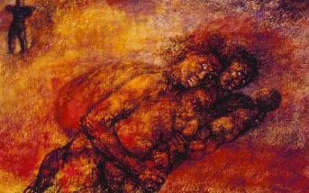
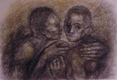 Although he enjoyed wide critical favor in the 1950s, both artists are essentially outsiders. They are center stage in a particular moment only in so far as their work is misunderstood in it. Where they find resonance is with each other.
 Even though he was mystical and she materialist, they are each best understood in the context of their shared Jewish culture, what Bloom called a "weeping from the heart." A weeping and a joy. Jewish culture was existentialist thousands of years before the French defined the term. Bloom and Waldman confront the horrors of life and pay them back with radiance.
Dave White on first episode:
Verdict: LiLo took out her frustrations on the girl who looked like Sam Ronson. All the judges did. And I think that cheats us, the viewers. Because how many short-haired, pixie-ish, spaced-out-art-girls-who-could-very-easily-be-lesbians do we ever get on Runway?Moving on. White knows how.
PRECIOUS FEW. THAT'S HOW MANY.
This show has homos seeping from its pores. Boring, tacky, annoying ones most of the time. What happened to the days when an allegedly talented lady-person could simply arrive at Parsons -- oh, wait, no, now it's FIDM -- and just waltz through this show, creating at least a few sub-Bjork garments out of puffy, metallic, octagonal empanadas that also feature their own water purification systems inside a hood made of charcoal and shards of glass and go, "TA-DAAAH!" before being shown the door? Can't they, instead, eliminate one of the dullards first? ...When Kors called her final product a "disco soccerball," I thought, "Fuckin' right it's a disco soccerball. Not enough of those in the world." more
Meanwhile, my first favorite person of the new season, now that Planet Claire is already out of the picture, is Malvin with the Haysi Fantayzee hair. He says shit like "my design is ineffable" and that "there's not a vocab for it yet." He's so far into the future there's no known language developed that can adequately communicate his fashion brilliance. Maybe by the end of the season some really chic aliens will land and teach us all how to see and speak of Malvin's work with the garbled respect it deserves. I want to believe.As we all know, Malvin's gone too. All dullards are still standing. White on episode two here.

Bruce Nauman

Frances Celentano

Jun Kaneko
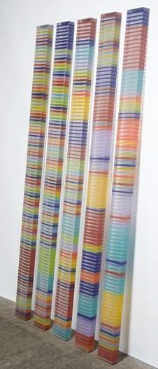 Matt Browning
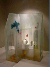
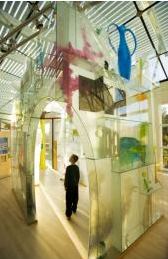
In the 1990s, Louise Bourgeois muscled her way in.
(Cell (Glass spheres and hands), 1990-1993)
 Statom's houses are a solace and Bourgeois' suitable for involuntary confinement. Somewhere between these polarities are all later entries into what's becoming a crowded field.
Deb Jones - (I'm being followed by a moon shadow.)

Giles Bettison - House as a consumer product. Your life in your purse.
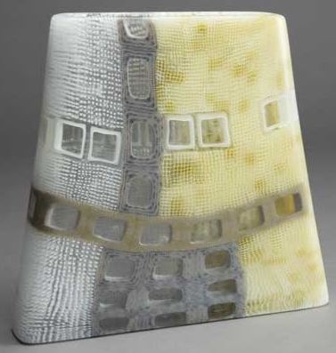
Jane Bruce - Down the hatch.

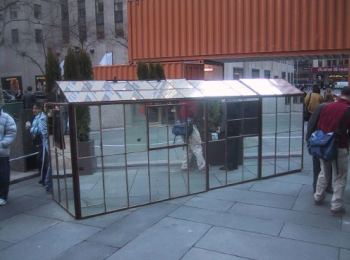 Rik Allen - Your portable escape plan; there's a hell of a good universe next door.
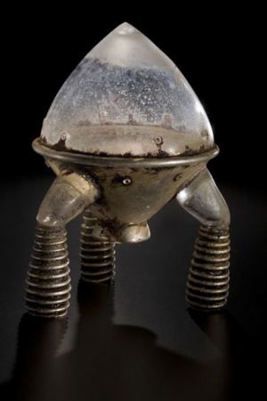
There is an amazing auction happening right now, to benefit a dear friend of mine. Rachael Jensen, a dazzling member of the band Parenthetical Girls, has suffered a major tragedy. Four members of her immediate family were involved in a fatal car accident while traveling home from an annual family reunion. Her father and two brothers were rushed to an intensive care facility, and are now in the early stages of their recovery. Tragically, family matron Kris Jensen, 51, passed away at the scene. Kris' extreme kindness and exuberance touched a tremendous number of people, but it was her particular enthusiasm for music and generosity with musicians that broadened her impact to so many people in our community. I don't know how to fix this heartbreak, but I do know that we can raise some money. (more)Parenthetical Girls will play in Seattle at Bumbershoot, Sept. 6.
(Photo via)
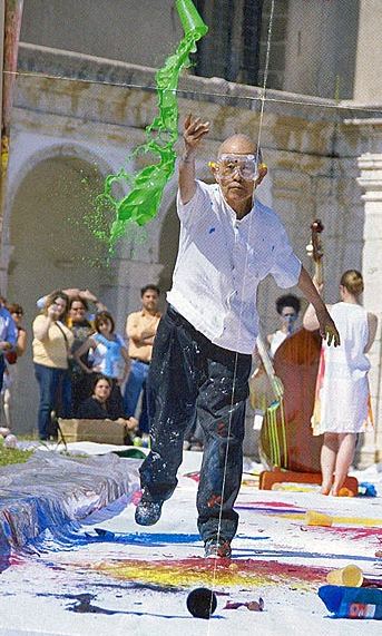
Good group.
Bent:
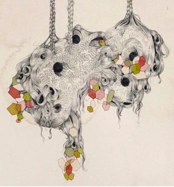
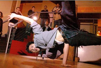
In Seattle, MM is hard to miss. I've seen its members in small clubs and large stadiums, during competitions and solitary star turns, but I've never seen them so flat as they are on America's Best Dance Crew.
I blame the show. Its tight, brassy format kills what's best in its subject. Given the freedom to set its own agenda, a great crew will reveal an ability to expand on a moment and keep uncovering different aspects of solitary and group moves within a circle of discerning admirers.
I like Afro Borike and Vogue Evolution or at least I think I do. I'd love to see them in a different setting. Even so, I hope MM takes it all but won't be following them to the finish line, as this show too painful to watch. It proves it's possible to ruin a great thing by wrapping it in shoddy packaging and imposing truly goofy challenges. I like the judges, especially Shane Sparks, but they too can't breathe inside this show's stale air. Dance crews deserve better.
Check this for a sampling of the real deal. The movie wasn't so hot, but this trailer is thrilling.
Massive Monkees' Jerome Aparis in happier times. Photo, Josh Trujillo.
What have you done for the polar bear today?Bowen died in 1977 at age 58. Although chiefly remembered for prodigious cheerleading on behalf of Northwest artists, she was also a fashion-forward supporter of civil rights, ecology and education for everybody. In 1978, a group of her friends approached the Seattle Art Museum with the idea of an annual award in her name for emerging Northwest artists.
As the economy continues to limp along, more artists need the money. Surely they're not bothering to apply primarily for the honor, which is local. Artists taking news of their win to New York, LA, Chicago and even San Francisco are stones dropped in a dream pond that sends out no ripples.
Within the region, however, a Bowen means something, although there is a lot more award money in play in recent years, thanks to the Brink, the Neddy, Artist Trust, the Arlene
Finalists this year are Jovencio de la Paz and Josh Faught from Oregon; Jenny Heishman, Sean M. Johnson and Matthew Offenbacher from Seattle.
Press release here.
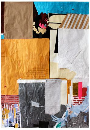
Beloved by grade-school art teachers, cut-out paper on paper collage can easily be overworked and inert, especially the way Alpert makes them, which is stuffed to the gills. And yet, hers work. It's easy to see the ghost of Romare Bearden in her rough-hewed shapes. She's going for similar territory too, the crumbling walls and make-do repairs of a rundown urban core.
She hasn't hitched her wagon to his star, however. His tonalities are dark and tightly orchestrated. Hers have a wider range, with a little zing of wild thing.
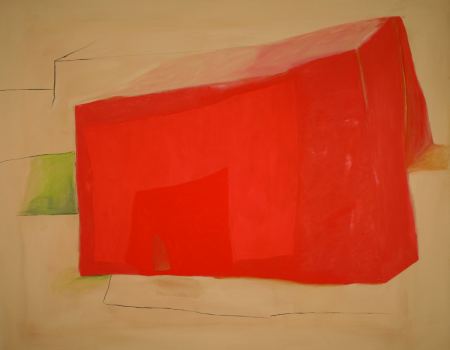
 If Graham had created the world, buildings would be able to lift themselves off their foundations to dance. They'd settle back without missing a beat or cracking the skulls of their occupants.
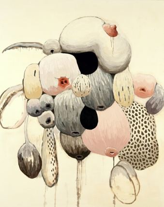
 Griffith is a pattern painter aspiring to volume. If he painted heads instead of landscapes, he'd give them crew cuts. As his shapes hug the ground, their pastel shades, like yeast in dough, attempt to rise.
 Fullness Passing, Patricia Hagen at Punch Gallery through Saturday.
Hagen is interested not in ripeness but what follows it, after the baby's been fed, the seed has dropped from the pod and the cut flowers have begun to droop in the vase.
 Witness, David French at Linda Hodges.
French's sculptures remind me of keepsakes, something broken off and saved to be passed down from mother to daughter, a moment of youth long gone.
 Carrie Marill and Robert Yoder at Howard House.
 (Yoder reviewed here. ) Marrill's men at work: They're too busy to notice that they're already gone.
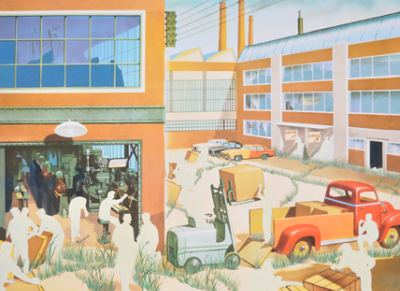
(Alice Wheeler, Homeless Camp, Seattle)
 Barney Kulok, Crescent Street, Queens, New York
 Ezra Johnson, still from The Time of Tall Statues
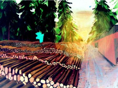 Elizabeth Sandvig, Landscape in Spring with Owl
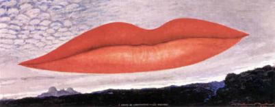
Thy lips are like a thread of scarlet, and thy speech is comely: thy temples are like a piece of a pomegranate within thy locks.Song of Solomon
Artists threading the scarlet tend to color within the lines.
Man Ray
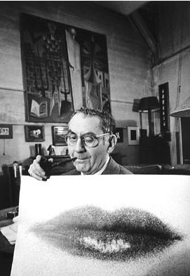 Man Ray again
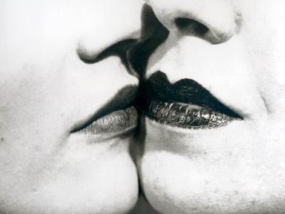 And again, when his favorite erogenous zone became weather.
 When we're talking about erogenous, however, nobody beats Marilyn Minter's Green Pink Caviar, trailer below and on the link.
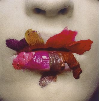
 For coloring outside the lines, credit goes first to Irving Penn, 1986, ...
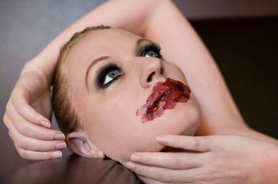
 and second to Ariana Page Russell, whose photos of her flushed and/or painted body are amazing.
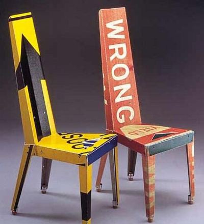
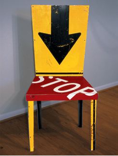
Sorry, I just can't let this one slide- this chair is an almost direct copy, right down to bends, shapes, and construction techniques, of the chairs that my friend (and I say that because I am honored he calls me a friend) Boris Bally has been making for close to 15 years now.No, Ries, I don't think you can know that. It's possible Pruzan thought of the idea on her own and proceeded without knowing about Bally's production. Yes, Bally was first and remains best, but I think there's room for Pruzan. I still like the skinny legs of her chair. They undercut the massive utterance of her seat.
Boris has been making all kinds of objects from street signs for longer than Amy Pruzan has been out of 9th grade. Ms. Pruzan may be a great artist, and other works of hers superb- I don't know. But I do know this one is a knockoff.
Bally:
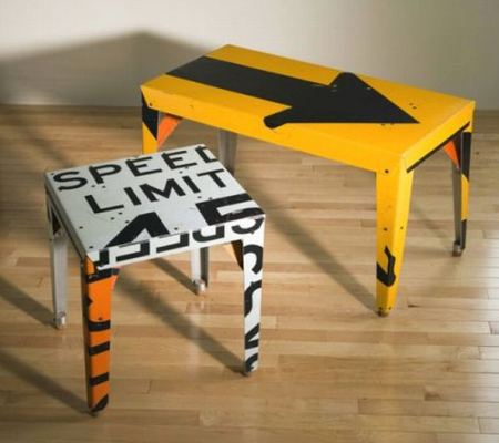 Bally:
 Pruzan:
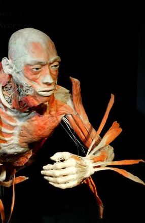
Remember Bodies...The Exhibition? When it was in Seattle in 2006, a PI reporter, gazing at a flayed corpse, noted that no one knew his individual identity.
What is known is that he was from China, and when he died his body went unclaimed -- unclaimed, that is, until the dissectors at a Chinese university took him into their care and the show's promoters took him on the road.What is known? Sorry, Charlie. How the government got hold of these bodies is not known. When it's an exhibition of corpses out of China, all bets are off. If these corpses just happened to die from unnamed causes, it's lucky for the show's promoters that so many young and fit keel over in China's streets. The old and infirm wouldn't look nearly as good in the spotlight.
The heart has its reasons which reason does not know. Pascal
Roberto Kusterle
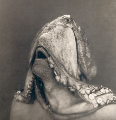 Odd Nerdrum
 Roger Ballen
It was a great place to be. For Zverina, reality is an exalted state. Because he focuses his praises of it with the deceptively casual force of his economy, he makes videos the way John Ashbery
Six of his three-minute pocket videos here, funded by 4Culture. Below, three-
Years went by before I could see her paintings as anything but early Brice Marden also-rans. Maybe she just wore me down. Today I appreciate their specific evocations of the natural world. A grouping of small paintings, for instance, explores a dogwood in her parents' backyard. It's all there, reduced to color: leaf in one square, furry bud in another followed by pod, bark and bloom.
It's a good back story. What's in the forefront? The same lovely thing over and over.
A suite of her prints from 2008 are at the Greg Kucera Gallery. Each panel consists of two sheets of handmade paper printed front and back and fused to bleed into each other. The edges are frayed, as if color had chewed on them.
 Above, Sweet Pea: brown for the seed to leaf green and yellow, and pink for the flower.
 If I'm not plunked down in front of her work, the thought of it does not quicken the heart. Only when locked into the delicate minuet of her color relationships does interest grow. Is there enough there for her to keep doing it? On a generous day, I'd say yes.
Through Sept. 26. Reception for artist, Sept. 3, 6-8. Artist talk Sept. 5, noon.
Speaking at The Drawing Center last July, Boris Groys claimed that the contemporary situation is the opposite of the one described by Guy Debord in The Society of the Spectacle.
There are no longer any spectators, or even an audience. 'We are all on stage', he argued from the stage, as we watched from the audience, and wrote down what he said. Reflecting on the profusion of the blogs and the mysteries of the readership, Groys mused, 'I am convinced they are being written for God,' later clarifying, 'who, of course, is dead.'
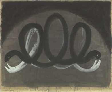
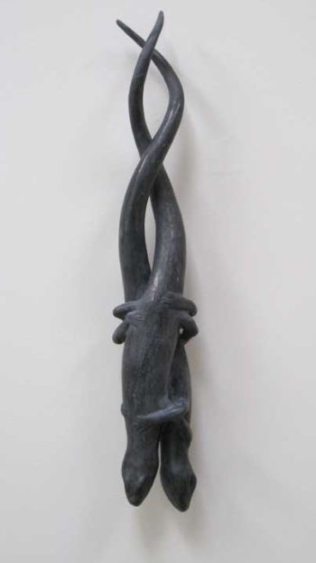
African sculpture, Japanese aesthetics, Mexican folk arts, nature, personal experience and relationships, family, music, Christian art (both Gothic and Medieval) and other artist's creations, are some major influences I draw from. I do not like to create images that read as only one thing, but try to create works that have both power and mystery.The tension that runs through the cast lead and bronze sculptures at Greg Kucera Gallery appears to come from a source close to hand who is not specifically on his list: the slippery, dark-moon-and-muck sensibility of Morris Graves.
(Graves, Waning Moon, #3, 1943, Seattle Art Museum, via)
 (Calderon Untitled, skink twins, 2009, cast lead)
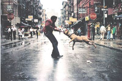 Warhol:
On the other hand, I think it's possible in the future she'll be esteemed for other reasons.
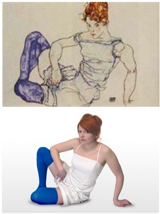
Below, her restaging of an Egon Schiele drawing. What is out-of-control in the drawing becomes self-possession in her girl-in-charge self-portrait. Schiele's figure wears her nerves on the outside of her body. Mae is solid. If she were a boat, no iceberg could sink her.
Via
His essay titled Green Gothic is in the current issue, reprinted by permission. Emily Carr's and Gretchen Bennett's images from the article. Other images (and the links) added by me.
I saw Twilight the other day, the teen vampire movie set in Forks. Local vampire Edward falls for the new kid at school, a pretty transplant from Arizona with the unlikely name Bella Swan. Edward is an unusually urbane vampire. He lives with his family in a Northwest modernist dream house in the woods. He drinks only non-human blood. Deer, mostly. He is sort of like a vegetarian in the vampire world. Oregon scenery (standing in for the Peninsula) co-stars. Whenever the camera can tear itself away from the lovers' tortured faces, the screen is lit by a million shades of green.
(Glenn Rudolph, Via)
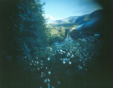 In Gothic stories landscape is destiny. A character's inner life is reflected by their surroundings. In one scene, the young lovers go on a field trip with their biology class to a greenhouse and gaze into a wormy bin of compost. This is an everyday lesson in the damp, decaying, riotously fecund Northwest: the decomposition of dead things is what allows new life to grow. Why is Edward and Bella's romance accompanied by the lush Northwest landscape? Maybe it is because Edward is a different sort of monster. Vampires are undead, a death which feeds on life in order to obtain a semblance of life, an anti-ecology, a reversal of the nitrogen cycle. Edward struggles to reconcile this existential horribleness with his sense of morality. Bella, meanwhile, is attracted to his dark, freakish, supernatural strangeness. The dilemmas Edward and Bella face echo those of much of the art which engages the history and ecology of the Northwest landscape.
 What do you do if you love a monster? What if you are a monster, an ethical and moral creature who happens to be an abomination?
(Glenn Rudolph, Via)
 Perhaps the most obvious example is Mark Dion's Neukom Vivarium, a massive decomposing hemlock log parked inside a green-glass building at the Olympic Sculpture Park.
  In an interview for PBS, Dion had this to say about it:
 In some ways, this project is an abomination. We're taking...an ecosystem--a dead tree, but a living system--and we are re-contextualizing it....We're pumping it up with a life-support system. So this piece is in some way perverse. It shows that, despite all of our technology and money, when we destroy a natural system it's virtually impossible to get it back.
The Vivarium log is like the Beast from Beauty and the Beast, imprisoned in a magic castle, waiting for Belle to fall in love with him. How do you deal with an abomination? You imprison it (and it will become an abomination partly as a result of the imprisonment) and wait for love to redeem it.
If the Vivarium applies a wishful strain of romantic thought to the problems caused by the destruction of natural systems--a monster in a glass cage to prick our consciences--Gas Works Park, the park designed by Richard Haag for the north end of Lake Union, is more pragmatic.
Some things are certain. Night follows day, summer gives way to fall and Tyler Green will disapprove of art collections owned by banks on view at art museums. (New York Times' story, And Now, An Exhibition From Our Sponsor, here. Green's well-reasoned enlargements on the theme here.)
Green also disapproves of museum's hosting exhibitions featuring work from a single private collector, arguing that such displays give too much of a market boost to their owner as well as undercutting curators on staff. (How about if curators select work from a single collector, which is nearly always the case?)
In any event, with big budget cuts in virtually all art museums, curators are likely to appreciate the breathing room a packaged exhibit provides. Even where curators remain in full force, their support staff is a shadow of what it was. The work load increases as resources erode.
Ideally, curators would be able to borrow important art from banks just as they do from individuals without ceding control to either. But given a choice between empty galleries and first-rate work presented by Bank of America, I'll take the latter.
Anyone out there who still thinks the Brooklyn Museum shouldn't have taken Sensation: Young British Artists from the Saatchi Collection?
Yes, museum authentication boosted Saatchi's bottom line. And yes, if anyone deserves disapproval for his ethics, it's him. Talk to artists whose work he has bought and sold. He's not Santa.
And yet Sensation was an important exhibit to bring to the U.S. Exhibitions are about art. Where it comes matters less than what it is.
When art exhibits are little more than a pretext for trustees or favored patrons to pad their bottom line, it's great that watchdogs like Green are on the job. Before I get interested in writing those stories, wrong-doing has to stink like a corpse in a closet.
Moral judgments continued: From Art Fag City:
Good morning misogyny! This week in poorly executed photography projects, Chad States discusses his series Men at Their Most Masculine at the Morning News. The project is simple. The photographer places an ad on Craigslist reading, "I am doing a photography project on masculinity. If you identify as being masculine, please get back to me." Then he photographs selected respondents in their homes, and places a quote from the session alongside the work. The results from the banal solicitation are pretty much exactly what you'd expect--a cross section of various misogynistic statements, peppered with a few other predictable interpretations of masculinity.Why the attitude? Because some of States' models are dicks. Dear Art Fag City: They're not people you're sorry to have invited to dinner. They're part of an art project.
And your point about States' project being simple, and its initial contact with subjects a "banal solicitation"? To paraphrase Robert Morris, simplicity of design does not equate with simplicity of result.
Besides selecting themselves, States' subjects posed themselves in the attire and setting of their choice. They are strangers who dispensed with the conventions of their anonymity to tell all to an artist with a camera and recording device, the 21st century's version of a priest's confessional.
I saw a portion of Men at Their Most Masculine earlier this year and was fascinated by its deadpan Surrealism.
"I'm not feeling it," he said last Saturday, cleaning up after a workshop in the gallery.
By the late 1990s, Yoder's calligraphic collages made of wood scraps, appropriated street signs and/or Legos were a certifiable hit in the region and beyond. From clunky materials he created magisterial abstractions, visual symphonies whose sheet music came from castoffs.
(Union Bridge, 2000, wood/road signs, 48"x48"x2")
 (Aluminum Management, painted found wood, 2004, 24"x24"x2")
 (Sunset, 2005, Lego on wood panel, 24"x24)
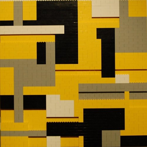 Such beginnings lead to substantial careers. Once Yoder had established the form, however, he found he didn't want to continue to explore variations on its theme.
Is he another victim of the Pound imperative, make it new serving as an excuse for Attention Deficit Disorder? What if Dan Flavin hadn't stuck with florescent light, Elizabeth Peyton abandoned portraits and Gary Hill walked away from video?
Not all artists can be as successfully chameleon as Bruce Nauman. Many best serve themselves by mining a single vein. Life is short. Art's best chance of being long is internal coherence.
Other Seattle artists have done well improvising off the base Yoder created, including, below, painters Alfred Harris....
- Alan Ginsberg
Seattle crime, the artists
Chris Crites
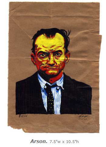 Grant Barnhart
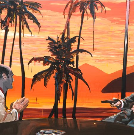 Jack Daws, CECI N'EST PAS UNE BONG
 New York crime, the singer
Roy Zimmerman, Dick Cheney
Sample lyrics:
"When it's late at night we can go back to my place,
where he can tap my phone and shoot me in the face ...
Dick Cheney, ain't he, the sexiest man alive ...."
The compressed space of the surveillance society, with barren implications extending past the frame.

 Gilles Barbier, The Hospice, (detail)
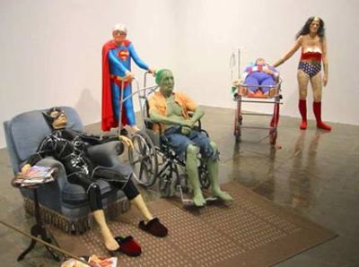 Mark Newport, Batman
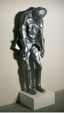
 Dan Webb, Knight in (non-shiny) duct tape armour. No rescues on the horizon.
 Christian Weihrauch
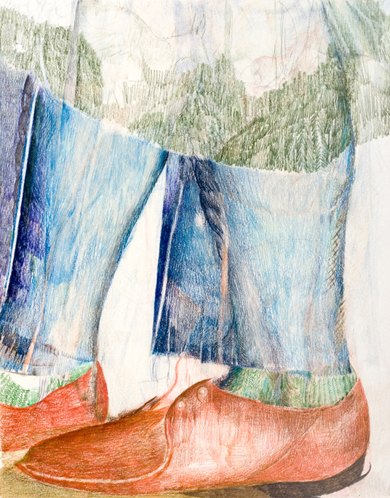 Or, saving babies, one tree trunk at a time.
Andrew Keating

 Tyler Cufley
 Evan Hecox
 Christian Martin Hoff
 Rachel Maxi
Maxi continues at Grey Gallery through Oct. 3.
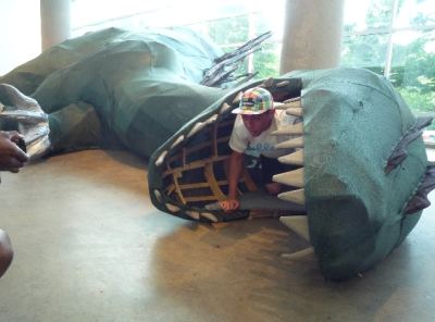 Plot summary: An aging monster who feeds on chaos beached itself on suburban shores. As Satan said, surveying hell, "What do mine eyes with grief behold?" Godzilla feasts on cities, adding its havoc to havoc. In Bellevue, the shopping capitol of the region, the orderly flow of commerce had a soporific effect. The beast staggered into Open Satellite, curled its 50-foot-long, 10-foot tall body around the pillars and fell asleep, breaking into soft, rumbling snores.
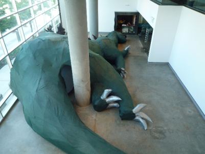 SIMPARCH's exhausted is a rough-and-ready construction devoid of get-up-and-go: animal instinct on the fritz. Visitors can stroll through its back end and crawl out its mouth. Made in handyman-garage style of green U-V fabric over a plywood skeleton with duct tape claws, it's Jonah without slime, danger, turbulence or redemption.
SIMPARCH's Matt Lynch and Steven Badgett built it in 8 days with a little help from a few friends. Kevin Drumm's soundtrack of guttural snores and slurps derives from orchestrated chorus of appliances, some of which appear to need a tuneup.
Is the Eastside coming into its own? The Bellevue Arts Museum's embrace of crafts proved an excellent move. The Kirkland Arts Center is a little jewel, and Open Satellite is as ambitious as any arts center its size in the country.
Only one move remains: Embrace the purse.
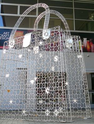 Ries Niemi, Walk Thru Designer Handbag. (2007, Stainless steel, 5' x 10' x 14')
 A better title would be A Pocketbook Now. Empty yet imposing, weighty yet insubstantial, it's an apocalyptic metaphor in the heart of Bellevue's consumer culture. Like exhausted at Open Satellite, Walk Thru Designer Handbag blooms where it's planted, in the latter case at the entrance to the Bellevue Arts Museum.
Alas, its appearance there has been occasional. Now's the time to buy it and make it a permanent part of the experience of visiting a museum whose neighbor across a wide, traffic-clogged street is a shopping mall.
 These would be good shoes to wear in a coffin. Who could ask for more? Bob Dylan on speakers and The Big Lebowski
on your feet. The right one's chill, dude, but the left is the haunted Viet Nam vet, a variant on the character who went screaming
down a hallway that's on fire, pumping a shotgun and screaming, "I'll
show you the life of the mind."
These would be good shoes to wear in a coffin. Who could ask for more? Bob Dylan on speakers and The Big Lebowski
on your feet. The right one's chill, dude, but the left is the haunted Viet Nam vet, a variant on the character who went screaming
down a hallway that's on fire, pumping a shotgun and screaming, "I'll
show you the life of the mind."Photographer Thorsten Brinkmann
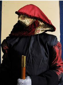 Painter Christian van Minnen
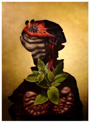 Photographer Magdalena Bors
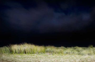 Painter Michael Brophy
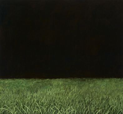
Maybe that's a good thing. The installation crew is now down to the size it was before the 2007 expansion, which tripled exhibition space. That's not counting installation at the Olympic Sculpture Park, which also opened in 2007.
Attendance remains strong, over projections in 2009.
The museum's fiscal year 2009 budget is $27 million. The 2010 budget is projected to be
Update: SAM corrected one of the figures it originally gave me. The museum ultimately cut its 2009 budget to $25 million.
Seattle: Time to show up. Seders has been in business for 40 years. That's a long time to be as good as she is. Painters are her core, and they include Jacob Lawrence, Guy Anderson, Michael Spafford, Elizabeth Sandvig, Robert C. Jones, Michael Dailey, Lauri Chambers, Pat DeCaro, Norman Lundin, Denzil Hurley and Juan Alonzo. Although she no longer represents Lawrence and Anderson, they chose her as their Seattle dealer for their entire careers.

In defense of Macaulay and me, a couple of thoughts: I do think there's a difference between Croce's not going at all (though if it were the time and I had the time, I would defend that action, given her reasons) and Macaulay not watching the bulk of these two dance competition shows.
Don't TV critics, even, review a show after having watched only the pilot and a few shows in? I don't think a critic is obliged to watch every show to weigh in on the gist of it. Of course there are going to be exceptions to the general rule of terrible choreography that makes even good dancers dreadful, but that's not his or my point. And haven't you walked into a gallery, given a good look at a few paintings/installations/videos and then scanned the rest? I mean, do you study every single inch of canvass to give it the benefit of the doubt?
I think Macaulay is very careful, in all of his reviews, to report exactly how much he has seen and not seen. Probably other critics wouldn't even mention it if they hadn't seen every single show.
As for the whole high/low distinction, I agree that dance critics--or rather, ballet critics--can be snobs. On the other hand, we've reached a point in the culture where to condemn a popular and populist art is suspect from the get-go. I think it's refreshing, not tiresome, that he would dare do it in the Times.
Also, how often do art critics even bother with this kind of commercial work: say, Thomas Kinkade? Let me know what you think when they do. Sure, Dave Hickey has done Rockwell, but that's so far after the fact, it hardly counts.
Finally, this video above: I agree he's a fine dancer--particularly his hips and footwork--but the choreography and the way it works with its music doesn't allow him to be musical. Every one of his phrases ends with the same sort of ta-da, and the feel of the music runs exactly counter to the spirit of the dancing. It's a ludicrous piece, and that's the problem with So You Think You Can Dance --the show reduces even the best dancers to dreck. ~Apollinaire
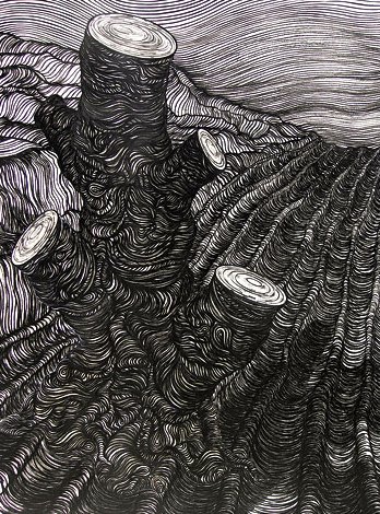
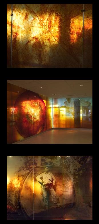
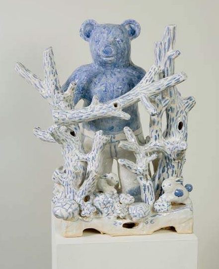
Something there is that doesn't hump a stump.
Brian Tolle, on the campus of the University of Washington:
 David Ellis
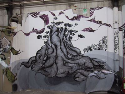 Steven Heino
 Linda Beaumont, installation, Sea-Tac International Airport
 Jeffry Mitchell

At Greg Kucera Gallery,
Mark Calderon:
 Anne Appleby
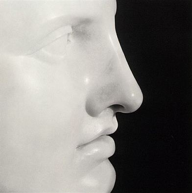 (Apollo, 1988)
He was always about perfection. The thing about Polaroids: Mapplethorpe, opening Oct. 24 at the Henry, is that he found it early and on the fly. Curated by Henry director Sylvia Wolf, it opened last year at the Whitney.
 Inside, the first room sports a stained, concrete floor, four skylights and wallboard. Past the raw, there's elegance: a series of galleries with bamboo floors, including a video room, a parlor and a sculpture garden, bounded by chain link. Lawrimore's office is an inside joke. Because he grew up in a trailer park, Lead Pencil gave him a trailer-park office on concrete blocks with a hot-pink exterior.
 Hot pink is the gallery's signature, which is why, when asked to participate in an exhibit titled Spite House, Matt Browning attacked the pink.
Lawrimore showed up at his gallery to find his pink gone. For the price of a gallon of black house paint, Browning spited his dealer and fellow artists Han and Mihalyo. Because pink is the gallery's calling card, he replaced it with his own hue. His color and his gallery, inside and out.

In corporate boardrooms, you eat what you kill. You don't kill, you don't eat. As curators Yoko Ott and Jessica Powers noted in the catalog, group exhibitions arrive with a similar kind of built-in hostility, the art version of "land grabs and property disputes."
Spite houses exist across the country, usually dwellings built on small strips of land the owner of an adjoining parcel felt was too small to use and refused to purchase. I'll show him, says the owner of the tiny parcel, building a structure on the thin slice aimed at destroying the peace of mind and window views of the neighbor.
The most famous spite exhibition entry is Duchamp's Mile of String from 1942. After surrealists had hung their paintings, he turned the gallery into a spider's web, making anything but his work impossible to see.
Again, from the catalog:
Spite houses...may as well be shaped like a hand giving you the middle finger with a pair of testicles hanging off the wrist...
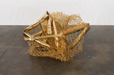 Unless they appear in the early architecture of Frank Gehry, chain-link fences denote prisons, construction sites or industrial wastelands. Aaron Young dipped his chain-link Tumbleweed (above) in 24-kt gold, and also his chain-link fence blocking entry to the video gallery. (What the artist touches turns to gold.) A bent corner makes it theoretically possible for someone who weighs less than 40 pounds to slip through. Everyone else has to stand outside, watching Andrew Dadson's two-channel video projection, Roof Gap, at a remove.
 Bert Rodriguez built a white wall with his father, a repeat of a performance in Miami where the two at long last learn to work together and incidentally partially block entry. SuttonBeresCuller built a wall that completely blocks entry to the gallery containing the group's sculpture. All that's visible from the crack is the shadow of a sculpture stand.
Back to Dadson: He painted his neighbor's lawn black and photographed it, oddly affecting. A vase of white roses standing in black in are slowly through their veins turning black. Titled Should Love Come First, it refers to a piece Robert Rauschenberg made for Jasper Johns, the answer being, apparently, no.
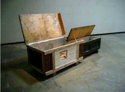 Elias Hansen (with Herman Beans) built a coffin that functions as a rough/ready shelter, image above. One person could live there, awaiting the demise of the other. The Place I Used To Live is a bum's camp equipped with survivalist's essentials but located high on a wall, making it inaccessible.
Christian Kliegel reconfigured the gallery's spaces from the roof, marking them out in duct tape. The rubble he found there now rests against indoor pillars, bringing the outside in.
Through Sept. 12. Lawrimore invited four writers to consider the theme. From those essays:
Joel Felix:
The spite house exposes the natural hostility buried in cooperation. Once I understand your motives to inhabit (own a) space, I will block them with a small, useless building on my grounds..,.These are the darker rights of my sovereignty.Robert Mittenthal:
The aggressive artist marks his territory, carefully pissing away time - sitting on the egg with the hope that it will begin to resemble himself. Even the faint possibiity of being spited, the possibility that some heathen may transgress his invisible or intagible boundaries, invites negative ease.
Will Owen:
Spite homes lie in the collapsing human space of a house as it unveils the intentions of its development: a contortion, obstruction, repulsion and cast of our disembodied fecundity.
Tabitha Brown:
Placing things where they're not meant to be reflects a kind of striving. Fueled by the habit of outdoing one's limitations, the restrictive order of these modules makes waste and economic struggle inevitable. But it also makes possible the limitless permutations of surprise. ..
The function of the object obstructing our view is apocryphal. Contrary to all appperances, though, it serves one. It's obviously not here to resolve conflict. But id does solve a problem. It answers the question of what we do now.
Like art, it begins to appreciate.
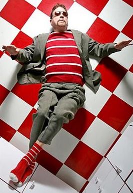 It's a great shot, which is why it has proved popular on the Web. The only thing missing from this happy story is credit. Neither Urban's nor the PI's name appears here and here. Ruby Montana did the right thing here. As an art critic who relies on the Web, I'm constantly urging artists, galleries and museums to make their images reproducible. The prospect of being ripped off hinders free flow.
 Web life matters. Here are the region's top 10 museums arranged in order of Web merit.
1. Henry. A thing of beauty is a joy forever, or at least until the update. Credit goes to Betsey Brock and her team.
2. Frye Art Museum. Useful, practical and informative. Lacks the Henry's excitement and drive, but good job.
3. Vancouver Art Gallery. Nearly as good as the Frye's, but needs more images.
4. Tacoma Art Museum. Dull design but in the game. Again, more images. Art museums are visual storehouses.
5. Bellevue Arts Museum: Considering the resources of this institution, tip top.
6. Portland Art Museum. Clean design, but not nearly enough information on current shows, never mind past and future, and flash prevents the site from releasing any images. Let your images roam free on the Internets!
7. Museum of Contemporary Craft. Competent. Well done.
8. Museum of Northwest Art. Not bad but skimpy. Build it out.
9. Whatcom Museum of History and Art. A placeholder. A shadow of a shadow.
10. Seattle Art Museum. It's only last because as the premier art museum on the West Coast
A strain of malicious, hysterical crazy continues to assert itself in American politics, threatening progressive change. Is the heartland missing its heart? After 8 years of Bush, haven't these people done enough damage to the world? Obama's come-let-us-reason-together stance does not appear to be cutting it.
Walter Robinson (not the painter) diagnoses the problem with Cracker:
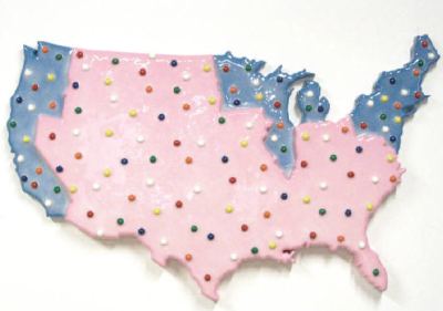 Time's running out. Via
 Garde Rail moving to Austin: Story here. The folk/outsider gallery owned by Karen Light and Marcus Pina opened in 1998, after the boom in that field had come and gone. Gradually, Light and Pina found a core of artists who are more than me-too and established themselves nationally.
 Light, from the South, has been talking about moving to Austin for months. Her husband Pina is from Seattle and, she said, dreaded the heat. Moving in August is not going to assuage his fears. They close in Seattle Aug. 22.
Among the more singular artists they discovered and will continue to represent are Seattle's Gregory Blackstock and Southern California's John Taylor. (Click images to enlarge.)

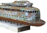 Despite the recession or whatever the country's economic ruin is currently called, Seattle has lost not a single significant gallery till now, and this one's a move, not a closure.
 Portland, on the other hand, has been hit hard. (See D.K. Row, who wonders if it's too late to save the Portland gallery scene, here.) Recent closures include Quality Pictures, Pulliam Deffenbaugh and Mark Wooley.

The price tag for "Train" is $25 million. I'd assume that's a ballpark guesstimate, because engineering and fabrication costs have a way of evolving over time. The steel-and-aluminum "Train" is a 70-foot replica of a 1943 Baldwin 2900-series steam locomotive, and the aim is to suspend it vertically from an actual 161-foot-tall construction crane. The wheels will rotate, smoke will puff from the smokestack and the whistle will blow, all at as-yet-unspecified intervals. At LACMA's blog Unframed, John Bowsher, director of special art installations, was quoted in October describing the design-process as "reverse-engineering." An actual 1943 machine is being digitally scanned, piece by piece, so that the new parts then can be fabricated and assembled to create a shiny doppelgänger.In an earthquake zone, the hubris of the project is notable, but if any artist can make it work, it's Koons. Unlike Damien Hirst, whose shark continues to rot in its tank, sagging against its supports despite interventions, Koons places a premium on fabrication exactitude.
Despite its size, Train is reduced to an absurdity. If constructed, it will steam to no purpose in the heart of car culture. That's what art continues to say about trains, that they are an echo of an echo, a memory to cling to in sentimental song, the ultimate road not taken.
Makes sense that American artists would see it this way, but European? Christoph Draeger is Swiss. We're a long way from Sleeping Car Murder.
Christoph Draeger
 Glenn Rudolph (and here)
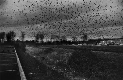 Eirik Johnson: Scrapped train, Arlington, Washington
 Erika Langley
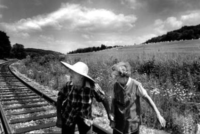
Not So Strictly On TV -- the British reality series "Strictly Come Dancing," which began in 2004, and the American "So You Think You Can Dance," which started in 2005 -- we see all the good-humored hard work that both sexes put into performing ballroom. In such a context I only occasionally pause to consider that their endeavor itself is gross....
The little I see of "So You Think You Can Dance" and "Strictly Come Dancing" tends to put me off watching more; the camera angles seldom help you judge footwork; the whole climate feels manipulative; and the dances themselves aren't those I'd want good performers to learn...
What makes me wretched is that all these stunts, acrobatics, point-scoring and flashy displays of sexual availability are what matter. Musicality, phrasing, intimacy and actual sensuousness are what don't.The little he sees of it. Ordinarily, admitting that you haven't seen what you're attacking is not thought of as good form.
And yet Apollinaire Scherr rushed to agree, here.
I've been wanting to write this piece forever, and probably because I knew it would seem hopelessly snobby--I can't tell you how many people whose only exposure to dance are these shows ask me eagerly what I think of them--somehow haven't. I just say I haven't watched them much, which is true enough, but the reason is that they give me a stomachache.I just say I haven't watched them much, which is true enough...
I'm not going to defend Dancing With the Stars. It's amateur hour with coaches. But So You Think You Can Dance? There are dancers on that show qualified to be in any contemporary company in existence. Some of the choreography is corny and over-the-top, but far from all of it.
Alastair Macaulay is not only a good writer. He's the only full-time dance critic employed at a newspaper in the United States. He has weight. I can't imagine why he wants to swing it at a target he hasn't seen.
What is it with dance critics? Do they dream of divine forms they can't bear to see sullied by daily life?
When Arlene Croce attacked Bill T. Jones' Still/Here in 1995, with an (unlinkable) essay that began, "I have not seen Bill T Jones' Still/Here and have no plans to review it," she besmirched her career, not his, because what followed was a review of Jones' meanings as she misunderstood them. (Her piece discussed here.)
Macaulay more recently wrote a lovely piece about Fred Astaire and Ginger Rogers, here. Had he been watching So You Think You Can Dance, however, he'd have known that Benji Schwimmer, dancing below with his cousin, Heidi Groskreutz, won first place on the show in 2006. Instead of maintaining that its dancers lack "musicality, phrasing, intimacy and actual sensuousness," Macaulay would have seen a genuine heir to Astaire.
Teresita Fernandez's Seattle Cloud Cover at the Olympic Sculpture Park
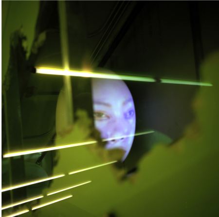
 Tony Oursler on the escalator at the Seattle Public Library
  Ivar's on Northlake Way, under 1-5
Leslie began the drawings for what is now Attacked by the Heart in the early 1960s, some of which were published in Artforum in 1962, and all of which were destroyed by a fire in 1966. In 1991, he redid and enlarged upon them.
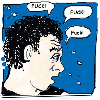
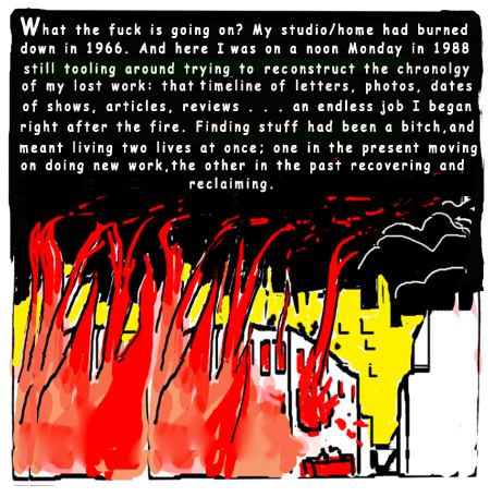 Attacked by the Heart is one of 15 Leslie books available here,
most of which can be clicked through and read online. It opens with a
fine young man walking down a New York street carrying

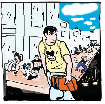 Excellent Art in America interview with Judith E. Stein from January here.
Joe Btfspik:

Q. Why is he shunned and feared?
A. He's the world's worst jinx.
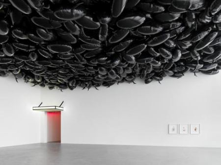
The idea of indoor clouds is rarely credited to America's best Calvinist comic strip.
John Grade, Seep of Winter, 2008
 Tara Donovan, Untitled, 2003
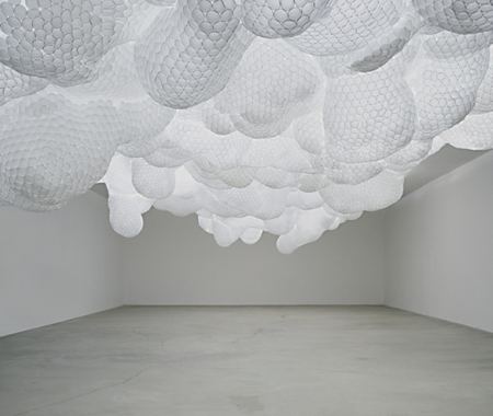 SIMPARCH
 Philippe Parreno, 2009
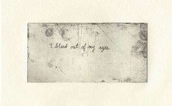
From her 100, here's a sample of 10 guaranteed to take the jaunty down a peg.
I think that I met Mike Dailey in 1972 when I took my first Beginning Drawing class from him at the University of Washington. I took many more classes from him, and he became my unofficial guidance counselor during my undergraduate voyage to my BFA in painting.
I went to the University of Iowa for my MFA because of Mike. (Mike introduced me to the work of Pierre Bonnard!) Actually, all the things I really learned about painting, all the things that I came to value as an artist and hold close to my painter's heart, I learned from Mike. He was not only my mentor, but my role model as an artist, teacher, friend, and human being. He was the example I could point to, the touchstone, the way one should be. I have never known anyone as generous with himself as was Mike. Or as loyal. Or as wise.
Police officer Craig Spencer said: 'Residents called to complain there was an old scruffy man acting suspiciously. 'It was an odd request because it was mid-afternoon, but it's an ethnic Latin area and the residents felt the man didn't fit in. Lets just say he looked eccentric.At 68, Dylan tends to look as if he doesn't have a dime. No facials for him, no teeth whitener, no Barney's.
From Jan Herman:
Living in a Police State is OK:
I know, because I live in one, and I'm doing fine. I haven't been arrested for jaywalking, littering, loitering, begging, or sleeping under a bridge. I haven't been arrested for sleeping in a homeless shelter when there's an outstanding warrant against me for sleeping on a suburban sidewalk. I haven't been arrested for being someone who looks to a reasonable person like I belong on public assistance. I haven't been arrested for eating food someone gave me in a park. I haven't been arrested for not being white, wearing a wrong-color T-shirt in a wrong-color neighborhood, or looking overly anxious in an airport. I haven't been arrested for being late for school or without ID in public housing. And those are just some of the things I haven't been arrested for. The reason I haven't been arrested is not because I'm white and haven't committed any of these crimes -- let's face it, I've jaywalked, littered, and loitered, which makes me a triple threat -- it's because I'm not poor. If I were, living in my police state would not be OK, as Barbara Ehrenreich points out today in her must-read NY Times op-ed on "the viciousness of the official animus toward the indigent."News reports of the incident stress the humor of a 22-year-old police woman who didn't recognize Dylan. None discuss why it's ok to cuff somebody for looking odd, eccentric, out of place, indigent.
Even if he weren't a celebrity, Johnny Depp could dress as shabbily as he wants. He's protected by the beauty bubble.
Those with no money and no allure are advised to step lively in the street, with purpose and benign good will. Poor, ugly, weak and grim? Be sure to have a public defender on speed dial.
Here's to the odd.
Heidi Schwegler:
 John Waters:
 Alice Wheeler
 Zoe Strauss

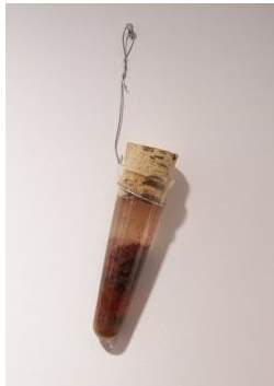 Joe Piecuch, Elias Hansen, from review of Truths We Forgot To Lie About:
They treated Tacoma like a science experiment, taking core samples of the place distilled into gruesome forms of theoretically drinkable beverages.In all manner of glass test tubes (blown by Hansen), they mixed an alcohol base with Western red cedar, brick fragments from Ted Bundy's childhood home and soil from Port Madison; coyote blood, beard hair, beeswax and butterfly wings; blackberries, club moss from the Hoh rain forest and hydrogen cyanide; soil from Lewis and Clark's Cape Disappointment camp site, concrete from the Boeing plant in Everett flavored with hobo urine, and brick chips from Francis Farmer's childhood home with paint flecks from Curt Cobain's final abode on Lake Washington.
Ryan Sarah Murphy - Blue Dress in a Bottle
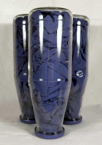 Jack Daws, Louisville Slugger
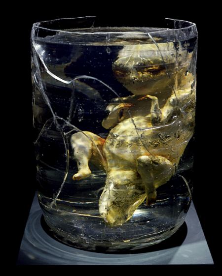
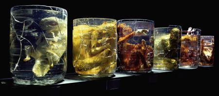
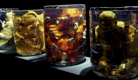
 It was 20 years ago today, Sargent Pepper taught the band to play: Lauren Grossman, Homunculus , from 1989. One, The Ancestor. Series shot, left to right, The Ancestor, The Hermaphrodite, The Mother, The Critic, The Poet, and The Idiot. (At Howard House)
Still great, after all these years.
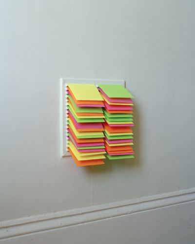
With Post-It Notes in an air vent: (Alastair Levy)
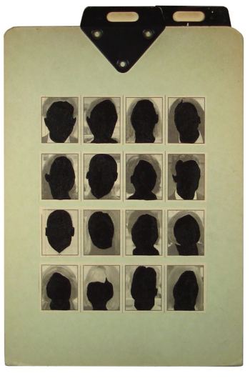
 On a clipboard: (Ryan Sarah Murphy)
 Outside the box - Early Bus: (Darrell Williamson)
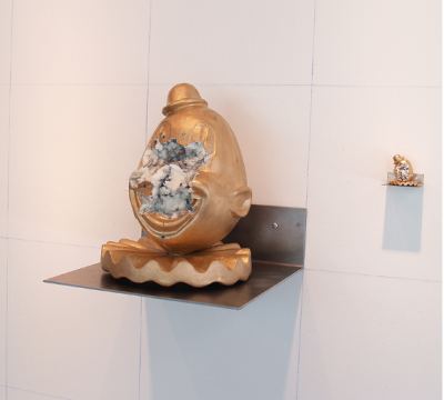
 Echoes, not choices: (Heidi Schwegler)
 Nancy Burson began making composites in the early 1980s. (Thanks, Jen)
 The rise of Photoshop made the mix and match of features between individuals and species easy. Anonymous designers at Converse do this sort of thing as well as anybody. (Design Boom via This Isn't Happiness.)
 Painters tend to be less slick.
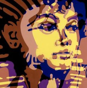
 Troy Gua, The Boy King of Pop (Tut and Michael Jackson)
 Deborah Oropallo blurs male/female, vintage and now.
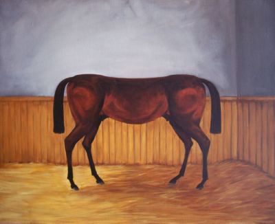
 Eric Yahnker updates Cubism with a shaggy dog story.
 Alice Tippit's animals look good coming and going.
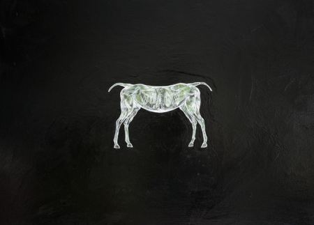
 Yeni Mao prefers an electronic look:
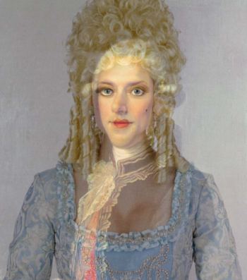
 Dawn Cerny's portrait of Mary Todd Lincoln shows her youth under her old age.
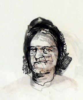 I love Sharon Shapiro's collages, and not because they're perfect. Like her subjects, they are rough drafts, with the tattered edges of their dreams showing.
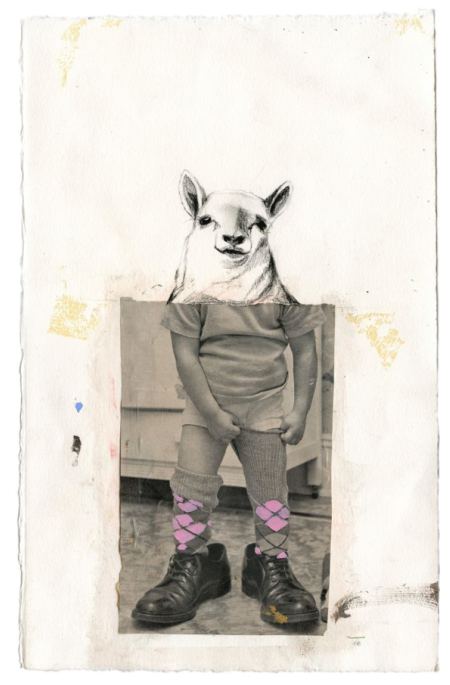
Weasel boy/girl can't wait to grow up, to lose oddball status in the anonymity of adulthood.
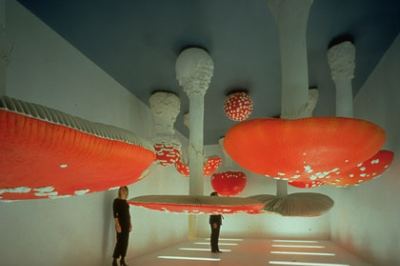
 If food grew on the ceiling....(Carsten Holler)
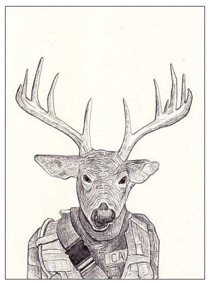
Science fiction imagines hybrid animals we can send to war in our stead. Bryon King's version pops that bubble. Titled Trophy Soldiers, his series of deer-head drawings is a memorial to the fallen. Even when his figures are holding rifles, they're the target.
Opening Saturday at Ditch Projects is Patrick Rock's happening/installation, Face It, You're Hippies!
In Face It You're Hippies!, anti-sociologist Patrick Rock spends six days living in a bunker below the Ditch Projects space, using that time to obsessively and painstakingly construct a physical manifesto of Oregonian identity designed to turn the viewer into salt at a single glance. Details are fuzzy, but the following statements are certainly true: something is going to burn, something is going to die, and the landlord is going to be pissed. Rock's tenure will culminate in a neo-pagan anti-potluck on Aug. 15 featuring a musical performance by cock rockers PISS.Patrick Rock, from his series, The West, 2002:
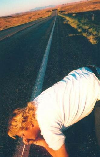
 Meredith Lee
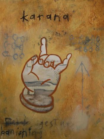 Dave Badders
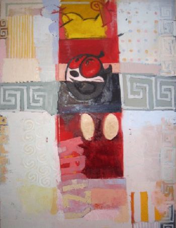
Oscar the Grout
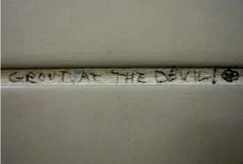
 Grout the Devil
 Grout of Bounds
 Thanks, Scott.
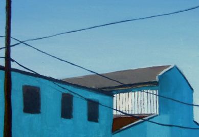 Creatures and Curiosities from the Digital Kitchen at Vermillion:
 Paula Rebsom at Form/Space Atelier:
Outskirts is a site-specific infiltration using photographs and a kiosk to narrate a previous site- specific exhibit by Rebsom developed during a residency at the Ucross Foundation in a Wyoming prairie dog metropolis.

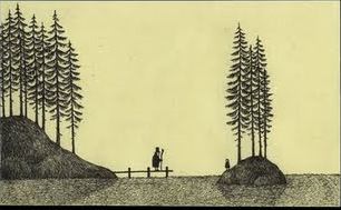 I like these too: Marc Johns, previously on CM, and Xu Zhen.
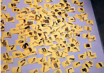 Triple Candie's R.I.P. fake show for Maurizio Cattelan, via ANABA, here. Holland Cotter on TC's 2006 fake show for David Hammons,
here, whom Cotter rightly calls "one of the three or four most
interesting and influential American artists of the last 30 years."
Triple Candie's R.I.P. fake show for Maurizio Cattelan, via ANABA, here. Holland Cotter on TC's 2006 fake show for David Hammons,
here, whom Cotter rightly calls "one of the three or four most
interesting and influential American artists of the last 30 years."Susanna Bluhm makes excellent comparisons between artists in Target Practice: Painting Under Attack, 1949-1978 at the Seattle Art Museum and major moments in art history, here.
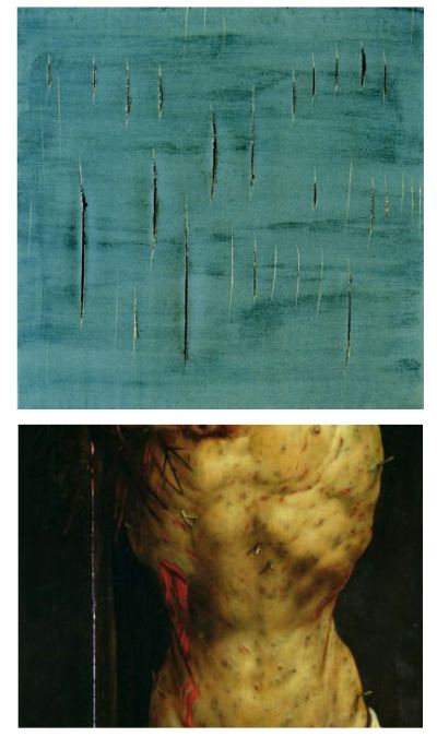 She should have identified them, however. Top, Lucio Fontana, Concetto Spaziale, 1958. Bottom, Matthias Grunewald, from The Crucifixion, 1515 (Isenheim altarpiece).
 Jen Graves on the (I hope) come-back kid future of Seattle's 911 Media Arts Center, here. Who's to blame for its travails?
Billionaire Paul Allen's "city within a city, where lively workplaces, shops, restaurants, schools, parks, entertainment, and recreation are located in a dynamic, emerging neighbor-hood" is once again forcing out the arts. Allen's plan for South Lake Union, once touted as a developing arts and technology hub, is instead turning into a designer playground for the rich. 911 Media Arts Center, like independent arts groups Consolidated Works and Center on Contemporary Art before it, can no longer afford the rent it pays to Allen's company Vulcan.Not fair, but admirably rousing. ConWorks collapsed under the weight of a bungling board. 911 and CoCA couldn't afford the rent in a dollhouse.
On the other end of the spectrum, Ken Johnson slams the socially relevant at the Newwark Museum, here.
The strategy is pretty clear: almost every piece in the exhibition, whatever its form -- and there is a great variety of formal approaches --pertains to a social issue. Race, ethnicity, identity, immigration, ancestry, disenfranchisement and globalization are among the themes represented, and if they are not immediately discernible in the works themselves, wall labels helpfully explain. Call it Postmodern Social Realism Lite.Ouch.
Finally, Martin Creed on YouTube (TateShots): "Art is just a word." Word.
As the title suggests, it's a Northwest memoir.
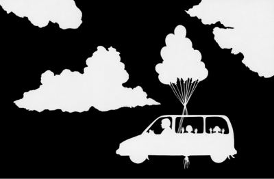 ON FAMILY
ROAD TRIPS WHEN I WAS LITTLE I LAID DOWN IN THE BACK SEAT OF THE
MINIVAN. I WOULD ARRANGE MY HEAD SO THAT WHEN I LOOKED OUT THE WINDOW
ALL I COULD SEE WERE CLOUDS. I WOULD PRETEND WE WERE FLYING AND THAT
THERE WAS NO SUCH THING AS LAND. WHENEVER A TALL TREE OR A TELEPHONE
POLE WOULD CAREEN INTO MY LINE OF SIGHT I WOULD CLOSE MY EYES AND
SQUEEZE OUT ITS MEMORY, THE MEMORY OF SOIL.
 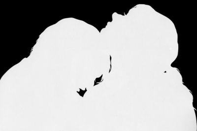 HE WAS BORN
ON THE DARKEST DAY OF THE YEAR. A FACT THAT SEEMED TO COINCIDE WITH
HIS DEMEANOR. I LOVED HIS SADNESS, NOT THE MAKING OF HIS SORROW, BUT
ITS AUTUMNAL KINDRED QUALITY. ITS SUBTLE PERVASIVENESS SO SIMILARLY
ALIGNED WITH MINE. HE WAS LIKE A DOLEFUL GRANDFATHER WHOSE MOMENTS
COULD BE BRIGHTENED SO HANDSOMELY BY HIS BROOD. I SO RARELY GOT TO
DRAW THIS OUT IN HIM, NOT ON HIS FAULT, BUT BECAUSE I WAS LAZY WITH OUR
LOVE. LAZY BEING THE LEAST BAD THING I CAN SAY ABOUT MY BEHAVIOR.
 Asked another, rhetorically:
What am I symbolizing? Artist? Sex machine? Muppet?
Seattle's Ellen Ziegler used her hour to enlarge the idea of the project. Holding a mirror, she directed it at those gazing up at her. In looking at her, they were looking at themselves.
 Watch Ziegler on the Plinth here. (The tape starts with a minute or two of the final performance of toilet guy wearing a kind of ribbon-like diaper.)
Participating (including travel expenses) cost her about $2,000, which she didn't have.
Wrote Ziegler:
More than 120 donors contributed almost $2000 toward my travel and expenses, mostly in $10 donations. Why? I believe it's because of the Quilting Bee Theory of Artist Funding. As artists, we need short-term funding from time to time. You give me $10 when I need it now, then when you have an urgent funding need, I'll give you $10. Community support is essential in these times. I'm thrilled that it worked, not only for my sake, but to know that it's a method to support each other, just like a quilting bee or a barn raising.
Following is a (long) list of donors to date:

Aug. 14-15, 21-22, 8 p.m. $15
NEW CITY THEATER
1404 18th Avenue (Capitol Hill between Union / Madison)
Seattle, WA 98122
 With a 30 percent drop in income, on July 30 NFF asked everybody with a
stake to send $10 by Aug. 15. Sub Pop responded with a matching grant
of $10,000. To date, NFF has raised more than $33,000.
With a 30 percent drop in income, on July 30 NFF asked everybody with a
stake to send $10 by Aug. 15. Sub Pop responded with a matching grant
of $10,000. To date, NFF has raised more than $33,000.NFF was looking at a $70,000 deficit for the current year (on a $700,000 annual budget) and hopes to close with less than $35,000 in the minus column.
In the meantime, NFF has laid off its excellent managing director Susie Purves, whose background covers a wide variety of Seattle's arts institutions, including as curator and/or director of the Center on Contemporary Art, Kirkland Arts Center, On the Boards and the Seattle International Children's Festival.
Two more staff have been cut from full time to 24 hours a week. Again, an arts institution will try to do what it does with less money and important staff missing. Director Lyall said he hopes to be full strength by the end of the year.
What NFF does, from its Web site:
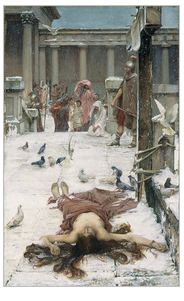
John William Waterhouse (1849-1917) was born the year the Pre-Raphaelite Brotherhood (William Holman Hunt, John Everett Millais and Dante Gabriel Rossetti) delivered their manifesto challenging official art rules promoted by the Academy. Waterhouse revived the literary and mythological inspiration of his predecessors, often staging, with crisp brushwork, dramatic confrontations of a single figure and a group. An active member of the Academy in the 1880s and 90s, Waterhouse nevertheless fell into oblivion in the early 20th century. Left, "St. Eulalia, 1885." (Tate, London) The saint was martyred in Rome at age 12. According to Prudentius, a Christian poet who also lived in the 4th century, a white dove flew out of her mouth and snow suddenly fell at the moment of her death.
From Kader Attia:
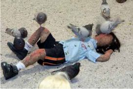 Late one night, Kader Attia's friend had a fatal heart attack on the street in Paris. Attia found him where he fell, covered in pigeons. The man had been eating a sandwich. A couple of birds sat high on his chest, pecking his mouth to get the bread out.
Attia made his reputation with his response in 2005. Flying Rats featured seed-filled sacks shaped like children, plus 250 pigeons to eat them. More shots of the installation here and here.
 Sami Ben Larbi, Shirt ( 2003) Via Lawrimore Project
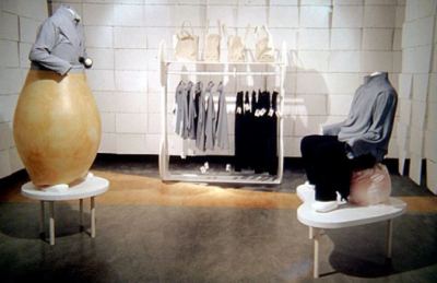 The artist modeling his work:
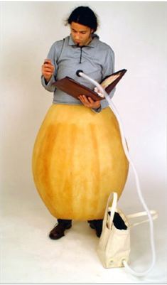
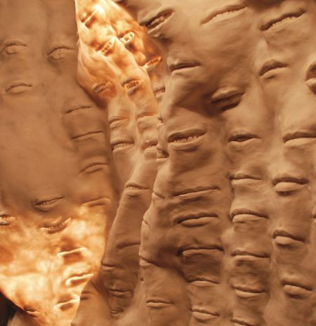 Grade (pronounced Grotty for no good reason) is part of UberPortrait at the Bellevue Arts Museum, curated by Stefano Catalani and featuring more than 40 artworks from 11 artists.
 Grade's rubberized lips are impressions from hundreds of his closest artist friends. Kukuli Velarde's terracotta self-portraits are a vaudeville version of what she calls the "violent encounter between the European and the indigenous world." In keeping with the current status of much PreColombian statuary, the title for her series is Plunder Me.
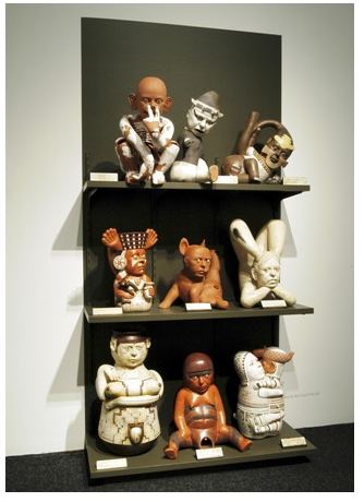 Detail:
 She also offers a critique of Catholicism, the original, ritualized source of spiritual S&M:
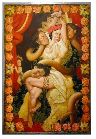 Ah Xian's painted porcelain busts make good on Mao's false promise, to let a 100 flowers bloom.
Regina, your comment about Dailey's work is an interesting, if not highly arguable, one. You wrote that "Once he found his style he didn't change it until forced by health reasons." I think that Dailey is, instead, one of those subtle, but still convincing artists who changed, not just because of his health issues, but because his mind expanded continuously.
In 30 years or so, Dailey's work progressed from horizontally banded works about palpable landscape in the 1960s, to vaporously open paintings about light and sky in the 1970s and into the 1980s, to complicated color studies in vertically banded works suggesting differing times and atmospheres into the 1990s, to the complex, nearly Baroque, works about framing space and color and mood in the last 15 years or so.
Stillman turned his head to stare at Walker critically then waved off the valet parking attendant.
"We'll have to stop and get you some clothes and stuff."
He turned and walked west on Wilshire Blvd. Stillman stopped to look into the Neiman Marcus window, and Walker pointedly kept moving.
Stillman called, "Hold it," and Walker came back.
"I know you can't afford this, but don't worry about it. We're on an expense account."
"You may be," said Walker, "but I doubt it includes me and I'm sure it doesn't include clothes."
Stillman glanced at his watch and said affably, "It includes anything I say it includes. I don't itemize."
Walker cocked his head and raised an eyebrow.
"My clients know I'm not wasting their time on that sort of thing. If they want my services they pay what I cost and don't get on my nerves. I don't bid. I don't give estimates, and I don't account for things. "
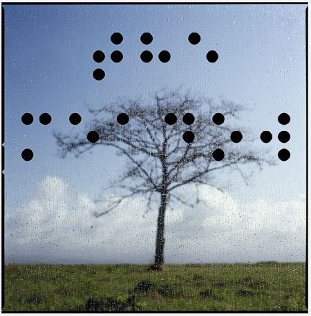 In Braille, the black dots spell out the title: The Meadow. Braille functions as a coded cloud, a darkness that inserts itself into the clarity of daylight. Mafford's Braille series at the Virginia Inn through Aug. 31.
 From Greg.Org:
The photo above of a 2001 space shuttle launch at sunset shows part of the exhaust plume in the earth's shadow, and part of it illuminated by the sun. Apparently, the shadow of the plume itself, which only appears to connect with the moon, is called the Bugeron Effect, [or Burgeron Effect?] which is apparently different from the Bergeron Effect . So that's like three or four things I didn't know, and one I still don't. here's a normal picture of the earth shadow rise. [via nasaimages.org]
He always called me Maxwell. He taught me how to light rockets out of Rainier beer bottles.
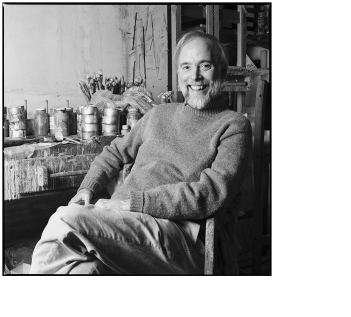
 Tuesday at noon begins a 24-hour performance reading in Occidental Park (Pioneer Square) of Haruki Murakami's A Wild Sheep Chase, featuring D.K. Pan, NKO and Holly Brown.
 While one person reads, another will transcribe the text on the exterior of a box truck while the third types the text on an endless roll of white paper.
from press release:
This overnight endurance performance serves to highlight and expose the intensely private acts of reading and writing along with the conflicting desires they engender. The relationships of voice, hand, and typewriter become intertwined in the act of imprinting memory onto a public site. A silent transformation occurs, unnoticed. A box truck becomes an elephant, text escapes the confines of its pages; we awake from a dream and find ourselves at the beginning of a journey. Murikami's tale of search, longing, and reconciliation serves as the point of departure.
More here.
Art dealers?
Says Vital 5's Greg Lundgren:
Some may say, "Art Dealer! Why, that's not someone you give grants to! Give it to the artists." And my response is three fold - All artists who exhibit their work are part dealer; all dealers are part artist, and lastly- sit on it.Thursday, 6-7 p.m. in the parking lot of the 500 block of East Pine St, Vital 5 invites anyone at all to strap a piece of art (with price tag) around his/her neck and join others so attired, making walls out of bodies.
For an hour, pedestrians can stroll into this temporary structure and view a selection of poorly curated work (one thing at a time, alright?)...One person will walk with $500.00 cash, chosen randomly, in one small effort to recognize and appreciate the true nature of our arts culture. Plus, how cool would it be to make a gallery out of bodies? Come one, come all! Rain or shine.All entries will be exhibited at Dada Economics at Bumbershoot, 2009
Prime movers included David Park, Joan Brown, Elmer Bishop, Manuel Neri, Nathan Oliveira, Jay DeFeo, Richard Diebenkorn and, in Seattle, William Ivey, Boyer Gonzales, Margaret Tompkins, Robert C. Jones and Michael Dailey, who died this weekend after a brief illness.
Dailey was one of the youngest and most steadfastly abstract. Once he
found his style he didn't change it until forced by health reasons.
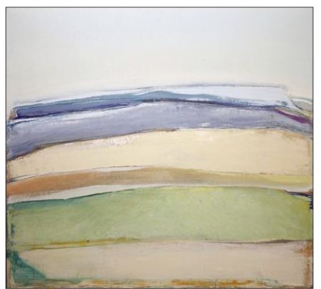 In the 1960s, using oil paint, he began to make colors float. His canvases are full of ripe colors only loosely contained within their frames. I've always had the feeling if I put a finger under one of his buoyant passages, I could flip it into the air.
That was enough for him, and he'd undoubtedly be doing it still had oil paint not become more than his balance and lungs could bear.
 Dailey lived with multiple sclerosis since his 30s. While he loved the depth and illusion of oxygen he got from oil, he was ready to make the change when change was inevitable.
Acrylics took away his bounce, but what developed as a replacement has become as intriguing. Dailey painted flat smears of color that drag themselves across space and fight with their frames, which are constantly realigning their positions.
(Biscay Blue, acrylic/canvas, 2000)
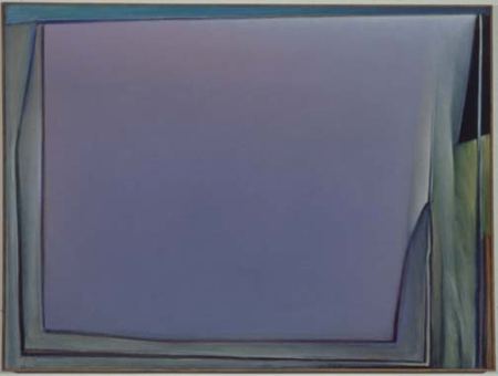 Seattle art museums being what they are, none has seen fit to provide one of the Northwest's most singular colorists a retrospective, which is why the Greg Kucera Gallery joined forces with Dailey's gallery, Francine Seders, to provide one last January.
 Dailey:
People have noted the complexity of my color and have given me credit for skill that more properly should be given to persistence and experimentation. This process of improvisation and revision has been the basis of my work since the beginning.
Born in Des Moines, Iowa, he received BA and MFA degrees from the University of Iowa. From 1963 to 1998, he taught painting and drawing in the School of Art at the University of Washington.
Besides Francine Seders, he is represented by Laura Russo Gallery in Portland, Oregon. His work is included in the collections of the Museum of Modern Art, The Smithsonian Institution, The Municipal Gallery of Modern Art, Dublin, Ireland, The Seattle Art Museum, The Tacoma Art Museum, the Portland Art Museum, and the University of Washington.
Dailey is survived by his wife Linda, son John, daughter Susanne Kelly, son-in-law Jeff Kelly and granddaughters Jane and Tess. Funeral services will be private.
All I need is a room somewhere,
far away from the cold night air,
with one enormous chair
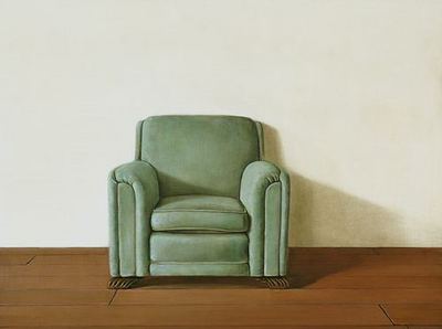
Oh wouldn't it be loverly.(From My Fair Lady, here.) Eliza Doolittle was not singing about a showroom sofa. She longed for the broken-in beauty of a used object, softened around its edges but still supple in its springs, exactly what Holly Ferrell paints and the reason for her success.
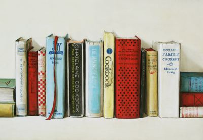
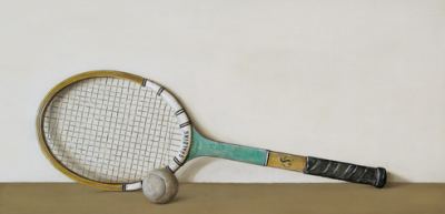
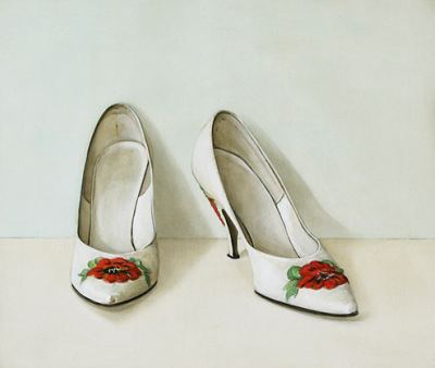
Farrell paints aging dainty things with good bone structures. They aren't just tennis rackets, shoes and shelves of books, they are repositories of memory. If Bladerunner's Dr. Eldon Tyrell wanted the replicant Rachael to be a happy homemaker instead of siren secretary, he would have filled her head with Farell.
The child whose mother used these cookbooks ate well.
 No new tennis balls in Farrell's paintings.
 What saves her work from other feel-good fantasies is the exactitude of her depiction, her spare grace. Next to hers, Thomas Kinkade's smeary landscapes are bloated frauds. There is also in Farell's work an undertone of elegy. The shoes below date from the early 1950s. It's not likely that their owner still wears them. They are what you'd find cleaning out your mother's closet after her death. If your mother favored florals and wore high heels, these would pierce your heart.
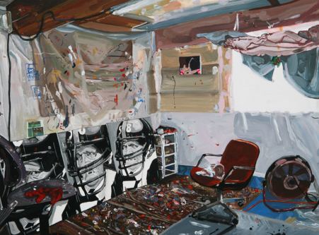
Football is a 20th-century technological struggle played on a gridiron in a stadium.
John Schuh: the gridiron opens its technological maw:

Enter, America's Best Dance Crew, Season 4, tonight at 9 p.m., featuring in the top
 They are percussively-gifted, hip-hop dervishes who've been winning top honors in global competitions for several years. Instead of a team of all-stars who come together to compete, Massive Monkees are a thriving social unit complete with DJ's, writers, producers and a good-vibe support team.
 Nearly all grew up in Seattle's South end: Beacon Hill, Columbia City and the Rainier Valley. The majority went to Franklin High school. They developed their stick-like-glue, move-like-silk style organically over time, with members moving in and out of the spotlight.
The roots of the b-boy and b-girl dance crew movement roots are African tribal combined with Brazilian capoeira and American gymnastics; the fancy footwork of James Brown and later Michael Jackson; electric boogaloo poppers like Don Campbell and the footwork of Brooklyn kids in the 1970s. To avoid summer heat trapped inside their apartments, they fooled around, outdancing each other in the street.
West Coast crews won the first three seasons. It's time for an East Coast victory. On the other hand, no Northwest crew has ever made it to the starting gate.
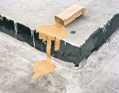 Annie Leibovitz, Whoopi Goldberg
 Sharon Shapiro
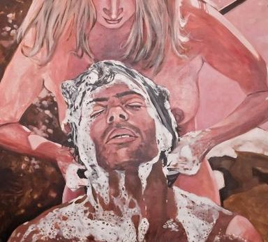 Juniper Shuey
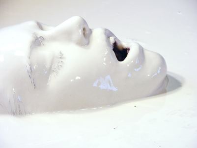 Steven Miller, from Decode Books' Milky at Platform
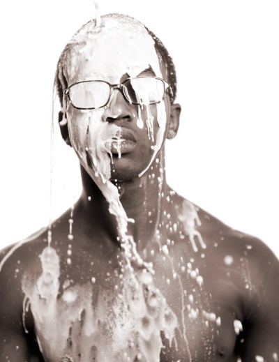 Steven Miller, again:
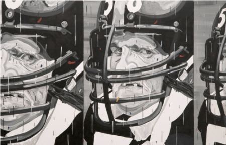
What is even less likely to materialize in a football stadium is art that critiques the game as effectively as Grant Barnhart's does.
 Detail:
 George Carlin on the difference between baseball and (American) football here.
Exhibit A is the Dallas Cowboys Art Program in its recently completed stadium. Instead of tapping LeRoy Neiman, somebody the state's most famous politician is sure to have heard of, aritsts in the lineup are largely but not exclusively abstract or text based: Franz Ackermann, Annette Lawrence, Olafur Eliasson Ricci Albenda, Mel Bochner, Daniel Buren, Teresita Fernandez, Terry Haggerty, Trenton Doyle Hancock, Jim Isermann, Dave Muller, Matthew Ritchie, Gary Simmons, Lawrence Weiner, Doug Aitken, Wayne Gonzales, and Jacqueline Humphries.
I'm dazzled. There's a press tour Aug. 11. Press release here.
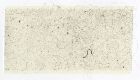
Mike Simi is not about to waste his time weaving, although he too is interested in what can be salvaged from the bathroom.
Lint Roller Series: Bathroom Rug
 Ben Beres as a cat (SuttonBeresCuller):
 Bryan Zanisnik - mom and dad as stars in the night sky, with nuclear cooling towers as background shadows and the demised World Trade Center at her feet.
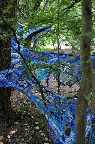
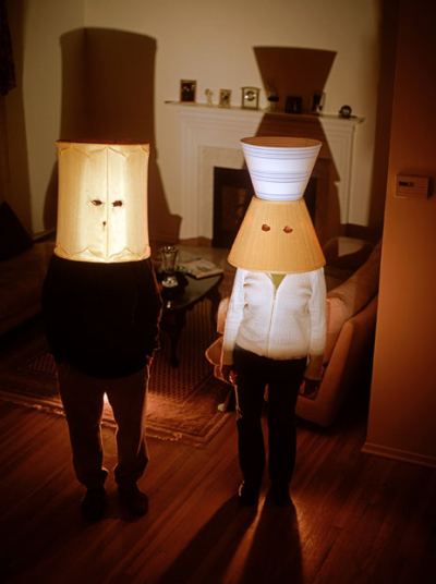 Mandy Greer as a spider:
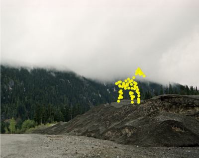
 Fred Muram as a horse, after John Baldessari :
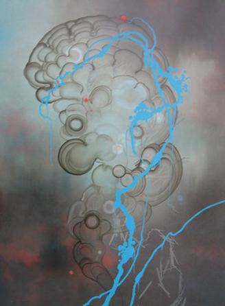
 Darren Waterston as a jellyfish:
 Susan Robb as an animal made of land:
 Claude Zervas as many bears:
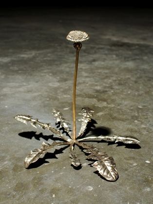
 Dan Webb as a dandelion:
  Gretchen Bennett as her own forest:
(Last time I checked, the link for Art Attack says July 11, but a similar event takes place Aug. 8, same place. Info on this month's activities after the jump.)
(Graves also wrote Danzker's exhibit, William Hogarth: Nationalism, Mass Media and the Artist, was "awesome-sounding." Awesome? Hogarth is an illustrator in the worst sense of the word. He belongs in picture books accompanying stories.)Her response:
I cannot even address a person who dismisses Hogarth.Maybe it's generational. Nobody from my time and place countenances the didactical moralism of Hogarth, the 18th-century's Norman Rockwell. It's hardwired. You can have them both, Jen.
An Egyptian bust from 1500 B.C. to 1050 B.C. at Chicago's Field Museum is getting heavy traffic thanks to its resemblance to Michael Jackson.

Born and raised in Japan, Toshi Asai has the troubling delicacy down cold. She draws madonnas from a tattoo parlor, outer-space Virgin Marys and their animal companions.
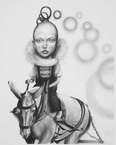

Working in oils, Asai plays with the suggestion of depths, populating her surfaces with greater and lesser beings emerging and receding within an orchestrated flow. Opening Wednesday night, her current exhibit at Joe Bar is all pencil on paper, which highlights the supple rigor of of her line.
Through August.
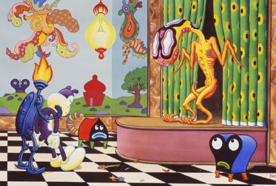
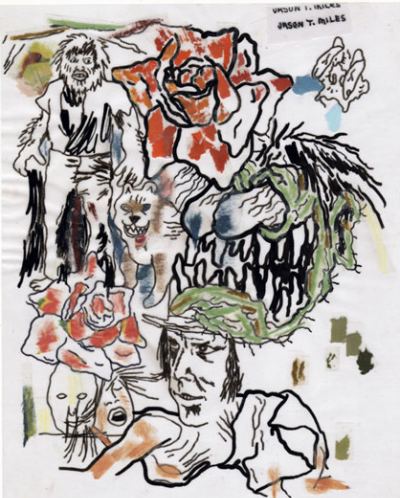
Some of these people are the best of the best. Below, a small sample. Hit the links for more.
Charles Burns:
 Ellen Forney:
 Jim Woodring
 Jo-Anne Birnie Danzker has much to recommend her as the new director of the Frye. She's scholarly, curious, engaged and engaging. An international figure, she has strong local roots, first as curator then director of the Vancouver Art Gallery, 1977-91. (Previous post, announcing the appointment, here.)
Her problem is exactly the same as the Frye's. With nearly unlimited resources and the wide world from which to collect, Charles and Emma Frye chose to concentrate on the academic realists of the Munich Secession Movement. As members of a movement, its artists were forward thinkers. As painters, despite occasionally overheated subject matter, they are unspeakably dreary.
And they are the artists on whom Danzker has chosen to focus. After leaving the Vancouver Art Gallery, she was director of the Museum Villa Stuck in Munich from 1992 to 2005, devoted to Franz von Stuck. Villa Stuck. The name suits.
Art historian Meyer Schapiro usefully distinguished between a painting's subject matter and object matter. Von Stuck and his associates painted with no strength in their object matter. They weren't just past their pull date, they don't have a date, being feeble in any era. While artists around the world surged forward, rocking the foundations of what art could be, these artists clung to overheated and underfed attempts at imagery.
For every painting that holds its own there are five that cry out for the privacy of storage. Seen rarely and in small groups, they might be able to charm as artifacts, like lion-footed tables, heavy brocade curtains and corsets. Thanks to the terms of the Frye will, however, these weak vessels must continuously pour themselves out on the wall, cruelly exposed to familiarity breeding contempt.
Jen Graves wrote today that she didn't think the Frye could have hired someone better. True, if the museum insists on maintaining the delusion that its collection is tip top. I was looking for somebody who'd figure out a way to free the museum from the dead hand of the past, to move the Frye's holdings into storage, deaccession and trade up.
(Graves also wrote Danzker's exhibit, William Hogarth: Nationalism, Mass Media and the Artist, was "awesome-sounding." Awesome? Hogarth is an illustrator in the worst sense of the word. He belongs in picture books accompanying stories.)
Danzker curated The Munich Secession and America at the Frye earlier this year. It was as meticulous and thoughtful as it was unconvincing.
Danzker is interested in creating closer ties between Northwest art communities, something she did while a curator at VAG in the late 1970s, working with Anne Focke's and/or, an art center that closed by 1980 and has not been equaled in the NW since.
I'd got nothing against Danzker but her taste. Here's hoping she can overcome it.
From the press release:
Born in Brisbane, Australia, Birnie Danzker lived in the Pacific Northwest from 1977 to 1991, during which time she served as curator and then director of the Vancouver Art Gallery. Birnie Danzker left Vancouver for Munich, where she directed the Museum Villa Stuck for 15 years...Birnie Danzker has curated exhibitions ...at the International Center of Photography in New York (1980), Chicago's Museum of Contemporary Art and P.S. 1 -- MOMA (2002), and the Solomon R. Guggenheim Museum (2005). No stranger to Seattle or the Frye, in 2008 Birnie Danzker undertook extensive research on the history of the Frye's Founding Collection curated The Munich Secession and America and Transatlantic: American Artists in Germany, which opened at the Frye in January 2009.
 Created by SuttonBeresCuller, There Goes the Neighborhood was destroyed, but the gallery lost nothing else, said Scott Lawrimore, who got a call from the fire department at 6 a.m.
"They were amazing," said Lawrimore about the fire department. "They broke into the gallery and physically removed the art that was threatened in storage."
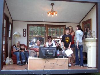
There Goes The Neighborhood is insured, he said. He speculated that someone climbed the fence and used the artwork as shelter while smoking.
A group show, Spite House, will open as planned tomorrow night at 6.
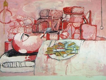
Philip Guston
 Tracey Emin
 Will Ryman
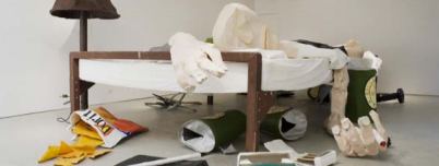 Shaun Kardinal
 Mamie Tinkler (watercolor)
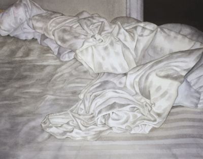 Jennifer Zwick
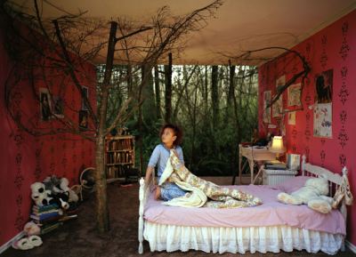 For the communal experience, there's Alice Wheeler's portrait of Peaches resting on a bed of her admirers. (Via) Wheeler's Women are Beautiful is at the Greg Kucera Gallery through Aug. 15. My review here. Jen Graves' podcast interview here.
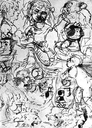
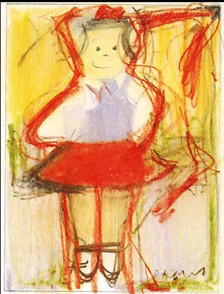
 Somebody needs to publish a book of Nancy tributes, both written and drawn. Tom Robbins has done both, although I can't find either essay or drawings online. I remember his Nancy with Medusa Hair, but it's the essay that rocks and rolls.
Joe Brainard is essential.
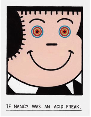 Also, Brainard's If Nancy Was A Da Vinci Sketch and If Nancy Was A Painting By De Kooning:
 Lawrimore Project Spite House curated by Yoko Ott & Jessica Powers, featuring Matt Browning (Seattle)
Andrew Dadson (Vancouver)
Eli Hansen with Herman Beans and Joey Piecuch (Tacoma)
Christian Kliegel (Vancouver)
Bert Rodriguez (Miami)
SuttonBeresCuller (Seattle)
Aaron Young (New York)
Opening night hours are 6-9 p.m, an hour later than openings, so go there last.
Theme: Andrew Alpern:
The physicists tell us that for every action there is an equal and opposite reaction....There is apparently an element of the human character that parallels that law of physics...Sometimes, the push-back becomes so counter-productive and even self-defeating that it appears to be generated merely by spite, rather than by rational thought. This human element of spitefulness appears to come to its fullest flower when adjoining property owners disagree. Spite fences [houses] had a long tradition in urban America, at least until legal statutes and judicial decisions evolved as ammunition against them. Their builders have ranged across the social and economic spectrum, with the most spectacular barriers erected by people who possessed large amounts of both spite and money.Howard House Robert Yoder, Send Me an Angel, a residency, workshop, collaboration, exhibition, and Carrie Marrill, Visual Aids
Punch Gallery Patricia Hagan Fullness Passing
Soil Land(e)scape with Julie Alpert, Lise Graham, Cable Griffith
Schrag:
Some artists make things - I think my creative urge comes from more destructive places..
When scrawled commentary proved to be (no surprise) robustly negative, organizers bowed to complaints by putting the Bible behind glass and inviting spectators to participate by writing on blank sheets of paper.
Not close to the same thing, and not enough to reassure the Pope. He called Schrag's project "offensive and disgusting" and added:
They would not think of doing it to the Koran.If he'd stopped at offensive and disgusting, fair enough. He's the Pope. It's his job to defend the Bible. But the second sentence represents him better. He's right, of course. Few would hazard open commentary on a Koran. Why? Pure fear. The radical fringe of the Muslim faith defends its orthodoxy with car bombs, guns and beheadings. Is the Pope jealous? Does he long for the days when popes silenced the critical with burnings at the stake?
Michael Kimmelman bemoans the moment: After spending what he called an idle morning watching people drift through the Louvre, seeing few stop to stare, Kimmelman contrasted our crude age with an educated one, long gone:
Travelers who took the Grand Tour across Europe during the 18th century spent months and years learning languages, meeting politicians, philosophers and artists and bore sketchbooks in which to draw and paint -- to record their memories and help them see better.The fair comparison isn't the one he makes, between the 18th century audience and the 21st's. It's between the most ratified upper crust and the middle classes who can and do go to art museums today. If he'd framed his essay in those terms, his point would have disappeared.
In the real world, more people are looking at art than ever. What do they think of it? I wouldn't presume to guess, especially not after spending a morning watching them in the Louvre.
Kimmelman is a fine writer, flawlessly smooth, but frequently I find myself disagreeing with every sentence, every word, including the a's and the the's.
Kimmelman:
Visiting museums has always been about self-improvement.There he goes again, speaking for everybody. I go to get out of my skin, to hear my brain click, for pleasure and passion and connection. When I want to improve myself, I go to the gym.
Kimmelman's story here. Edward Winkleman called the piece a "thoughtful reflection," here, which is exactly what it is not.
Other links:
Chuck Berry and the homing instinct from Go Head On! here. Bob Hicks wrote nice profile of Oregon artist Rick Bartow, here. From Eyeteeth, rightwing street art, otherwise known as fat cats in the hood, here. Roberta Smith on the Rococo phase of street art, here.
About
Blogroll
AJ Blogs
AJBlogCentral | rssculture
Terry Teachout on the arts in New York City
Andrew Taylor on the business of arts & culture
rock culture approximately
Laura Collins-Hughes on arts, culture and coverage
Richard Kessler on arts education
Douglas McLennan's blog
Dalouge Smith advocates for the Arts
Art from the American Outback
Chloe Veltman on how culture will save the world
For immediate release: the arts are marketable
No genre is the new genre
David Jays on theatre and dance
Paul Levy measures the Angles
Judith H. Dobrzynski on Culture
John Rockwell on the arts
innovations and impediments in not-for-profit arts
Jan Herman - arts, media & culture with 'tude
dance
Apollinaire Scherr talks about dance
Tobi Tobias on dance et al...
jazz
Howard Mandel's freelance Urban Improvisation
Focus on New Orleans. Jazz and Other Sounds
Doug Ramsey on Jazz and other matters...
media
Jeff Weinstein's Cultural Mixology
Martha Bayles on Film...
classical music
Fresh ideas on building arts communities
Greg Sandow performs a book-in-progress
Harvey Sachs on music, and various digressions
Bruce Brubaker on all things Piano
Kyle Gann on music after the fact
Greg Sandow on the future of Classical Music
Norman Lebrecht on Shifting Sound Worlds
Joe Horowitz on music
publishing
Jerome Weeks on Books
Scott McLemee on books, ideas & trash-culture ephemera
theatre
Wendy Rosenfield: covering drama, onstage and off
visual
Public Art, Public Space
Regina Hackett takes her Art To Go
John Perreault's art diary
Lee Rosenbaum's Cultural Commentary


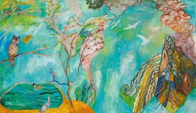

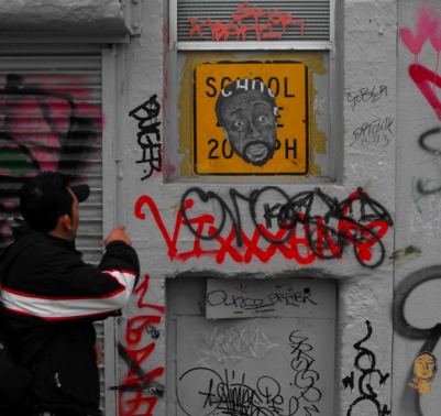
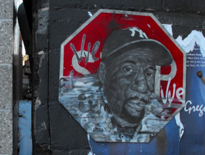
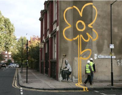

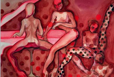
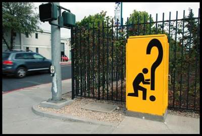
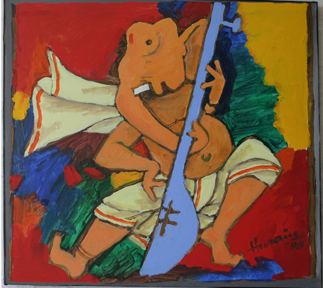
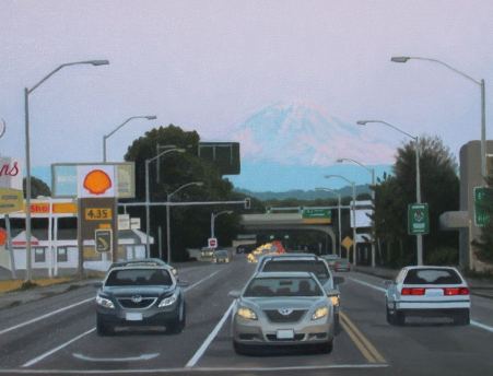

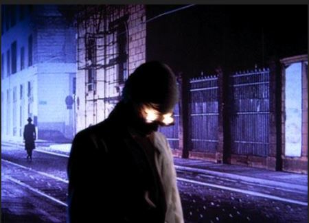
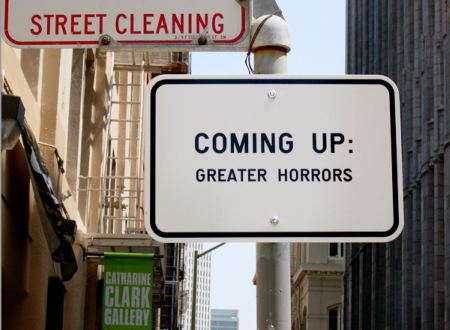


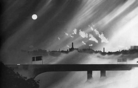



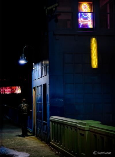





Recent Comments