Another Bouncing Ball: May 2009 Archives
Before I was 18, this piece was a news story, thanks to its chicken-wire figures having no-rent oral sex. Get a room? Cars are cheaper. To see it, you had to be 18 or an art history student. Being neither, I didn't qualify but remember thinking, any art the police don't want you to see has to be worth seeing. It was the point that I began a switch from a primary interest in literature to a primary one in art.
(Click to enlarge images.)
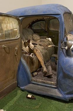 By the early 1970s, J. G. Ballard had begun to think cars as a kind of death-in-life, the equivalent of the cursed ship in The Rime of the Ancient Mariner.
 (From Testpattern)
Approximately 2 years before the publication of J.G. Ballard's novel CRASH! in 1973, filmmaker Harely Cokliss created his short film "Towards Crash!" for the BBC which featured two parts: one based on Ballard's short story "The Atrocity Exhibition"; the other based on Ballard's then short story "Crash!". He cast Ballard himself as both narrator and lead alongside B-movie actress Gabrielle Drake. The short captures a more empirical tone as it studies the binary systems of structure and force, form and desire, the collisions of bodies as the tools of a modern empire. The visual style seems almost stark compared to David Cronenberg's visual imagining of the material in his 1996 full-length feature CRASH, which dwelled more on the mutative synthesis of man and machine/technology/society at the end of the (previous) century.
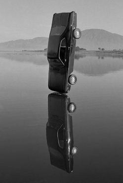
I'm interested in the automobile as a narrative structure, as a scenario that describes our real lives and our real fantasies. If every member of the human race were to vanish overnight, I think it would be possible to reconstitute almost every element of human psychology from the design of a vehicle like this.
(Photo, New York Times. Dirk Skreber at Friedrich Petzel Gallery through June 27. Review, Ken Johnson: consumerist desire on a collision course with death (To read review, click through from here.)
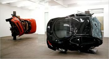 J. G. Ballard, 1971:
 As a writer I feel I must try to understand the real meaning of a lot of commonplace but tremendously complicated events. I've always been fascinated by the complexity of movement when a woman gets out of a car. Take a structure like a multi-story car park, one of the most mysterious buildings ever built. Is it a model for some strange psychological state, some kind of vision glimpsed within its bizarre geometry?Jonathan Schipper at Boiler through June 28.
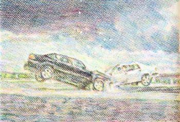
 Stephen Andrews, car crash, 2006, crayon rubbing on mylar, from Platform
 J. G. Ballard, 1971
What effect does using these (multi-story car parks) have on us? Are the real myths of this century being written in terms of these huge unnoticed structures?
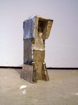
Whiting Tennis, untitled model at Greg Kucera
 J. G. Ballard, 1971
More exactly, I think that new emotions and new feelings are being created, that modern technology is beginning to reach into our dreams and change our whole way of looking at things, and perceiving reality, that more and more it is drawing us away from contemplating ourselves to contemplating its world.Justin Colt Beckman - road hard and hung up muddy.
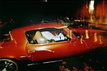
 Alice Wheeler, What Women See At Night
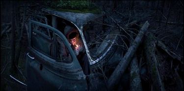
 Aaron Hobson:
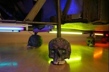
 Matthew Day Jackson from The Violet Hour at the Henry, title after Beuys: I Like America and America Likes Me. His muscle car rides on skulls, an allusion to fossil fuel but lit with neon powered by solar panels on the roof. Jackson's in New York but raised in the Northwest and Northwest in his bones.
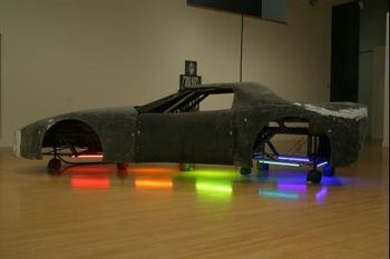 Detail:
Hugo Ludeña
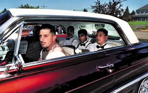 Evah Fan, Hiccup
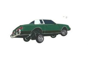 Buddy Bunting
Valay Shende - Buddha Right, Marx Wrong
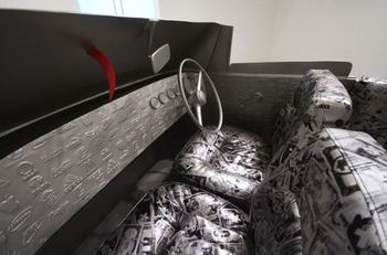
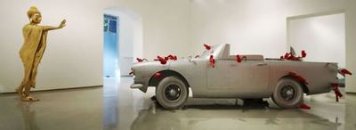 Detail:
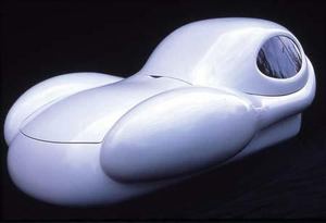
Lee Bul, karaoke machine from Live Forever at the Henry Gallery:
 Kathleen Henderson, Pickpocket:
 Gonzalo Lebrija, Entre la vida y la muerte (blanco y negro), from Culture Monster:
Kenneth Baker, SF Chronicle, What is American art, a car perhaps?
Charles Linder appears to think continually about the zero degree of art and how to meander just this side of it. But a second question preoccupies Linder: What makes American art American?
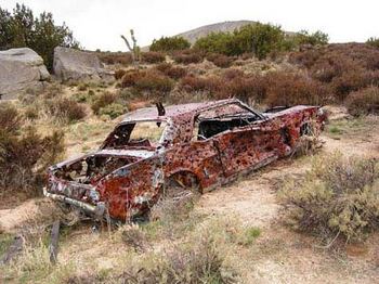
At the center of his Gallery 16 show, facing "Take Me to the Drive-In," sits "Ghostang" (2006), a bullet-riddled 1965 Ford Mustang body that Linder retrieved from the desert and powder-coated to preserve it and revive it as an ambivalent object of nostalgia for auto and gun fetishists.
As a monument, it offers us symbolically the vanity of the gunslinger nation, in tatters. "Ghostang" will remind some viewers of the radiant '64 Chevy Malibu that levitates at the end of "Repo Man." But it makes me think also of "The Master Chassis" (1969), the legendary dragonfly-sleek car-as-sculpture built by former Berkeley artist Don Potts. Both Potts' vehicle and Linder's might serve as markers on a distinctly American cultural timeline. (Shown here as he found it.)
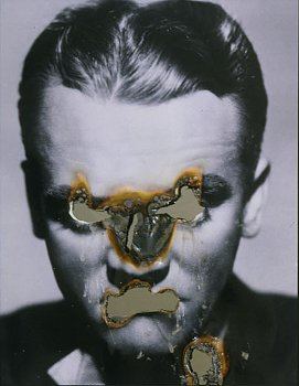
Douglas Gordon:
 Tomoo Gokita from Ambach & Rice through Saturday.
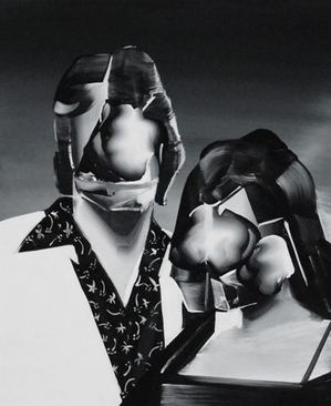 Sara Greenberger Rafferty at Ambach & Rice through Saturday.
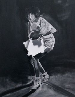 Gordon's is the most corrosive. Gokita, using models from Japan's Elvis cult dancers, gives their undoing a jaunty spin. And Rafferty's is a never-say-die image. Her model has taken a big hit, but she's still standing and ready to give back.
Not so new, after all, the anguish, passion and death of the flesh.
Now therefore, while the youthful hue
Sits on thy skin like morning dew,
And while thy willing soul transpires
At every pore with instant fires,
Now let us sport us while we may;
And now, like am'rous birds of prey,
Rather at once our time devour,
Than languish in his slow-chapp'd power.
Let us roll all our strength, and all
Our sweetness, up into one ball;
And tear our pleasures with rough strife
Thorough the iron gates of life.
Thus, though we cannot make our sun
Stand still, yet we will make him run.
from To His Coy Mistress by Andrew Marvel
Saturday 11 a.m.-4 p.m.at the Tashiro Kaplan Bullding (310 S. Washington St., Seattle) is a print sale to benefit that fund.
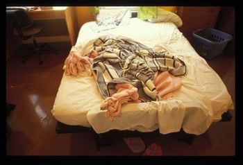
For many years I've been making my bed differently everyday. In this way I am able to combine my work life as an artist with my daily chores. It also gives me an opportunity to work with the same materials over time -changing them again and again, and seeing how many different ways I can remake them sculpturally as well as conceptually.
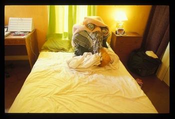
Damien Hirst:
 Whiting Tennis (Link to artist talking):
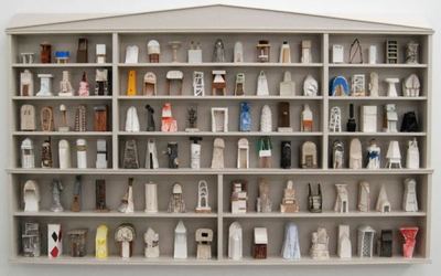
Detail:
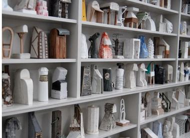
Hirst is cool, Tennis feverish. Hirst's form is armored, Tennis' vulnerable. Tennis' assemblage of his models for sculptures isn't intended a medicine chest, which is where the comparison breaks down. His elegant gray box is more like a church. Like Robyn O'Neil's (here), his overal effect is silent, engaging a private implosion.
I value both Hirst and Tennis, but if I could pick one of these objects to live with, it would be Tennis' a thousand times over, price points be damned.
Tennis is in Supramundane at Ambach & Rice through the weekend. He's also in Dimension Invention at the Kirkland Arts Center through June 3, which I'm going to see later today. He is represented in Seattle by Greg Kucera .In flusher days, now demised, Kucera would never have let him appear at another local gallery, especially with his best work to date.
Abandon all reason, you who enter here. (Click to enlarge; more images at Tony Wright.)
In the last year there have been probably 100 Chelsea shows of 35-year-old-ish artists with so-so CVs. So why has the New York Times decided that one Alison Elizabeth Taylor is worthy of a long profile? (Note that I'm re-creating the NYT's HTML coding, ha ha.) I mean, there's nothing wrong with Taylor or her work (which appears to be the lovechild of Fred Tomaselli and Stephen Balkenhol), but why her and not 100 other artists?! The Carol Kino-penned story never makes that clear. If the paper of record is going to declare one artist whose history is indistinguishable from scores of others worthy of this kind of attention, it should explain why.
Purely within the context of newspaper realities, I attempted to explain, nothing against Ms. Taylor.
Green's not asking about reviews. He's asking about human interest stories with an art angle. What is it about this particular human -- Alison Elizabeth Taylor -- that inspires press to scribble in a notebook and arrange for a photo shoot? Green knows the answers but, idealist that he is, must be hoping they aren't true. They are. Always. One size fits all. Every feature story in the mainstream press about an unknown artist scores in at least one of these categories. (Story here)I ended with this:
Extra points go to artists if they or their subjects are glam. Back to Alison Elizabeth Taylor, which is, by the way, a great name for an artist. She's female, young, got a gimmick and is lovely, which is why everybody runs her picture. If she weren't spotlighted in the nation's top newspapers, she'd have every reason to complain.Glam? She's not only lovely, she looks terrific posed next to her work, her hair being the same color as part of the veneer behind her. (New York Times photo.)
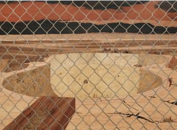
Taylor is included in Supramundane at at Ambach & Rice through the weekend, with Chainlink from 2008.
 Curated
by Elizabeth Burke, it's an excellent show (more later today) off the
deep end of the unruly expressive. The context throws her craft roots
in high relief, where they stifle her narrative content.
 Taylor's inspiration began with a visit to the Met, where she was struck by 15th century Italian marquetry, or wood inlay. Using techniques she mastered from the period, she creates bleak landscapes with a charged psychological content reminiscent of Eric Fischl. What saves Fischl from being swamped by the inherent drama of his tableaus is his paint handling, which is nervously silky. His content is his paint handling and the reason his edgy dramas continue to haunt.
Taylor was raised in Las Vegas but is not interested in high rollers. She focuses on what is bleak and dying in the sun, the trashed grounds and working poor piling up around the edges of reckless high hopes.
She calls her wall pieces paintings, which they are not. If she finds a way to make the meticulous refinment of her production work for her marginal narratives, she'd be unstoppable. What doesn't work as a painting could as a functional object, and she appears to be moving in that direction. (Click through to Room, here.)
How about boxes that are boxes, or, as Marianne Moore put it, "imaginary gardens with real toads in them"? She needs real toads, real functionality. Her solution comes from Jasper Johns:
Take an object. Do something to it. Do something else to it.
In Greece, the same thing is known as avoiding the evil eye. If two Greek mothers meet on the street, one might say, "What an ugly baby." The other might reply, "Yours also." Praise attracts the jealously malign. Self-praise secures it.
Before seeing S'abadeb -- The Gifts: Pacific Coast Salish Art and Artists at the Seattle Art Museum last fall, I imagined the city's aversion to fuss had roots in the large number of people who live here with Norwegian and Japan ancestries, where the trait is dominant.
In fact, the source is a older. From my review:
By choice and by circumstance, Coast Salish peoples are silent partners in the internationally celebrated style of Northwest Coast Indians. Intimate instead of assertive, their art is overshadowed by the colorful bilateral geometries carved and painted on masks, boxes and totem poles of the peoples from the north, including the Kwakwaka'wakw (Kwakiutl), Bella Coola, Haida, Tsimshian and Tlingit.
The Coast Salish were living in Seattle when the Point Elliot Treaty of 1855 drove them to the outskirts of their territory and later failed to deliver a range of promised compensations.
Coast Salish art is Seattle's root music. It's the basis for what came after, even when the people behind it were no longer dominant on the scene.
Call it the poetics of the handyman. Everything is for use, and the sacred reveals its nature in its refusal to make a fuss. If gray was good enough for a goat, a carefully crafted gray is good enough for a weaving made of goat hair.
Just how good is that weaving? The best are very good indeed, among the finest in the Northwest, although a traditional Coast Salish weaver wouldn't say so. Why puff up? The quality of a dress woven in soft cedar bark or a blanket of animal hair speaks for itself.
Instead of totem poles that advertise the power of a clan, there are house posts carved in a fluid, naturalistic style that can't be found anywhere else in the lexicon of Northwest Coast art. Coast Salish cultures don't have clans. They have family groups linked to other family groups, and their potlatches (gift exchanges) continue to be homey instead of extravagant.
Back to Derrick R. Cartwright, 47, director of the San Diego Museum of Art since 2004 and soon-to-be director of the Seattle Art Museum. (First story on his appointment here.) Before that, he was director of the Hood Museum of Art at Dartmouth College and the Musee d'Art Americain Giverny in France.
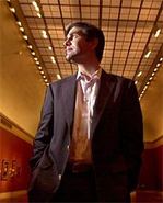 (Photo, Howard Lipin/ Union-Tribune)
 His Ph.D is in art history from the University of Michigan, where SAM's press release says he specialized in American art and architecture and 19th-century French art, as well as the history of photography.
That's not specializing; it's sampling. While not the usual path for a scholar, his range of interests (he has since added one in Asian art, historical and contemporary) prepares him for life at a museum such as SAM, with its wide-ranging collection base.
And his (quiet) passion for art precedes him.
Susan Muchnic noted on Culture Monster (LA Times) that in San Diego, Cartwright "is credited with building the Balboa Park museum's international reputation, reaching out to a diverse community and enhancing the exhibitions and publications programs."
Before him, this border town museum had no gallery devoted to Mexican art. Now it does, along with programming focused on the Hispanic community's cultural interests.
After Cartwright was hired in San Diego, the art critic Robert L. Pincus wrote:
Though he is highly personable and easygoing, he possesses both an underlying intensity and vision of what he believes to be the role of the museum director in the early 21st century.
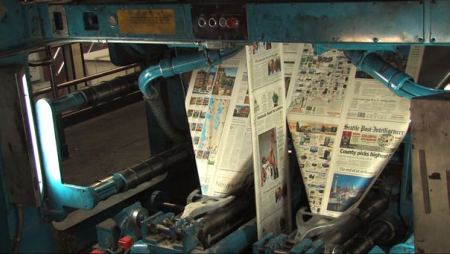 (Photo/Alex Stonehill)
In October of 1980, marinating in joy and alcohol, I staggered down the cobbled streets of Pioneer Square right after I'd scored a job at the paper and sang softly to myself, "I'm in the PI."
Only the PI would have hired me, an instinctive fantasist with no prior newspaper experience. I learned from the staff how to be one of them. Today, if somebody asked if there's a journalist in the house, I'd feel comfortable raising my hand.
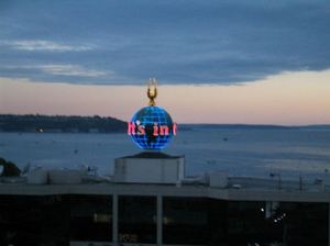
 Following its March 17 demise, the PI continues online as a ghost of its unruly and hard-hitting self. A small team of real reporters still work there, but what they do is strangely not featured and even hard to find on the site, where cute puppies and hot chicks get clicks.
 The demise of the paper is now a documentary short (It's In The PI) being screened Friday night as part of the Seattle Film Festival. I heard about the film for the first time today from Facebook. I'd feel strange to be so outside the loop, but Curt Milton (former PI page designer) didn't know. When the paper was a paper, he knew everything.
Brief clip from the brief film here, featuring Joel Connelly quoting Edward Abbey:
When the situation is hopeless, there's nothing to worry about.
On a more positive note, there's a community tribute to the PI on June 3 at Town Hall Seattle. Free admission. Both laid off PI people and the online-only PI people will show up to pretend everything's peachy. That should be fun.
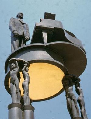
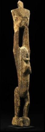 As graces, they also hold up Duke Ellington. (Robert Graham.)
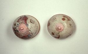
 In mapping, they are the heart of any geography. (Jena Scott)
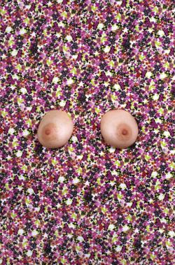
 They are the focal point in a field of flowers. (Jennifer Zwick)
 They make the landscape more beautiful. (Susanna Bluhm)
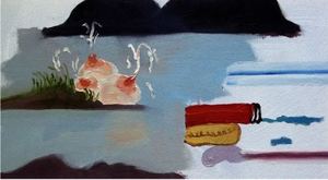 Even in shadow, they dominate. (Pinaree Sanpitak, suggested by Gala Bent)
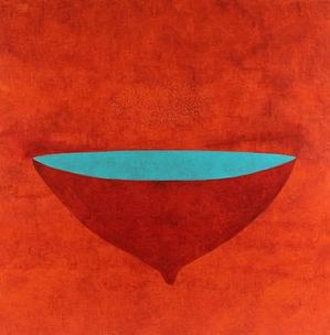 Once you're looking for them, you see them everywhere. (Jennifer Campbell, suggested by Marianne Wu.)
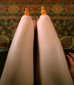 Carrying that kind of cultural weight makes them ripe targets for the fetishist. (Woody Allen, from All You Ever Wanted to Know About Sex, 1972)
 More than a decade ago, I saw a photo of of this tattoo and distinctly remember it being horizontal lines wrapping the torso. Subtle but all-encompassing. Turns out, instead of Agnes Martin, he's celebrating celestial navigation? Pure abstraction? Cracks in ice? Himself, while his flesh remains well muscled? As he ages, he can be his own collapsing star.
 In a time when finances are the major issue in the museum world, SAM's press release on new director Derrick R. Cartwright doesn't mention the subject. If he's a fund-raising wonder, he has declined to say so.
As the director of the San Diego Museum of Art, he repeatedly described his job as presenting vital, challenging, aesthetically rewarding and socially relevant works of art.
From SAM's press release:
Over the past five years, Cartwright's leadership has bolstered San Diego Museum of Art's international reputation as a nexus for deep scholarship, thoughtful exhibitions and a dynamic permanent collection, while developing close ties to the community it serves through public outreach and engagement. Under his direction, the museum has increased its traveling exhibition and permanent collection loan programs, established a strong publications program and added more than 1,000 new acquisitions to the collection.The San Diego Museum has little relationship to the art he says he admires most, however, the challenging and social relevant. Instead, it's a once-over-lightly assortment from all periods, with no particular strength in contemporary. It seems like a place that is loath to challenge to anybody.
As a much bigger museum with depth in African, Asian, European decorative, European/American art after WW II and growing depth in American historical, gives him a wider field of engagement, and it can use his interest in connecting with regional communities.
Back to money. With the failure of Washington Mutual, with whom SAM shared space, the museum lost nearly $6 million annually. That's along with the losses all museums are experiencing in this economy. (Story here.)
I could find no negative stories about Cartwright and few positive ones. In his mid 40s, he's largely unknown but respectable. Mimi Gates retires June 30, and Cartwright starts in the fall.
(Click to enlarge.)
Billy King, from his first gallery show in 25 years. He paints as if he's carving wood.
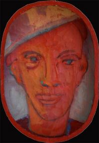 Heidi Anderson, Night Eyes.
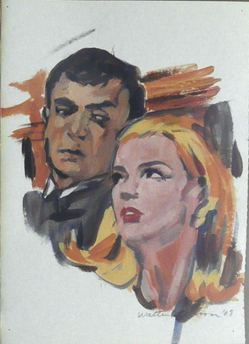
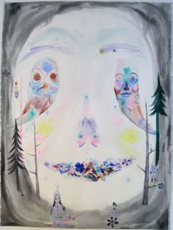 Walter Robinson. As a painter, he defines deft, but his incredible mouth keeps his work from getting the credit it richly deserves.
  Margot Bergman:
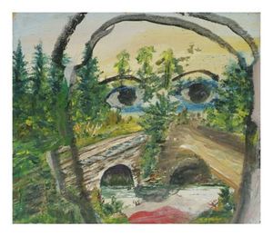 Fatima Allotey:
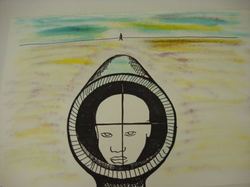 Judith Page:
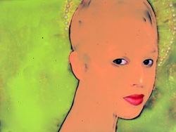 George Chacona:
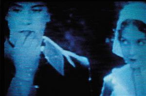 Marco Zamora:
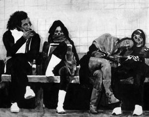
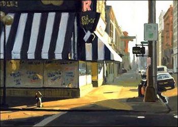 And speaking of Mr. Elston, here's his response to this post about Boy Scouts, art and homophobia:
My own experience with the Boy Scouts was formative. In 1967 I returned to Spokane, my hometown, coming from L.A. and on my way to Montreal. I was invited to participate in an anti-Vietnam War action by my good friend Jed Irwin, who was then the Curator of Art at Cheney Cowles Museum. The Boy Scout Jamboree was being held at Farragut State Park, Idaho.Related: the California Supreme Court fails to do the right thing, here.
A small group was going to leaflet the visiting international Scouts. When we arrived, we were immediately surrounded by Boy Scouts. We had not even removed the leaflets from our bags. As soon as we began distributing, the leaflets were ripped from the hands of our recipients, and we were soon surrounded by angry and threatening American Boy Scouts.
It was clear that they were prepared for our arrival, a fact which became clearer still when we returned to our cars and discovered that, of the several hundred cars in the parking lot, our 5 cars all had slashed tires... I do not have much tolerance for romanticized depictions of the Boy Scouts.
At Davidson Galleries through Saturday.
John Grade - New Works, May 2009 from Davidson Galleries on Vimeo.
John Temple, the editor of the Rocky Mountain News, who recently presided over the end of his print edition, speaks with the voice of grim, very personal experience, but his message is neither defeatist nor gloomy, despite all he has just been through.Hit the link above to hear David A. Ross moderate a discussion on the future of museums with Thelma Golden, director of the Studio Museum in Harlem; Arnold Lehman, director of the Brooklyn Museum, and Claudia Gould, director of the Institute of Contemporary Art in Philadelphia.
One astute reader of Temple's comments wrote: "You could take most of John's comments, substitute the word 'museum' for 'newspaper' and the word 'curator' for 'journalist' and it would be equally true. How can museums and traditional print media learn together how to navigate a future in which services are divorced from traditional sources of income, and users expect to share authority and content development?"
Speaking of David A. Ross, who bills self as a recovering museum director: His most recent piece on FLYP, Bearing Witness, is extraordinary.
On Art Fag City: Paddy Johnson tosses off art criticism as if it came to her while she was waiting for the bus. That casual stance is an illusion. She packs more content into a few sentences than most critics achieve from going on and on. Here she is on John Houck:
Houck's photographic series To The Things captures the physical properties of the spiritual and logical, as well as many of their mechanical elements. Light may resemble higher reasoning in one photograph, and in another it acts as one of many products used to manufacture such an effect.From Translinguistic Other, The Campfire in the Closet: Yes, more in Seattle about Zack Bent and the Boy Scouts, homophobia and art. I semi-regret my part in it (discussed in this essay) and would have improved it had I the chance to do it over, but, I gotta be me now that I don't have any PI editors to prevent it.
From Best Of, Joey Veltkamp tours the MFA show at the University of Washington. His affable approach to the new strikes the right note.
From Looking Around: Richard Lacayo discusses the art being purchased for the Obama White House.The new team appears to be concentrating on artists of color and women who are senior (or dead) and comparatively under the radar, instead of the usual blue chip.
As for the public areas, the president and his family can make proposals for what to show there, but those have to be approved by the White House curator and something called the Committee for the Preservation of the White House, which sounds like it was formed to protect the place from Damien Hirst's shark.Nobody asked, but my way under the radar recommendations include Oliver Lee Jackson, Raymond Saunders, Weldon Butler, Marita Dingus, Preston Singletary, Joan Snyder and Elizabeth Sandvig. Using the new guidelines and removing the age limitation if there is an age limitation, the White House could be filled with wonders.
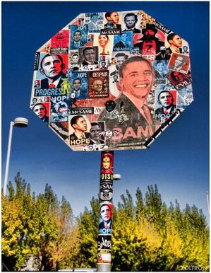
 The chief curator at the Portland Art Museum, Bruce Guenther, sports a full back tattoo -- thin, Agnes Martinesque lines wrapping him, like heartstrings pulled out. (Update: Faulty memory alert - not Anges Martin-like. See related post for photo.)
It therefore comes as no surprise to learn that his museum is host to a skin show. From the press release:
This summer, the Portland Art Museum will present a unique visitor experience exploring the art of tattoo and the impact of this artistic practice in the local community.
Beginning today, individuals who got their tattoos in Portland or people who have a tattoo and currently reside in the area are invited to share images of their tattoo/s on the museum's flickr page: http://www.flickr.com/groups/markingportland. The Museum's curators will review the submitted images and select some to be presented inside the galleries.
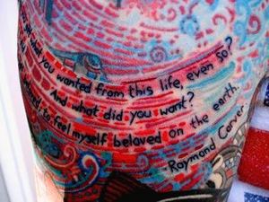
It's getting-to-know-you, Guenther style. Because tattoos are not a regional phenomenon, it's arbitrary to confine contributions to his city's limits. The rule means PAM will not be able to exhibit a photo of the ultimate Northwest tattoo. It exists on the flesh of Patrick Attenasio, who is not from Portland. He happened to see Alfredo Arreguin's painting, A Hero's Journey reproduced online and decided to have it inked onto his arm.
In the center is a poem titled Last Fragment by Arreguin's friend, the late Raymond Carver:
And did you get what
you wanted from this life, even so?
I did.
And what did you want?
To call myself beloved, to feel myself beloved on the earth.
A Hero's Journey appeared on the cover of Carver's final book of poems, A New Path to the Waterfall.
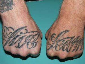
Below are few images from PAM's tattoo flickr pool I find especially fetching. Those who peruse it will notice a photo of Guenther's back is not among the entries.
(First says, Live Learn)
Related: In the New York Times - Seafarers' Memoirs Written on Skin, here.
1. Make playing cards for sale at high-end shops.
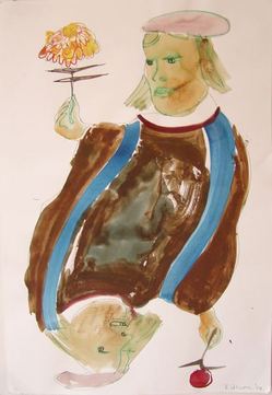 2. Sew wedding dresses for the wealthy.
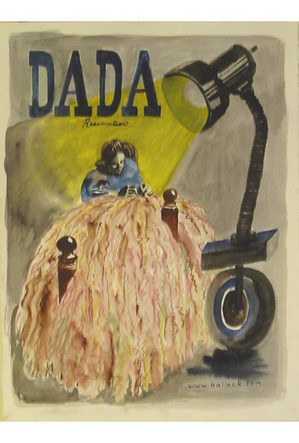 3. Paint people's houses in a flattering light.
 4. Consider farming.
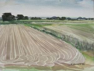 5. Become a Skagit Valley river rat.
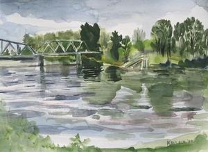 6. Harness the energy of a cloud.
 7. Never underestimate your personal appeal.
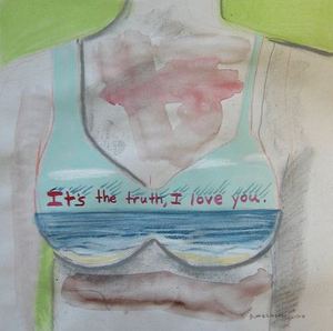 8. Invent a machine for turning dry grass into fire.
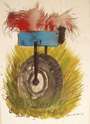 9. Sleep through it.
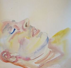 10. Try death. It has worked so well for so many.
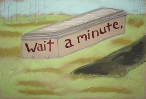
Leo Saul Berk, Hot Spot, 2005, pen/paper, 42 x 92 inches
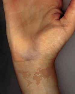
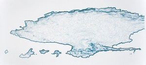 Ann Chamberlain, Wrist, 1998, pigment print, 20 x 16 inches
Her starting point is an essay by Charlotte Higgins at the Guardian, here. Higgins asked Alstair Spalding, artistic director of London contemporary-dance center Sadler's Wells, why there were no female choreographers among the "raft of commissions" he's just announced for the coming season. He responded:
It is something to do with women not being as assertive in that field. It's not that I don't want to commission them.If he only could, he'd be behind women a 1,000 percent. Alas, there's the regrettable problem of their not being up to scratch, and quality is his watchword, he says, regardless of color, sex, sexual orientation or creed.
Collins-Hughes' essay is terrific, if theoretical. She doesn't name any women choreographers she thinks could if given a chance step up at Sadler's Wells.
Here's a few, just for starters.
Susan Marshall, BeBe Miller, Anne Teresa de Keersmaeker, Pina Bausch (at Sadler's Wells last year), Trisha Brown, Twyla Tharp, Zoe Scofield and Donna Uchizono.
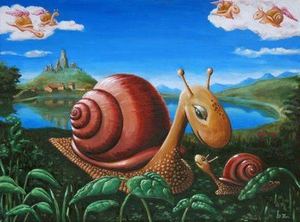 The Brief: A mama snail and a baby snail
The Critique: I'm sorry to say that you're worser than me. You gotta learn to draw as me. You just don't draw so well. Why do you think that is? It turns out that I'm the good draw-er. It turns out that you're the art director.
Artists Note: The critique is on the initial sketch, and compares to hers. She actually likes the painting.
Job Status: Provisionally Approved, pending addition of jumping fish in the lake.
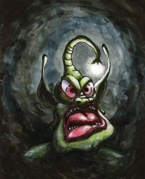 The Brief: A monster (on spec)
The Critique: Too scary! He's a tomato and he's yelling right in my ear!
Job Status: Rejected
When Jen Graves wrote on Slog that she was seeking an intern, Seattle artist Ken Marulis (look under February in his name's link to see his work) replied with the following, which he posted on Artdish:
Firstly, I thought it prudent to list my shortcomings. I'm a two finger typer who gets worse if someone is watching. I'm ignorant, I have almost no schooling and I come from a strictly blue collar background. I'm sixty years old, uncomfortable to be around, have a stupidly perverse and immature sense of humor, sometimes emit dense male body odor and have been known to say the wrong thing at the wrong time (and usually to figures of authority).To nobody's surprise, including the artist himself, he did not get the job.
I can be a troublemaker. I like to peek down woman's blouses and a nice ass will make me lose my concentration. I avoid being politically incorrect but if you look into my eyes you'll see the truth. I may have been barred from entering a couple of galleries but I'm not sure yet. I love Artists more than I love critics. I like to drink sometimes. I know there are more than a few items missing from the preceding list but you can point them out to me when we begin working together.
On the plus side, I love art and I think I may be interested in writing something, and as stated before I'm ignorant and would like to learn a few things. Oh, and the answer to that question: If I could go to any art show in the world this very minute it would have to be a café somewhere, an art town maybe, and see the work of the best ignored Artist that that particular area has to offer. Some hidden jewel of a painter that the entrenched have chosen to ignore because he/she does not come replete with a following. Aside from that, maybe I'd like to see Al Held's studio.
Thanks, Ken Marulis
Mostly, it's the system.
First, a jury, with perhaps one artist on it, and, usually, an architect who feels any art is an intrusion on his genius, plus a few laypeople who are convinced the budget would be better spent on giving them more days off.Unless you have been on juries, ...you have no idea the horsetrading, educating, and politicking that are involved to get any but the blandest, least threatening, beige art selected.
Although I am an artist who competes for these projects, I have served on several juries over the years, and most every time, the strongest artists with the most personality are voted out in the first round, despite my protests.
Jury composition is an art- in the legal system, there are consultants who charge hundreds of thousands to help on jury selection of big cases. And this is one of the biggest weaknesses of a weak arts administrator- not timidity, but the inability to find, and cajole, great people to serve on juries. Generally, the administrator must sit on the sidelines and manage process, not lobby for favorites.
Then, the even bigger problem is the politicians or beaurocrats who must say yes before checks are signed- the main reason for dumbing down of ideas.
In the recent Dan Webb/Olympia dustup, it was the elected politicians who shot down the idea, not the artist who was timid- and this is very very common. Which leads professional artists, ones who have been around the block once or twice, to avoid pitching that x rated day glo pink giant reptile eating human cadavers amidst a pile of crack bags. Self editing is what you are talking about, not timidity...
In any field of endeavor, there is a difference between being timid and just tossing out expletives for their shock value.
Nope, Vito has never proposed that he would masturbate under the stairs for a project for a new convention center...
I can't say "I'm thinking of you Mary wherever you are" because I think that when people die they die; this one hurts because despite her age I really always thought I'd see her again. Also, and, sure, this is inappropriate, but what the hell, smoking pot with Mary was a total hoot.Related: From Family Guy on Hulu, Bag of Weed.
Public art is not a matter for the majority - people should simply cough up and stand back as talented artists indulge themselves.How very monarchist of him. The problem with public art is not the public. The public is part of the challenge. The problem is lazy-ass, timid arts administrators who don't bother to engage the communities who will interact with the art on a daily basis. Too many artists in the public realm are also timid. They go for the safe and bland.
All this is the public's problem? Offer good art and sell it to those who are going to see it regularly as they go about their business. Critics who have nothing but contempt for public art are also the problem. They need to be using different criteria to evaluate what Lawrence Alloway called "focal points for an undifferentiated audience." Instead, they bring only their studio art gasbag of tricks.
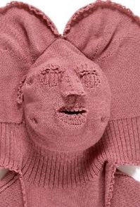
What the well-dressed bank robber will wear: (Freddie Robbins)
Culture Grrl (Lee Rosenbaum) blames the victim, here, in a post about the beleaguered Rose Museum and heroic director, Michael Rush, not heroic to CG, however, who rewrites history to knock him.
Michael Rush, whose directorship at the museum ends June 30, told (Geoff) Edgers:Catching up: Excellent Aldrich director Harry Philbrick interview last Februrary with Robert Lazzarini in his New York City studio here.
The Rose, as we have known it, is closing......or at least the Rose as HE has known it is finished. My hope that a new director, arriving in Watham without the baggage of an acrimonious relationship with the administration, will find a way to preserve the Rose's collection and its status as a full-functioning museum, while making a more effective effort to communicate its necessity and importance to Brandeis officials, the broader university community and the general public.
HP: Do you own a gun?
RL: Well, I own that gun [the one reproduced in the artwork] the original, simply because that's my process, and I had to go through an FBI check and all that stuff, but I don't shoot, and it's not that I don't want to. I've been to a firing range in the city because one of my assistants was a gunsmith, and he worked at a firing range so I'd go there and shoot there. But it's really loud, even with ear protection on you're like "wow, that's loud!"
HP: So not your thing.
RL: I prefer stabbing.
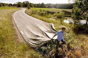
I love Photo Shop: Erik Johannsson, Road Pull
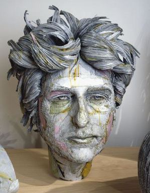
Scott Fife: (Bob Dylan)
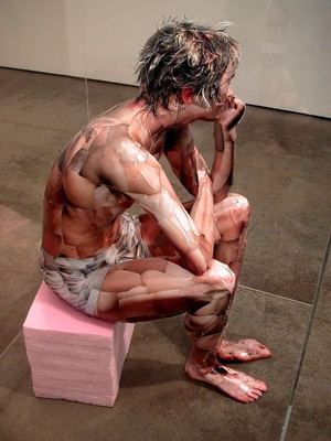
 Oliver Herring: (Patrick)
 Ana Serrano: (Chalino)

I appreciate your candor and your perspective in the post you put up. To round out the discussion, my purpose was not to glorify (Boy Scouts of America) but to investigate scouting as a type of American survivalism that is wrought with complexity- and is far from innocent.Good points. Bent and I discussed this show as he was working on it. He emailed me to say he'd taken my thoughts about the BS into account. The first time I saw the exhibit, I didn't focus on those ambiguities. Second and third time, after he drew them to my attention, they became apparent, as well as the insufficiencies of my original review.
I was hoping to use the notion of a 'trace' as something that remains in a person, something that is experienced. To me a trace in itself doesn't denote either positive or negative traits, it just IS. This is where my investigation began. I wasn't trying to romanticize the scouts, though I do believe there is a romanticism inherent in scouting that is tied to an old American idealism.
I do find it curious that you didn't address the work/images in my show that dealt with tension, ambiguity, and failure: the deer carcass, the jar of tears, the hatchet with a cast, the tree full of bird houses - why only show the images that seem romantic? Here is bit from my show statement: "Though earnest in these attempts, the BSA have failed in both areas (conservation & social responsibility).... my aim has been to reference scouting traditions (honor, merit, first aid etc) while allowing my family to become a tribe of scouts that aims to understand its own limitations in relating to each other, to the natural world, and to the divine."
It's not my job to review anybody's politics, but it would be disingenuous to pretend politics don't matter to me, that I can separate out the aesthetics and focus on them exclusively.
Raised Catholic and unable to separate myself completely from a church whose social agenda I find reprehensible, I should have been more sympathetic.
Here's what Paul Schmelzer had to say on his excellent blog, Eyeteeth: A Journal of incisive ideas:
Having just seen Zack Bent's scouting-inspired mixed-media exhibition in Seattle, I'm floored that Regina Hackett can't move past her fixation with the evils of the Boy Scouts to actually examine Bent's art; while her critiques of the Boy Scouts are fair (if over-emphasized), she ignores some of the most poetic pieces (I'll be interviewing Bent next week). A counterpoint: "How different is teaching children to learn the positive lessons embedded in the loaded framework of scouting from teaching them to function in American society (which is, well, fundamentally war-mongering, greedy, and all the rest)?"
These types of artists stress a linear or algorithmic process method during the generative, fabrication, or performance phase of artmaking. The method is an important component of the conceptual framework that underpins the artwork, which often requires explanatory text to make this clear. The exercise of naming artists is left to the reader.Here's the artist doing his best not to kill anybody.
The Transducer: Makes {phenomenon/artifact/system} X {seen/heard/felt} [, with conceptual basis C].
The Transliterator: Performs a literal mapping from semiotic system X to formal system Y [, with conceptual basis C].
The Translator: Converts semiotic system X to Y [, using process P] [, with conceptual basis C], preserving the original semantics as much as possible. There's more.
Beth Campbell backed into the form. She makes drawings that diagram the branching connectives of a thought - My Potential Future Based on Present Circumstances -
and noticed that if their shape was airborne, its drift would reflect another layer of consciousness.
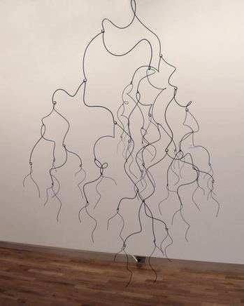
Her mobiles are a kind of calligraphic drawing, a lattice that flirts with its own shadow. Maybe because there's a mobile hanging over the heads of nearly every baby whose parents have the funds to provide one, the form is considered trifling. Campbell's have nerve, urban wit and slippery grace. Infants might love them, but what parent would allow one to inflect their view as they lie, helpless, in their cribs? Her version has a dangerous edge, like spiders descending in mass.
At James Harris Gallery with a suite of drawings through June 6. More on Campbell here.
Art likes to contradict itself. Both voluptuary and ascetic, it revels in the sense world yet honors rigor, leads you astray and points to higher ground. Its rules are made to be broken. Because those rules favor the young, unknown older artists who come on strong are particularly appreciated. Their example derails careerist thinking and restores a sense of possibility.
 Few artists came on stronger in Seattle than Mary Henry, who died yesterday at age 96. An abstract painter who produced tough geometric forms filled with bright yet sour tonalities, she lived her last decades on Whidbey Island.
In summer her garden was a sight to see, and she tended it largely by herself until recently.
 In a 2001 interview, she told me the place was all grass when she bought it.
I was only 60, so I was able to do a lot of digging. I put everything in, from trees and shrubs to flower beds. Someone helps me by mowing and trimming the shrubs. I don't do it all alone. I garden in the summer and paint in the winter. The rest of the year, it's a little of each.She left golden grass growing in silky clumps in her meadow. Everything else, she put there: water lilies on her pond; giant rhododendrons on gently rolling hills; beds of blue bonnets, fragrant lavender and pink, papery poppies; wine grapes on trellises; flowering plum and apple, and wild, yellow roses leaning out into the light from tops of trees.
Born in Sonoma, California, Henry worked as a muralist on the Federal Art Project during the Depression and studied with the Hungarian designer-photographer Laszlo Moholy-Nagy at the Institute of Design in Chicago. She married, had two children, stopped and started painting repeatedly, with little encouragement or notice.
It's a fairly normal curve for women artists, especially women of her generation, circumscribed by paternalistic dismissal and then clobbered, like everyone else, by the catastrophes of aging. But instead of fading into her seniority, Henry surfaced in her mid-70s with triumphant, joyful work.

It grew directly from her experience at Chicago's Institute, known as the New Bauhaus after the famous German institution that sought through abstraction to join the worlds of the spirit and the everyday. Her work derives from...
Santiago Sierra:
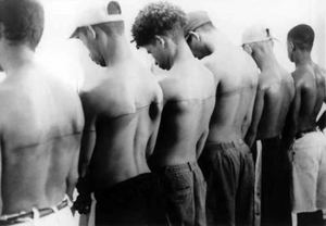
Zhang Huan:

Both artists engaged members of the hardcore unemployed in performances. But Zhang joined them, and Sierra did not. That's Zhang in the center on the pond, carrying a child. Had Sierra tattooed a line across his own back and made room for himself in the lineup, his work would resonate instead of grate. He wants to grate, however. Haughty is a big part of his package.
In response to this post, (my advice: ashes, ashes; all is ashes), graduate students in the University of Washington's department of museology responded. Go, you guys. More about this class experiment here.
Whitney Ford Terry:
I feel compelled to mention that an M.A in Museology isn't just a credential. I don't feel all together threatened by the current job market, in fact I think it has allowed for people to truly realize the importance of restructuring cultural institutions.
If you know what your doing, and you do it well, you'll find a good job. Though this may be idealistic - I really do believe it to be true.
Thanks for the advice but I think this one is f*cked.
K.C. Porter:
With museum jobs as scarce as truth and justice from the Bush administration, my advice is, do not go into debt getting a credential for a job that isn't there.
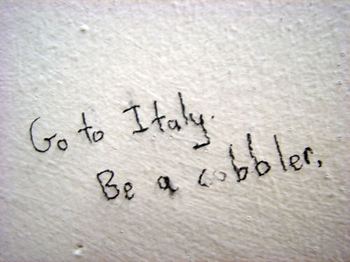 More general life advice is also welcome. All entries will comprise an exhibit at the University of Washington. Details here.
(Men around us #1 here.)
Zhang Huan: To Raise the Water Level in a Fishpond, 1997, performance, Beijing
I invited about forty participants, recent migrants to the city who had come to work in Beijing from other parts of China. They were construction workers, fishermen and labourers, all from the bottom of society. They stood around in the pond and then I walked in it. At first, they stood in a line in the middle to separate the pond into two parts. Then they all walked freely, until the point of the performance arrived, which was to raise the water level. Then they stood still. In the Chinese tradition, fish is the symbol of sex while water is the source of life. This work expresses, in fact, one kind of understanding and explanation of water. That the water in the pond was raised one metre higher is an action of no avail.

In old communist China, there was little freedom but there was work guaranteed, along with a rough version of a safety net for the compliant. In post-communist China, freedom is given or taken away on the whim of the state. Thanks to capitalist inroads, there is no safety net. It's a new world of totalitarian capitalism: all risk and few freedoms.
To Raise the Water Level in a Fishpond features the victims of the new economy. They are workers for whom there is no work. They raised not just the water level but the profile of all the left-over and displaced workers around the world.
As John Perreault wrote in another context, capitalism is global, but so is tuberculosis.
Zack Bent's father was a Boy Scout within the Buffalo Trace Council in southern Indiana. "The tradition of scouting was handed down to me by him. And like the true Buffalo Trace, which was a migratory buffalo path through Kentucky, Indiana, and Illinois that acted as road west for early Americans, scouting bears its trace in my life."Bent's photos and relic-like objects document the wry and absurdly tender process of himself, his pregnant wife (the artist Gala Bent) and two young sons diving into the scouting life.
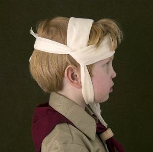
There are, however, children involved. What do they learn from scouting?
1. Homophobia. The organization is on the wrong side of history. If this were the only problem, I'd want its governing board to rot in hell, but there's more.
2. Anti-eco greed. Just before my newspaper folded last March, PI reporter Lewis Kamb documented that Boy Scouts higher ups across the country for decades have conducted high-impact logging on tens of thousands of acres of forestland, often for the love of a different kind of green: cash. (Three-part series here.)
3. War mongering. See yesterday's New York Times' story, Scouts Train to Fight Terrorists, and More. After reading it, art blogger James Wagner had the following, silver-lining thought:
Should we be grateful for one small favor? I mean, as homos we are fundamentally excluded from BSA membership, which normally means no participation in any of their fun and games or lovely overnights, so at least the Boy Scouts of America and their affiliate, the coeducational Explorers program, aren't teaching violence, militarism, xenophobia, racism and fascism to our own young people (or at least not to those boys and girls who dare to be out while teenagers). (More here.)Back to Bent. He won me over. I think he's seriously wrong on this issue, but it isn't his job to be right. The Boy Scouts are at the heart of his experience, which was in his case positive. Not only is he entitled to his memories, he's able to turn them into doors that invite even the most alienated to walk through.
On the other hand, the uniforms chill me.
 From ARTnews:
Often working with refugee organizations, Sierra created pieces that involved workers from the local underclass being paid to do meaningless tasks: support a piece of Sheetrock at a 65-degree angle for an entire day; sit inside a cardboard box; or push around two-ton blocks of concrete. By designing such deliberately pointless "jobs," he highlighted the disjunction between such workers and their work, showing labor as an imposed condition rather than a choice one makes. "The remunerated worker doesn't care if you tell him to clean the room or make it dirtier," Sierra remarks. "As long as you pay him, it's exactly the same. The relationship to work is based only upon money."Degrading work is based only on money. By offering only degrading work, Sierra epitomized the problem. His reputation soared, but it's doubtful his collaborators look back on their participation with pride.
What is exploitation? In the 1980s, many critics claimed that to photograph the homeless at all is to exploit them. Saner voices now prevail, but it's hard in such work to avoid the didactic or sentimental.
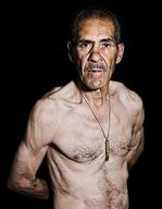
Jesse Burke scores a poignant success in Low at Platform Gallery. Burke paid a group of homeless men to come to his studio, take off their shirts and be photographed. (Click to enlarge.)
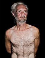 In the early 1980s, visiting a friend who'd moved to the lower East Side prior to its upgrade, I noticed watery blood stains in snow drifts. I asked if they documented fights from the previous night. No, said my friend. They mark places that the homeless relieve themselves.
I thought of that exchange when looking at Burke's photos. The men in them aren't pathetic or heart-warming or instructive. They do not go forth and teach all nations. Instead, they are simply and clearly a genuine measure of themselves. To June 20.
 Gathered together in Bleacher, they project a comic air of expectancy: Whatever is going to happen is going to be good.They are not troubled by their lack of forward momentum. Why travel when you're already there?
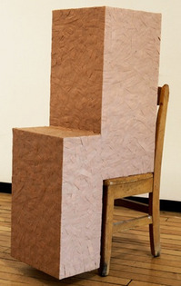
Band aide chair:
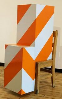
Barricade tape chair:
 Although it's an insufficient image, I love the cheap charm of his baby blue/girly pink foam core Frank Stella, on the wall below.
 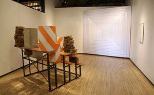 Robert Yoder's battered geometries from the 1990s....
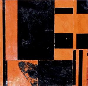
look positively regal next to Grussgott's.
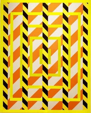
Although Yoder is almost always purely abstract, he has the weight to sound a serious depth. I'm not sure the same can be said of Grussgott.
I used the swastika as a literal symbol, immediately recognizable as a representation of hate. It's both in a vulnerable/boxed in position as well as at the center of the image. The intention was to simultaneously discuss the ways in which symbols are sensitized and how overtime, even a swastika can become a cliche.
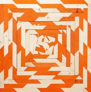
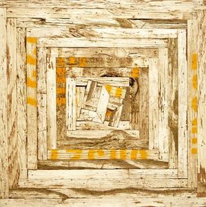
But swastikas are not cliches. John Updike once wrote that what interests Saul Bellow does not appear to interest his characters. There's a similar disconnect between what Grussgott wants to convey in his work and the work itself. As long as he stays away from ultimate evil, which swamps him, there are worse problems. In the end, who cares what the artist was thinking?
Grussgott continues at Grey Gallery through June 6. In the Seattle Times, Rachel Shimp sees the show as the artist wants it to be seen.
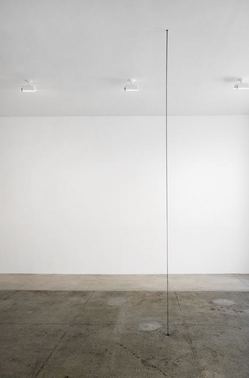
In 1987, Charles Ray found a more literal way to connect within the spacial void. Ink Line flows from the ceiling to a hole in the floor, refabricated for his current exhibit at Matthew Marks. (Ken Johnson review here.)
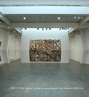
Alex Schweder connects through directions, which are, in the photo below, painted at the room's top and bottom.
What a waste. Jan Fabre's splendid company saves him from the didactic tedium of his text, but just barely.
I think he was going for something like this, Jean Lowe's Overstock! from 2009,
(Enamel on panel, 95 ½ x 84")
The fatal virus of consumerist capitalism kills its host.
 Instead, frantic overkill subverts his indictment of high fashion, Christianity, the id of appetite, the KKK, Abu Ghraib, racism and the wealthy. Fabre is a leftist blowhard who charms radiant performers into working for him.
 There are moments, however, when the text scores. Men with guns lounge on leather sofas and summon women with a snap of the fingers, who rush over to masturbate them.
"My museum is getting too small for all my Hindu Indians," says one man. "I need only two more Jews to complete my collection," says another.
Faber also succeeds in taking the erotic out of the sexual and the fun out of a joke. Orgy of Tolerance opens with four writhing under the pressure of their own hands, coached by four in paramilitary garb. The first 10 seconds were pretty funny, but Farbre skillfully turned the humor inside out to mock those in the audience foolish enough to laugh.
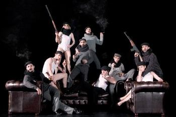 I love this company. They can do anything. Too bad they're doing this for one hour and 45 minutes. Anytime there was music (Dag Taelderman) and dance, the bad time I was having became a distant memory. The ballet with shopping carts was wonderful, and performer Goran Navojec sold every scene in which he appeared. He's the only hefty body on the lithe team, and the only one whose sex appeal could not be disguised. Even when he wandered in wearing nothing but diapers and smoking a cigar only to disappear again, he was the star.
I heard a woman behind me whisper to her companion, "Bring back the big guy." Amen.
An inspiring way to start the day can be found at FAIL Blog. It tracks those who fail big, fail fast and fail often.

What has always struck me about Wu's work is his tenderness for lost things. Below, The Ancient City of Jiaohe, from 2007, via.
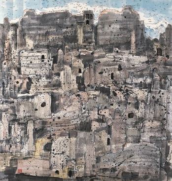 As a theme, it's universal.
Joseph Goldberg, Wall Ghosts, 1999
 Ansel Adams, St. Francis Church, 1929,
 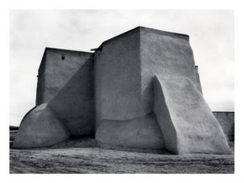 Georgia O'Keeffe, Ranchos Church No. 1, 1929
Jay Steensma, Landscape, 1991

Jeremy Mangan, The Little One, 2009
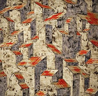
Buddy Bunting
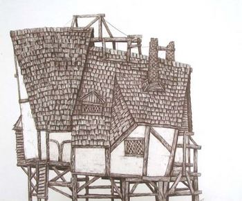
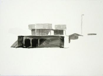 Whiting Tennis, Stranded Tudor, 2009
 Gary Faigin
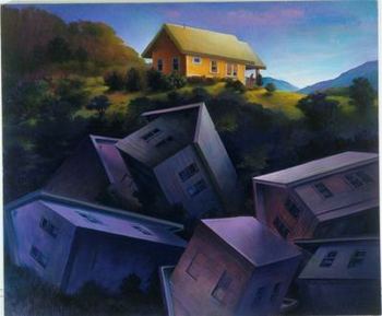
Jesse Paul Miller, Landscape, 2007
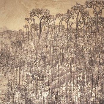
Two of my favorites could not be more different. Jonathan Janson's Essential Vermeer is a scholarly dissection of every aspect of the painter's work and the context in which he made it. Janson can truly say he has thought of everything. Peter O'Neil's Go Head On! The Art & Rock & Roll of Chuck Berry is O'Neil telling his life story through his reaction to Berry's work. In his own way, O'Neil too has thought of everything.
Disclosure: Peter's my brother-in-law. I remember trying to argue with him once that
One of his sisters emailed me a couple of days ago to say she didn't have time to read my blog anymore, because she's reading his. I guess she has a one blog limit. Those who have a one blog limit might consider joining her. I'll understand.
In other grating news, The Daily Mail reports famed artist David Hockney creates digital paintings on his iPhone and He also sells prints created on his computer in limited editions. If there were any interest in this project past the fact people are actually willing to pay for it, lifestyle, the display of Hockney's iPhone on an easel certainly destroys it. Surely the artist doesn't use the easel to make the work and the iPhone is not equivalent to a stretcher- its frame is invisible- so why display it as such? The iPhone as medium is a gimmick that needs to die a quick death.Couple of things wrong here. First, why should any medium be called upon to die? It's not the size of the boat, it's the motion in the ocean. Japanese school girls are writing text novels. I await the text novel masterpiece. Second, Hockney is Mr. Tech. He loves the mechanical means of reproduction and thinks old masters did too. Third, he's the ultimate in pure visuals. Like a drummer who can play with a symphony orchestra by banging away on tin cans, he can be Hockney in any form he chooses. Case by case basis, Ms. Johnson. Nor do I care that he put his little phone painting on an easel. So what.
C-Monster nails it: Abdel Abdessemed's roots in a bad 1980 movie. It's funny, of course, but doesn't matter at all in the art sense. He could get his inspiration from the drool on his grandfather's chin. What matters is where he took it. I haven't seen this show, but I'm mighty impressed with the photos.

 Peripheral Vision's take on Arts Writing and the New Thing:
Well worth reading. She quotes Doug McLennan:
I've recently come to feel that the new thing (whatever that is) won't have a chance until the old order is disposed of. Newspapers are sucking up all the oxygen in the room, and the startups won't have room to flourish until newspapers get out of the way.I think I agree in cities like Seattle, where the Seattle Times represents a grim version of the old order, but I don't agree at all if we're talking about the New York Times, LA Times and Boston Globe. Can't we all just get along?
As PV notes, it's an excellent time for anybody interested in reading about art.
Greg.org on Le Corbusier's Poeme electronique from 1956 is riveting. Watch the videos. It's probably the only futurist pavilion that delivered on the future.
I love Emily Pothast's tribute to Bea Arthur at Translinguistic Other.
In 2005, during my final quarter of the MFA program at the University of Washington, I spent hundreds of hours holed up in an apartment equipped with a TiVo and dozens of chisel-tip felt markers to cross out the entire Bible, leaving only the violent words. The resulting document is a concentrated study in psycho-spiritual trauma more closely resembling a censored Bush era CIA folio than a sacred religious text.To figure out how Bea Arthur fits in, click the link.
If you're in LA May 23 to June 13, check out 1000 Days, which Daily Serving helped organize at Scion Space. It includes, from Seattle, the dazzling Tivon Rice.
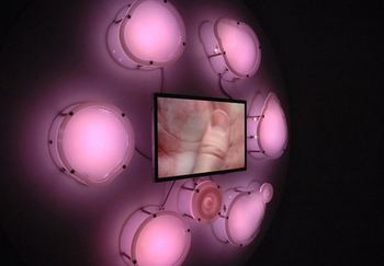
 MOG bought a truck to take a portable version of its selling point on the road. It debuts in front of the museum May 15, 6-8 p.m. and remains in the tow-away zone on Saturday. After that, it goes where it's wanted.
The museum's 2003 Antoine Predock building may be a peach, but the plaza is a pit.
TAM is unusually frank in its assessment of its plaza problem.
* There is undistinguished street visibility along Pacific AvenueThe budget is $3 million, entries due June 5. Discussion forum, or shell of a discussion forum, here. Outline of issues here.
* There is no protection on the plaza from the elements
* The building turns its back on the city
* Museum appears closed and monolithic from the outside
* Plaza feels empty
* Plaza appears like a drive-by space
* Plaza feels stark, cold
* Plaza contains no art work.
Why not let an artist do it? The artist can add landscape designers as needed. Be bold, Tacoma Art Museum. Pick an artist.
My preliminary recommendations, based on their past work and interests:
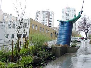
Buster Simpson: No one understands public space better, or engaging the audience.
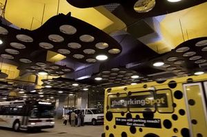
 Ries Niemi and Sheila Klein: Working together, they'll make sure nobody forgets this plaza ever again. Plus, Klein is all over the concept of glam parking lot, and Niemi can do the furniture.
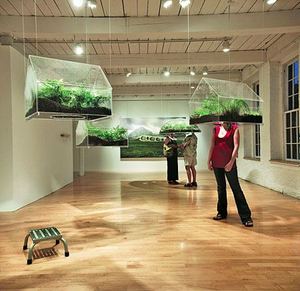
 Vaughn Bell: portable nature for a parking lot culture.
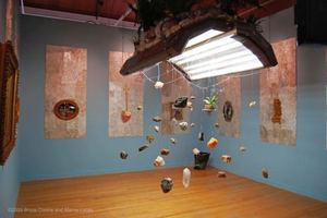
 Bruce Conkle and Marne Lucas: Lively up yourself with fantasy, Northwest edition of Eco-Baroque.
Peter Reiquam: The concept of a flying saucer was invented in Tacoma. Roots, baby, roots.
 Ann Gardner: Rain can be a plus. And she knows how to wrap a plaza in rhythm.
 I would love to see what Claudia Fitch came up with.
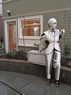 Ditto Linda Beaumont.
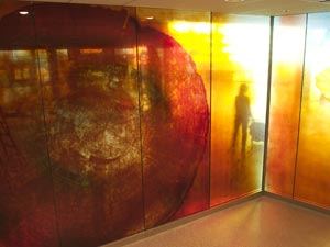
In the meantime, here's Couple from Hell #1 in the hopes there will be many, many more couples from hell to follow.
You walk out in the morning
and the sky is broad and blue
and across the pathway threads of silk
glint in the sun at the end of each a spider
still wet from the egg spins out a dragline
and sails off into the breeze
The air is so bright and busy
your whole body feels it
a puppet weightless on its wires
and you let it guide you down a path
you've never taken along the river
the little harbor at its mouth
where three blue boats are moored
at a dock cushioned with old tires
where the only sound is the deep bass
drumming of waves on wood
Here is a small café
opening for breakfast
a zinc counter catching the light
at every angle in bright rings of glitter
A cup of black coffee is placed before you
brimming with rainbow-colored foam
a packet of sugar a pat of butter
a split roll of bread
scored and toasted and still warm
The butter is just soft enough to spread
the coffee hot and sugared to perfect sweetness
the bread grilled to the palest brown
crisp but not quite dry
You tear it neatly into pieces
eat them slowly when you finish
you are exactly full
Here are bread butter and coffee
Here you are your own body
eating and drinking what you are given
as one day you in turn will be devoured
and that is all You were never the lord
of a lightless kingdom any more
than she has ever been its queen
and the world you talked each other into prison
suddenly seems to be made of glass
and your eyes see clear to the horizon
and you feel the molecules of air
part like a curtain as if to let you pass
 That golden shower signifies the life force. Myriad artists aspire to its quickening light.
 Lecia Dole-Recio
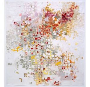 Leo Saul Berk
 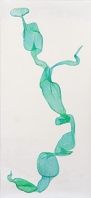 Blake Haygood, the tragedy of insufficient projection
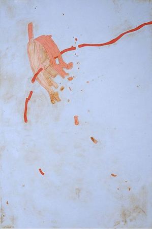
Mary Ann Peters, evoking Robert Sund: It's easy to see in the insect world/ How many pilgrims have fallen to their knees.
 Jaq Chartier (sex as electric avenue)
Jeffery Simmons, contact, egg and sperm
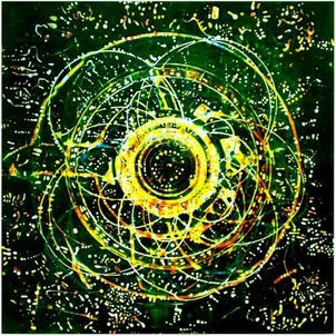
Jason Salavon, more contact

Gretchen Bennett (the man himself is the means of his trajectory)
 Victoria Haven
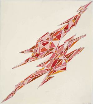
Michael Knutson (point of explosion)
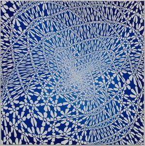
Darren Waterston (sky merging with earth)
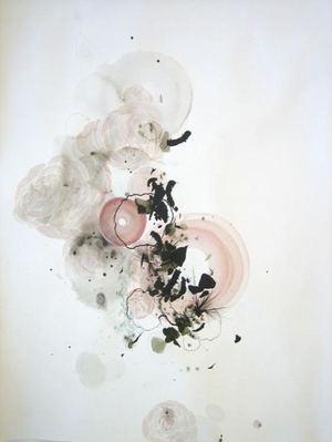
Bing Wright, Zeus after, because even for a god, there's a moment after.
When Cai Guo-Qiang's Inopportune Stage 1 opened at Mass MOCA in 2004, the nine Ford Tauruses were low to or on the ground in a corridor in semi-dark.

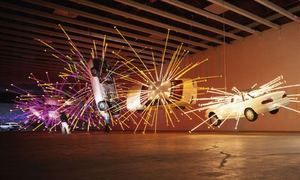 In Seattle three years later, Cai said through an interpreter that he was thinking about suicide bombers, about how terrorism takes place in the middle of an ordinary day, and how we go on afterward.
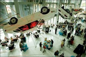
 Installed at the Seattle Art Museum, however, Cai's intentions were undone by daylight. Placement too. Inopportune One hangs high over the lobby in bright light. What read as an explosion at Mass MOCA became a swizzle-stick oddity at the Seattle Art Museum. The easily alarmed might worry about one of those cars falling on them in an earthquake, but who thinks of suicide bombers? The tale does not relate. (Photo, Paul Brown, Seattle PI)
 At the Guggenheim (smaller cars), the piece is different again, somewhere between a giant male charm bracelet, a vertical Nascar run and an illuminated Chinese scroll painting come to three-dimensional life.
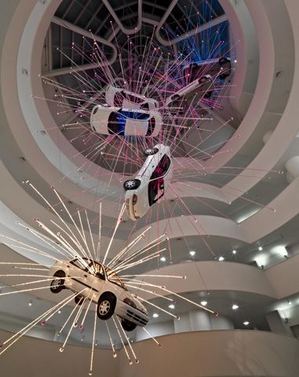 In the dark, Inopportune carries the dark; in the light, it becomes artifice - like Oz, its tricks exposed.
 And that's where Cai lives, in the shifting ground of the metaphors he evokes. As the first falls away, other, more ambiguous ones take its place. Instead of determining the impact of this piece, context reveal another kind of impact latent in the work all along. Shutter the windows and turn out the lights in SAM's lobby, and something close to Cai's first thought will spring back into view.
 Call it kidding on the square.
You haveHere's the romantic part.54 days left to walk into a grocery store, construct a sculpture from the store's inventory and email an image to: info@vital5productions.com. All entries will be exhibited this summer at the Bumbershoot Festival in Seattle, and one random applicant will be awarded $500.00 USD.
This grant is open to all people in all countries of all ages and backgrounds. The winner will be announced on May 30th along with the outline for our next Arbitrary Art Grant in Writing. For more information, visit: www.vital5productions.com/currentevents Brought to you by Artists for a Work Free America and Vital 5 Productions.
We believe that no institution or individual holds the capacity to objectively judge who should, and who should not receive money to create art. We are all painters and writers, musicians and performers, and that through social conditioning we have been stripped of our natural desire to create and perform, and programmed to believe that art is for the gifted and privileged. If indeed all people are artists, and that the inherent nature of art is subjective; the current institutions disbursing public art grants are negative and isolating to the general art populous.
Back to this Arbitrary Art Grant, the latest in a string,
Finally, from Jen Graves' excellent profile of Seattle dealer Scott Lawrimore (Lawrimore Project), an anecdote from his early days as gallery assistant:
When he was working for Seattle galleries, he instituted a program: the $150 studio visit. He'd go to artists' studios but often would be unable to show their work for one reason or another, so he'd give them $150 in exchange for whatever they thought that was worth. "I always wanted them to, like, spit in a napkin and give it to me," he said wistfully. "But they never did."
Each of these series has involved various random selection techniques to isolate a rectangle of the Earth's surface. In the case of the World Series, 1000 random selections were made from a giant map of the world by blindfolded visitors to the exhibition at London's ICA in 1969. The random selection serves several purposes: nothing is excluded as a potential subject; the particular is chosen as a representative of the whole & it reduces their subjective role as artists & creators to that of "presenters". To present a slice of reality as objectively & truthfully as possible. They call this "motiveless appraisal". Once the random selection has been made, they recreate the site in a fixed and permanent form as a painted fibreglass relief.Mark Boyle died in 2005, but Hills and their two children, Sebastian and Georgia, continue as Boyle Family.
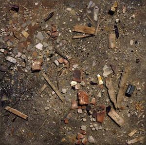
I can't find a review of Tavares Strachan's Portal from Where We Are Is Always Miles Away that mentioned the Boyles, even though Strachan is singing a nonrandom version of their song. From Roberta Smith's review, you'd think Strachan was the first to pick up a piece of the earth and replicate it, pound for pound, in Strachan's case, the place where he got a parking ticket.
And here we go again, Karen Rosenberg on Strachan in the NYT on Sunday, no tip of the hat to Boyle Family. Milan Kundera called history a thin thread of remembering stretched over an ocean of forgetting. It is the job of everyone who writes about art to strengthen that thread.
Nothing against Strachan. I think he's terrific.
Ryan Mrozowski, suggested by BeFruitful&Multiply:
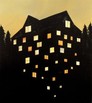
Kevin Schmidt, suggested by dvnms
 Lauren Grossman, Not Consumed, suggested by Billy Howard. (I should have thought of this one, since I reviewed the dang show.)
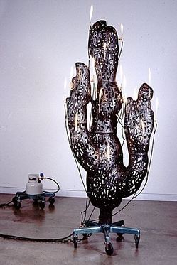 Ana Mendieta, suggested by Sharon Arnold
 James Lavadour, suggested by Harold Hollingsworth
 Charles Linder , suggested by IMALEADER
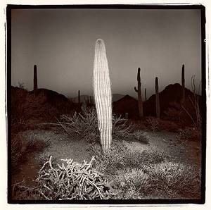
 Richard Misrach
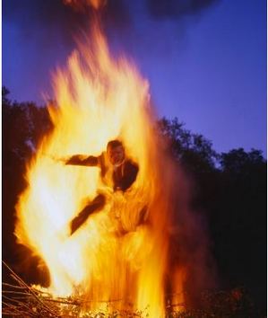
  Charles LaBelle
 Kerry Skarbakka
 Cai Guo-Qiang
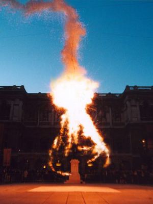 Cai again
Harrell Fletcher: consuming fire as relational aesthetics
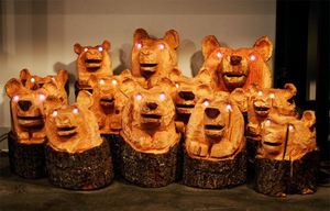
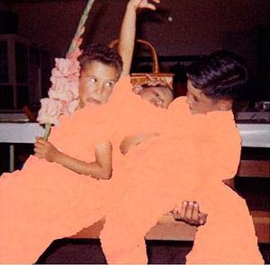 Claude Zervas: His bears prevent forest fires by eating them
 Alice Wheeler: motel sign as burning bush
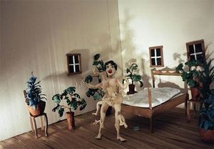
Monika Baer, suggested by BeFruitful&Multiply
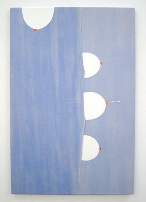 Kaucyila Brooke, Tit for Twat
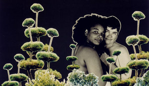
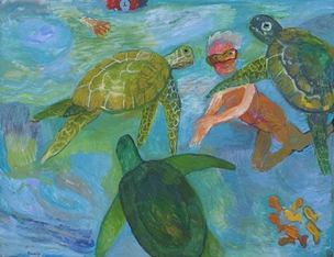
Elizabeth Sandvig, Swimming with Giant Green Turtles
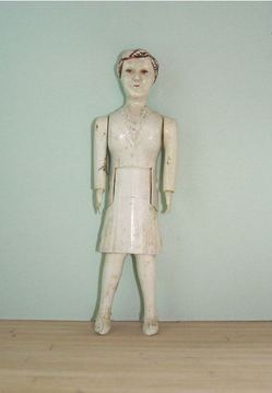
 Bob Zoell, Dead Mom Standing
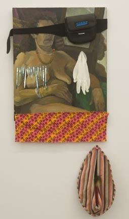
 Michael Mahalchick, Don't Look at Me
Charles Ray, Family Romance
THE STORY
AS A NEWCOMER TO THE CITY, I WANTED TO INTRODUCE MYSELF TO ONE OF MY FAVORITE NY ART GALLERIES, Gavin Brown Enterprises.
I APPROPRIATED A DISCARDED DOMINO BOARD FROM THE SIDEWALK IN HARLEM. I TITLED THIS OBJECT, (the life and times of) HARLEM 1910 - 2010, AND SIGNED THE BACK WITH MY NAME.
I HAD A PROFESSIONAL CRATE MADE FOR THE PIECE. I DESIGNED LABELS FOR A FAKE COURIER COMPANY AND DELIVERED THE PACKAGE TO GAVIN BROWN FROM ANOTHER MANHATTAN GALLERY OWNER NAMED PAULA.
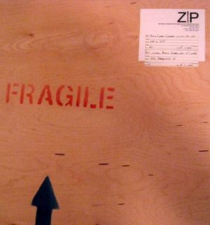
INSIDE THE CRATE WAS A LETTER FROM PAULA'S EXECUTIVE ASSISTANT:
GAVIN, PAULA WANTED TO SEND THIS OVER AS PER YOUR CONVERSATION AWHILE BACK. WE LIKE THIS PIECE AND PAULA THOUGHT IT WOULD FIT NEATLY WITH THE LINEUP FOR THE GROUP SHOW. IT MIGHT BE A BIT OUT OF LEFT FIELD, SO IF THIS WON'T WORK, JUST LET US KNOW. REGARDS, ONA
A GALLERY WORKER NAMED SCOTT SIGNED FOR THE PACKAGE AND ASKED IF I WANTED SOME WATER (AS I HAD JUST CARRIED THE CRATE ACROSS MANHATTAN SO) APPARENTLY I LOOKED THIRSTY. BUT I DECLINED AND LEFT.
SINCE THE DELIVERY A FEW FRIENDS HAVE CONTACTED THE GALLERY INQUIRING ABOUT PURCHASING THE PIECE. THEIR CALLS HAVE NOT BEEN RETURNED. CURRENTLY, THE WHEREABOUTS OF THIS ART PIECE ARE UNKNOWN.
My disgust with art critics has been cleansed in what I can only describe as the waste water treatment plant of an elevated artistic practice.
I don't want to offend the easily offended, but it looks to me like he's wasting the waste water. Maybe he could incorporate something like this:

On the other hand, go guy go. Name an accident, and it's yours. The critic quoted in this interview, New York's Jerry Kimmelman, does not exist, which suggests the artist might not exist either. I like him anyhow. Who says an artist has to be real to do real work?
(From 39 Forks)
 I wonder where that leaves Erwin Wurm?
Placing his own plainly anachronistic oil paintings in this environment must have given Waterston pause. For years, his paintings have evoked something of the strange unease that comes of recognizing oneself as a conscious organism. The setting of Splendid Grief heightens the paintings' reminiscence of the Victorian vogue for seances and belief in the individual's spirit as "ectoplasm" that might extrude itself from the body and even survive it.
Helen Lessick's first Texas exhibition consists mostly of barely altered mass-produced objects -- metal buckets with holes drilled in them, a couple of words embossed on a mirror, store-bought fans with ribbons attached. The alterations seemed designed to bring poetry out of the objects with as gentle a nudge as possible.
 Speaking of Texas, here's a review plucked not at random from the essential arts catalog known as Glasstire: Ben Judson's Six Years Later at Unit B.
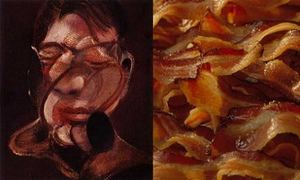
The focus on objects and materials that are generally not valued for their aesthetic qualities allows Lapthisophon to draw viewers into a relationship with the poetry of the everyday, but also to consider the impact of conceptual art and criticism on mainstream aesthetics. The page from Six Years simultaneously serves as an echo of the title of the show, a kind of wall text and a chunk of raw material like the bricks and lumber.Also from Glasstire, I'm excessively fond of Roy Neinast's comparison of Francis Bacon's painting with, well, bacon.
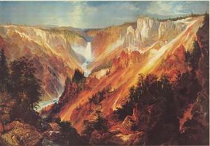
While on the subject of food, I've always thought Thomas Moran's mountains looked like slabs of well-marbled beef.
In the New York Times: Holland Cotter calls William Powhida awesome, and Roberta Smith had this to say about Sophie Calle's conceptually-rigorous unpacking of her latest in failed romance (both reviews here):
Sophie Calle's "Take Care of Yourself" is an operatic monument to late Conceptualism, a full-throated demonstration of its means and effects. It mixes multiple mediums: photography, video, film, performance, music, dance and, above all, language, spoken, written, sung, delivered in a range of voices, styles and fonts. It combines appropriation, collaboration, randomness within a strict framework, quite a bit of real life, several forms of theory (including feminist) and no small amount of narcissism.I wonder who's foolish enough to date Ms. Calle. Don't they know when the end comes she'll reveal all (and I mean all) in installations that will receive world-wide notice?
What she did to ex-husband Greg Shepard here. I met him once, have no friends in common yet know him to be a lying, cheating self-mutilator. For the opening of the exhibit that exposed these traits, he was at her side and shaking hands with her fans. I tried not to look for bite marks.
In The Stranger: Jen Graves takes a look at a public art failure and promises a series on the theme.
What's the latest art movement in Seattle? Public art. What? Yes. Seriously. For the last few decades, public art has been mostly thought of as a haven for losers, the place where artists go to die (or to hide). It's not just that good public art has been the exception, it's that good artists, with few exceptions, have avoided public art, preferring the freedom of their studios to the compromises of government work. But now, Seattle's established and reputable studio artists--Dan Webb, Cris Bruch, SuttonBeresCuller, Lead Pencil Studio, Susie Lee, Kristen Ramirez, Leo Berk, et al.--are signing up in droves to make major public installations. Will public art kill this new generation of artists? Or can these artists save public art?My piece on the event that motivated her response here. More to come from both of us. As a first rattle out of the box, I'll say her denunciation of public artists who haven't made her exceedingly small A team is excessive. But if that's what it takes to stir the pot, then I'm for it.
Damn braces: Bless relaxesWilliam Blake, The Marriage of Heaven and Hell
In life, corpulence signifies consumption of poverty junk food, poor choices, inertia and/or genetic predisposition. In art, it's an opportunity. Figures who earn the space they consume are heroes.
Art began with fat people. The Venus of Willendorf was carved in limestone at least 24,000 years ago. Among painters, Rubens stands out, which is where the complimentary adjective, Rubenesque, came from, although it doesn't apply to his men. His fat women are voluptuous, while their fat male companions are dim or funny in a Falstaffian vein, except for his gravely dignified Bacchus. Lucien Freud also paints girth in both men and women; Jenny Saville, women only, and Catherine Opie, photographing herself.
Where are we now?
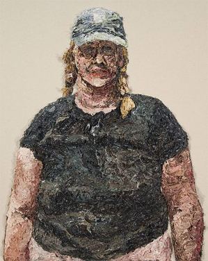
Mark Takamichi Miller paints from discarded or lost photos - prints never picked up from the drug store or undeveloped rolls he finds by accident. I love his blond woman in a baseball cap from 2003. She averts her eyes, as if the process of being in the frame is barely endurable, but she wears lipstick and sports a floral necklace in the grizzled folds of her neck.
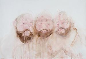
 Brian Murphy has made a career of painting himself as a massive volume with no weight. His image in watercolors is large and leaky, the brown of his beard underlining the sand-pink cloud of his face. He's a tempest of his own making, creating weather states as self-portraits. Because you can see through them, they're apparitional, an insubstantial pageant ready to melt into colored air.
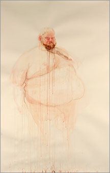 Using watercolor and graphite, Geoffrey Chadsey is all about attitude. His work is delicate but packs a punch.
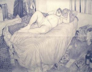 John Feodorov 's fat people live in their heads; in dreams they avoid responsibility.
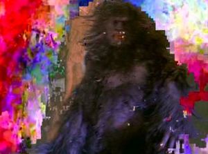
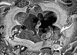
 To paraphrase Carl Dennis: Chewed by his appetites, he chews his prey. (1) Takeshi Murata (2) Jim Woodring
 Also, Donnabelle Casis, free-floating fat in oil paint, here.
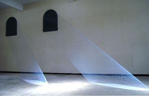 the piece reminded a lot of people of Mariele Neudecker's The Internal Slipping Out of the World at Large from 2000.
 Much talk ensued, with little in the way of conclusion. Since then, other examples of the form have continued to circulate, suggesting that Lead Pencil cannot borrow what is already widely distributed.
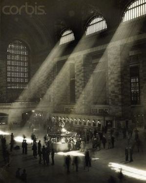
(Grand Central Station, anonymous, probably from the 1950s, from Corbis)
Lygia Pape:
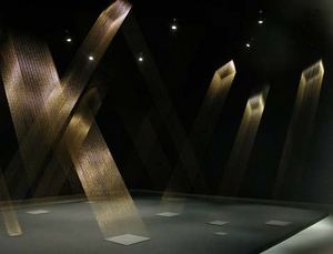 Simon Aldridge:
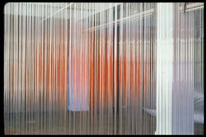
 Hirschfield:
I have been using monofilaments to investigate the phenomenon that results from the creation of ephemeral planes that pass through, divide, and ultimately become an integral aspect of the space in which they exist.He's interested in changing space without occupying it, or, as Wallace Stevens put it in Thirteen Ways of Looking at a Blackbird:
I do not know which to prefer,Fred Sandback is the master of ephemeral planes.
The beauty of inflections
Or the beauty of innuendoes,
The blackbird whistling
Or just after.
 Since his death, Alyson Shotz has been coming up fast on the inside rail.
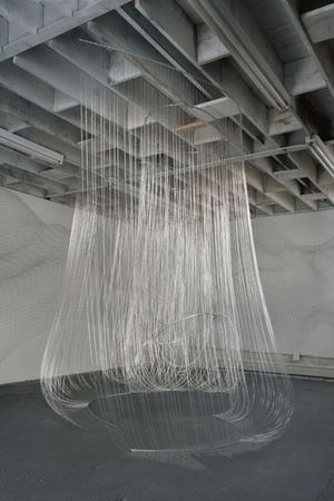
Painters have a stake here too.
Kate Shepherd:
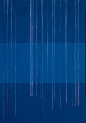
Margie Livingston
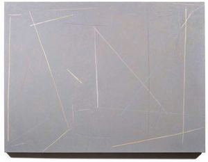
What Wayne Thiebaud said years ago, that art is more about likeness than difference, still holds true and is worth remembering the next time a confluence is understood to be a copy.
(Shared Web site here. All images here are Heidi's. Click to enlarge.)
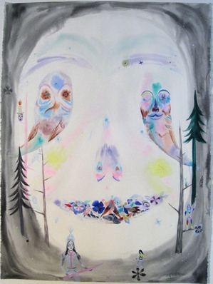
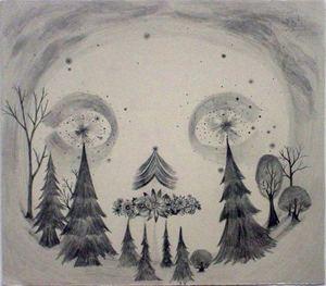 Just by looking at the Web site, which isn't enough evidence, I think Seattle got the better deal. While Erika's drawing is heavy and awkward, Heidi's is confectionery light. Since they're both dealing with the mystical end of other-worldly ventures, light is right.There's a lot of folk fantasia around, but Heidi's has every sign of the genuine.
 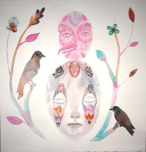 She opens in Seattle Friday night at 7 at Cairo.
Jasper Johns via Betsey Brock
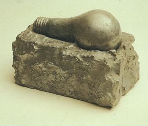 Joseph Beuys, via Judith Tannerbaum
Bernardi Roig
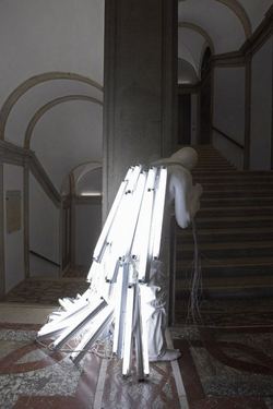 Felix Gonzales-Torres
 Haegue Yang
 Atsuko Tanaka, Electric Dress, via Martin
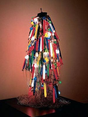 The Art Guys, Travel Light
 SuttonBeresCuller, Homesick
 Christian Boltanski (via Claude Zervas)
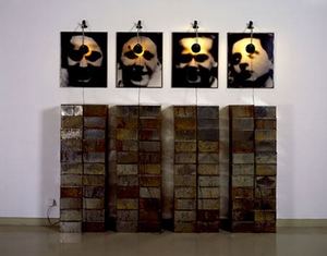 Claude Zervas
Tivon Rice, Resolution
 Dan Corson
 Brian Jungen, via BeFruitful&Multiply
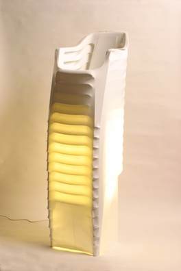
Tiffany Holmes, darkSky
 Ted Apel, via TJ Norris
 Roger Hirons (dipped in semen)
 Michel Delacroix
 ANABA, via Martin
 Tavares Strachan, Cloud Chamber
 Strachan, Cloud Chamber, detail
 Christina Seely, Metropolis 40°25'N 3°41'W (Madrid)
 Valay Shende
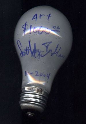
 Scott Wayne Indiana
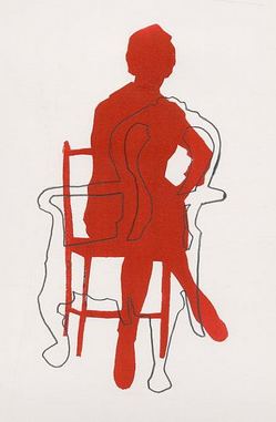
Dawn Cerny
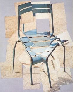
 David Hockney
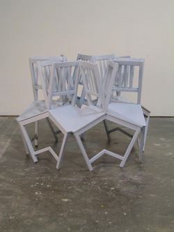
 Drew Daley
Pat DeCaro
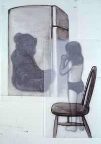 Harriet Saunderson
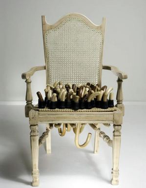 Sean M. Johnson
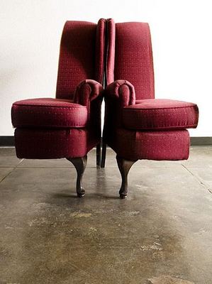 Urs Fischer
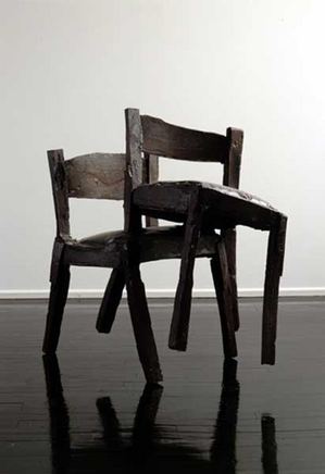
Roy McMakin

All the classics, from Duchamp and Beuys to Bruce Nauman, at DesignBoom.
Diem Chau carves crayons.
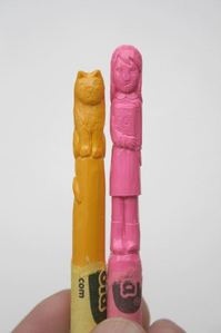 But that's not all.
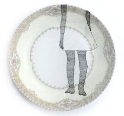
Her blog here. Her Web site.
Saya Moriyasu brings Elie Nadelman-style high romance to pocket-sized figures.
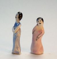 Moriyasu's gallery here.
Marita Dingus makes her small people from whatever is at hand.
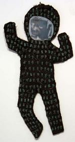
Dingus' gallery here. Her Web site here.
Perreault:
The NuMu "The Generational" has an attention-getting but foolish extended title: "Younger Than Jesus", which seems to mean that all the 50 artists from 25 different countries are younger than The Christ when He was crucified. I find this truly offensive. And I am not even a Christian.
Will future titles be equally insulting? How about: More Boring Than the Buddha; Bossier Than Moses; Louder Than Luther; Madder Than Mohammad; More Baffling Than Madame Blavatsky?
...
Well, yes, art is indeed global. But so is late capitalism and so is tuberculosis. In spite of transnational trends like the Renaissance, the Baroque, the Enlightenment, and then Modernism, it was once thought nations were little, much cherished pockets of stylistic development, language tics, and even aesthetic surprise. Not so anymore.
...
The official Artopia doctrine is that art has been done in by a fatal disconnect from poetry and from the metaphysical. Whatever art was, it is being continued somewhere else.In a similar vein, Edward Winkleman capers through aesthetic theory, here.
OK, so clearly I have no idea what I'm talking about (and yet, amazingly, that doesn't slow me down one bit, does it?)
There are artists, good artists, who have no idea what anyone in Artforum thinks or what's on view in any particular museum or gallery. They are so outside the system of having a gallery or being included in a museum that years go by without them giving it much thought, and yet, day after day, they're still working.
Because at its root art is so frequently about the interplay of ideas arising from a particular time and place, being cut off from other artists as well as curators, dealers and critics is not usually a good thing. For some people, however, it's necessary. Talk can be depressing noise, and other people's voices can drain the life from an inspiration that arises from materials at hand.
Nole Giulini is not naive by any stretch, nor is she uninformed or entirely unknown. Her banana peels sewn into a species of Persian slipper were included in an exhibit at the New Museum in 1996. Her dessicated Mickey Mouse is in the Surrealist Impulse at the Tacoma Art Museum, which is what made me think of her again.
It's a stopper, that little mouse, made of dried fungal membranes joined by coarse thread.
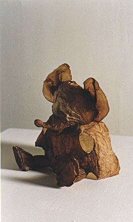 Some of her sock puppets bring to mind Louise Bourgeois' wool figures, heavy with absurdly sexual implications.
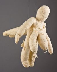 Her fungal puppets might have marched straight out of a William Kentridge video. Brought into their own universe and seen in their own company, however, both wool and fungal objects remind viewers of no other.
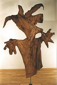 Giulini needs what she doesn't have - a solo show in a respected and well-attended space. Instead, every couple of years, a single piece pops up. Take Unititled (wedding dress) from 1994 constructed entirely of used underwear, which I saw half a dozen years ago in Seattle.
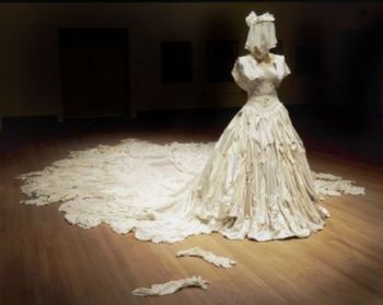 A girdle stretches across the shoulders with old
lace at the waist. The skirt features a massive Jockey train, each garment
signaling a long lifeline. Get married in this dress, and you're up front about your back story, which trails behind you, sporting intractable stains.
A girdle stretches across the shoulders with old
lace at the waist. The skirt features a massive Jockey train, each garment
signaling a long lifeline. Get married in this dress, and you're up front about your back story, which trails behind you, sporting intractable stains.Out, out, damn spot! This dress says don't bother.
This dress says, virginal white is either a fantasy or the person wearing it is too young to make the commitment. Getting married means dressing up, but being married means picking up somebody else's underwear.
Be mine.
The box with clear glass sides contains rabbit droppings, each wrapped in 22 K gold, Untitled from 1991. A curator or the right kind of dealer could put it together. Do artists have to make the scene to make anything happen for them, even in a regional context? When does the work speak for itself?
Giulini made a fascinating video on her process. According to YouTube, it's been viewed 12 times. People farting get more viewers in an hour.
 Very nice indeed. It reminds me of Crazy Jane's final, trump-card words to the bishop:
A woman can be proud and stiff
When on love intent;
But Love has pitched his mansion in
The place of excrement;
For nothing can be sole or whole
That has not been rent.
And as an addition to this post (Art at the end of the road: your life span - time's up), David Maisel suggested this image from his series, Library of Dust:
A few days before he died, Oscar Wilde said:
My wallpaper and I are fighting a duel to the death. One or other of us has to go.The wallpaper won.
Kelly Mark is interested in wallpaper -
 - and I am interested in Kelly Mark. Sexual identity conclusions? Fortunately for the unruly and revitalizing complexity of art and life, there aren't any. Yet we know gay art when we see it.
 Jeffry Mitchell: Good Council and Good Council (on cracked ice). Click to enlarge.

As gay American founding father poet Walt Whitman put it long ago,
Do I contradict myself? Very well then I contradict myself, (I am large, I contain multitudes.)
About his print, Don Jose from Nezahualcoyotl, Mexico, shot in 2003, Ruiz wrote:
This is a dump lord. He was very proud that everything in his office had been found in the dump: the television (which worked), the painting of the Mexican revolutionary Zapata, the desk, the rug, the trophy, everything. The plastic wall covering was kept in place with bottle tops nailed to the wall.

 Miller makes something rare of bondage, something personal instead of stage-struck, such as the print below, of someone living in his head.
Miller also tackles science, such as his Proof of Homosexuality in Nature.

Wesley Wehr. Neah Bay, 1971. 2.4 x 3.5 inches. Palm-sized moody romance.
 Jason D'Aquino. Pencil on matchbooks and paint on ice cream sticks
Rachel Maxi. You could carry an exhibit of her oils in your pocket.
The drowsing, recently demised and sexually aroused are still with us, predictably horizontal.
Gloria DeArcangelis
 Rob Putman
  Akio Takamori
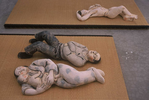 Jeff Koons
 But multiple meanings have severed standard expectations.
Gilles Barbier: Sagging skin at rest serves as a corrupt and temporary medium for a message.
 Oliver Herring: His Oliver is a three-dimensional collage of cup-up photos, possibly a little too tricky for its own good.
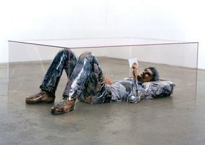
Ann Mathern: How to represent a bird of prey.
 Rafael Sanchez: Roberta Smith wrote that he "modestly but tellingly coaxes something magical out of almost nothing."
 Susan Robb: From memories of a gang rape on a pool table to microbial colonies of new life, this image has it all.
 Jim Shaw: Still crazy after all these years. Dream Object (vomiting bum)
 Fred Muram: If he invites you to stretch out on his couch, say no.
 Eleanor Pachaud told the sorry tale of good art coming to a bad end in Washington State's capital, here. (Detail of artwork on the left.)
 In brief, the city council rejected Dan Webb's proposal because that august body found it to be "too ugly." (Good Seattle Times' story here, including interview with the artist.)
What happened? Only Olympian reporter Matt Batcheldor tried to track it, here.
The selection process for the City Hall artwork goes back at least to May, when a citizens advisory group discussed the subject. A jury was empaneled in October and later recommended the artwork. The Olympia Arts Commission, a volunteer citizen advisory group, unanimously recommended approving Webb's proposal.In other words, boilerplate public art process. But because Olympia a tiny town with tender, ignorant feelings, boilerplate is not enough.
An Olympian editorial fully supported saying no to Webb.
Olympia has had numerous successful public art projects. Who doesn't like the kissing statue at Percival Landing or the orca or motherhood statue on the boardwalk? Who could possibly criticize the stunning otter family sculpture by Tony Angell in the Olympia Library? And the artwork on the new Fourth Avenue bridge is simply outstanding. The benches in downtown Olympia are artistic expressions and some might consider the Heritage Park fountain interactive art.Whoever wrote the above is an excellent candidate for art reeducation camp. Yes to bronze orcas and otters, no to Webb? What was missing in Olympia's failed process is an art advocate. Most of the 160 people who objected to Webb were angry about the $180,000 price tag, not his work.
The point is, Olympia has gotten it right in a long list of public art projects. It's unfortunate, then, that the city stumbled so badly on the selection of artwork for the new City Hall. The proposed bronze bubbles by Seattle artist Dan Webb were a complete bust.
Whose job was it to sell the One Percent for Arts concept in Olympia? Whose job was it to take Webb's model to schools, community centers, retirement homes and shopping centers? Who understood Webb's work well enough to sell its ideas and material form? If Olympia isn't going to provide that person, it needs to stop thinking it can commission substantial contemporary art. Go for a 3-D Hallmark card and call it a day.
Webb's work sells itself to a broad, undifferentiated audience, but only over time, which it didn't get.
The city government now joins the state in disgraceful treatment of artists. Remember the Olympia Mural 3: Michael Spafford, Alden Mason and Jacob Lawrence.
Webb on why he loves public art, here.
Oh, that this too too solid flesh would meltHamlet
Had Hamlet lived longer, he'd have seen his flesh melt, like pudding under crust, then dust.
Erick Swenson
Dan Webb
Ida Applebroog
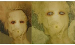 Nayland Blake
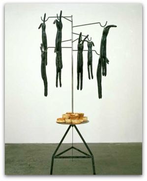
Claude Zervas
 Pam Keeley
Laura Fritz
(Image, New York Times, click to enlarge.)
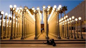
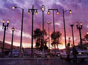 Burden employed lampposts dating from the 1920s and 1930s; Klein has 25 that sample changing styles of street furniture, beginning in 1925.
With his bigger budget and better placement come bigger impact. Fleshing out an idea developed by another artist is fine, but there's something troubling about a famous artist getting big attention for a concept a less celebrated artist brought to fruition in the same city 16 years earlier.
New York Times' story about Burden's piece here.
What I planned to do, besides eat, was listen. Conkle represents a fascinating edge of Northwest landscape art, known in Portland as eco-absurd. He's an oddball blend of fairy tales and facts on file, and his work is more celebration than dirge.

Back to the lunch that never was: Somehow it showed up on my electronic calendar as a date for the eight, not the first.
In honor of this missed date, bought a calendar that I'll be carrying in purse or pocket. The right date was on Conkle's email. By double checking both electronic and paper, I might have a better chance of being in the right place at the right time.
Apologies to Mr. Conkle.
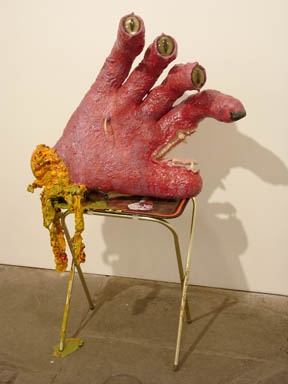
Mario Naves gets it right in the New York Observer, link via Two Coats of Paint.
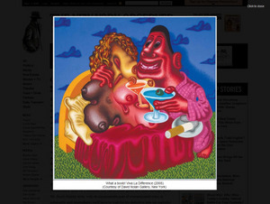
Pictures Generation builds on the base of Crimp's Pictures exhibition at Artists Space in 1977. Crimp is good at theory, not necessarily on how it plays out in the work of individual artists. Also, with 30 years of hindsight, Met curator Douglas Ecklund is in a better position to judge who belongs in this media-saturated group.
My problem isn't who's in and out, it's how they're out. Philip Smith is the only artist in Crimp's show who isn't in the Met's. (In Crimp's own reevaluation of his exhibit in a 1979 issue of October, he played down Smith and added Cindy Sherman.)
Fair enough. Smith doesn't fit. The glue of their ideas does not adhere to him.
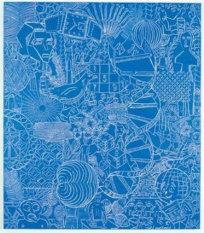
But curator Ecklund goes out of his way to tell both Culture Grrl and Jess Wilcox (excellent Art in America interview here), that Smith's work just doesn't cut it aesthetically.
Crimp speculated to CG that Smith's omission might be because he's gay.
Culture Grrl: What do you make of Philip Smith's absence from the Met's show?Well played, Mr. Crimp. You stuck it to the establishment without defending Smith at all. It's the perfect expression of your porcupine position.
Crimp: He was not so much of the group, of the social world, of the people who formulated this. He's gay and this [the Met's show] is a very straight configuration of artists. I don't know what's happened to him, career-wise. It's a slightly touchy subject: I think Philip is upset, reasonably.
I haven't seen Smith's work in a number of years, but I remember it well. I'll take him over at least half of the artists in this show. Within the arena in which he chooses to act, his dense yet fluid congestion of signs and symbols continues to ripple out, influencing others.
A 1996 review in Art in America by Lily Wei zeroed in on their specific qualities:
The seeming spontaneity of the drawing is balanced by the deliberate richness of the meticulously worked grounds. These elegant surfaces, marked out in broad bands or grids of mustard yellows, lucid gray-greens, sea and sky blues, along with black and white, are toned down from Smith's works of a few years ago, when figure and ground competed fiercely for attention. The appeal of these paintings is a perverse one. They can stymie or enchant, according to the viewer's sympathies.
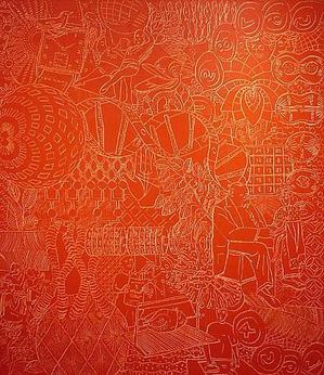
So did Michael Kimmelman in a 1992 NYT review:
It is understandable that Philip Smith's paintings did not stand out at last year's Whitney Biennial. They're quiet works that do not try to compete for attention. The considerable pleasure of them comes from the painstakingly constructed oil and wax surfaces into which are incised myriad images, like hieroglyphs. Mr. Smith builds layer upon layer, first painting abstractions on linen and then covering them up, often with subtle stripes of color, and on top of these laying down the final soft surface. The incisions reveal the painting underneath, so that the result is a multiple image of swirls of color beneath geometric designs beneath loopy drawn pictographs of matchbooks, corncobs, skyscrapers, grapefruits, clocks, fingerprints, African carvings and much else. Mr. Smith's inspiration seems to have come from many directions, from Brice Marden and Mark Tobey and Jackson Pollock and also from Egyptian art and even from the graffiti carved in antique monuments. But there's a combination of slowness in his surfaces and patterns, and speed in the rush of cacophonous imagery, that is distinctive to him.
I hope Ecklund's haughty attitude comes back to bite him. Below are a few of artists in Smith's debt.
Sue Williams:
Ellen Gallagher:
Brad Kahlhmer:

Fan owes to a lot to William Eggleston but isn't a repeat of him. Her print has its own smeared and unraveled grace.
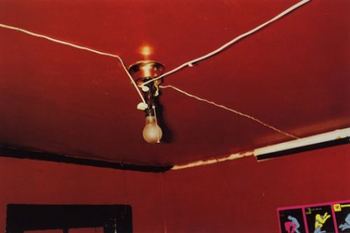


Laura Splan embroiders the structure of viruses into doilies. Below are AIDS, Herpes and SARS. If silence equals death, what does decorating equal?

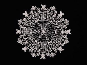
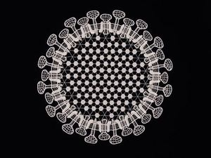
 She likens her process to someone trying to paint over a water stain on a basement door. The stain tends to bleed through.
Exposing her painted panels to direct sunlight influences the chemistry of the color changes, causing some colors to blur. Occasionally she'll cover portions of a painting with tape. The colors that are sun-exposed bleed, while those shaded tend to retain clearer contours, causing the clear and the fuzzy to collide.
 Computer love: If machines develop the consciousness to make art, they'll undoubtedly want to hitch their search engines to Chartier's star. Her dots in a stacked Q-Tip pattern and her blurred holes burning like distant stars appear to be glorified fragments of computer code, instead of what they are, abstractions in a serial mode.
Her current exhibit at Platform Gallery finds her in game mode, where she finds common ground with grid-based computer graphics of match-3 games, whatever they are.
Competitive gaming is always a test, and that's the real link between painter and the joy stick crowd. Each painting is an experiment that she engages on its own terms, subjecting her original patterns to chance decay but giving them the chance to assert themselves. Assert themselves they do. Her vertical grids are what you might see if a heart monitor were hooked up to the universe.
Ultimately, what she explores is not science or fragments of genetic code. It's an update of something as old as art itself, a new version of Dust Thou Art. Her coils are mortal, yet they flare brightly before their promised ends.
About
Blogroll
AJ Blogs
AJBlogCentral | rssculture
Terry Teachout on the arts in New York City
Andrew Taylor on the business of arts & culture
rock culture approximately
Laura Collins-Hughes on arts, culture and coverage
Richard Kessler on arts education
Douglas McLennan's blog
Dalouge Smith advocates for the Arts
Art from the American Outback
Chloe Veltman on how culture will save the world
For immediate release: the arts are marketable
No genre is the new genre
David Jays on theatre and dance
Paul Levy measures the Angles
Judith H. Dobrzynski on Culture
John Rockwell on the arts
innovations and impediments in not-for-profit arts
Jan Herman - arts, media & culture with 'tude
dance
Apollinaire Scherr talks about dance
Tobi Tobias on dance et al...
jazz
Howard Mandel's freelance Urban Improvisation
Focus on New Orleans. Jazz and Other Sounds
Doug Ramsey on Jazz and other matters...
media
Jeff Weinstein's Cultural Mixology
Martha Bayles on Film...
classical music
Fresh ideas on building arts communities
Greg Sandow performs a book-in-progress
Harvey Sachs on music, and various digressions
Bruce Brubaker on all things Piano
Kyle Gann on music after the fact
Greg Sandow on the future of Classical Music
Norman Lebrecht on Shifting Sound Worlds
Joe Horowitz on music
publishing
Jerome Weeks on Books
Scott McLemee on books, ideas & trash-culture ephemera
theatre
Wendy Rosenfield: covering drama, onstage and off
visual
Public Art, Public Space
Regina Hackett takes her Art To Go
John Perreault's art diary
Lee Rosenbaum's Cultural Commentary
