Another Bouncing Ball: March 2009 Archives
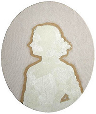
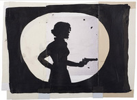
Karen Ganz, Girl with a Gun, drawing #1, ink on paper, 10 x 13 inches, at Howard House
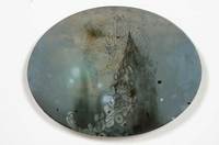
Darren Waterston, Five Oblivions 3 (peak), oil on oval wood panel, 12 x 16 inches, at Greg Kucera Gallery
Anybody want to add one?
Culture Grrl disagrees here, here, here and most recently here, the last having the distinction of being not only plaintive ("Did no one miss me while I was gone?") but threatening ( "See you tomorrow (maybe).")
Culture Grrl (Lee Rosenbaum) is an industrious reporter, especially on museum administration news. But if she's that intent on raising a bit of what
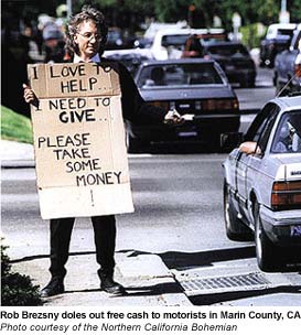
Or hook up with Rob Brezsny. Their needs appear to be in sync.
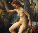
The hill and dale of Thomas Hart Benton, detail from Susanna and the Elders, the de Young Museum in S.F. (Photo, C-Monster.)
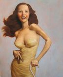
Benton swings again: John Currin, The Gimp (Gagosian Gallery)
 (Click on images to see them larger)
History does not misplace a movement that rewrites the rules of its region across a time span of two centuries, but few of the 58 paintings in Garden and Cosmos: The Royal Paintings of Jodhpur have ever been seen in the wider world, even by scholars.
Their base is the miniature. Jodhpur painters could produce palm-size cosmologies full of gods and goddesses, kings and queens, dancing girls, flute players, warrior monkeys and battles waged on the backs of elephants. Over time, however, they allowed themselves more room. And instead of filling bigger spaces in a miniaturist style, they expanded into wider worlds with open, rolling rhythms and colors with air in them. The jewel-box shine of the miniature became the saffron and sherbet shades of a dynamic pleasure dome.
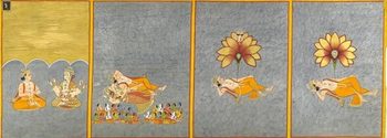 However gorgeous, and it is gorgeous, such a show wouldn't be expected to attract big numbers in Seattle, even with ecstatic local reviews (here, here, here and here). My favorite review headline from this group (first click) comes from Jen Graves - Your Brain Lights Up With Happiness.
Yes it does. Maybe outrageous skill and blissed-out iconography are more powerful attractions than previously imagined, or maybe it's the Slumdog effect - all things Indian riding the Slumdog wave.
Whatever the reason, SAM reports that Garden and Cosmos is running 200 percent over the museum's optimistic pre-crash projections. It's on view at the museum's sleepy satellite venue, the Seattle Asian Art Museum in Volunteer Park. Its numbers are dwarfed only by King Tut in 1978 and Bruce Guenther's Jacob Lawrence retrospective in 1986, both before SAM moved its headquarters downtown.
Speaking of downtown, SAM's doing well there too. Life, Liberty and the Pursuit of Happiness is attracting the pre-crash projection of 20,000 visitors in the first three weeks. Considering the attendance dive SAM experienced after the economy fell apart in the last year of the Bush administration, that number is amazing.
Possibly it has something to do with this. Advertising its pay-what-you-can admission policy (instead of keeping it a secret), was second on this list of what SAM needs to do to connect with a younger audience. So far, so good.
(Click on images to see them larger.)
 Helen Levitt died in her sleep on Sunday. She was 95. Lovely Margarett Loke obit in the New York Times here.
For someone who had a long and distinguished career, Levitt seldom had much to say about it. If she grew tired of having critics exclaim over her early work and ignore her later, she rarely expressed this view in public.
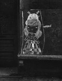 In the late 1930s and 1940s, she captured the animal radiance of an urban childhood - the chaotic fun of hanging out where lots was happening. As far as we know now, which isn't enough, she didn't work much in the 1950s and 1960s but came back big in the 1970s.
Her career charts a course from the specific to the nearly abstract, from black-and-white to color. In later years, she liked to lift the edges off objects and give them a shake.
I remember a print of a woman dressed neatly in a grid of crisscrossing checks leaning into a cab. The car's checkered trim seems to have wondered off her skirt. In another, three motley roosters stroll down a street, heading for a clump of cheap chairs with gold and red floral patterns blooming with startling force under plastic wrap.
Her unifying thread is a focus on gestures. Like Henri Cartier-Bresson and Weegee, she specialized in the fleeting, spontaneous and tossed off.
 In her early work, children rule. They are ruffians with the grace of angels. In what is probably her most famous image, three of them stand staggered on the steps of a brownstone, two in face masks, the third struggling to tie hers on.
Ralph Eugene Meatyard hit the same theme, but his kids are grotesques. Hers is tender. He put the masks on the children and posed them. She found them as they moved outdoors and caught them in the act of being themselves.
In Seattle, Levitt's work is at the G. Gibson Gallery.
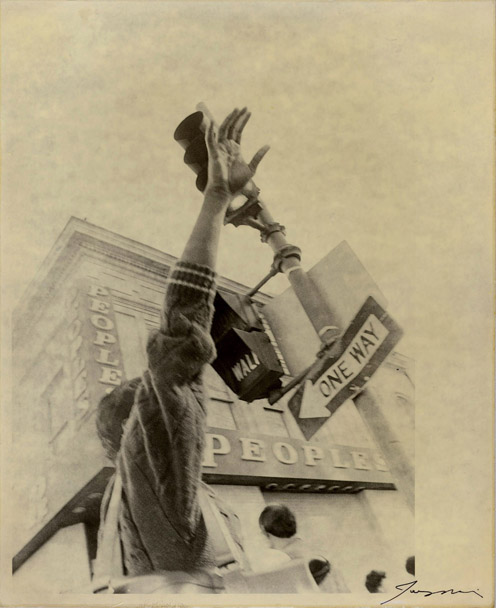
pathological aversion to paperwork could indicate an imbalance in the prefrontal cortex. Amen's prescription? Hire someone else to do it.
In other words, those with a paralyzing reluctance to fill out anything resembling a form are not just self-indulgent procrastinators but victims of their chemicals. Reading this, I was awash in my own Cherry Orchard moment, a feeling that, in the future, advances in medicine will make it possible for the formerly slothful to be tidy and timely. No more drifts of unopened mail obscuring the work space on their desks.
Chekhov's characters believed in the future. They believed that in time the ability to work would make everyone free, when the truth of future was Stalin. It's the single greatest example of history deepening the meaning of art, instead of the reverse.
TROFIMOV. The human race progresses, perfecting its powers. Everything that is unattainable now will some day be near at hand and comprehensible, but we must work, we must help with all our strength those who seek to know what fate will bring. Meanwhile in Russia only a very few of us work. The vast majority of those intellectuals whom I know seek for nothing, do nothing, and are at present incapable of hard work.And Trofimov, again:
Believe me, Anya, believe me! I'm not thirty yet, I'm young, I'm still a student, but I have undergone a great deal! I'm as hungry as the winter, I'm ill, I'm shaken. I'm as poor as a beggar, and where haven't I been--fate has tossed me everywhere! But my soul is always my own; every minute of the day and the night it is filled with unspeakable presentiments. I know that happiness is coming, Anya, I see it already. . . ANYA. [Thoughtful] The moon is rising.
EPIKHODOV is heard playing the same sad song on his guitar. The moon rises. Somewhere by the poplars VARYA is looking for ANYA and calling, "Anya, where are you?"
TROFIMOV. Yes, the moon has risen. [Pause] There is happiness, there it comes; it comes nearer and nearer; I hear its steps already. And if we do not see it we shall not know it, but what does that matter? Others will see it!
Both Rubino and Kaindl had counter sued. Suddenly, all suits were void, and terms of the settlements sealed. At the time, Chihuly said if it had it to do over, he wouldn't.
To sue or not to sue. That is the question. I'm not the kind of person who wants to sue somebody, and yet I did. I got kind of fed up.
What was he fed up with?
I recently saw an ad for Kaindl in a luxury goods magazine. Here's a piece from his Web site, followed by one from Chihuly's. (Click on images to make them bigger.)
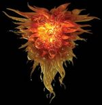 That's not all. When Chihuly Inc. announced its suit, press coverage
tended to be sympathetic to the defendants (underdogs) rather than the
plantiff (top dog).
 The worst offender was the Seattle Times. After six months of digging, the paper produced a bloated and inconsequential three-part Chihuly series.
It suggested grave wrongs were being uncovered at Chihuly Inc., maybe just over the hill of the next paragraph.
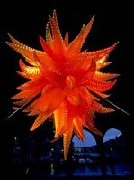 As written by investigative reporter Susan Kelleher and art critic Sheila Farr, there was nothing but smoke over that hill. My favorite headline in the tell-all wannabe series was "Chihuly Benefits from his own Philanthropy." Who doesn't?
 Here's how the ST framed the idea of the suit:
Headline: Chihuly turns up heat on competing artists.
Subhead: He's been guarding his artistic style for years, warning others not to copy shapes and techniques he claims as his. But some say he's gone too far with a copyright lawsuit.
That's fair and balanced. Welcome to Seattle's version of the no-spin zone.
My Chihuly profile here.
Fashion designers are more or less resigned to knockoffs, but artists aren't. After Jeff Koons floated a basketball in a half-filled fish tank and called it a sculpture in the early 1980s, nobody rushed to market with the same idea. But Chihuly straddles two worlds, both art and craft. Like fashion, craft gets copied. Who hasn't seen an imitation Tiffany lamp or an imitation Charles Eames' chair?
What got lost in all this was art, but what chance does art have when conflict is on the table, along with juicy personal information and the opportunity to scorn a homegrown celebrity? None at all.
Time to move on. Chihuly has. But as I held Kaindl's ad in my hands, the injustice of the outcome rankled.
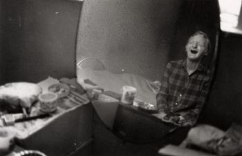 Billingham's disreputable dad Ray has a mirror personality in Scobie from Lawrence Durrell's The Alexandria Quartet, first book:
Scobie is getting on for seventy and still afraid to die; his one fear is that he will awake one morning and find himself lying dead. Consequently it gives him a severe shock every morning when the water-carriers shriek under his window before dawn, waking him up. For a moment, he says, he dare not open his eyes. Keeping them fast shut (for fear that they might open on a heavenly host or the cherubims hymning) he gropes along the cake-stand beside his bed and grabs his pipe. It is always loaded from the night before and an open matchbox stands beside it. The first whiff of seaman's plug restores both his composure and his eyesight. He breathes deeply, grateful for the reassurance. He smiles. He gloats. ...Billingham went from shooting pictures of his nearest and dearest to photographing at the zoo, not a large leap. He's in the current exhibit at Western Bridge.
He places his wrinkled fingers to his chest and is comforted by the sound of his heart at work, maintaining a tremulous circulation in that venous system whose deficiencies (real or imaginary I do not know) are only offset by brandy in daily and all-but lethal does. He is rather proud of his heart.
One of his comparisons, however, doesn't quite make the grade - Jeff Wall's
Dead Troops Talk (a vision after an ambush of a Red Army Patrol, near Moqor, Afghanistan, Winter 1986) with Caravaggio's The Incredulity of St Thomas.
Dave Hickey forged the link that matters between contemporary art and Caravaggio's Incredulity in The Invisible Dragon: Essays on Beauty from 1991, long out of print and now available in a reissue, here. Specifically, in a chapter titled, Nothing Like the Son, Hickey compared Incredulity with Robert Mapplethorpe's photo of a man sticking his finger in his penis. (Images and text of this chapter here.)
Wall's work is remote. That's its signature. It's cold to its core. In contrast, Caravaggio's painting and Mapplethorpe's photo are all about touch. Both are as perverse as they are seductive.
John Berger wrote about Caravaggio's voluptuous intimacy two decades before Hickey, the electric charge of the boy Cupid's wing resting his thigh, but Hickey found its present-day equivalent in the work of an artist not credited with it. Before Hickey, Mapplethorpe was seen as stylishly meticulous. The kink in his content didn't change that, but Hickey did.
The pre-Hickey view of Mapplethorpe was instantly out-of-date. The book was a game-changer, plus big fun to read. Back to intestines. In art, a writhing form is a writhing form.
(Click images to enlarge.)
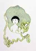
In Sabrina Small's Duality, intestines are the equivalent of umbilical chords:
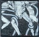
In Michael Spafford, they're a fatal form of father-son bonding:
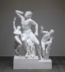
In Kris Martin, they're present in their absence.

In Masami Teraoka, they're octopuses.

In Karen Liebowitz, a horn.

In Claude Zervas, they're a river.
10. What is the most expensive piece here?Molenkamp's Web site here.
9. I should show my art here; can I see the curator?
8. Did you ever see Night at the Museum?
7. I've got this painting. (Describes work vaguely, typically forgetting the artist's name.) Can you tell me how much it is worth?
6. Why is it so hot in here?
5. Why is it so cold in here?
4. Do you get bored?
3. Why can't I bring my coffee in?
2. Has anyone ever stolen anything?
And, of course:
1. Where's the bathroom?
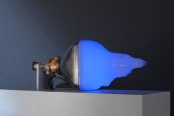
The cathode ray light that saturates most of the world didn't exist until Philo Farnsworth invented it in 1928. Because he believed that corporations could be trusted, his career was a sad one. The honor they didn't give him came after his death, when Nam June Paik in 1974 turned what Farnsworth had wrought into art.
Although Paik is interested in everything about television, its shape and sound qualities, its pretensions to realism, its hallucinatory snows, blips and flickers, Seattle's Tivon Rice is interested mainly in Farnsworth's light.
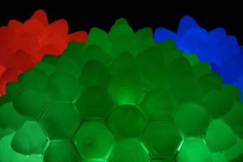
Rice's focus differentiates him from most of the major light artists who precede him, such as Dan Flavin (fluorescence) and James Turrell (fictionalized ethereal). From the specific, Rice moves from the spectacular and down to the humbly interactive - tube as church and tube as intimate companion.
Pink Noise: From a finger (2008) is part of his current exhibit at 911 Media Arts Center. Rub the fleshy screen under the single digit and another will appear to do what you're doing, from gentle massage to nervous scratch.
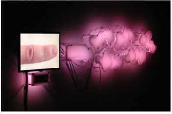
Through Tuesday at 911. All Rice images from Lawrimore Project. More images here.
Could this be the reason?
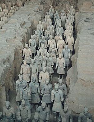
Or, more recently, this?
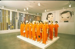
Whatever the stimulus package, the harvest is bountiful.
Gregor Kregar is into maintenance men.

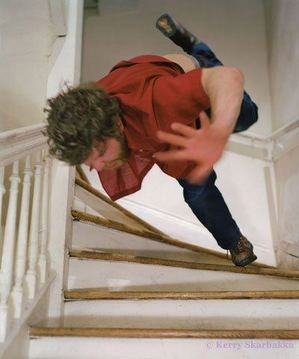
Kerry Skarbakka tries (and fails) to defy gravity.
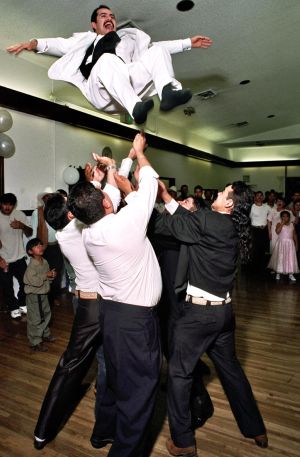
Hugo Ludena celebrates gay marriage in a community setting..
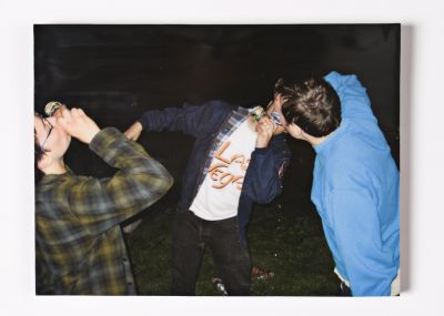
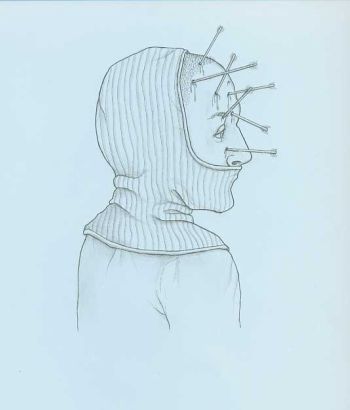
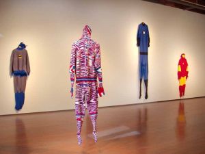
Mark Newport represents sold craft values. With boyhood heroes gone, he continues to knit their empty suits.
Even sanest man in art criticism - Richard Lacayo - goes mildly nutty at the mention of Schnabel's name. Here's Lacayo's drive-by Schnabel hit in a discussion of Guest of Cindy Sherman by Paul H-O:
Paul comes off as a somewhat goofy but implacable guy who has a way of getting his foot in the door and a sense of humor about himself. He's not afraid to show us footage of artworld blowhard Julian Schnabel -- who (no surprise) does not have a sense of humor about himself -- telling Paul that his tv show is "a sort of masturbatory exercise in stupidity." (Careful Julian, that's a pretty good description of your entire career as a painter.)Really? His entire career?
Another must-kick artist is Dale Chihuly. He could make mountains dance, and critics would turn away in disgust. The most recent addition to the critical no-fly zone is Shepard Fairey. Damion Hayes of the street art blog To Fear It Is To Know It is obsessed with disrespecting Fairey. How bad is it? Hayes backs AP over Fairey. That's a disgrace. Today, again. (A rational view of the case here.)
Artists do not poison waterways, start wars or send the economy into free fall. Rigorous criticism is essential, but personal insults degrade the critic who tosses them off.
I started reading Thomas Albright in the SF Chronicle in college. He later wrote a book about Bay Area art. It's good but not great. Albright was master of the 10-to-15-inch review in a newspaper. In that small space, he did it all: close attention to the work in question and a sweeping sense of context paired with decisive judgment, all in his confident, smart, no bullshit style.
He died in his late 40s in 1984. At his funeral, someone said that Albright's attacks were formidable but never personal. In his reviews, Albright called no one names, not even the SF art dealers who once bought space on a billboard to say, "Fire Tom Albright." I believe they included an exclamation point.
Like Orozco, Teraoka knows how to take the air out of a room. He knows how to paint glamor after it's gone and everybody's time is borrowed.
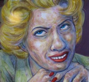
His women can eat you whole; his men have nothing to say and nothing to say it with. Teraoka grew up in Hawaii watching movies interrupted by commercials on late night TV.
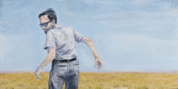
He paints with acrylics in wet glue:
A few years ago, I became really frustrated with this painting I was working on. So I took a bottle of glue, squirted it all over, and applied more paint on top of that. I liked what it was doing, so I kept developing this method. The wet glue absorbs the acrylic paints in a certain way, so I feel like I can get a nice skin quality. I guess it's a psychological thing too - I can really 'feel' the skin texture as I'm painting. As it starts to dry, it repels. That's how I get the washes in the background: I get this foamy mix, and as I paint it over it separates, creating these interesting effects.His background is in graphic novels. If he were what Pop Surrealism were about, I'd be all over it. Instead, too often, it's illustrative fantasy, skillfully drawn.
-from Toyoko Art Beat, full interview here.
Teraoka is at James Harris through Saturday.
Today, however, Tyler Green pointed out that Orr-Cahall was director of the Corcoran Gallery of Art in 1989 and canceled the Robert Mapplethorpe show in response to outrage from Congress, led by Jesse Helms.
It was absolutely the wrong thing to do. She resigned in response to the chaos caused by her decision. (New York Times story here.) As Green noted,
The Corcoran -- and in some ways the art world -- still hasn't recovered.Orr-Cahall appears to have been a big success as director of the Norton Museum of Art for the last 19 years. (Story here.) Surely her life's work cannot be defined by one false move.
But nobody in Seattle appears to have asked her about it. The Seattle Times' reporter quoted her saying she was interested in the "whole visionary side" of museums and wanted to - wait for it - "push boundaries."
"I knew I remembered something attached to her name," wrote Jen Graves, acknowledging Green's post. Me too. I glanced at the PI story and thought, hmmm. Where have I heard that name before? Neither of us sees EMP as our particular concern. We don't cover it. Isn't that somebody else's job? Somebody, anybody?
The mark of tiny town journalism is, when something worth digging into happens, outsiders do it or it doesn't get done.
Passionate love is Temporary- Olga Broumas, from Landscape with Loaves and Figure
Insanity the Chinese
say that day
I walked nine miles in a bowl
the hill makes coming round
and round avoiding
the road in
sane I realized a whole
week later....
At Howard House, the title of the exhibit Dearly, Madly comes from a pathetically excessive sentiment expressed in Dumas' The Count of Monte Cristo:
I love her dearly, madly; I love her so much that I would shed all my blood to save her one tear.As soon as it's said, the loved one is looking for the door. Curated by artist Robert Yoder, Dearly Madly explores the spirit of doomed pursuit. The nature of the pursuit insures its failure and seals desire into an endless loop,having nowhere else to go.
Michael Dee's Heartsmelt (The Panopticon) is a Jeff Koons' on the skids. Trailing its own battered props, this party is dead and doesn't know it.
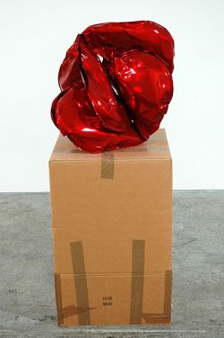
Shaun Kardinal's Repose is in love with its own melancholy.


I'm not sure what Haim Steinbach is doing in this show. A self-possessed member of the Cool School, Steinbach has never demonstrated a flair for or interest in vulnerability. He's the Giorgio Morandi of consumer goods, and his shelf life goes on forever.
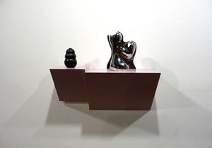
A case of the latter: Jeff Koons' St. John the Baptist probably cracked its arm during a short ride through Seattle from Artech storage to the Bagley and Virginia Wright Exhibition Space in 2004. Produced in an edition of three with an artist's proof, Saint John is from the 1988 Banality series of large-scale, ceramic sculptures.
Michael Jackson and Bubbles from the same series is the largest porcelain sculpture ever made. Saint John is a close second, at 56 inches high, 29 inches wide and 17 inches deep. Story about the conservation efforts that left John whole but with a scar here.
Thursday night at Cornish College of the Arts is a panel discussion with the overblown title, Eros-Bios-Thanatos: Conundrums in Conservation of Contemporary Art, at 1000 Lenora Street, 7:30-9 p.m., 7th floor.
The panelists are worth hearing: Mitchell Hearns Bishop from the Getty Conservation Institute & curator, Los Angeles County Arboretum; Nicholas Dorman, chief conservator, Seattle Art Museum; Claire Gerhard, independent conservator, now in Seattle recently working at the Whitney, MoMa & Mozambique, and moderator Elizabeth Darrow.
The installation crew. The curator in charge.
Sometimes the same curator improves dramatically from first stab to second. Greg Kucera Gallery's present Gee's Bend show looks much better than the gallery's previous. Through Saturday.
Young as they are, Hashemi and Hirata have a wistful edge. Maybe it's because all the good positions are taken. For artists in their early 20s, the chances of doing someone else's work without realizing it are good. Alert, awake and aware, Hashemi and Hirata have a sly magpie sensibility. Yes, they're recycling, and yes, isn't everybody?
Hirata licked a canvas till his tongue bled red. (Hello, young Chris Burden.) Hashemi sent a droopy houseplant for a ride on the top of one of those movable disc vacuum cleaners. (He's looking at you, Buster Simpson.)
But nothing in their show is anybody's old school. Hashemi's light touch in the world of manufactured things and Hirata's pathetically puny use of props celebrates a world of reduced circumstances. Maybe that's why I keep coming back. Their flimsy take on what's happening now is what's happening now.
Saturday night, they're closing with a party. Expect fog machines.
The selection committee - Henry director Sylvia Wolf and curators Elizabeth Brown and Sara Krajewski; Seattle artist Joe Park; Portland artist Harrell Fletcher; Vancouver's Contemporary Art Gallery director, Christina Ritchie; and arts patrons John and Shari Behnke - will announce the winner April 17, 8 p.m. at the Henry. The award was the Behnkes' idea, which they bankrolled.
What's the Brink? Explained here, although the Henry responded to criticism and took out academic requirements. More on the Henry's

Fred Muram's is robustly vulgar - a video titled Sharing a bowl of Fruit Loops with my dog, from 2008.
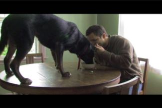
Both graduated from the University of Washington in 2007. A review of their class debut at the Henry Gallery here.
Take his Postwar Landscape, An Urban History at Howard House. These documentary urban landscapes purport to show past and present in layers, all visible at once. If Harry Potter had one that worked in his debut novel, he wouldn't have needed those profitable sequels to understand his own story.
Anselm Kiefer paints the Nazi past as poison leeching into the present, but covering the same plot of ground and history, Picton is recessive, letting the facts speak for themselves.
Except they don't. Below is Picton's Berlin, 20008, in duralar, enamel paint and pins, 45" x 55" x 3".
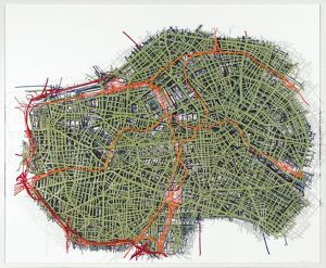
What is evoked here? I see nothing but tricky clutter. Below is another version of the same idea from Picton, and this is the one piece in his show that connects. Underneath a contemporary street name is the Hitler Platz in translucent Jello-shades of lime over strawberry: Berlin Text Work #2, 1943, 1962, 2007 - laminated duralar, from 2007.

Other Seattle critics are more favorably inclined. Here's a Jen Graves preview of the same show, and an Adriana Grant review.
Maps in general leave me cold. My brainy brother who refused to admit he needed glasses once pulled his car over in a rainstorm to try to read a map's small print in the headlights as the paper puddled in his hands. Sitting in the passenger seat I thought, that's the way maps are for me all the time.
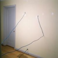
On the other hand, Fred Muram's version - I'll let you drive if I can read the map, 2009 - is my idea of soul food.
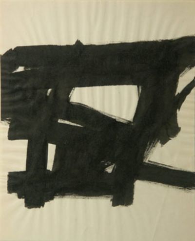
In a 2002 review, Holland Cotter described Kline's "fascination with radical forms of East Asian calligraphy," citing a drawing from 1955 that "has the explosive look of Zen thrown-ink painting."
Kline was no Zen priest, however. His achievement is the appearance of spontaneity without the fact of it.
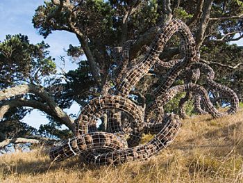
The recent photographs of N. P. Thompson offer evidence of what many have suspected, that instead of being purely abstract, Kline was painting the urban scene, specifically the scaffolding of tall buildings under construction.
Here's a Thompson photo, titled Intricacies. And here's Kline's small ink-on-paper, Untitled (Study for Wanamaker Block) from 1955, image from Stephen Foster Fine Arts.
Morford offers grudging respect to Clay Shirky's Newspapers and Thinking the Unthinkable, because of Shirky's solid analysis, but Morford is sick of everybody without a stake in the old newsroom calling it done for:
This, to me, is the hoariest snag in any preachy "a mature blogosphere will supplant old media" argument. In the howling absence of all the essential, unglamorous work newspapers now do -- the fact-checking, interviewing, researching, all by experienced pros who know how to sift the human maelstrom better than anyone, and all hitched to 100+ years of hard-fought newsbrand credibility -- what's the new yardstick for integrity? On what do you base your choices? Some fickle mix of personal mood, blood-alcohol level, and how many followers your given source has on Twitter? Right.
I disagree with Winer in one huge way: When the professional news filters vanish, when you lose that vigorous center of storytelling expertise, you don't necessarily get a rich 'n' wonderful mix of new choices. You get chaos. You get noise. Sure, it might be a boatload of fun to read, but it's also maddening as hell.
Of course Morford is right. Nothing has yet arisen to replace the organization of fact hunters and checkers who research and verify what sees print in a newspaper. Working without a team paid to weigh and assess every word is writing without a net. Editors can leave rope burns on copy or strangle it outright, but more often they save writers from themselves.
In spite of their expertise and devotion to the truth, however, newspapers have too frequently failed us.Take the New York Times, the best of the best. Judith Miller's reporting on the Iraq War helped get us into that war. Those phantom Weapons of Mass Destruction? According to her, they were real. (Morford, on the other hand, got it right, early and often.)
In my own small case of online only, as a former member of a far less illustrious newspaper team than the NYT, I'm banking on readers to tell me when I'm wrong and to debate the debatable. So far,so good. Plus, change is inevitable.
Here's Mitchell and Webb on orientation day at the dawn of the Bronze Age. Stone chippers were not amused. (Thanks to Tim Appelo for link.)
Two recent cases in Seattle:
Now at the Frye, Swedish video artist Nathalie Djurberg was at Howard House last year in a show curated by HH director Sara Callahan. The Frye wall text acknowledges only the high points of Djurberg's resume, which is fine, except in Seattle, where Callahan put her on the map. Why not say so?
More egregious is the Henry Gallery's treatment of Greg Kucera. Kucera is Seattle's go-to guy for all things William Kentridge. Because Kucera sold a hefty share of it, he knows who has which Kentridge, and who'd be willing to loan it.
Naturally, when organizing her own Kentridge, Henry chief curator Elizabeth Brown asked Kucera for help, which he promptly provided. Fast forward to show time.
Kentridge performed I am not me, the horse is not mine earlier this month, sponsored by the Henry. The Henry's Kentridge exhibit is up through May 3, and Greg Kucera's through March 28.
Introducing Kentridge before his performance, Brown failed to mention Kucera's show. She also failed to thank the dealer for the major role he played in putting hers together, although she thanked as a group the local collectors who made loans.
Surely these omissions were inadvertent? I'd like to think so, but it's hard to imagine the reverse - dealer acknowledged and collectors snubbed.
Isn't it time to abandon the illusion that dealers are all about money and curators are all about art? The dealer who's in it only for the money doesn't make any, and the museum curator who thinks the bottom line is beneath her helps to sink her/his institution.
When I asked Kucera about this subject, he said, "Don't write about it." Why do it anyway? Because it's healthy to air certain aspects of the art world that used to be hidden.
As Robert Creeley put it in Like They Say:
Underneath the tree on some
some grass I sat, Iwatched two happy
woodpeckers bedis-
turbed by my presence. And
why not, I thought tomyself, why
not.
It's easy to blame the paper's art critic, Kenneth Baker, but the real culprit is the art itself. Forced to tiptoe around the sensitivities of the boutique city by the Bay, art arrives on the streets with a good back story to support its existence and very little forward momentum. Unless the artist is universally acclaimed and/or unlikely to offend any aging flower children, the chances of squeaking through the public process are slim.
Hamlin's list includes what Hamlin admits to be kitsch - an awkward sculpture of Father Junipero Serra - because it "makes us smile."
Kitsch makes the list? Seattle has a neon elephant that tops SF's carved missionary, with the additional virtue of cleaning your car.
The roots of SF's public art aversion here.
Culture doesn't seem on these people's radar. They never seemed toTrue, but let's give the PI a couple of weeks to shake out and dig in. The final day for the print version (and the vast majority of the staff, including the entire arts staff), was Tuesday.
notice that in the coffee shop, nobody steals the sports section or
the editorial page or the business section -- it's always the arts
section that's missing.
A dog limped into a bar
and said, I'm looking for the man
who shot my paw.
The Dalai Lama would let it go,
but the dog being dog
wanted to know
who sold him a seat
in a sink hole.
I'm with the dog and with the pig
who leapt after leaning
on the electric fence,
her lardy self landing on little feet.
Let other bless what bounty brings
(not felled by fracture).
She replied with a toothy rake
across the rear
of the swine beside her,
believing, like Burroughs,
there are no innocent bystanders.
 From Gary Faigin on Artdish:
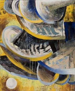
Lucinda Parker speaks of taking her inspiration from nature, but Thoreau would have had her thrown out of Walden Pond for disturbing the peace. Her big, noisy paintings are celebrations of energy, movement, and conflict. To the extent that they are inspired by the natural world, it is the realm of tsunamis, windstorms, icebergs, and waterfalls - force colliding with force.Go, Gary. I love that lead.
Based in Portland, Oregon, the painter in question is well into the third decade of her career. Across time it's easy to see relationships that weren't clear in the beginning.

 Although Parker had a brief flirtation with decorative effects,
her strength is power painting: broad arcs of form crashing, folding or
curving into each other, cutting through space like knives through
thick batter.
 Her work bears a relationship to the late Portland painter Carl Morris: his sweeping arcs without his muddy color. And like the paintings of Howard Hodgkin, hers continue over the frame, refusing to acknowledge a beginning or end.
But Parker is blunter than either Morris or Hodgkin. At the core of her abstraction is an interest in generative life processes, which she presents in all their sour, messy glory.
When yellow hits black in a Hodgkin painting, the effect can be delicate. When the same colors meet in Parker's spaces, that
convergence has a blunt and battering force.
She had a solo show last month at Linda Hodges Gallery in Seattle. In Portland, she's represented by Laura Russo.
Working with his childhood friend, chemist and botanist Joe Piecuch, Elias Hansen celebrates the cheesy weirdness of Tacoma.
Tacoma is the kind of town artists flee from. Art Chantry, who left and came back, refers to it as a "little piece of New Jersey that broke off." The term flying saucer was coined there in 1947, when a Tacoma man reported seeing silver discs flying over Mount Rainier and along the crest of the Cascade Range. When asked what they looked like, he said, "Like saucers without cups."
Chantry also claims that the term new age was invented in Tacoma by a splinter group of a flying saucer church. Add the town's reputation for organized crime, gangs and heavy-industry polluting the waterfront, it's easy to see why Tacoma had no hope of becoming a city known for art.
Except it has. (Story here.)
Back to Hansen, a glass blower from Pilchuck who never had a decorative thought in his life. He looks at a flourish and wonders how it could be put to use.
He and his older brother Oscar Tuazon come from the Buster Simpson school of handyman poetics. Because Hansen is best known for his collaborations with Tuazon (review here), Hansen's exhibit at a suitably tacky little Tacoma storefront gallery was a test for him. Has he hitched his wagon to his brother's star or has he his own forward momentum?
Clearly the latter. With Truths We Forgot To Lie About, he and Piecuch delivered an exhibit of staggering greatness.
They treated Tacoma like a science experiment, taking core samples of the place distilled into gruesome forms of theoretically drinkable beverages. In all manner of glass test tubes (blown by Hansen), they mixed an alcohol base with Western red cedar, brick fragments from Ted Bundy's childhood home and soil from Port Madison; coyote blood, beard hair, beeswax and butterfly wings; blackberries, club moss from the Hoh rain forest and hydrogen cyanide; soil from Lewis and Clark's Cape Disappointment camp site, concrete from the Boeing plant in Everett flavored with hobo urine, and brick chips from Francis Farmer's childhood home with paint flecks from Curt Cobain's final abode on Lake Washington.
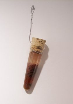
Beauty, for Hansen, breathes in the forest.
How to keep--is there any any, is there none such, nowhere known some, bow or brooch or braid or brace, lace, latch or catch or key to keep
Back beauty, keep it, beauty, beauty, beauty, ... from vanishing away?
from The Leaden Echo and the Golden Echo, Gerald Manley Hopkins
If the beauty of the forest is a commodity in a threatened industry, how can Hansen & Piecuch make use of it in an old loggers' town?
By turning it into a memory preserved in alcohol. In the hopes of not setting their house on fire, they took a large, Venetian-style glass vase out to the backyard at night and poured hot urethane into it, over the root bulb of a datura plant, from the Nightshade family. The glass cracked, and the pieces fused in layers as the urethane cooled. With that base, they added the ingredients of peach home brew.
From the website of The Helm, the terrific makeshift gallery that sponsored this installation:
Why are bootleggers romanticized? Why are meth cooks ostracized? Why is the Northwest home to so many bootleggers, meth cooks, serial killers and craftspeople? Does the geography of this area create a space for this kind of activity? Or do we create these stories and myths to fit the geography?
Through garage chemistry, traditional craftsmanship, backyard naturopathy and a limited budget, Hansen and Piecuch attempt to assemble a collection of stories, distillations and reactions to the geography and history of the Northwest.
I don't want to oversell the good news here. The Helm is going out of business after its April show. It's tough for galleries to stay in business. For a gallery that's off-the-edge adventurous in Tacoma, it might be near to impossible. RIP, Helm, and come back in another form soon.
The pace of the old PI, which I considered brisk, now looks plodding. Three editors looked at everything on its day-long journey toward print. Blogs at the paper were a different story. One editor took a fast look, usually after the item was printed.
When I started blogging a couple of years ago, the prospect of that fast read intimidated me. As I like to say, misquoting Sir Thomas Wyatt, facts flee from me. Everybody benefits from another set of eyes evaluating the product, I more than most.
What I discovered online was reassuring. I'd traded three editors for many more. If something's wrong, readers say so in the comments, email me or call. I hope on this blog, they will continue the practice, even though comments are not immediately posted. I have to look at them first, and I'm already behind.
Doug McLennan, AJ editor, told me to start Another Bouncing Ball with a piece about the transition from the PI to freelance art critic. This is it. It's not the start, but it's close enough. Those who want more from me on the PI's demise can find it in The Stranger (here and here) and the Columbia Journalism Review. The CJR quote has the virtue of being brief:
The Hearst Corporation has always treated the P-I like a placeholder. When there was money to be spent, they didn't spend it here. This is the time to invent the template for the transition from newsprint to online only, and once again, the Hearst Corporation is doing it bare bones. A skeleton looks plump compared to poorly-paid online crew. I wish it well, but those people have a near-impossible task. The future according to the Hearst Corporation seems to be, journalism without journalists.I should have added that Hearst has always treated me and mine well. The PI was a great place to work.
Washington Post art critic Blake Gopnik emailed yesterday to say he was the victim of a drive-by Twitter post. Somebody's impersonating him in the department of Tweet Tweet.
I saw the item about his Twitter post on MAN. Note Tyler Green's question mark, which I ignored:
Look who's Twittering?
Washington Post art critic Blake Gopnik? Here's a sample -- and one which manages to miss many points at once: "I, for one, won't miss the Rose Art Museum. It was always a second-rate collection in a city full of first-rate art."
I responded with this post, unfortunately titled, A Washington Post twit on Twitter, which includes:
A man who tosses off irresponsible one-liners but builds paragraphs into essays with the reliable if unexciting skill of a bricklayer is not best served by Twitter. All his worst faults are on view, his best suppressed.
Gopnik, who says the offending item was not by him, wrote me:
I thought you might like to know that I have never Twittered, and am not even signed onto the service as a user. Someone is impersonating me. I am surprised that you didn't suspect such a thing. The Twitterer's voice and opinions are clearly not mine, and many of the issues addressed are not ones that I have ever expressed an interest in. I am even more surprised that, as a professional journalist, you didn't take the basic step of calling or emailing me to fact-check this.
He's right. Somebody went to a lot of trouble to set him up. I should have spent a small fraction of that time checking it out before responding.
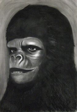 An exhibit that meant little to me when it was on view won't go away now that it's gone - Bas Louter's Dust (Asphalt) at Ambach & Rice. Paintings fanned out across the walls like pages of a book riffling in the wind.
 The images in black and white were muted and deliberately vague. A woman stood beside a car in a pose familiar from advertising: Buy this car and get the girl. But car and girl were a myopic blur drained of color. Clowns gazed into the middle distance, where no performance takes place. A portrait of a humanoid ape lifted the corner of its thick lip, either to greet or growl. She's from Planet of the Apes but can't be found in any frame of the movie.
Dust (Asphalt) was neither here nor there. I thought when I saw it that Louter's efforts would make a good stage set for an absurdist drama, but lacking the drama, lacked visual momentum. Louter is one of those artist who appears to paint on a whim. He could just as easily take photos, make videos or pile empty suitcases in a corner. HIs paintings neither catch nor kill. Teflon, engagement slides off them, and I think, in retrospective, that is the point.
EDITOR's NOTE: Today (March 16) is the last day of the P-I. This blog will begin tomorrow.
Several years ago I was invited by the Limited Editions Club of New York to illustrate a book of my choosing from a list of the club's many titles. I selected the book Hiroshima, written by the brilliant writer John Hersey This work was selected because of its power, insight, scope, and sensitivity as well as for its overall content My intent was to illustrate a series of events that were taking place at the moment of the dropping of the bomb... August 6, 1945. The challenge for me was to execute eight works: a marketplace, a playground, a street scene, a park, farmers, a family scene, a man with birds, and a boy with a kite. Not a particular country, not a particular city and not a particular people.Valdez marshals her media to create a series of moments. As if fearful the attention of the audience might wander, she changes her approach like a nervous suitor changing clothes for a big date. Lawrence's series is not interactive except in the traditional sense, that it catches the eye and holds it. Valdez's work is technically astute. Lawrence's isn't, but next to his, hers looks simple-minded, too caught up in the toys of its time and place to make any one thing matter.

Recurring Dream, Nine, 2002 (Detail) Digital print on board, video monitor, 10 minute video 48" x 60" Unique Image via Lawrimore Project

Jacob Lawrence, Farmers from the Hiroshima series
About
Blogroll
AJ Blogs
AJBlogCentral | rssculture
Terry Teachout on the arts in New York City
Andrew Taylor on the business of arts & culture
rock culture approximately
Laura Collins-Hughes on arts, culture and coverage
Richard Kessler on arts education
Douglas McLennan's blog
Dalouge Smith advocates for the Arts
Art from the American Outback
Chloe Veltman on how culture will save the world
For immediate release: the arts are marketable
No genre is the new genre
David Jays on theatre and dance
Paul Levy measures the Angles
Judith H. Dobrzynski on Culture
John Rockwell on the arts
innovations and impediments in not-for-profit arts
Jan Herman - arts, media & culture with 'tude
dance
Apollinaire Scherr talks about dance
Tobi Tobias on dance et al...
jazz
Howard Mandel's freelance Urban Improvisation
Focus on New Orleans. Jazz and Other Sounds
Doug Ramsey on Jazz and other matters...
media
Jeff Weinstein's Cultural Mixology
Martha Bayles on Film...
classical music
Fresh ideas on building arts communities
Greg Sandow performs a book-in-progress
Harvey Sachs on music, and various digressions
Bruce Brubaker on all things Piano
Kyle Gann on music after the fact
Greg Sandow on the future of Classical Music
Norman Lebrecht on Shifting Sound Worlds
Joe Horowitz on music
publishing
Jerome Weeks on Books
Scott McLemee on books, ideas & trash-culture ephemera
theatre
Wendy Rosenfield: covering drama, onstage and off
visual
Public Art, Public Space
Regina Hackett takes her Art To Go
John Perreault's art diary
Lee Rosenbaum's Cultural Commentary


Recent Comments